One trick Apple uses to make you think green bubbles are “gross”
A brilliant trick you should probably never use.
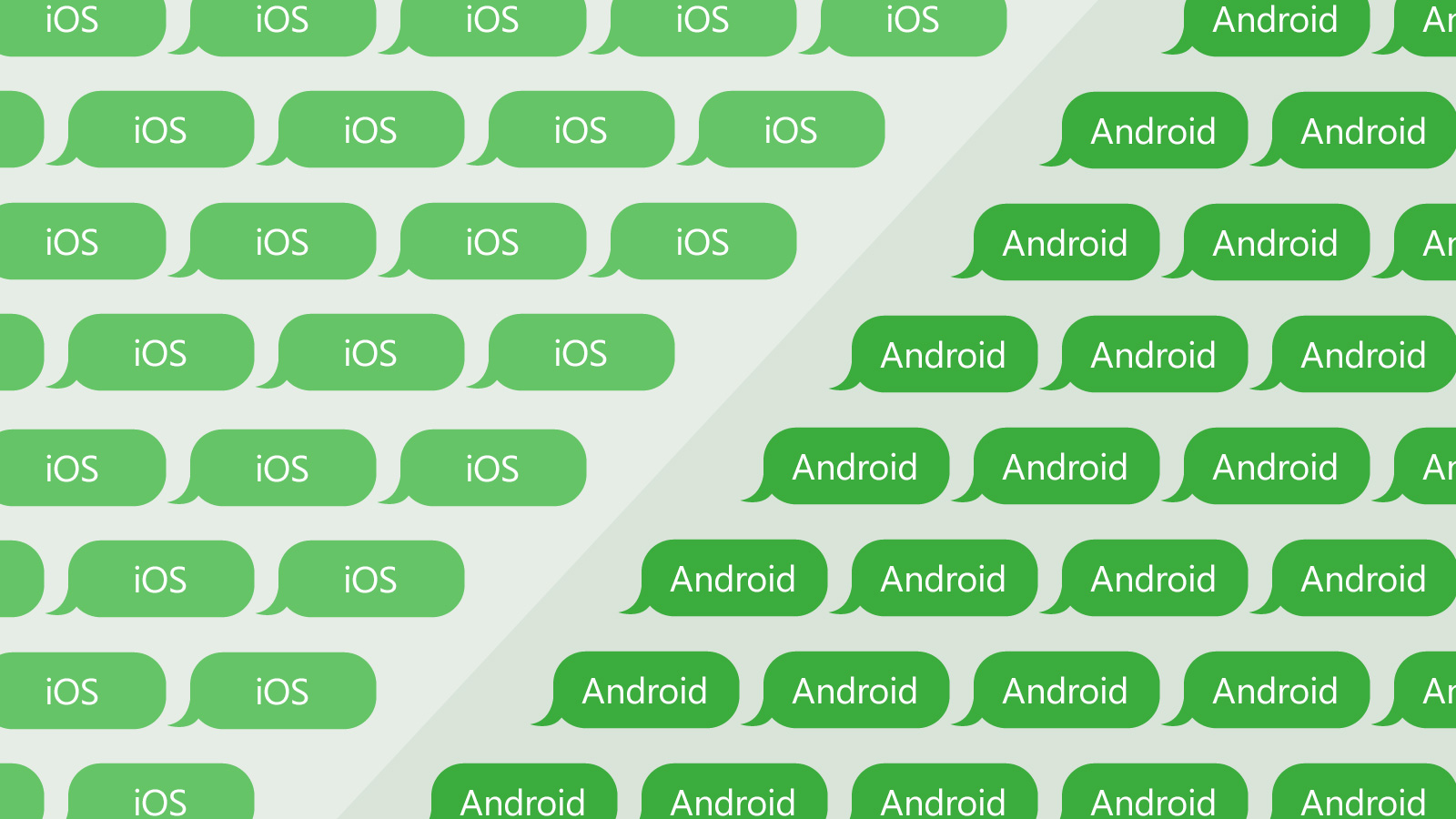
To make sure iPhone users don’t expect iMessage-only features when texting Android users, Apple marks the chat bubbles in blue (“you are texting someone with iMessage”) and green (“you are texting someone without iMessage”). This segmentation has then evolved into discrimination against green bubbles, especially among young smartphone users in the U.S.
Why is green worse than blue?
The answer is color contrast
The blue Apple picked for the iMessage bubbles provides a better color contrast against the white text on it compared to the green Apple picked for the Android bubbles. In other words, since text is white, likely Apple picked a darker blue but a lighter green to purposefully make the iMessage text more readable.
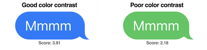
The blue Apple picked provides a better contrast compared to the green Apple picked
To be clear, it is not that green is gross. It is the low color contrast of the green Apple picked and used against white text is gross.
Color contrast is important because it impacts legibility, and in a messaging app, legibility is everything. Thanks to the darker blue, iMessage users end up with a better experience when texting other iMessage users and a poor experience when texting Android users.
Furthermore, every user has a different vision, screen brightness, and light condition. Image below shows how increasing the same amount of brightness for both bubbles easily worsens the legibility of green bubbles.
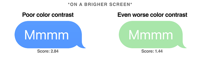
Blue and green chat bubbles with the same amount of brightness increased
In fact, the green Apple picked doesn’t even pass the WCAG accessibility test, with a score of 2.18 which is considered “very poor”². It impacts the user experience for everyone but especially for the users with visual disabilities.
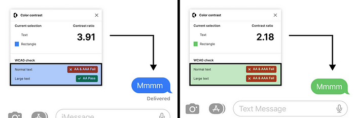
The green Apple picked does not pass the WCAG accessibility test
The wrap
Given Apple’s massive design resources and talents, it is likely no coincidence that Apple intentionally picked a green that adds friction to reading Android messages to make users stick to iMessage.
Apple builds great products and services like iMessage and it makes business sense for Apple to make them exclusive to its own users. That said, it is almost a universal rule for designers to never sacrifice accessibility to make a design work since accessibility is a fundamental pillar of good design.
Source: Medium, UX Collective