
What is Ashby’s law and how does it relate to UX design?
How to design complex applications by matching the complexity of UI with the mental models of users and vice versa.
Designing interfaces for applications and software that people will use involves aligning them with the mental models that individuals possess. These mental models represent a compressed version of reality that people use to handle situations in life, even though they may not accurately reflect the full picture or true reality (as proposed by Donald Hoffman).
Similarly, we say that people have a mental model of how the UI will behave, which is also compressed and may not accurately reflect the reality of the UI’s behavior. This occurs because when we store information about UI in long-term memory, we tend to store only the general characteristics that fit the conceptual representation and its “stereotype,” rather than every detail. This is a cognitive process that prioritizes efficiency and cognitive economy, resulting in simplified UIs that are easier to interact with.
As a result, we tend to make the UI of our products minimalistic and simple because the compressed version of the UI in people’s minds is a simplified version of real UI. However, what if we cannot reduce the complexity of our UI? What if we cannot eliminate all the controls, options, dropdowns, radio buttons, lists, tabs, nested navigation, and complicated settings where changing one thing affects everything else? If you have ever worked with complex web applications that have dashboards, numerous settings, multiple user roles, large amounts of different types of data, tables, columns and charts, you may have faced this challenge where reducing the complexity of the UI is not an option since all of these elements are important to the user.
So what should we do when we encounter these highly complex UIs? In the world of UX design, Tesler’s Law states that there is a certain level of complexity that cannot be reduced and simplified, especially when designing tools for expert users, such as a cockpit interface. In these cases, it may seem impossible to simplify the interface any further. Similarly, software development tools like Postman, Github, MongoDB, Blender, and design tools like Photoshop and Figma can be very complex. While Figma looks simpler than Photoshop, it is still more complex than popular social media apps like Instagram or TikTok, which are designed for a wider audience. For beginners, it typically takes more time to learn how to use Figma than Instagram.
Since complexity cannot be reduced for every product, we are encountering UX challenges on how to design UI of complex products so it’s easier to learn and use. One way to do that is to use concept from science of complex systems and cybernetics — Ashby’s law of requisite variety (or for the sake of simplicity, just Ashby’s law).
What is Ashby’s law?
Ashby’s law, coined by cybernetic scientist W. Ross Ashby, states that for a system to be stable, its control mechanism must be capable of attaining a number of states (its variety) that is greater than or equal to the number of states in the system being controlled. This law was later updated by scientists Max Boisot & Bill McKelvey to law of requisite complexity which states that:
In order to be efficaciously adaptive, the internal complexity of a system must match the external complexity it confronts.
In simpler terms, in order for a system to survive and remain stable, it must match the complexity, diversity and variety of its environment. Matching the complexity of its environment is key idea of Ashby’s law. If the system is not capable of doing so, it will ultimately fail and perish. Therefore, it is necessary for the system to match or even surpass the complexity of its environment.
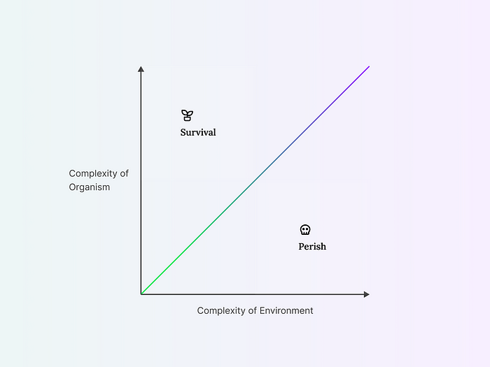
Ashby’s law — an increase in the complexity of the environment is followed by an increase in the complexity of organism. Otherwise, organism will perish and not survive.
This concept is originally related to biological systems. Organisms must adapt to their environment, which has non-living materials and other living organisms. Due to the complexity of the environment, organisms must also become complex to survive. As organisms evolve and become more complex, they add new complexity to the environment, which then requires other organisms to adapt and match the new complexity. Over time, this process leads to a biosphere that is more complex than its initial state. From simple single-celled organisms, life has evolved into complex societies of diverse multicellular organisms.
One of the conclusions drawn from this idea is that each organism is a model of its environment, a reflection of it. To further illustrate this, let’s take the example of the lion and the gazelle. A lion that hunts and eats gazelle must have at least as many behavioral states as there are gazelle variations of escapes. Similarly, in order to survive, gazelles must have behavioral states that take into account all the different ways a lion can hunt. Both of these organisms have a mental model of the other one. The lion’s mental model of the gazelle includes ways to catch and eat them, while the gazelle’s mental model of the lion includes ways to evade and escape from them.
Ashby’s law in UX design
While this concept is typically studied in the field of complexity science, it can also be applied to UX and UI design. We have already discussed how organisms adapt to environmental complexity to ensure their survival. This evolutionary mechanism can also be seen in the market. Just like organisms, products must be adopted by users in order to survive. This principle can also be applied to user interfaces. To ensure the survival of a particular UI, it must match the complexity and diversity of the user’s mind.
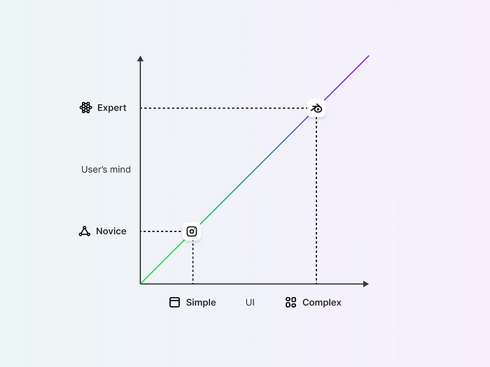
Complex UI of Blender requires a complex cognitive system, mental models of 3D modelers and expertise.
In the image above, we can see two examples of UIs that require different levels of complexity and the user’s mental model. For simple applications that only require a few controls and interaction options, the complexity of the user’s mind doesn’t need to be high and UI requires just a few cognitive capacities.
But if these users want to use the UI of Blender to create a 3D model of their favorite car, this would require a much higher level of complexity and variety in their cognitive abilities, as well as more skills, knowledge, and expertise.
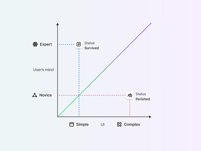
Although Instagram can survive in the complex mental environment of the Expert, the complexity of Blender’s UI is too much for Novices, causing it to eventually “perish” from their daily repertoire of product consumption. To survive, the Blender UI must either reach the level of cognitive complexity that Novices possess or motivate Novices to become Experts themselves.
As a result, complex UIs designed for users with simpler mental models are likely to be ignored or abandoned. In other words — they will “perish”. This is why creating accurate user personas is crucial, as it helps you to identify the intended users and design the UI accordingly.
On the other hand, users may also find themselves in danger if they are unable to use complex tools effectively. For instance, if someone’s car breaks down in the middle of a desert and they have no knowledge of how to fix it, they may eventually die unless they can find someone who is knowledgeable in car repairs.
As we often encounter complex applications, Ashby’s law can be useful in understanding and addressing these challenges in two ways. The first approach is to match the complexity of the UI with the complexity of the user’s mind. The second approach is to match the complexity of the user’s mind with the complexity of the UI. We can view both the user’s mind and UI as complex systems. The cognitive system is the user’s mind, while the UI is a complex system made up of different interconnected components.
Match UI with the user’s mind
In the conceptual framework of Ashby’s law, the user’s mind can be seen as the external environment with a certain level of complexity and variety. In order to match the complexity of the user’s mind, UX designers must conduct research on the mental models of their users. This will help identify the appropriate level of complexity required on the UI. It’s important to note that the level of complexity will vary depending on the user group, highlighting the need for a user-centered design approach.
When designing a new social media platform for entertainment purposes and targeting a wider audience, users will likely require fewer complex options and controls since entertainment situations are usually straightforward. However, if you are creating a tool for ML developers who deal with vast amounts of datasets, charts, and controls, their minds will be much richer and more complex in those situations. They have a variety of challenges to face and for each one they need to build a mental model. Therefore, experts tend to have more complex mental models than the general audience, and it is essential to match that complexity on the UI. For an entertaining app, the UI may only have a few options and controls for content, while for an ML tool, it may require a much more diverse, richer and complex UI.
This implies that the environment in which the UI operates, which is the user’s mind, differs in complex expert applications such as cockpit dashboards, financial monitors, weather forecasters, insurance services, developer tools, and other enterprise, analytical, and data-heavy products.
It’s important to consider all possible states that a user’s mind can be in while interacting with a UI and a specific product. By including a model of the user’s potential behaviors, the UI can be designed to respond appropriately and match the user’s mental model.
Match the user’s mind with the UI
The second approach is kind of the opposite of the goals of UX design. As a designer, you have to create the UI in a way that matches the mental models of the users, which means you will mostly follow the first approach. But sometimes we can do the opposite.
With complex applications, challenges are high as users may need to learn new skills or processes. Many companies invest additional resources in providing training, tutorials, and customer support services to assist users in using the application. However, learning and training can also occur naturally. Consider the first time you used a computer with a mouse and keyboard. It likely took some time to learn and may not have been intuitive at first, despite how simple it may seem now.
The process of learning new tools requires an investment of time and effort. Whether it’s learning how to drive, type on a keyboard, cook, or change a diaper, all of these activities require a learning curve. From the perspective of Ashby’s law, this means that as a user, you must match the complexity of your mind with the complexity of the UI you are interacting with. Initially, the complexity of your mind in that situation may be lower and it needs to increase to a certain point until you are capable of handling the situation with new skills and knowledge.
Remember, human beings are naturally curious and seek out new information and experiences. We have a tendency to collect knowledge and build upon it over time. This desire for new experiences and knowledge can flourish in environments that offer a certain level of mystery and clues that lead users to discovery and learning. As designers, we can build these clues on UI and give the opportunity for users to match complexity of their mind with complexity of UI.
This means that we need to use both approaches when designing a complex UI — we need to match UI with the mind of the user, but we also need to teach our users how to use complex UI options and controls.
How can we apply this concept?
In terms of concrete solutions delivered from the concept of Ashby’s law, we can group them in two ways — what UI needs to do, and what users.
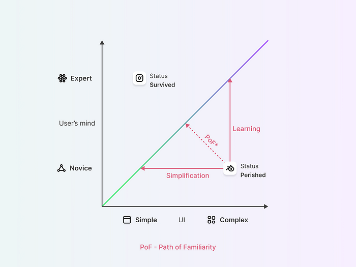
To achieve at least the same level of complexity as the Novice mind, Blender UI must be simplified or Novices must learn how to use Blender and become experts. A combination of both approaches is also possible through Path of Familiarity.
To address the issue shown in the image above, designers must simplify the UI. However, this can be a challenge because as per Tesler’s Law, some complexity is unavoidable. Simplifying Blender’s UI to the level of Instagram’s would render it useless. However, new generative AI technology has emerged on the market, which can shift the weight of complexity from the UI to the system itself. For instance, instead of a bunch of options that Blender provides, there could be just a few input fields where users can tell the system in natural language to create a 3D object.
On the other hand, users can also learn how to use complex UI through training, tutorials, and practice. With time, they will no longer be novices and their cognitive abilities will expand, making them capable of handling more complex tasks. While this may seem daunting for us as designers, as we don’t want to teach users to use our UI (if it’s not obvious, it’s not good UX), we should consider this approach, as learning and training can be necessary. When introducing a new product to the market that no one has used before, users need to learn how to use it, and there is no obvious and intuitive design that will magically help them do so. This is not a cause for concern, because there will always be early adopters on the market who are eager to try new things. These people present an excellent opportunity for product builders to obtain feedback and address the complexity of users’ mental models.
On the other side, to help users learn quickly how to use UI, we should provide clues and directions that match users’ familiar concepts and expectations. In our cognitive system, we store ideas and concepts about things in our environment, and we use these memories to deal with new situations. By building UI that matches the complexity of what users already have in their minds, they can match the new environment with previous experiences because it will feel familiar to them.
Although users don’t have a cognitive system that is equal in complexity to their environment, providing familiarity can help them learn more quickly. For example, a fish that moves from a river to a lake likely has familiarity because it is already lived in a water environment and will adapt more quickly to the new environment. However, if the fish were placed on land, it would have no time to match its physical and mental model to the environment because it is very unfamiliar. The same can be applied to users, familiarity will nudge users through their learning process.
In the image above, we can also see a dotted red arrow that represents the path of familiarity (as I would call it). This line is shorter than both learning and simplification, it combines both of them and it also has a shorter learning curve. The path of familiarity involves creating a UI that matches the user’s existing mental models and expectations, while also providing opportunities for learning, growth and exploration. By following the path of familiarity, designers can create a UI that is both obvious and powerful, providing users with a sense of control and agency over the product, while also encouraging their inner knowledge-seeking, curiosity, and hunger for learning.
Funneling the learning process in a good manner and creating reasonable learnability with a boost from familiarity will give a chance for complex UI to survive.
Conclusion
Ashby’s law can help us understand the interaction between users’ mental models and UIs, focusing only on the complexity of both.
For simpler applications, a lower level of cognitive complexity is needed, allowing users to easily navigate and interact with the UI. However, for more complex tools such as Blender, which require a higher level of cognitive complexity, novice users may find themselves overwhelmed and disengaged.
To address this, designers can either simplify the UI or provide training and resources to help users develop the necessary skills and knowledge to become experts. Finding the right balance between simplicity and learning can be achieved through a path of familiarity, as an overly simplified interface may not provide the necessary tools and options for experts, while an overly complex interface can deter novices from engaging with the tool.
Ultimately, understanding the complexity of users’ mental models and designing UIs that match their cognitive complexity and variety is crucial for creating a positive user experience and achieving high levels of adoption and engagement.
More details from this article and more content similar to this you can read at https://synthesa.net
Source: UX Collective