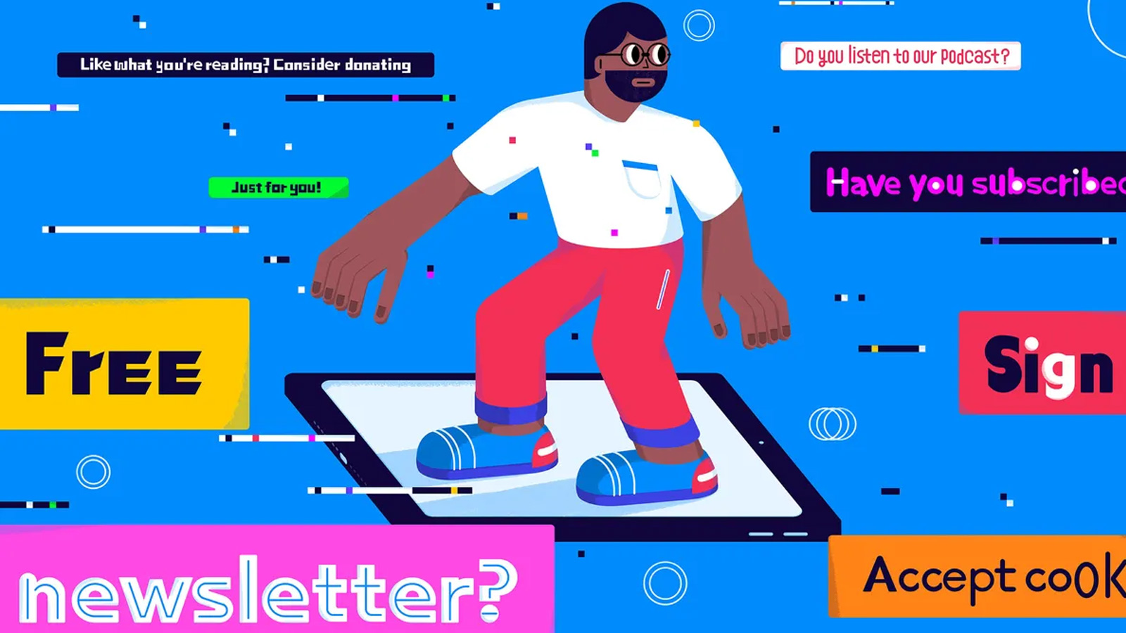
The revenge of the pop-up
Do you like feeling besieged? Enjoy sensory bombardment? Revel in obnoxious interruptions? Have I got the internet for you! No, it’s not the ’90s golden age of pop-ups. It’s today’s hell, with the new proliferation of cookie notices, subscription interstitials, donation modals, and so much more!
Features include: being unable to dismiss pop-ups with keyboard commands, breaking screenreaders, and irritating accidental clicks! The best part? It’s absolutely FREE! All you have to do is log on to literally any website in 2023, in the privacy of your own home, at the office, or on the go! Additional mobile benefits include: being completely unable to access the underlying website you were trying to visit in the first place!
The spammy website marketing industrial complex insists the recent deluge of pop-ups — I counted seven in one browsing session on one website — generate valuable conversions and are totally justified. Their SEO-jacked sites, some of which are, of course, run by companies that sell pop-up products, cite “studies” with very small sample sizes and questionable methods or note that even if users find pop-ups annoying, they keep using the website. When I asked some marketers to explain themselves, I started feeling like I was talking to an AI assigned to the prompt “tell me why pop-ups are good, actually.” Meanwhile, UI / UX experts and nearly everyone who has ever actually used a computer disagree, vehemently. So how did we get here? Why is one of the “most hated” elements of web design, a tactic known to provoke irritation and meaningfully disrupt the use of a website, returning with an aggressive vengeance?
Why is one of the “most hated” elements of web design, a tactic known to provoke irritation and meaningfully disrupt the use of a website, returning with an aggressive vengeance?
It’s not enough to drive users to distraction with pop-up elements in the name of grabbing attention. Some websites also use them in highly manipulative ways. Ever been asked whether you want to “save 15 percent” or “no thanks, I’ll pay full price”? You’ve been targeted by confirmshaming. Under EU and California law, websites have to display information about how data is used and obtain user consent; most websites have decided to handle this by serving a pop-up when visitors land. Those originally well-intentioned cookie notices you hate have also started deploying manipulative tactics, such as a prompt to “accept” without making privacy choices.
I thought it was probably time to talk to an actual expert. Jason Buhle, director of UX Strategy at AnswerLab, says developers may think they’re making tradeoffs by annoying some users but generating conversions at the same time. This decision is based on short-term metrics, though, not long-term results and actual user sentiment analysis. “You really have to do active research, not just look at analytics,” he says, but “analytics is close to free,” and user studies are not. As a result, “what they can’t see is how it makes people feel.”
The fact that pop-ups can spark outbursts of rage highlights the reputational damage they can cause over time. And the more often people see them, the more they start to glaze over them, a phenomenon seen with those now-ubiquitous cookie notices, which most people scroll around, click to dismiss, accept without reading, or simply block. This kinda defeats the point of barging into the browsing experience with information that’s supposed to be critical.
But surely, I thought, there must be a use case for pop-ups, an evidence-based explanation. I spoke with Alex Khmelevsky, head of UX at Clay, a San Francisco-based design and branding firm with clients such as Google, UPS, and Coca-Cola. Of pop-ups, he said they’re “not a good practice overall.” And yet, clients often demand them. Designers may try to suggest small changes to make them “context-based, information-based,” and less intrusive, but the client gets the final say.
I called an old colleague at the Center for American Progress to ask why opening their website doesn’t trigger the usual nonprofit tidal wave of subscribe, donate, and take action pop-ups. As vice president of digital strategy, Jamie Perez was closely involved in every step of the site’s recent redesign and ongoing development. “I trust users are doing what they want to do,” he said, noting friction frustrates people trying to grab data or read an article. He wants those users to return — and tell their friends. He views UX as “growing a relationship,” providing something of value rather than squeezing the most out of a single session.
The people who develop [pop-ups] have no idea about design and user experience.
Still, I’m starting to feel trapped in a web of frustration and unclosable interstitials: knowing that evidence against pop-ups is substantial, why keep using them? “The people who develop [pop-ups] have no idea about design and user experience,” commented Khmelevsky, and Buhle echoed the sentiment. “Oftentimes, decision-makers look at what’s right in front,” he said, turning to what others are using for guidance rather than stopping to reconsider. After talking to over a dozen designers and marketers, the best answer I could get was: pop-ups keep happening because other sites keep using them.
Ethan Zuckerman, inventor of the pop-up, apologized in 2014 for the monster he unleashed on the internet. But it was too late. Pop-ups continue to proliferate in the same way the internet flattens into a sameness: because everyone does what everyone else is doing under the assumption that it must be working. It turns out that in an era of “I do my own research,” no one is, in fact, doing that.
Source: The Verge