
Figma, I love you but you’re bringing me down
When a toy becomes the whole playground
Designers are not the tools they use. But designers are constantly learning, and the things we learn are heavily influenced by the tools we use, the features they offer, and the problems they solve. When Adobe acquired Figma in 2022, I was bombarded with advice and thought leadership telling me that we are not defined by our tools. As much as I’d like to believe that, I can’t ignore that I’m a big Figma nerd, I track Figma’s update releases closely, and I’ve solved many problems at work just by being an early feature adopter and teaching techniques to my team.
In my most recent design career pivot, I’m working more with design systems and component libraries. Design systems are so much more than just component libraries, but my individual focus is on building UI components. I was recently asked to reflect on my design system skills and where I find my flow. Upon reflection, I realized just how much my favorite skill hindered my most recent project. The following is a summary of my epiphany.
Geeking out on layers
One of my best skills — if not my strongest, at least the one I’m most passionate about — is building components. Not the visual style of a component. Not writing the specs or guidelines for a component, but the actual asset creation part. And what I enjoy the most is getting deep into the layer architecture to make components flexible yet systematic.
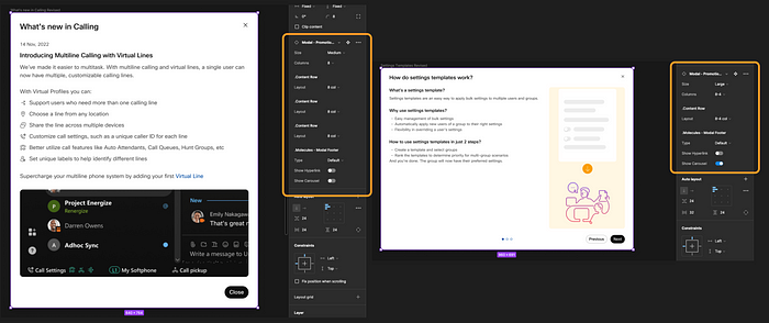
Last month, I needed a way to align the many different modals we use around our product. Defining this is much easier by giving myself atomic building blocks to swap in and out and align to auto-layout rules. And ideally, these building blocks can become elements of the final component in the library or available as templates for other designers to use.
I had a deep-dive building session. Several hours went by effortlessly, and that’s how I knew this was my jam.
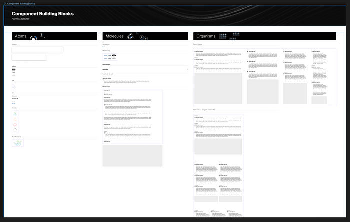
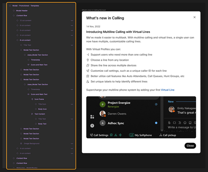
The basic building blocks for the modal component. At the organisms level, each content block is configurable to responsive column sizes.
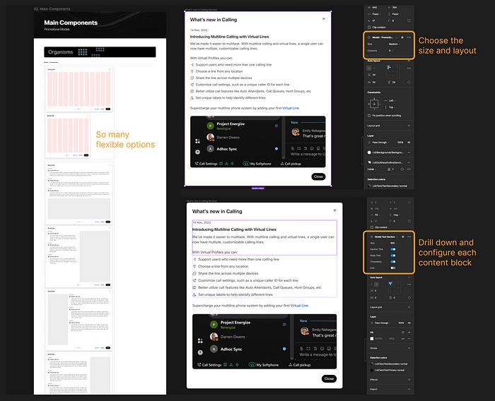
The build session was fruitful. I walked away with a couple of different size options for the main component and used 4, 6, 8, and 12-column size blocks to demonstrate (and also guardrail!) how designers could or should arrange their various content. And it’s really clever too. Using just the single base component below, you can arrive at any of the nine common content patterns we use across modals. So you only need to change one base component, and everything else will update as we tweak the visual details later.
It’s also very detailed. It might look messy here with so much text, but I wanted to make sure all our possible bases are covered. For every bit of main content, you can reconfigure it as any combination of columns.

And that’s great because it only took me a few minutes to churn out all of the final modal components we could ever need. And from there I could quickly adapt all of the placeholder content to match our real examples from the product. Since every layer of the underlying structure uses frames, and every frame uses auto-layout whenever necessary, it doesn’t matter which configuration of content blocks you choose; everything locks in with the correct padding, margins, and spacing between blocks.
Where I went wrong
So far, this all sounds like I’m patting myself on the back. But this is where I started to realize that maybe these Figma manipulation skills aren’t always a good thing. You see, I made this component to be really really flexible. It’s elegant, but it’s complicated. If I were to expose all the nested flexibility here to the end user, it would look pretty messy.
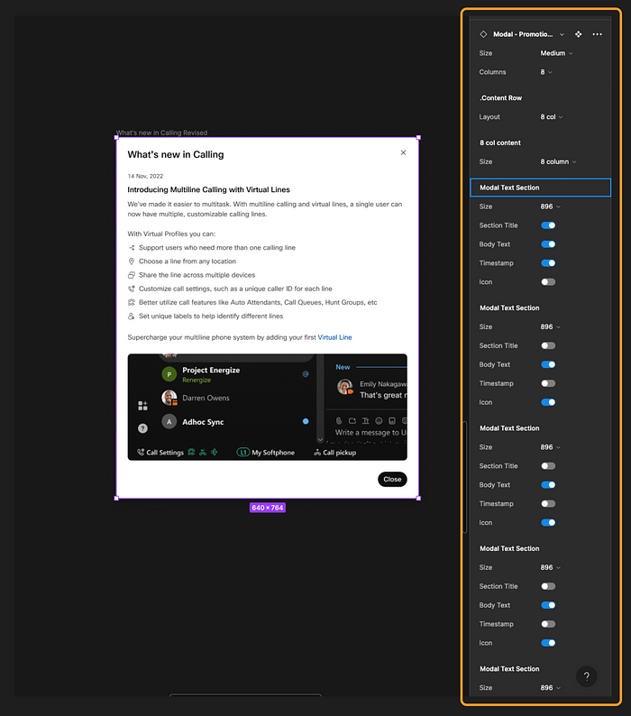
I can dial back how much of this flexibility is exposed to the end user. Figma’s Nested Instances make this pretty easy to control. But it would still be pretty hard to pick up this component from the library and use it to its full potential without understanding all the structure built into it.
The thing is, to make base components work their best, you need to make sure every variant has the same underlying layer structure, showing or hiding the parts you need for each variant. Please don’t look under the hood. You won’t like what you see…
The lesson
Ultimately, my point here is that I over-engineered this component. Figma has the capacity to be much more than a design tool, and sometimes I use it to engineer a UI. Clearly I enjoy doing that, and I even get lost in the weeds to achieve a deeply technical solution.
But design systems and asset libraries are just as much a user-centered design problem as any other publicly facing product. The whole reason we have design libraries is to keep components attached to a source of truth that the design system can govern. Our job is to provide easy-to-use components that don’t need to be detached by feature designers (the end user), and enough documentation to let the feature designer adapt to the pattern as needed. Over-prescribing, over-providing, and over-complicating the component will only increase the odds that the end user won’t be able to reverse-engineer its flexibility, get confused, and ultimately detach from the library anyway.
The simple solution
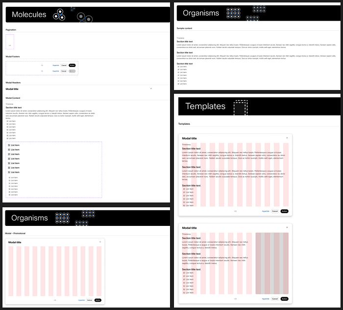
I learned this lesson the hard way here. While I’m proud of what I originally created for this modal guidance, I had to scrap a lot of it from the final deliverable. The modal that ended up in the library is simple — just a single resizable component with a placeholder to fill in with content from the end designer. I also created a couple of molecules and organisms that are available as templates (i.e., not structurally part of the component) which designers can use to guardrail their content.
Rather than rely on a bloated, overloaded component, my deliverable leans much more heavily on the accompanying guidelines. Designers can take the pieces and parts that are useful to them, but I know I can’t predict every future use case; I had to empower them to make some of the decisions themselves.
I don’t think I’ll ever stop exploring the depths of Figma features. I just enjoy testing the constraints of design tools. It’s no different than when I would pull Lego kits apart to see what else I could make with the pieces. But just like the wise designers at Lego know, their job isn’t to experiment with those possibilities themselves; it’s to deliver a kit that anyone can use.
Source: Joe Bernstein via UX Collective