Watch Gang is a popular men’s watch subscription box and direct retailer. WG has a couple of unique features, including their “Watch Wheel” that makes purchasing deeply discounted watches fun and interactive, as well as weekly name-brand watch giveaways just for subscribers.
Brand // eCommerce Website // Collateral
My role Design lead
Skills used
Creative dir.
Brand design
Interaction design
UI / web design
Visual design
Info arch.
Copywriting
Services and deliverables
Brand // identity
Brand strategy
User personas
Color, typography explorations
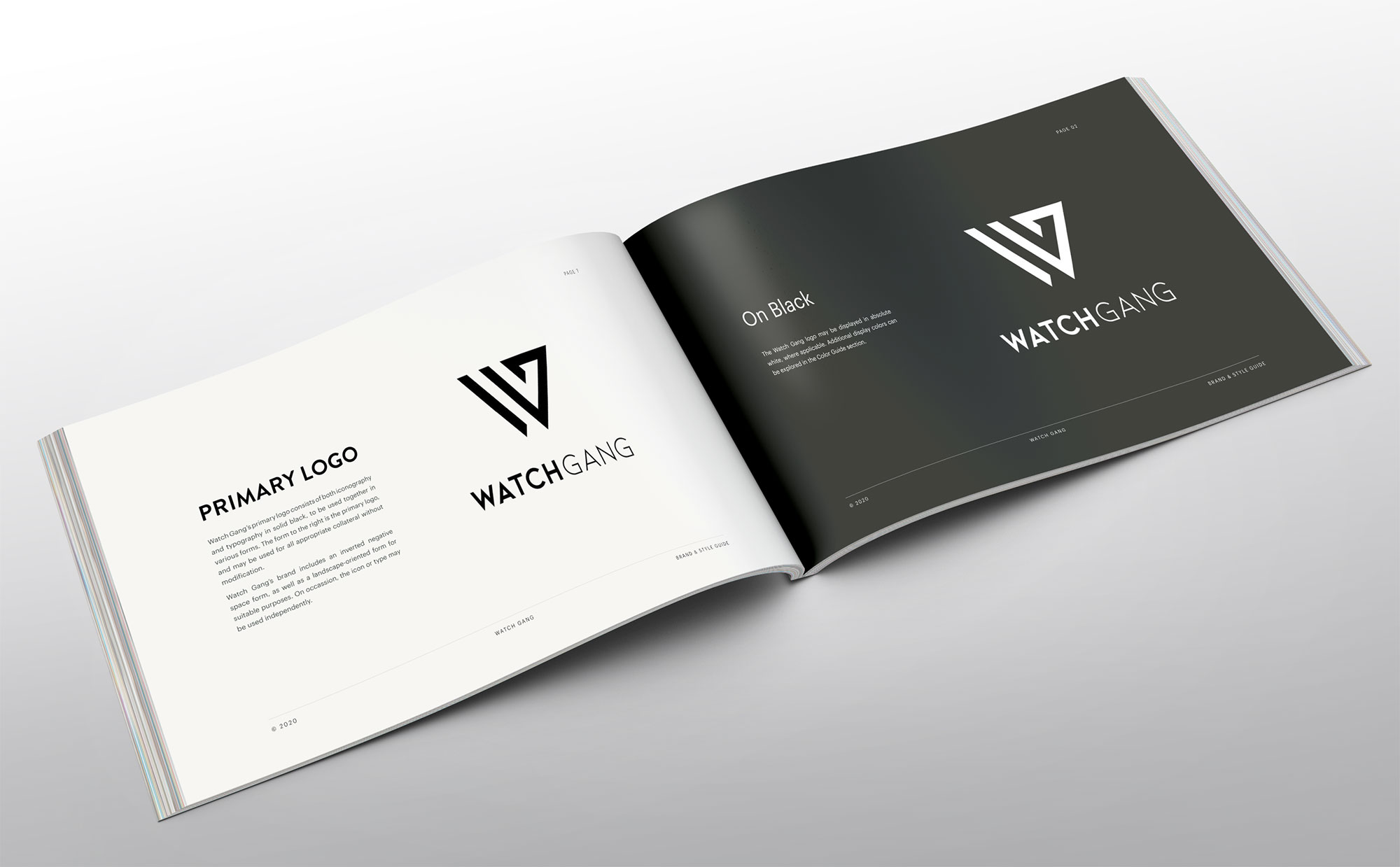
Logo design
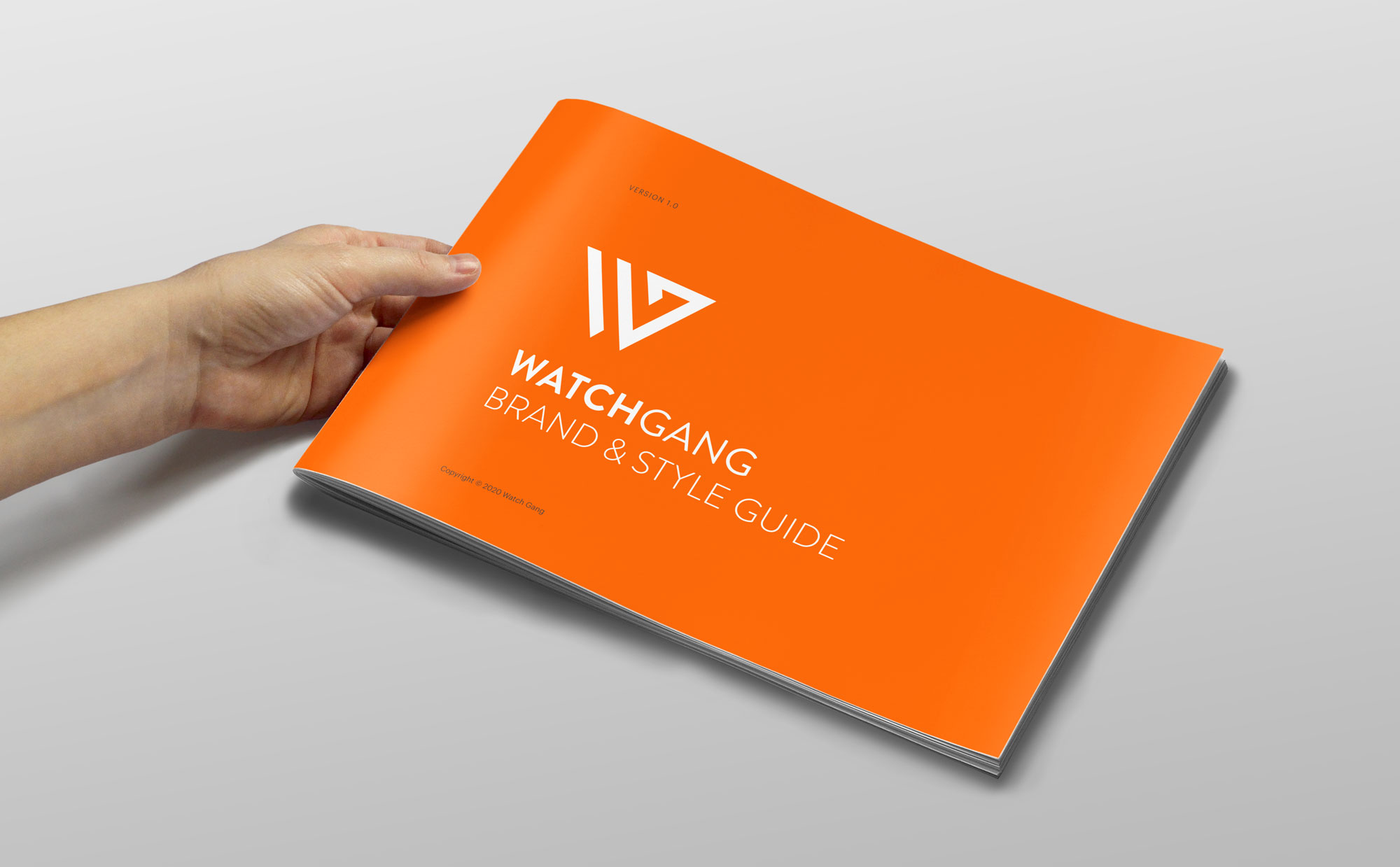
Brand guide + press kit
UI design // website
Discovery
Moodboards
User flows
UI / polished designs
“Wheel” feature redesign
Visual // collateral
Stationery
Product inserts
Packaging designs
Apparel designs
Photography selection
Photo editing and correction
Promo // marketing
Custom email templates (Mailchimp)
Social media banner ads
Promo email designs with motion graphics
SMS motion graphics
Brand design
My first project with WG was to design a “real” brand with the basic elements – logo, color palette, typography, brand guide, and press kit. WG had been operating essentially without a brand since its inception in 2016. A logo existed, but the company was not happy with it and greatly downplayed its existence in marketing collateral. So much so that banner ads didn’t clearly identify the company or the service adequately.
The new brand was designed to appeal to a set of four markedly different user personas, which was sometimes a challenge. Nothing could be too couture or too heartland, but also needed to appeal to military and executive or stock broker types. A balance had to be found, especially with the logo and color palette. And due to the close-knit community focus of WG, the brand had to appeal strongly to the current consumer base, but also to a larger potential consumer pool.
Exploratory brand elements, including user personas, moodboards, and color and typography explorations are included near the bottom of the page.
Visual design // collateral
Stationery
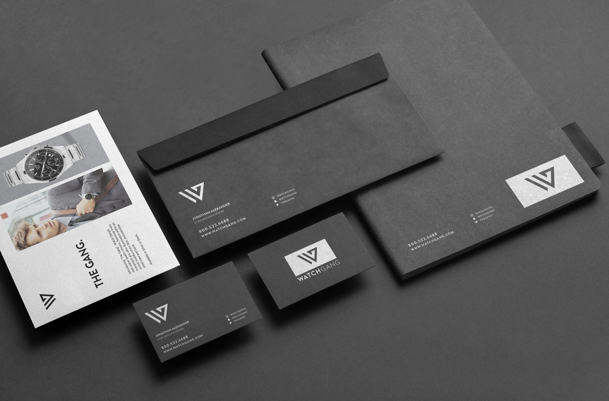
Continuing in the vein of first impressions, black cardstock stationery was designed for investor presentations and correspondences. Stationery elements include letterhead and envelopes, business cards, and a complimentary notebook. The stationery is bit more mature with a silver foil replacing the primary “WG Orange” brand color.
Product inserts
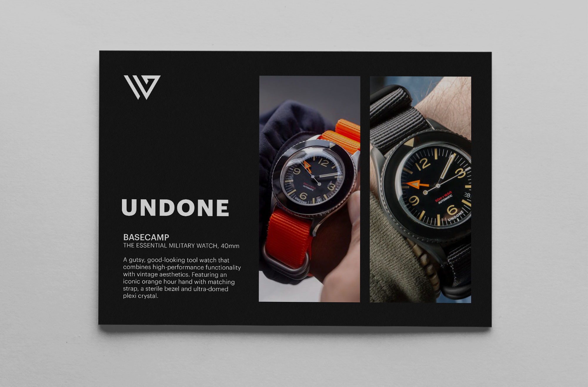
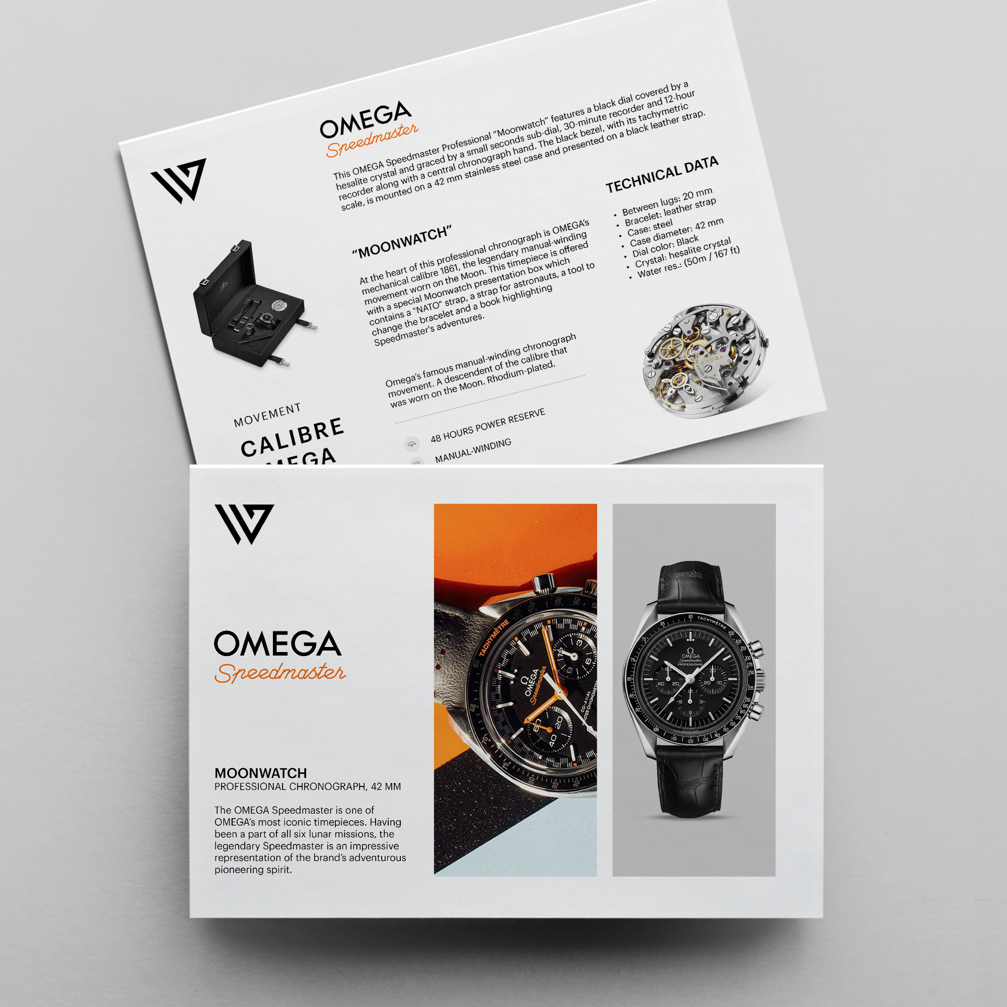
Product inserts were designed for each subscription and retail watch shipment. Each insert includes press kit photos from the watch designer and / or WG-provided photos of the watch, with detailed specs on the backside. Certain watches include a higher end black cardstock insert.
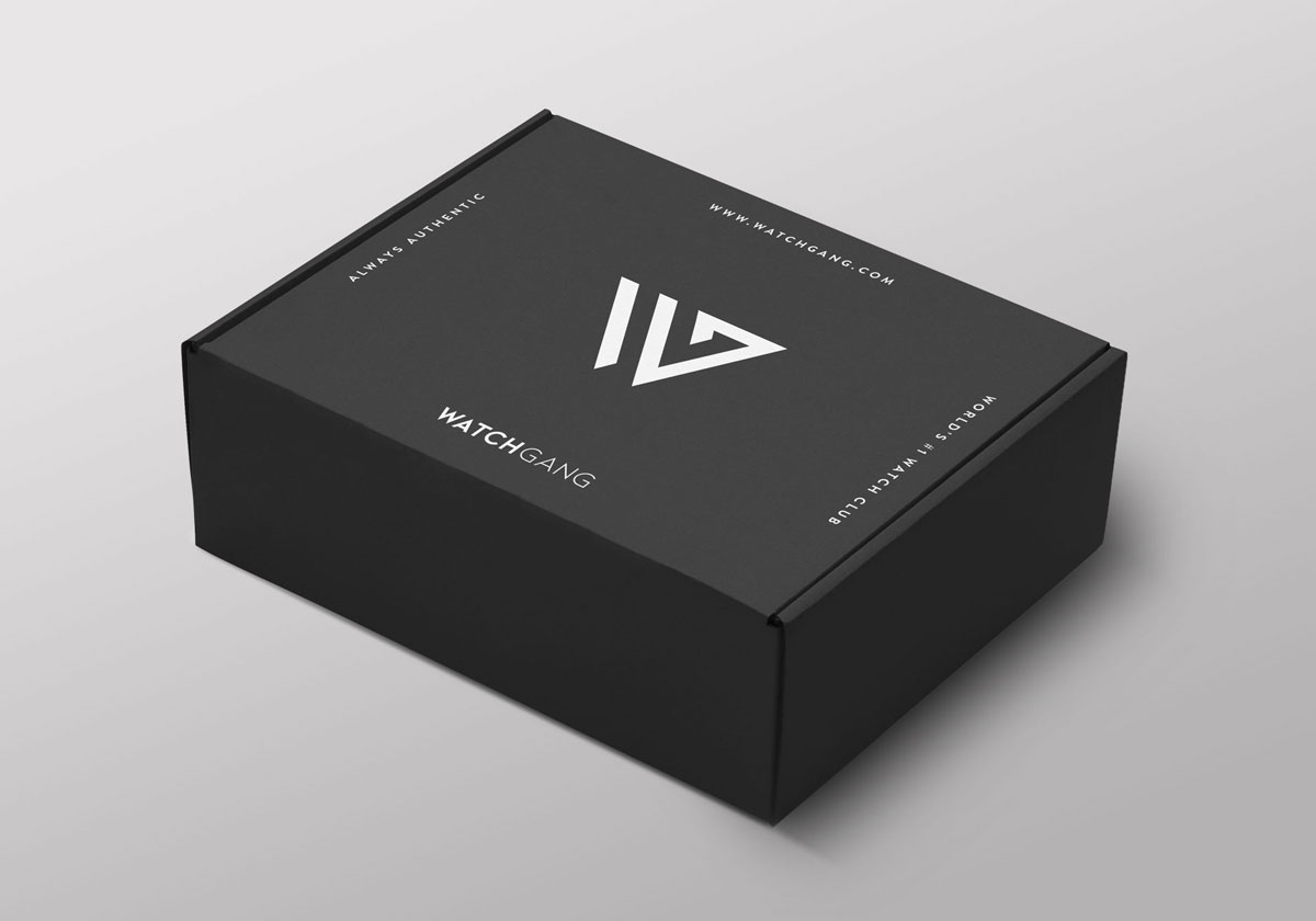
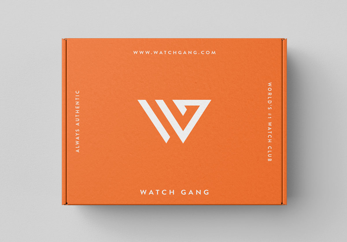
Packaging design
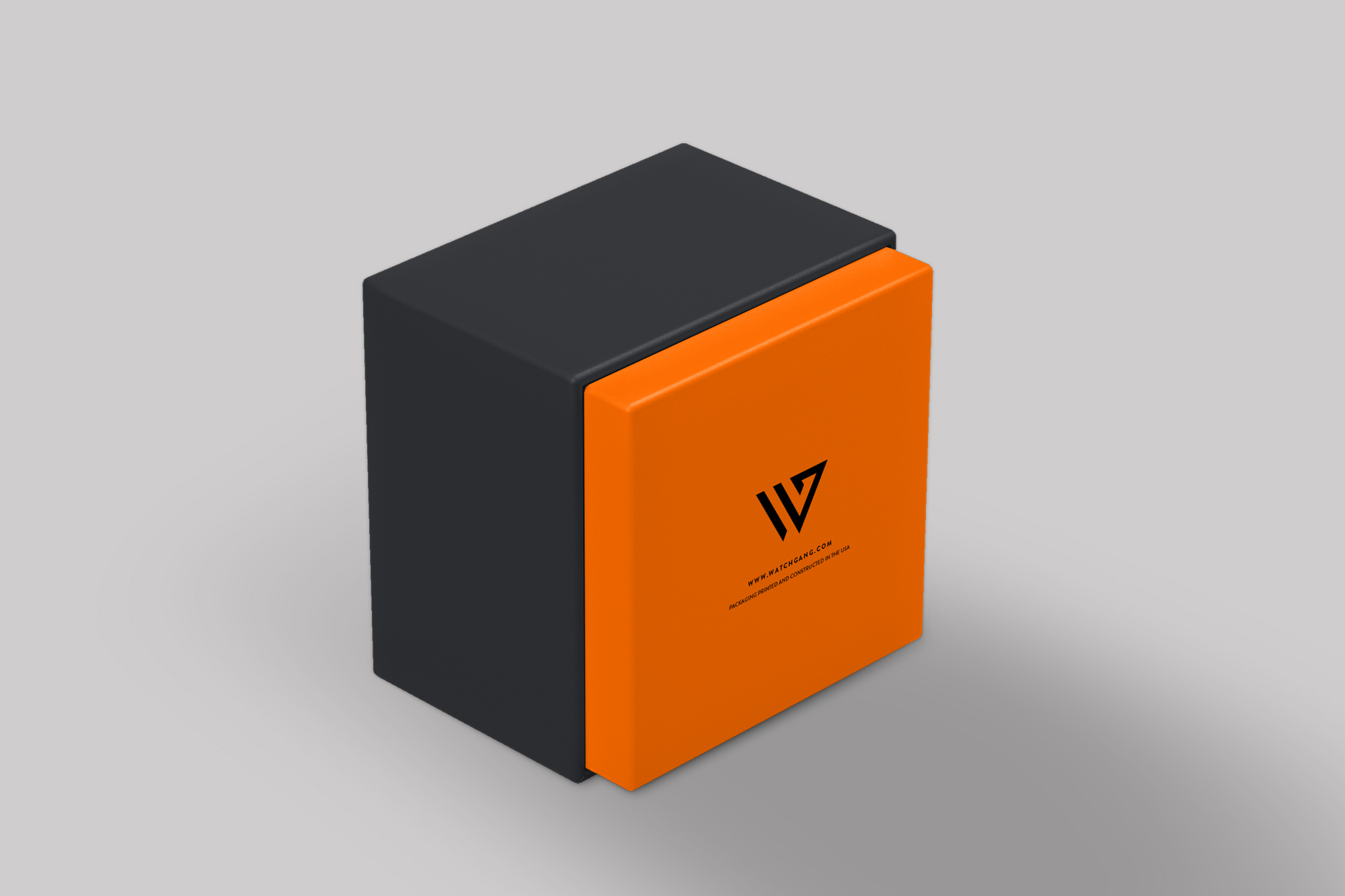
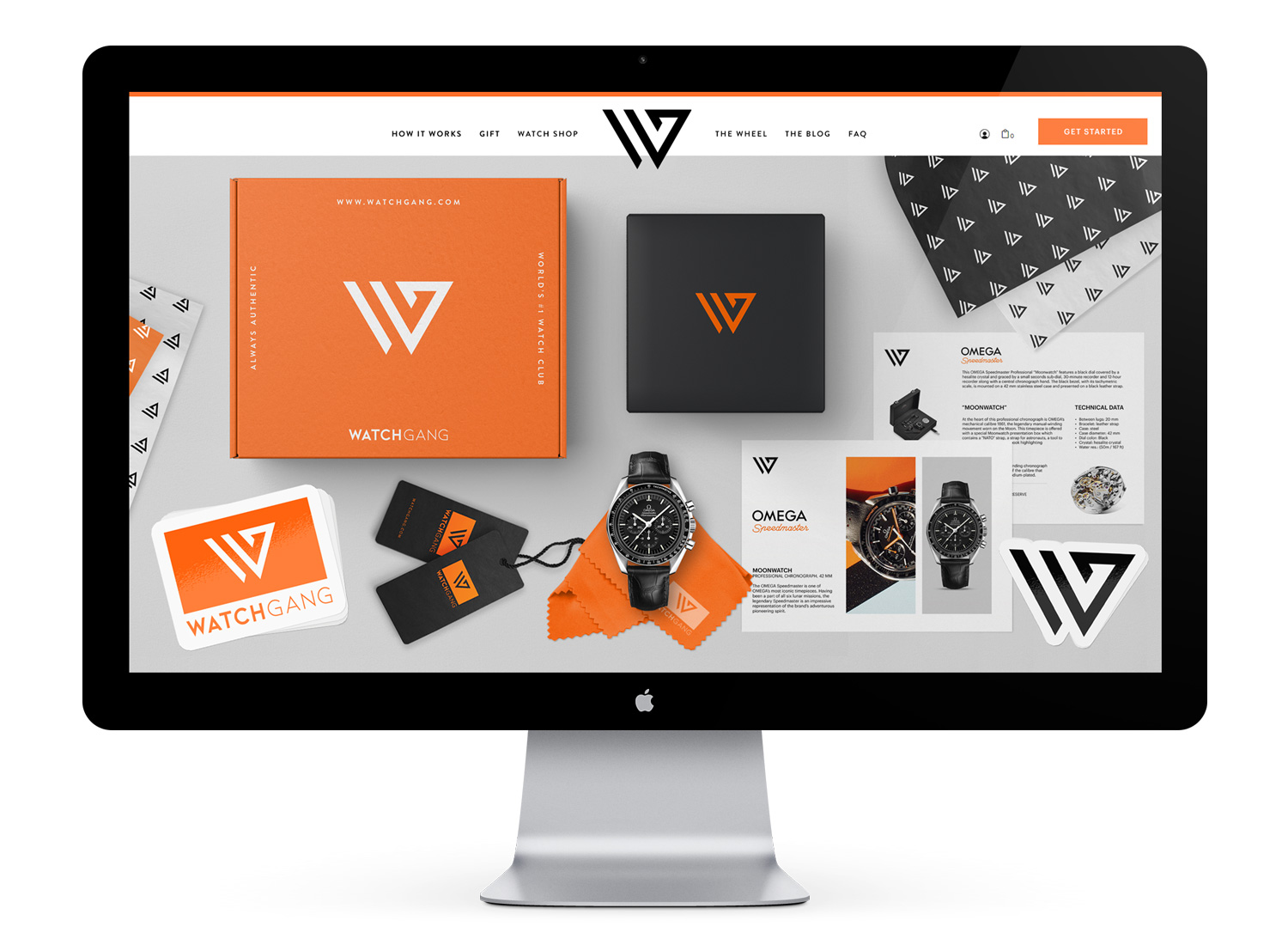
With the packaging design, my goal was to create a collection of strongly branded, visually stunning components with lots of goodies for recipients that would inspire social media sharing. Having worked with a few subscription box providers previously, I learned that these thoughtful and comprehensive experiences generate tons of word-of-mouth and social media marketing. They create a customer satisfaction not attainable with bare bones or drop shipping – the more branded goodies in the box, the happier the customer. And since WG customers frequently do unboxing videos and posts, these components are especially effective in generating positive buzz.
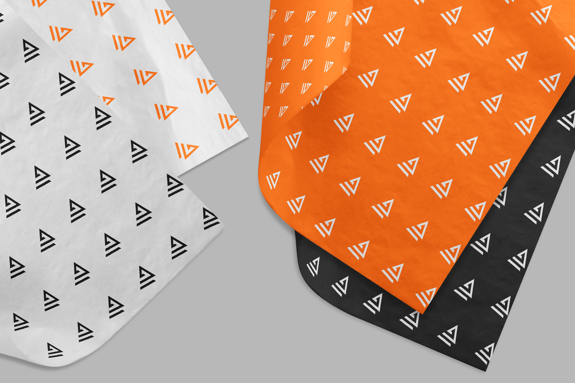
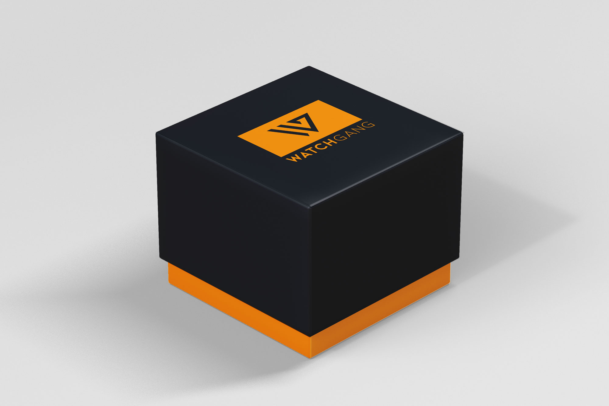
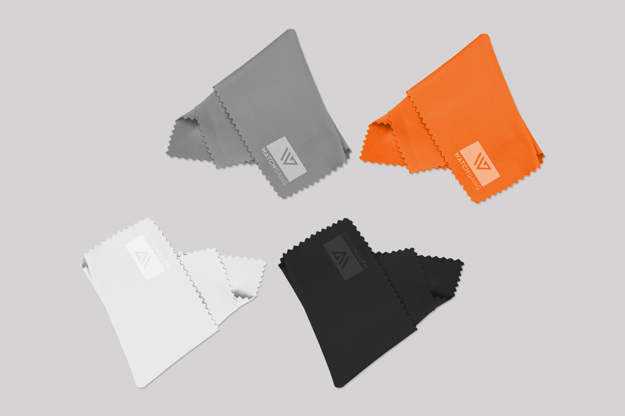
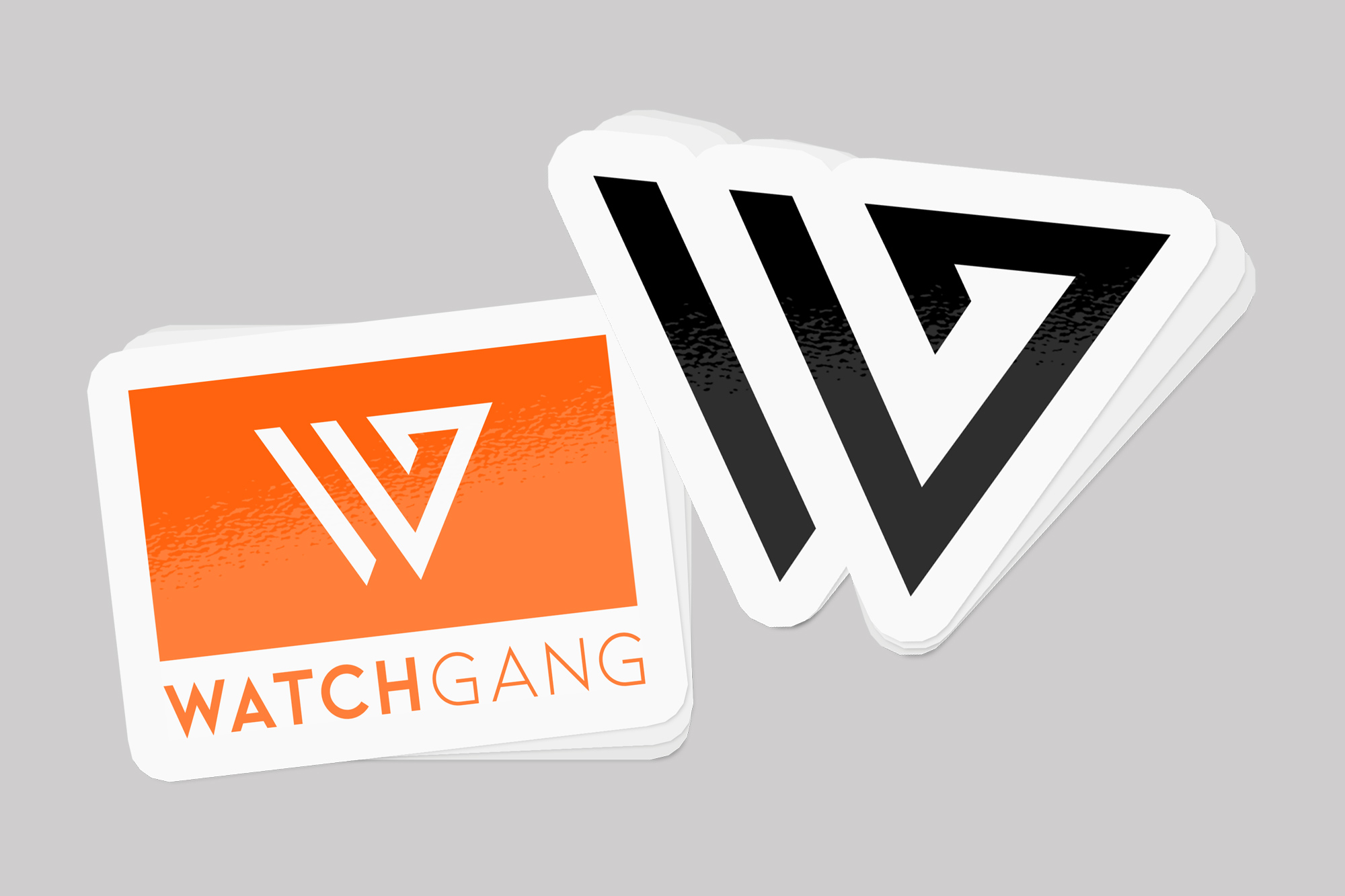
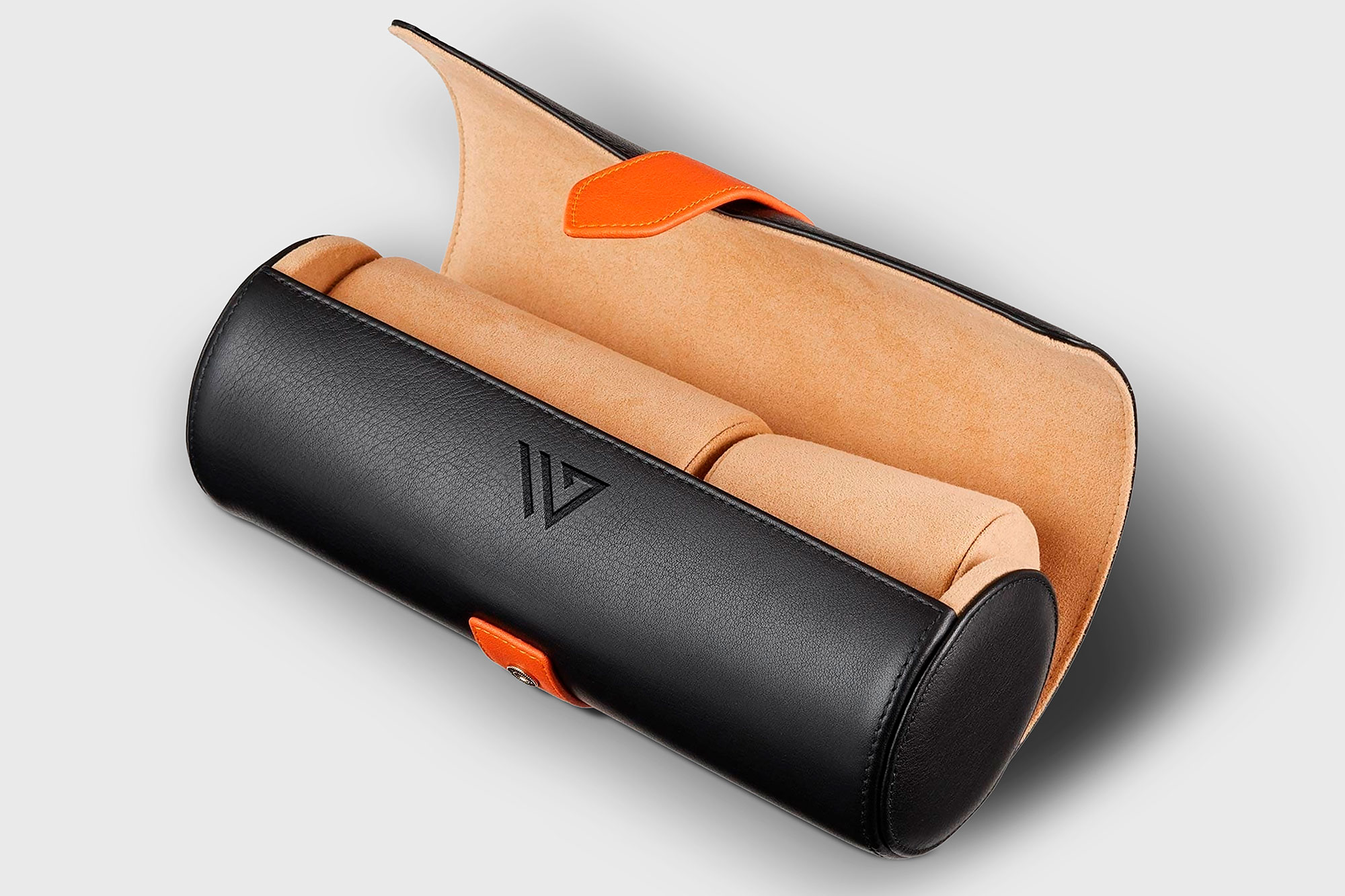
My idea was to provide a distinct shipping box (orange or black for different customer levels) containing a branded keepsake watch box or roll to house the watch, monogrammed tissue paper, product inserts, other printed promo items (varied), vinyl decals, product tags, and a complimentary cleaning cloth. Keepsake boxes, totes, stickers, and other reusable items generate ongoing, effortless marketing for years, which only increases with dispersal.
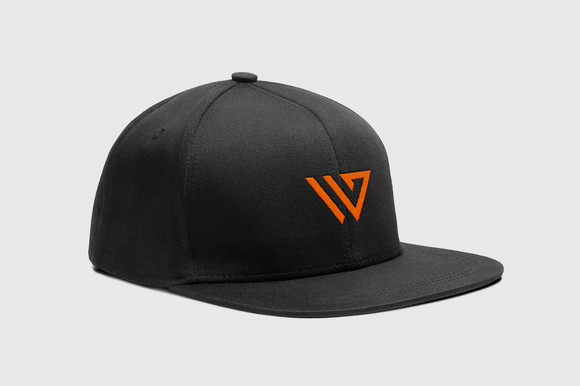
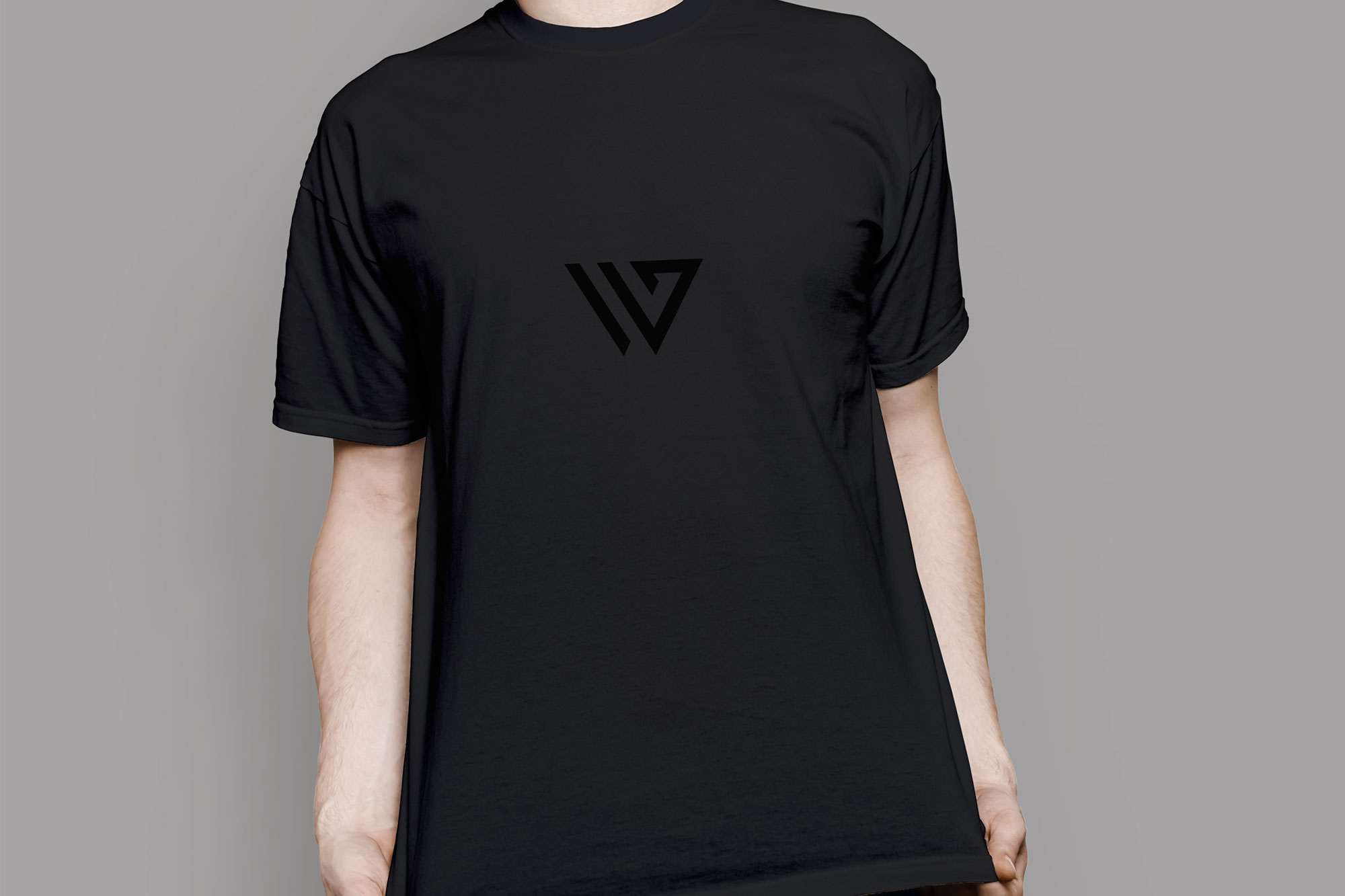
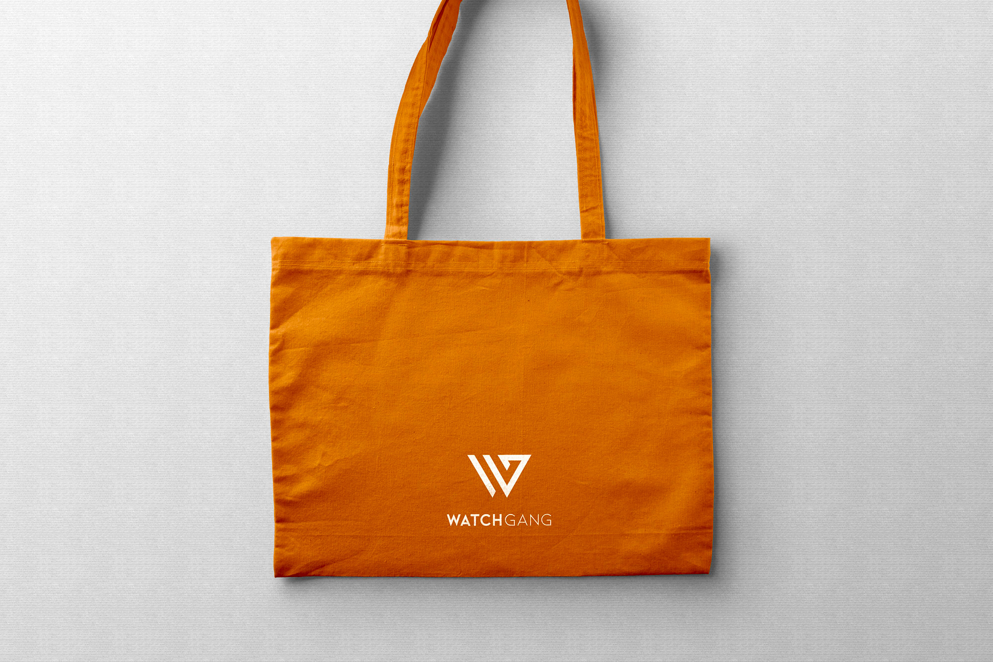
Product concepts
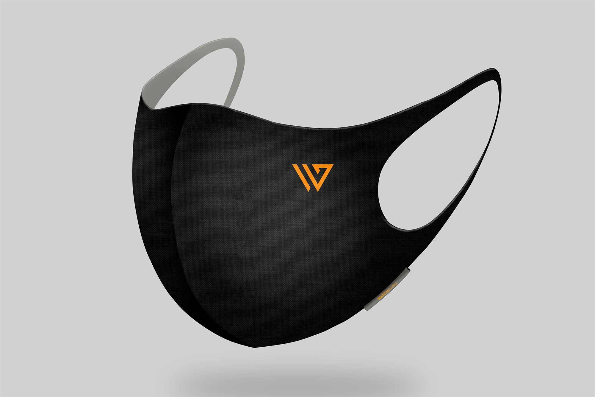
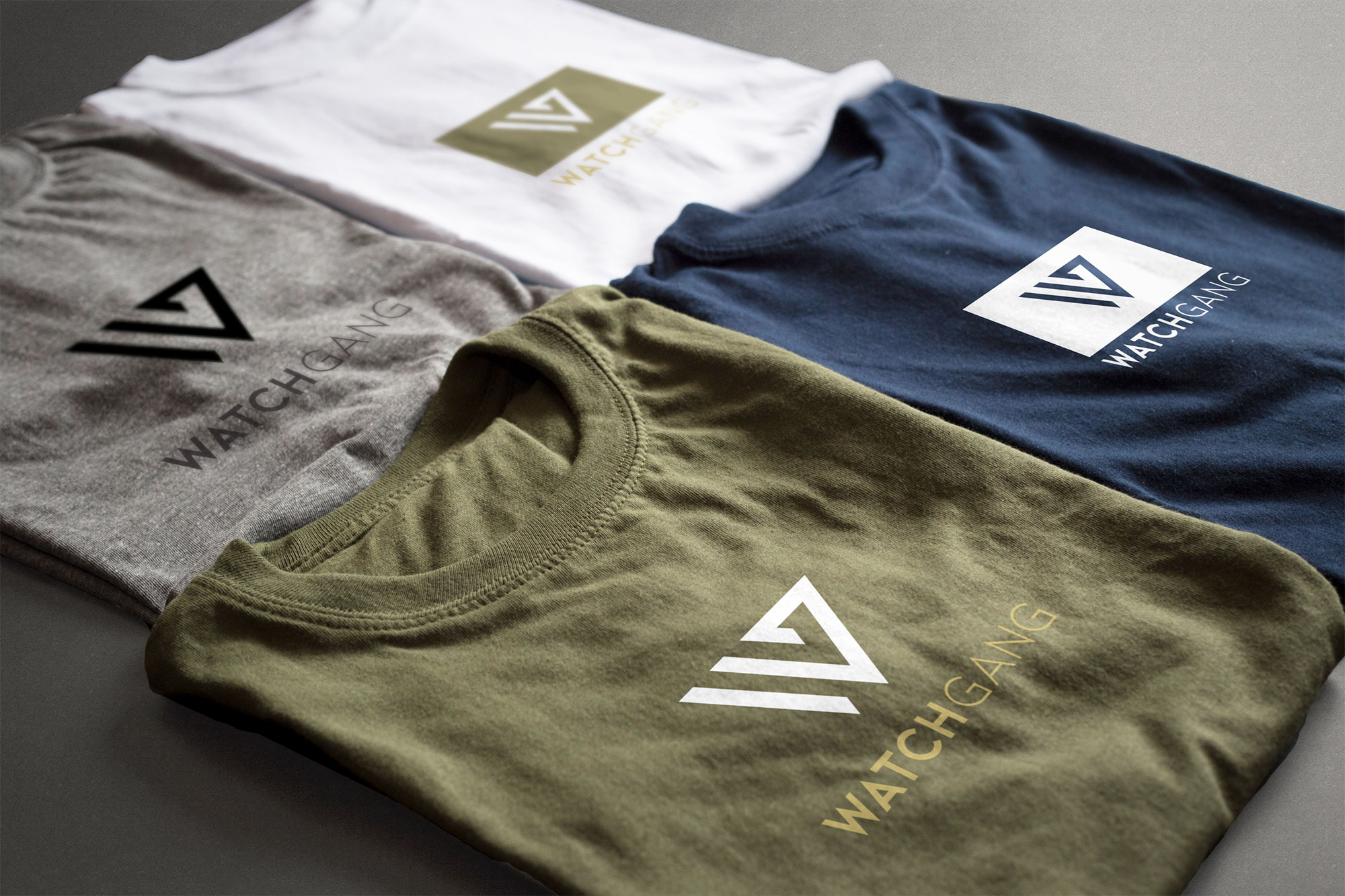
Several branded merchandise items were designed for display at events and for retail sale. Items designed include sweatshirts, hoodies, tee shirts, caps, reusable cloth totes, watch boxes and rolls, and face masks. One of my personal favorite customer gifts are branded cloth bags. People use them for all sorts of things, and it’s just pure exposure for the brand, usually in public spaces. I’ve seen remarkable, tangible ROI on gift totes with my former company (Corvus Design Studio).
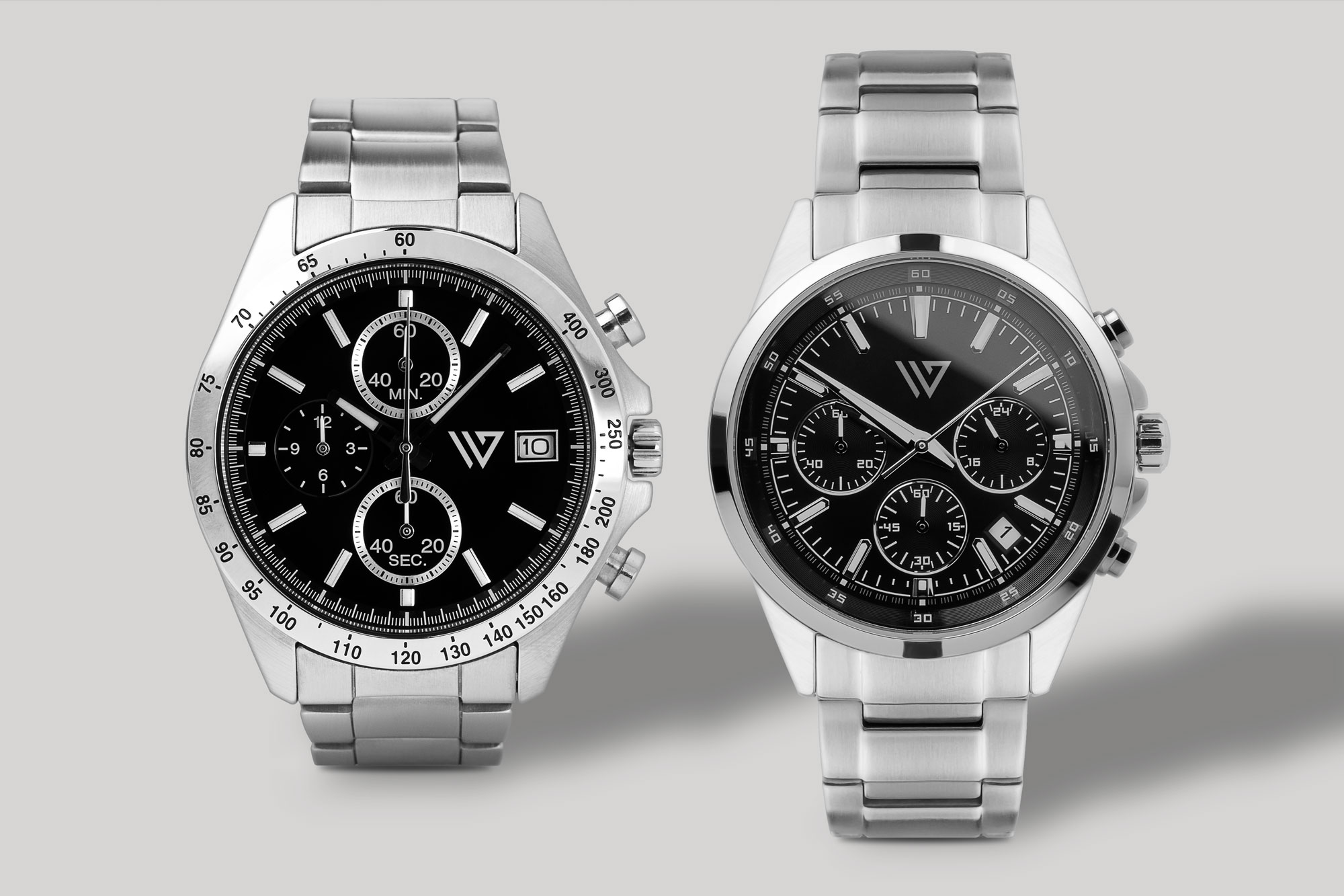
Additionally, WG is conceptualizing their own watch collection. I created mockups for various watch styles, including chronographs and high end “Tudor style” watches, as well as brick and mortar signage for an imagined LA-based watch boutique.
UI // web design
As a fully online company, WG’s ecommerce website is their most important tool. WG’s website needed an overhaul with more thoughtful information architecture, brand integration, consolidation of redundant pages, redirects of obsolete campaign landing pages, and improved mobile usability.
Website redesign + upgrades
The redesign of WG’s homepage focused primarily on content architecture and trust-building. The previous homepage was abbreviated and lacked vital information about what WG does. The overuse of landing and splash pages, tiny text, nearly hidden links, and lack of cohesion in navigation created a strong feeling of skepticism. It felt as though the website was designed to trick or confuse the user.
The truth is that WG is plagued with negative reviews across many online platforms, so this confusing user experience was especially harmful. The theme of these reviews revolves around the fact that WG purchases watches from unknown brands and white label manufacturers across the world, leading some to conclude that they are “cheap” and that the advertised discounts are false. The vague and unintuitive homepage only solidified this idea by creating a popup store feeling. Countering this stigma about WG was a primary focus for me. With every pixel placement, my goal was to maximize user-friendliness, promote product transparency, and ensure that nothing was confusing, vague, or gimmicky.
The previous tactic at WG was to ignore the negative reviews so as not to “give them a voice”; however, it’s impossible to ignore them when they’re so numerous they compete for ranking on the first page of Google. Instead, my intent was to directly counter them with a user experience that was undeniably authentic. My opinion was that the new comprehensive packaging combined with an improved online user experience would create an immediate sense of credibility and trust.
One good thing about the deep skepticism online is that it also extends to reviews themselves. As more consumers are realizing both positive and negative reviews are frequently manipulated, and on large scales, overall reliance on reviews is decreasing. In fact, there are even websites that analyze online reviews of products and companies, by comparing the review language and patterns, to determine the probability and percentage of fake entries. But, despite this waning trust, we’re not yet to the point where online reviews can be ignored by businesses. And although the negative reviews of WG are legitimate, from actual customers, they needed to be offset, if not completely negated, by addressing the user experience across all collateral materials and promoting those experiences via social media. My aim was to create collateral items, both intellectual and tangible, that catalyze this process, and craft a user experience that would wholly overshadow the negative comments made online.
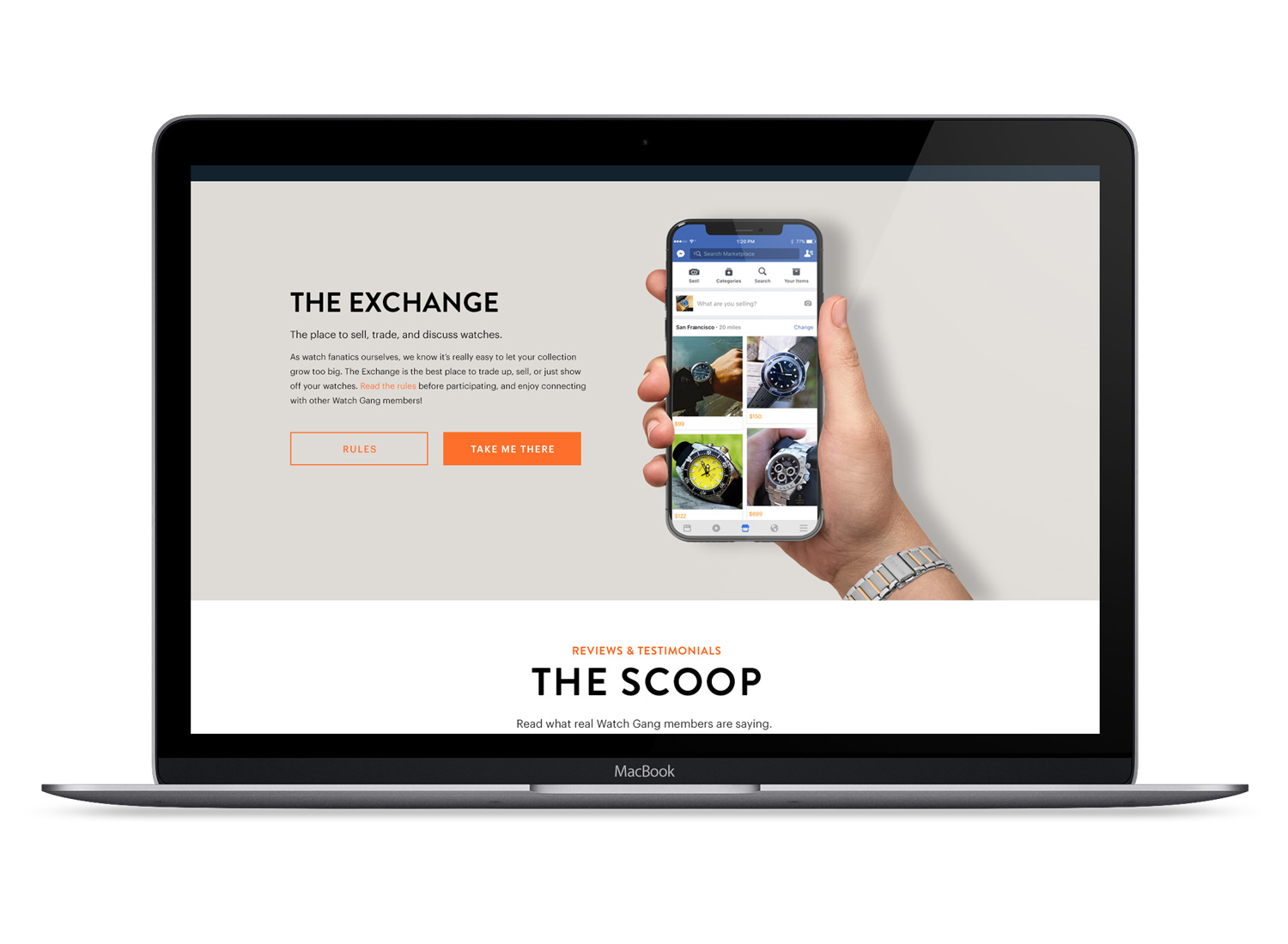
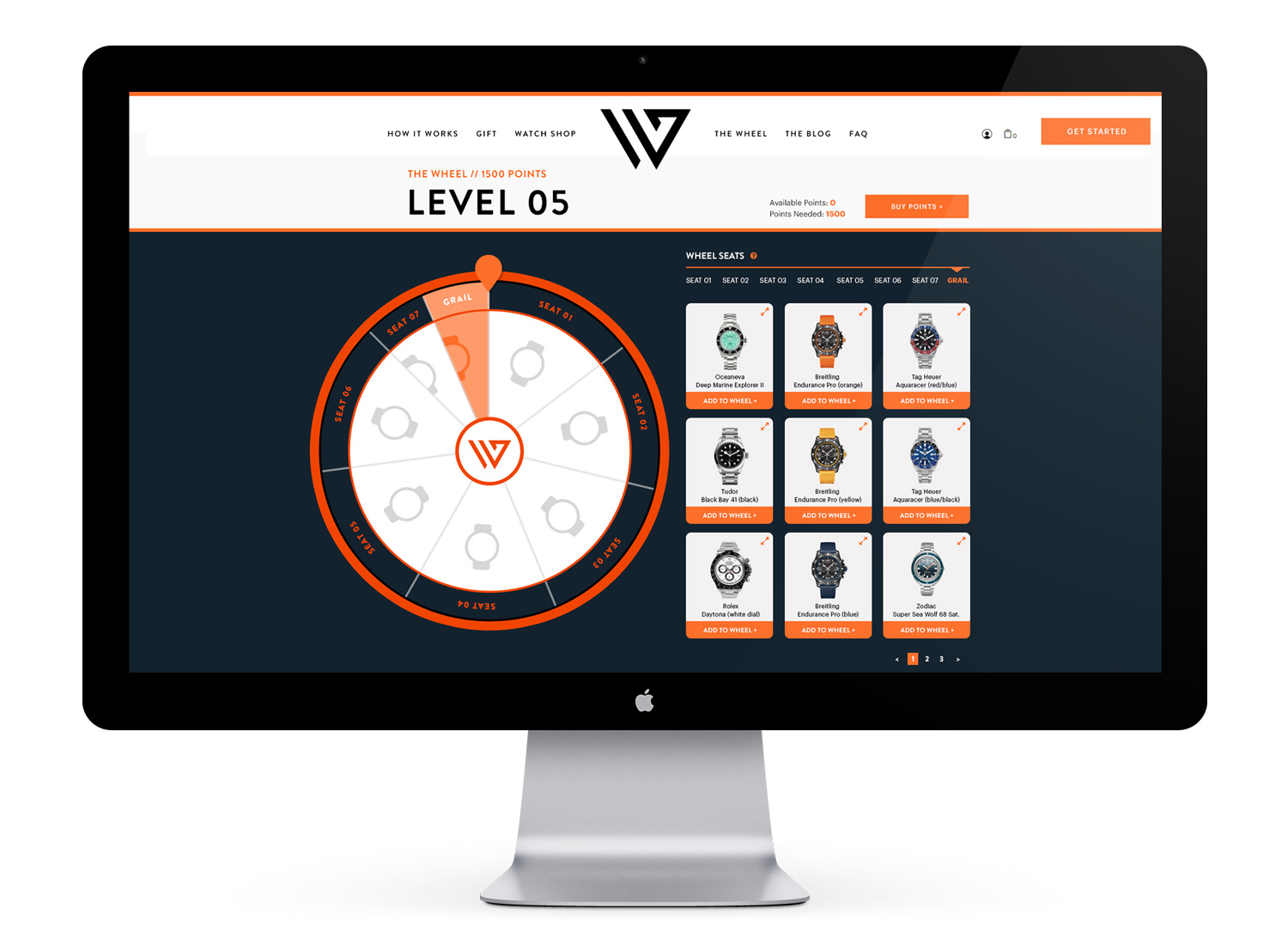
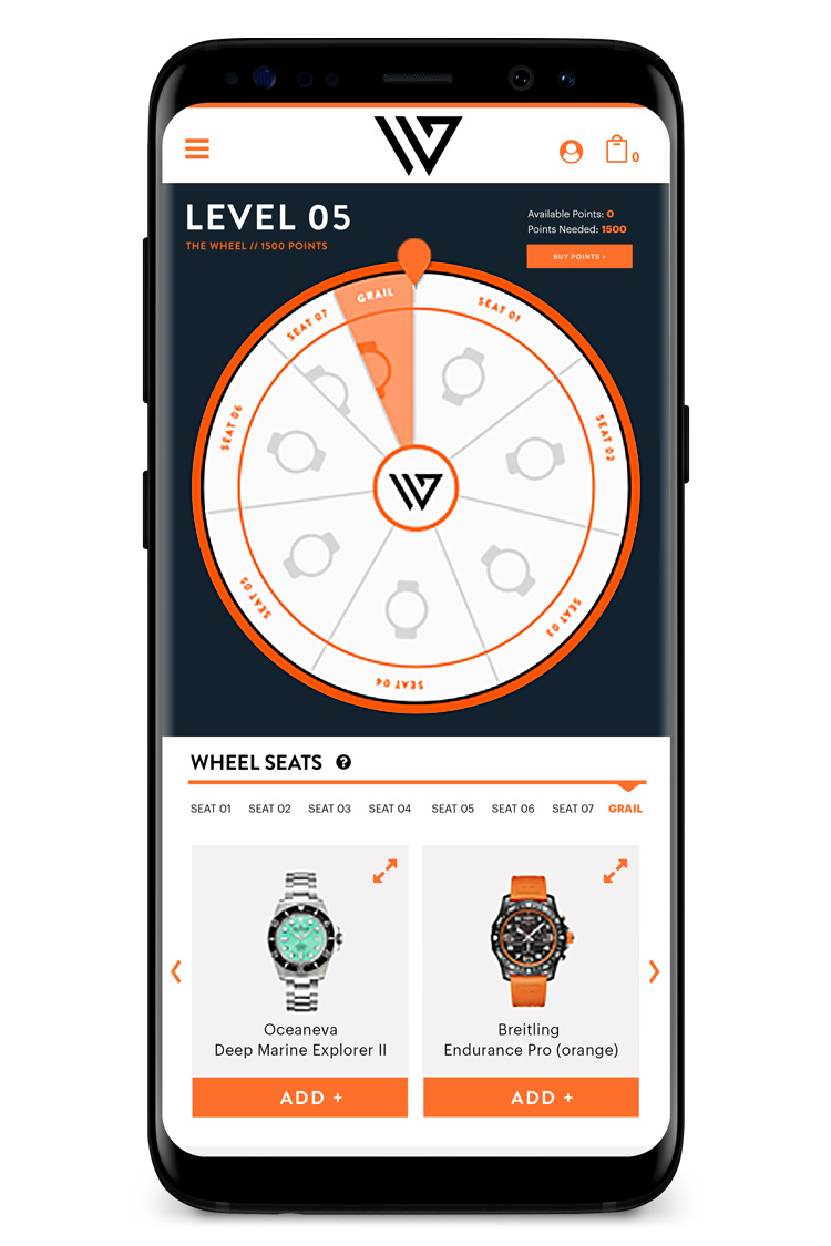
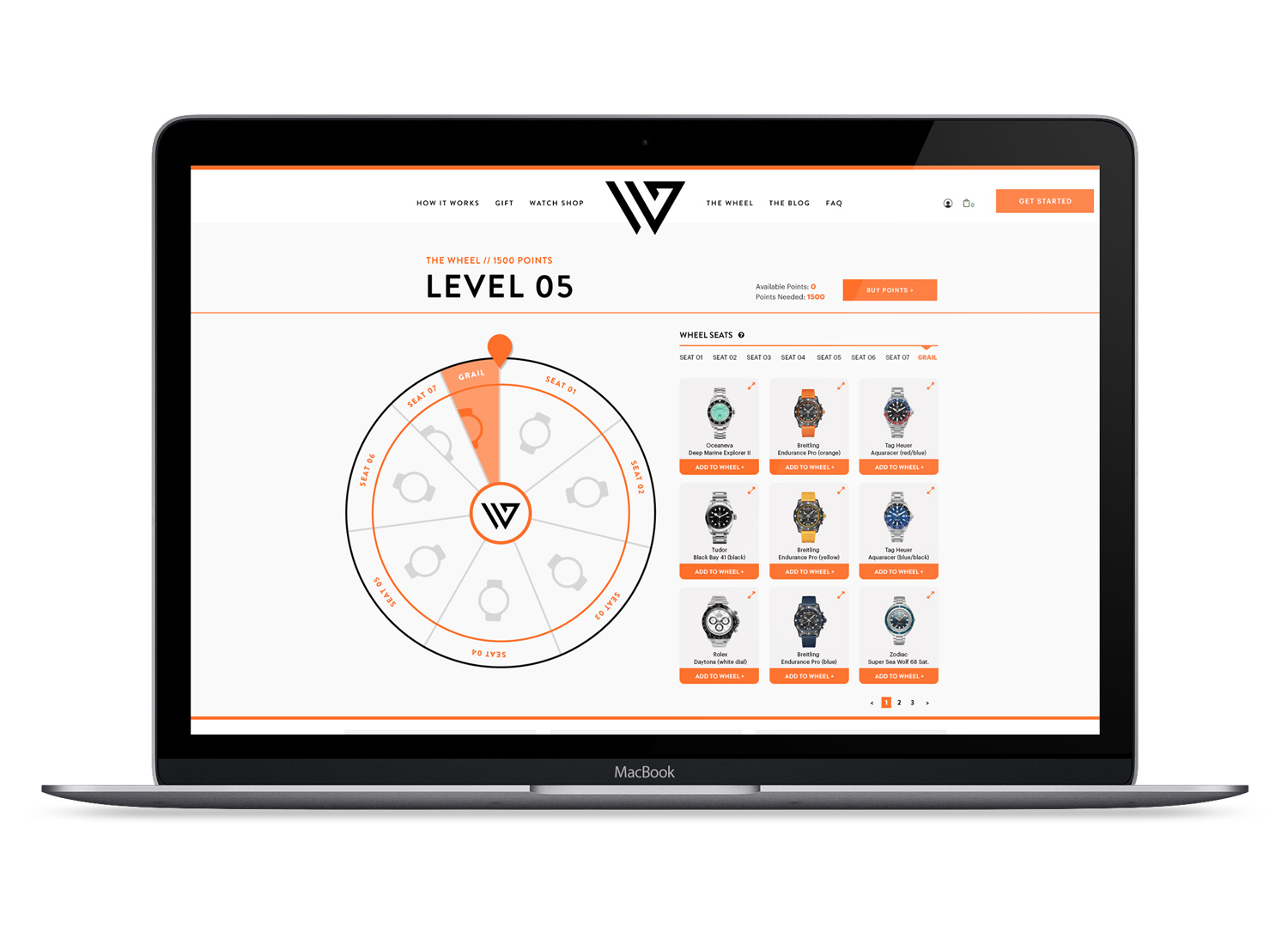
The “Wheel”
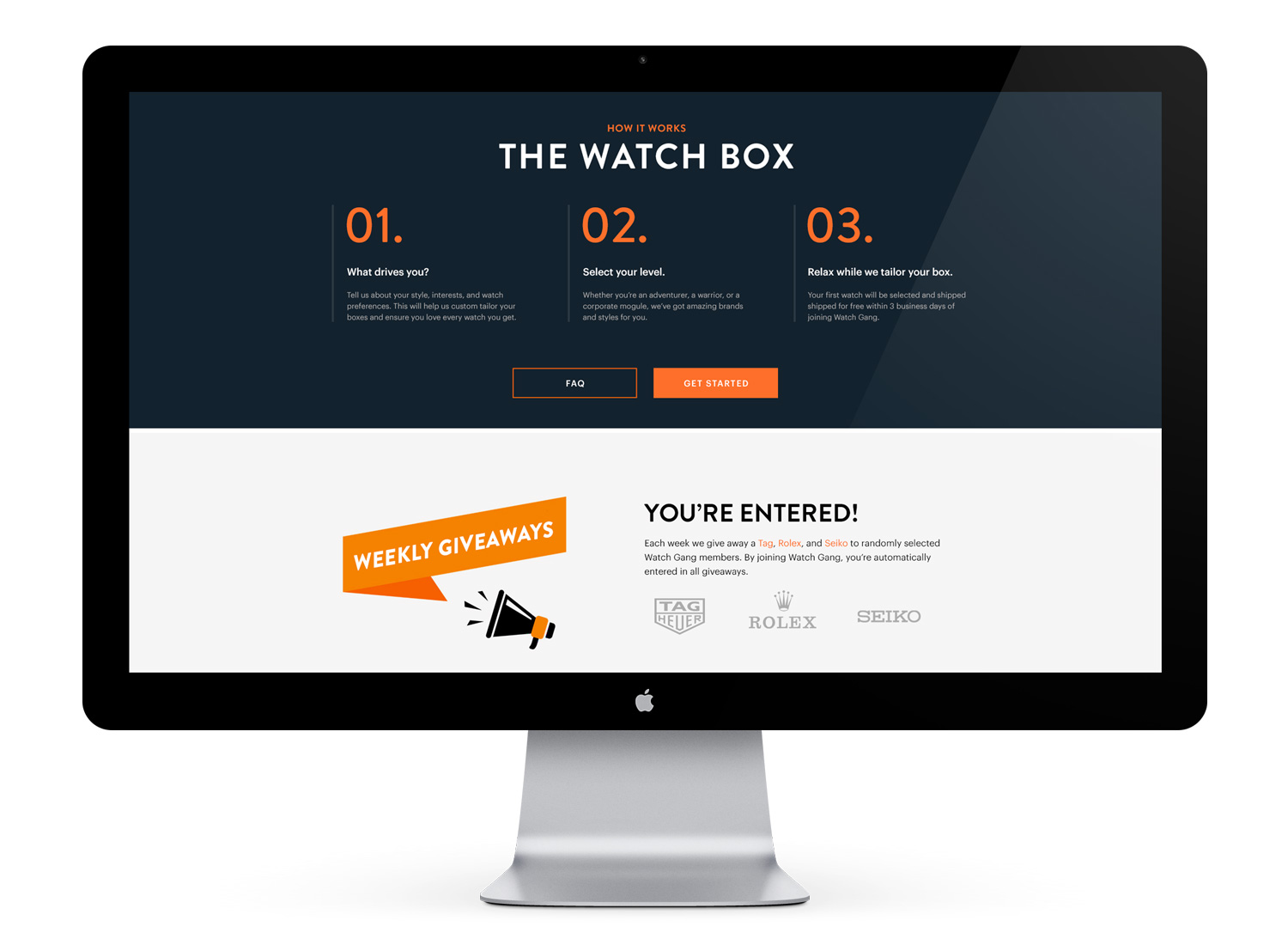
“The Wheel” is a feature unique to WG, where users purchase watches through an interactive “wheel”. It’s like a game show, and users have the chance to win a high end watch (aka “grail”) of their choice at a great discount. Users populate the wheel “seats” with their chosen watches from 8 price point-separated groups, with the chances of landing on each successive seat becoming progressively smaller – as the price increases, the chance of landing that watch decreases. It really plays into the risk-taking, gambling-loving side of a lot of people. It’s Vegas, but you win a discounted watch instead of money.
The previous wheel design was cumbersome and outdated. The user had to scroll the entire page to view and select watches, then back up to the top to add it to the wheel. I redesigned the UI so that the wheel and watches were above the fold to eliminate constant scrolling, and to create a more intuitive experience. I changed the vernacular of the wheel in several instances for the sake of intuitiveness, and streamlined the processes for adding, deleting, and changing watches on the wheel. Next, I updated the graphics with the new brand and colors to create a bolder, more modern look, and introduced the option to toggle the interface colors between light and dark themes. Another important addition is a toggle-able “tooltip” option that displays helpful tips at key UI spots throughout the wheel as a way to help new users quickly learn the wheel terms and functions.
Ad campaigns
WG’s banner ad campaigns are intensive and aggressive. Do a search for WG, and you’ll get tons of adverts going forward. It’s effective, but the ads become stale quickly. Banner ads of all sizes were created frequently and treated as experimental in their diverse styles and targets. It was a case of quantity over quality; basically throw everything at the wall and see what sticks. Banner ads were created and used rapidly, and the following is a sampling of what were referred to as “WG generic ads” that advertise the service as a whole, not a specific product or event.
Brand elements
The following is a summary of the brand design process that shows some of the elements produced in discovery and exploration. The brand design process included the creation of detailed user personas of WG’s primary consumers, color palettes, typography samples, and finally a logo and brand guide. These elements are a little more elaborate than usual because they were designed for inclusion in a printed brand guide and investor proposal.
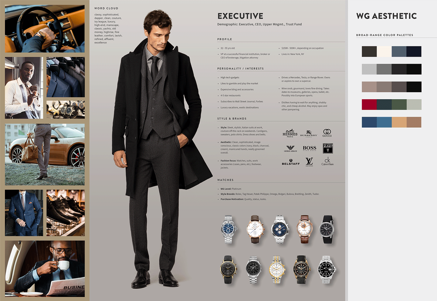
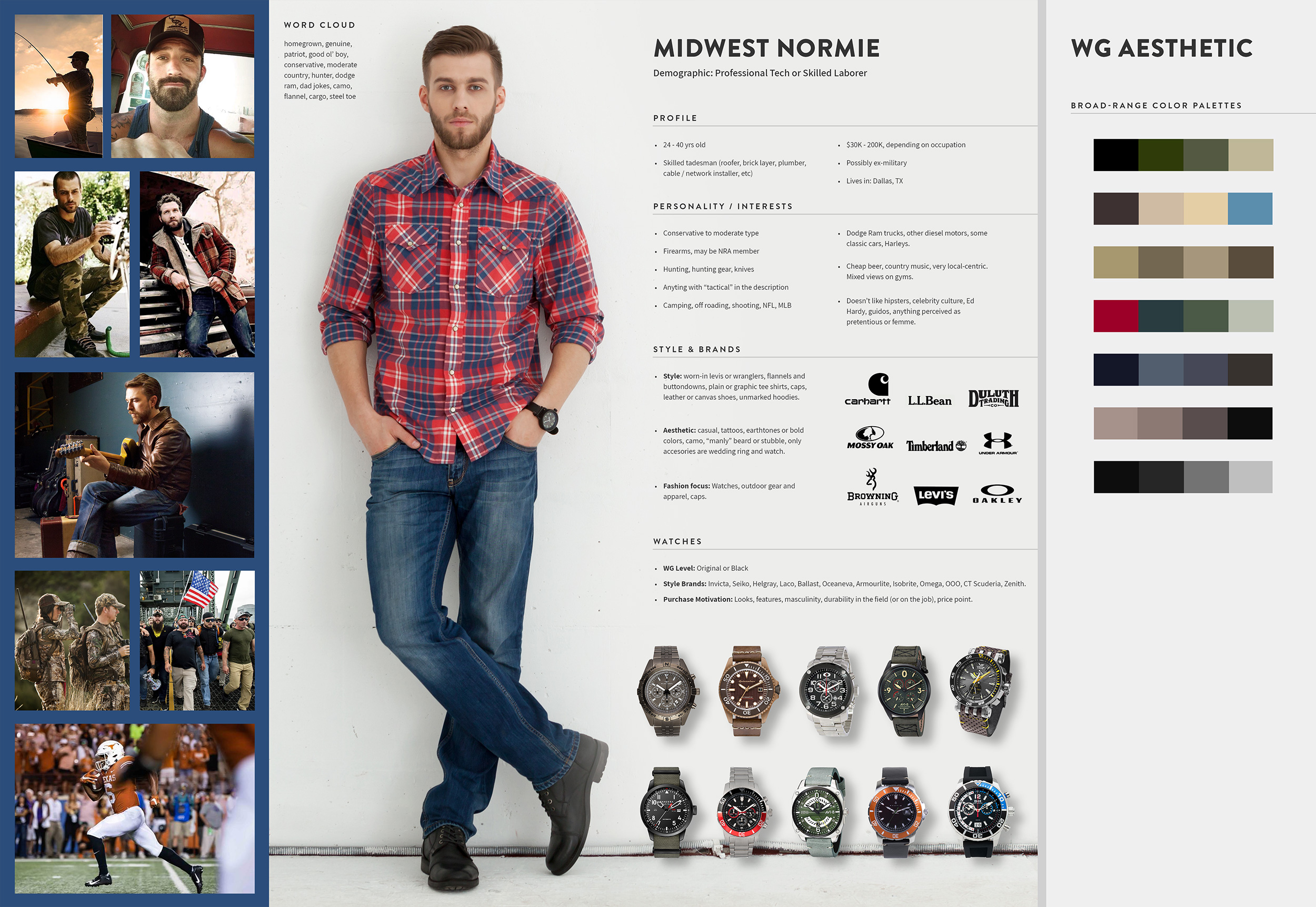
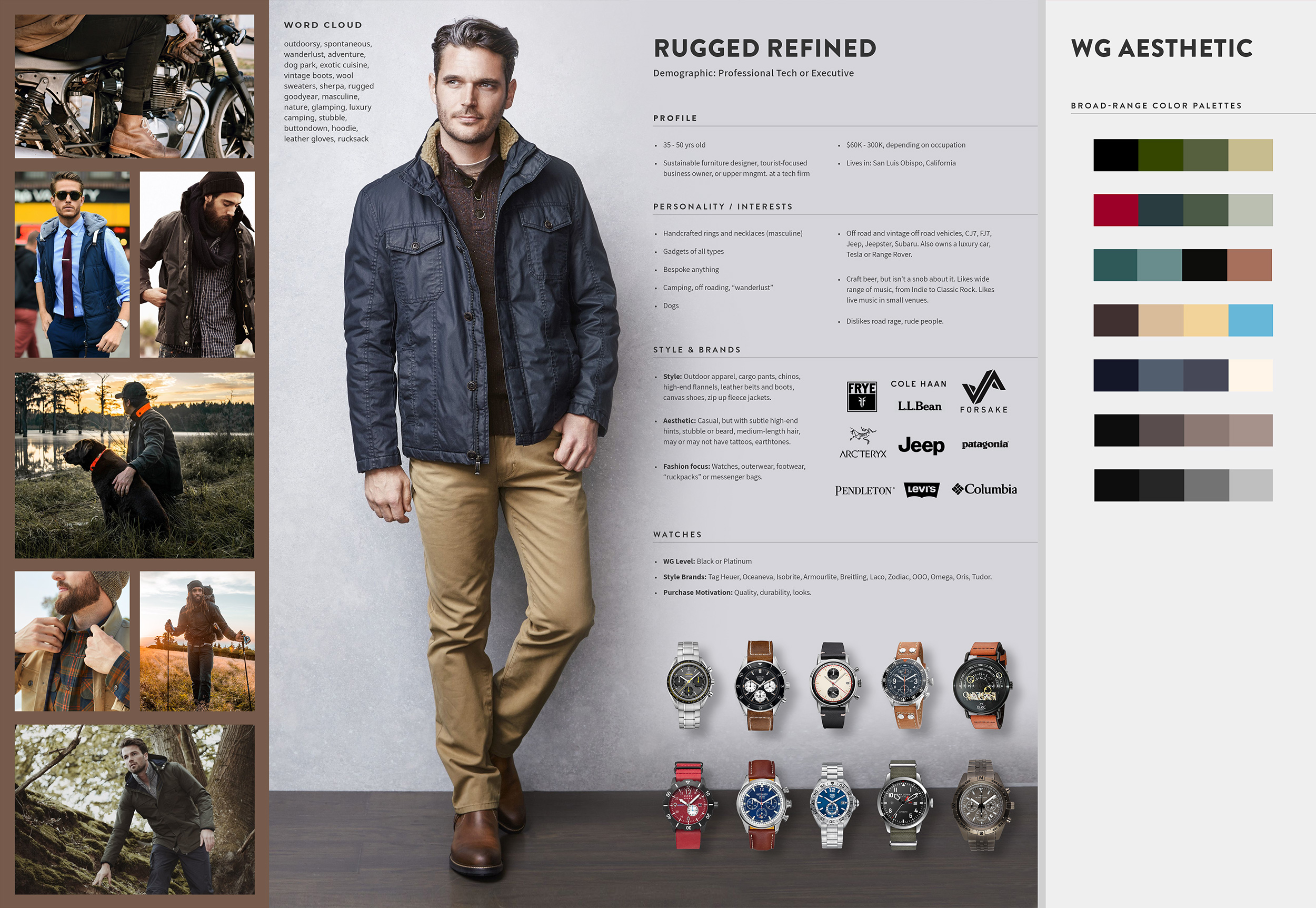
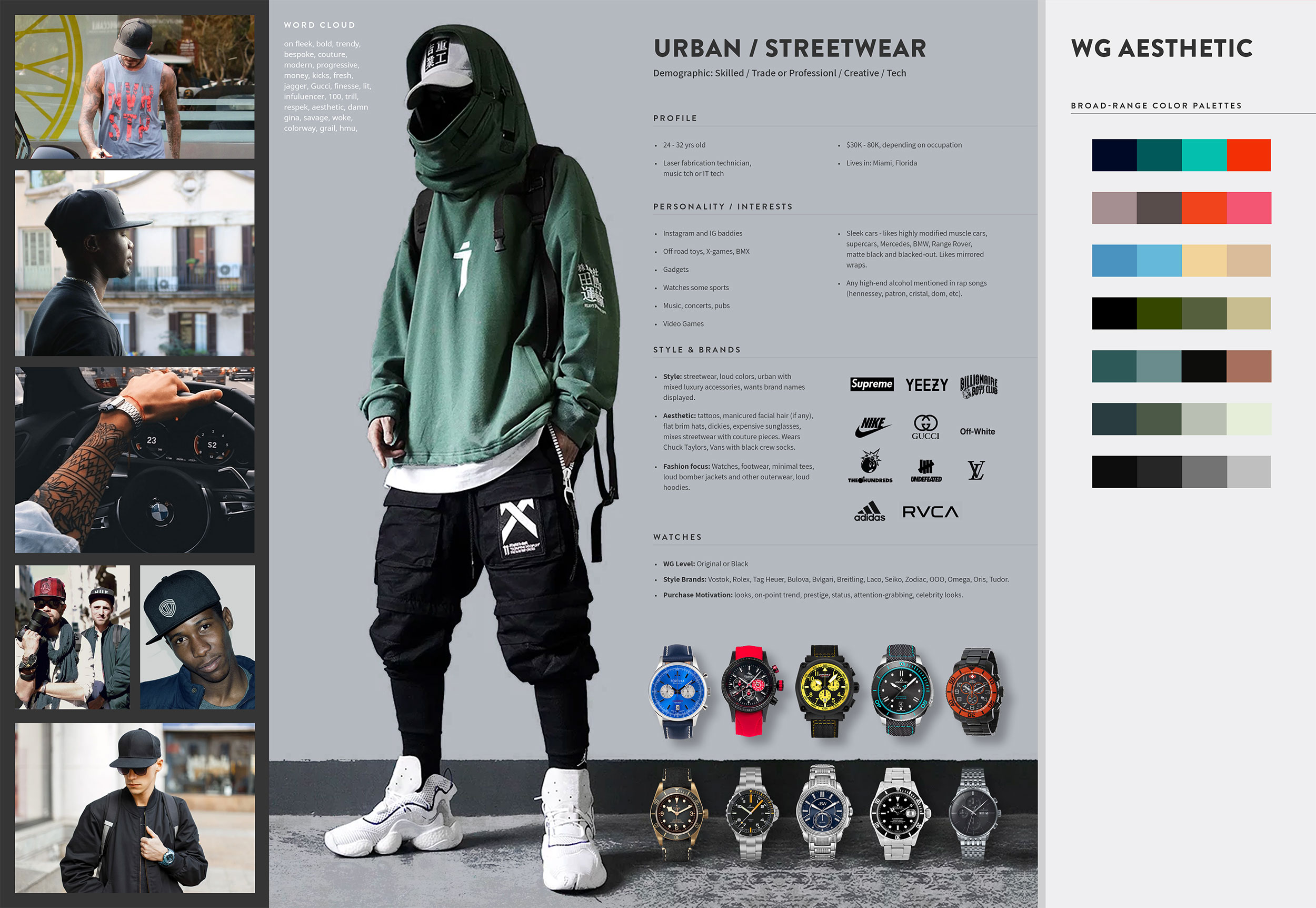
User Personas
WG’s user personas were created based on active consumer demographic analysis combined with data collected via Trust Pilot and Crazy Egg. WG’s facebook community was also helpful in understanding the most prominent consumer genres.
Analysis determined that WG’s primary consumer base included four distinct personas, with the highest consumer concentrations in California, Texas, New York, and Florida. Each persona is markedly different in age, lifestyle, and consumer motives, but clear overlaps were easily identified. The most obvious overlaps included interest in the outdoors, casual and couture styles, gadgets, and a love of high end watch brands. WG’s brand design focused on these overlaps in order to appeal to the full spectrum, and with a special focus on military persons, which occupy a large percentage of WG consumers.
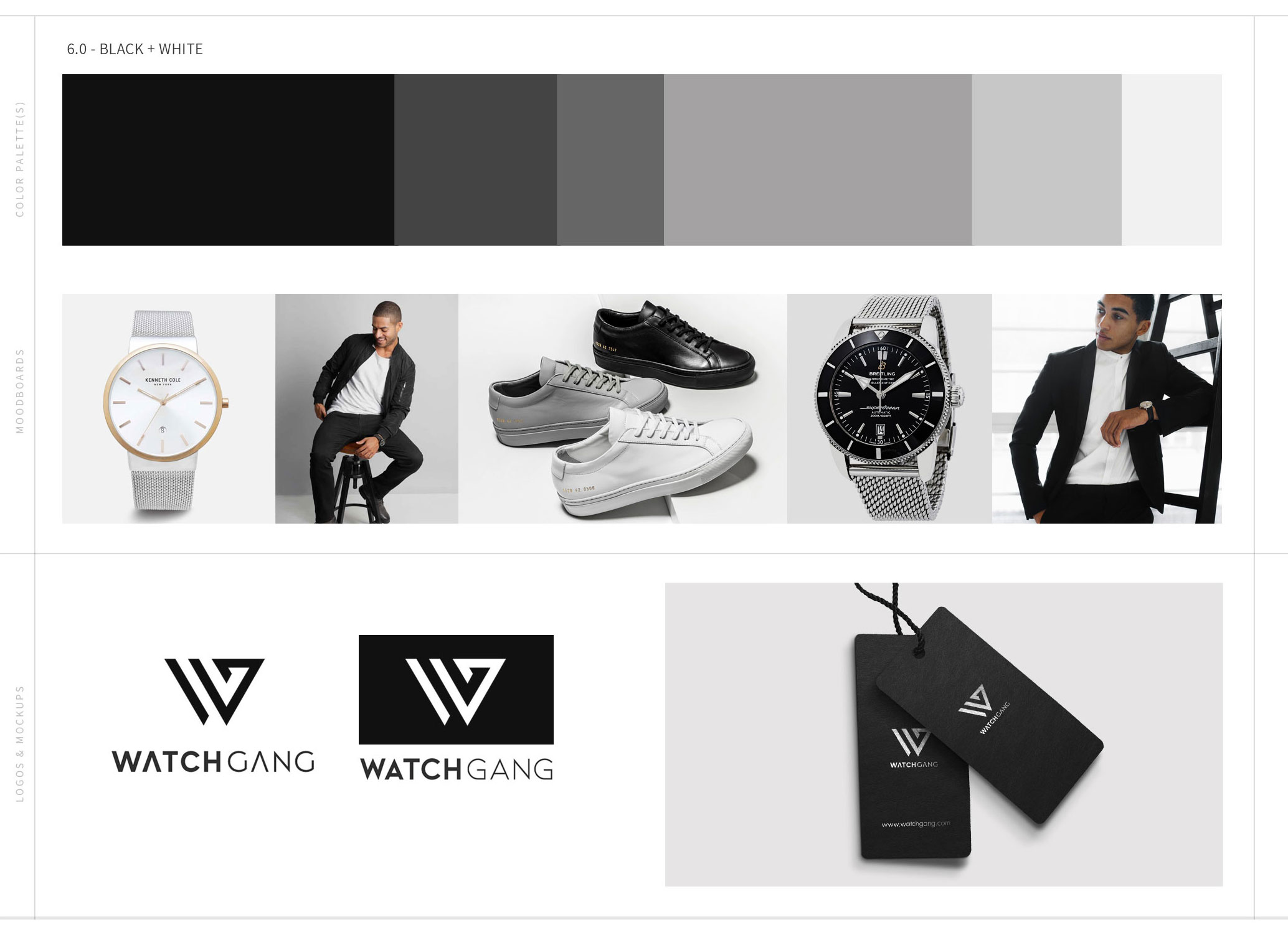
Color Explorations
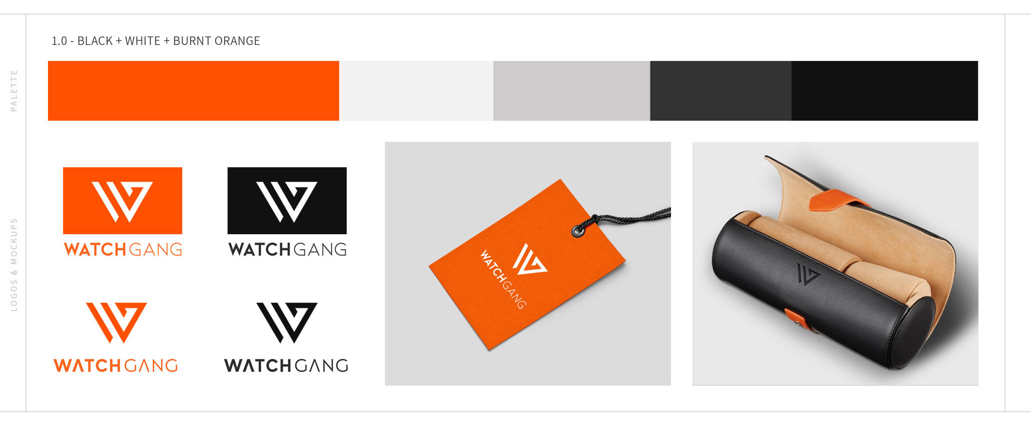
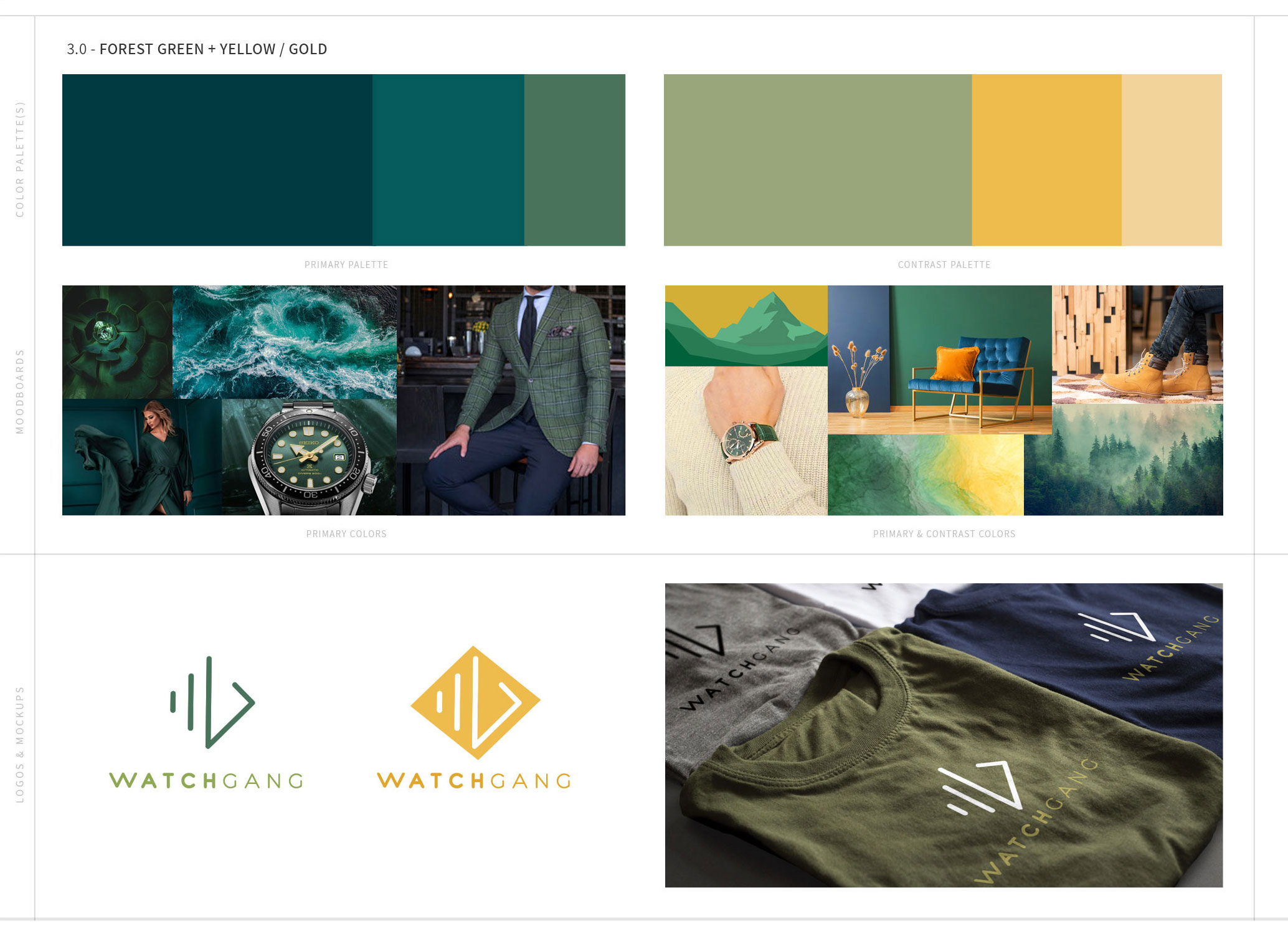
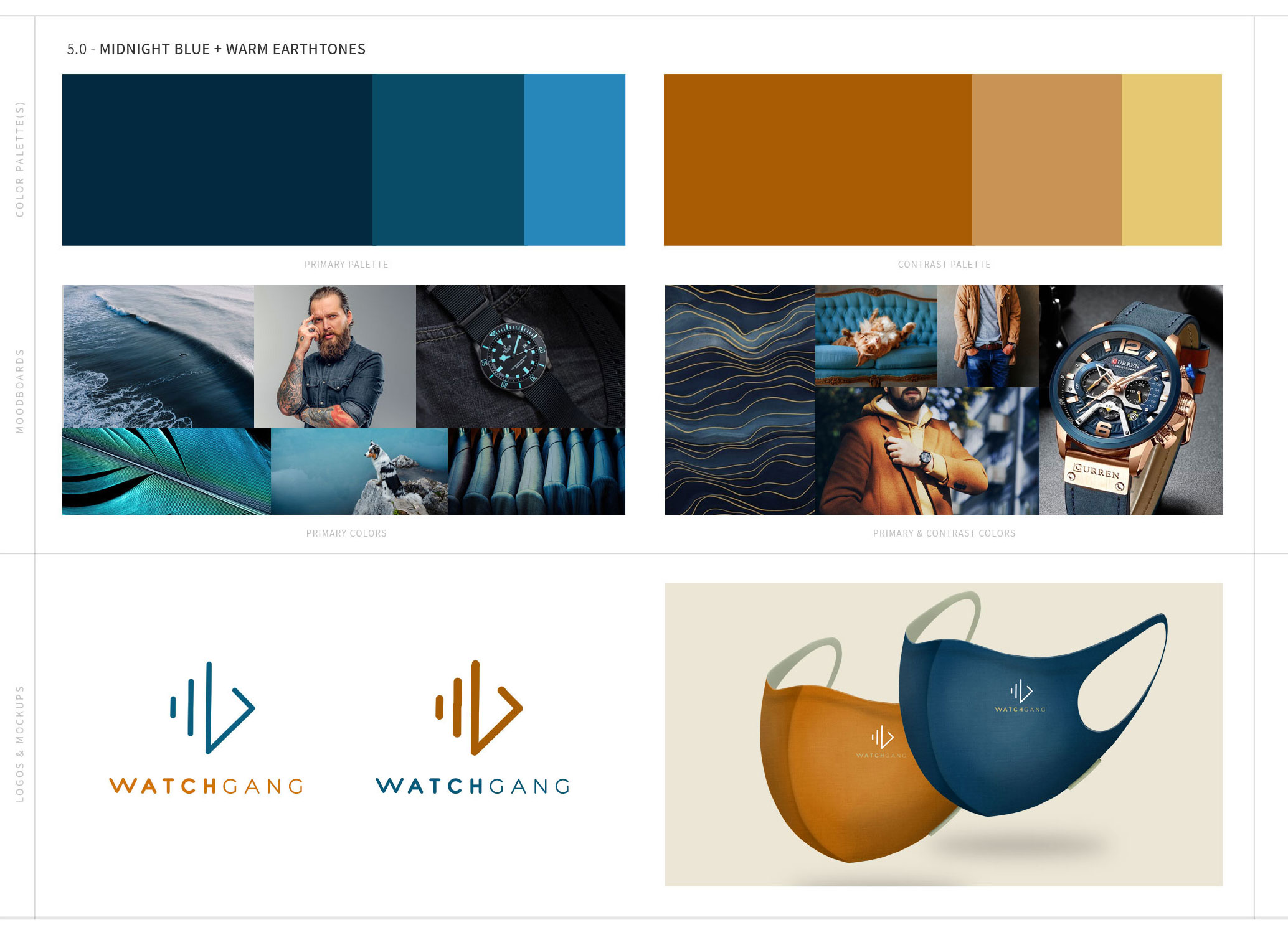
As WG’s CEO is very visual, I created more elaborate color palettes that include abbreviated moodboards and product mockups. Color explorations were divided into multi-color palettes and single primary color palettes.
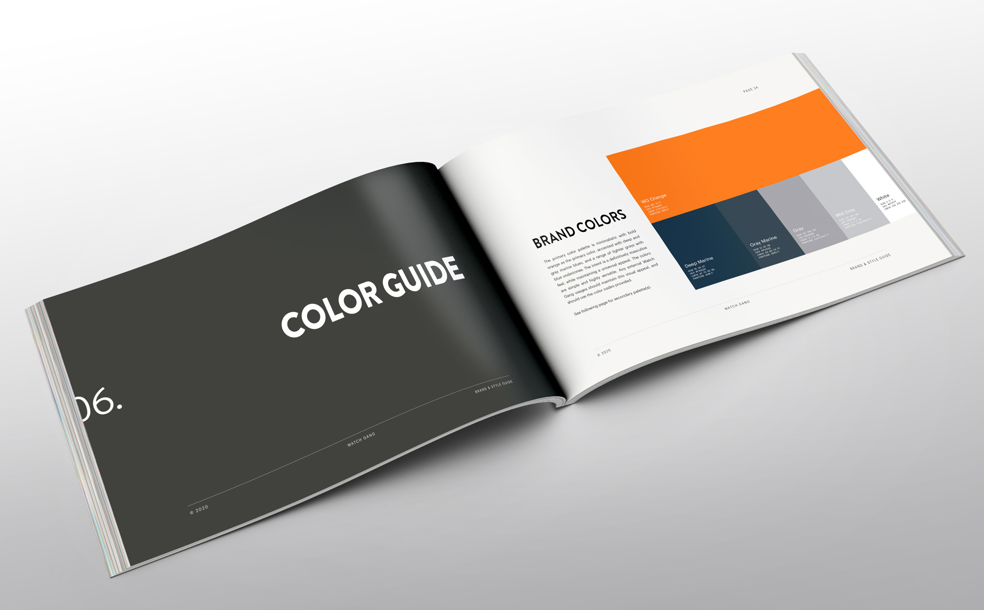
The finalized palette is a bold orange with deep marine blue, charcoal, medium and light gray, and white accent colors. To avoid a Halloween theme, the deep marine blue and charcoal were used instead of black as the most common contrast colors. It’s clean, modern, masculine, but not unappealing to women, and creates opportunities to really stand out from the crowd. The colors perfectly compliment the logo and offer more versatility of style to appeal to the entire persona spectrum.
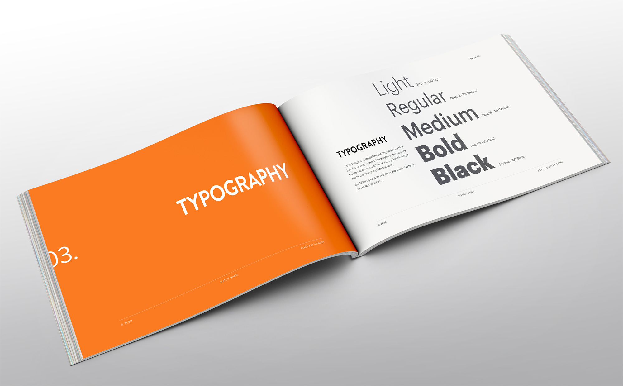
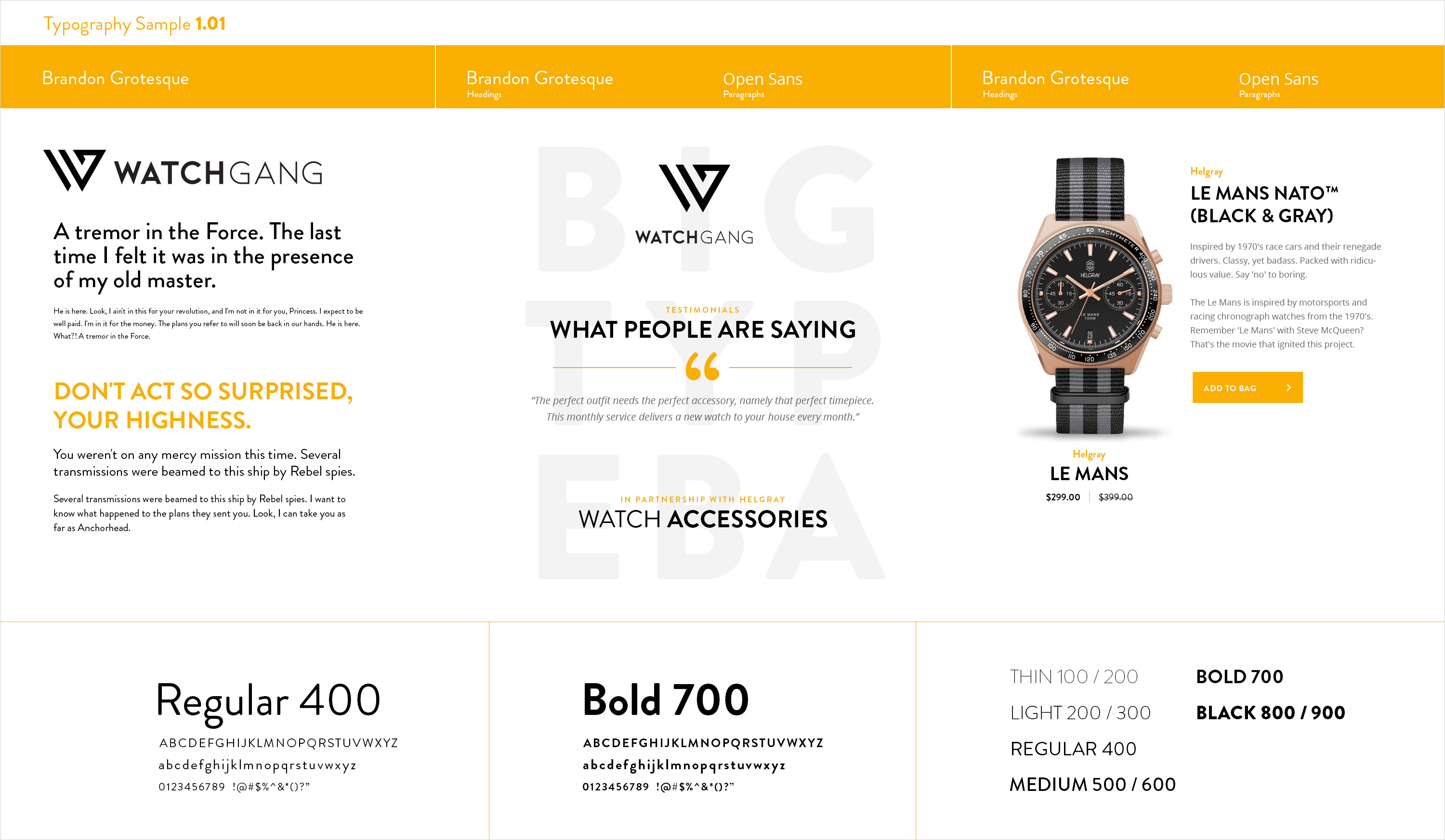
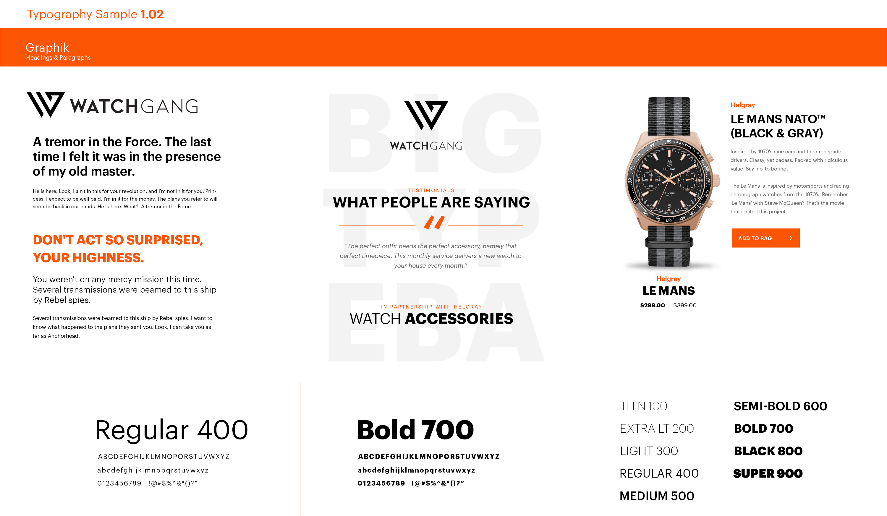
Typography
Although the font chosen for the logo works well in that capacity, it wasn’t a viable font for other purposes due to its limited features. Because of that, it was necessary to select a different font for web headings and print usage. I wanted to use a modern font that reflected the sharp lines of the logo, and “Brandon Grotesque” fit that bill nicely. But, this font didn’t work well for smaller paragraph text, so a third font was necessary. The font “Graphik” was chosen because of its viability for web use, and its extensive weight variants. The following is a sample of typography explorations, which were also specifically designed for inclusion in the brand guide.