RED is an elite salon and haircare line formulated specifically for natural and color-treated redheads. RED’s haircare collection is available at wholesale prices for professional salons, and directly to consumers via RED’s online store and flagship salon.
Brand // eCommerce Website // Collateral
My role Design lead
Skills used
Creative dir.
Interaction design
UI / web design
Visual design
Info arch.
Copywriting
Services and deliverables
Brand // identity
Brand exploration
User personas
Color explorations / palette
Typography
Logo design
Brand / style guide
UI design // website
Discovery
Moodboards
User flows, purchasing journeys
UI / polished designs
Visual // collateral
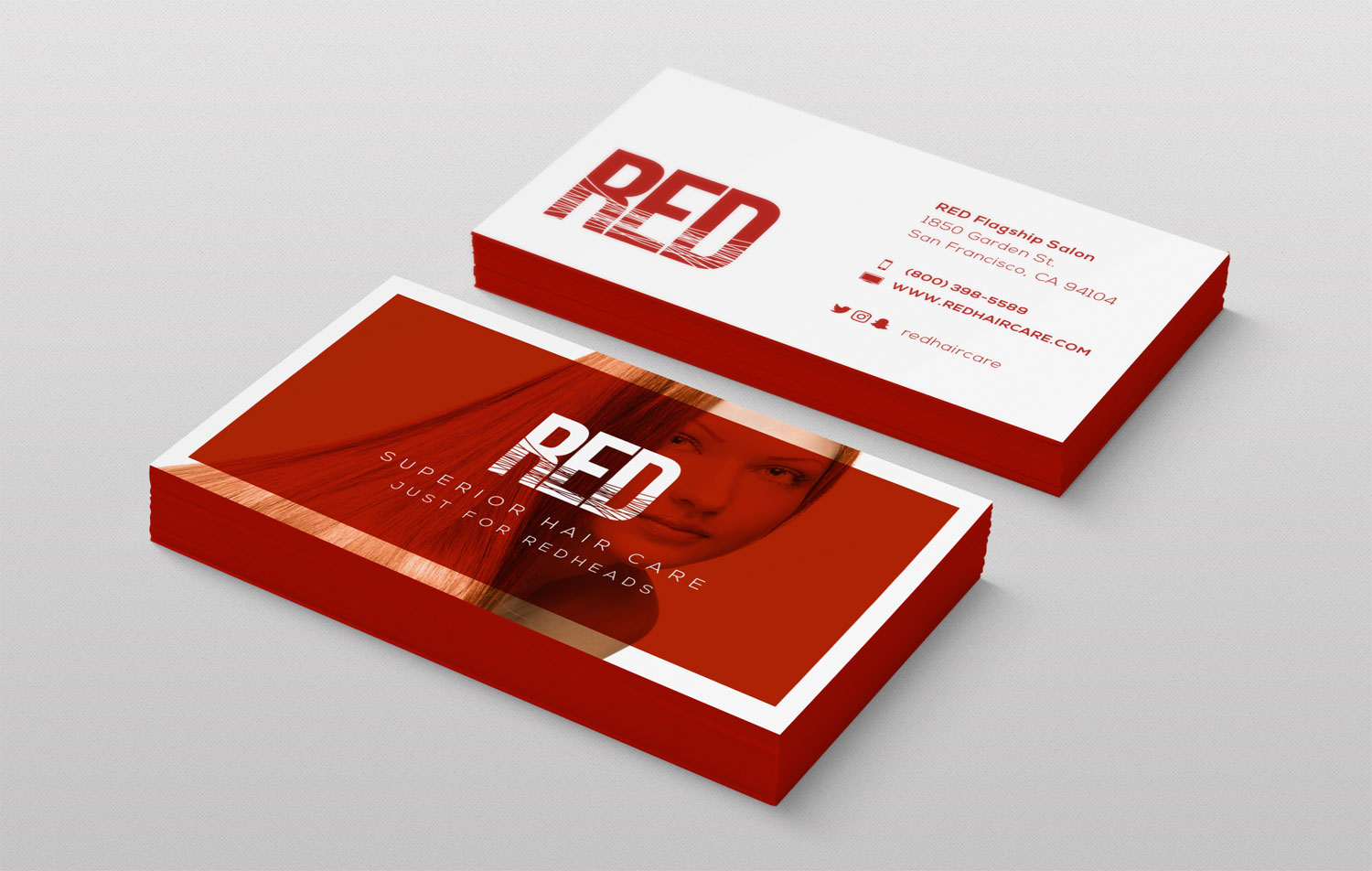
Stationery
Packaging
Custom Woocommerce emails
Lookbook designs and templates
Photography selection and editing
Promo // marketing
Custom email templates (Mailchimp)
Custom Woocommerce emails
Select copywriting
Brand design
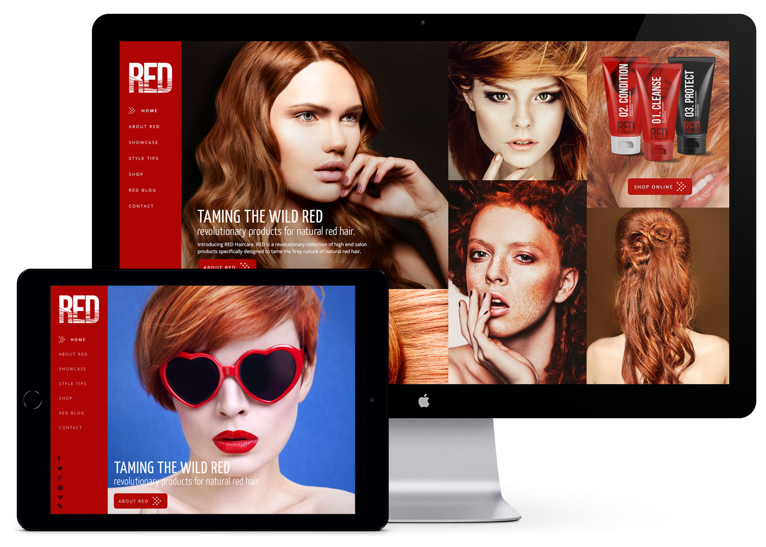
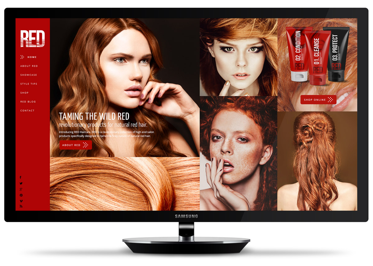
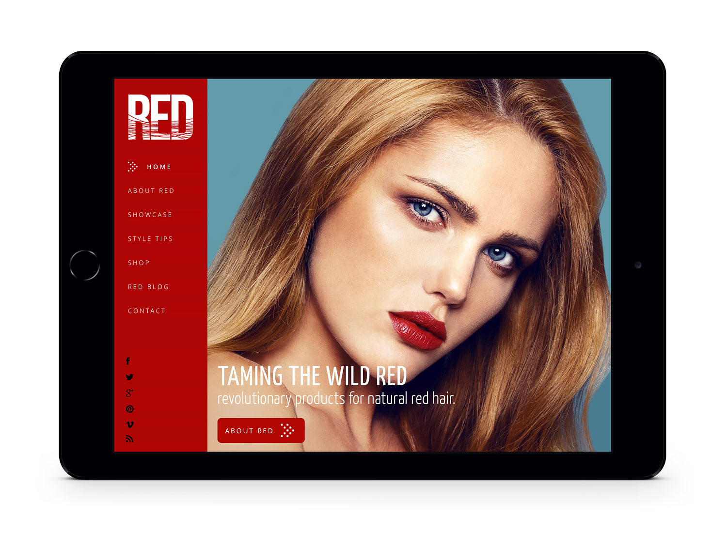
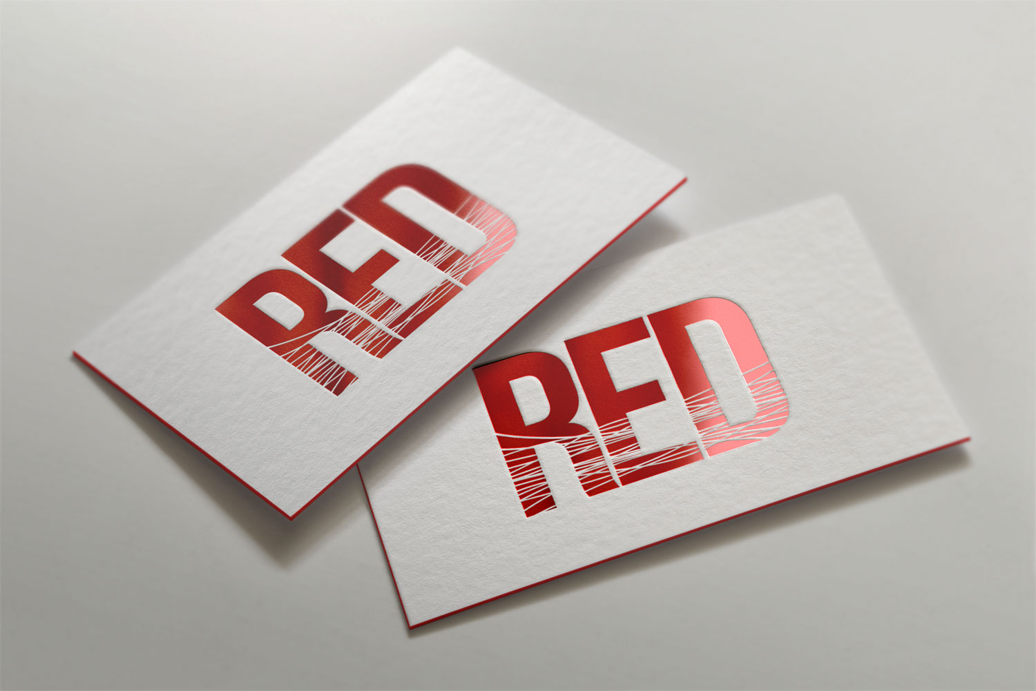
For RED, I aimed for a vivid, fearless, and edgy aesthetic. Audacious lettering stamped on mohawked models and unconventional beauties are a staple of RED’s look. The logo is bold, yet minimal, featuring a wisp of hair strewn across the text.
UI // web design
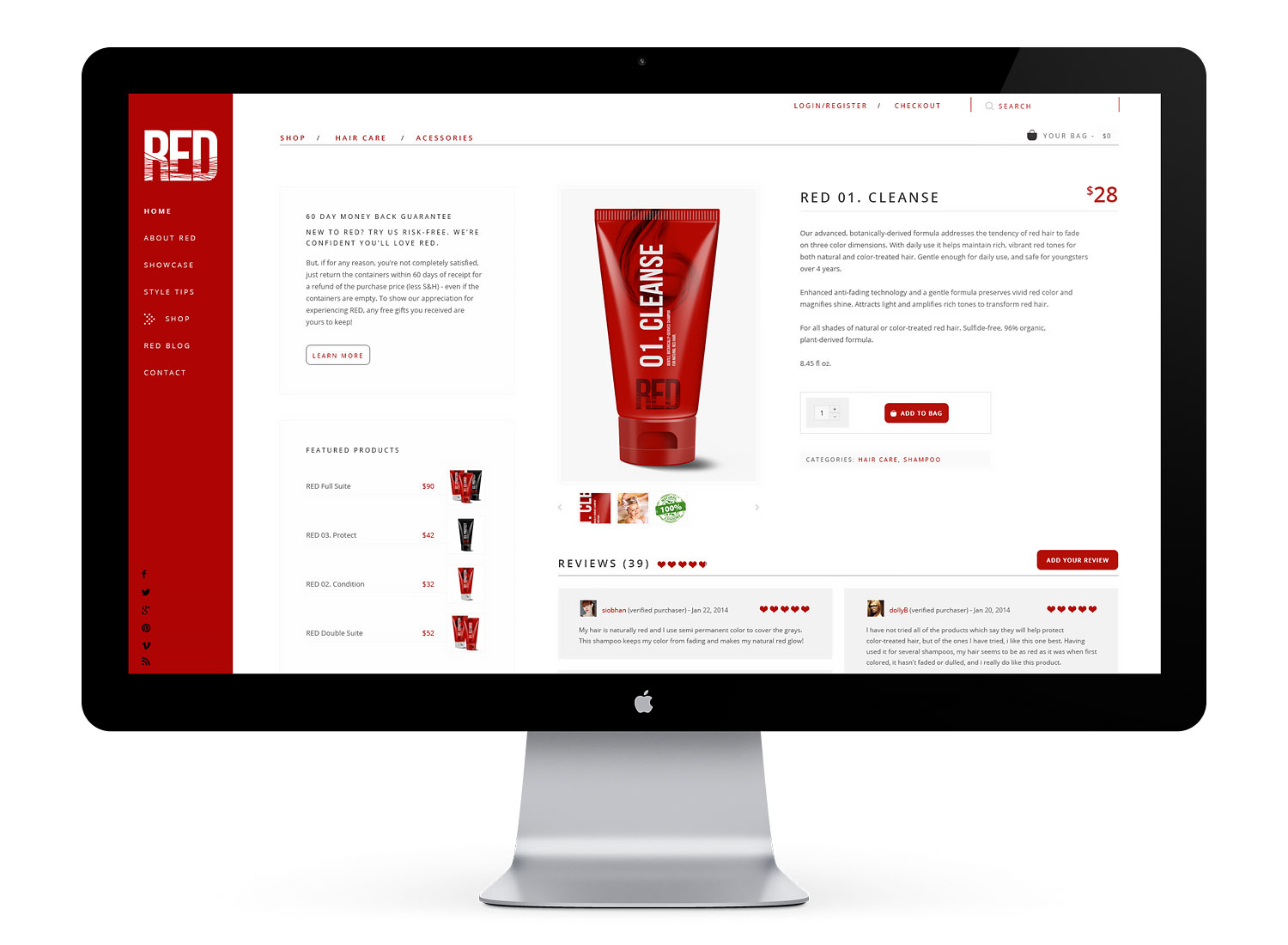
I went with bold visuals for the website, and developed a comprehensive online store with wholesale and direct-to-consumer purchasing capabilities. Sharing and review incentives were added at checkout, as well as a mailing list prompt with discount codes in exchange for subscription.
Visual design // collateral
Several print items were designed to showcase the beauty and diversity of red hair, including stationery, catalogs, and packaging.
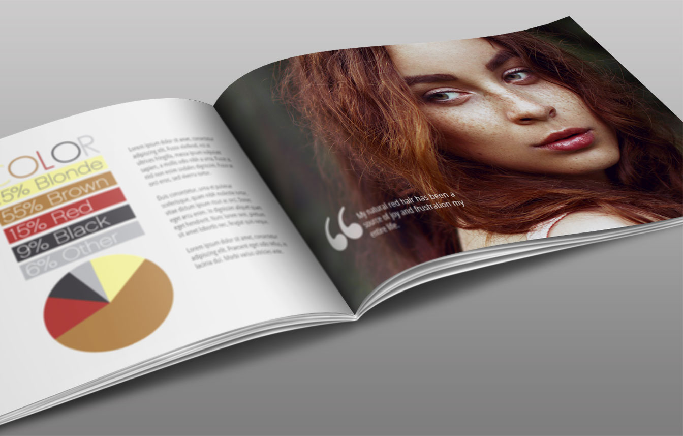
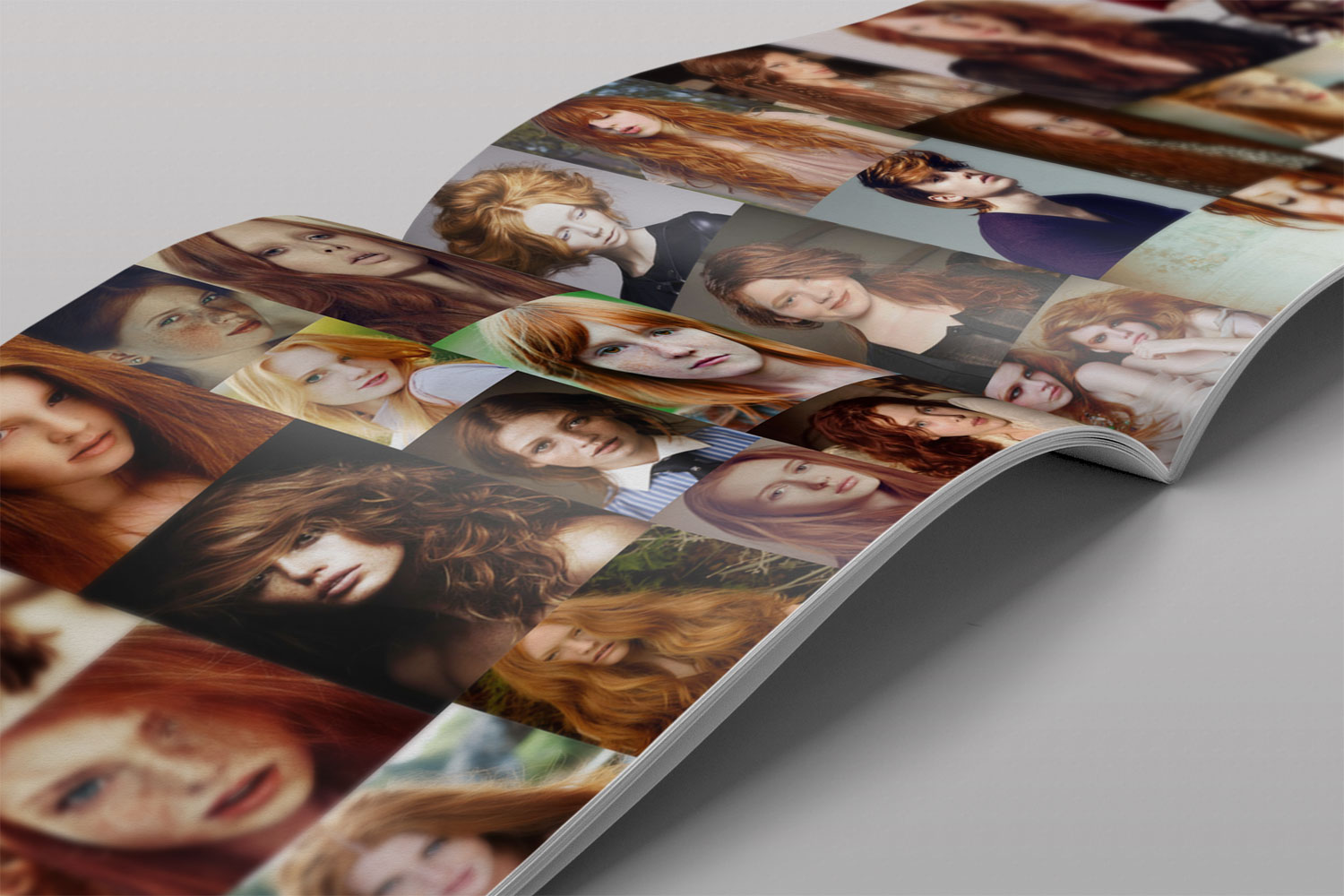
As a theme, I used diverse shots of red-haired people ranging from dark to strawberry blonde, both male and female of all ages, and showcased them in extra large layouts and compilations. Combined with big, bold text, and contrasting red and black overlays, RED’s signature style is unmistakable.
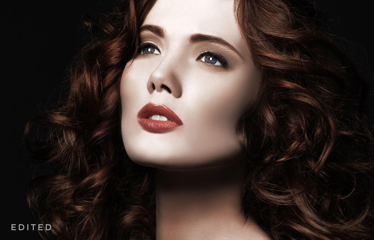
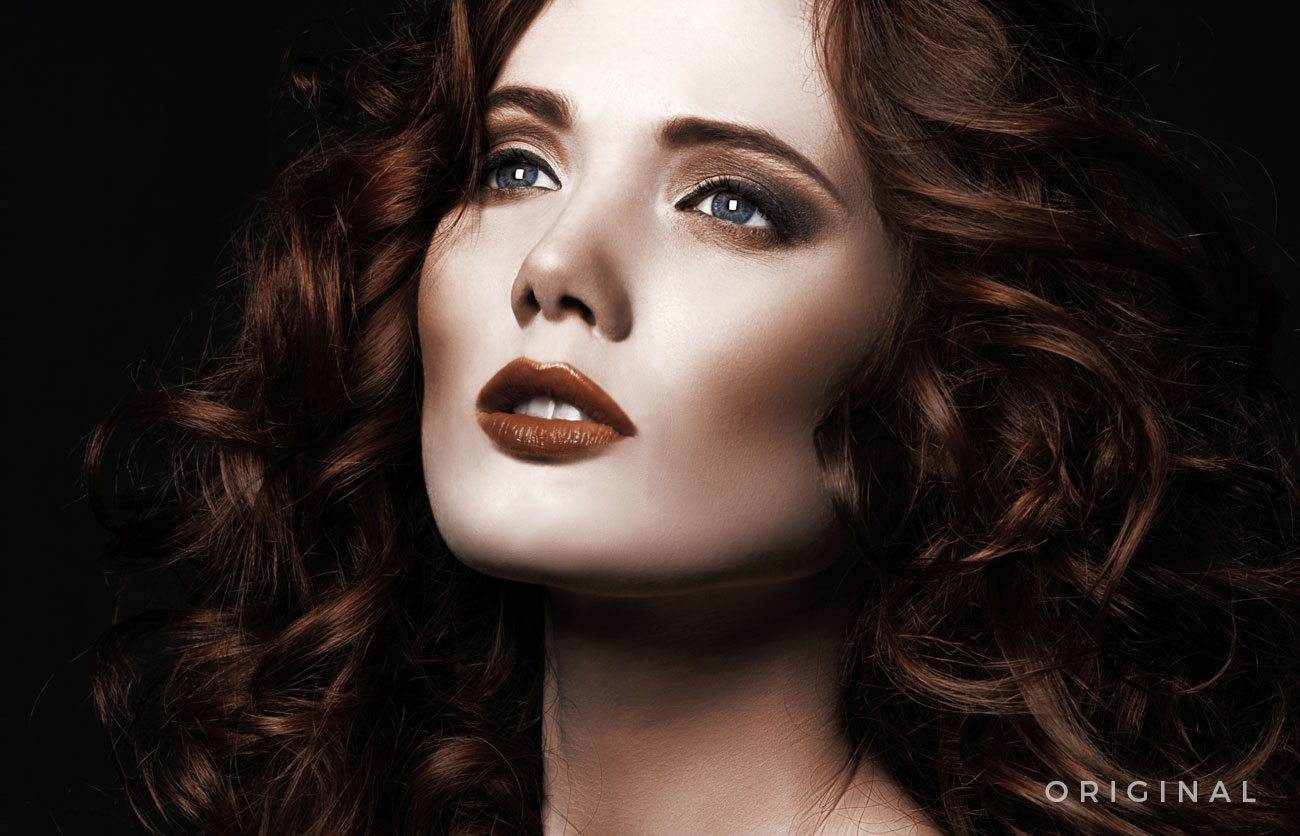
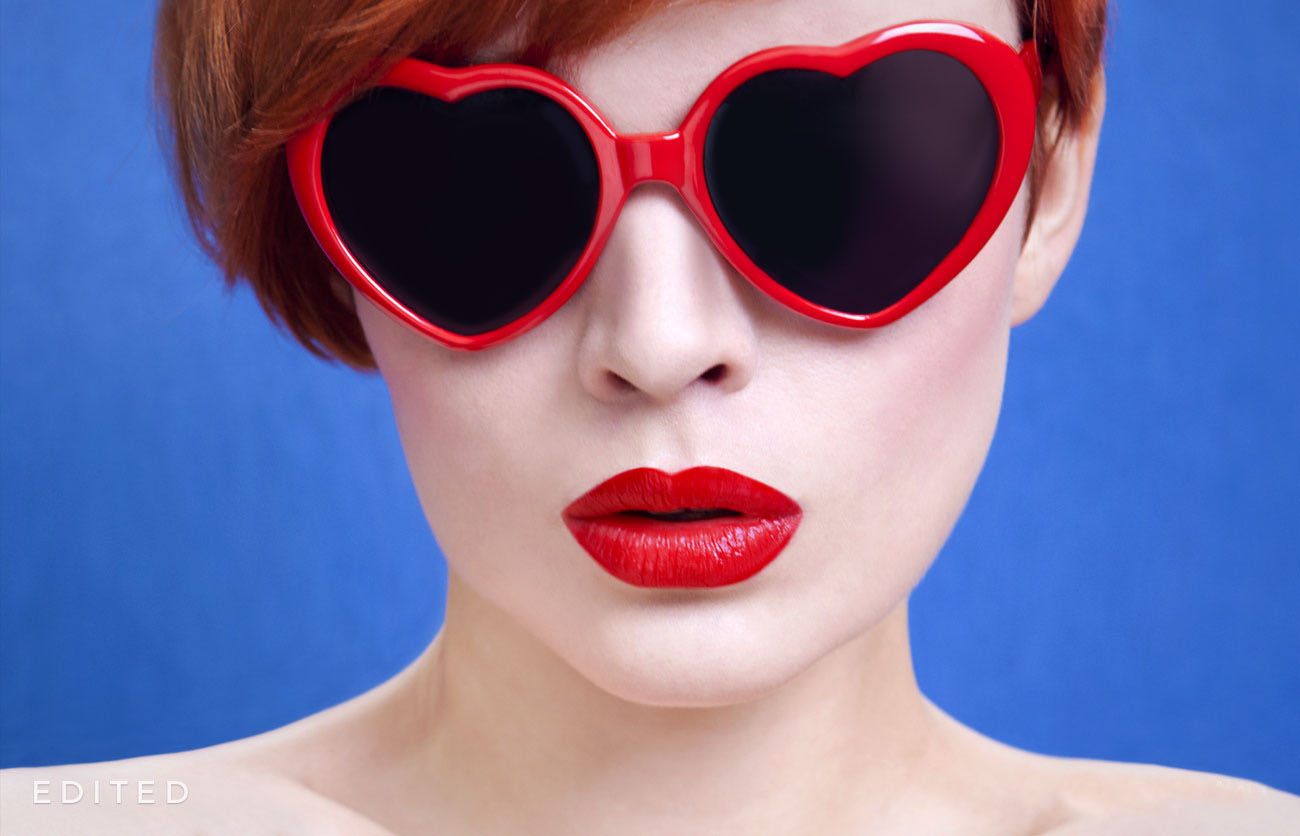
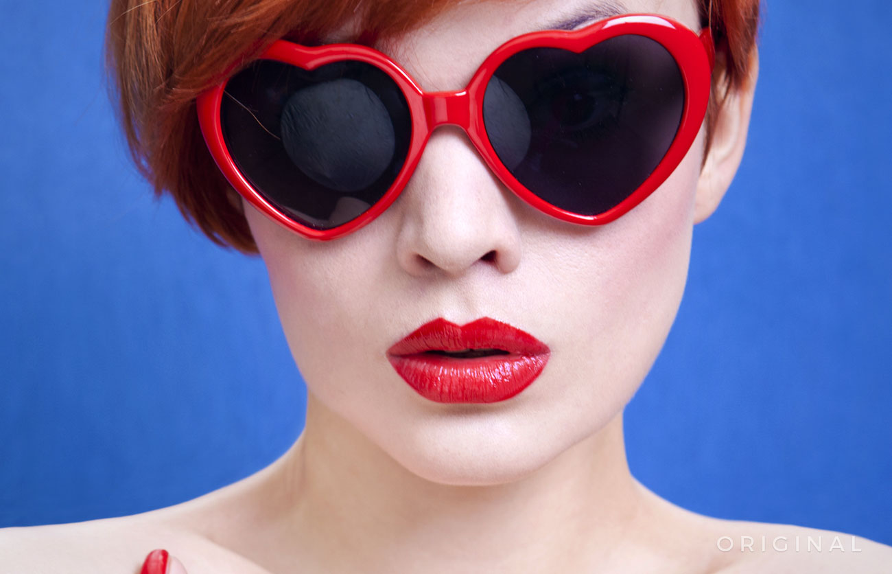
Photo Editing In all of RED’s photography, I avoided editing the natural hair of the models, except to tame fly-aways and clean up artifacts. I wanted to keep the hair looking real, as RED is all about embracing the beauty and characteristic of red hair, not changing it to something it’s not.