


⇆


⇆


⇆


Mozilla is a beloved tech company whose dedication to user privacy and open-source products has endured since the glory days of the internet. Most are familiar with Mozilla’s flagship product, the Firefox Browser, but less known are Mozilla’s other privacy-focused products, such as VPN, Relay, Monitor, and a plethora of browser add-ons.
Hats worn
I was hired to bring to life Mozilla’s Protocol Design System: a core Figma design system, atomically structured with scalability and design flexibility in mind, that bridges the gap between design and development. As a highly versatile system, Protocol is designed with multi-product theming, and serves as a single source of truth across multiple teams for creating cohesive, visually consistent web pages, emails, collateral, slides, and more. From a top-down, Protocol features:
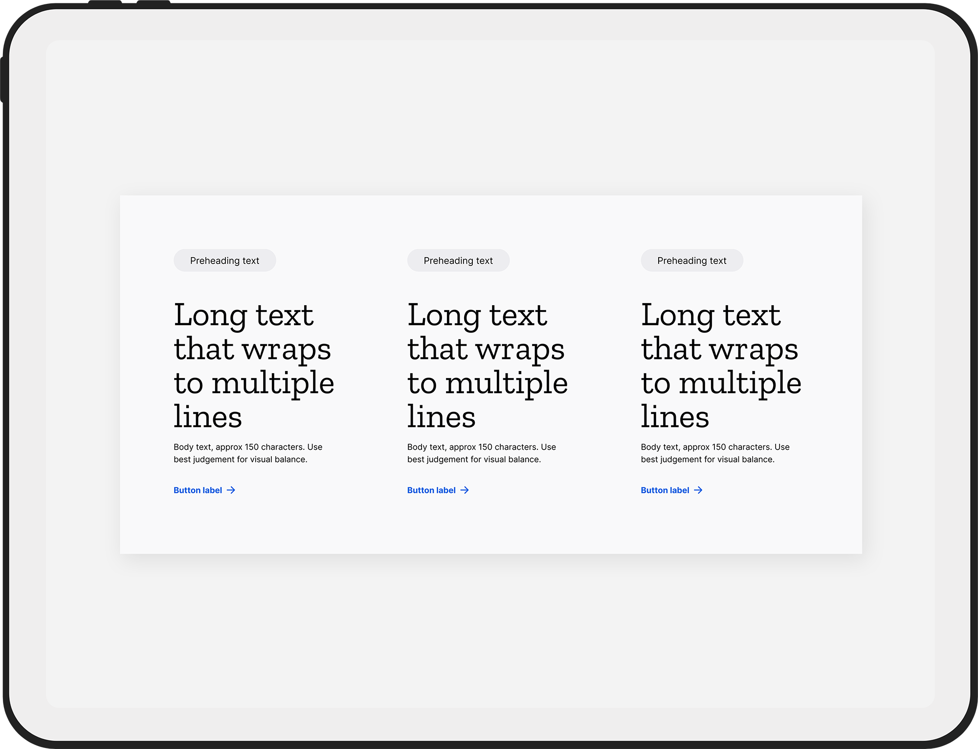
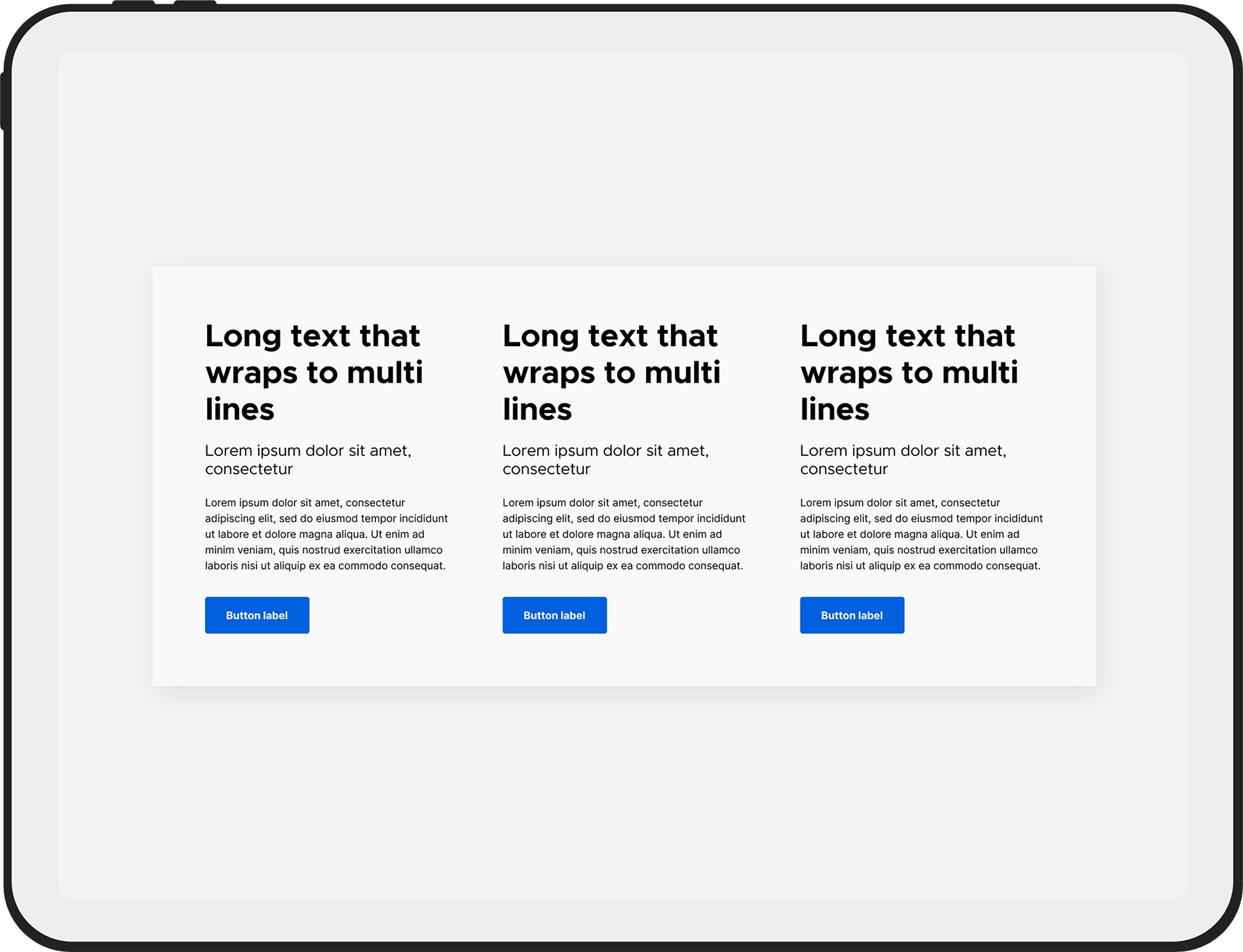
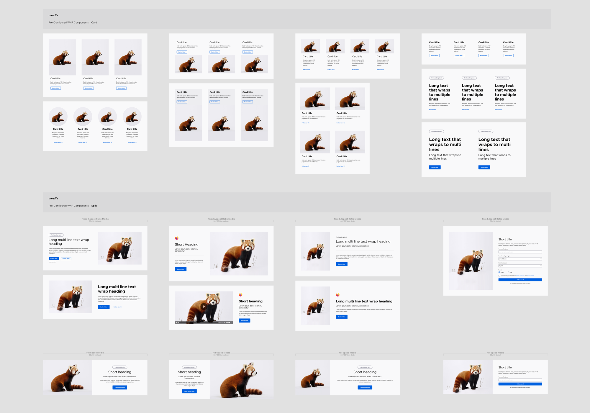
Because this design system was created for use across many teams, the primary goals were design flexibility and user-friendliness. Each component includes comprehensive configuration ability to allow users an extensive range of design options. Pre-configured layout templates were also created to showcase the flexibility of the components. The following shows samples of the Card and Split components’ design versatility, as applied to patterns for the Firefox browser’s monthly “what’s new page”.
Protocol’s file structure was created with usability and scalability in mind. The system includes 3 primary libraries, and 3 supplemental libraries, as follows:
Primary libraries
Supplemental libraries
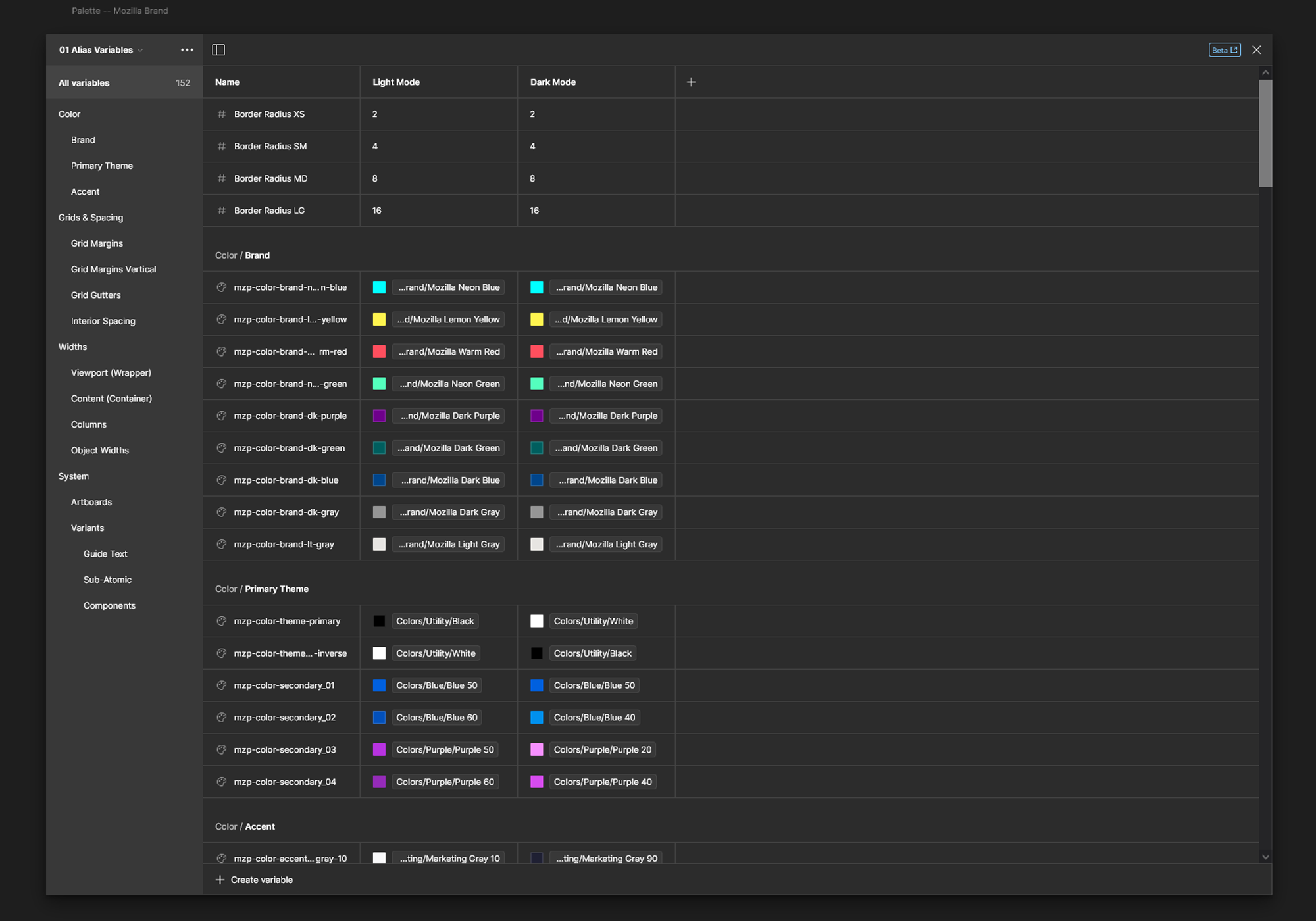
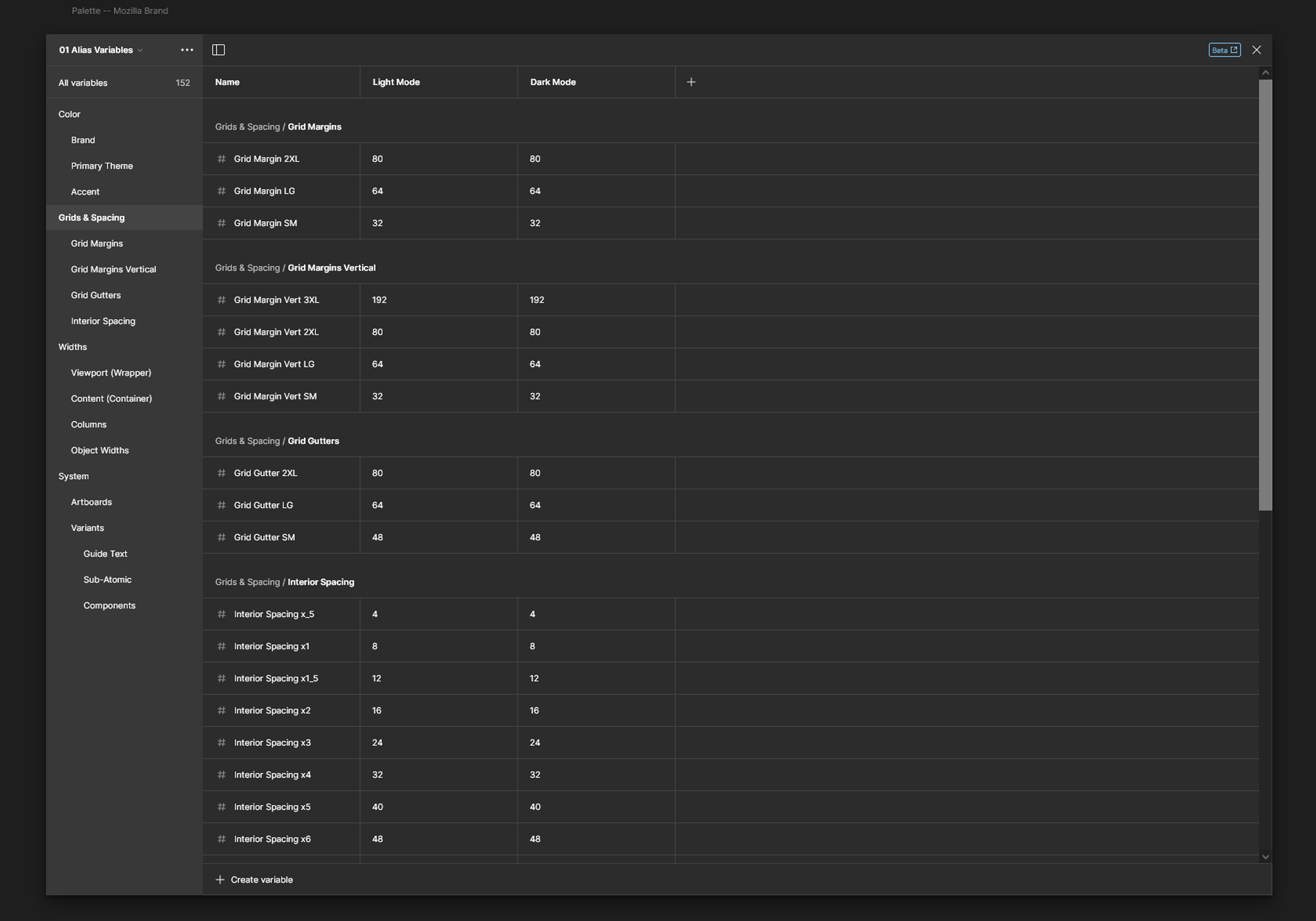
Protocol uses variables as a single source of truth to create granular control over global style elements, as well as variable modes for advanced theming configurations. Reference variables were used to mirror design tokens in code to store values for colors, border radii, grids, gutters, spacing, viewports and breakpoints, and content widths.
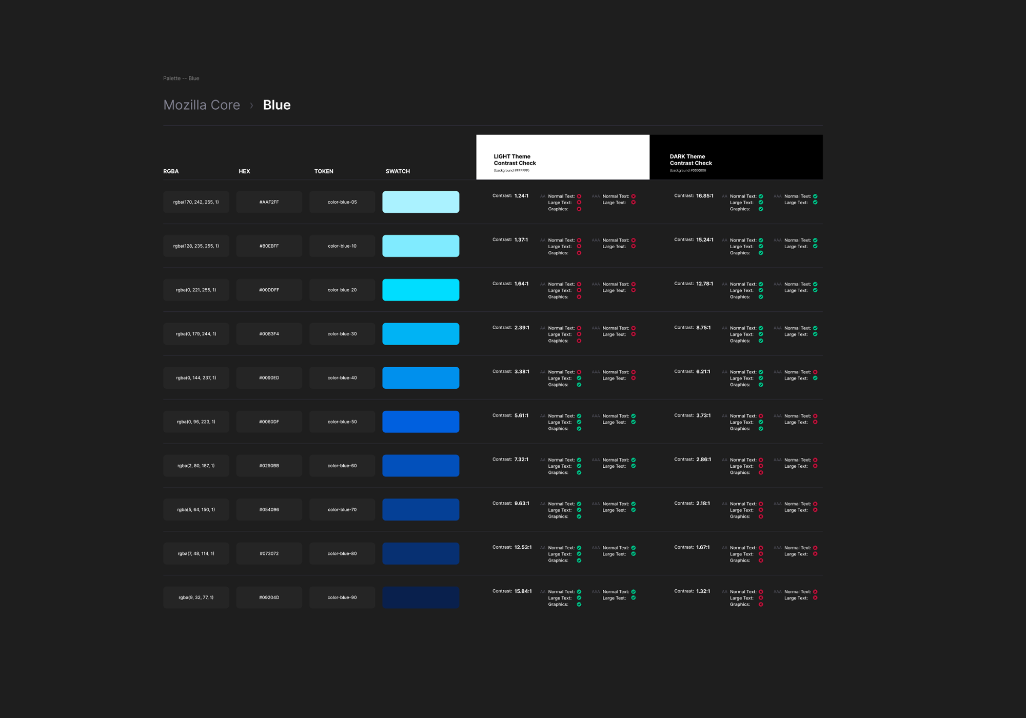
The following shows a glimpse of Protocol’s variables libraries, as well as a sample of a color swatch table that provides color codes in hex values, CSS classes, token names, and A11Y contrast specs.
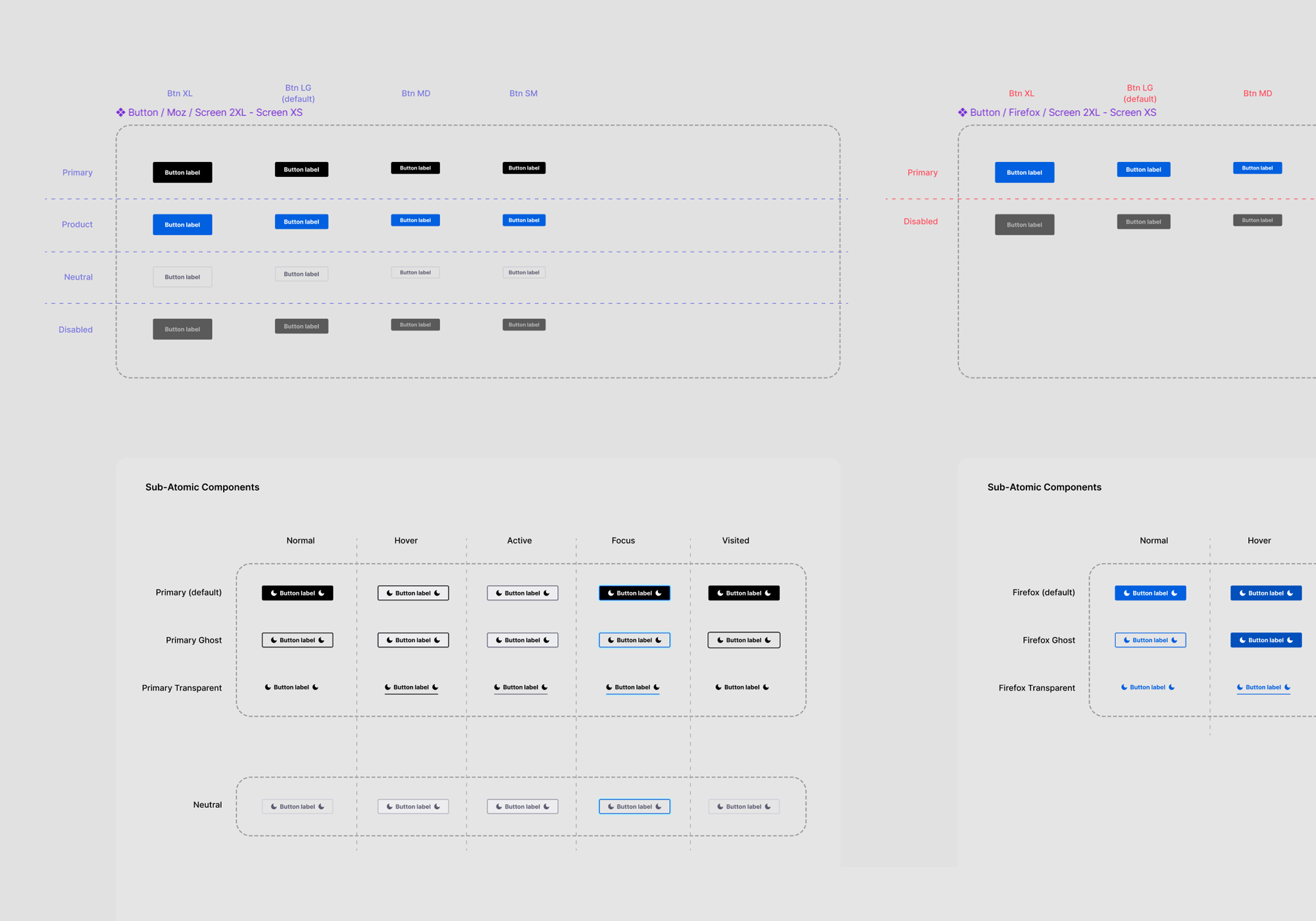
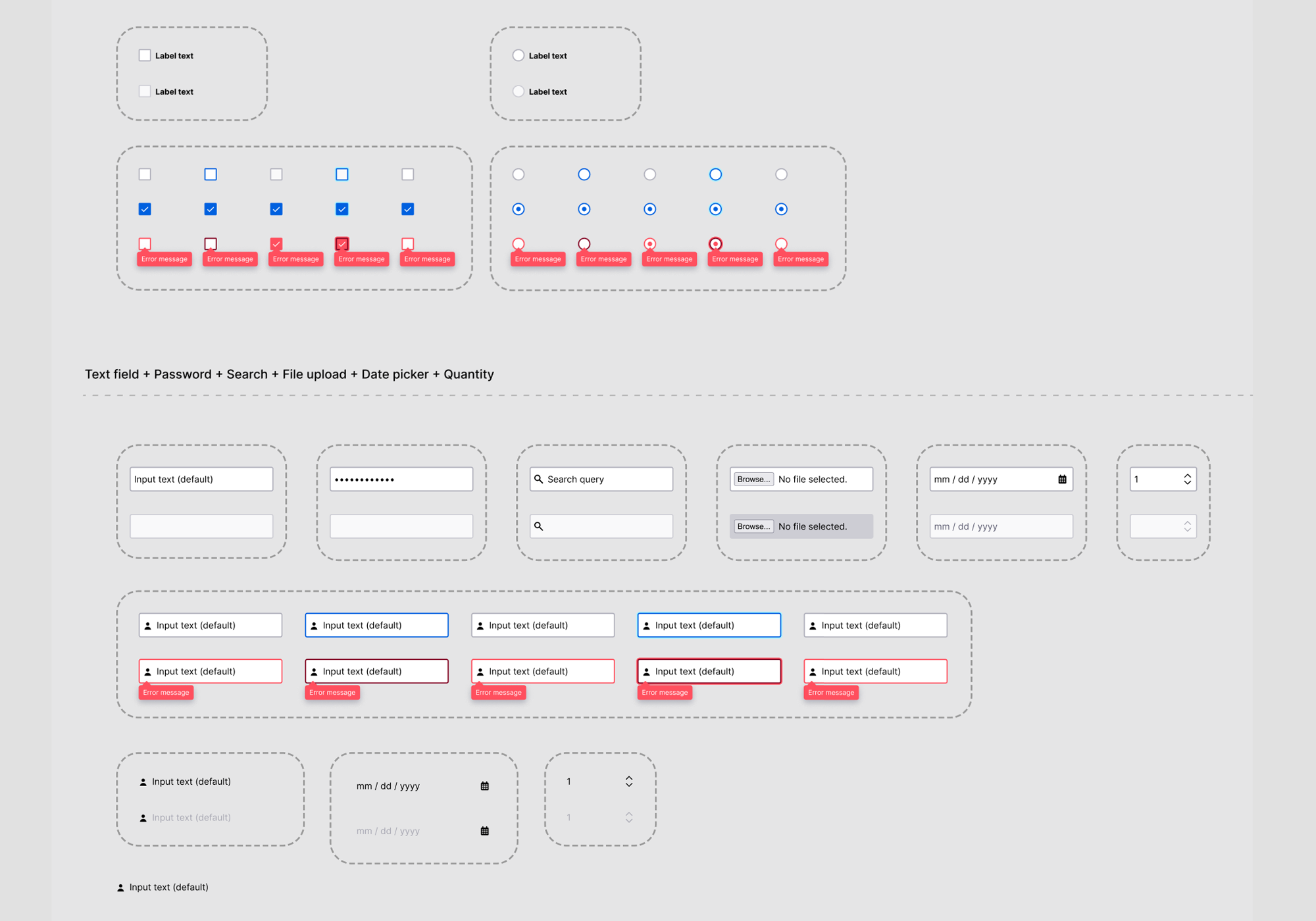
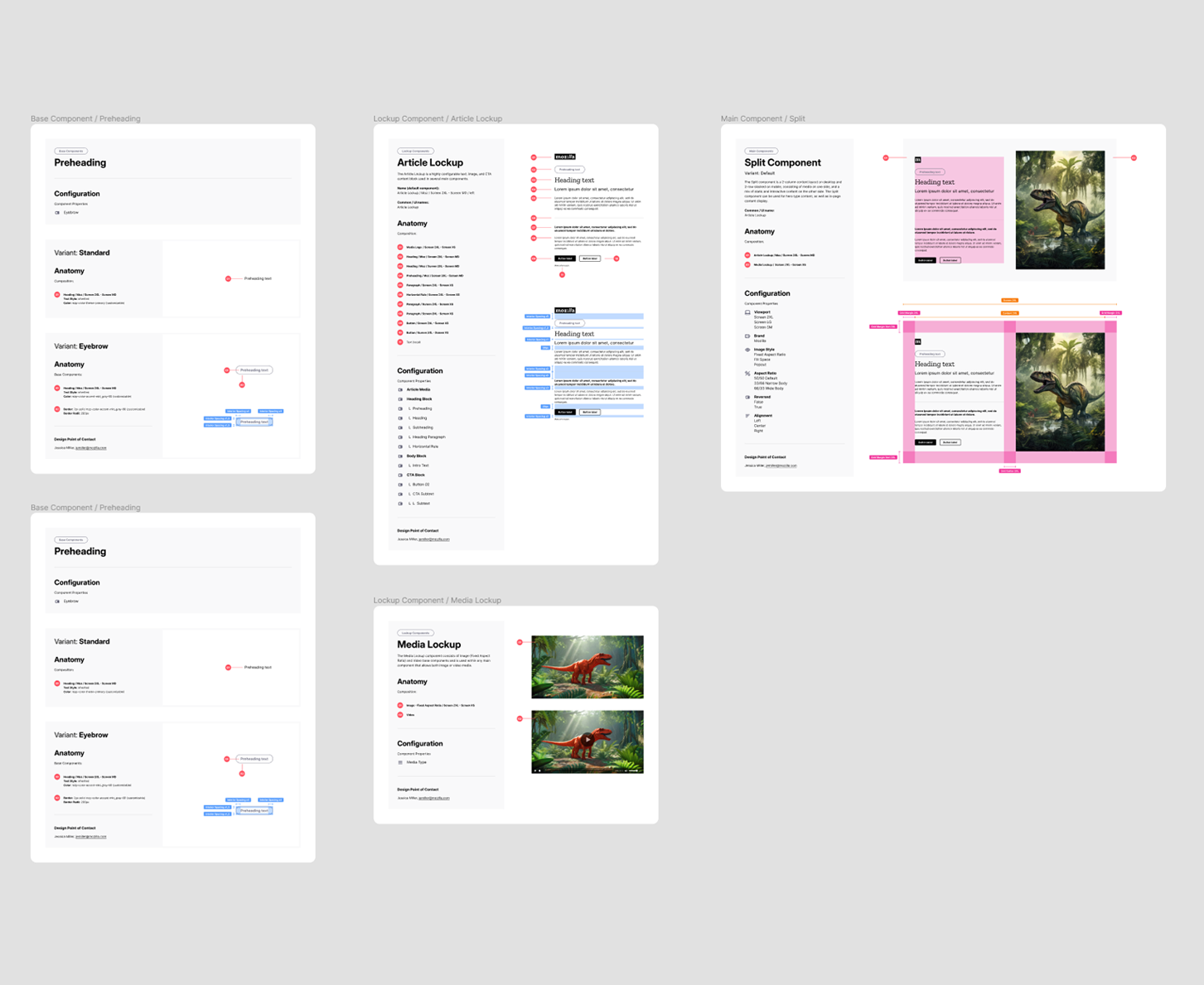
Baseline components are the smallest atomic level building blocks, such as buttons, icons, headings, dividers, and images. Protocol skips the atom-level, positioning molecule-level components as the smallest unit. This keeps the system smaller and more streamlined by consolidating what would otherwise be a tedious collection of tiny components.
Baseline components are intended to be nested within Lockup components for more granular control over visual consistency, but can be used directly in design explorations, as well.
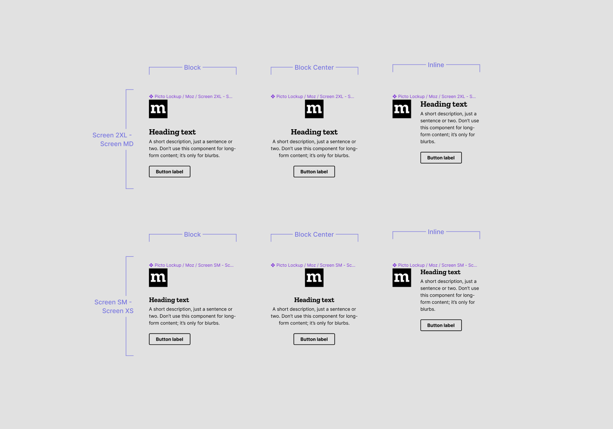
Lockup components exist at the organism-level, and are comprised of groups of Baseline components. The following shows a sample of Lockup components that are nested inside Primary components.
Primary components, or patterns, are built from repeating Lockup components with columnar variants that each include options for for LTR, centered, and RTL oriented content. Variants are further divided into 3 viewport / breakpoint sizes for desktop, tablet, and mobile.
Component structures were formulated with the philosophy that we, as system designers, must ensure that component complexity falls on us, not the user. Meaning we take the time to thoughtfully plan out complex components to reduce cognitive load and promote usability.
To achieve this goal, considerations for accessibility, grids, gutters, spacing, viewports, and more are automated such that designer’s need only stack components into auto-layout frames and they snap into place. Designers needn’t worry about grids, viewports, breakpoints, spacing, etc — design specs are all built-in, which saves time and ensures visual consistency throughout product designs.
A notable disconnect existed between designers and developers, as well as a lack of brand and UI consistency across Mozilla’s many online properties.
Without a core design system, there were no guidelines or guardrails for designers, which resulted in guesswork and added cognitive load, rampant visual inconsistencies, and an overall cumbersome production process for both designers and developers.
Protocol solved this problem by creating a single source of truth for reusable components and pattern across all of Mozilla’s surfaces, while ensuring designs adhere to brand guidelines, development specs, and accessibility standards.
Protocol components are unique in that they’re designed with theming and technical specs baked-in. Considerations for accessibility, grids, gutters, spacing, viewports, tokens, and brand guides are automated such that designers need only place components into their artboard frames and they snap into place, which saves time and ensures visual consistency throughout.
Protocol components take full advantage of component properties, including nested instances, text properties, boolean toggles, and instance swaps. Components are designed to allow nearly all configurations to be performed from the component panel, which simplifies the design process, reduces the number of components in the system, and makes system management easier.
As Mozilla and Firefox are a11y first in all products, I opted to use variables to create the Dark Mode theme. Using variables means there’s no longer a need for a separate set of contrasting variants, which greatly reduces the system size, and automates multi-theme design.
In addition to color theming Protocol includes advanced Variables + Modes theming capabilities that automate responsivity and brand theming in layouts. Color theming can be combined with these additional Modes that allow designers to instantly switch layouts between different product brands and responsive viewports (a full video demo is further down the page in Advanced Layouts : Using Modes for Design + Multi-theming Automation).
Mozilla’s development team had created their own set of coded components with comprehensive development specs, which formed a starting point for the design system. I started the build with an audit of the coded library to consolidate any redundancies, update grid values to current responsive standards, and plan component feature expansion and visual design. In the early stages, I worked with UX and visual designers from several teams to understand their pain points, and to get input on their specific needs for a central design system.
Once a roadmap of components and features was in place, I closely evaluated and redesigned each one from an interaction level. As I built components, I redesigned them, visually and functionally, then worked with the development team to incorporate my work into their code library to ensure parity.
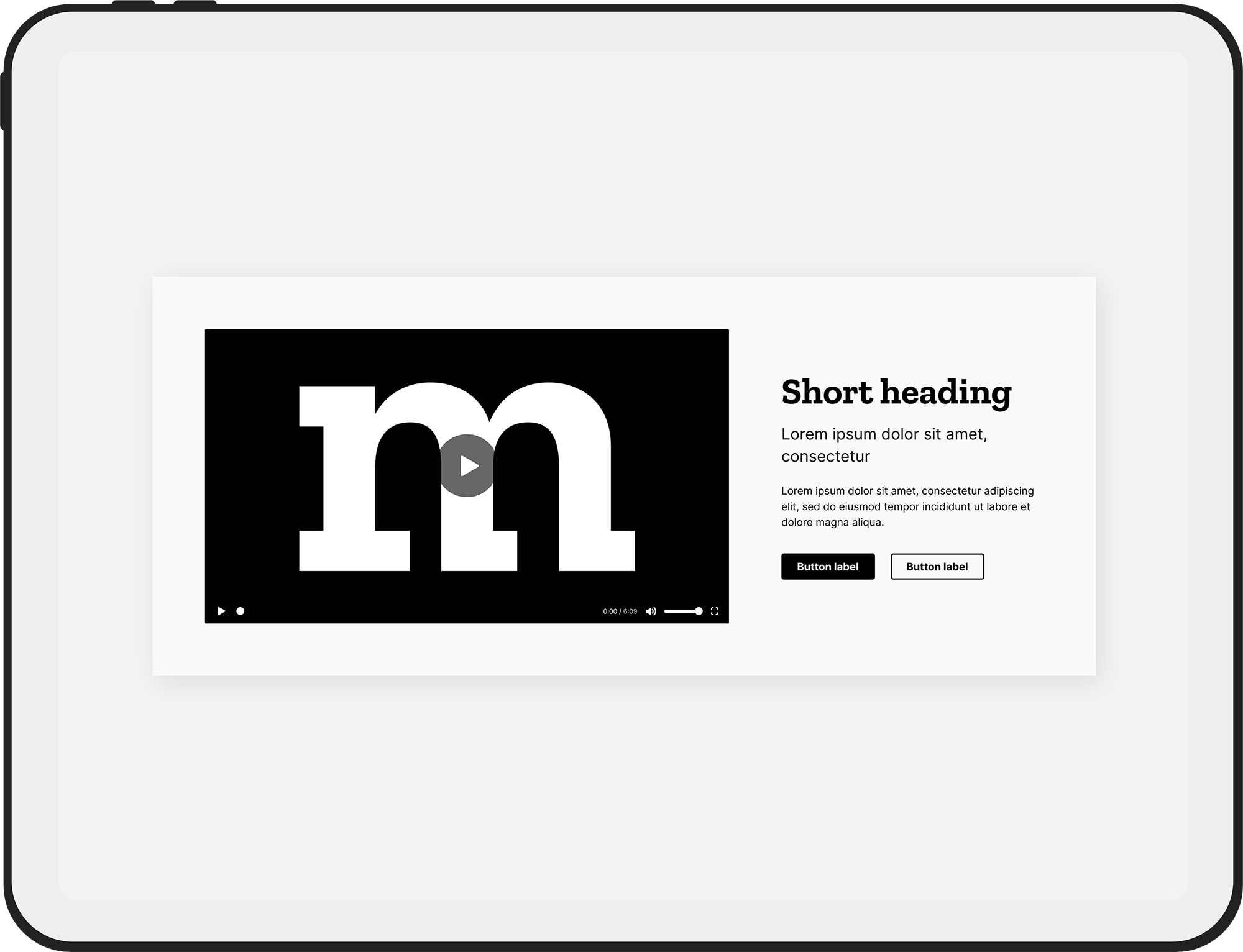
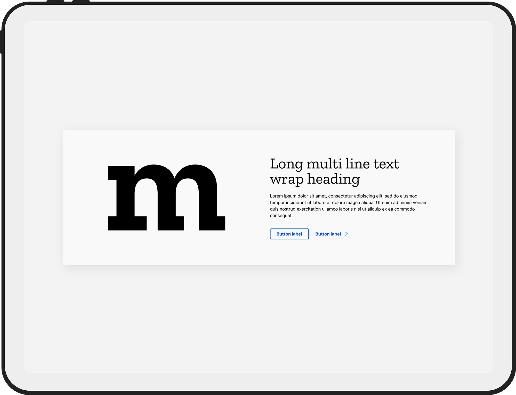
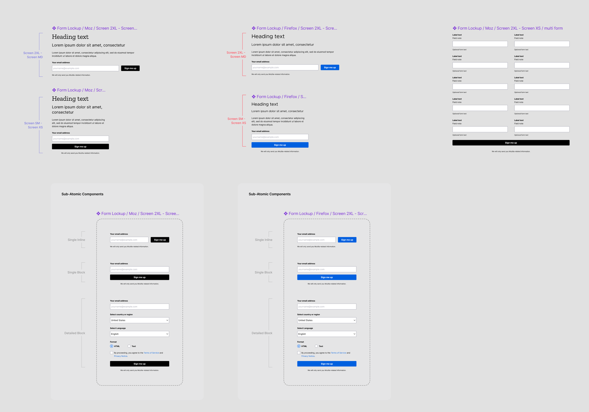
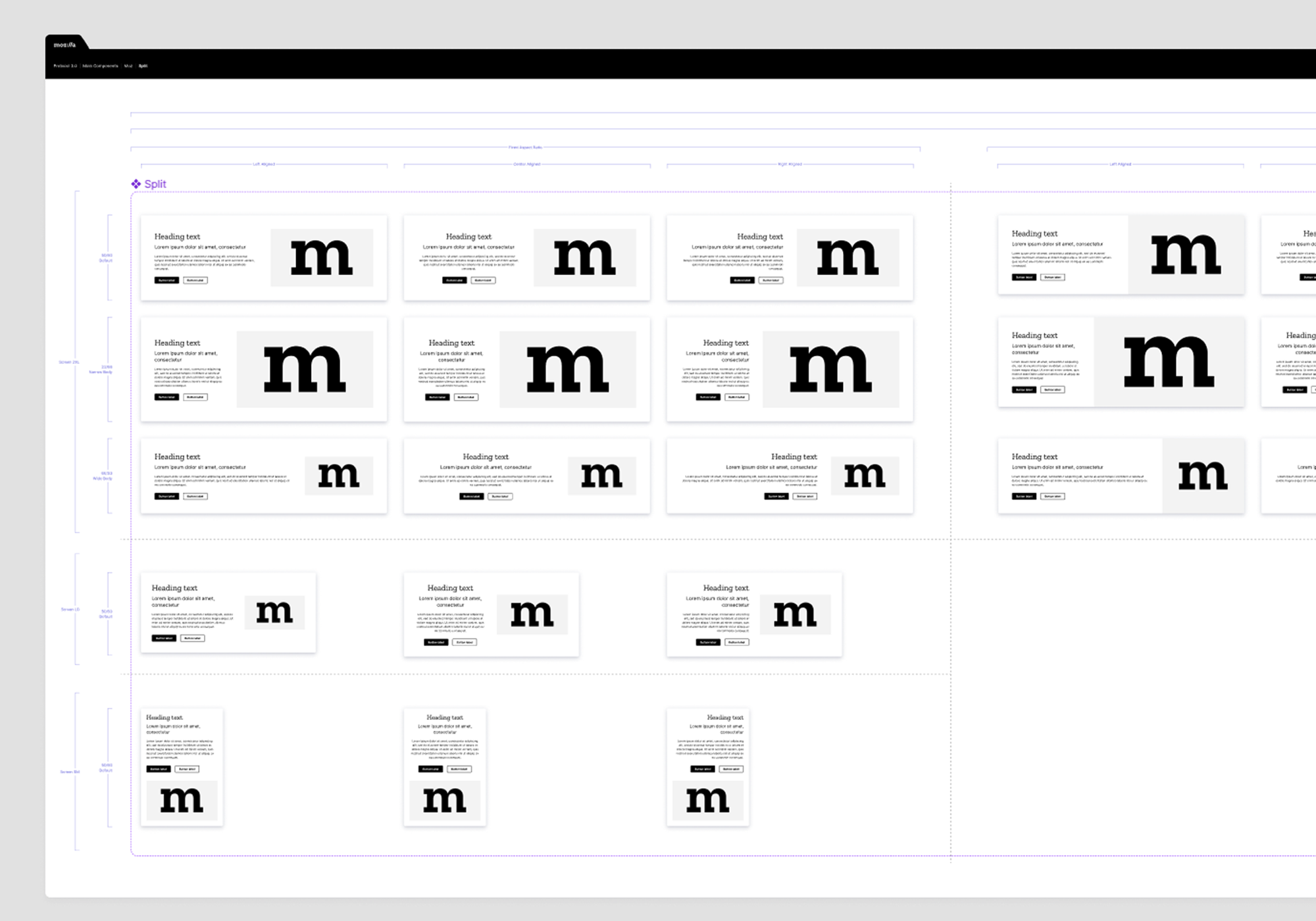
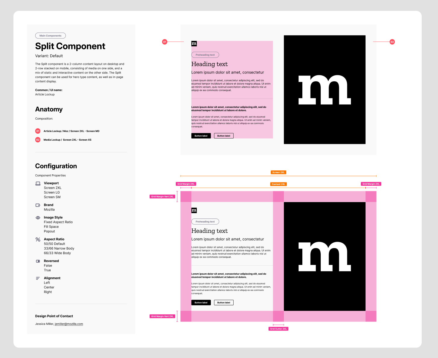
The Split component is, by far, the most popular component in Protocol. It consists of a slot component (default Article Lockup) on one side, and a Media Lockup component on the other. Redesigning this component was tricky and required considerable thought and strategy to incorporate existing behaviors and expand the design flexibility. With collaboration from our studio and development teams, component style options were consolidated and outdated designs removed, responsive modes were streamlined, and design / content options were added to maximize design features. Because this component is used with an array of content types, the Article Lockup is designed as a slot component that can be swapped with other Lockup components.
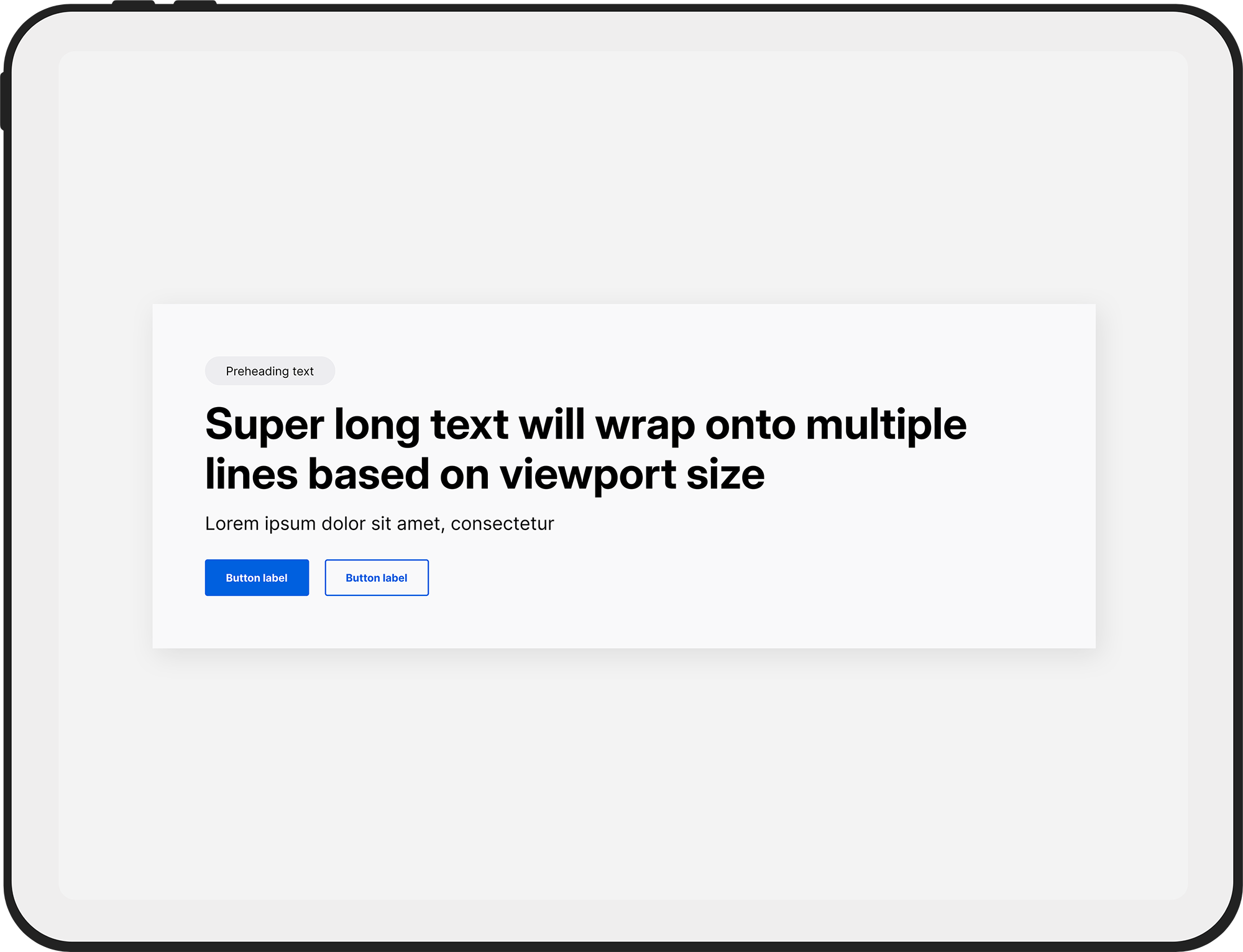
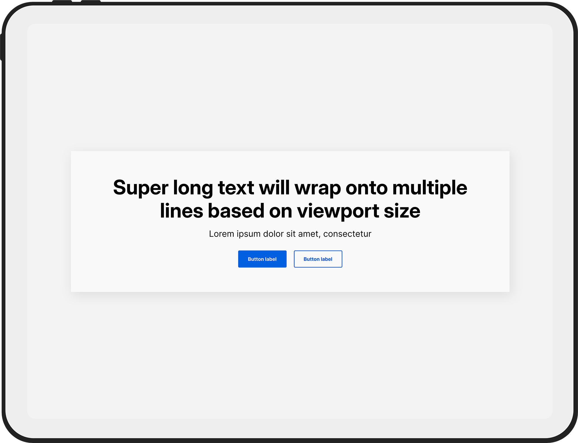
New components were designed from scratch, while existing components and UI elements were analyzed and updated accordingly. The following before / after shows a subtle, but impactful, redesign of the core form elements (demonstrated in the Split component). For a more polished and contemporary look, form fields were given increased padding, stronger border radii, and lighter border widths and colors.
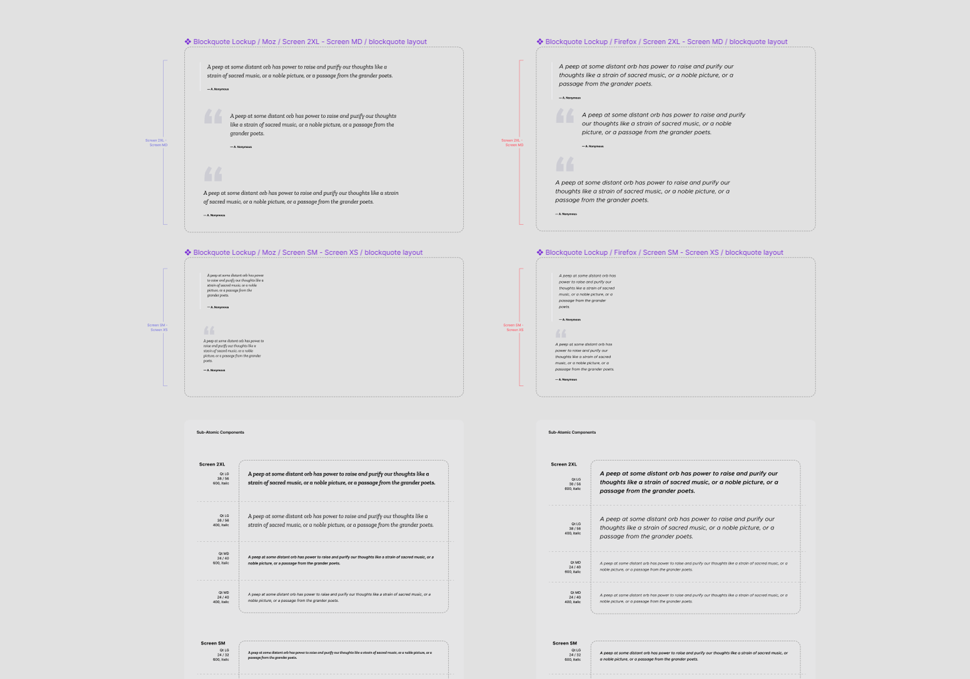
The Blockquote component is used frequently to display statements from the C-Suite and industry leaders, customer testimonials, and various quotes within blog posts. As such, the redesign needed to retain an editorial feel, but with a more versatile design. I added the ability to display columnar blockquotes, an optional quote icon for aesthetics and to break up long text, and multiple font sizes and weights. Thought was also put into the spacing and line-heights for better readability.
I like to think of myself as an early adopter in all things Figma. So, when Variables and Modes were introduced at Config 2023, I began experimenting and implementing these new features into Protocol. The entire system is Variable-based and uses Modes for color theming. But, as a core system powering several products, I also wanted to automate responsive design and brand theming. The following demo shows how this was achieved using Variables and Modes.
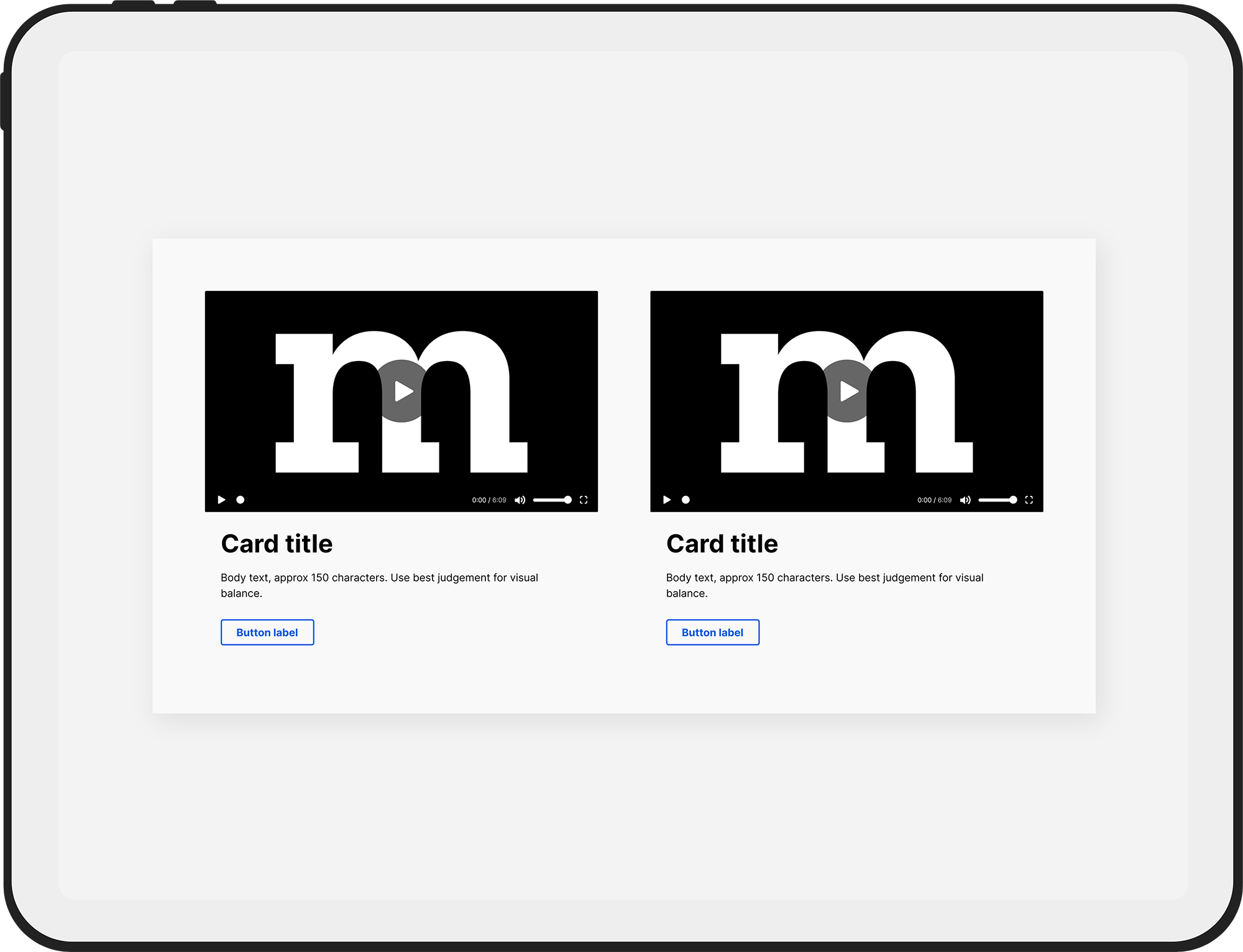
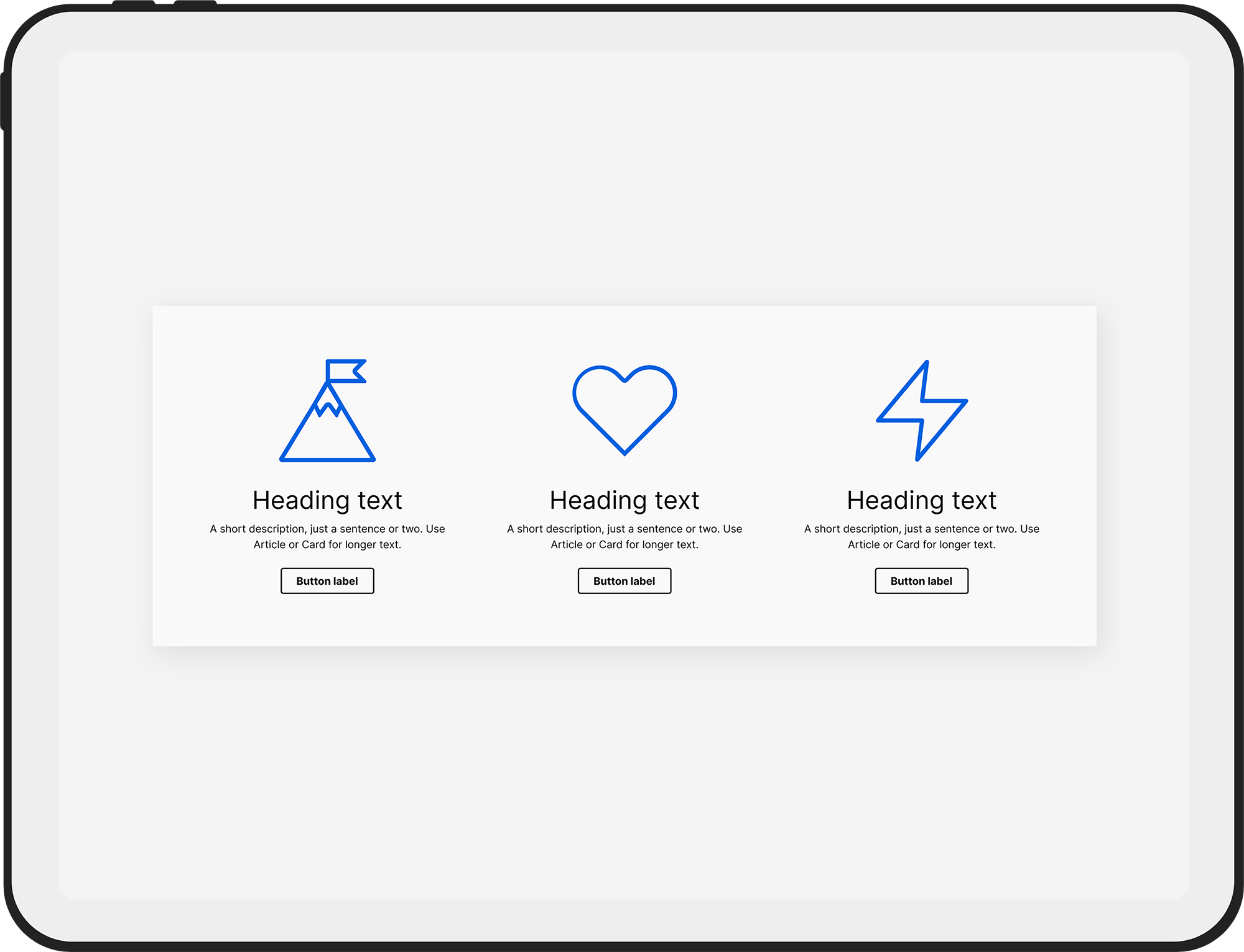
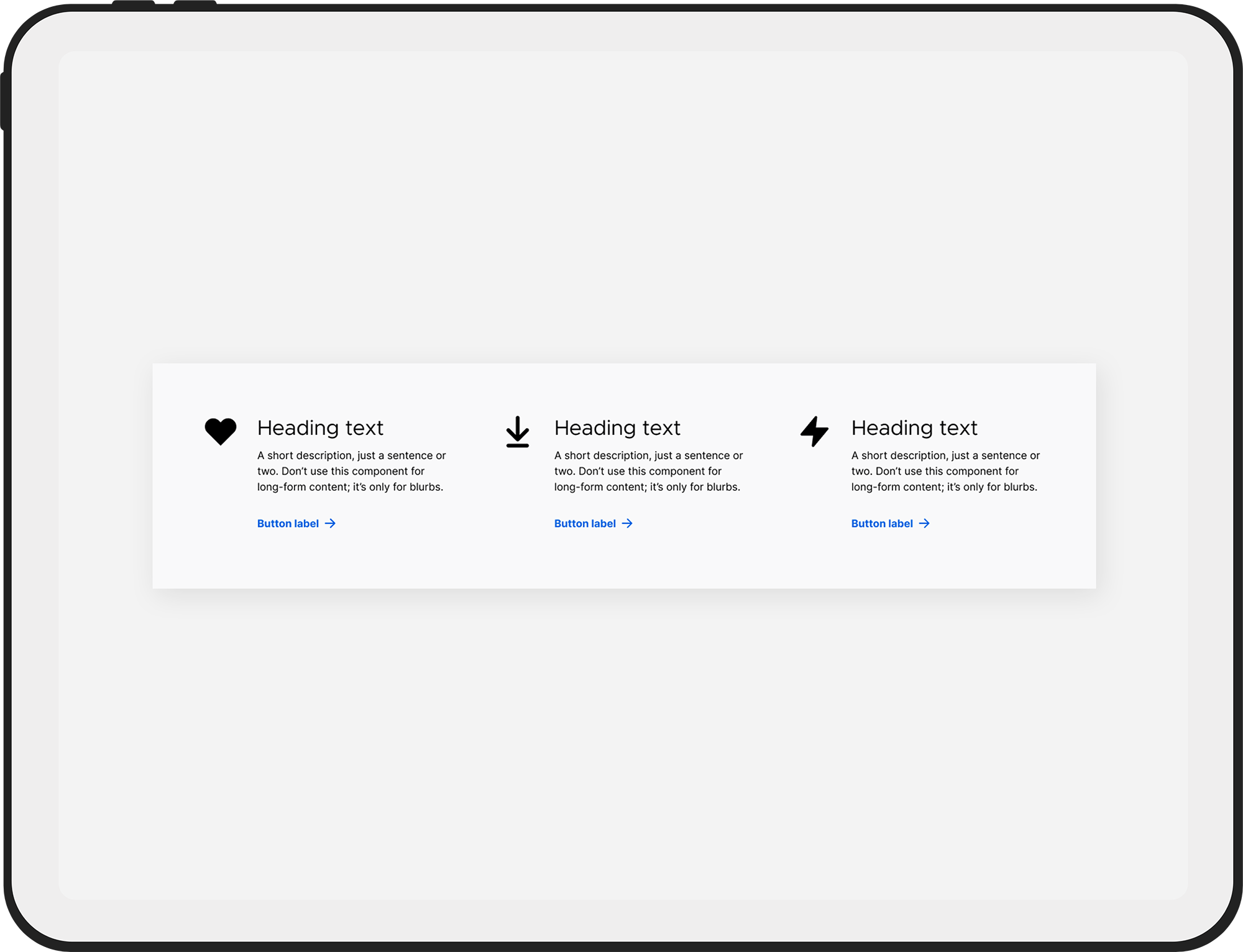
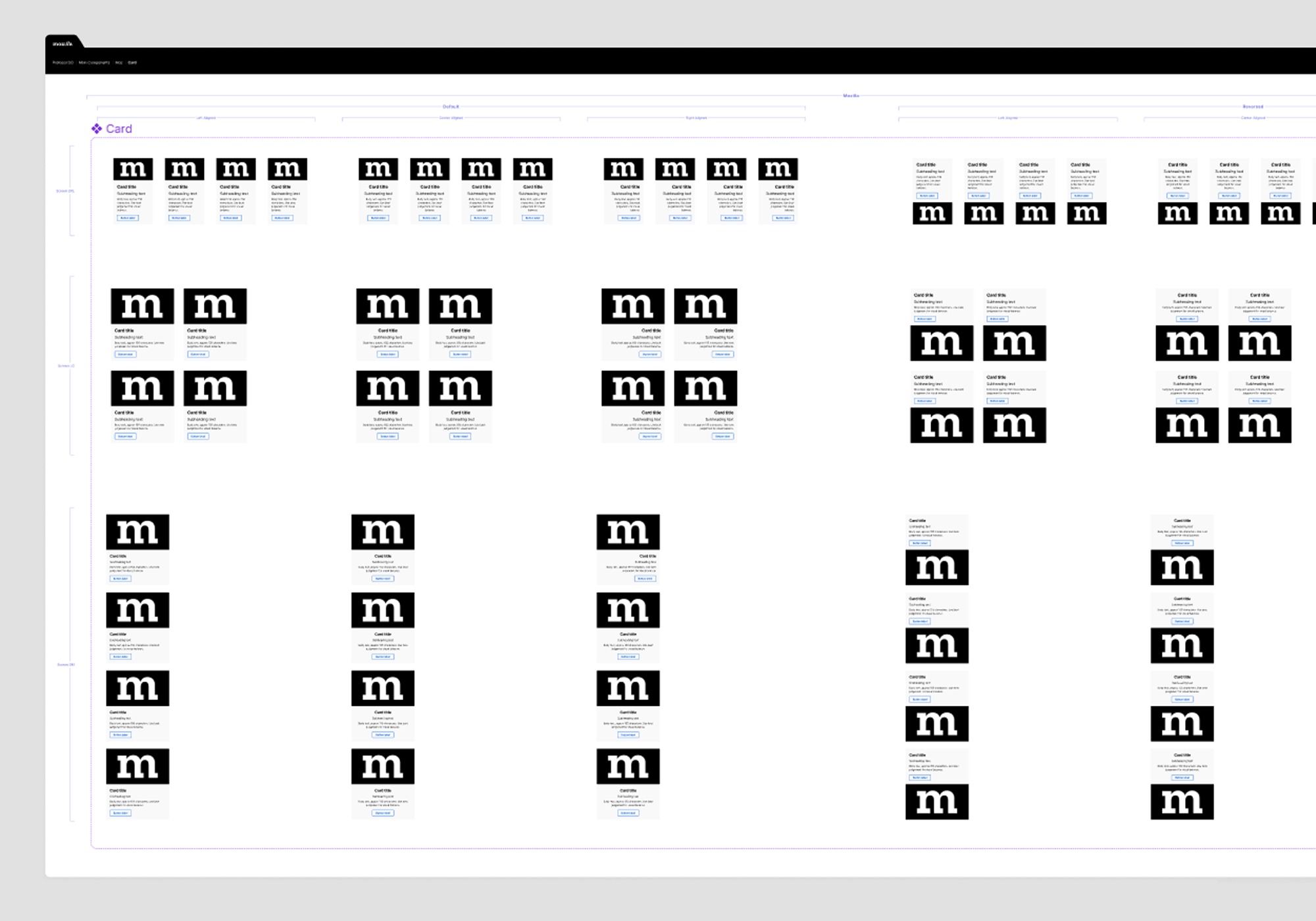
The Card component is a columnar component with full development specs built-in. Designed to be configured fully from the component properties panel, the Card component is complex and versatile. The following is a brief walkthrough showing the Card component configurations.
To showcase the versatility of Protocol to leadership and stakeholders, I opted to create presentation slides as Figma prototypes, which are designed from Protocol components. This was an important features, as it helped to show Protocol can be used for so much more than just websites.