Mozilla
San Francisco, California
Mozilla Privacy Protection Plan: designing a bold landing page for Mozilla’s new bundled privacy subscription, combining Firefox Monitor Plus, Firefox Relay, and Mozilla VPN into a single offer.
Product design // visual craft
My role
Sr product designer
Core skills used
- UI / web design
- Visual design
- Interaction design
- Cross-function
- AI prototyping
- AI content
Project overview
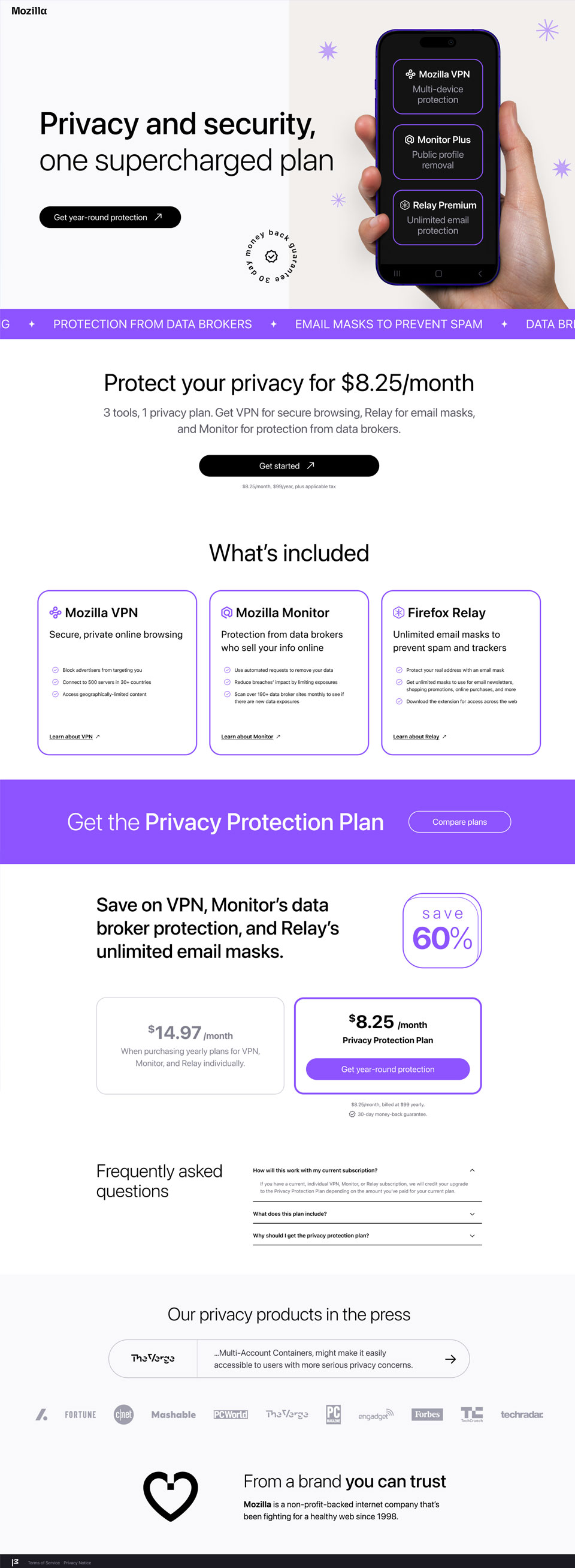
When Mozilla bundled Firefox Monitor Plus, Firefox Relay, and Mozilla VPN into one discounted subscription, I designed the landing page used to launch and explain the offer as a single privacy solution. The page was intentionally aimed at a younger audience, so the visual direction pushed beyond Mozilla’s typical product marketing while still needing to feel credible, accessible, and aligned with the broader Firefox and Mozilla ecosystem. The final design uses a bold pink and purple palette, high-contrast typography, and a clear conversion path to balance visual energy with clarity and trust.
Team structure
This project required coordination across product, content, marketing, and brand considerations. The page had to communicate the combined value of three distinct privacy products within one coherent offer, while also reflecting Mozilla’s voice and trust-based positioning. My work brought together competitor research, product positioning, content hierarchy, accessibility, and visual design execution into a single landing page experience.
My role
I led the design direction, layout strategy, and accessibility planning for the page, with focus on crafting a persuasive experience, while ensuring no unintentional dark UX patterns find their way into the page. I also translated Mozilla’s internal persona work into the visual and structural direction of the design, primarily targeting a gen-z audience while ensuring the page still felt credible and relevant to millennial and gen-x users.
Challenges and considerations
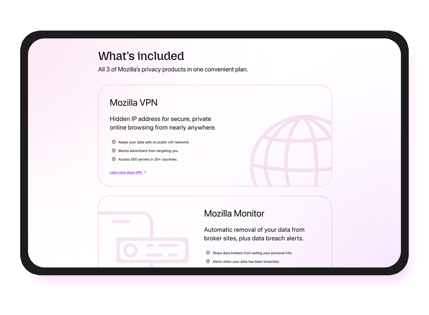
Because the offer combined three separate privacy products into one subscription, the page needed to explain the bundle clearly and make it feel like a unified experience, rather than a set of disconnected tools. The visual direction pushed beyond Mozilla’s usual style, so the design had to feel contemporary and expressive without losing the trust and seriousness expected in a privacy product. Since this was a paid subscription, the conversion flow also needed to stay clear, respectful, and transparent. The project involved multiple stakeholders with different priorities around conversion, brand, trust, and product positioning, which added complexity to the work.
Strategy and execution
I approached the project through research, content strategy, audience calibration, and visual craft.
The most important research was not benchmarking competitor websites, but understanding what people were already saying about Mozilla and its privacy products. I looked at audience perceptions, recurring praise, and areas of skepticism to identify where Mozilla already had trust and where the offer needed stronger explanation or reassurance. That helped shape a landing page strategy grounded in real sentiment rather than assumptions.
I used those insights to guide both messaging and structure. Instead of relying on broad privacy language, I focused on clarifying the value of the bundle, reinforcing trust, and addressing the kinds of concerns users were already expressing. This thinking shaped how the page framed the problem, introduced the offer, and built credibility through proof points, product value, and a more transparent subscription story.
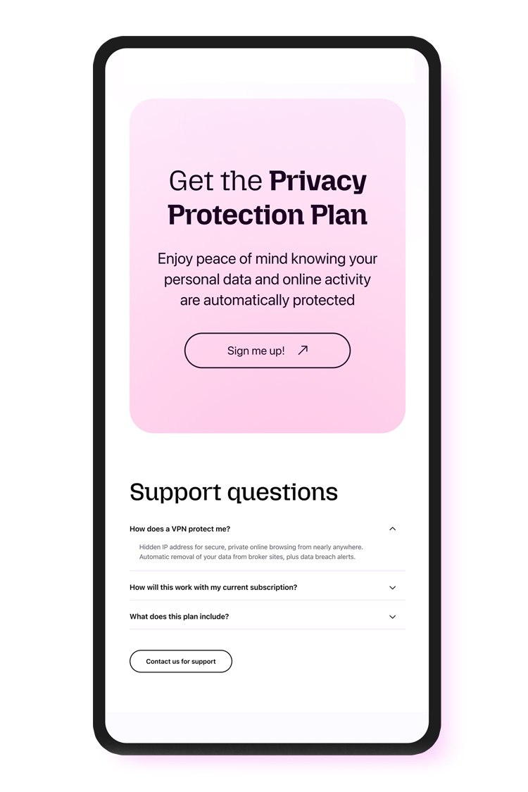
Structuring the page for a straightforward conversion journey
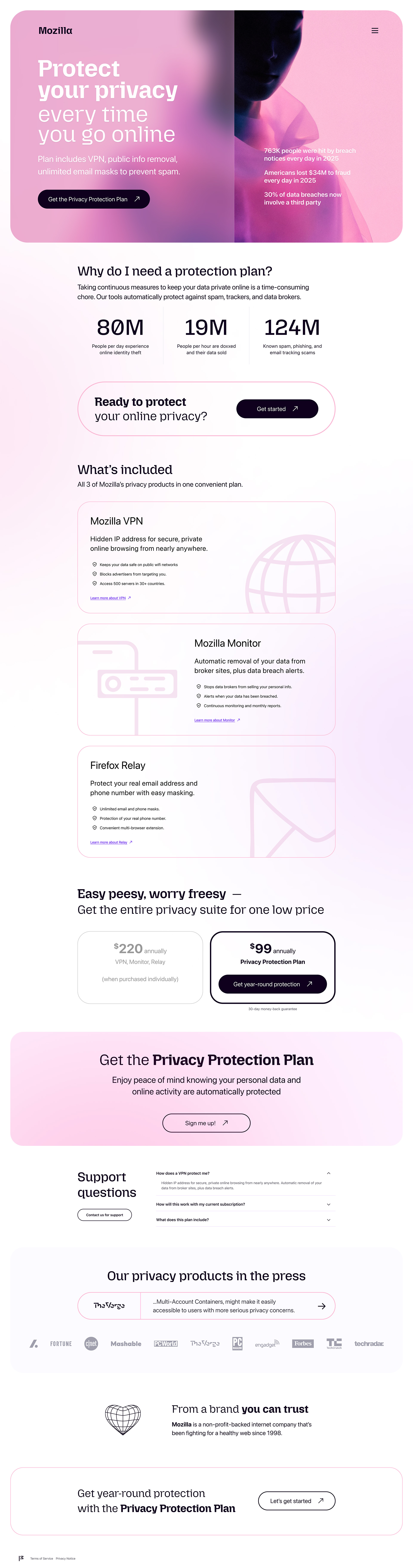
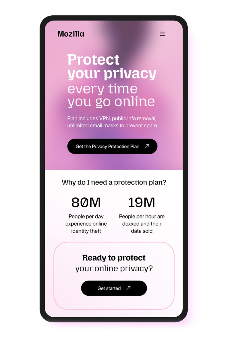
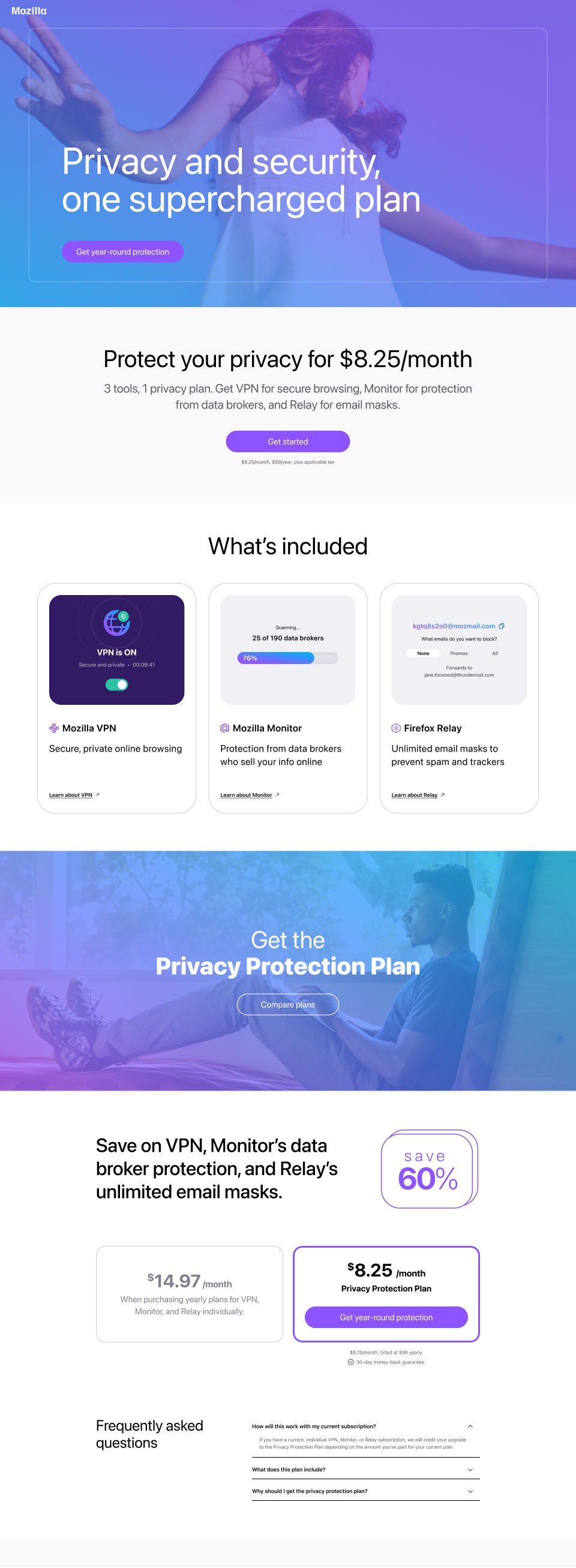
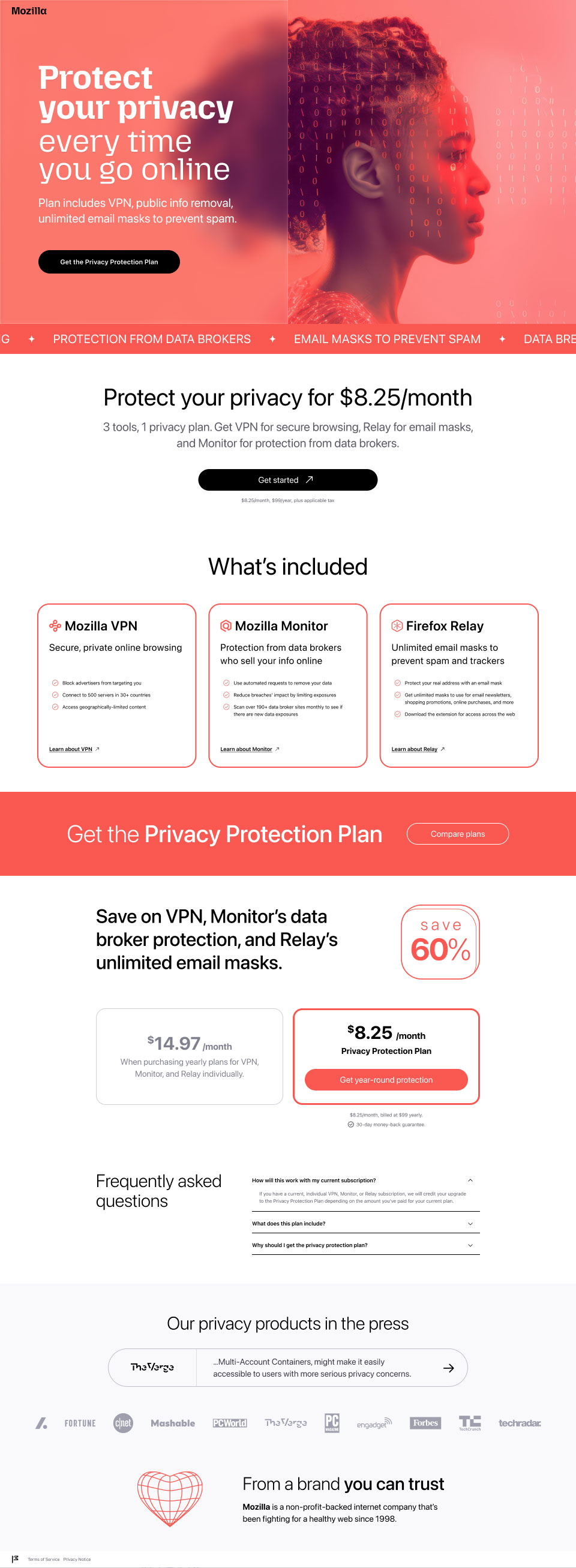
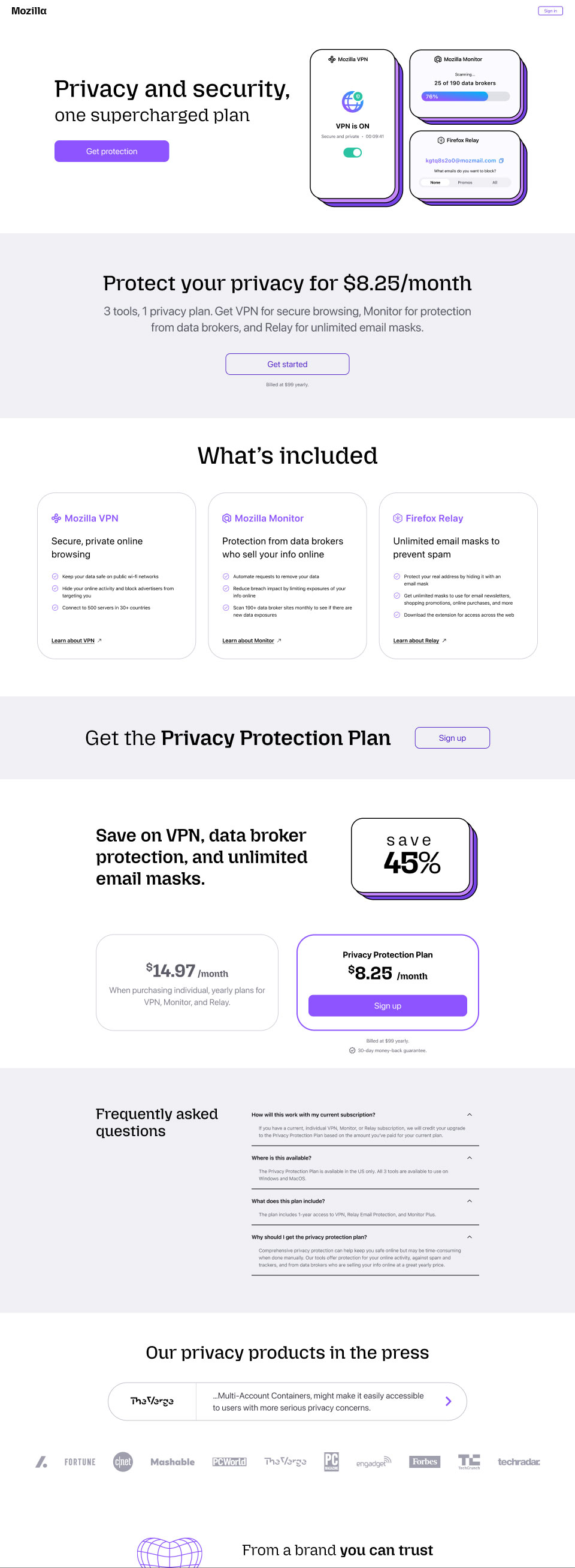
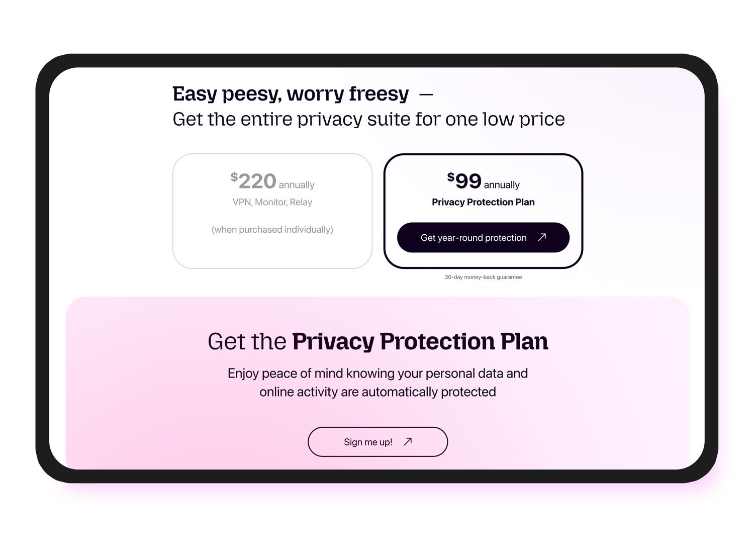
The page was intentionally designed to be minimal, direct, and easy to move through. Its structure follows a clear path: hero, problem framing, included products, pricing, repeated calls to action, and supporting trust content. That sequence helped simplify a bundled offer by introducing the subscription gradually instead of overwhelming users with detail too early. The result was a conversion journey that felt clear and focused without becoming aggressive.
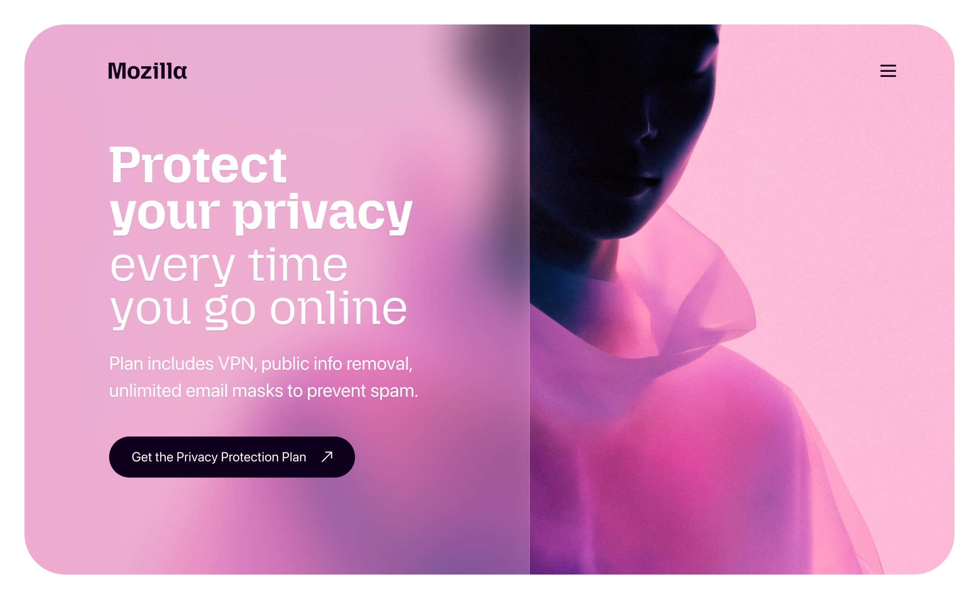
Designing a bold visual direction within Mozilla brand boundaries
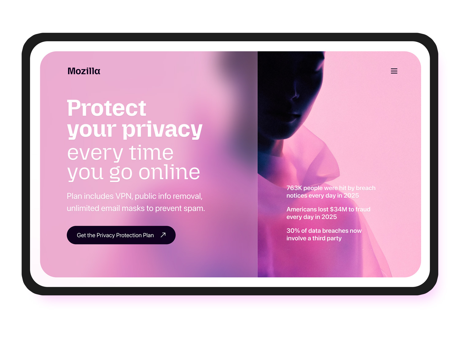
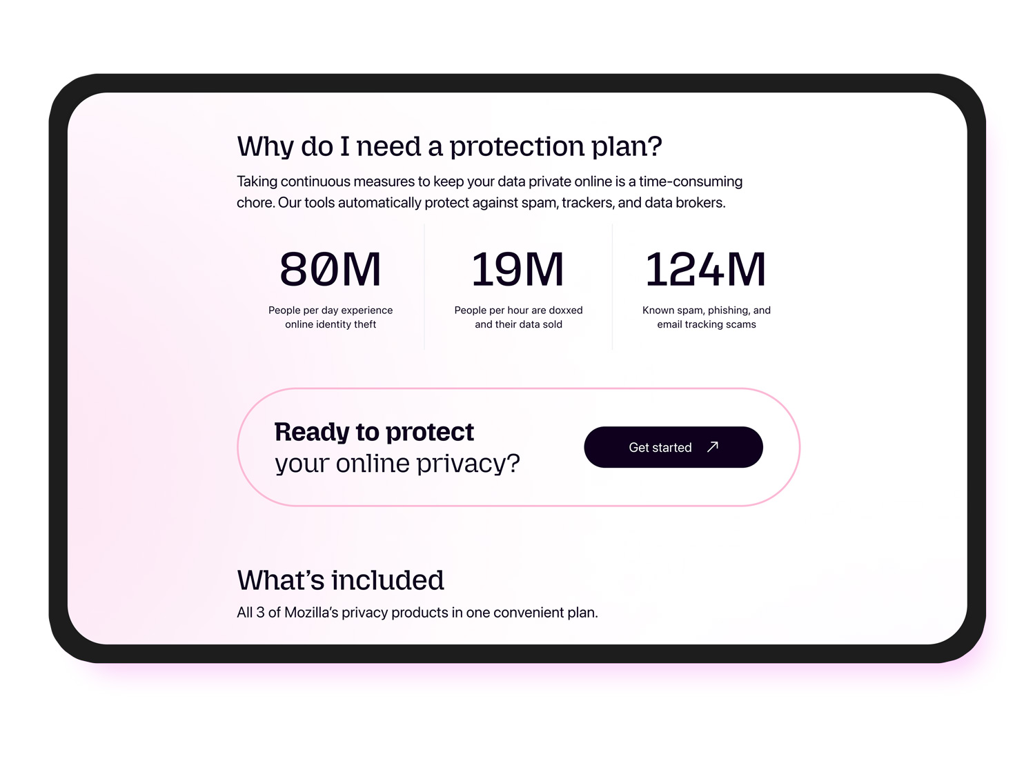
The landing page uses a more experimental visual style than Mozilla’s typical product marketing, with a dramatic hero, layered gradients, and oversized typography. I kept it grounded in recognizable Mozilla cues while reducing some of Firefox’s usual whimsy to better match the seriousness of topics like doxxing, domestic abuse, and data exposure.
A central part of the hero was a scrolling, terminal-like text block featuring real stats about online privacy, email spam, doxxing, and digital safety. It was designed to create urgency without feeling alarmist, helping frame the problem space in a way that felt dynamic, credible, and clear. We chose this approach instead of screenshots or in-app imagery because showing all three products individually made the offer feel fragmented. The animation created a more unified metaphor for risk and protection, reinforcing that the bundle was meant to work as a connected privacy solution rather than a set of separate tools.
Translating persona strategy into visual and content choices
Mozilla had developed three personas to guide privacy product work, and I used them to shape both the visual tone and the messaging strategy. The visual direction primarily targeted the gen-z persona through a bolder hero, gradients, oversized type, and a more editorial feel. At the same time, the page also supported the values of millennial and gen-x audiences with straightforward pricing, clear bundle value, trust messaging, and credibility-building content lower on the page. This helped the experience feel youthful without becoming too narrow or exclusionary.
The following shows 3 early concepts, based on a wide range of input, that helped hone the final design direction.
Building clarity into each section of the page
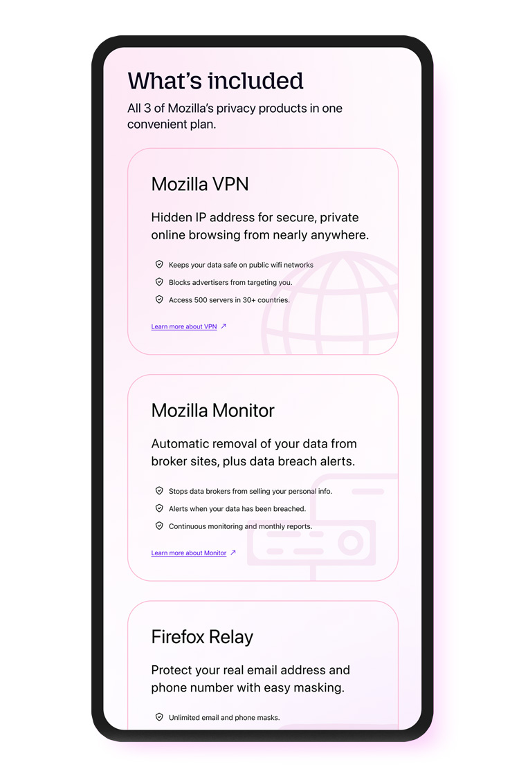
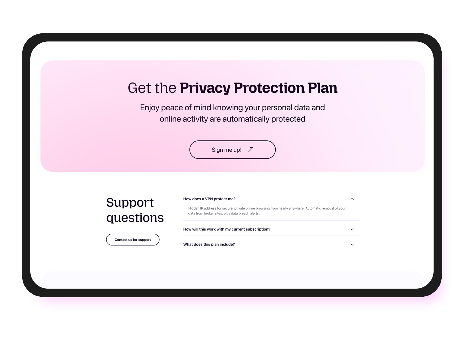
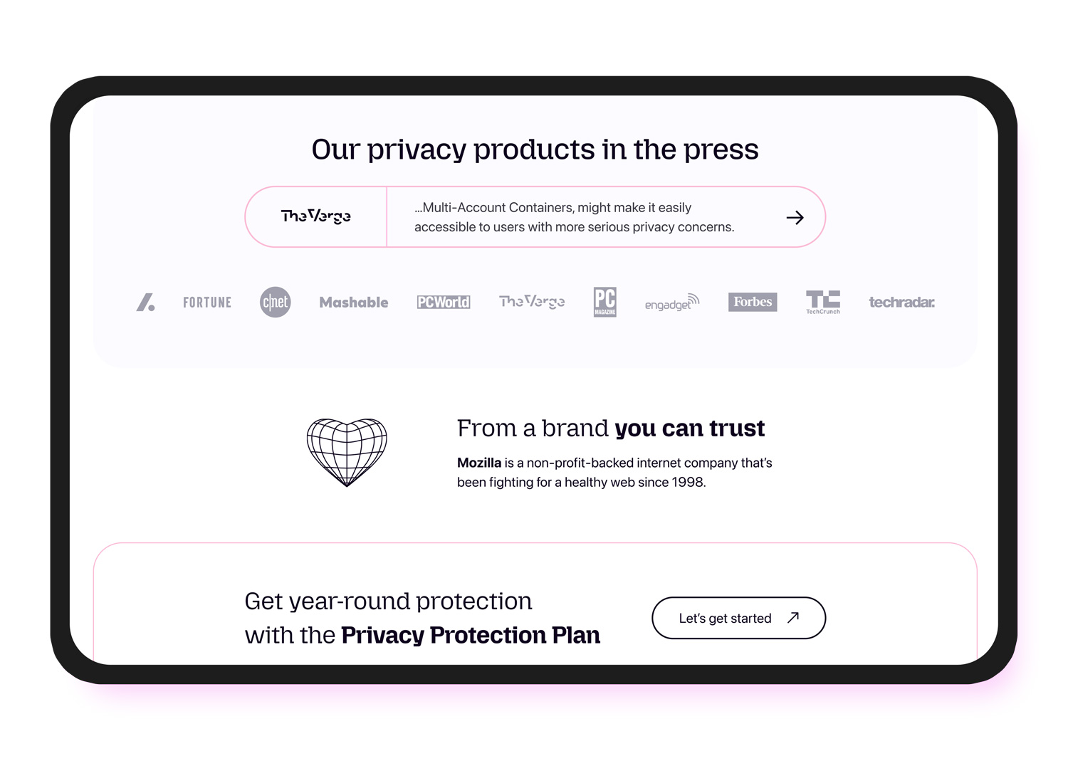
The page was designed as a sequence of clear, digestible modules. The hero introduces the offer, the stats section reframes privacy as an everyday issue, and the product cards make the bundle tangible by breaking out each included product. The pricing section makes the discount easy to understand, while repeated CTAs, FAQs, press mentions, and trust modules reinforce confidence throughout the scroll. This pacing helped keep the experience readable and easy to scan without sacrificing substance.
Prioritizing accessibility in layout, hierarchy, and responsive behavior
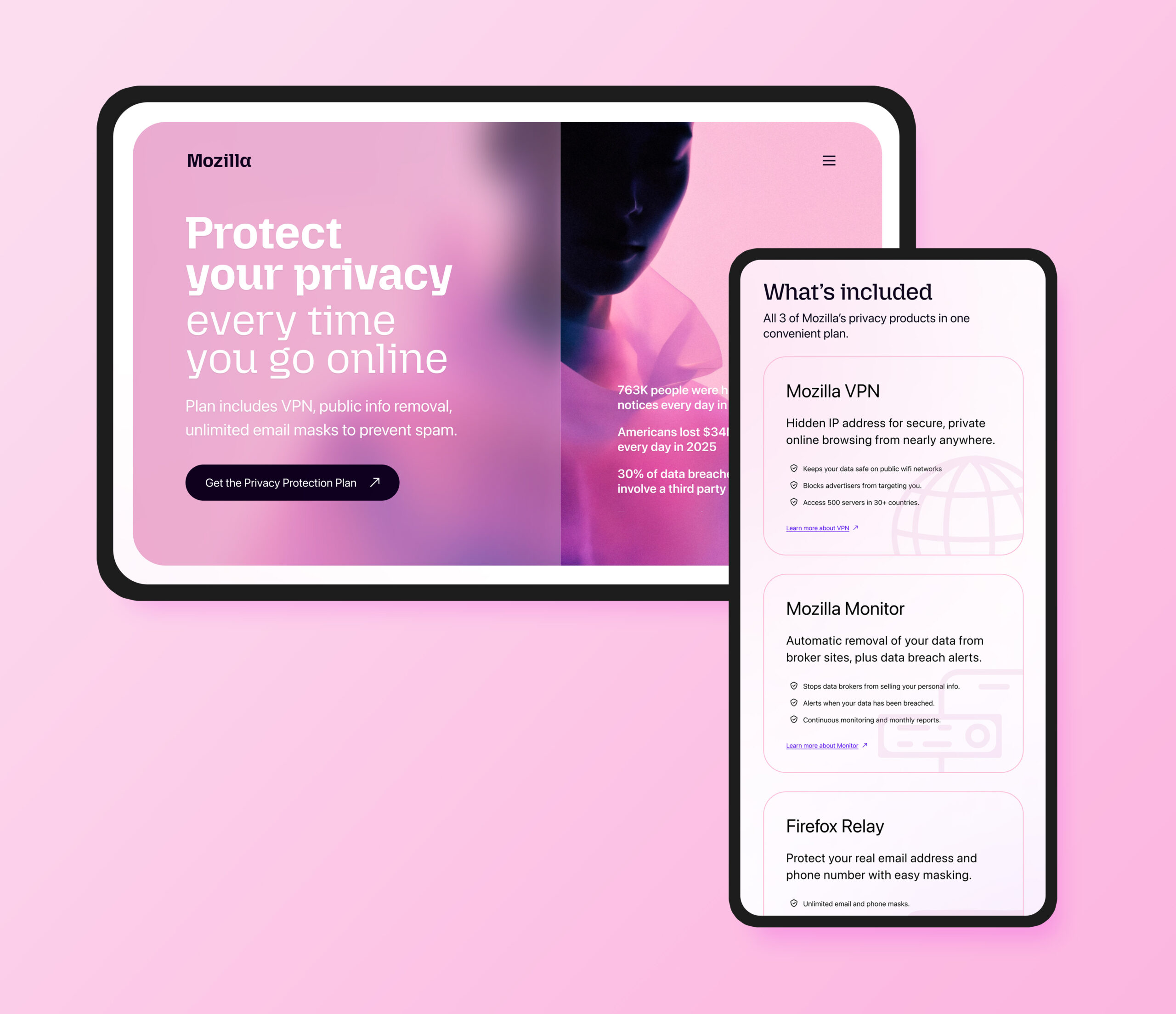
Accessibility was part of the design from the start. Because the page includes bold typography, image-led content, product cards, pricing modules, and repeated CTAs, each section needed to work clearly across desktop and mobile. I paid close attention to hierarchy, spacing rhythm, stacking behavior, and responsive reflow so the page remained understandable and navigable at smaller breakpoints. I also considered semantic flow, assistive technology behavior, and reading order to ensure the bold visual treatment did not come at the expense of usability or compliance.
Avoiding dark UX patterns
Because this was a subscription landing page, I was intentional about making it persuasive without making it manipulative. The design uses strong hierarchy and repeated calls to action, but it stays transparent about what the plan includes, what it costs, and why it’s relevant. I avoided ambiguity and artificial urgency, which was especially important given Mozilla’s trust-based brand position and the sensitive nature of the products.
Result
The final page created a distinct marketing surface for Mozilla’s bundled privacy subscription by combining three separate product stories into one cohesive offer. It expanded Mozilla’s visual language in a way that felt more contemporary and youth-oriented while preserving trust and brand continuity. From a UX perspective, it balanced accessibility, persuasion, and ethical subscription design within a serious product category. The result was a page that felt both bolder and more mature.
Product design impact
This project shows product and marketing design grounded in research, accessibility, and strategy. It required clarifying how Mozilla’s privacy products could stand apart from competitors, shaping content around real user concerns, and creating a visual direction that could appeal to younger users without weakening trust. From a craft perspective, the work centered on making a high-contrast, visually expressive page still feel organized, legible, and credible.
Reflection
This project reinforced that strong landing page design includes visual excitement and conversion, but, more importantly, it’s about understanding the emotional context of the product, clarifying the value proposition, and building trust through every layer of the experience.
It also reinforced the importance of intentional tone. Even though the brief allowed for a much bolder visual direction, the most effective solution was one that balanced expressiveness with seriousness. For privacy and security products, good design needs to attract attention, but it also has to communicate care, credibility, and clarity.
High fidelity design