

Mozilla / Firefox
San Francisco, California
Acorn (Firefox) design system: Retooling and expanding Firefox’s design system during a major browser redesign, with a focus on designer usability, component architecture and craft, engineering alignment, and adoption and enablement.
My role
Senior system designer
Product type
- Design system refresh
- Design ecosystem
Principles
- Systems thinking
- Inclusive design
- Accessibility
- Brand cohesion
- Ecosystem cohesion
Leadership
- System strategy
- Design governance
- Cross-functional collab.
- Adoption strategy
- Support, training
Design + craft
- Component craft
- Visual design
- Interaction design
- Documentation
- AI prototyping
- AI content
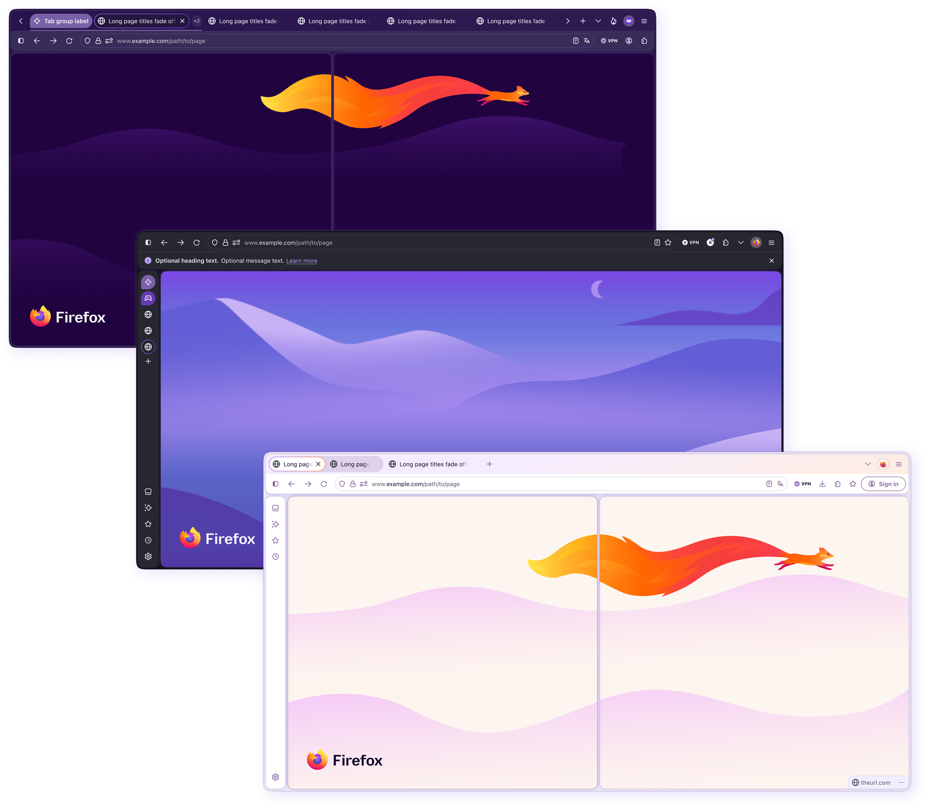
Acorn at a glance
Acorn provides the foundations, components, patterns, and guidance used to design the Firefox browser. Its architecture accommodates browser-specific interactions, operating system differences, customizable layouts, and accessibility settings.
The Nova inflection point
Project Nova was a major modernization of Firefox’s interface, introducing stronger visual expression, product personality, and moments of delight, as well as a moderate retooling of some interactions. The direction was informed by large-scale research, particularly with Gen Z participants. Although participants considered Firefox highly functional, many felt its appearance made the product seem dated.
Responding required the visual language, interaction patterns, and supporting system to evolve together. Nova provided an opportunity to address existing limitations while preparing Acorn for more ambitious product experiences.
My role
I combined system direction with hands-on component design, working across product design, accessibility, and engineering to translate emerging requirements into reusable solutions.
I served as a system, visual, interaction, and UI authority for the redesign, ensuring that newly introduced patterns aligned with brand, Firefox design standards, and engineering constraints, and were visually consistent across all surfaces. My work revolved heavily around design system governance, system architecture, component craft, engineering parity, and the enabling of teams to successfully adopt the updated, more robust system. I also guided adoption and supported designers as they applied the system to product work.
The system challenge
The redesign moved quickly across multiple product teams that were exploring and delivering new UI patterns in parallel. Requirements continued to evolve, ownership was distributed, and teams often needed to make progress before every downstream use case was known.
Without clear governance, the redesign could easily have produced duplicate components, conflicting patterns, inaccessible solutions, and structures optimized for a single feature instead of the wider product. At the same time, applying rigid system rules too early could have blocked useful exploration and slowed the redesign.
The challenge was to create enough structure to protect the system while leaving room for teams to solve emerging product needs. This required judgment about when a design was mature enough to become a shared pattern, when a solution should remain locally owned, and when the system itself needed to change.
I helped teams work through this ambiguity by separating immediate product needs from reusable system needs. Proposals were evaluated for recurrence, accessibility, interaction consistency, technical feasibility, and their ability to scale across Firefox surfaces. This allowed the system to support experimentation while establishing clearer standards as patterns matured.
Defining the strategy
I framed the work as a connected system transformation rather than a component production exercise.
A polished component would not solve the problem if it introduced architectural debt, could not be implemented consistently, or remained too difficult for designers to use correctly.
The strategy centered on four areas:
01.
Foundations and architecture
Strengthen the underlying structures needed to support new themes, surfaces, operating systems, and responsive behavior.
02.
Component craft and patterns
Translate new product concepts into flexible, accessible building blocks without accumulating unnecessary variants.
03.
Governance and partnership
Create shared decision-making practices across product design, system design, accessibility, and engineering.
04.
Adoption and enablement
Help designers understand and benefit from the advanced capabilities built into the system.
These areas were treated as interdependent. Architecture shaped what components could support. Product use exposed gaps in the architecture. Governance helped teams resolve those gaps consistently. Adoption feedback revealed where the system still needed to become clearer.
Governance across teams
Deciding what belongs in Acorn
Nova required a governance model that maintained consistency without becoming a bottleneck. I worked directly with product designers during the design phase, helping them address accessibility, brand cohesion, interaction consistency, and technical feasibility before patterns entered Acorn. When reviewing a proposal, I considered:
- Whether the need recurred across teams or surfaces.
- Whether an existing component could support it.
- Whether the proposal introduced duplication.
- How it behaved across supported contexts.
- Whether it could be implemented accessibly and consistently.
- What guidance or guardrails adopters would need.
I presented recommendations as considerations supported by system knowledge, evidence, and product context. Patterns specific to one feature, or still undergoing significant exploration, could remain locally owned. Shared patterns needed clear behavior, supported configurations, and responsibilities for maintenance.
Cross-functional partnership
Design and product team partnership
I worked directly with product designers during the design phase to identify issues early and help designs move efficiently toward implementation. Our reviews focused on four questions:
- Does the design meet accessibility requirements?
- Is it cohesive with the Firefox brand?
- Are the interactions consistent with established product patterns?
- Is there an existing Acorn component or pattern we can use or extend?
My approach was to design with people, not at them. I shared my professional opinions when I felt they could strengthen the work, but presented them as considerations, as opposed to finite design principles or system requirements. I recognize that there is more than one right way to design anything, and I never want designers to feel like pixel pushers; I them to retain creative ownership and confidence in their own judgment.
I was equally comfortable asking for revisions when a design didn’t meet agreed requirements. I explained what needed to change and why, then worked with the designer to find a practical resolution. That made the required changes clear while giving designers room to shape the solution.
Balancing collaboration with responsibility for system quality meant being firm about requirements, but open about how we met them. My goal was to find the quickest route to implementation without sacrificing quality, using early collaboration and clear feedback to reduce avoidable iteration.
Engineering partnership
I involved engineering early when component anatomy, naming, behavior, or token decisions could affect implementation. The objective was to create shared structures that made sense in both Figma and code, rather than resolving parity problems after the design work was complete.
Our collaboration included:
- Aligning component and property naming with implementation concepts.
- Understanding technical constraints before finalizing interaction behavior.
- Reviewing existing coded components before introducing new design structures.
- Connecting Figma variables with engineering token architecture.
- Creating detailed specifications and annotations for states, behavior, accessibility, and responsive rules.
- Using coded prototypes to evaluate complex interactions that static screens could not communicate fully.
This partnership helped engineering constraints inform better design decisions without allowing implementation details to dictate the experience. It also gave engineers clearer guidance and reduced ambiguity during build.
Influence without authority
I influenced decisions beyond my direct ownership by helping partners evaluate competing priorities in the context of the overall experience. Clear reasoning and evidence made tradeoffs easier to understand and helped us reach decisions we could support together.
Balancing accessibility priorities
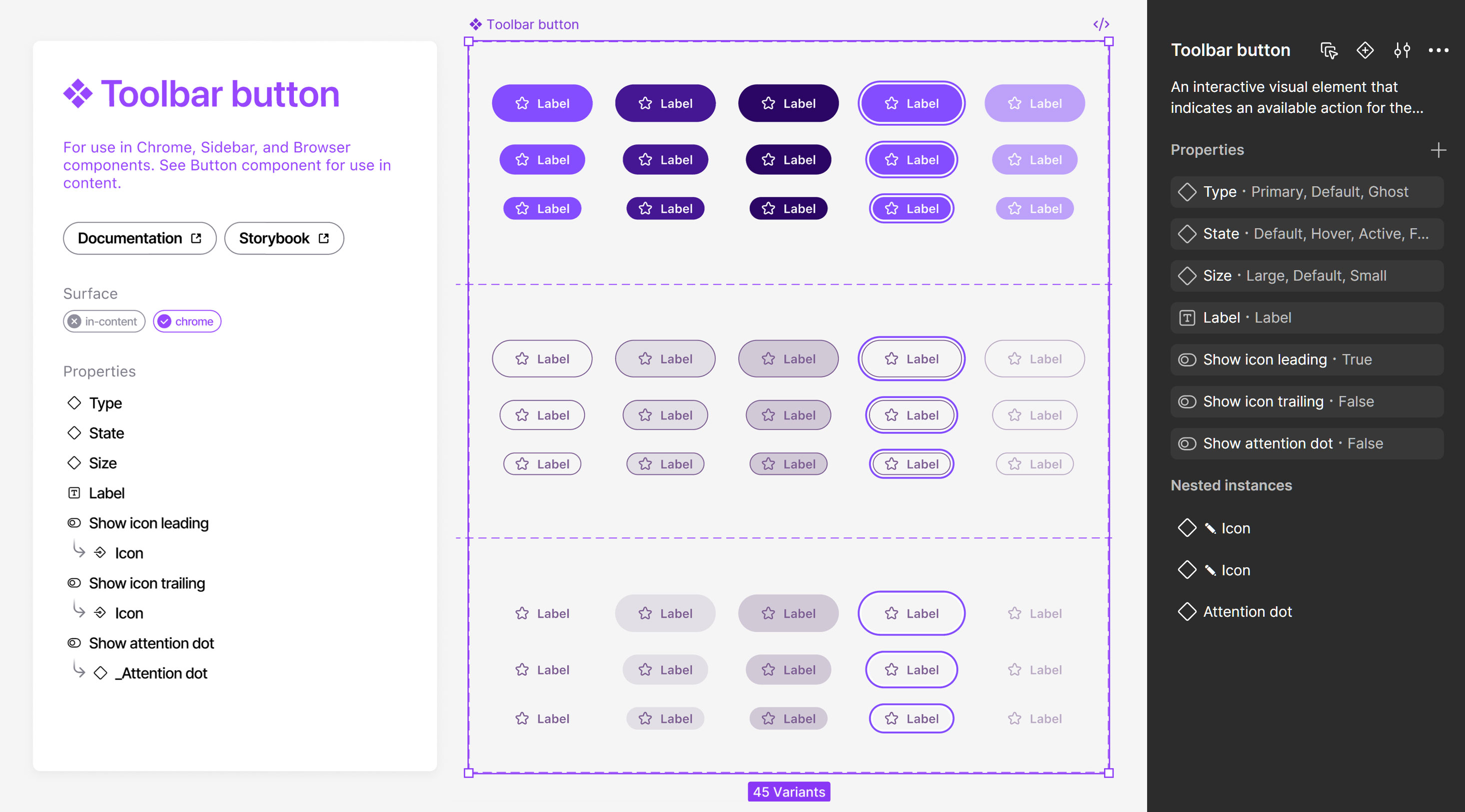
During the Nova redesign, my system teammates and I collaborated with product to develop button colors across Light and Dark modes. The original hover and active states used semi-transparent backgrounds, so we carefully adjusted the palette until every label and icon had sufficient contrast against the button surface.
Our accessibility partners then raised an additional requirement. The button surface also needed sufficient contrast against multiple page backgrounds, not only the default surfaces. Once we tested every combination, it became clear that no single color system could satisfy both contrast relationships across every state and background. The alternatives would either compromise the visual cohesion of the system or cause colors to change so dramatically between states that the interaction became disruptive and unpredictable.
One proposed solution was to invert the button colors between states. It improved contrast in some combinations, but coded prototypes showed that it created a disruptive, flashing effect and made the states harder to follow.
I did not own the final decision, so I focused on helping the group evaluate the problem within the context of the complete experience. I introduced a decision framework that separated what was non-negotiable, what could flex, and what should receive the highest priority.
Button labels and icons remaining readable in every state was the highest priority. Clear state feedback and predictable interaction behavior were also non-negotiable. Achieving maximum contrast between the button surface and every possible page background remained important, but there was more flexibility in low-frequency combinations where every requirement could not be satisfied simultaneously.
I presented this context and logic alongside contrast data and coded prototypes. The prototypes provided evidence, but the systems-level framing helped move the group forward. It shifted the discussion from evaluating isolated contrast values to understanding how each decision affected accessibility, interaction quality, and the experience as a whole.
We aligned on an approach that maintained compliant foreground contrast in every state, preserved smooth and predictable interactions, and brought the button surface as close as possible to the contrast target on less common backgrounds.
The decision moved forward through shared reasoning rather than authority. By bringing context, logic, and evidence into the discussion, I helped partners with different priorities evaluate the tradeoffs and reach alignment together.
Design system overview
This section highlights the component craft, scalable architecture, and modes that helped the Acorn design system support responsive, accessible, and consistent experiences across the newly revamped Firefox browser UI.
Foundations and architecture
I restructured portions of Acorn to address limitations exposed by the redesign. This included consolidating redundant structures, clarifying relationships between parent and nested components, replacing archived library references, and expanding configuration through properties and modes.
This work included:
- Consolidating duplicate components and variants.
- Expanding the use of component properties and nested instances.
- Improving layer, component, and property naming.
- Clarifying parent, child, and unpublished subcomponent relationships.
- Standardizing component page and documentation structures.
- Confirming that variables, text styles, effects, and dependencies came from the correct libraries.
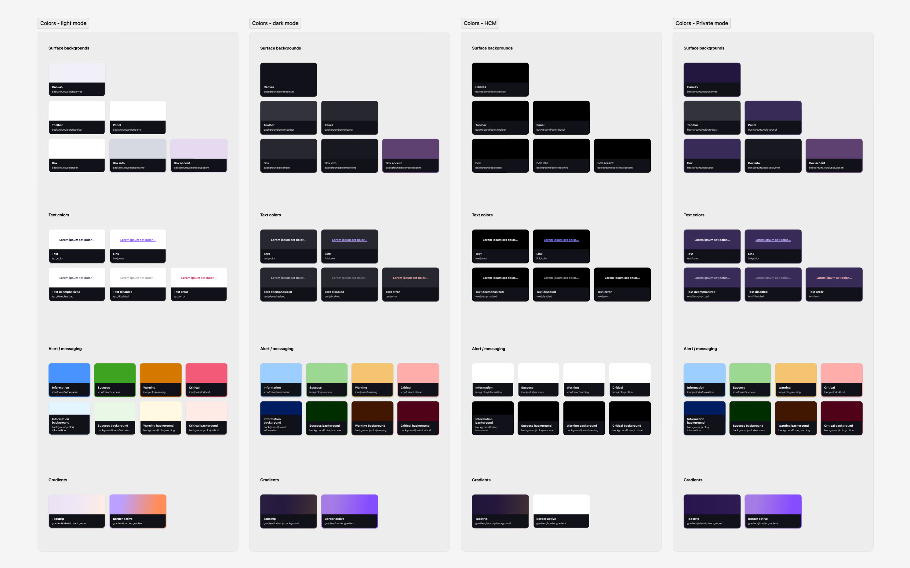
- Expanding support for Light, Dark, High Contrast, Private, and Smart Window modes.
- Accounting for browser chrome, in-content surfaces, and operating system differences.
Token and variable architecture
Acorn variables are closely aligned with engineering design tokens to improve parity between design and implementation. Tokens are managed through JSON and exchanged between Figma and the codebase, creating a shared foundation for color, typography, spacing, effects, and other system decisions.
01 · PRIMITIVE
violet-60
A raw value color, size, duration, spacing value. No meaning attached yet.
02 · SEMANTIC
brand.color.primary
Assigns purpose to a value, such as its role in the brand palette.
03 · COMPONENT
button.background.state
Applies that value to a specific component role or state.
Modes and contextual behavior
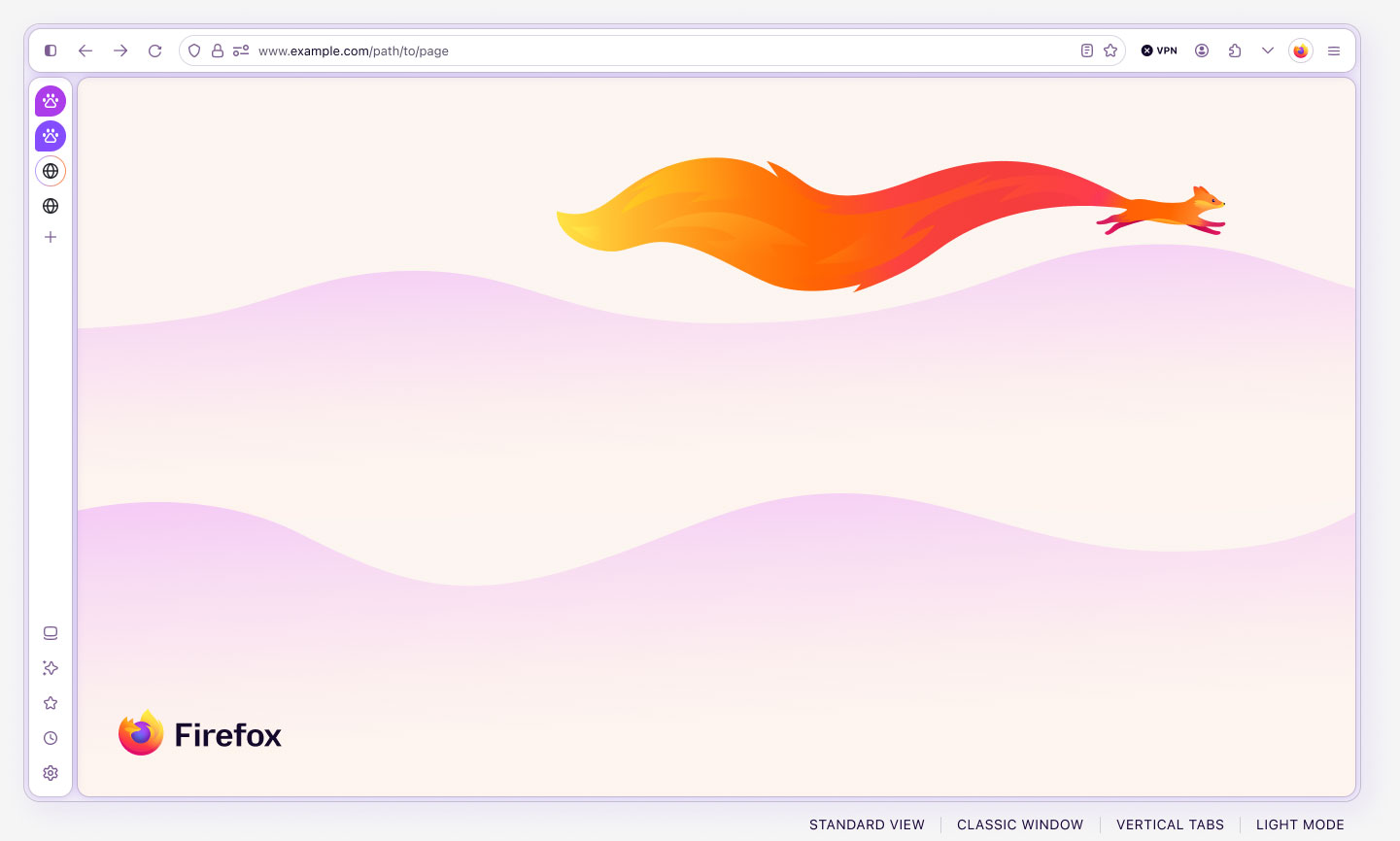
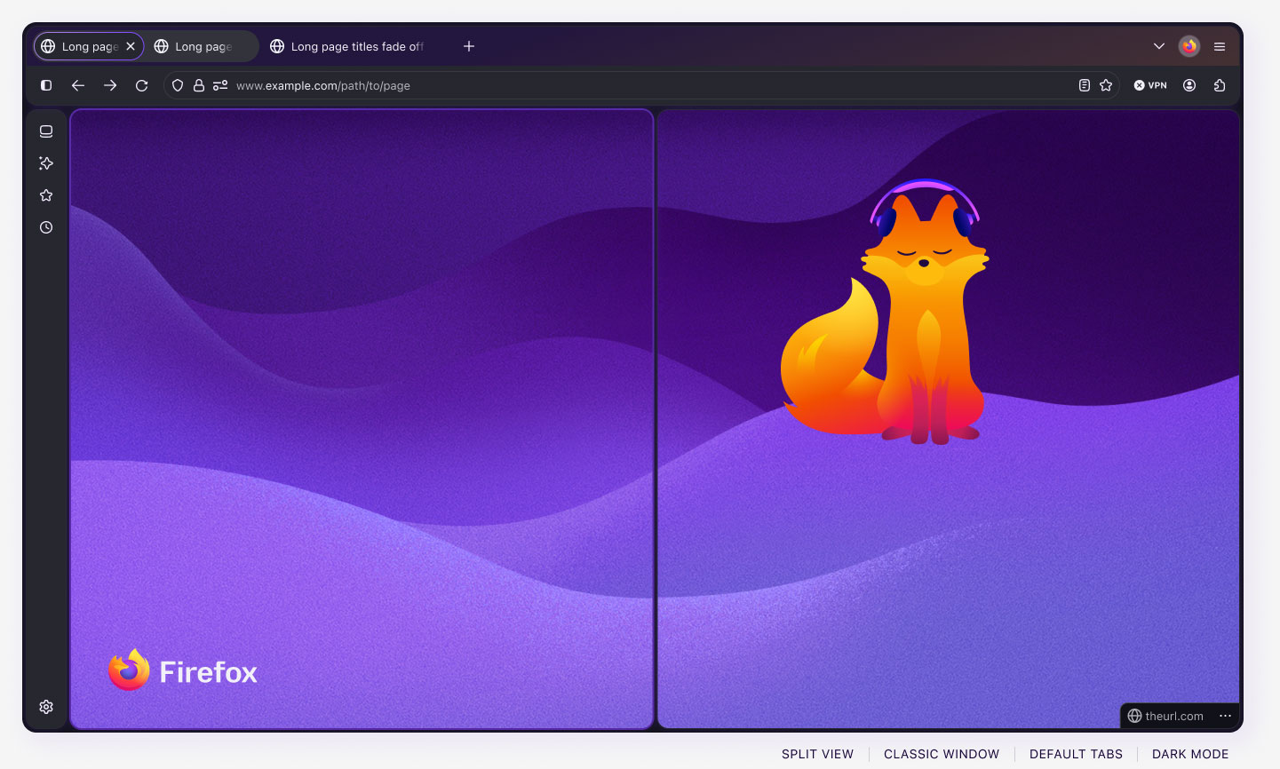
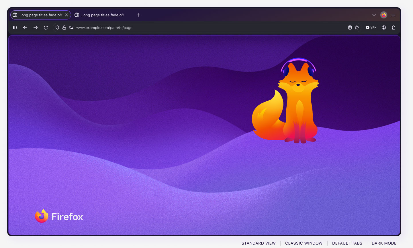
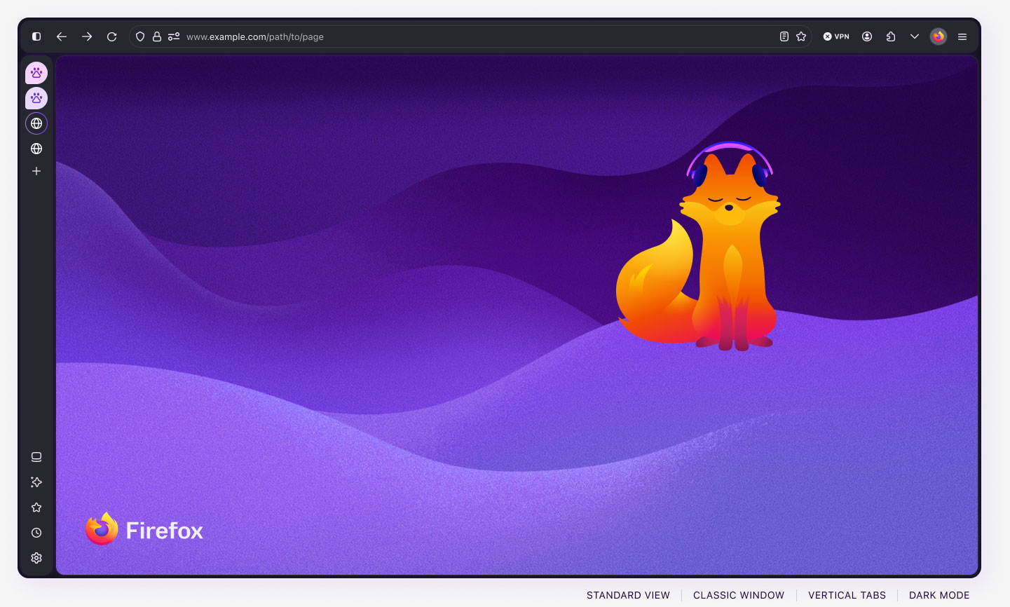
Acorn supports combinations of modes that reflect meaningful changes in Firefox:
- Color and accessibility: Light, Dark, and High Contrast.
- Window experience: Classic, Private, and Smart.
- Surface: Browser chrome and in-content UI.
- Operating system: macOS, Windows 11, Ubuntu, and KDE.
These modes change more than color. They can affect typography, border radius, window treatment, available controls, and component behavior. Encoding those differences into the system allows designers to move between contexts without manually rebuilding or correcting the interface.
Component strategy
The previous Acorn library prioritized engineering structure. Designers reported missing capabilities and components that required too much manual assembly.
I watched a designer struggle to reveal a dropdown menu because the menu item and dropdown were separate components. She was expected to consult positioning specifications and place it manually. A routine task depended on knowledge the component could have incorporated.
That experience illustrated the principle I championed: the system should absorb complexity.
I consolidated related pieces and built more complete components, balancing useful configuration against maintainability. Architectural decisions focused on:
- Which anatomy and behaviors were shared.
- Which differences belonged in variants, properties, modes, or nested components.
- Which controls designers needed to access directly.
- Where flexibility could introduce unsupported combinations.
This shifted recurring setup work into the library while preserving room for product-specific needs.
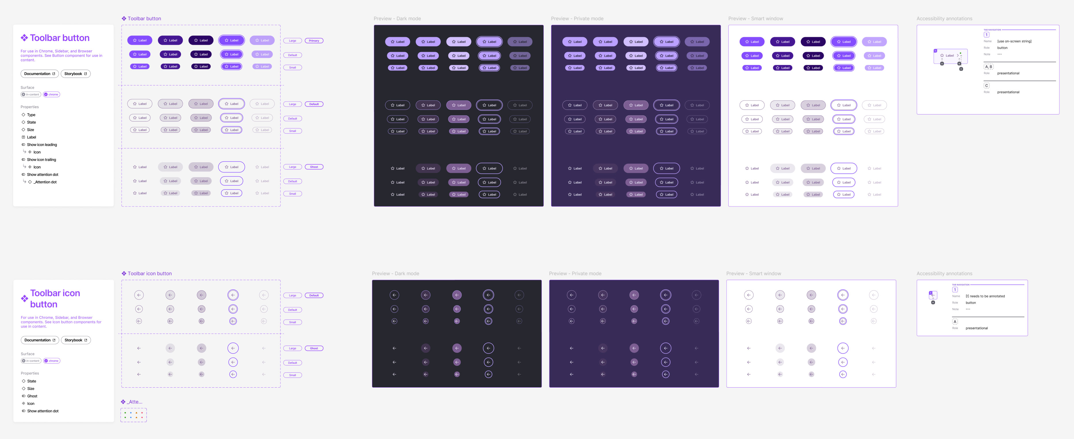
Button component
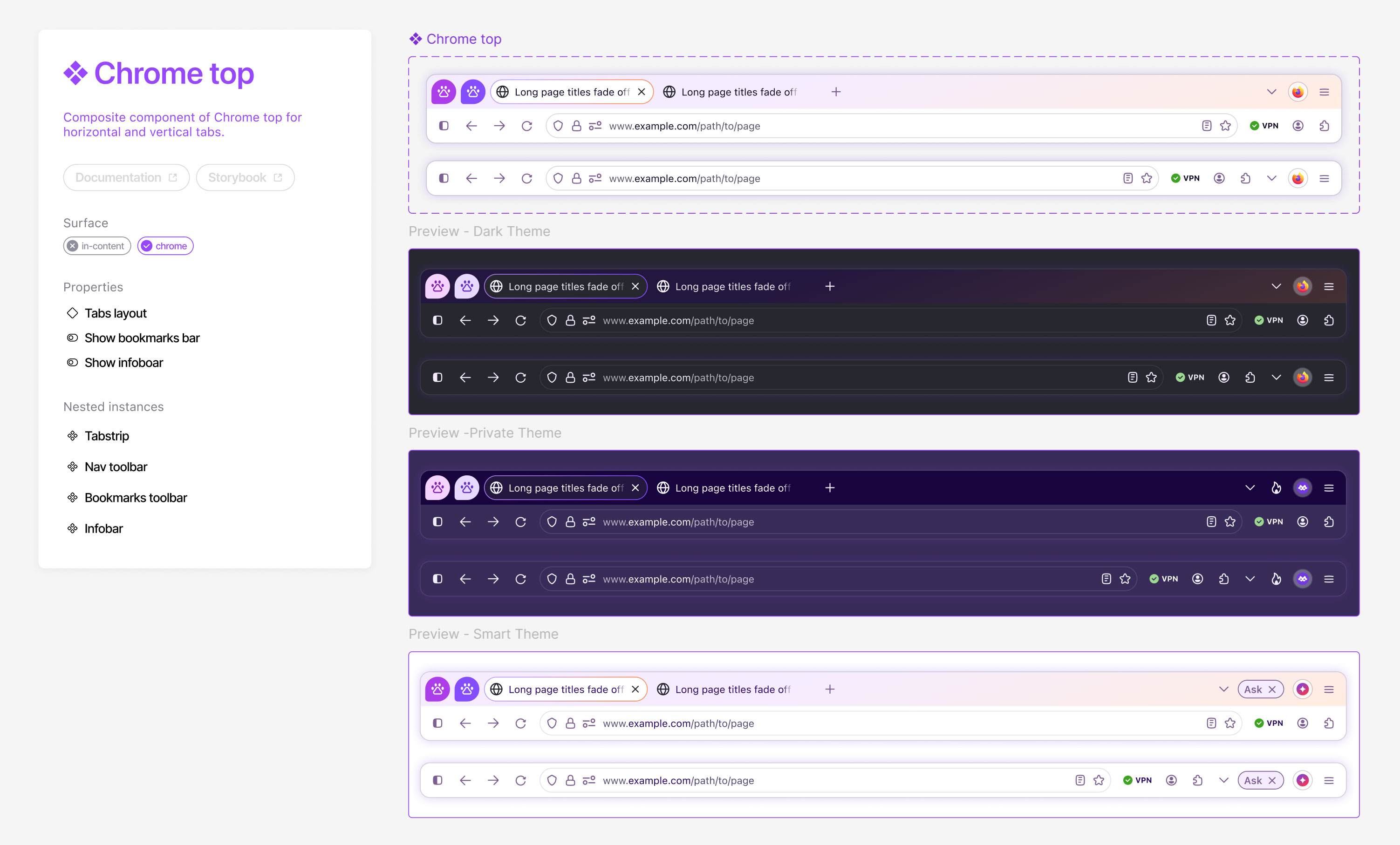
Chrome top component
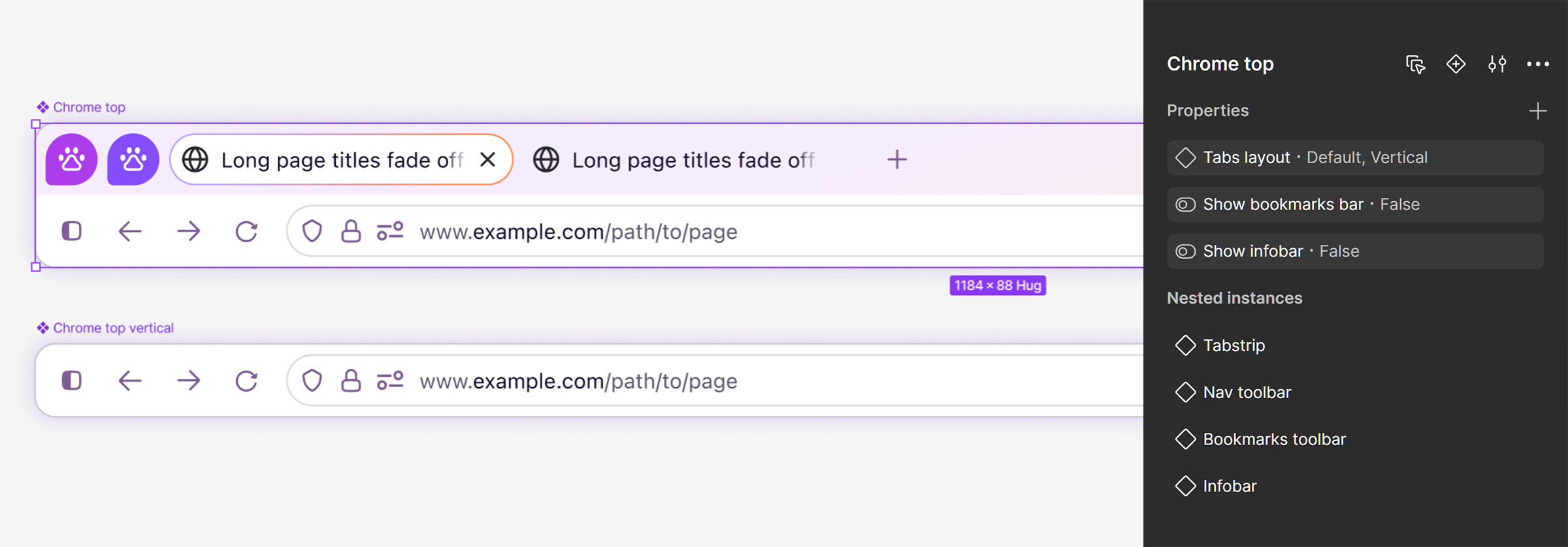
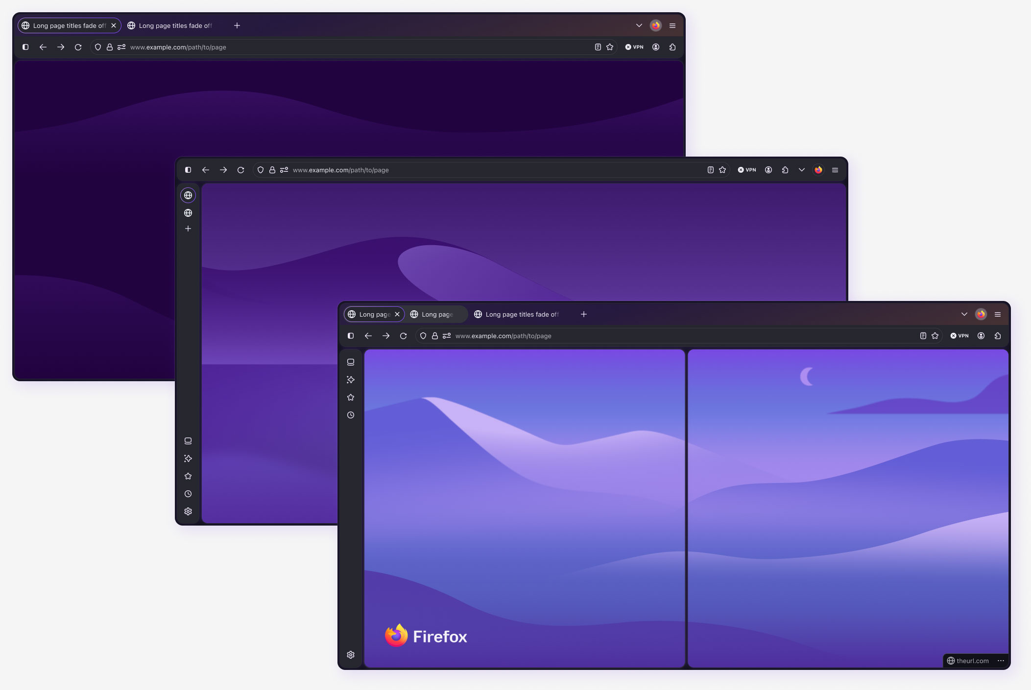
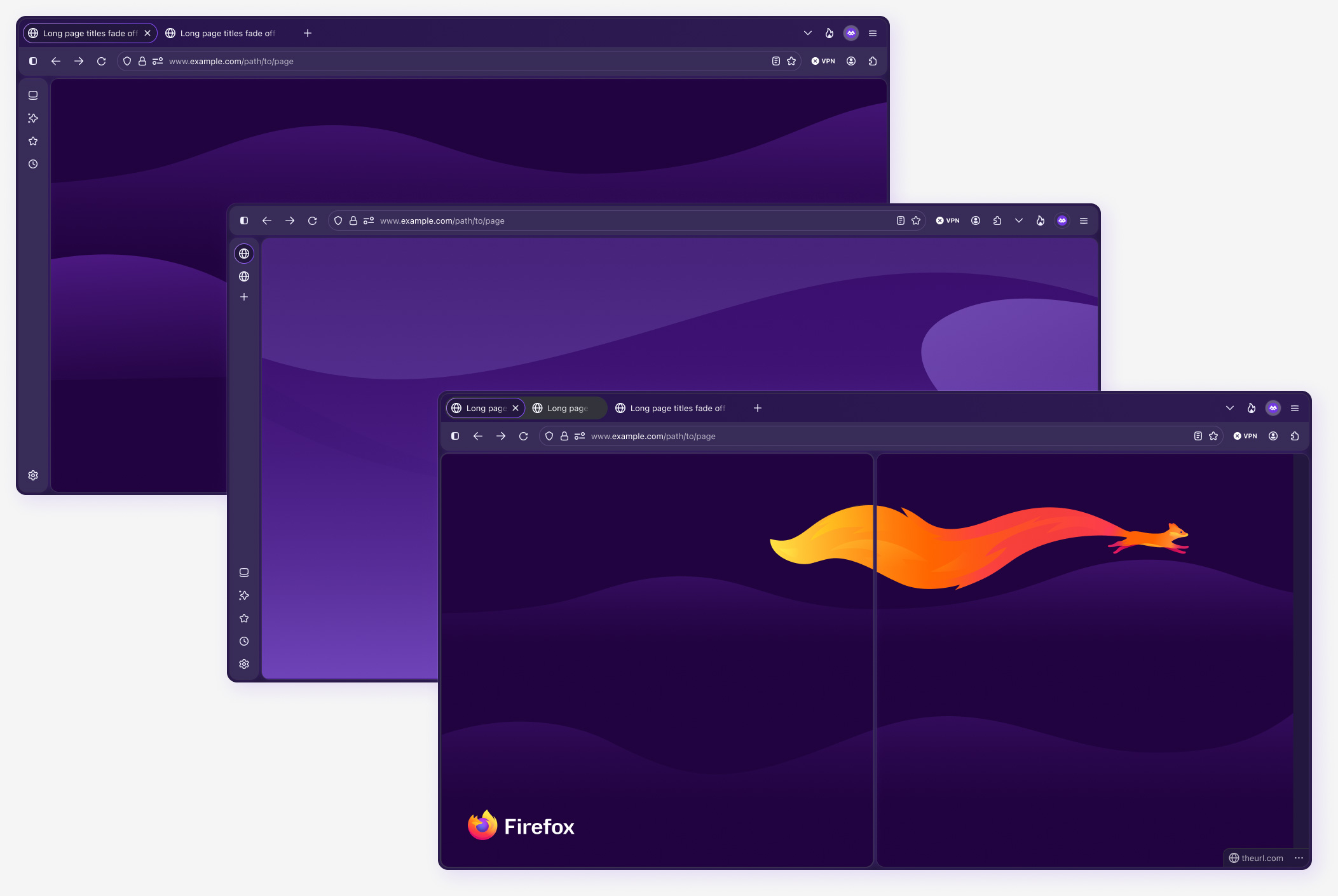
The Chrome top component is the primary (or default) Firefox browser interface, although there are also many other surfaces, such as vertical tabs, sidebars, settings, and more.
The Chrome top component is comprised of several nested components, including the tabstrip, toolbar, URLbar, bookmarks bar, and info bar. Slots are used in these nested components to allow designers to customize placement and options.
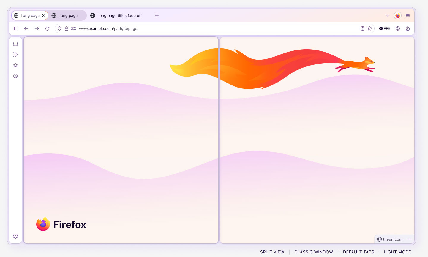
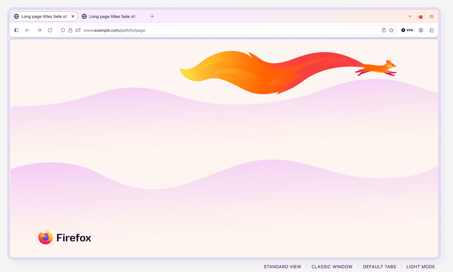
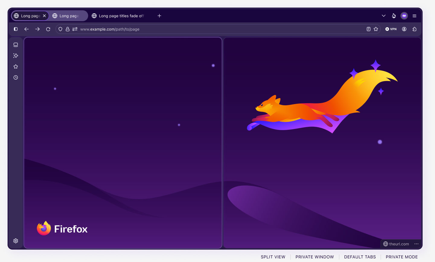
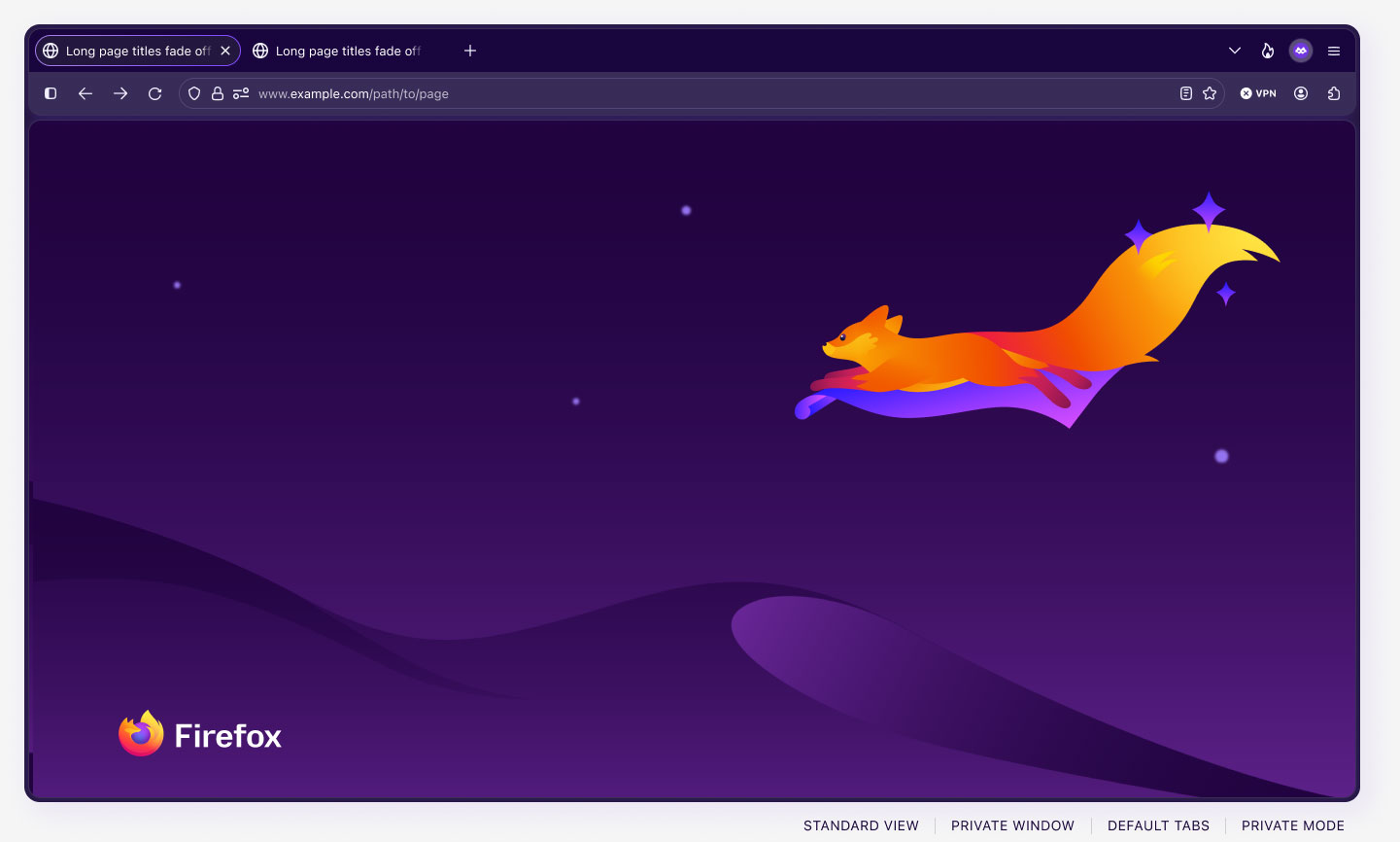
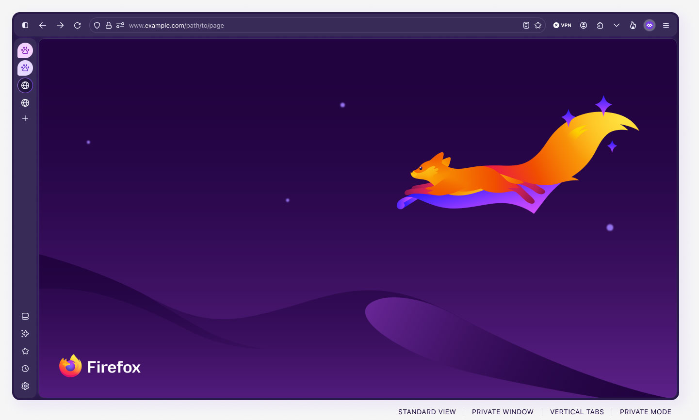
This component also uses boolean variables to show and hide elements across the modes. In the previews below, you’ll notice that the buttons shown in the classic, private, and smart windows differ. This is done automatically for the user as they switch between the window modes, ensuring the correct content is always shown for the different window types.
Note: in design and development, “chrome” refers to any visible part of a program or app that is not the primary content itself. For example, the toolbars, menus, tabstrips, and sidebars are part of the chrome). Firefox’s use of the word “chrome” is not related to Google’s Chrome browser, and long predates its existence.
Component craft deep dive: the Browser component
The Browser component is one of the most frequently used assets in Acorn because it provides a configurable, functional representation of the Firefox interface. Instead of requiring designers to assemble individual toolbars, tabs, sidebars, and content areas, it brings the browser structure together as a coordinated system.
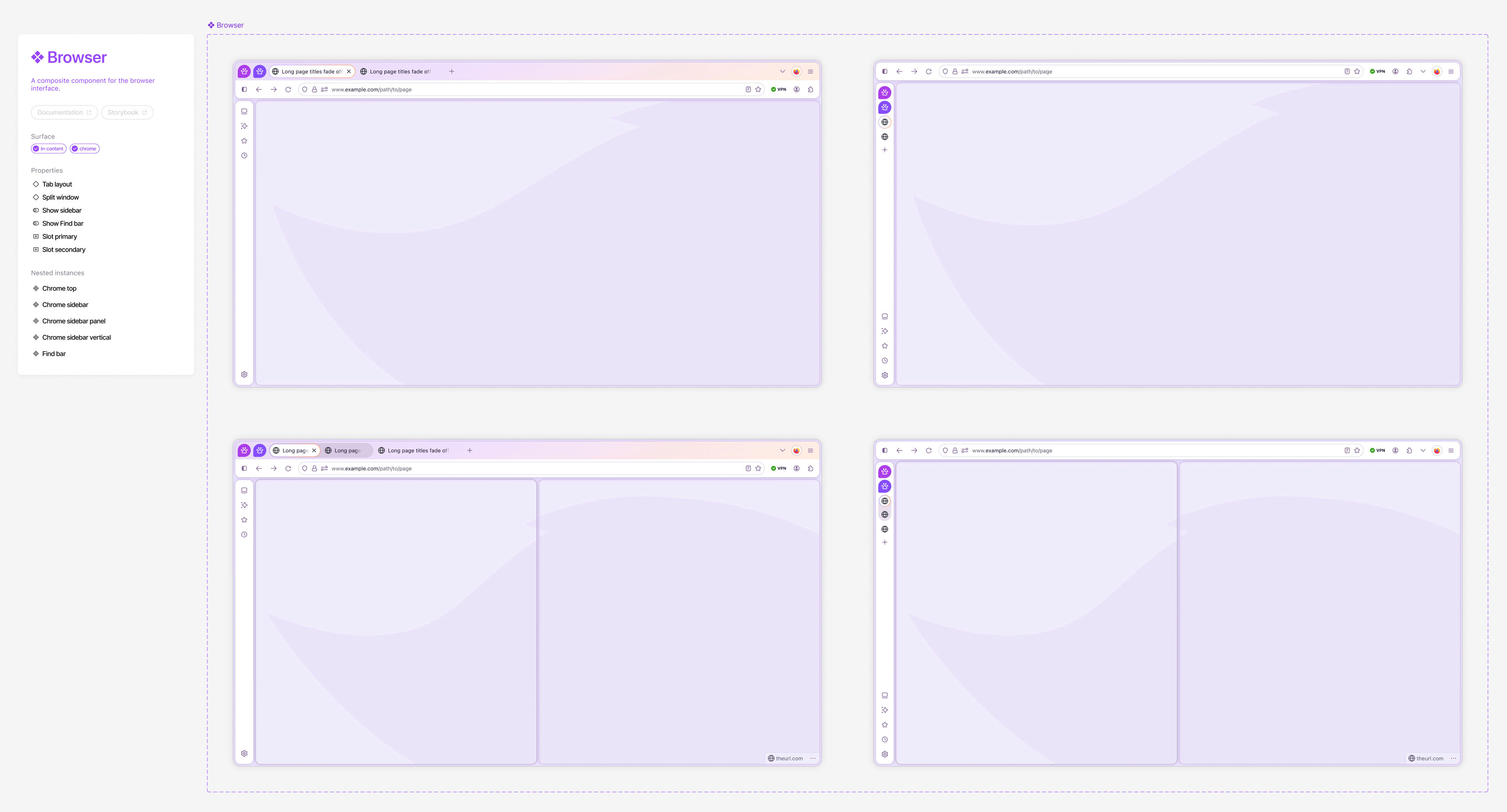
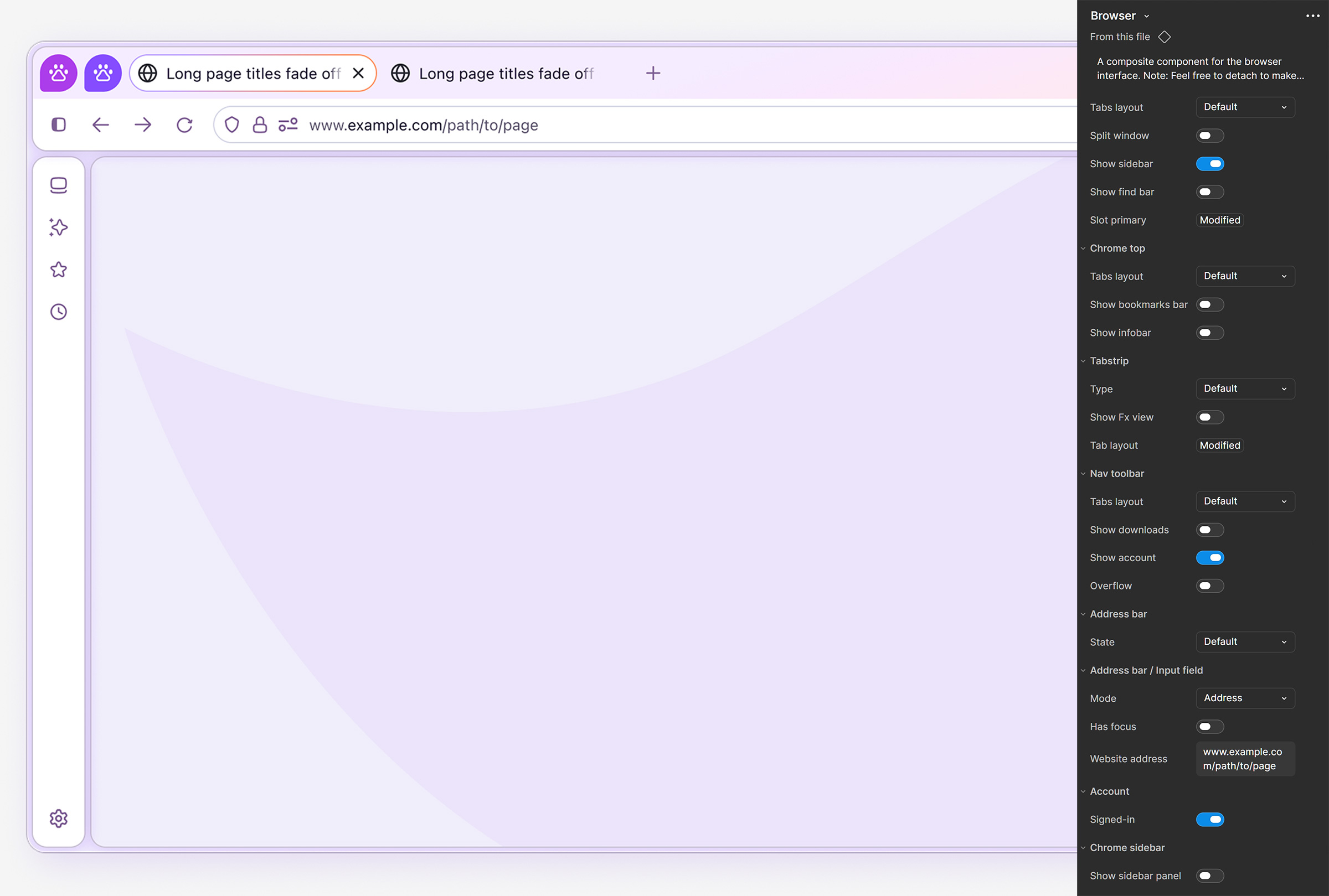
Top-level Browser component customizations include the default Firefox UI, vertical tabs layout, sidebar options, split window, custom tab groups, search and suggest panel, compact mode, toggle-able toolbars, auto responsiveness, slots for custom content, and all applicable modes. Any of these options can be combined to create fully customized UI designs, and every nested element includes its own set of advanced properties accessible from the component properties panel.
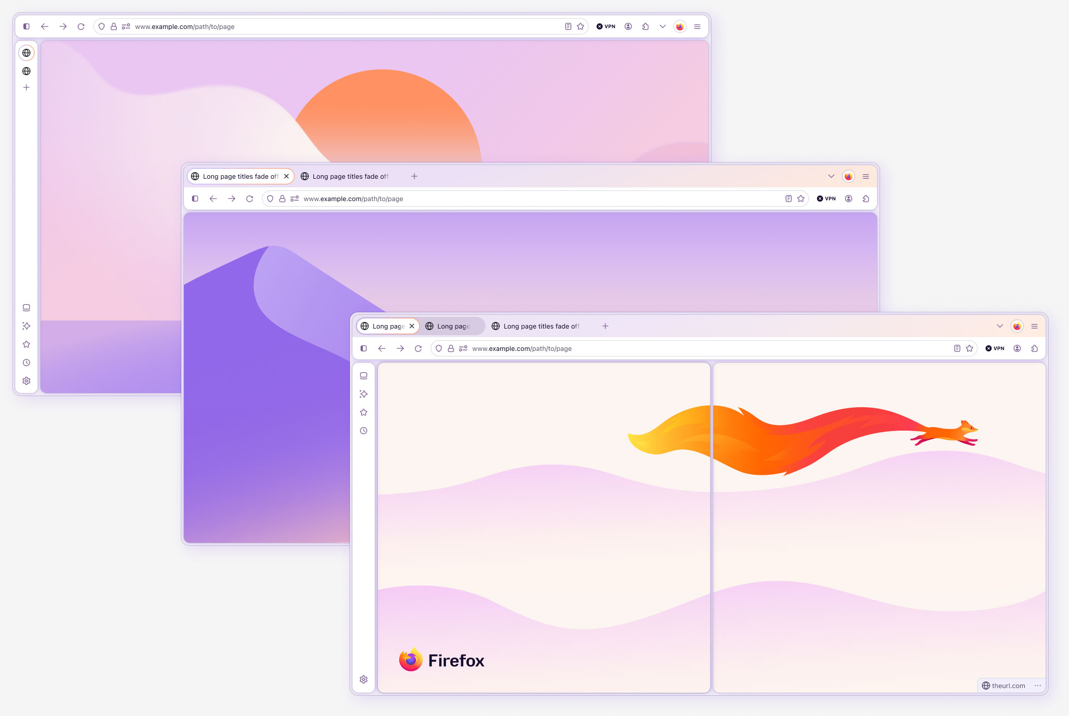
Browser component architecture
As with all components, I thoughtfully structured and built the Browser component to absorb the complexity of the nested hierarchy, as opposed to placing that work on the designers. All features of the browser are built into this component via nested instances, component properties, and modes, with just 4 top-level variants. This level of completeness helps ensure the UI is used correctly in UX flows, as it eliminates the need for designers to manually find, position, and use the individual components correctly. In addition to saving design time, this method significantly reduces, and often eliminates, design debt and entropy, extending the life of the current system iteration.
Slots and controlled flexibility
Slots allow designers to insert custom content into approved areas without detaching the component or breaking its architecture. They create flexibility where product needs are expected to vary while preserving the surrounding system structure and behavior.
This was particularly valuable for a browser system because product teams frequently need to demonstrate new panels, messages, tools, and content within the existing Firefox interface. Slots gave them room to explore those experiences while retaining accurate browser chrome, responsive behavior, and mode support.
Patterns in product context
Acorn needed to support more than isolated components. Many Firefox experiences depend on several components working together across tabs, toolbars, panels, sidebars, notifications, settings, and in-content surfaces.
I evaluated new work in context to understand how individual decisions affected the complete experience. This included reviewing hierarchy, focus order, responsive behavior, mode changes, interaction feedback, and relationships between browser chrome and product content.
In-context examples and prototypes helped teams evaluate placement, composition, and behavior before implementation. They also made it easier to identify when a request represented a reusable Firefox pattern rather than a one-time arrangement of components.
This systems-level view became especially important when a technically compliant component decision created a weaker interaction in practice. The accessible button-state work was one example of using context to evaluate the full experience rather than treating each requirement in isolation.
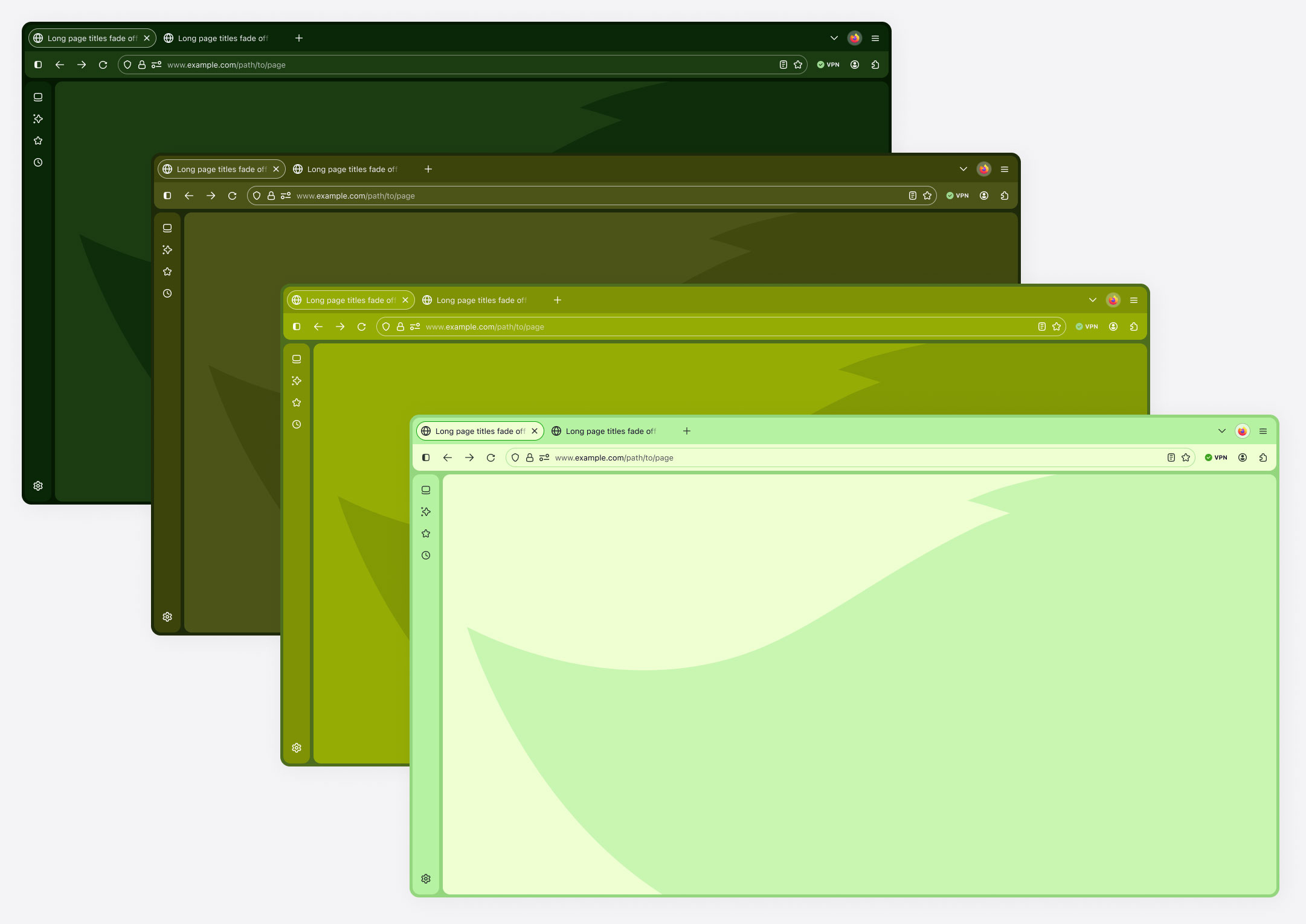
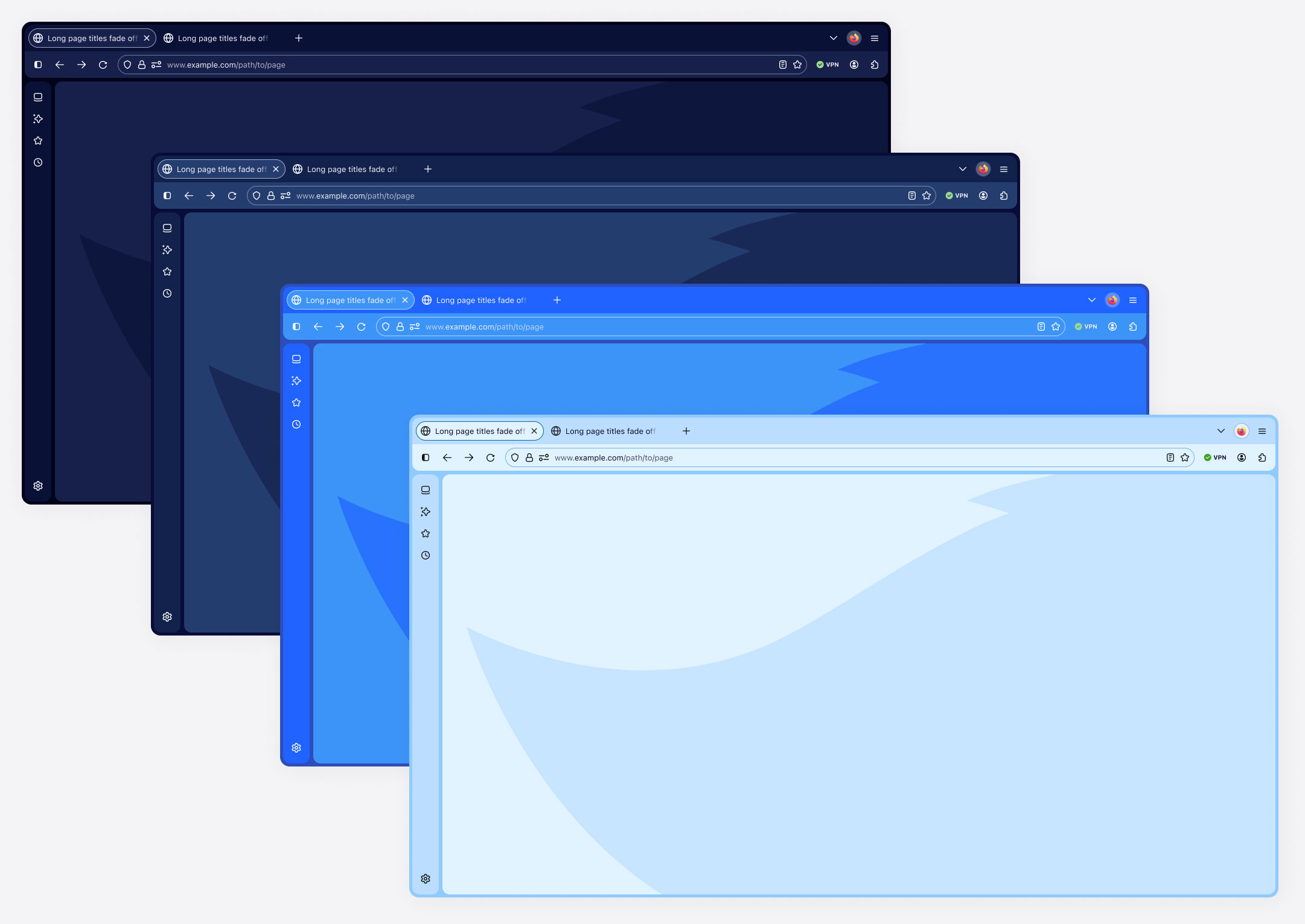
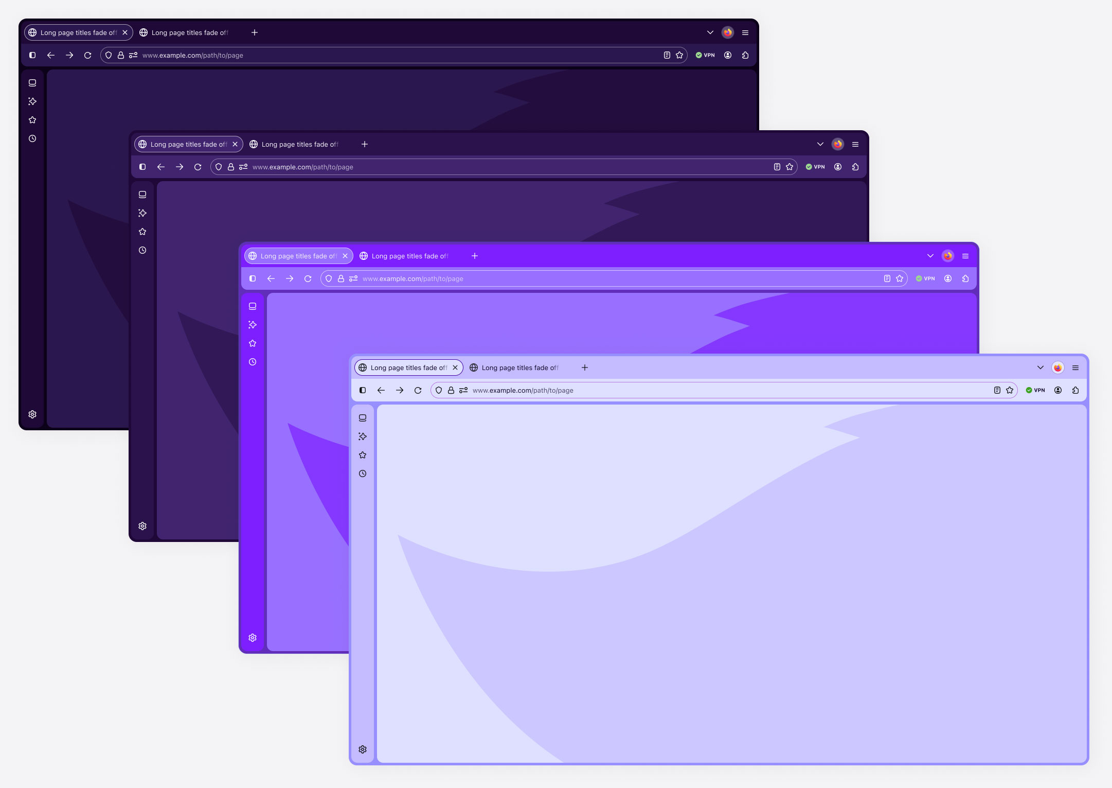
Color themes
Firefox supports custom colors and configurable tool placement. These examples demonstrate how coordinated palettes can create distinct appearances across the browser.
Color theme spectrum examples
Championing shared system standards
I reinforced the governance model we established for Acorn, working with teammates and regularly correcting inconsistencies myself.
That attention extended to:
- Component controls: Property names aligned with engineering, with consistent configuration and ordering.
- Internal structure: Predictable layer naming, case conventions, ordering, and parent and subcomponent relationships.
- Dependencies: Correct token, style, library, and instance-swap references.
- Component cards: Descriptions, code and documentation links, dependencies, supported surfaces, properties, nested components, accessibility annotations, and mode examples.
- Guidance at the point of use: Instructions available directly in the Figma component panel.
These standards made contributions easier to review and the library easier to maintain as it evolved.
Adoption and enablement
Advanced capabilities needed deliberate introduction. Publishing a component did not ensure designers would discover everything it could do.
I strengthened 1:1 support, emphasized office hours, and introduced short training presentations every two weeks. Sessions covered new features or demonstrated more advanced functionality.
Slots were introduced through one of these sessions, using practical examples to explain where they were useful and how to work with them.
Support also informed system improvements. Questions revealed opportunities to clarify controls, naming, documentation, and guidance. Beyond Acorn, I mentored designers on Figma, prototyping, visual craft, interaction design, and broader design practices.
Raising the standard for support
During four weeks in December, I covered two teammates’ work and provided direct support to their designers through Nova’s component questions and ambiguity.
Two designers independently contacted my manager to express their appreciation. After my teammates returned, designers continued seeking my help, and the team strengthened its support to meet those expectations.
The experience demonstrated the value of sustained partnership and helped make it a stronger part of Acorn’s operating culture.
AI and machine-readable systems
I explored AI workflows that reduced repetitive system work and made knowledge easier to maintain. I packaged useful approaches into reusable Claude Code skills stored in GitHub repositories, making their rules easier to version and refine.
Finding design debt and system drift
Large Figma ecosystems accumulate hidden dependencies over time, including outdated styles, incorrect library references, detached assets, and components nested deep inside product flows.
Using Claude Code, custom skills, and the Figma MCP, I developed workflows that inspect files and identify where incorrect assets, styles, variables, and component references are being used. Instead of simply reporting that dependencies exist, these processes help locate the specific instances creating the problem.
Encoding audit logic into reusable skills also makes the process repeatable, so the same checks can be run as the system evolves rather than rebuilt as a new prompt each time.
Some AI solutions I explored using Claude Code and Claude Design for Acorn include:
- Design debt and entropy identifier
Figma will tell you how many assets and styles are being pulled from any added file, but it doesn't tell you where they are. Finding deeply embedded items is incredibly time consuming, so I created an agent that locates and logs all assets and styles within the system and product flows that are incorrect or pulled from incorrect libraries, allowing the design system and product teams to eliminate design debt and greatly reduce entropy going forward. - Variable / token consistency and structures
An agent for scanning variables collections for redundancies, missing or incorrect styles, and token related errors. Eventually, we're wanting to use AI as a tool to perform automatic cross-updates in both code and figma. - System and component audits
An agent that audits and records any design-to-eng disparity, redundant components, missing components or parts, and areas that could be streamlined or optimized better. - Multi-directional updates
We're aiming to create a process where our coded prototypes are the actual codebase, and updates to either code or Figma will automatically update the other library for ultimate design and code parity.More advanced experiments explore how automatically updated markdown files can guide AI skills and agents. These agents can scan design and code sources, generate UI rules, answer system-related questions, and help maintain code parity, visual consistency, and brand cohesion.
Exploring tighter connections between design and code
One of my longer-term areas of experimentation is reducing the separation between the design system in Figma and its implementation in code.
Using Claude Code, Figma MCP, Cursor, and structured markdown files, I explored workflows where AI agents could read system rules, inspect both design and code sources, answer system-related questions, identify disparities, and potentially propagate approved changes between environments.
The longer-term goal is a more connected system where Figma and code remain synchronized with less manual maintenance, strengthening design-to-engineering parity while reducing opportunities for system drift.
Accelerating accessibility and contrast audits
Accessibility testing can become especially time consuming in Acorn because components often need to work across many opaque background colors, states, and theme combinations.
I used Claude Code to generate WCAG-focused accessibility reports that could evaluate large sets of color and contrast combinations much faster than checking them individually with manual tools. This was especially useful when validating text, icons, controls, and component backgrounds across multiple surfaces.
The reports helped me identify failures, edge cases, and patterns more quickly, giving me more time to focus on the harder design decisions where accessibility, visual quality, and usability needed to be balanced.
Prototyping complex system behavior
Some component concepts are difficult to communicate through static Figma screens alone, particularly when they involve responsive behavior, motion, nested interactions, or complex browser functionality.
I used Claude Code, Cursor, Figma Make, and Figma Agents to rapidly create functional prototypes based on Acorn patterns. One area of experimentation involved prototyping portions of the Browser component as working coded interfaces with accompanying specifications.
These prototypes helped make complex system behavior easier to evaluate with designers, engineers, and leadership before committing to implementation.
Streamlining component documentation
Maintaining detailed component documentation can be time consuming, particularly when specifications need to incorporate accessibility guidance, interaction behavior, and established platform conventions.
I developed a reusable Claude Code documentation skill to help structure and generate component documentation consistently. The workflow incorporates defined documentation rules and reference material, while tools such as ChatGPT and custom GPTs help with research and synthesis from public sources including Apple’s Human Interface Guidelines and Google Material Design.
Every output is reviewed and verified before publishing, but the workflow reduced the time required to produce a component entry by an estimated 70%.
Making system education more visual and engaging
Maintaining detailed component documentation can be time consuming, particularly when specifications need to incorporate accessibility guidance, interaction behavior, and established platform conventions.
AI also gave me new ways to communicate design system concepts beyond traditional documentation.
I experimented with Figma Weave, Nano Banana, and other generative visual tools to create custom imagery, motion, video, presentation graphics, and higher-fidelity demonstrations for training and adoption materials.
This is especially useful for explaining how components behave rather than simply showing how they look. It also allows me to explore visual direction and motion earlier, helping designers and engineers better understand how an experience should look, move, and feel.
Where I made the biggest difference
- Making designer usability a system priority: Bringing everyday workflows into architectural and component decisions.
- Raising expectations for support: Establishing more direct partnership and practical education for designers.
- Applying governance consistently: Carrying shared standards into everyday component construction and maintenance.
Outcomes and system impact
The Nova redesign shipped with a stronger system foundation capable of supporting Firefox’s evolving interface, while maintaining accessibility, consistency, and engineering alignment.
System outcomes
- Reduced duplication through more capable component structures.
- Expanded configuration and contextual mode support.
- More consistent build standards, documentation, and token alignment.
Team outcomes
- Broader adoption of updated components and advanced features.
- Less review friction through clearer expectations and earlier collaboration.
- Stronger access to support and a more direct feedback loop with system maintainers.
Product outcomes
- A more cohesive and contemporary Firefox interface.
- More consistent interactions and visual states across surfaces.
- Clearer translation of product designs into implementation.
Reflection
Nova reinforced that system quality includes the experience of using and maintaining it. Technical capability becomes valuable when designers can discover it, apply it confidently, and carry its intent into implementation.
It also sharpened my judgment about where standards need firm boundaries and where contextual evaluation creates better solutions.
In future work, I would establish clearer baselines for common design tasks, including setup effort, errors, and assistance needed. That would provide stronger evidence of which system improvements help designers most and where further investment is needed.