Founded by the accomplished Dr. Neil A. Shah, MD, FAAD, Clarus Dermatology provides the highest quality medical, surgical, and cosmetic dermatology services in the Minneapolis area.
Brand // Website // Collateral
My role Design lead
Skills used
Creative direction
Brand design
Interaction design
UI / web design
Visual design
App design
Info arch.
Services and deliverables
Brand // identity
Brand exploration and strategy
Color exploration
Typography exploration
Logo design
UI design // website
Discovery
Moodboards
User flows
UI / polished designs
Visual // collateral
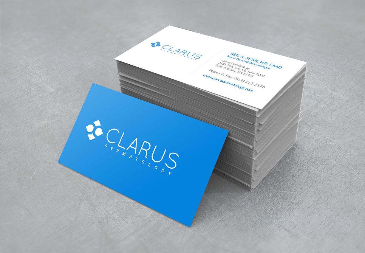
Business cards
Appointment cards
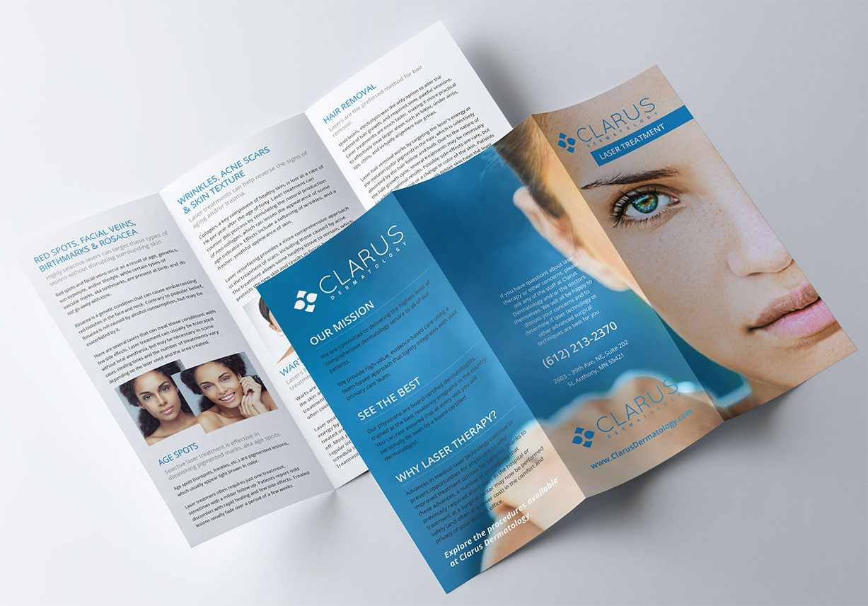
Tri-fold brochures
Pens, notepads, magnets
Promo posters
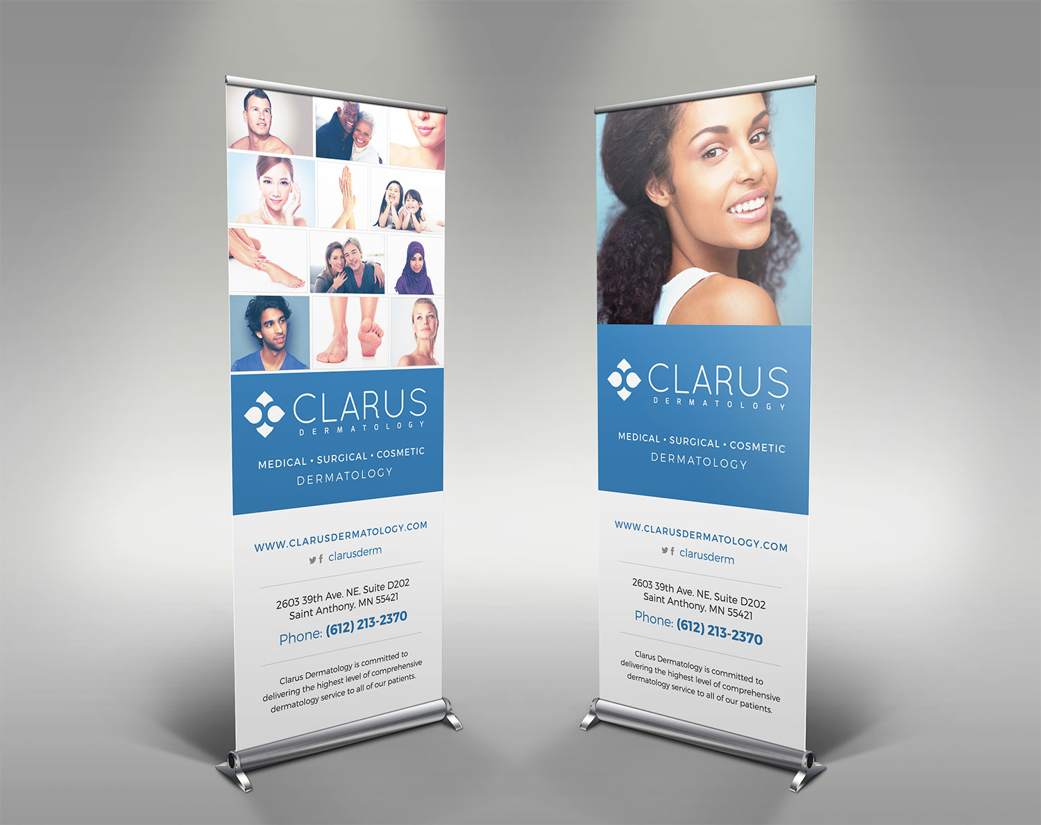
Roll-up banners
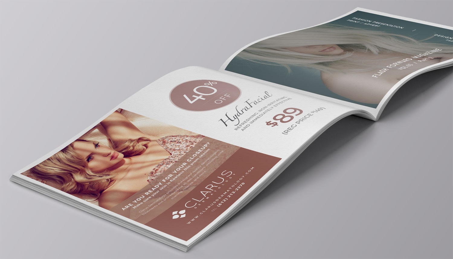
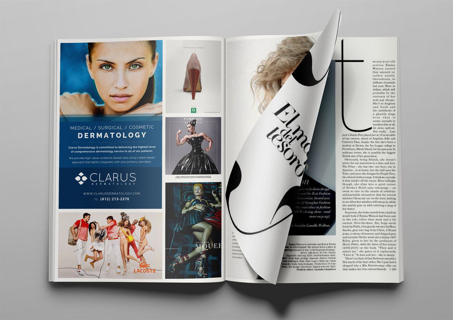
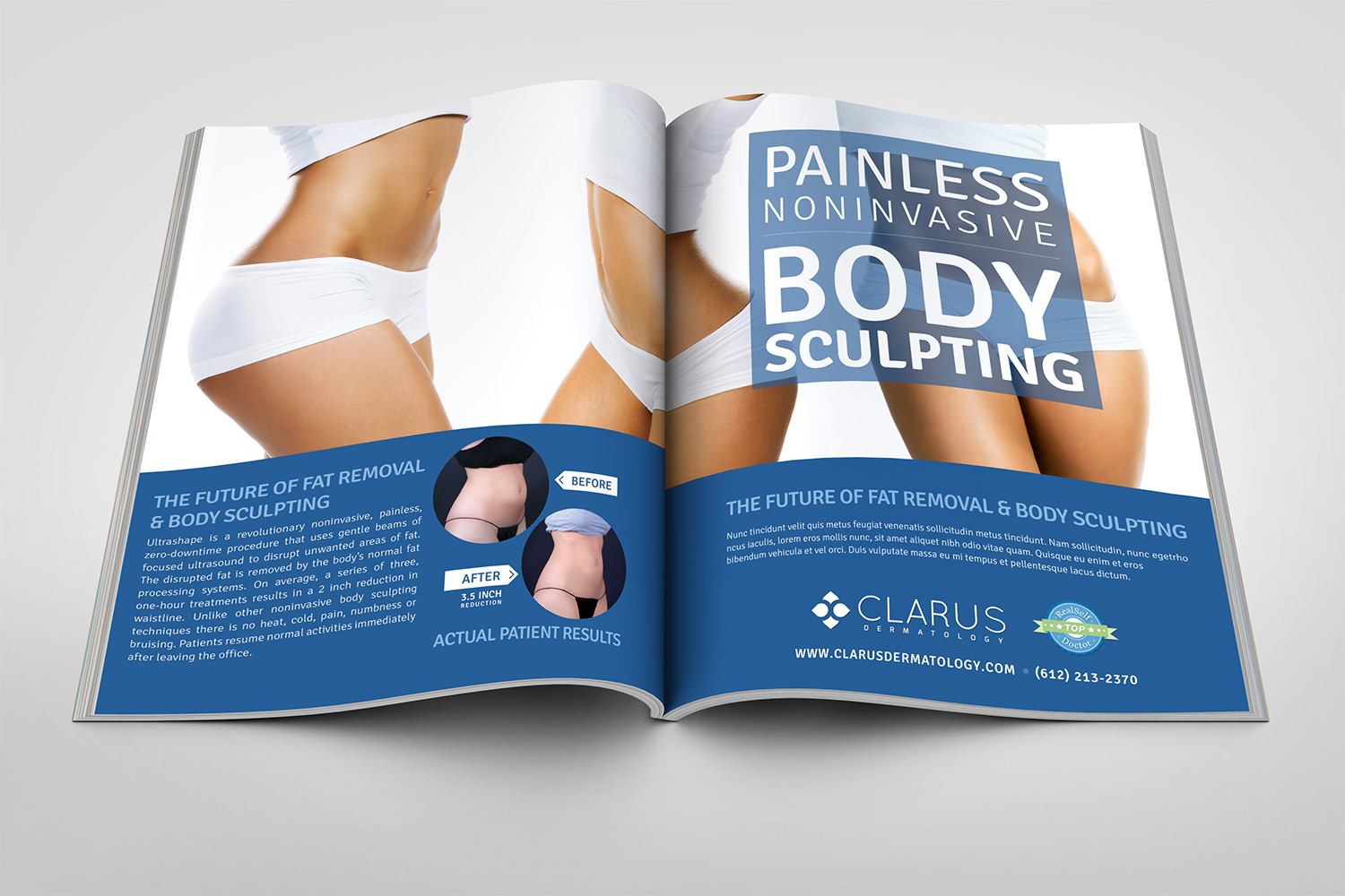
Magazine ads
Promo // marketing
Custom email templates (Mailchimp)
Photography selection
Photo editing and correction
Brand design
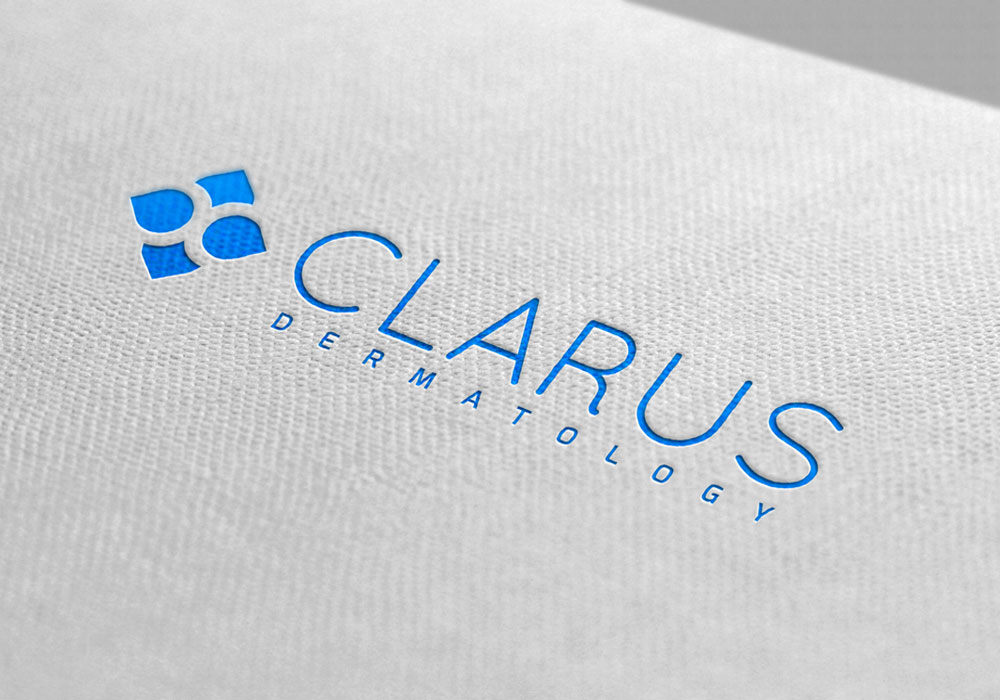
For a contemporary feel, I went with a bright blue and crisp white color palette, with light and dark gray accent colors. The logo consists of a negative space, abstract “c” and “d” monogram, set within an icon that represents medicine, health, and well-being. Dr. Shah decided on a light sans-serif font for the title to keep with the modern aesthetic.
Moodboards were used to define the look and feel of the brand and collateral items. Elements such as gingham cloth, French farmers’ markets, lavender fields, cafes on cobblestone sidewalks, Parisian carousels, and more were used to create a whimsical, yet modern French ambiance. And the most iconic French structure, the Eiffel Tower, was integrated into the logo for instant recognition.
UI // web design
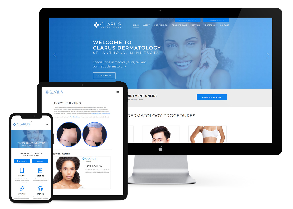
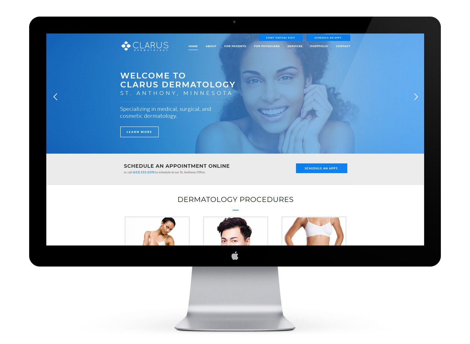
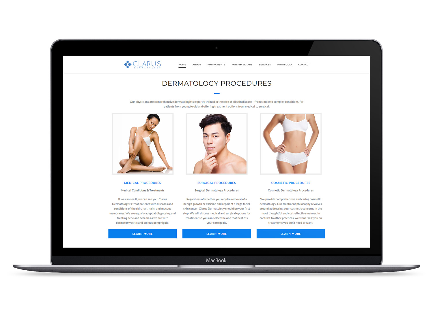
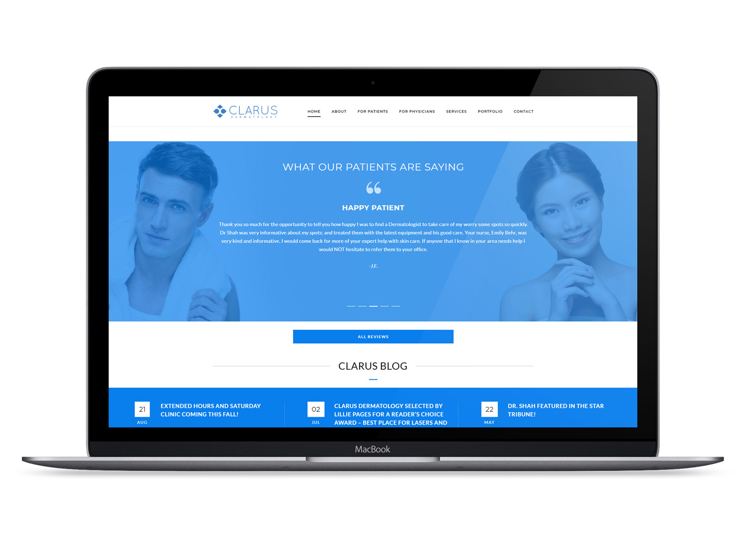
For the website (and all of the design elements), we selected photography with great care. My aim was to show lots of fresh faces without looking like that same overused “generic diversity” group photo so commonly seen in the industry. In many instances, the primary bright blue hue was overlaid to saturate the photo and take focus away from race and gender.
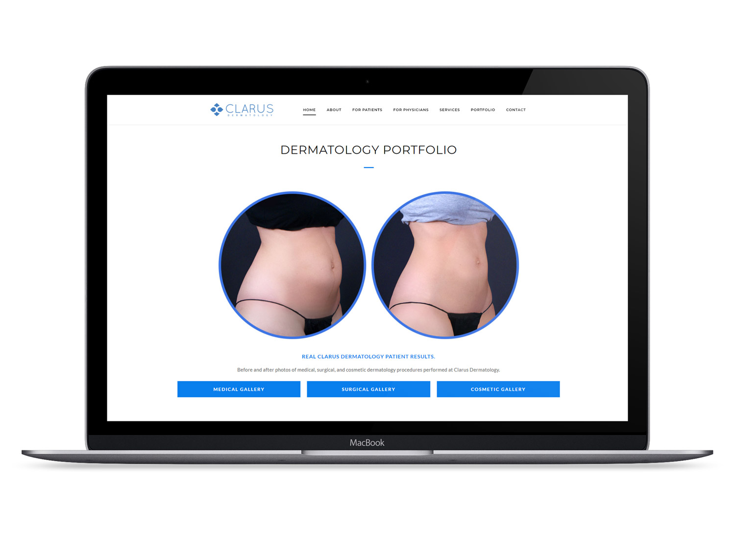
The website provides extensive medical dermatology information and useful patient tools such as online bill pay, a Virtual Acne Program, online sign up forms, portfolio with before and after photos, interactive educational slideshows, and more.
Visual design // collateral
Over the years, I’ve designed many print items for Clarus, including seasonal posters, permanent advertisement posters, medical brochures, clinical banners, and magazine ads.
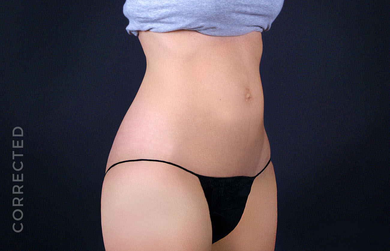
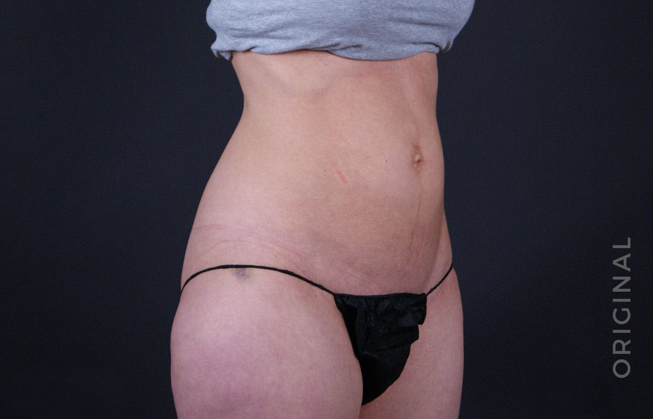
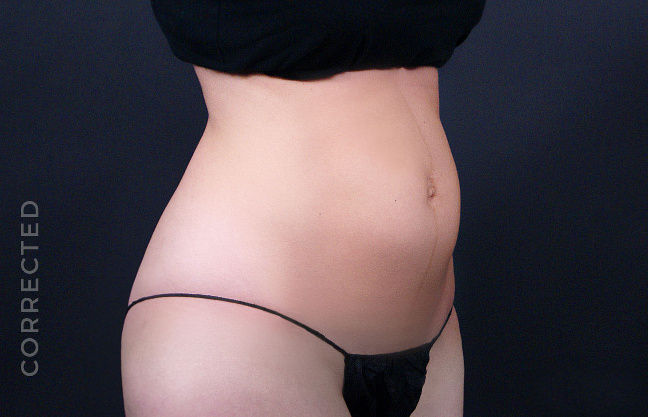
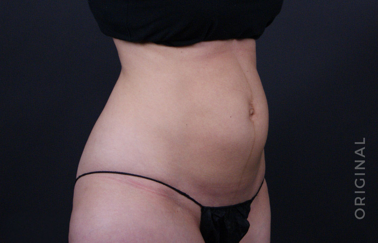
Photo Editing Although Dr. Shah was adamant about keeping patient photos natural and unaltered, some editing and correction was necessary for the photos used in print. The following show pre and post edited photos used in Clarus’ magazine prints. Editing consisted of heavy skin correction and color balance, and very subtle reshaping.