Complete brand and website revamp of ATOM, South Korea’s premiere source for modern apparel and accessories.
Brand // eCommerce website // collateral
My role Design lead
Skills used
UI / web design
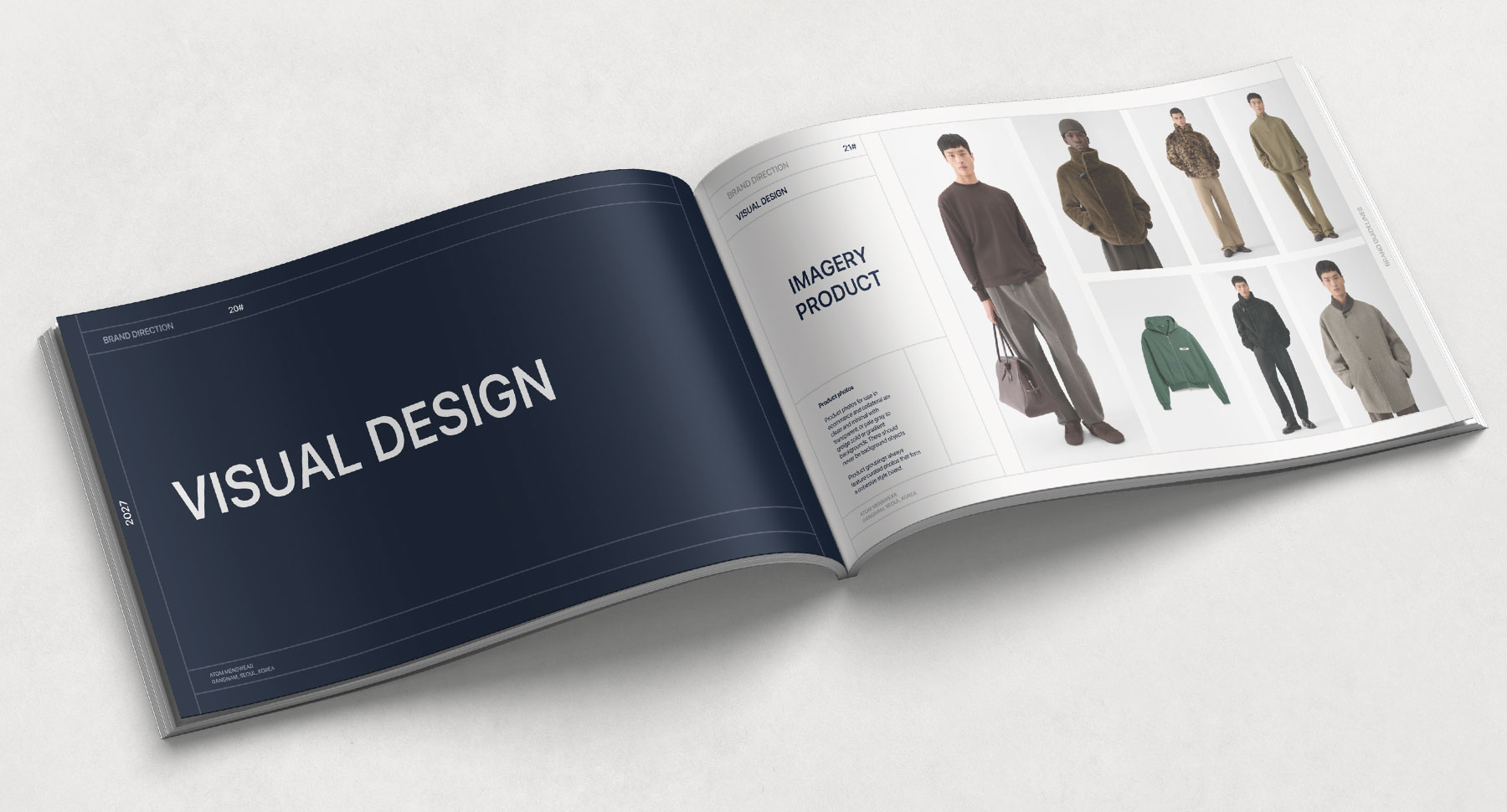
Visual design
Interaction design
Info arch.
Copywriting
Generative AI
AI content
AI microcopy
Services and deliverables
Brand // identity
User personas
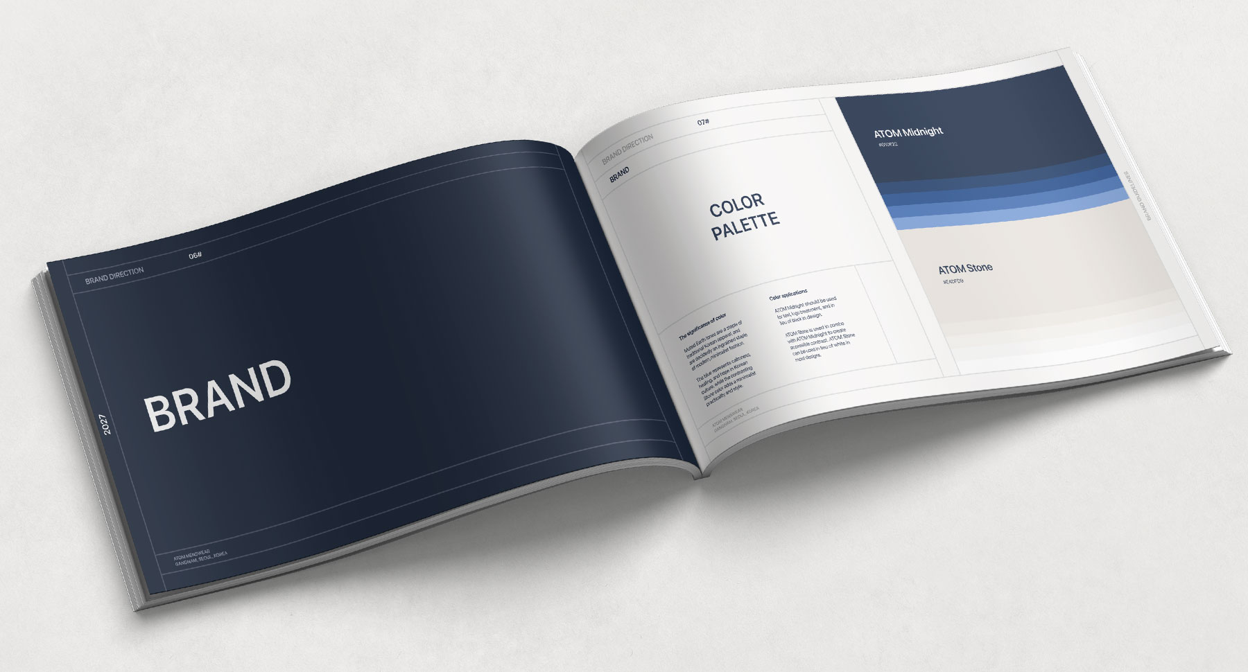
Color palette
Typography
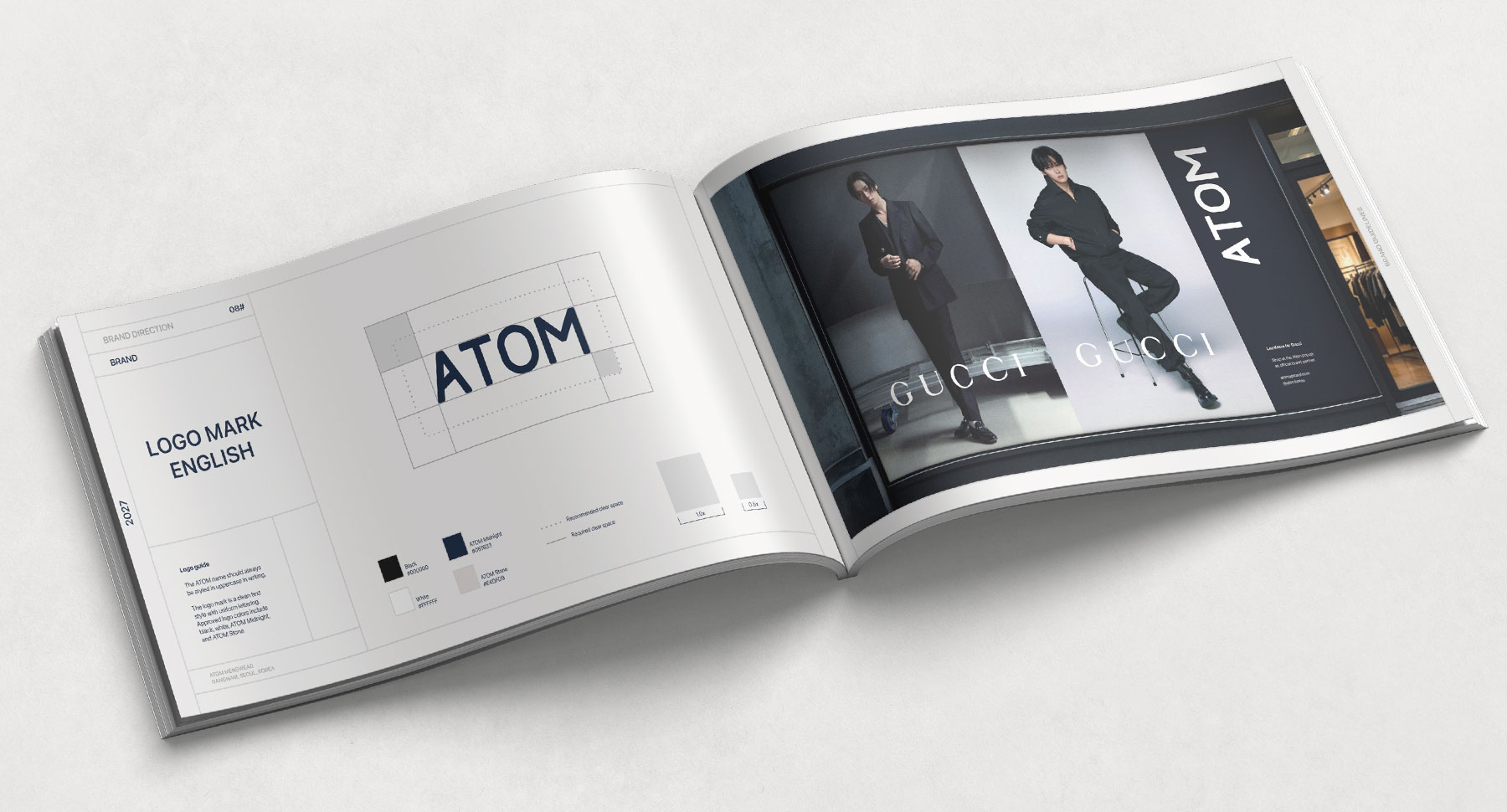
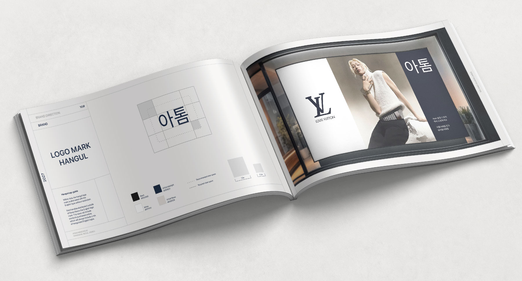
Logo design
Brand / style guide
UI design // website
Discovery
Moodboards
User flows, purchasing journeys
UI / polished designs
Visual // collateral
Generative AI
Business cards
Posters
Retail bags
Billboards
Photo editing and correction
Promo // marketing
Custom email templates (Mailchimp)
Custom ecommerce emails
Select copywriting
AI microcopy
Brand design
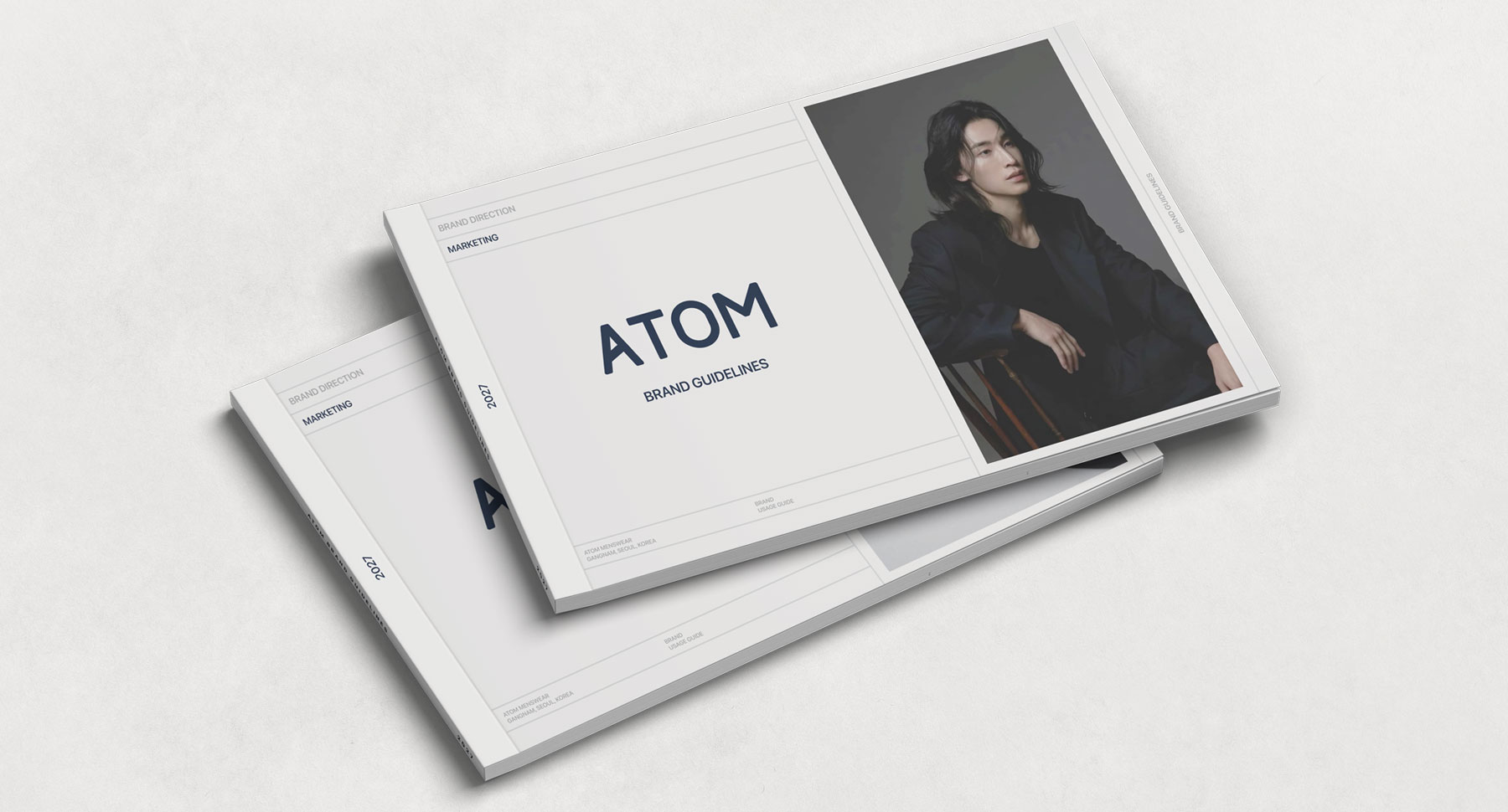
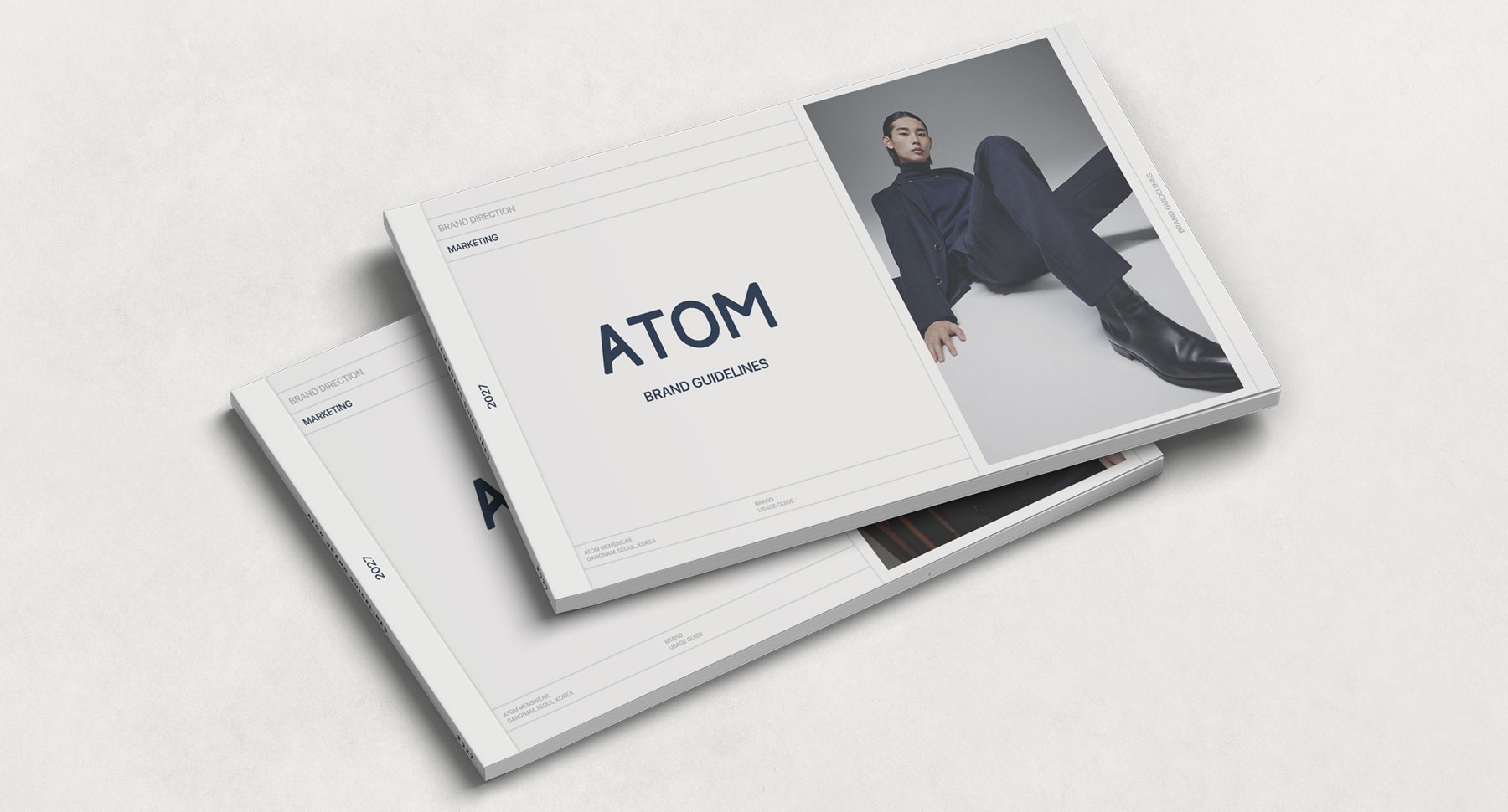
ATOM was a fledgling company when I started the brand design. They had an existing logo, but weren’t happy with its somewhat clunky aesthetic. My approach to the brand design was a “less is more” ideal. After some experimentation, the final logo design was decidedly minimal and modern in style. A second, Hangul version of the logo was also designed in the same modern style. The English and Korean versions are used interchangeably.
UI // web design
For this new iteration, ATOM wanted a more contemporary vibe that would appeal to a wide range of age groups, lifestyles, and fashion preferences. ATOM carries everything from budget-friendly necessities to couture brands, which I kept in mind in designing an inclusive experience that puts all consumers on the same level. I wanted the site to represent the brand as a trusted, high-quality apparel source, while avoiding an elitist vibe.
Homepage
For the homepage design, I went with a modern fullscreen hero, with body content focused on product groupings for easy purchase.
In keeping with the clean brand design, content organization was key. The homepage fits dynamic product groupings, including popular products, best sellers, featured products, collaborations, and various brand and product promos, without overwhelming or confusing the viewer. Interactive, horizontally scrollable sections are featured throughout, allowing the user the option of revealing as much content as they like, or diving deeper into the various sections, giving them control over how they navigate, shop, and purchase.
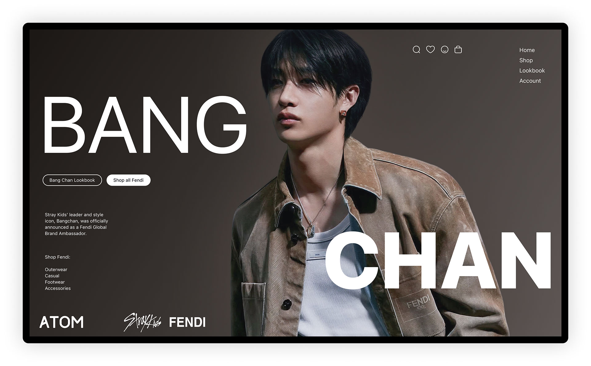
Homepage // hero section
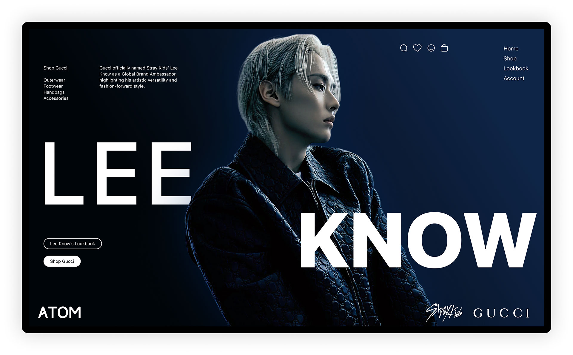
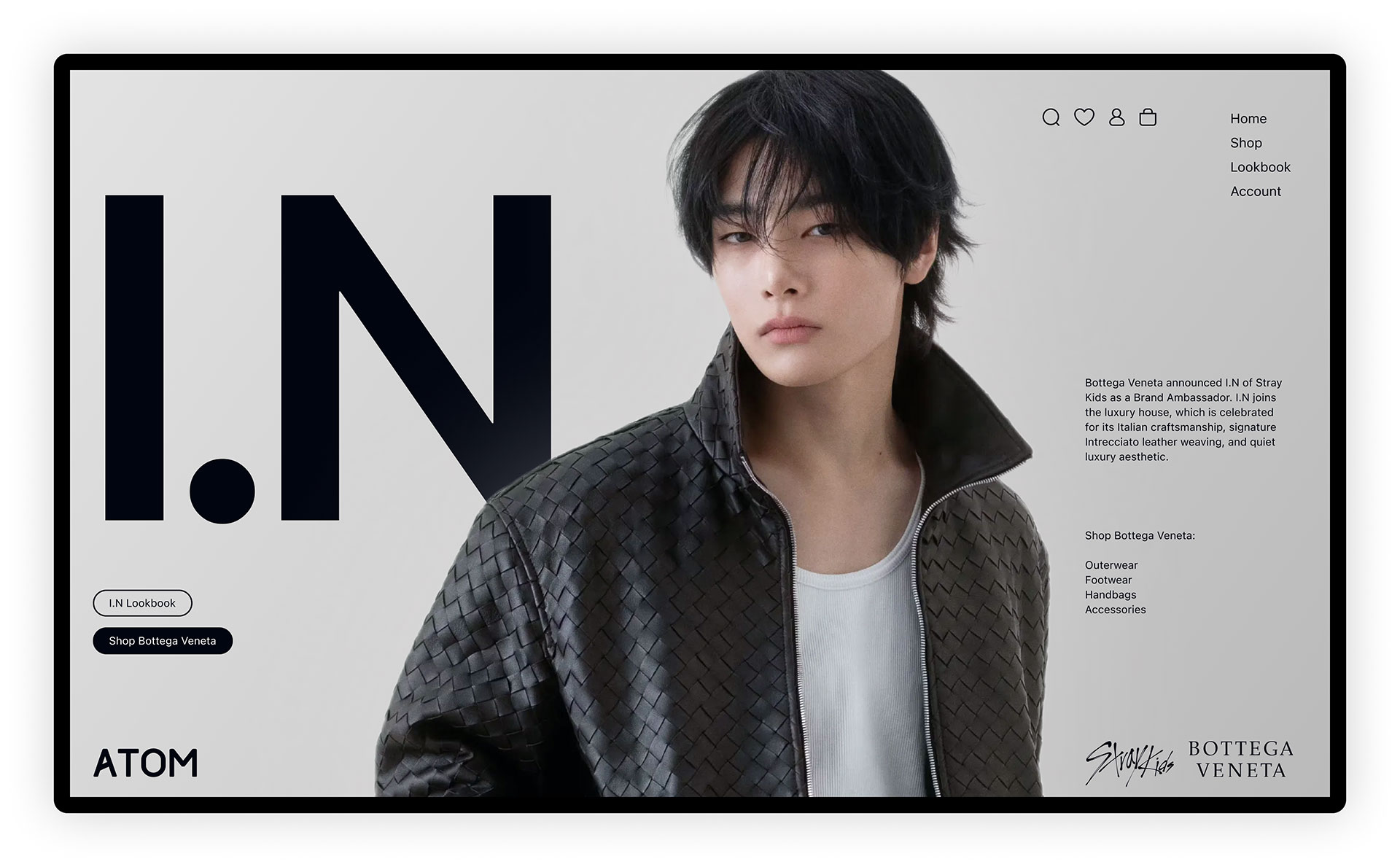
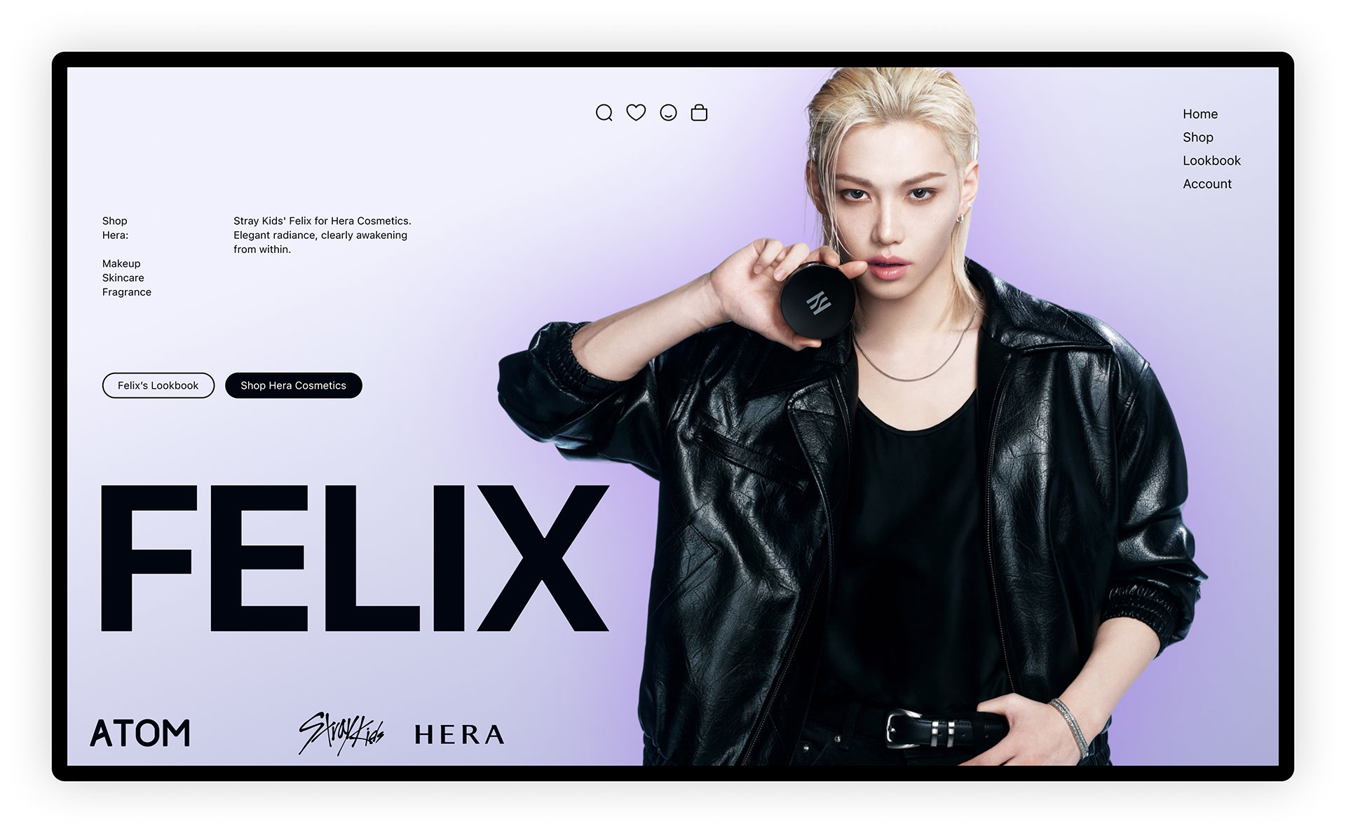
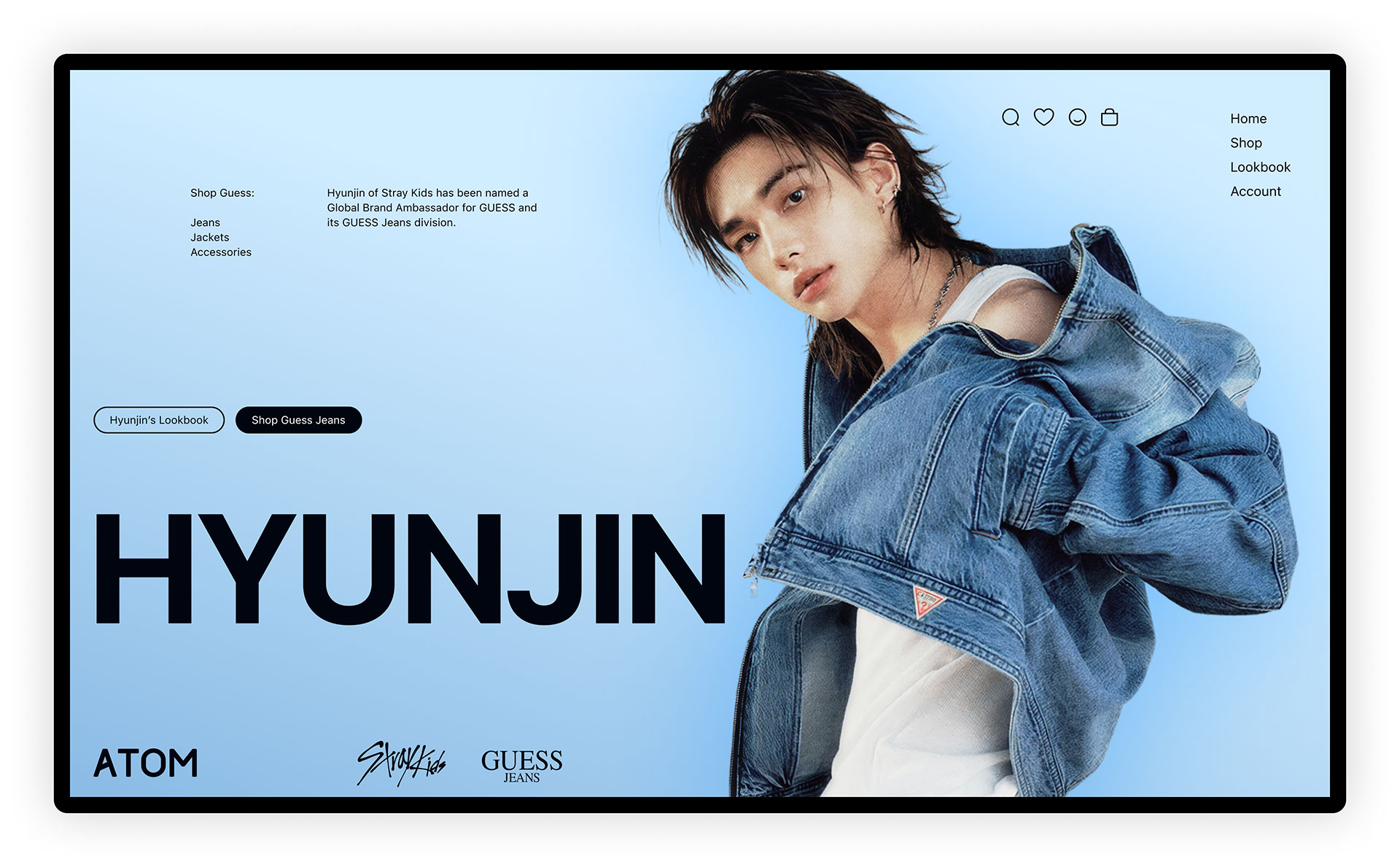
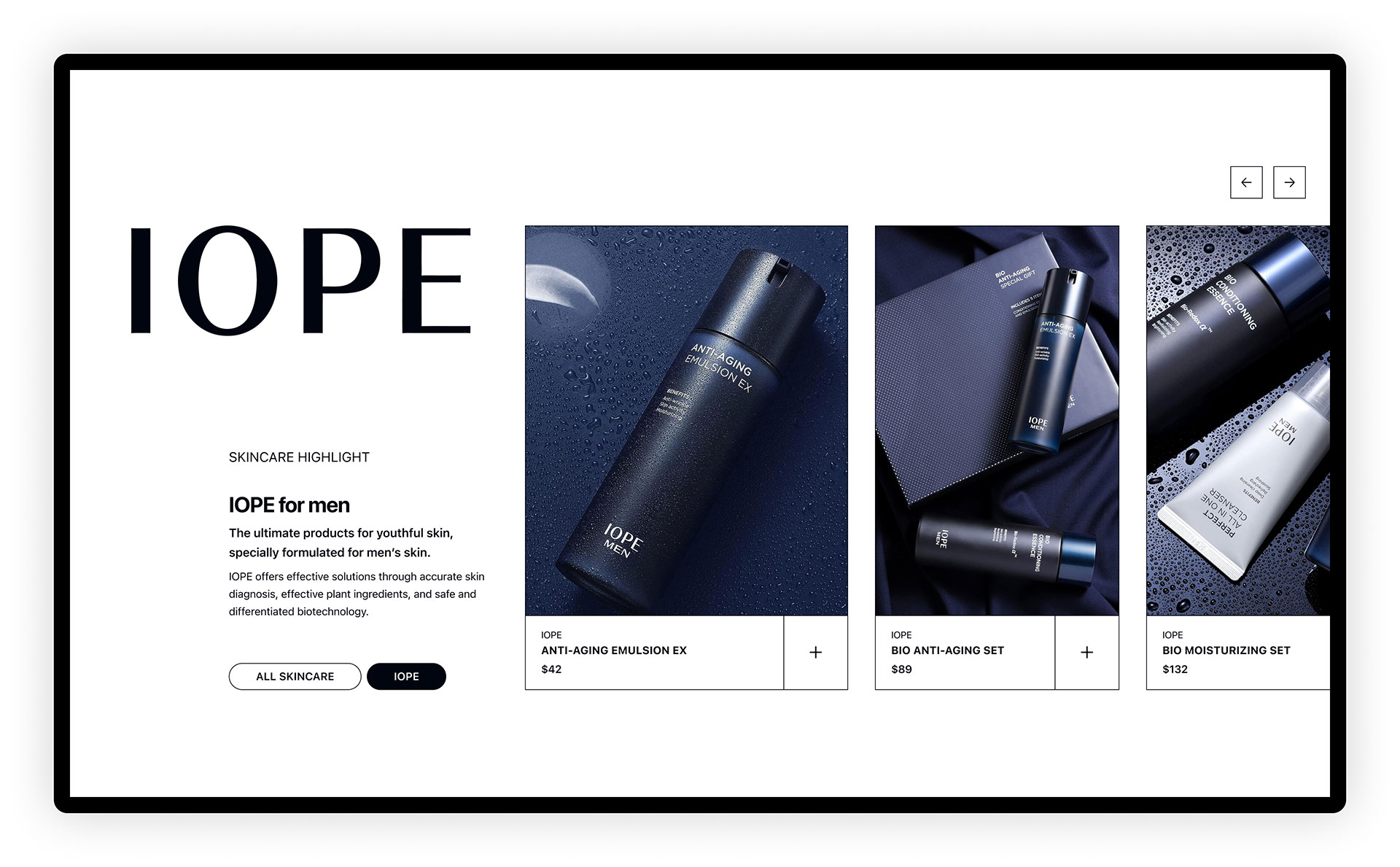
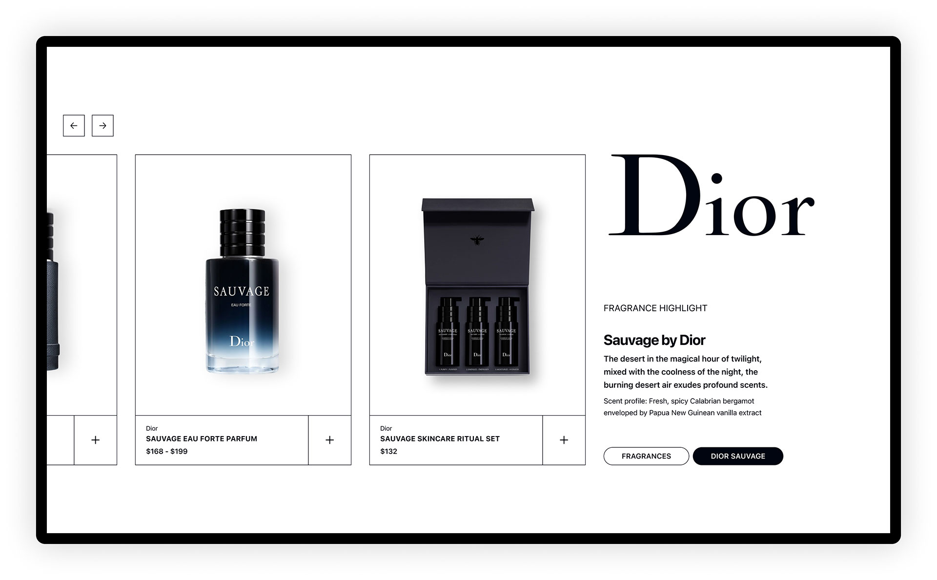
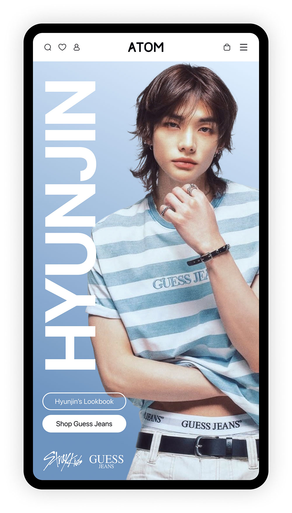
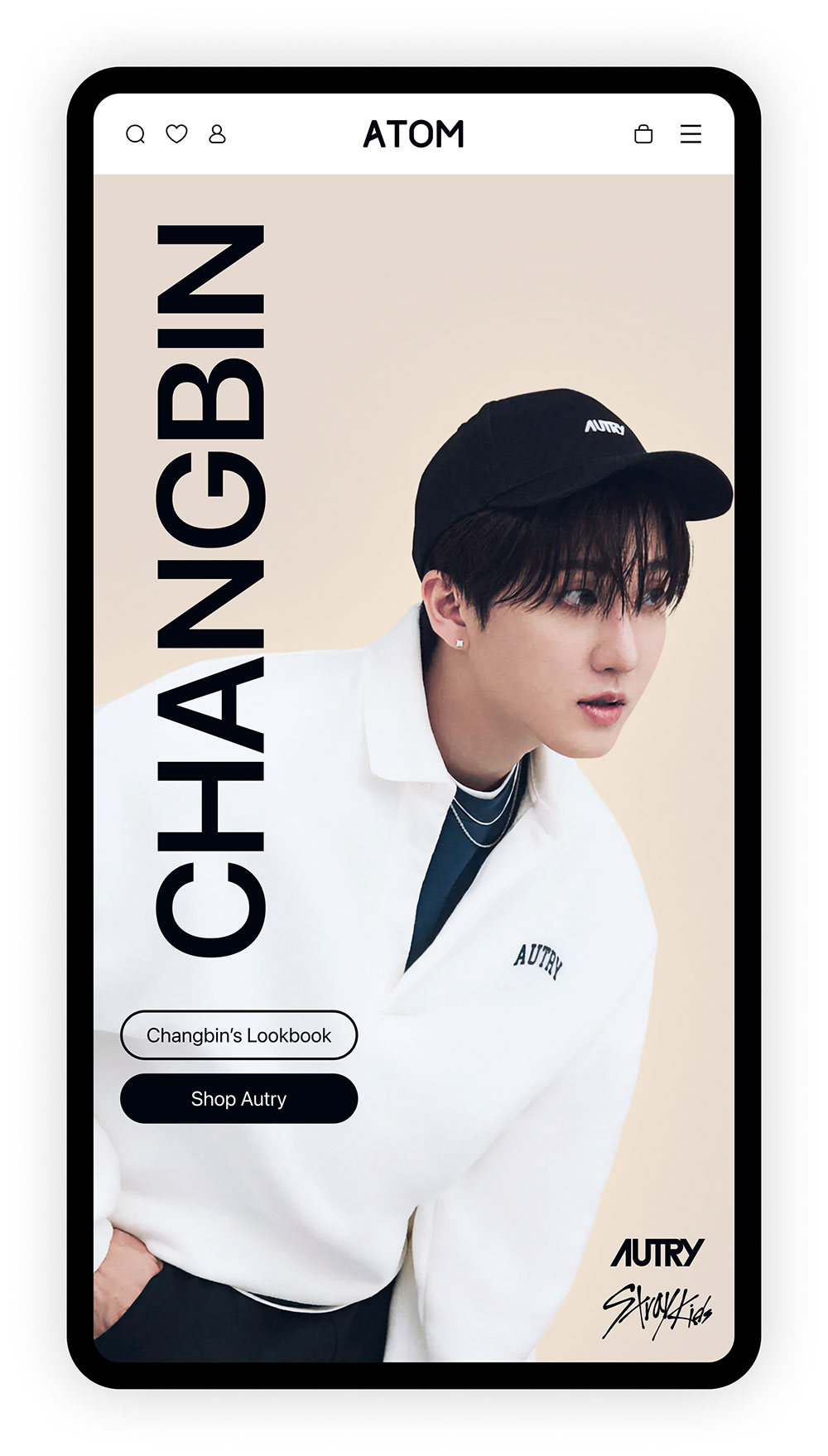
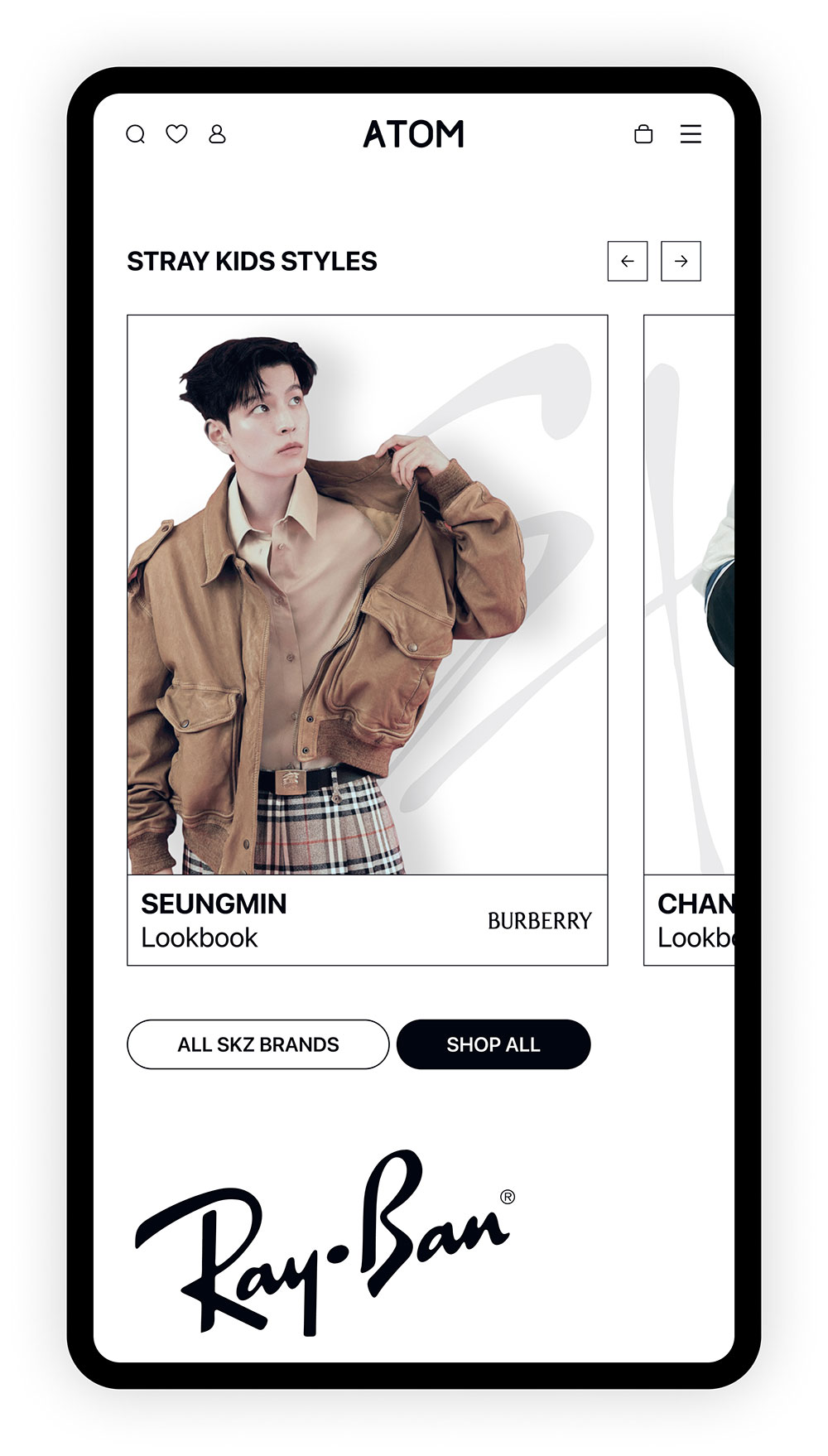
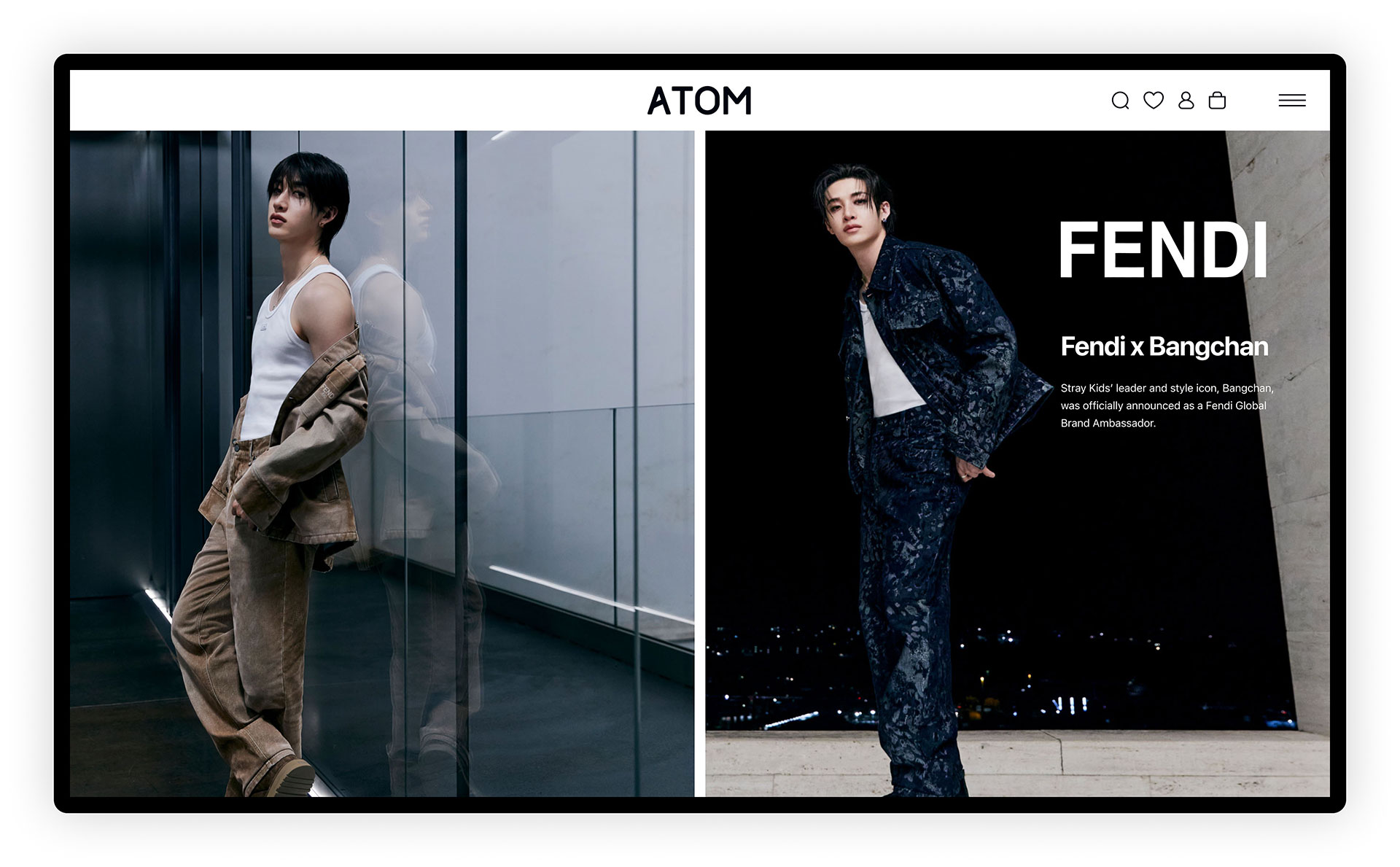
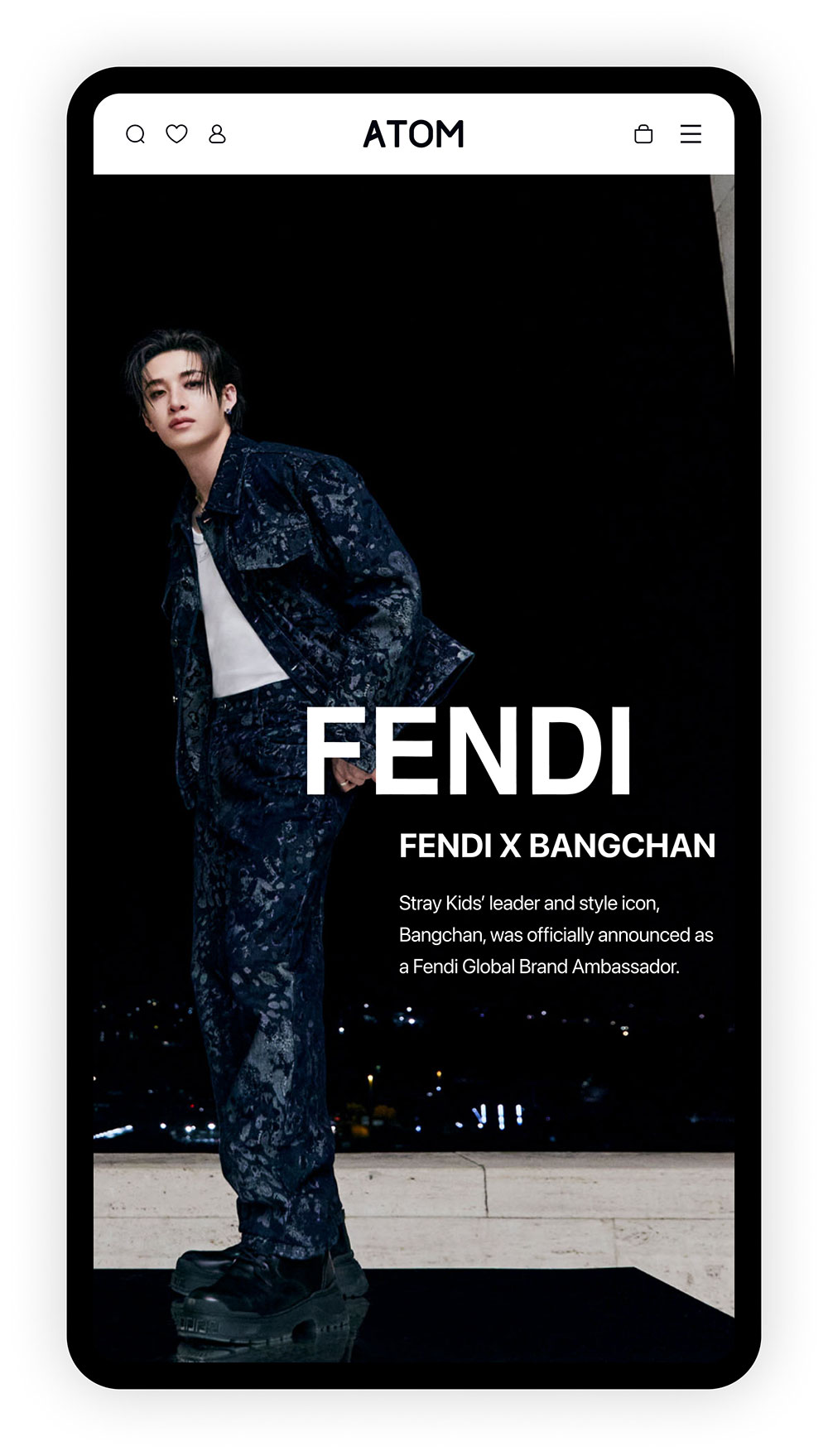
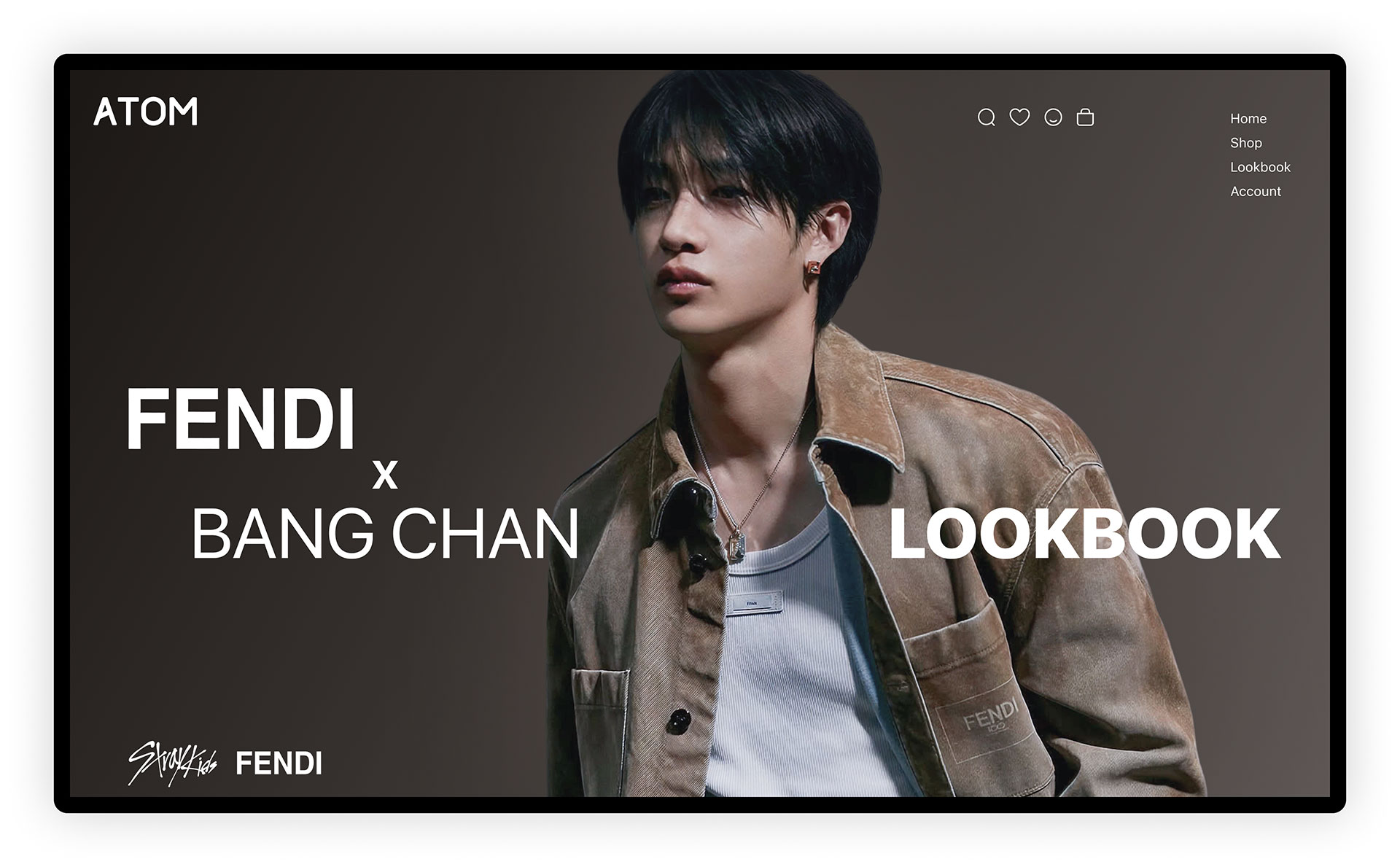
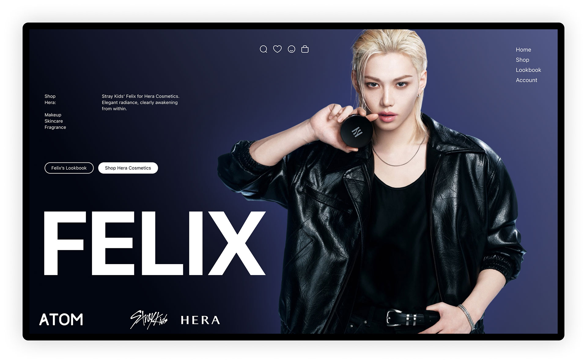
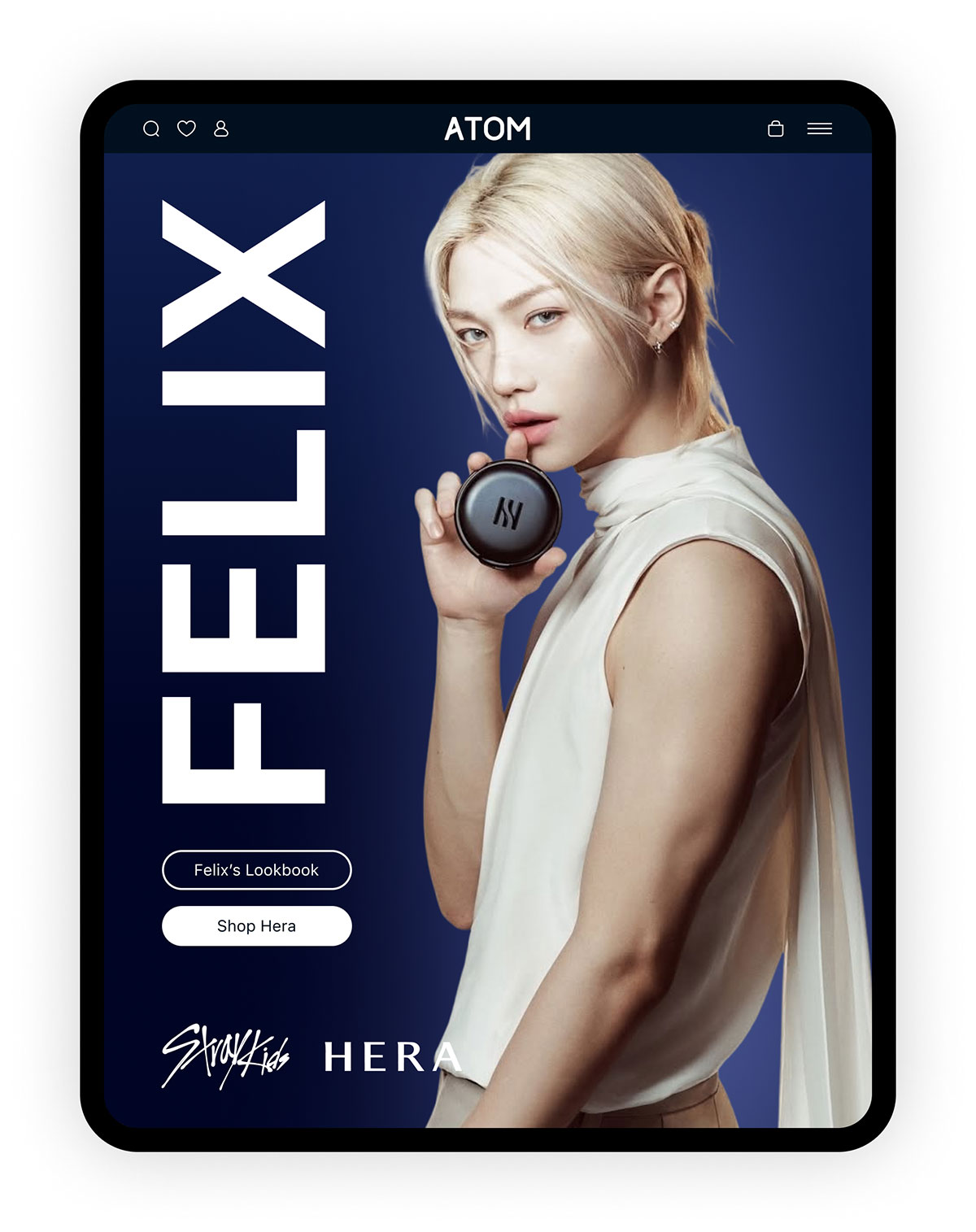
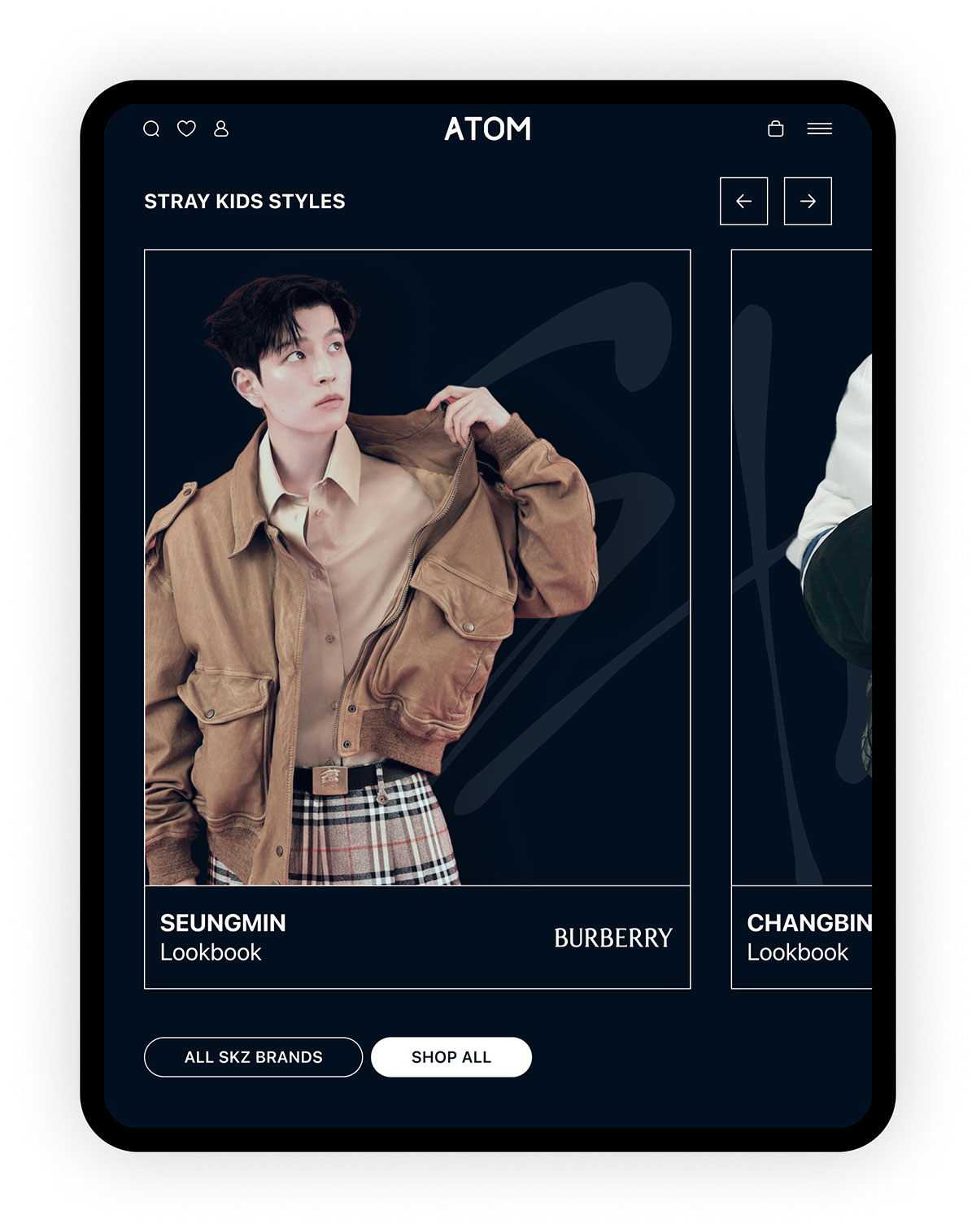
The fullscreen hero section features top brand promotions and collaborations with K-pop idols and celebrities, which rotate frequently. Currently, the site features promotions of K-pop megastars, Stray Kids, and the brands they partner with. Idols are a huge draw for Korean fashion and beauty brands, so they’re chosen for the most prominent spots on the site.
Homepage // collaborations and brand promotions
ATOM’s homepage includes several promotional types that focus on celebrity partnerships and brand collaborations, as well as select highlighted products and brands. These sections feature horizontally scrolling products to maximize product endorsement, without sacrificing valuable vertical space. This is an important concept for such an extensive catalog with numerous, parallel promotions throughout.
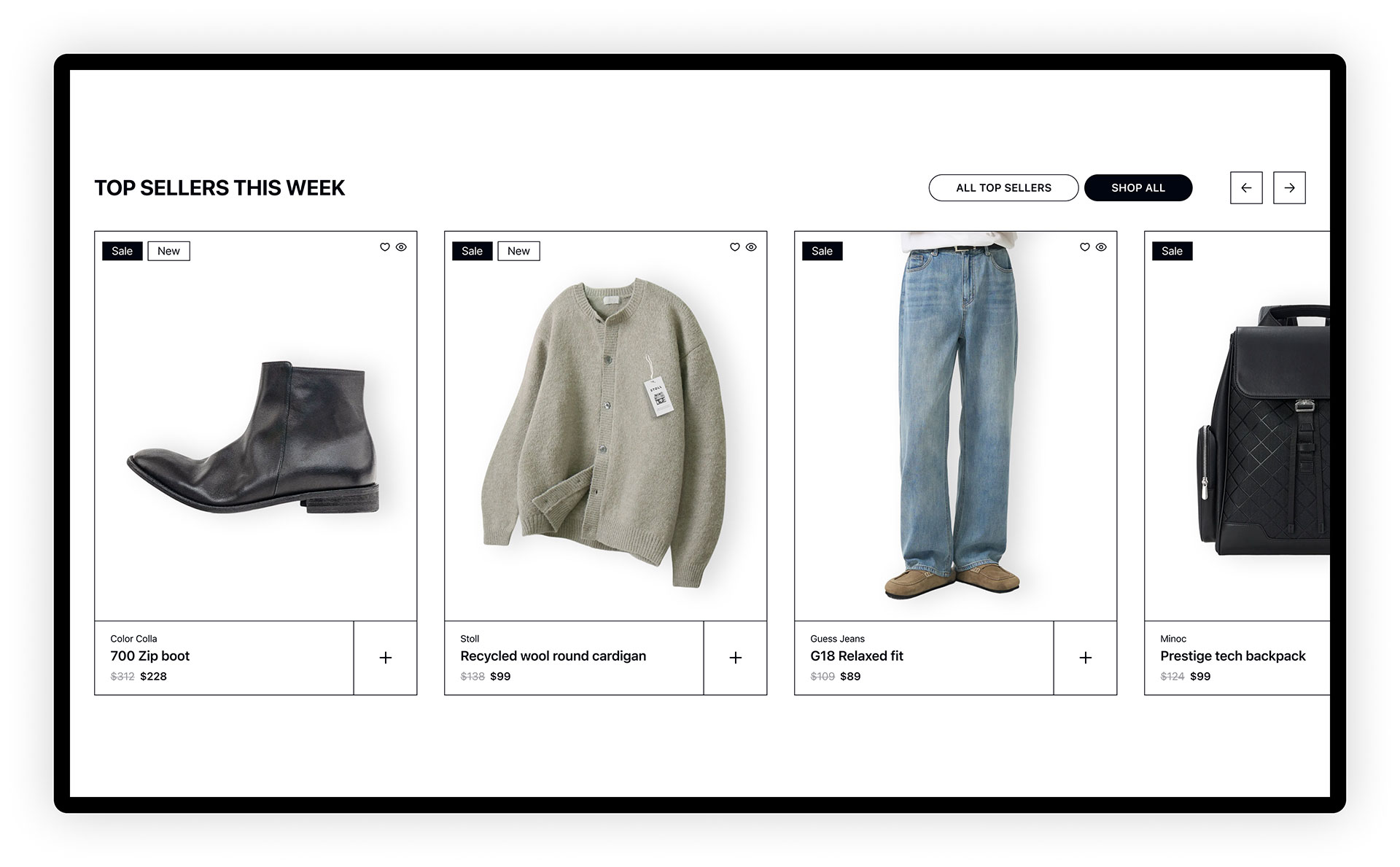
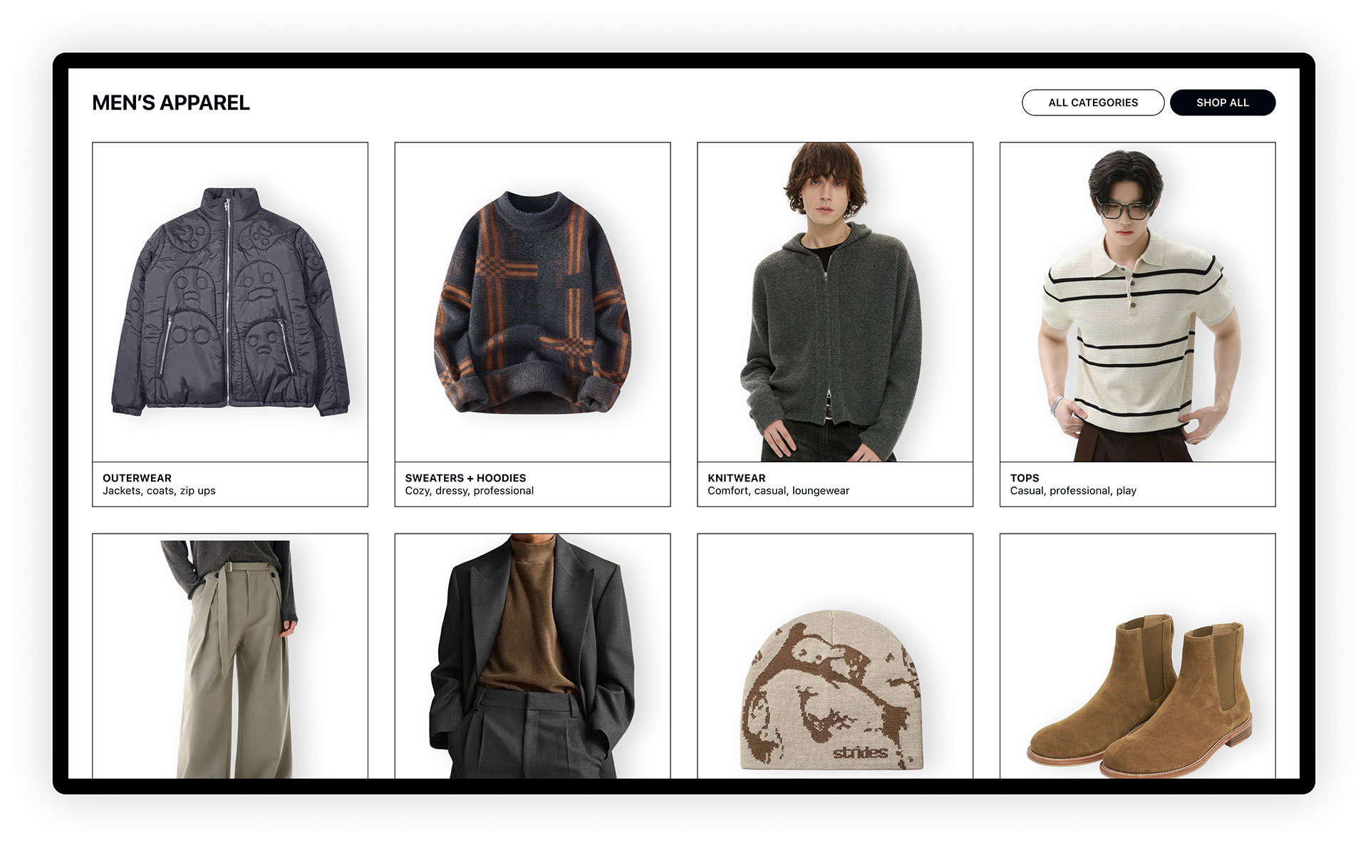
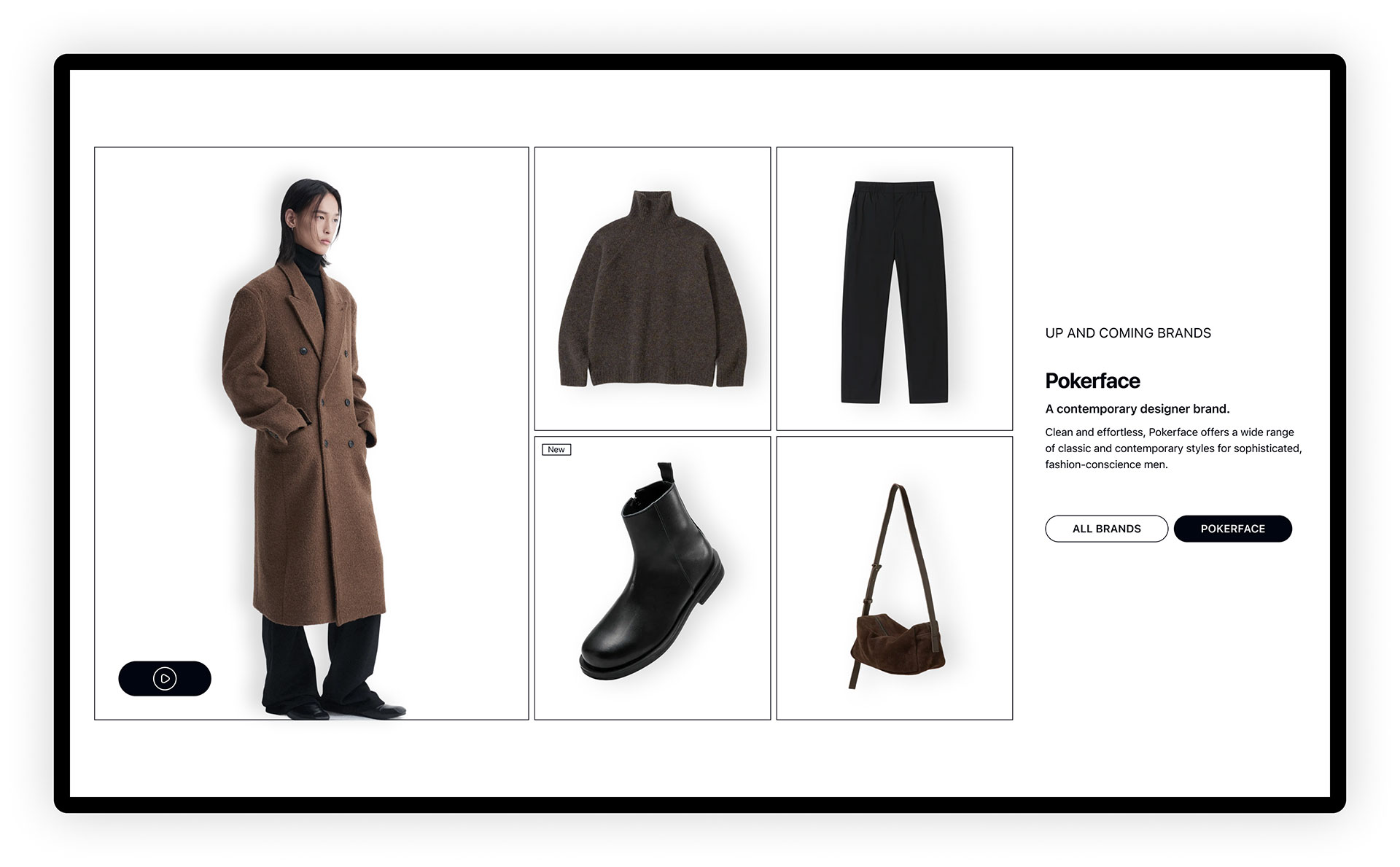
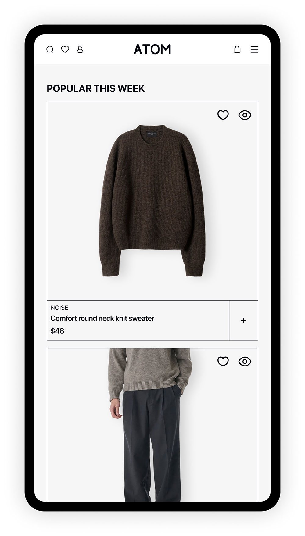
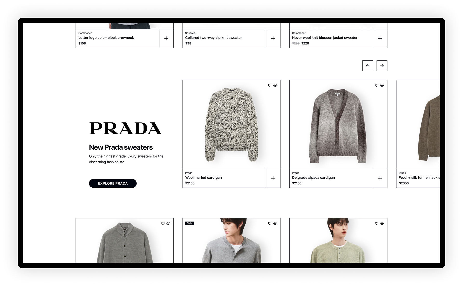
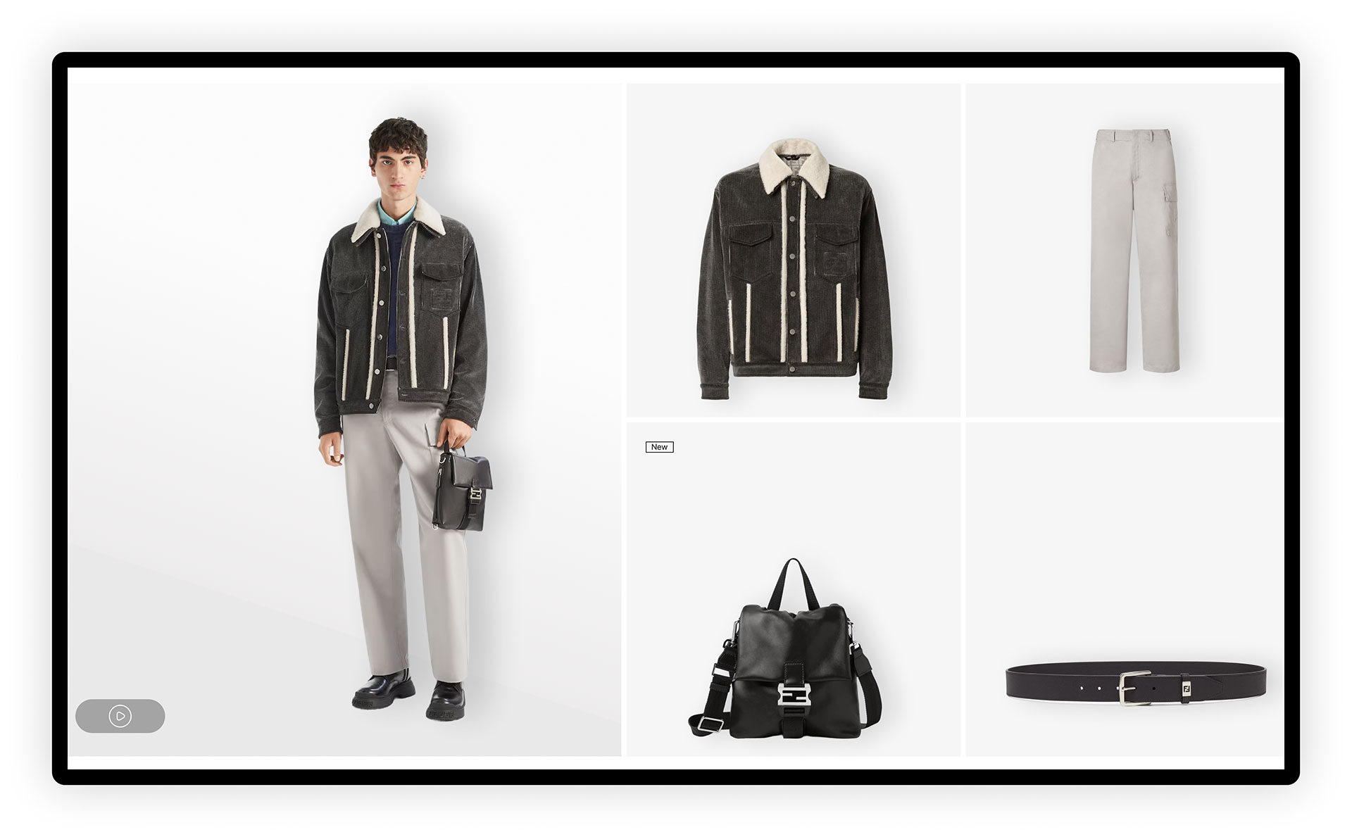
Homepage // product focus
The homepage features several product grouping types to provide diverse methods of browsing and buying, such as quick access to shopping categories, weekly top seller showcase, new products, and up and coming brand promos.
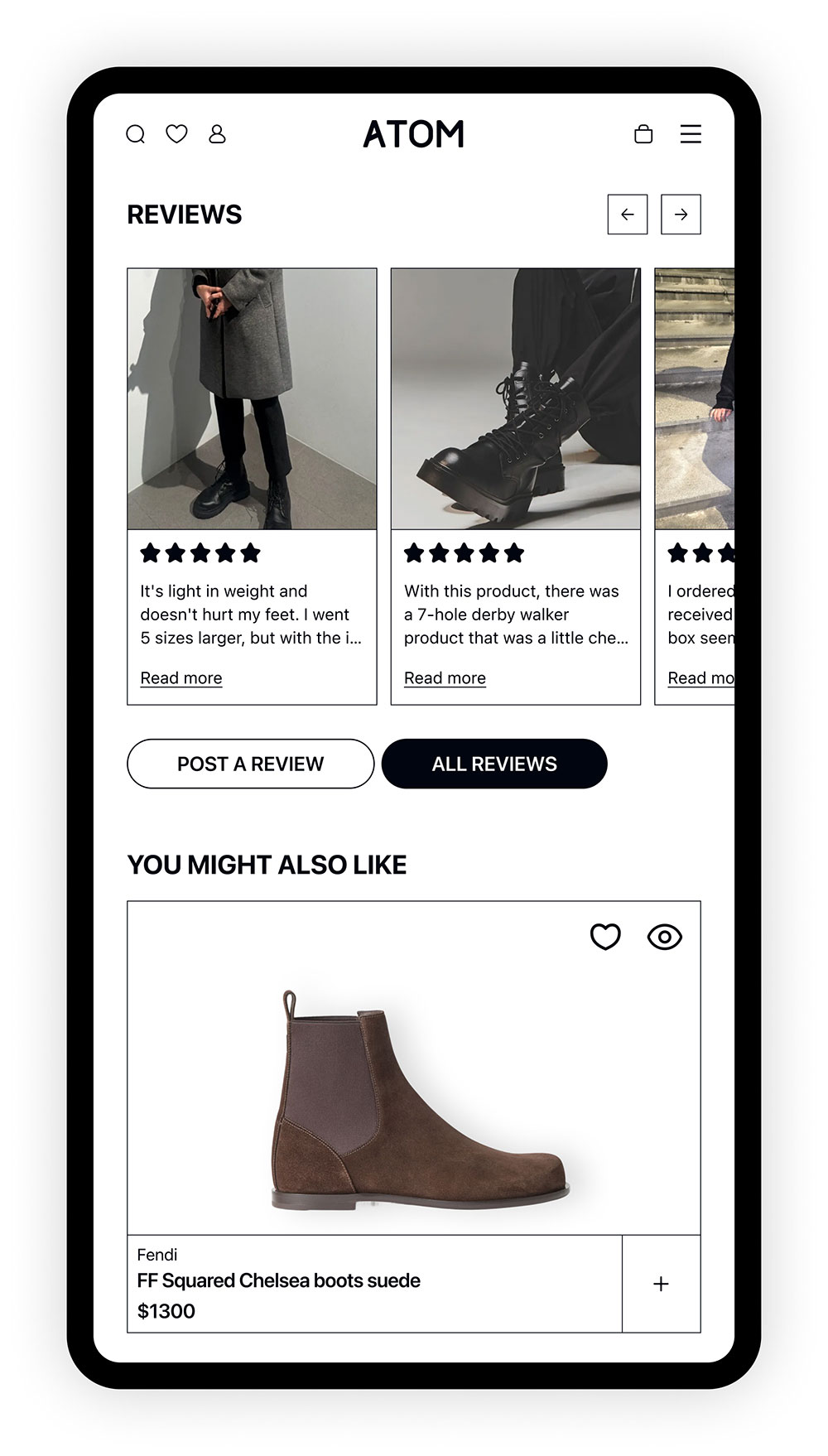
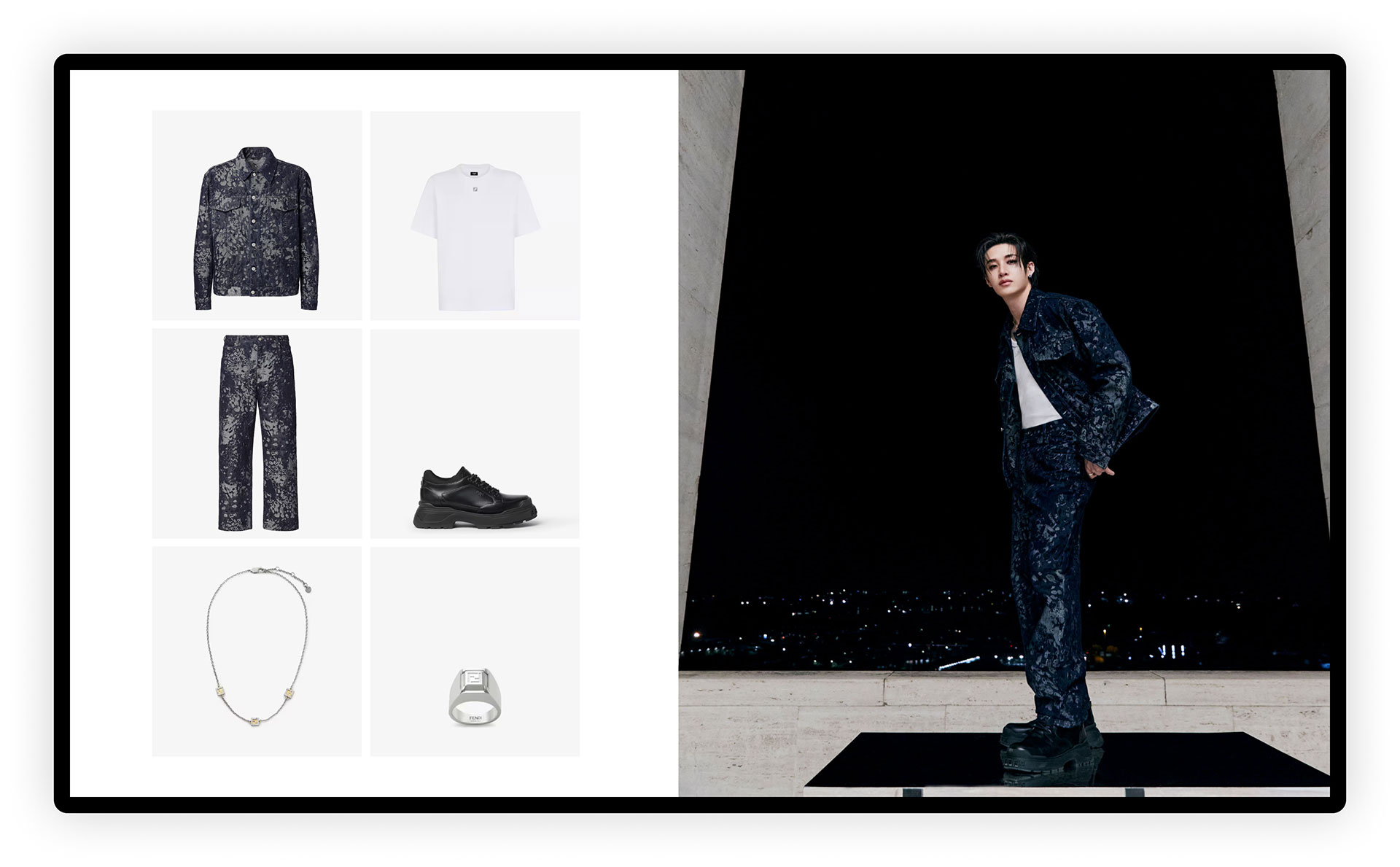
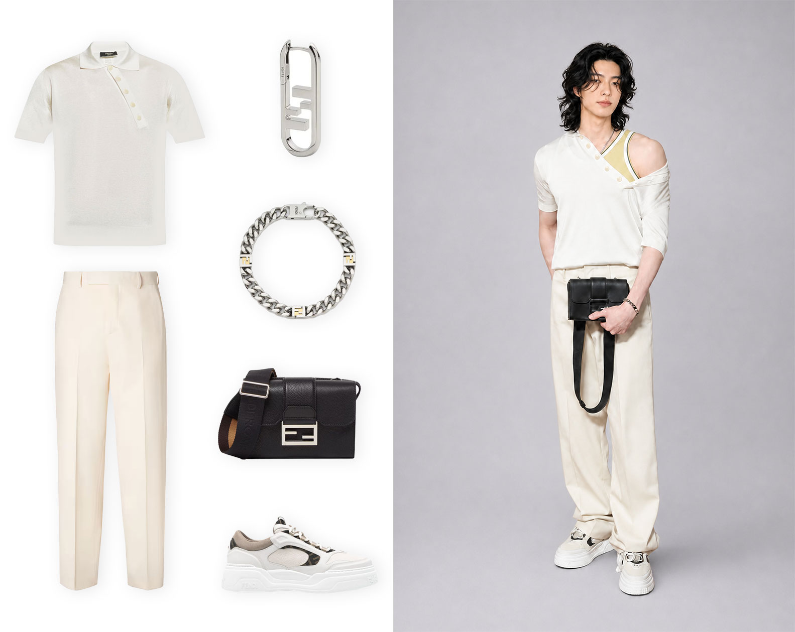
The products shown are not random, but carefully curated selections from each category that form complete ensembles, which are intended to serve as a virtual stylist feature, as well as a purchasing guide. In the comps below, you’ll notice a pattern where groupings include complementary items that can form an entire fit, or a set of products from a single category meant to wear together. This theme can be found throughout the website, with options for customers to add the whole outfit to their bag.
Mobile homepage
ATOM’s interactive sections translated well to mobile. As a content-heavy website, allowing users to swipe sections to access additional content saved valuable vertical space, while ensuring content remains clear and uncluttered.
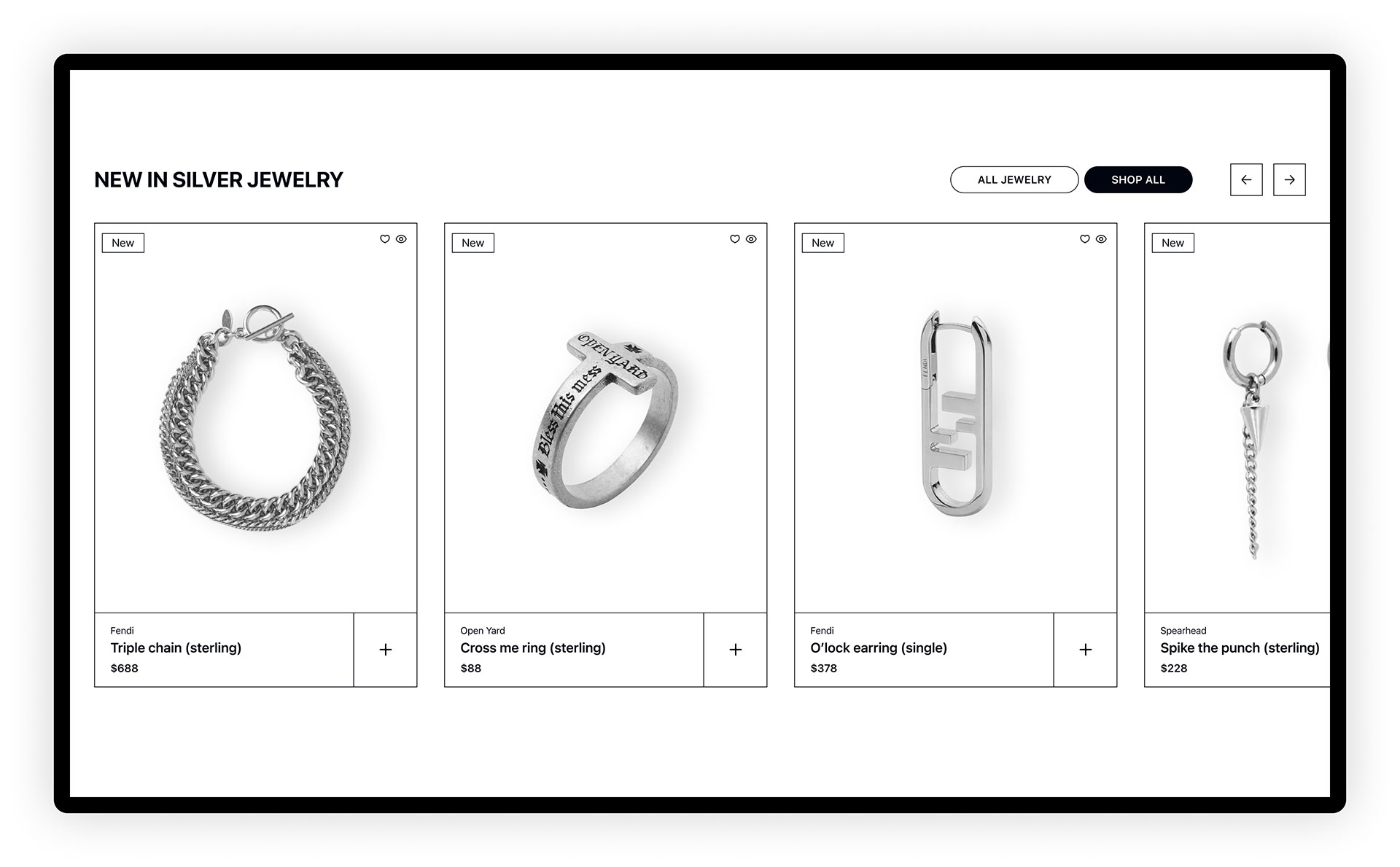
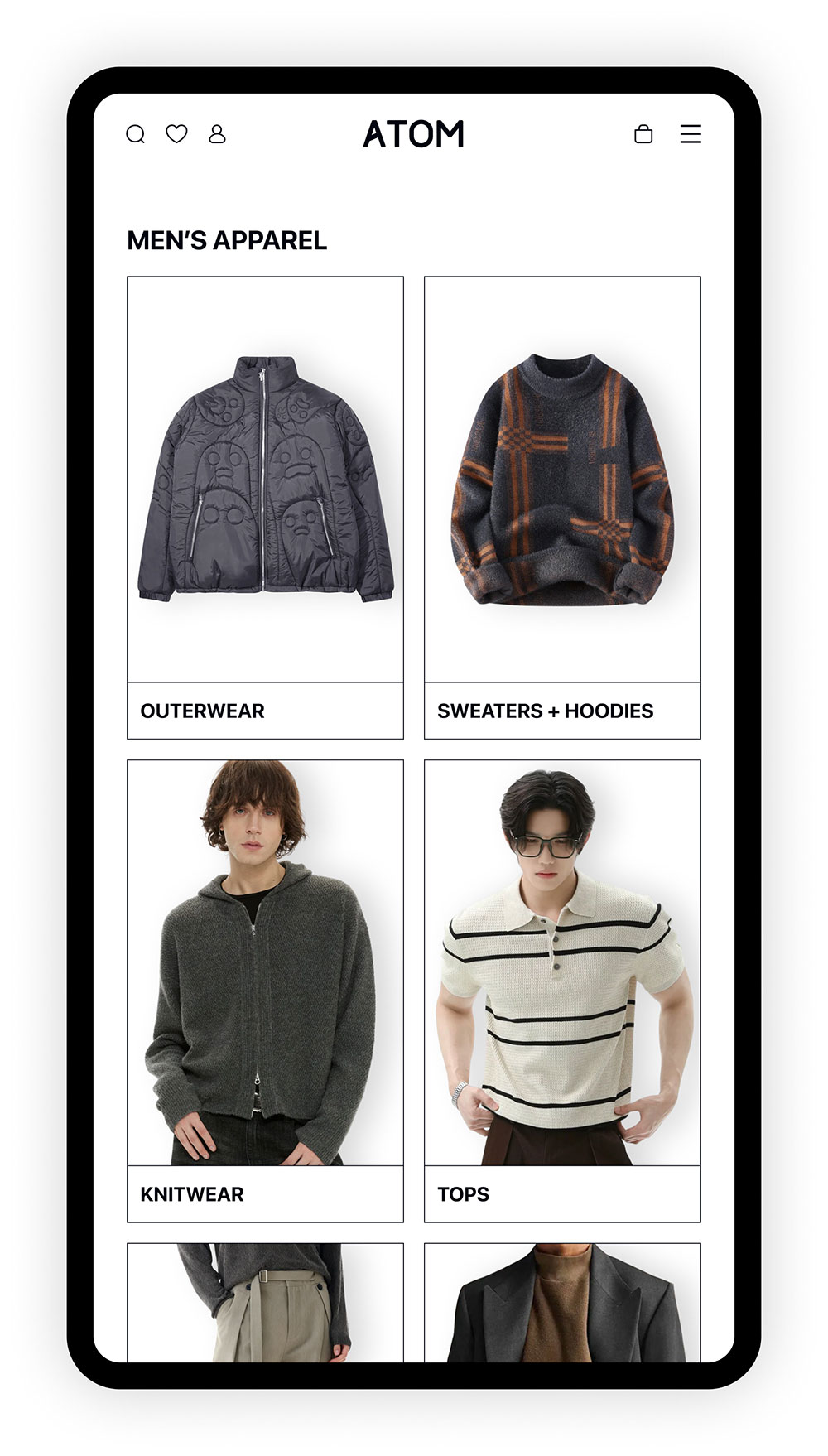
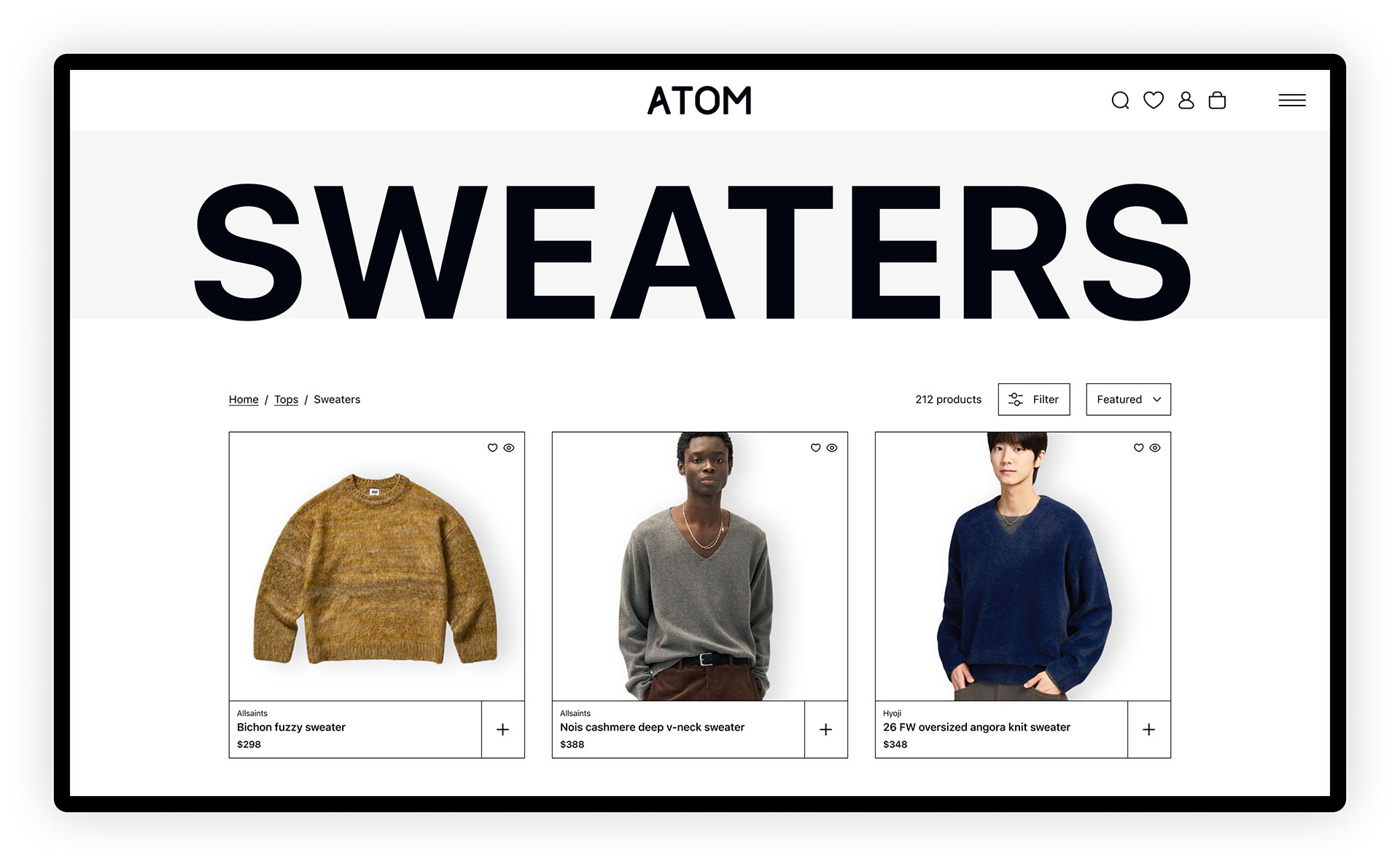
Shopping pages // category and standard product pages
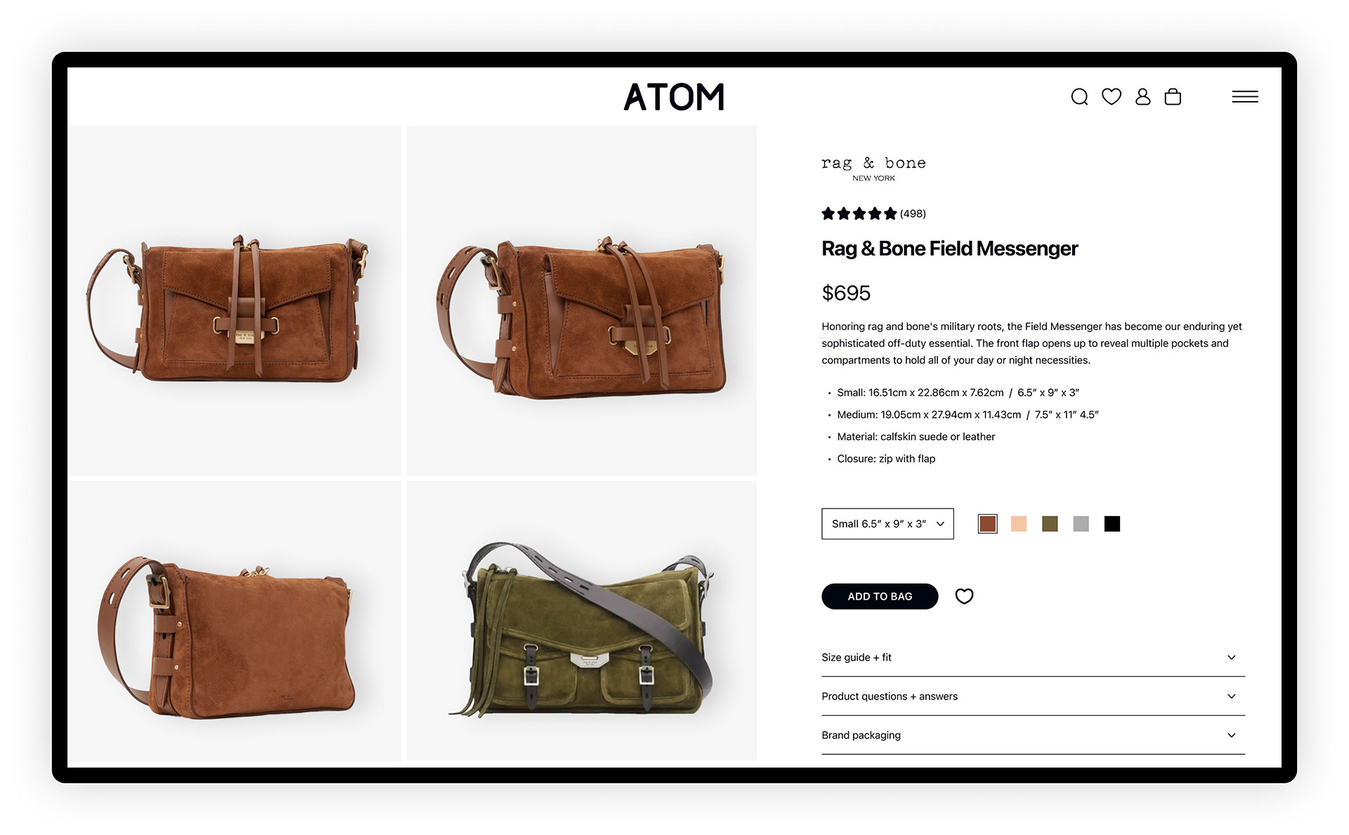
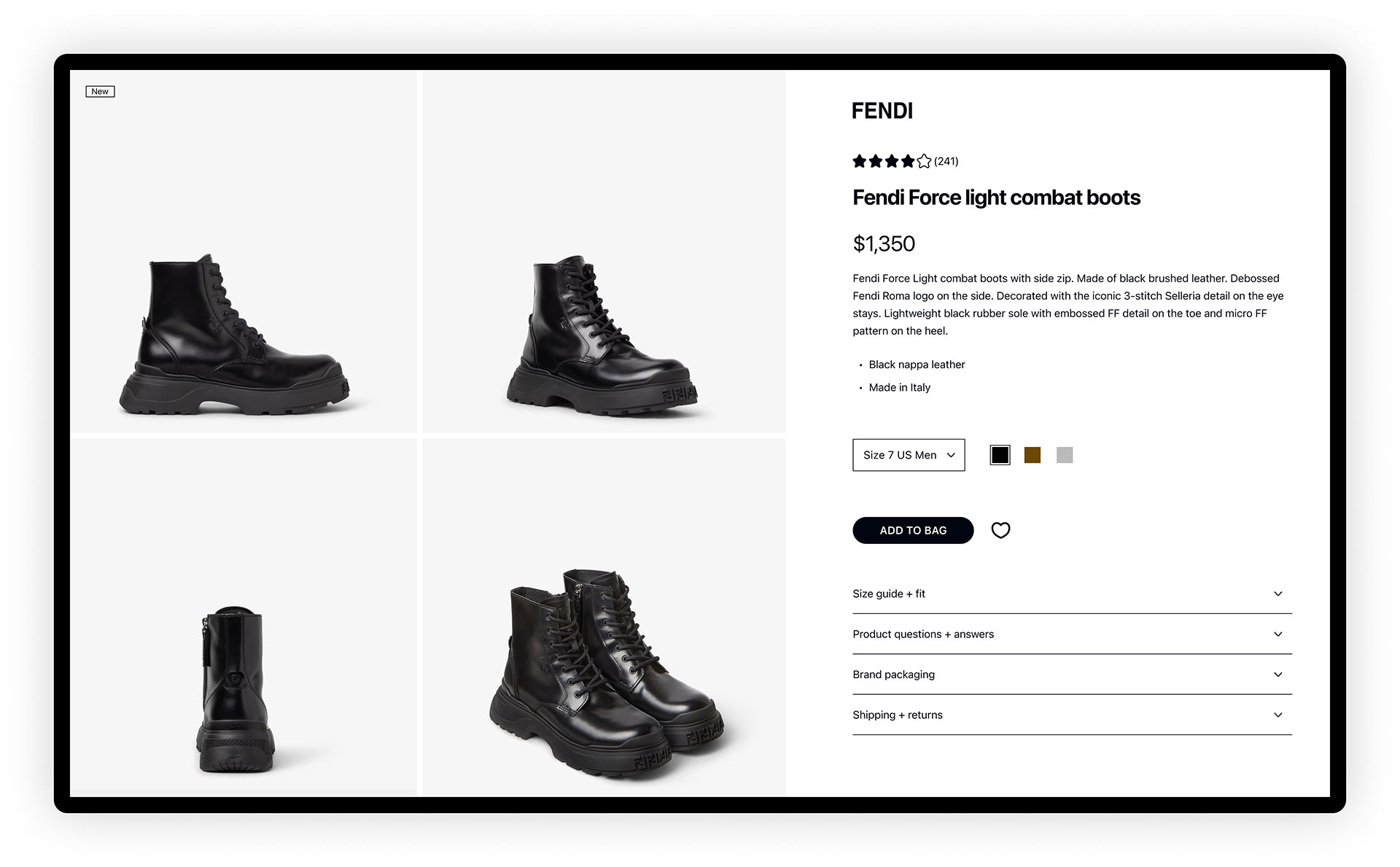
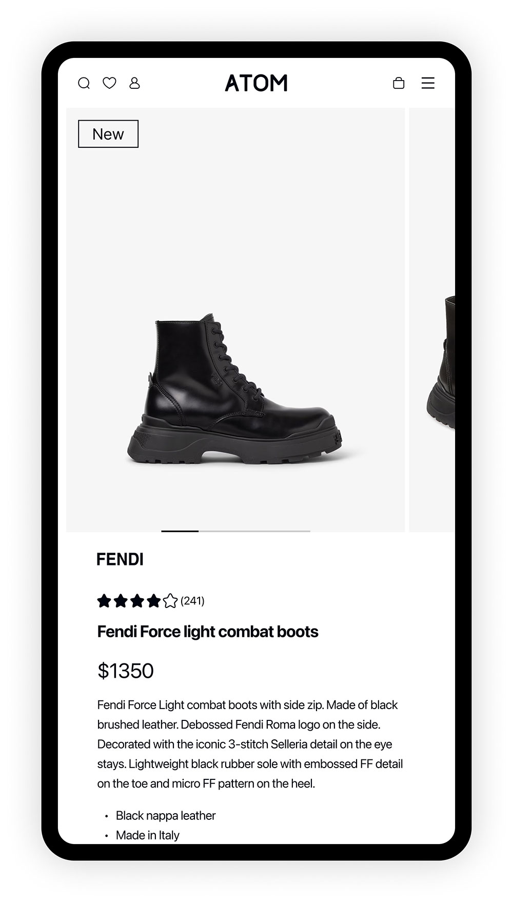
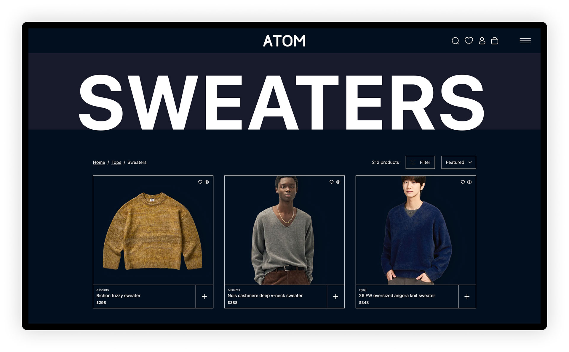
Focused on usability and shopping ease, ATOM’s categories and product pages are pretty straight-forward.
Categories include filters and sorting options to customize the shopping experience, while product cards include quick add, quick view, and add to favorites buttons. Badges for sale and new items are also displayed, where applicable.
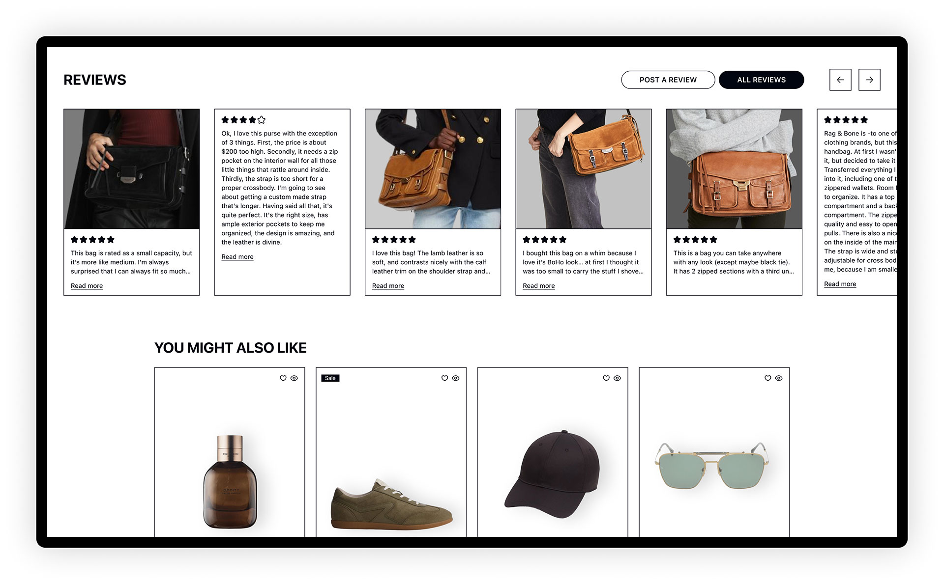
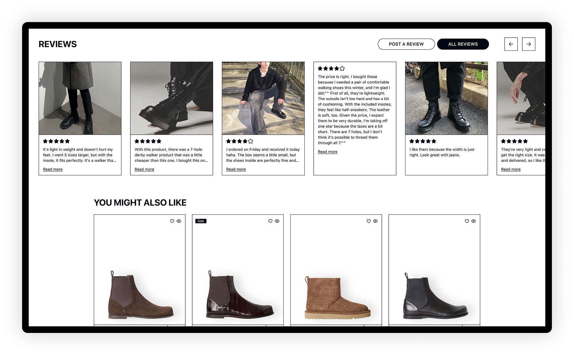
Standard product pages include large, grid-based product photos detailing each item, accompanied by detailed descriptions, ratings, and comprehensive information housed in accordion sections to reduce clutter.
Customer ratings, reviews, and photos are a prominent feature, as analytics show high user interaction with this section. Customers are encouraged to upload photos via follow-up emails, which often include a discount incentive in exchange for participation.
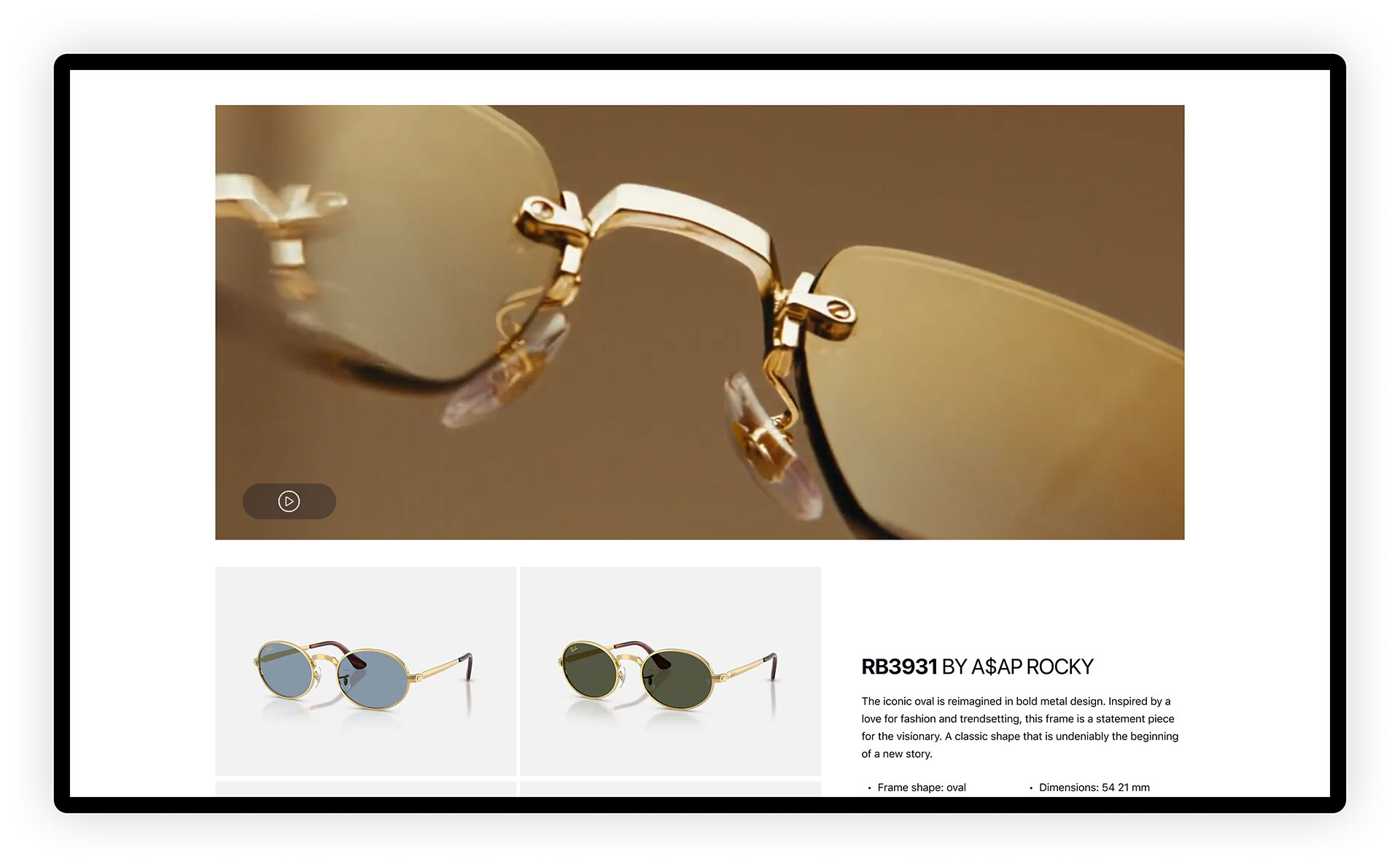
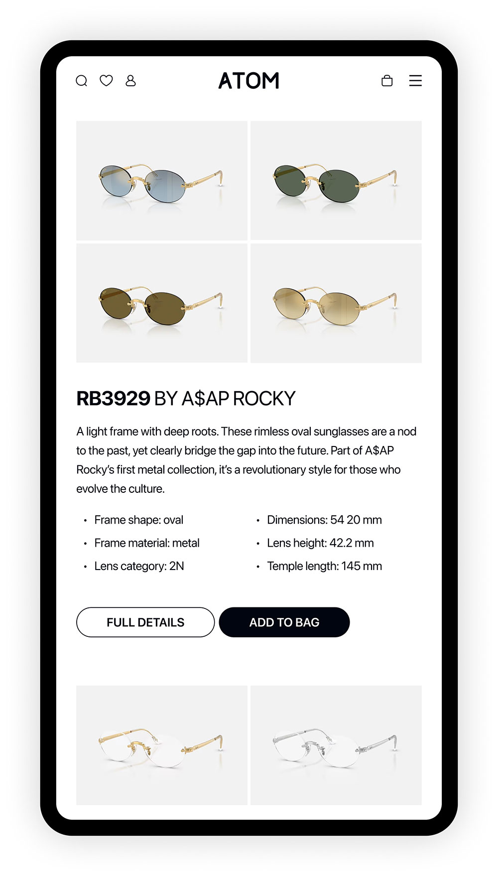
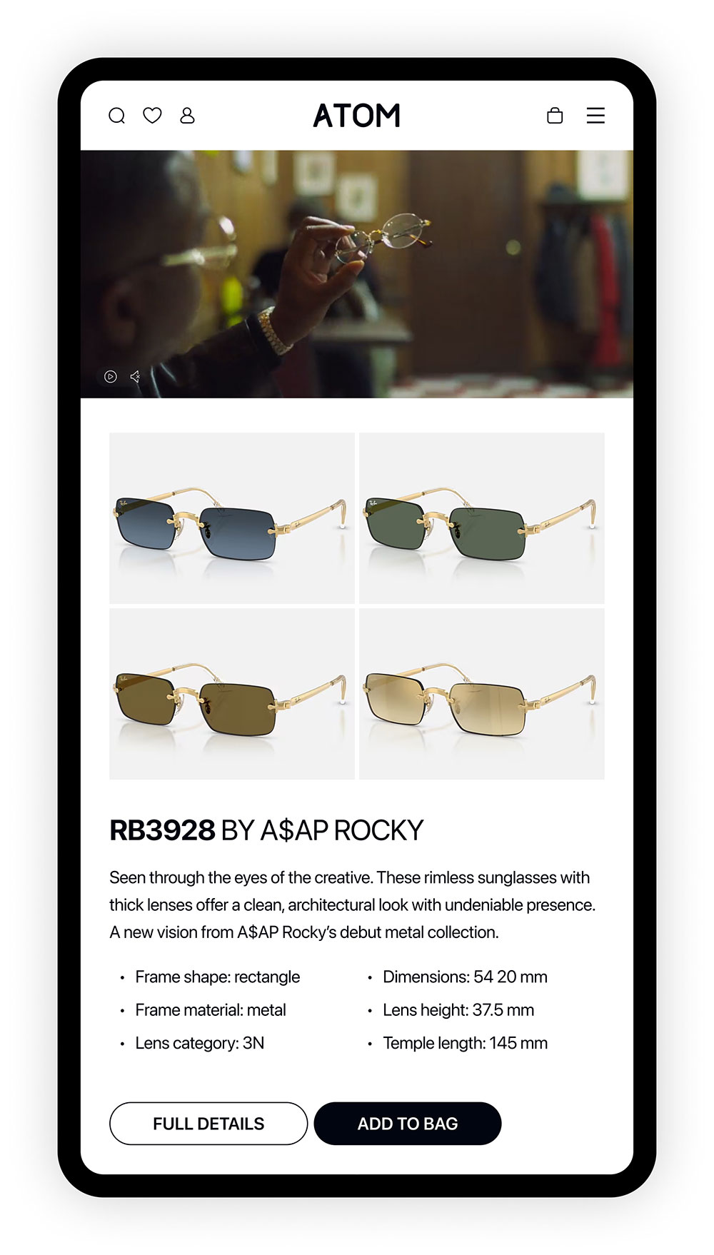
Shopping pages // featured product pages
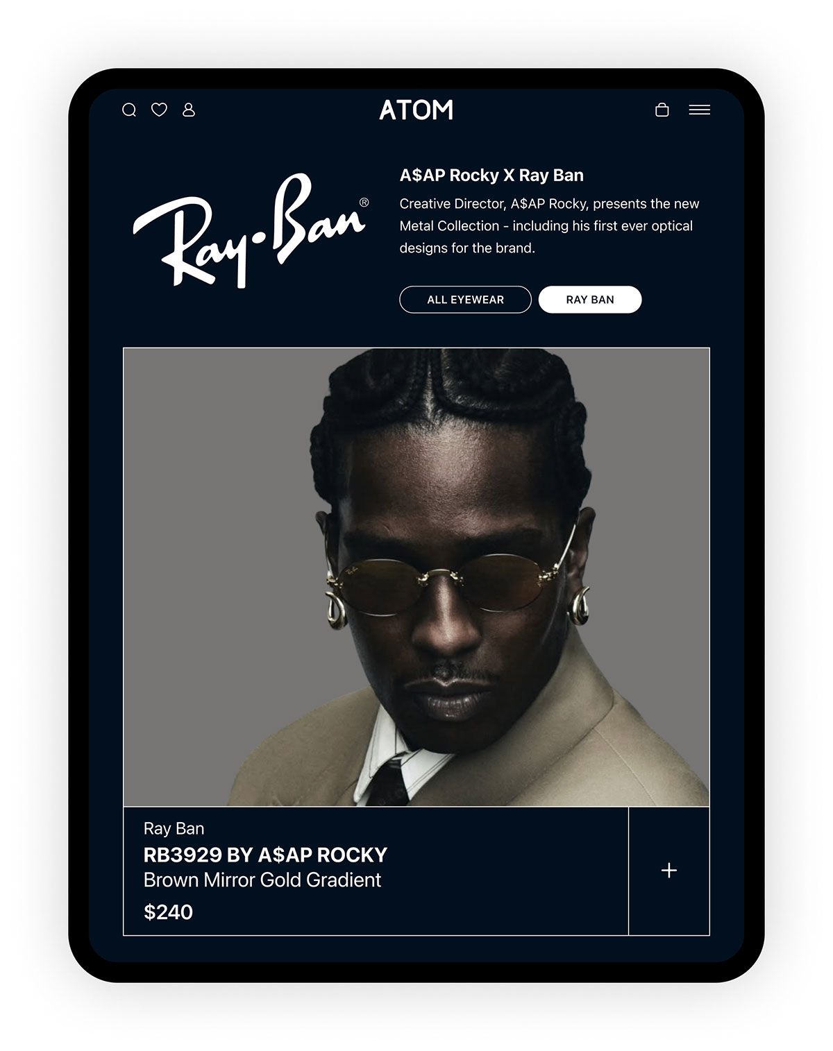
Featured products are typically those associated with celebrity partners, which are often couture brands. Featured product pages are a little more elaborate than standard product pages, and may include celebrity galleries, videos, and lookbook-style ensemble ideas featuring other products of the same brand. As with standard products, customer reviews are encouraged and promoted on the page.
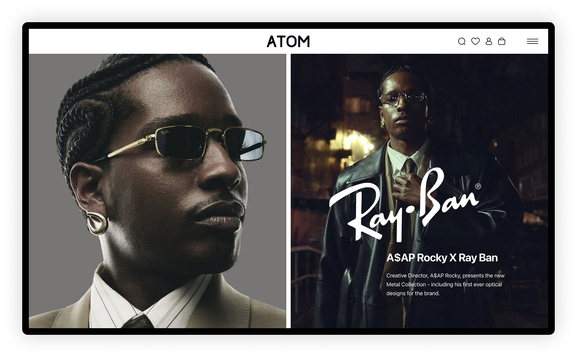
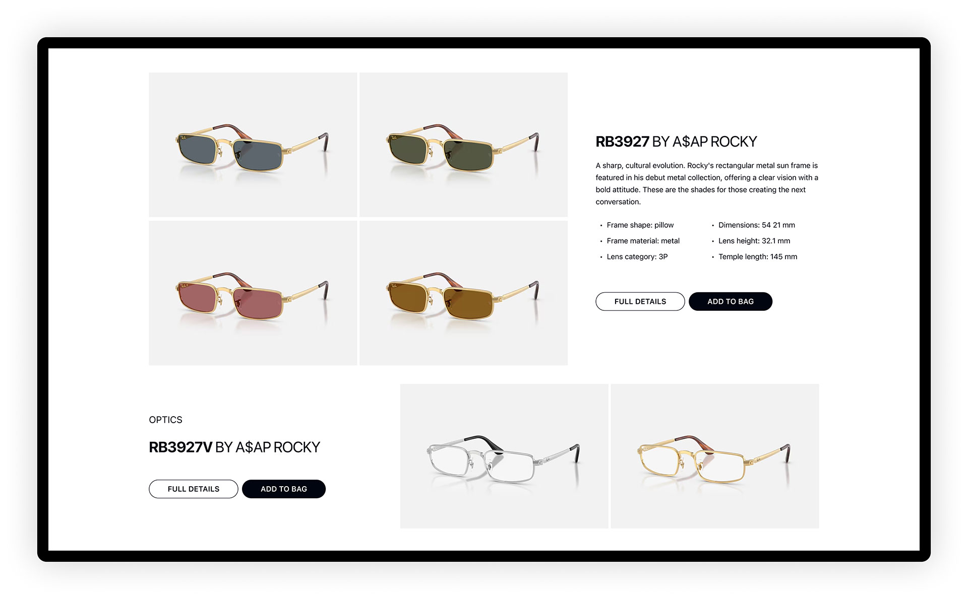
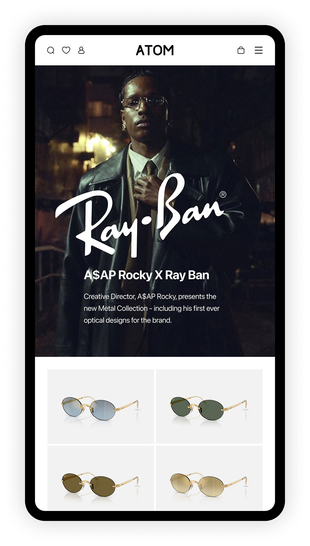
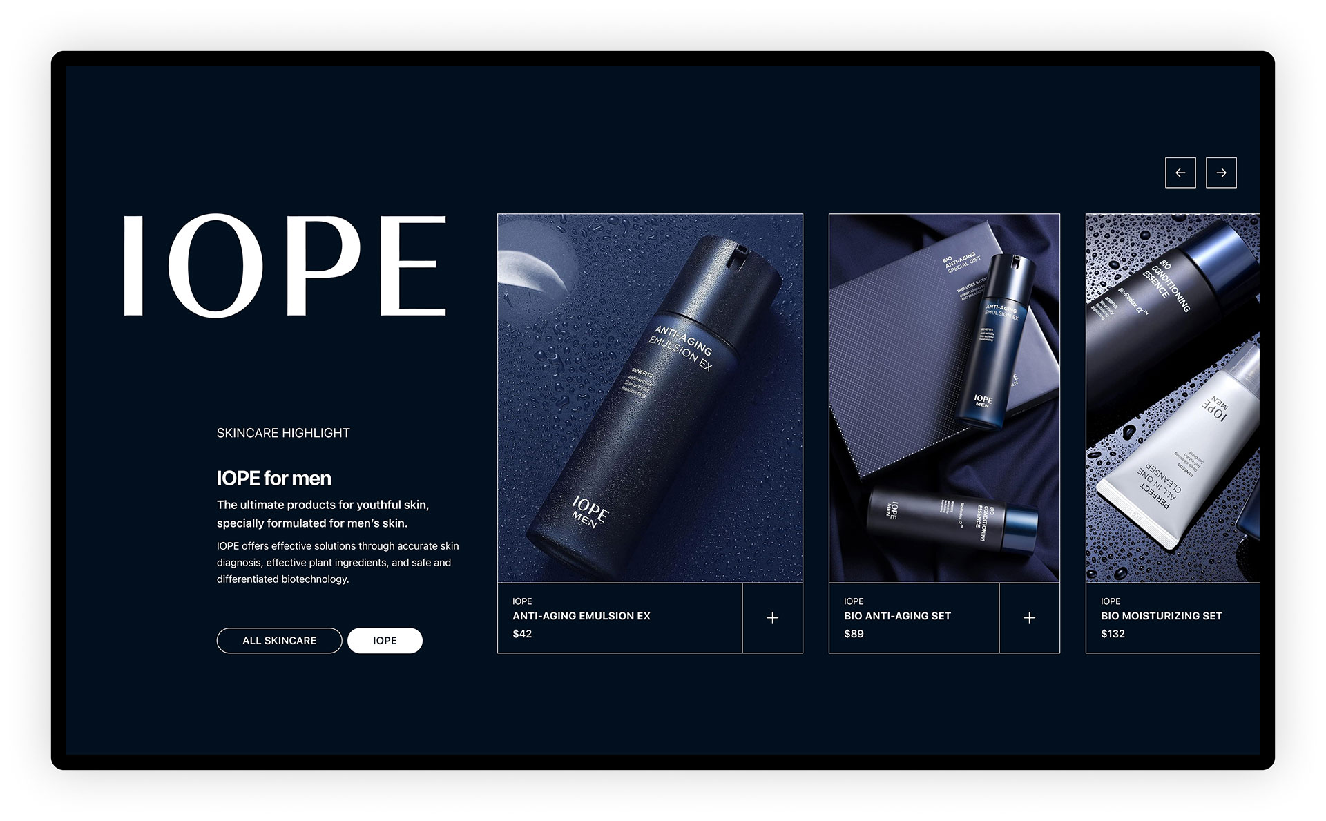
Collaboration product page
More prominent celebrity or brand collaborations may include a specially-designed landing page highlighting the partnership and products. These pages are unique to each collaboration and are custom designed based on the materials provided by the brands.
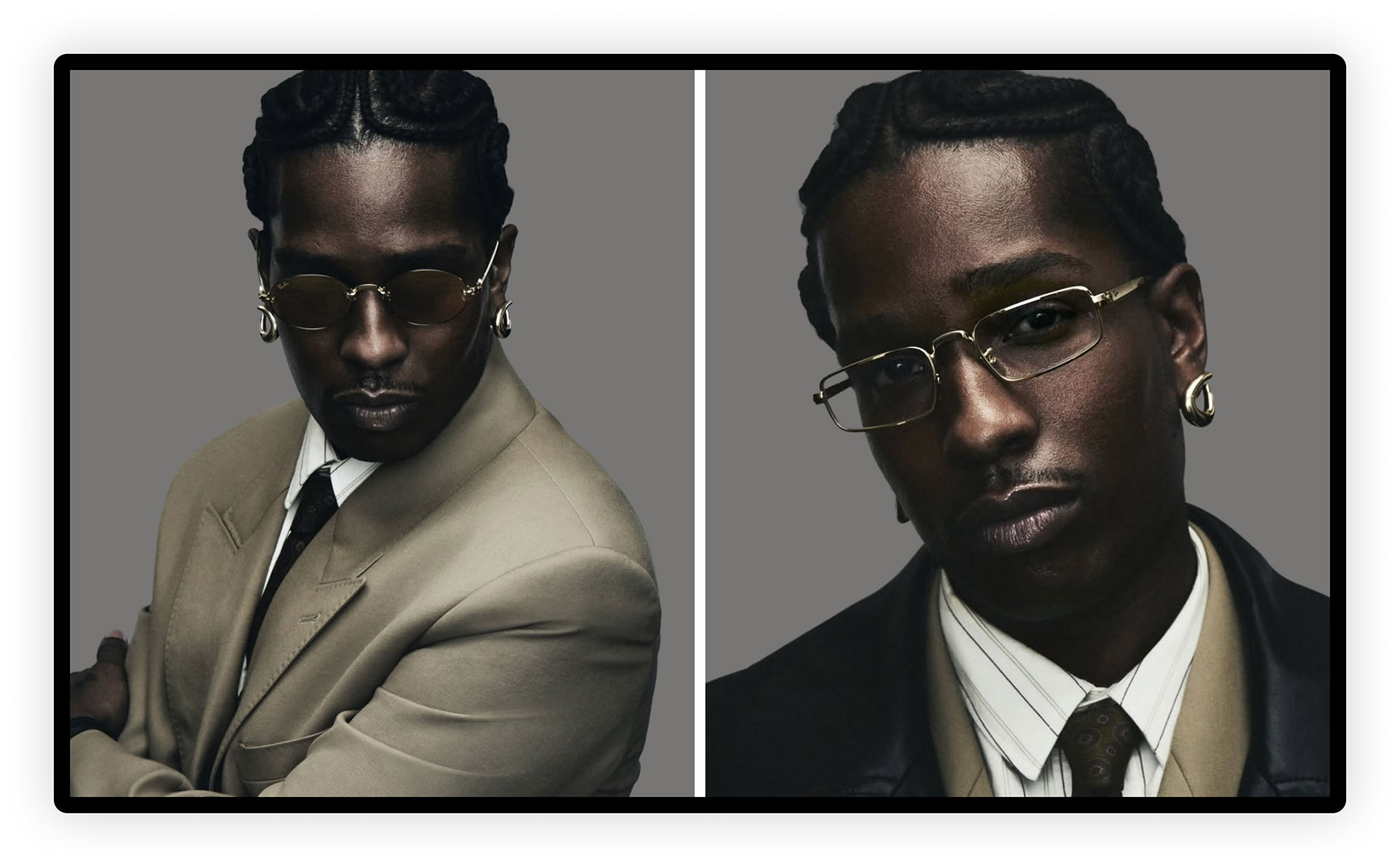
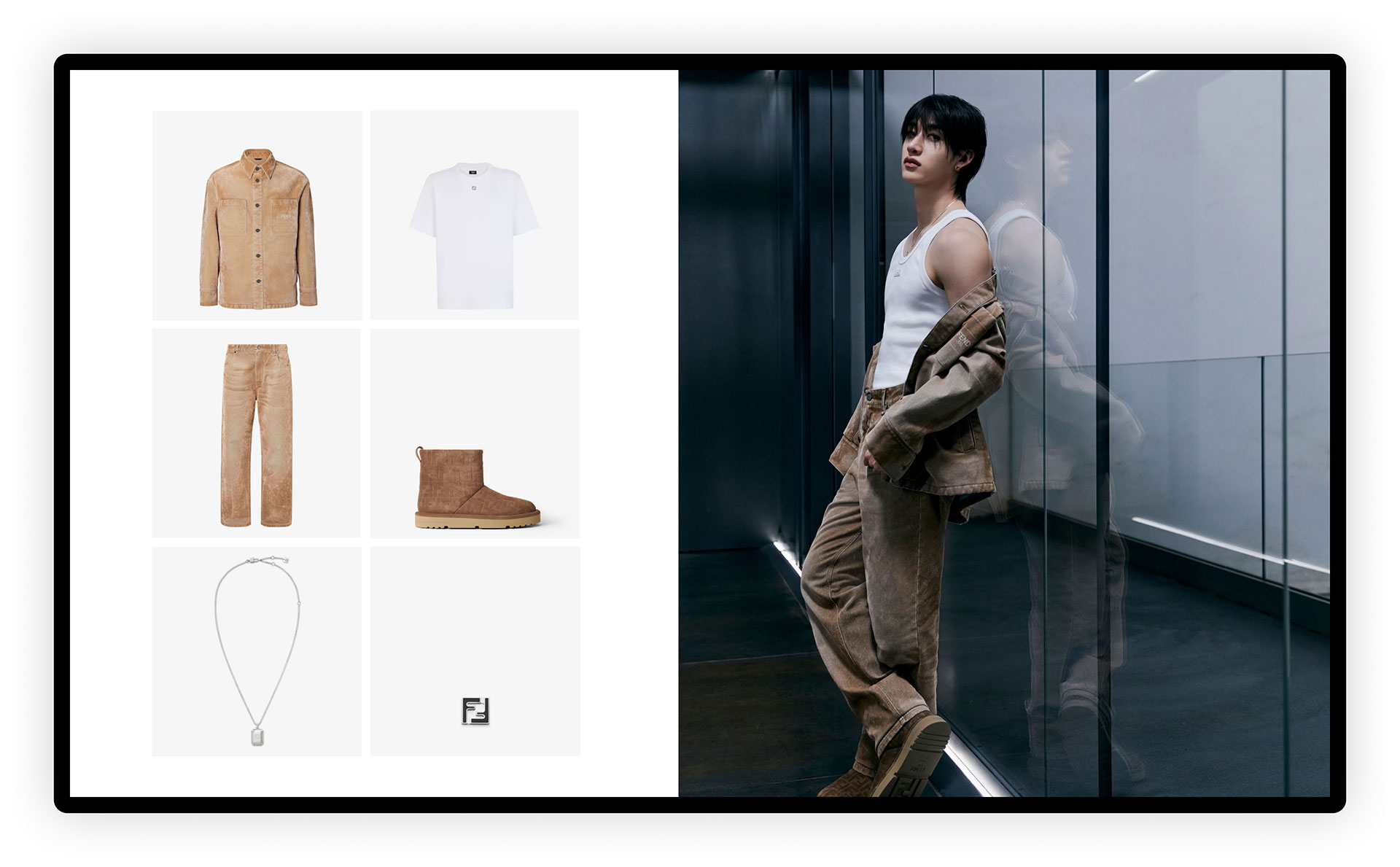
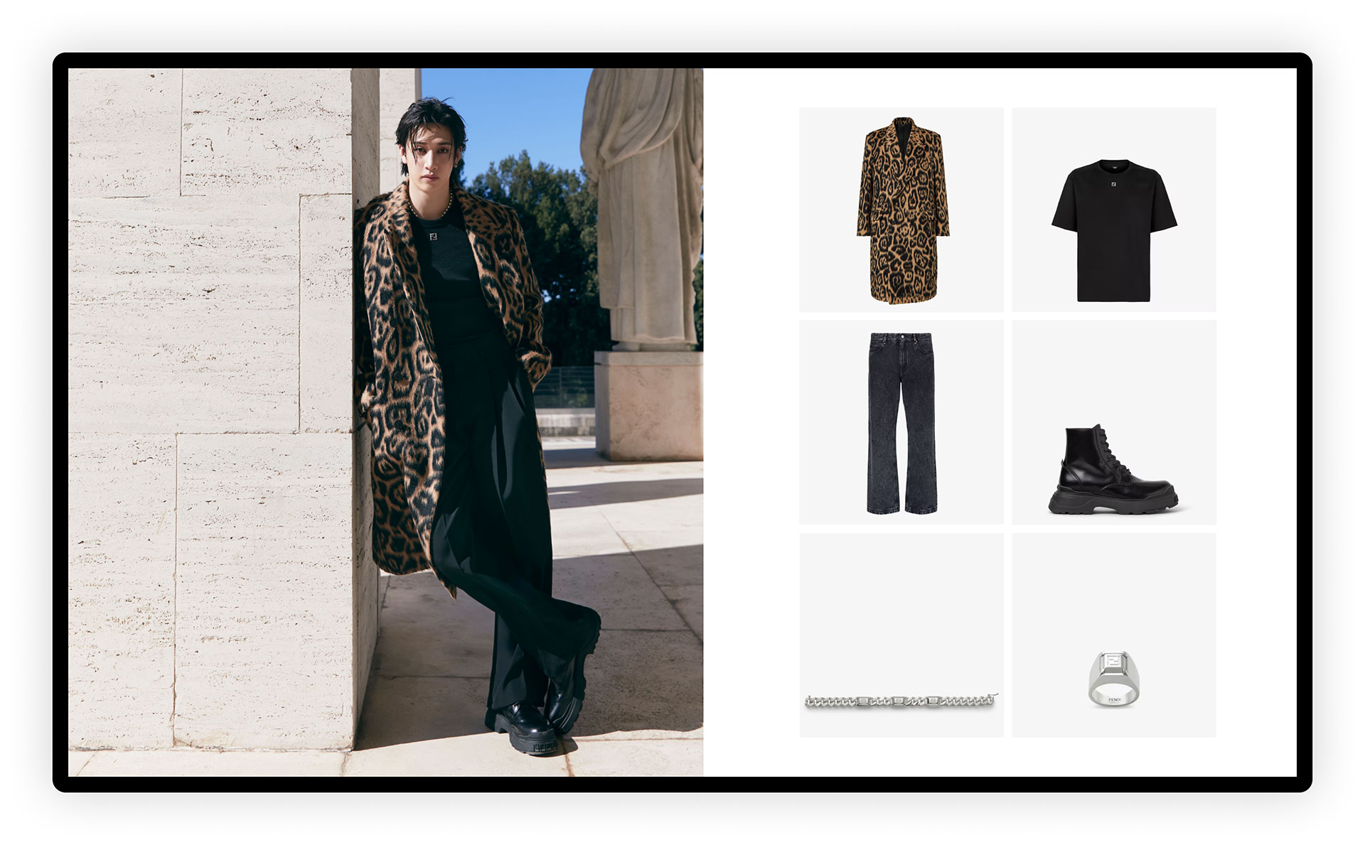
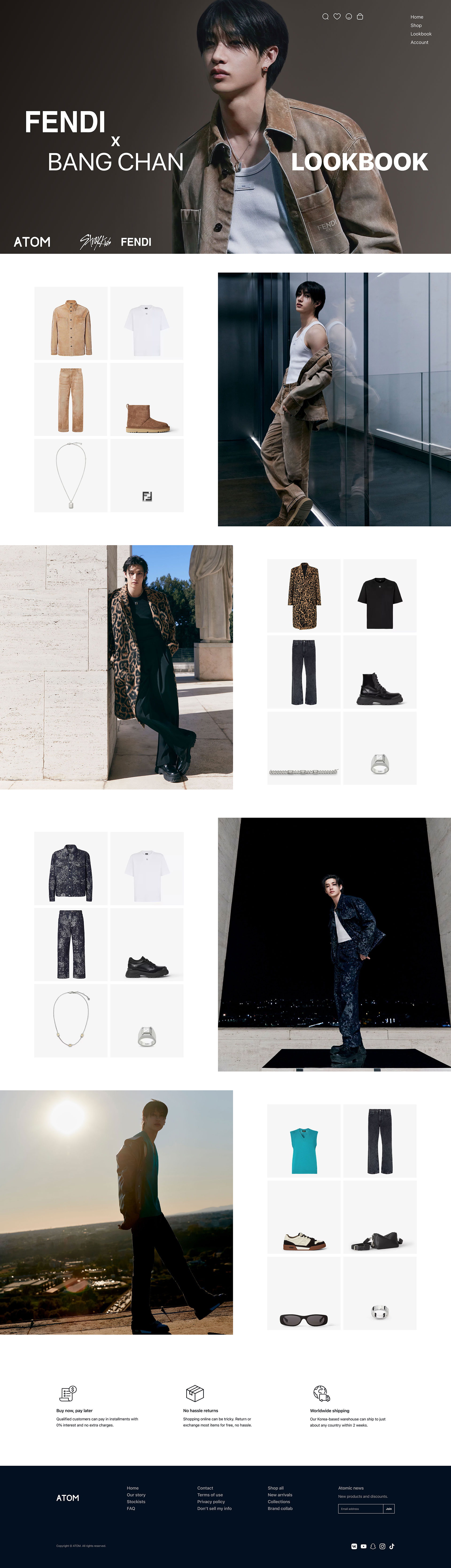
Lookbook
Celebrity partnerships may include a Lookbook page showcasing photos and video of the ambassador and the products. These pages are designed to serve as virtual stylists, featuring complete ensembles directed by the brand itself.
Dark mode
For added experience customization, a midnight-blue themed dark mode can be activated.
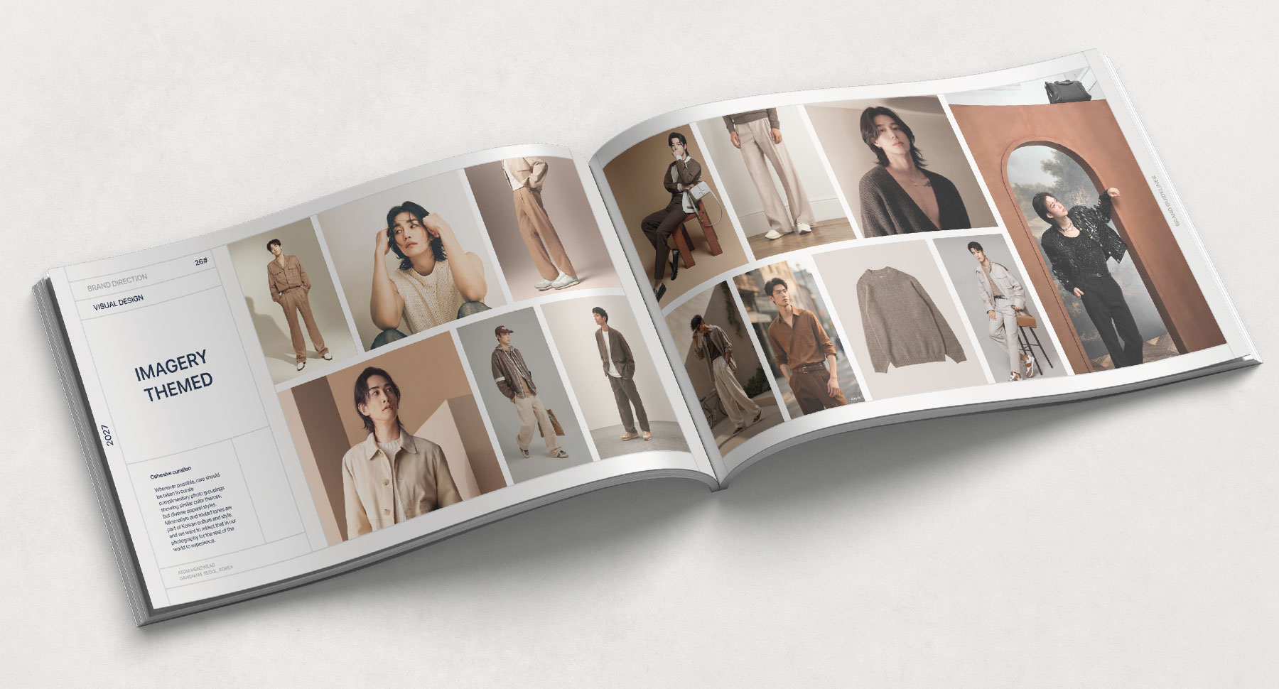
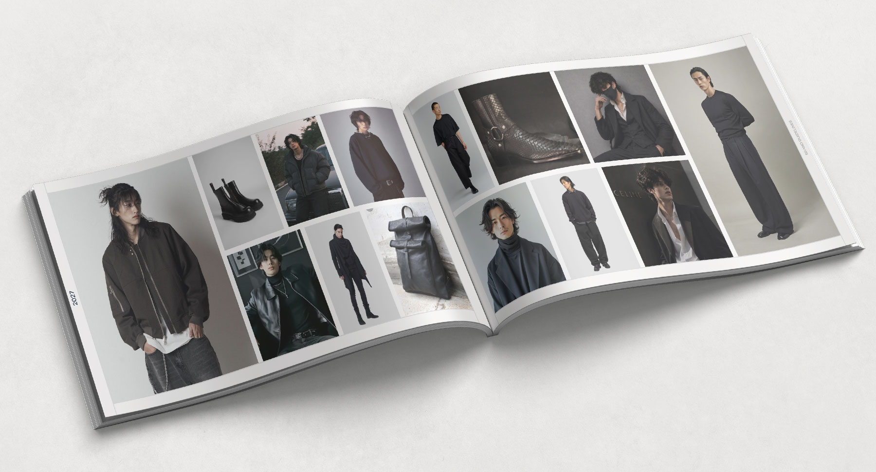
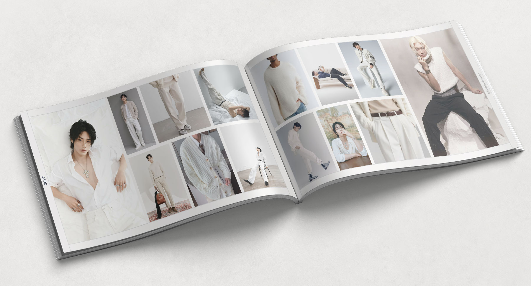
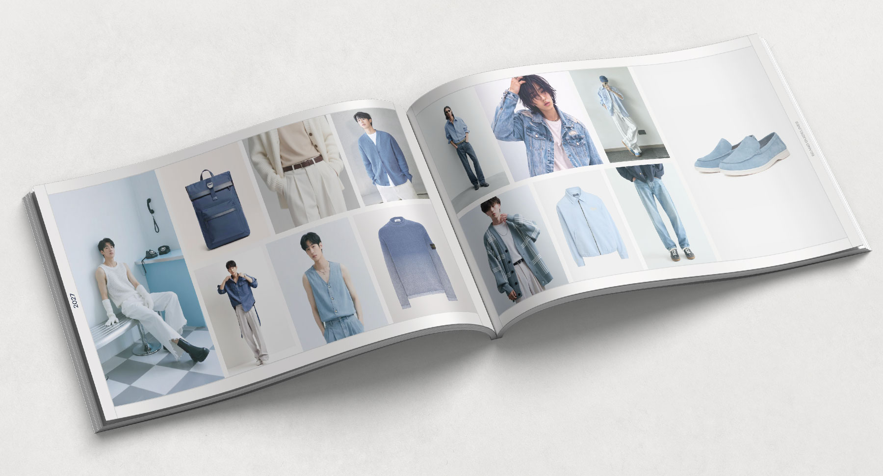
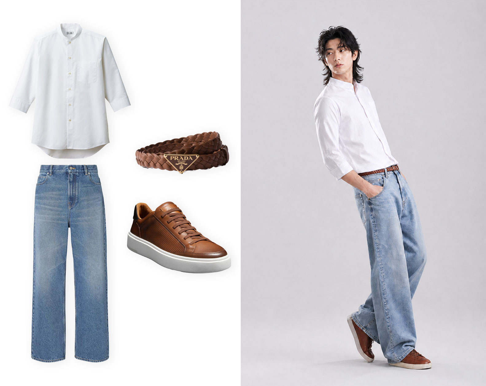
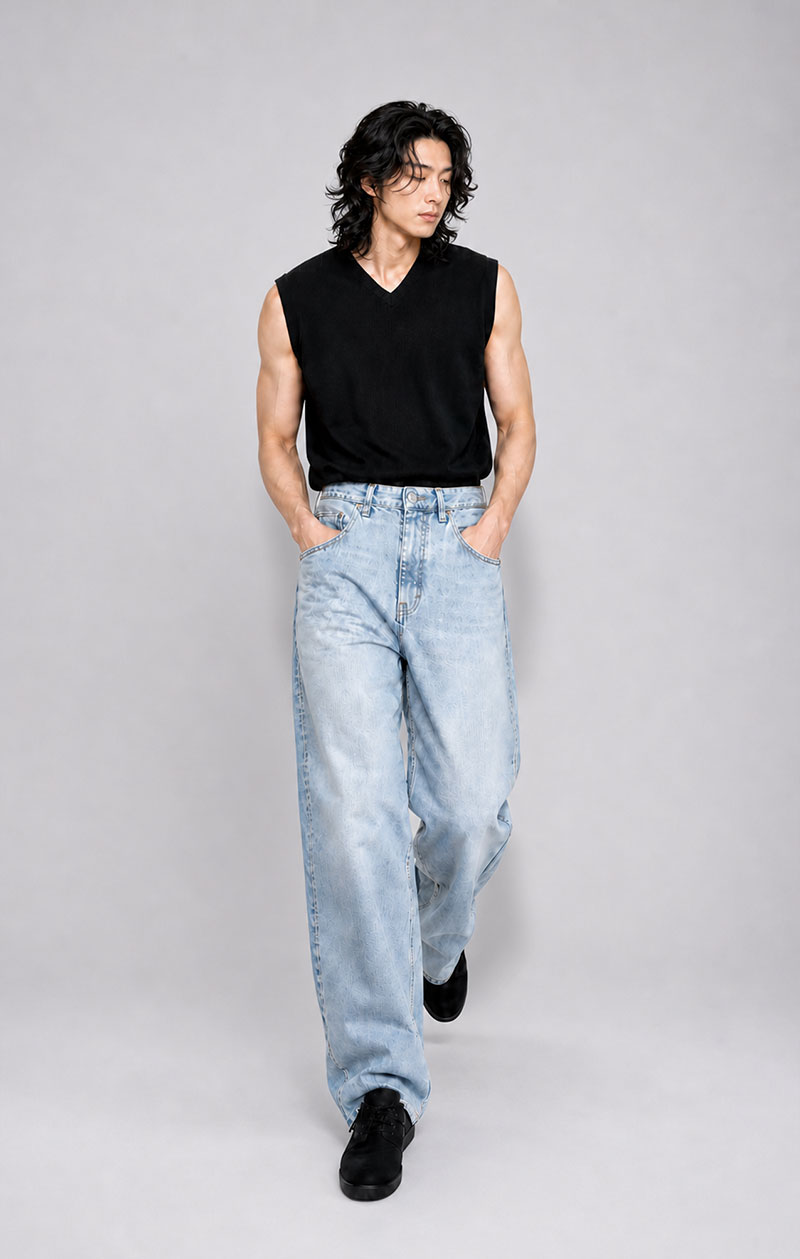
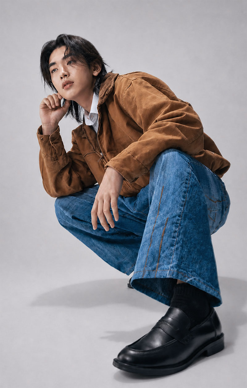
AI elements
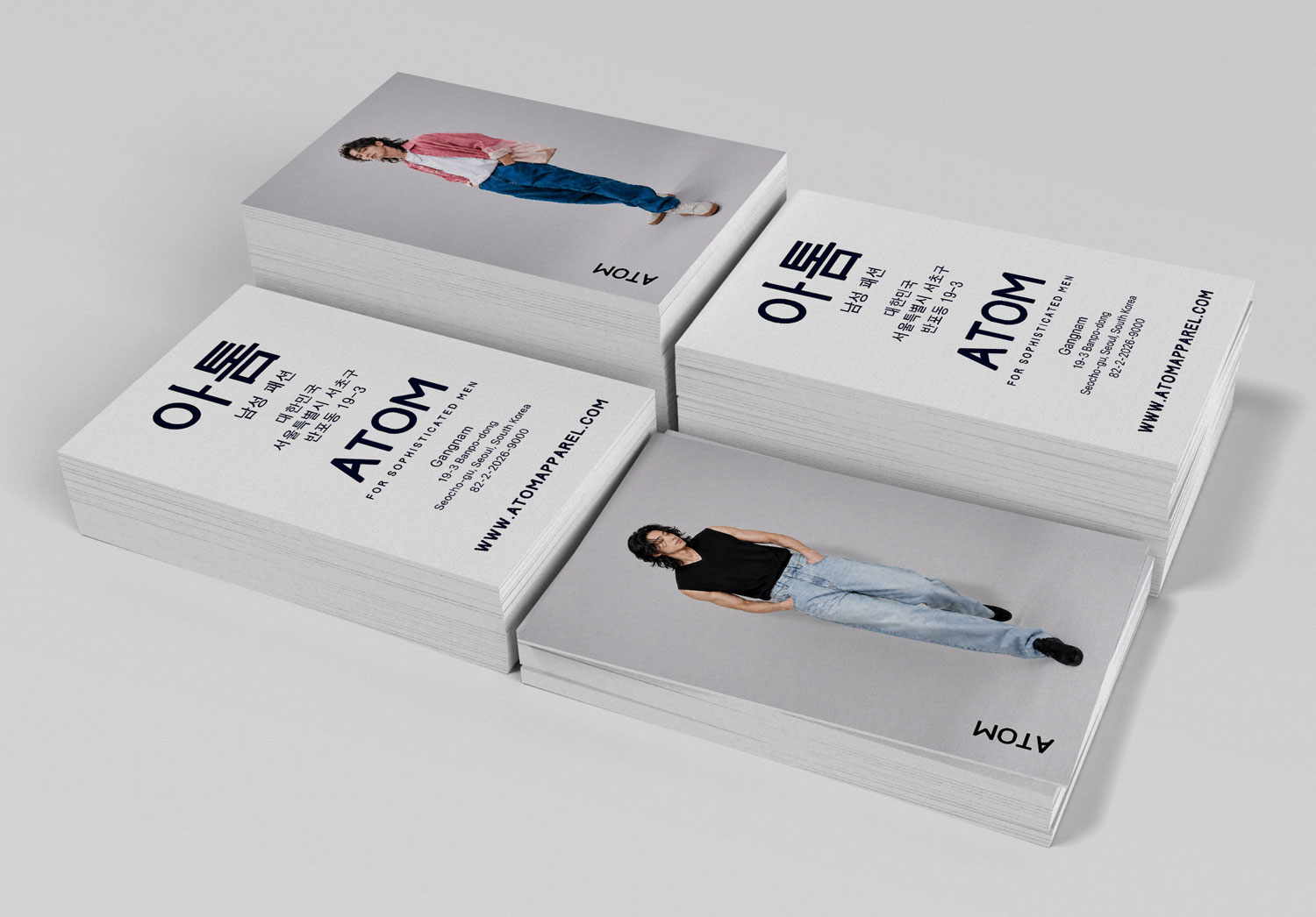
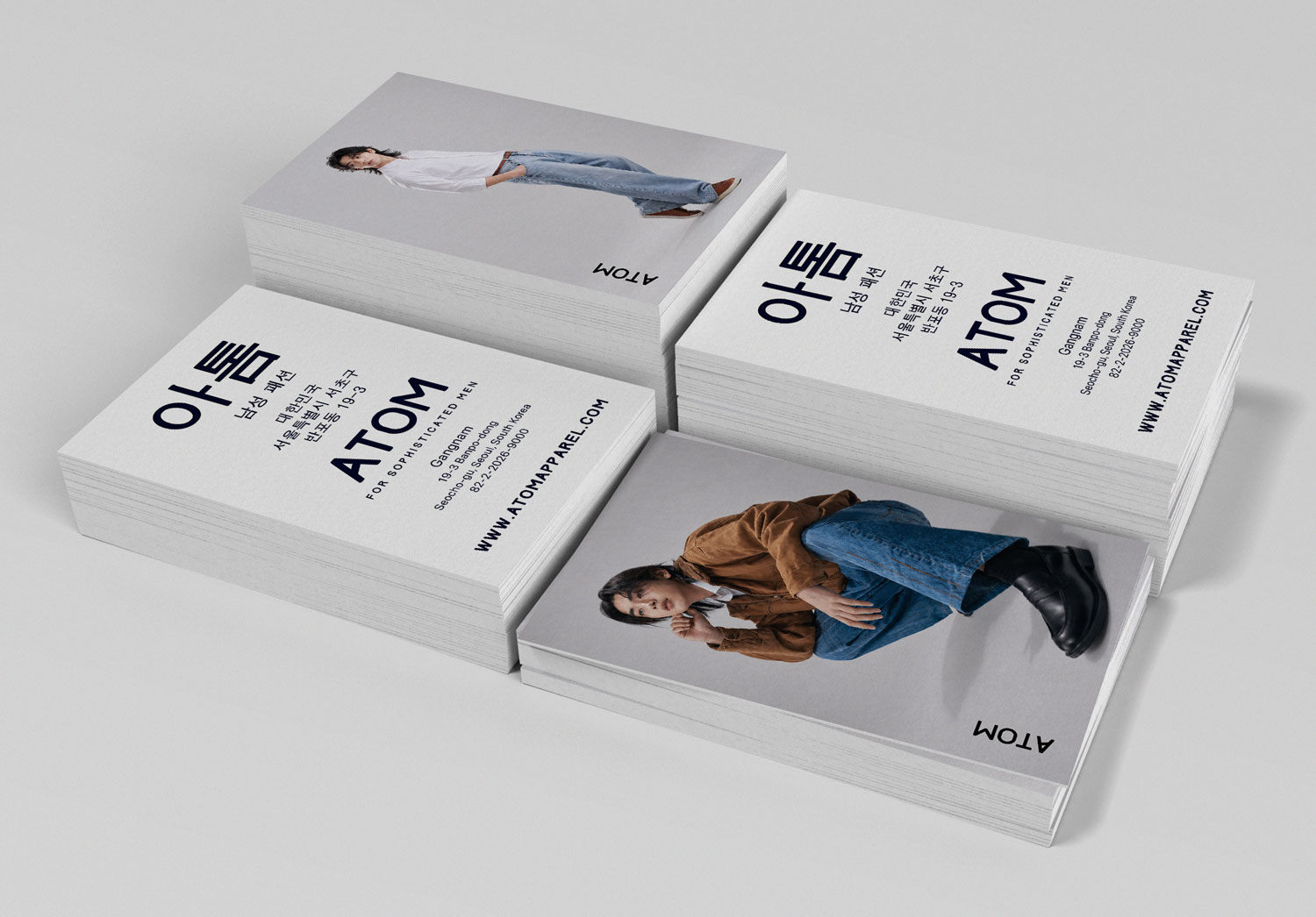
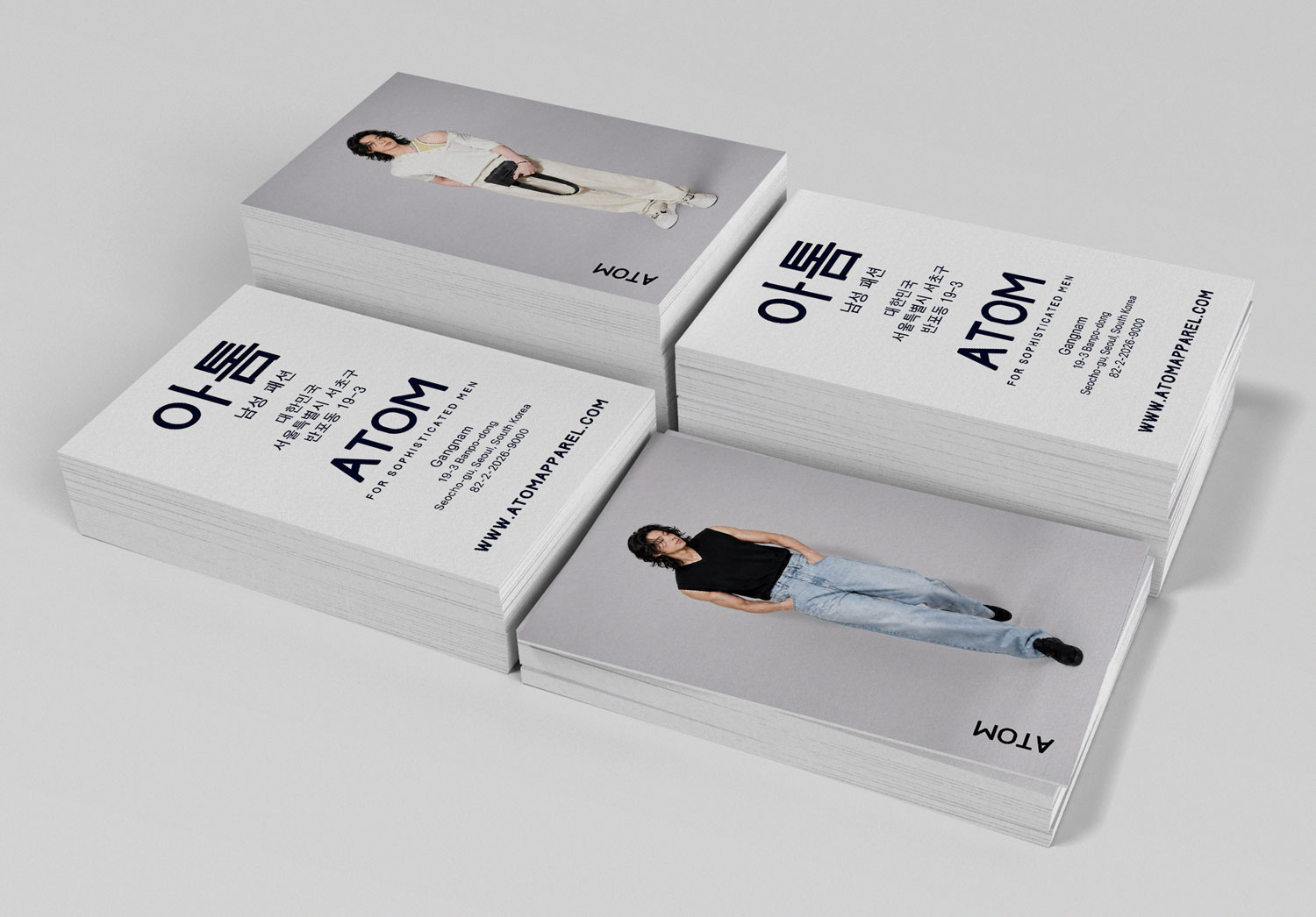
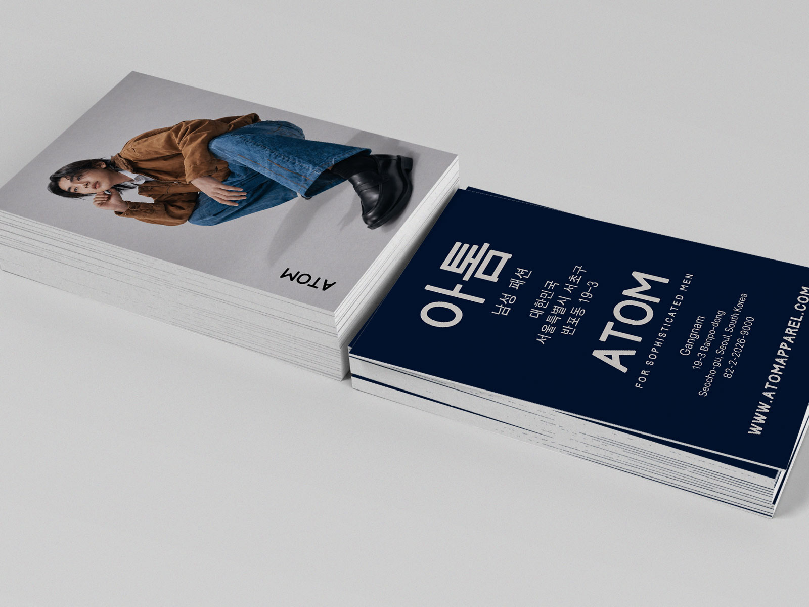
For ATOM’s collateral items, I used generative AI to create the models featured in their stationery. This allowed me to design custom imagery of models wearing real outfits curated by ATOM’s style experts, all of which are available to purchase.
In this instance, I used ChatGPT Image 2 to combine the selected apparel products, and then directed the models’ appearance and poses, how to style the clothes, and the desired aesthetic and vibe via prompt design. Using generative AI also allowed me to create multiple shots featuring the same model for a cohesive experience.
Built-in AI features in Figma, Illustrator, and Photoshop were also used to expedite tasks like removing backgrounds, scaling up low res imagery, and converting raster art to vector.
Visual design // collateral
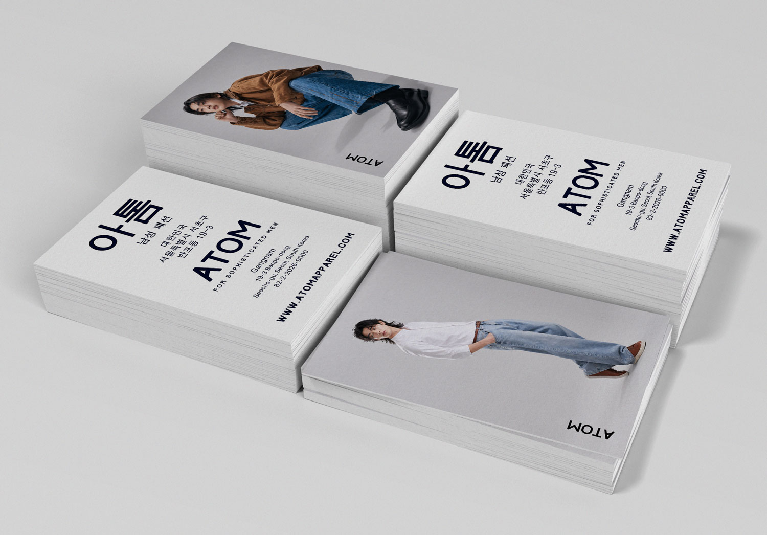
Business cards
For the business cards, I kept the same vertical design that I originally created years ago, but updated with the new logo, modern fonts, and incorporation of new lifestyle imagery showcasing contemporary fashion trends.
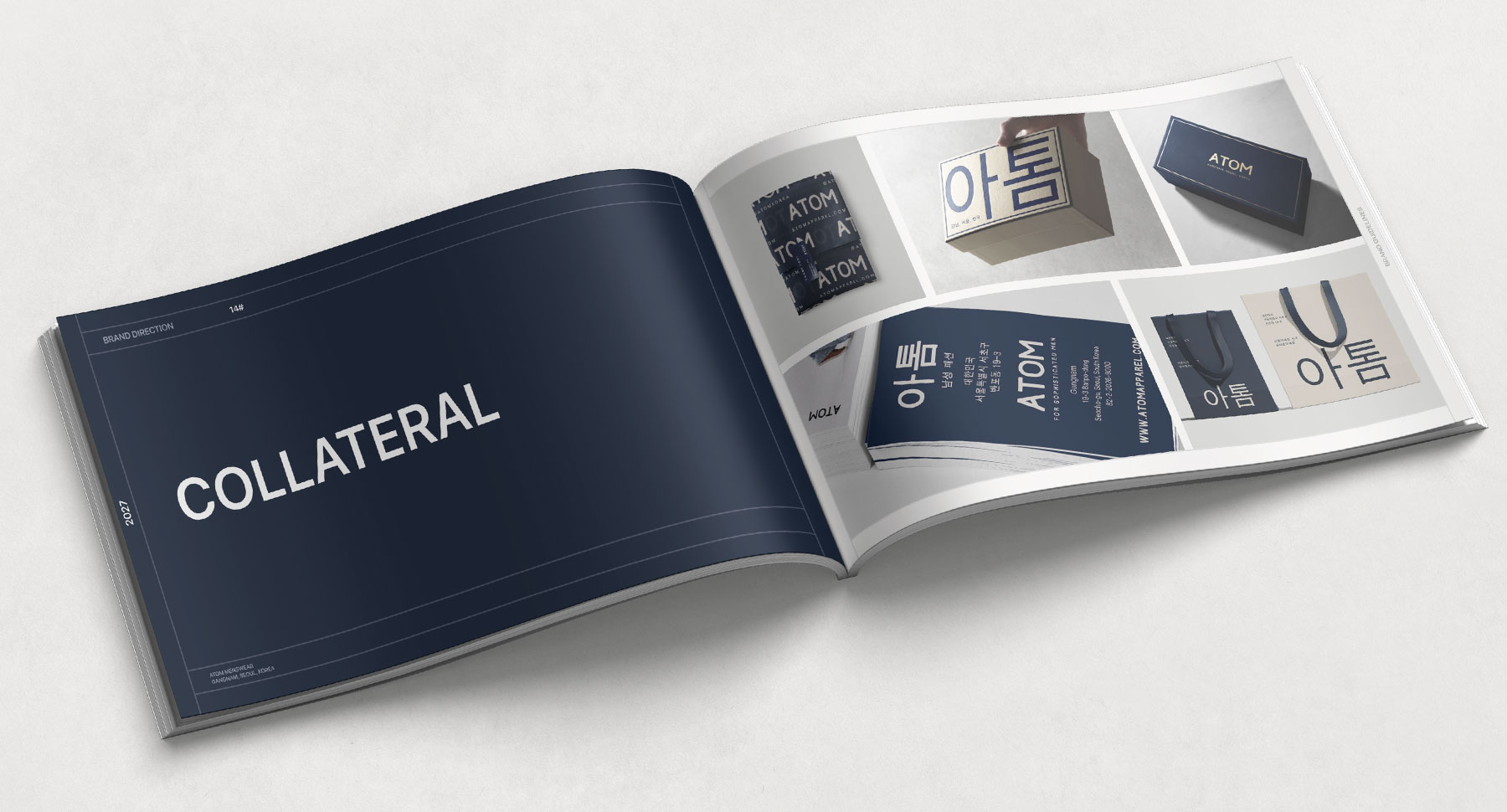
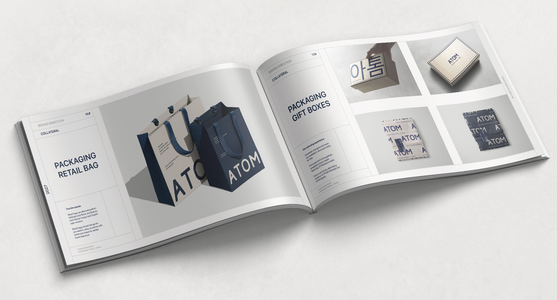
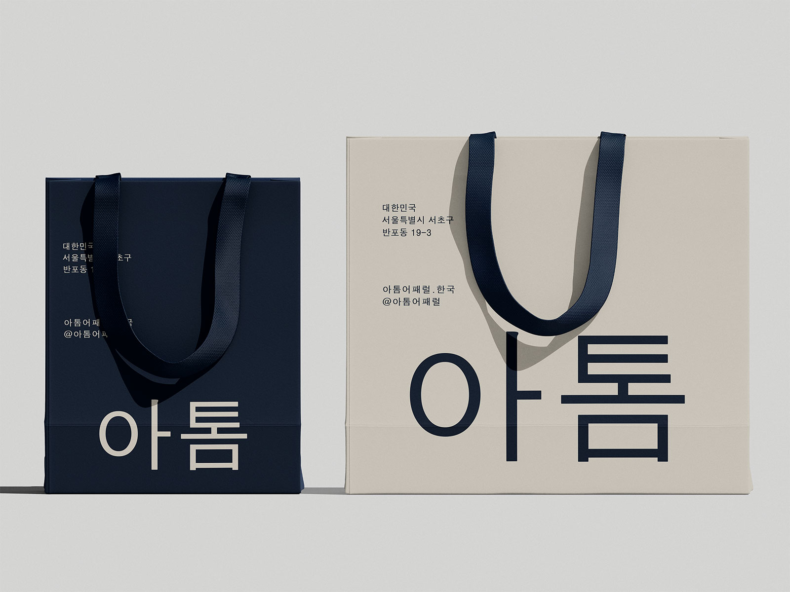
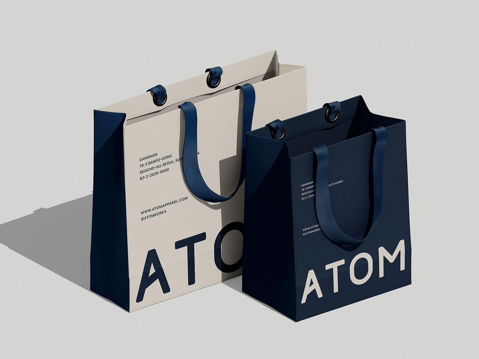
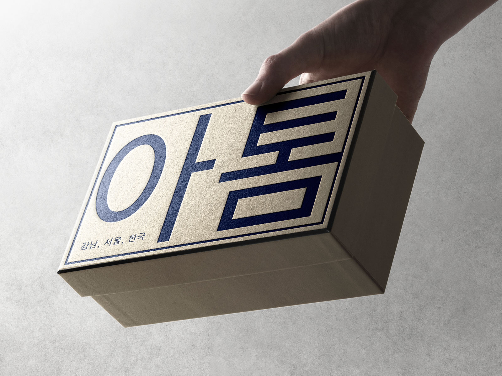
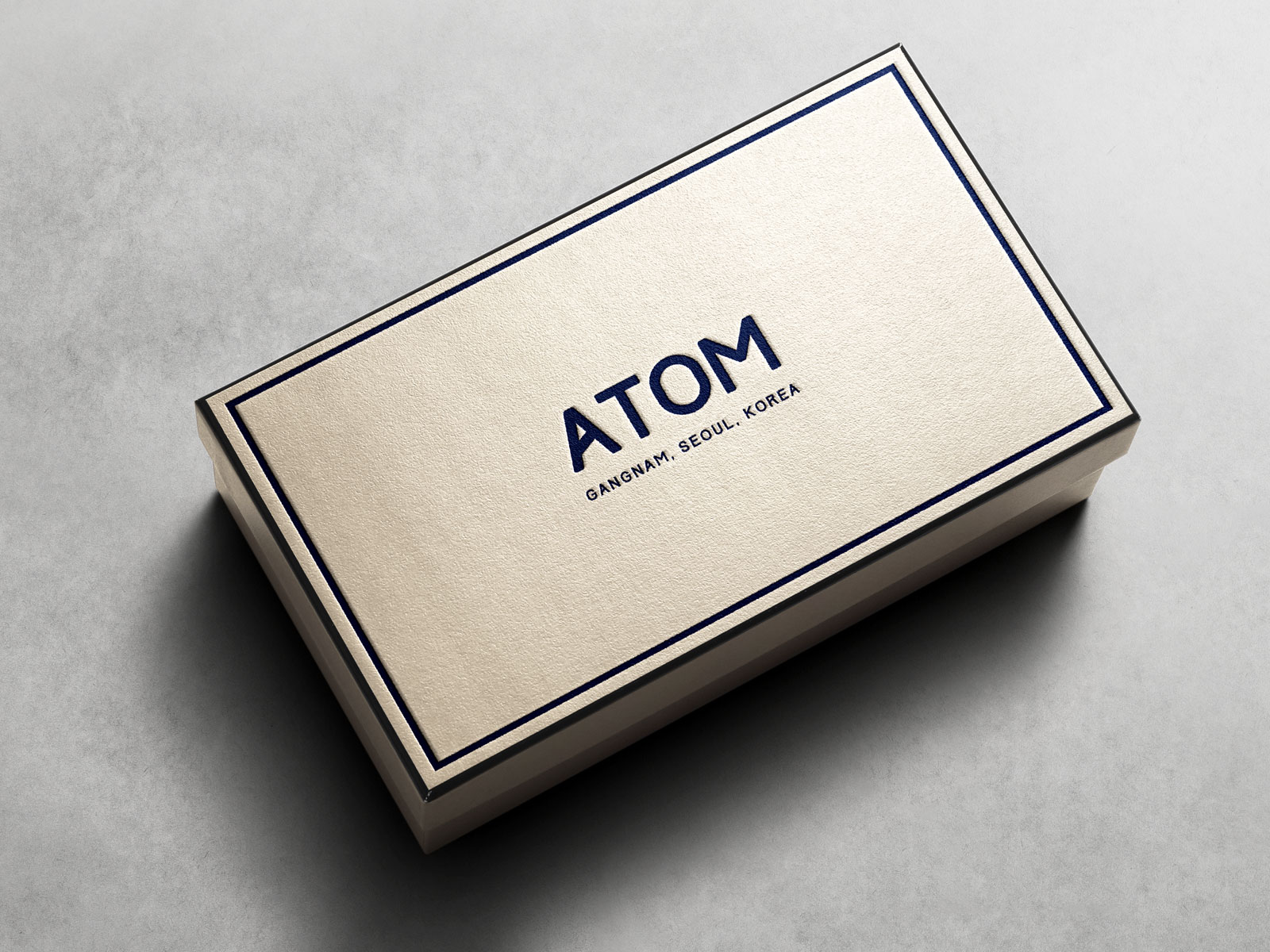
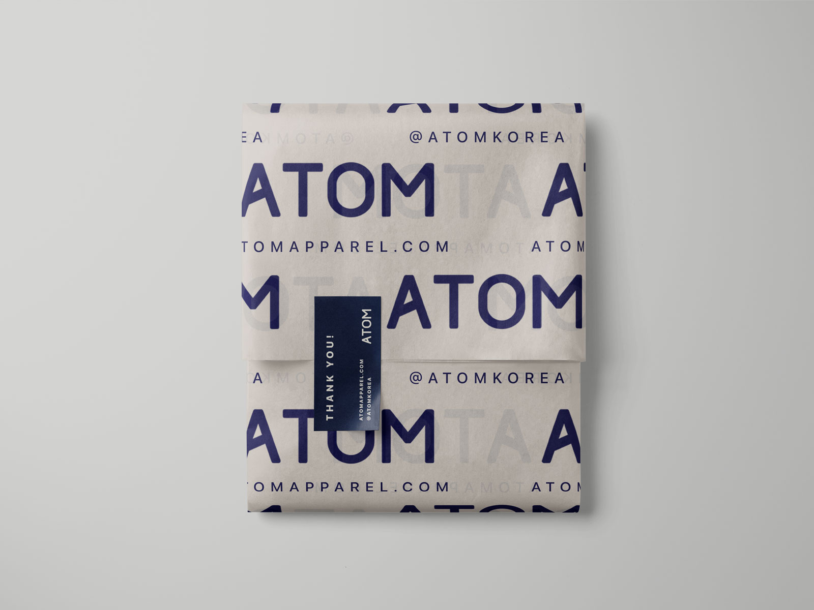
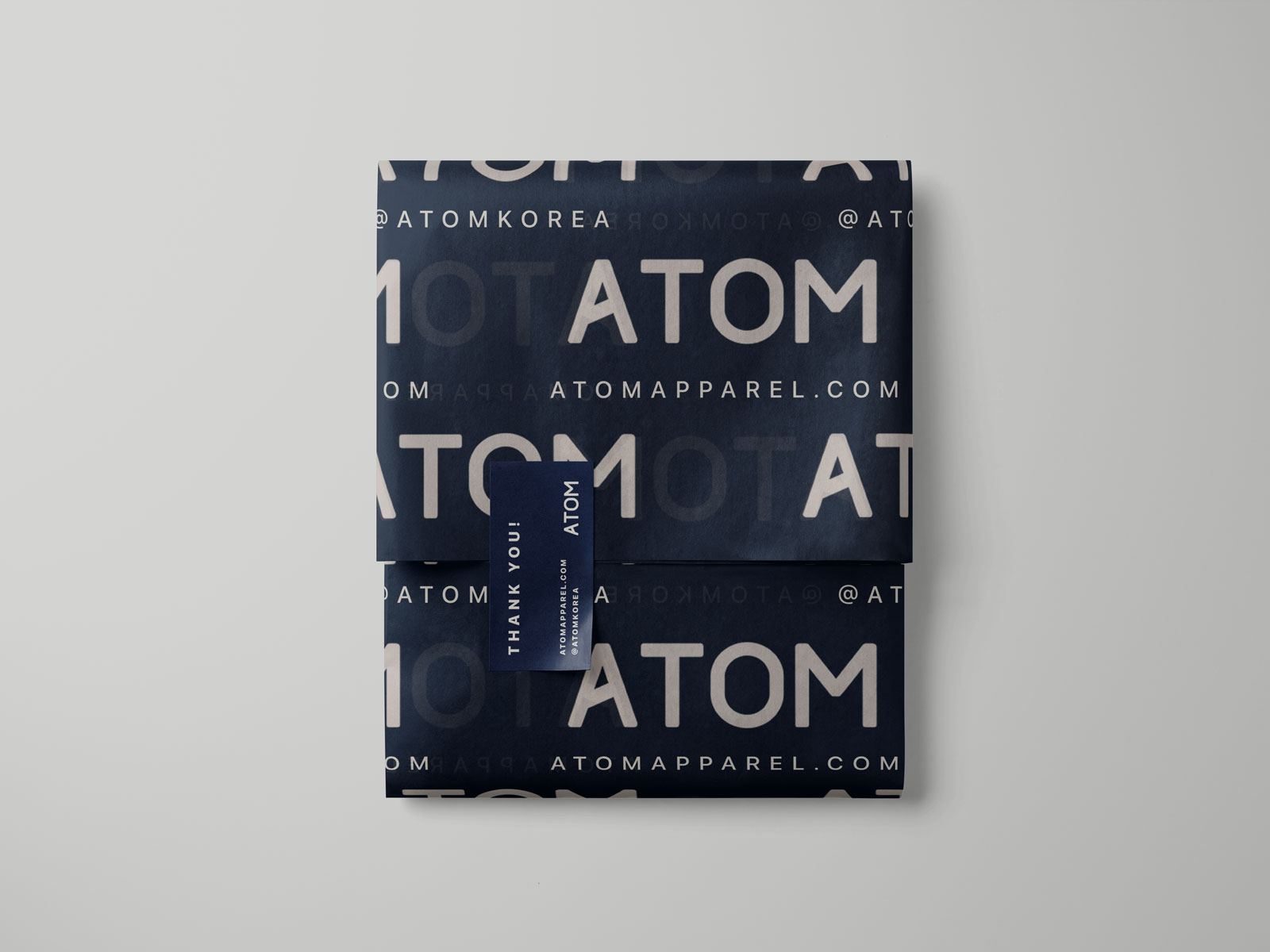
Packaging
Retail packaging for ATOM’s flagship and popup stores, as well as online purchases, feature a contrasting greige and midnight blue theme with alternating Korean hangul and English copy. Packaging designed includes reusable retail bags, accessory and apparel presentation / gift boxes, and branded tissue paper with a logo + socials motif.
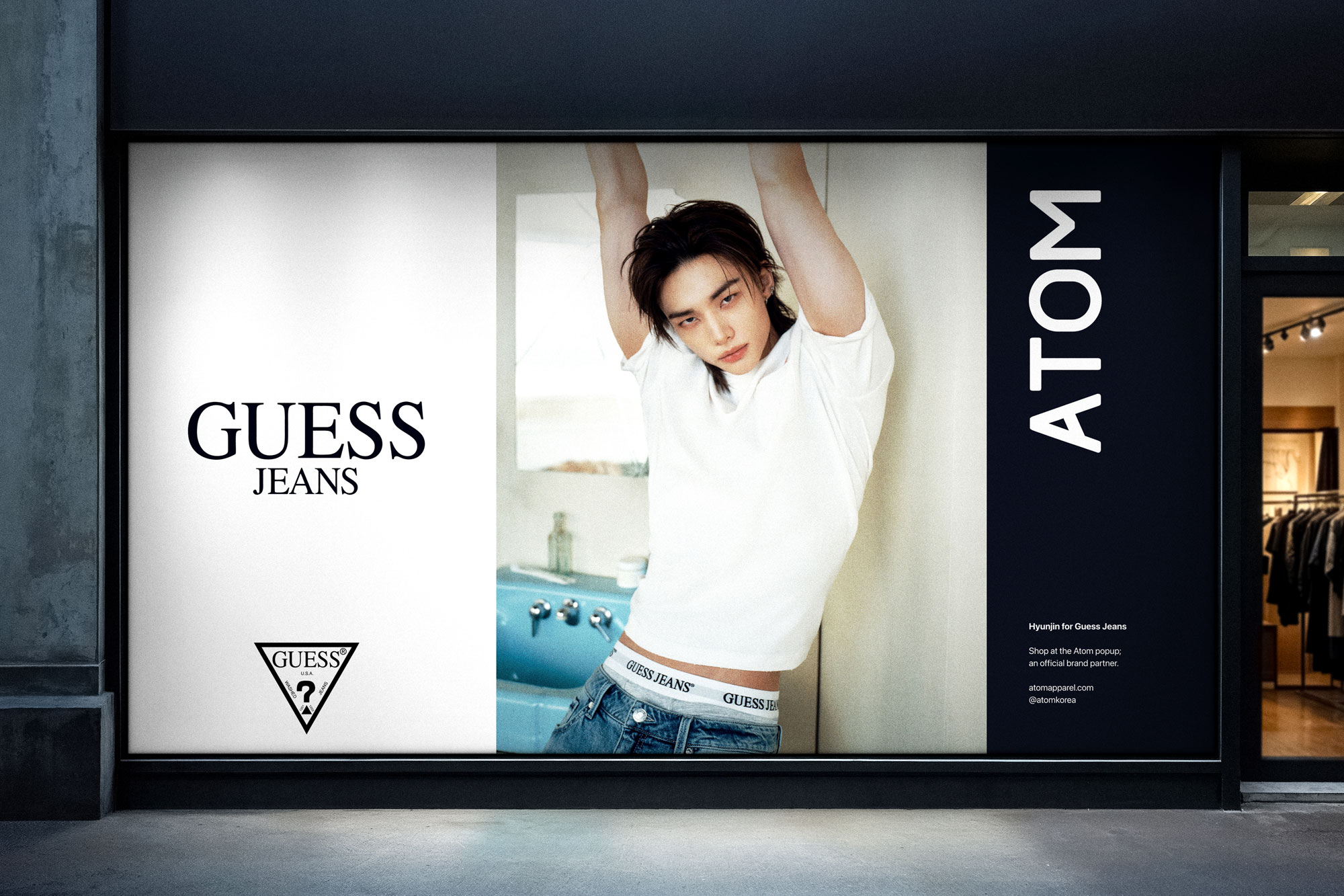
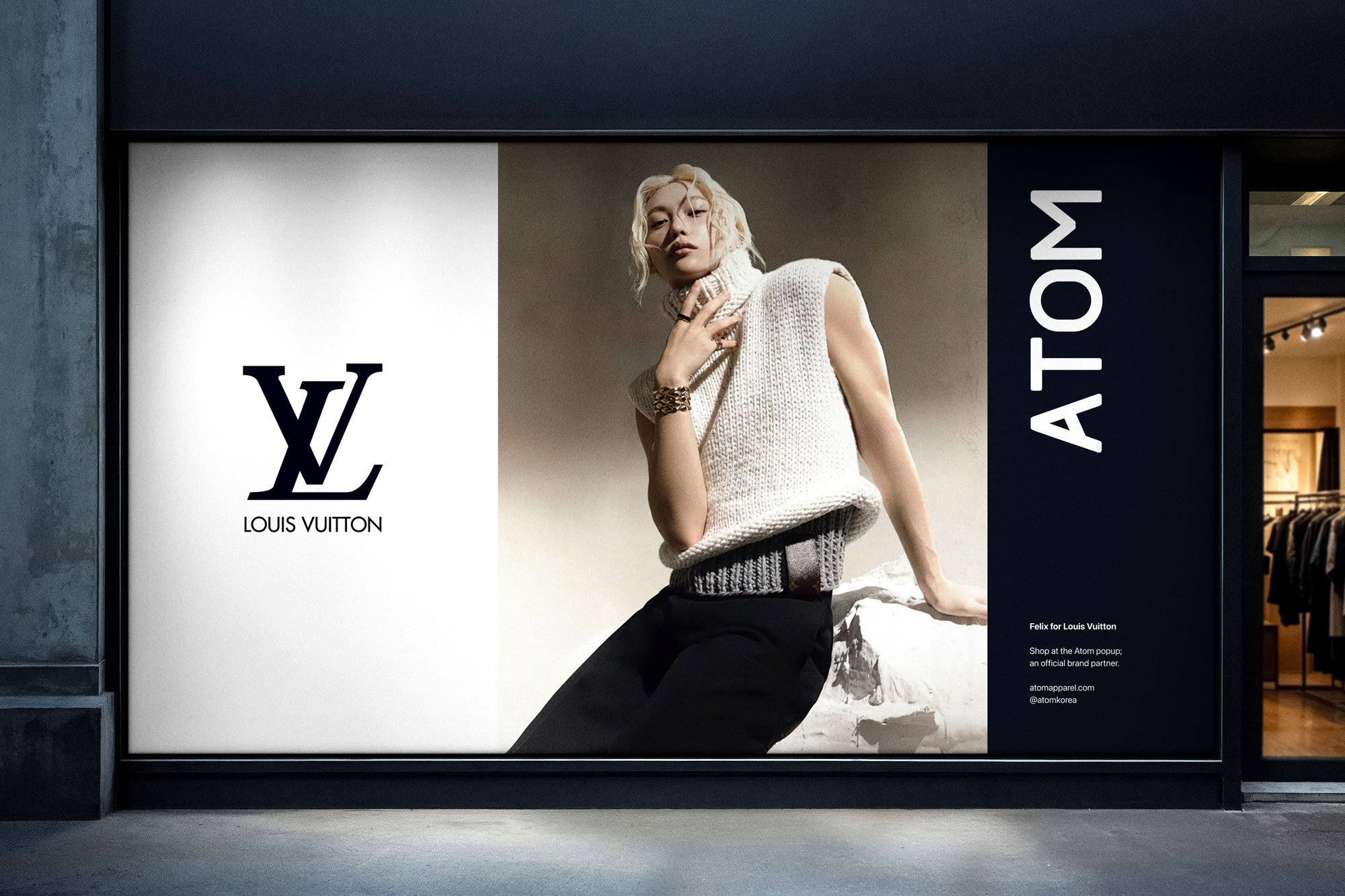
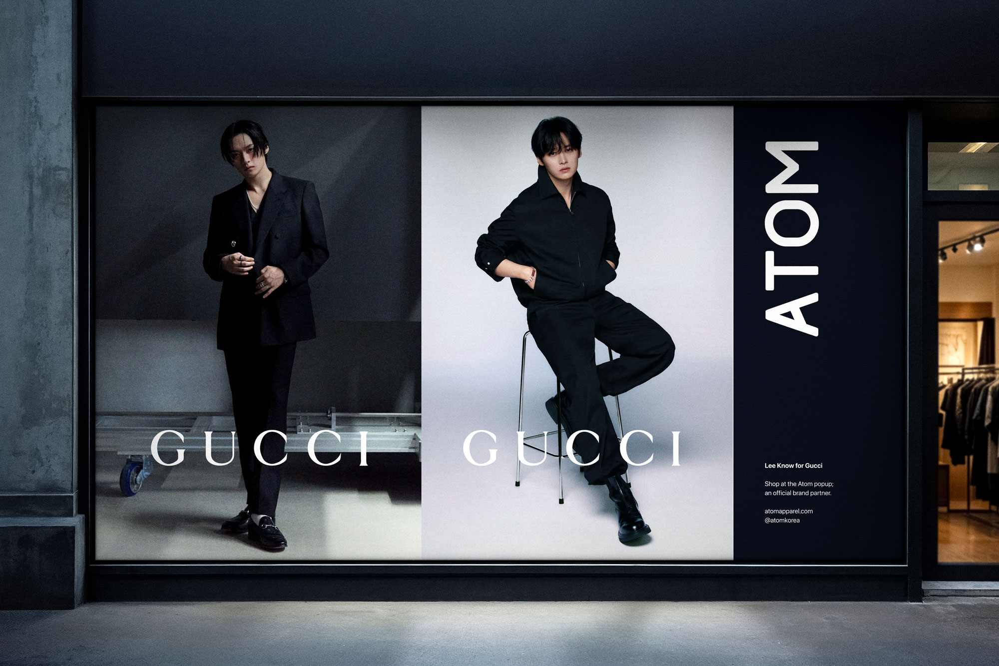
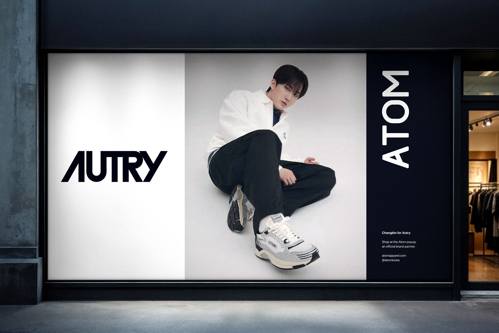
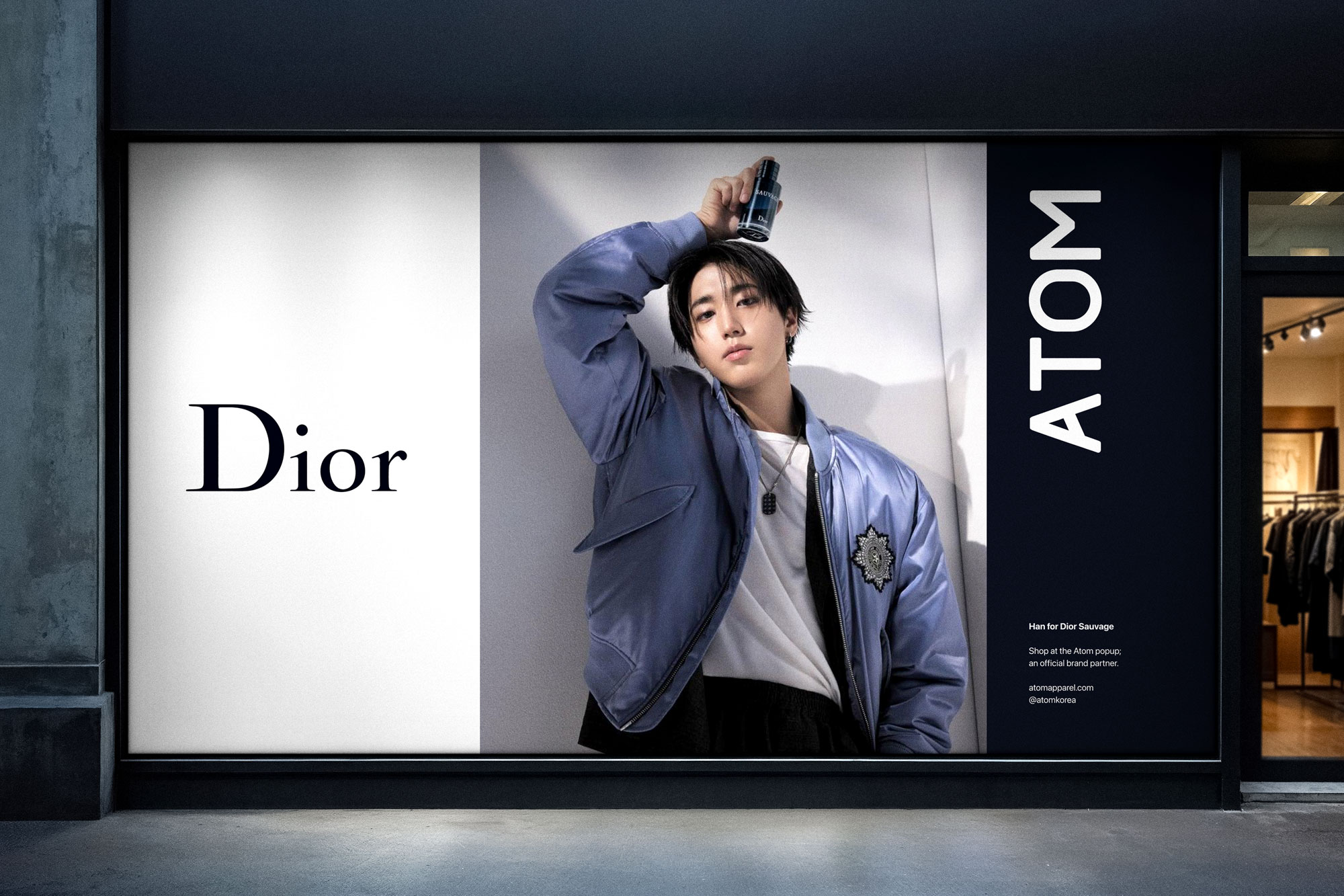
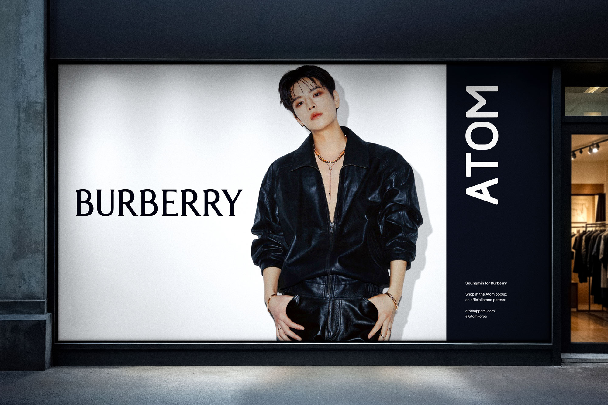
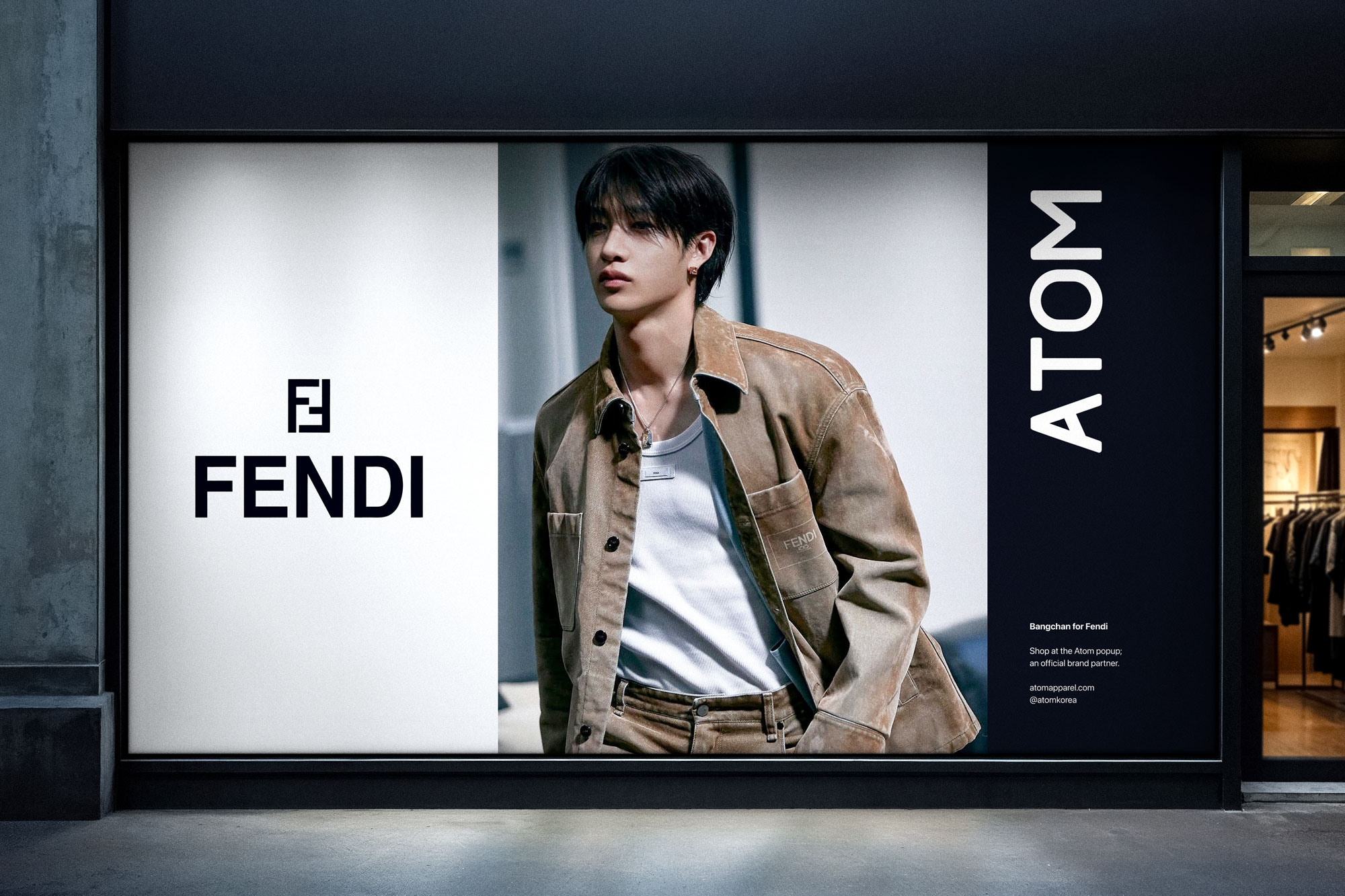
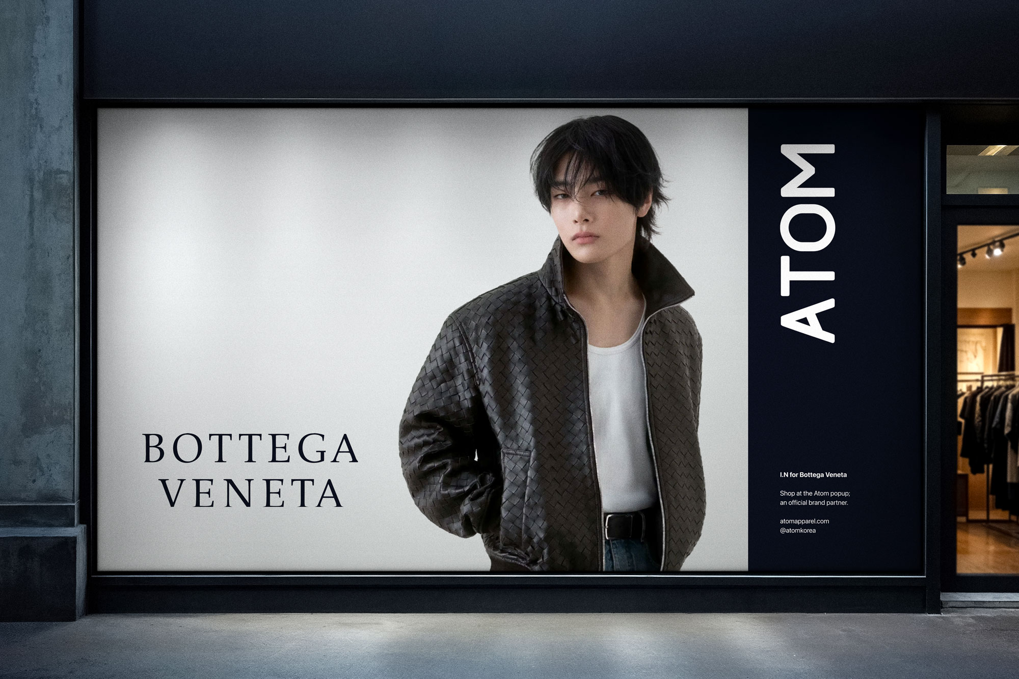
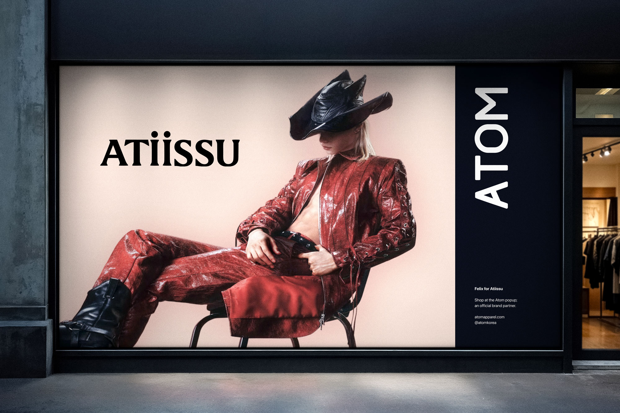
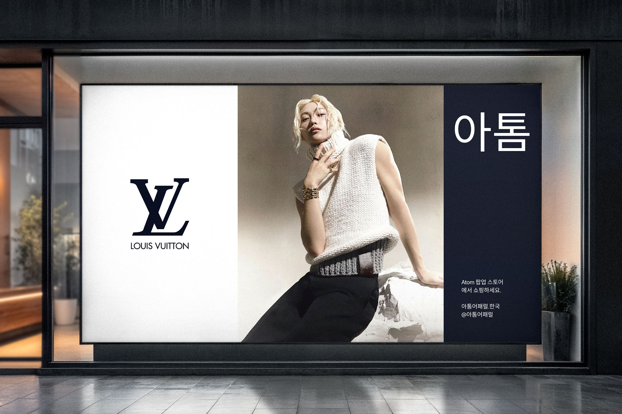
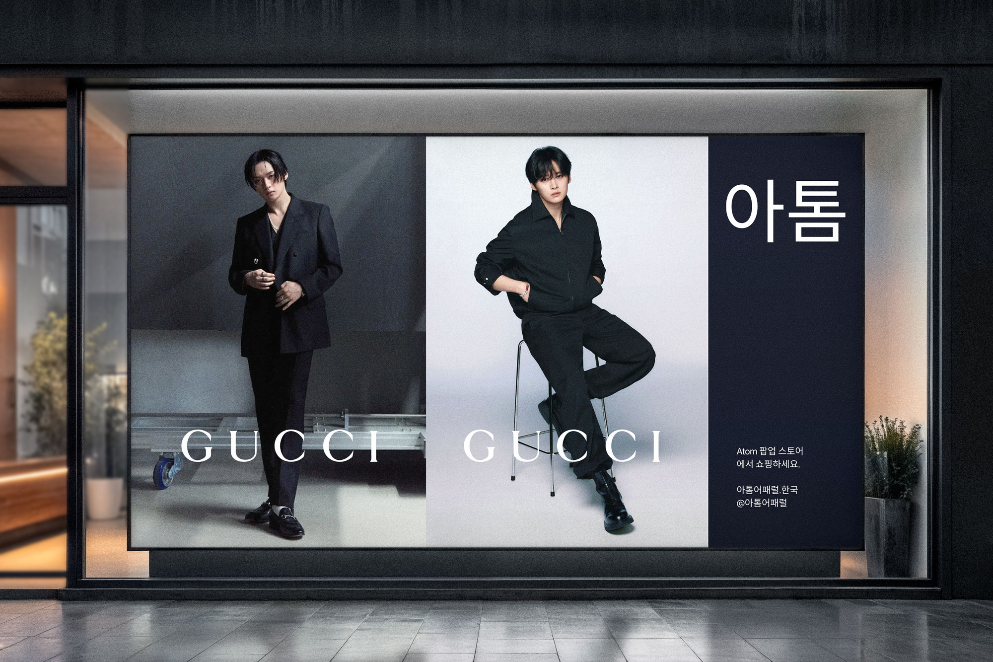
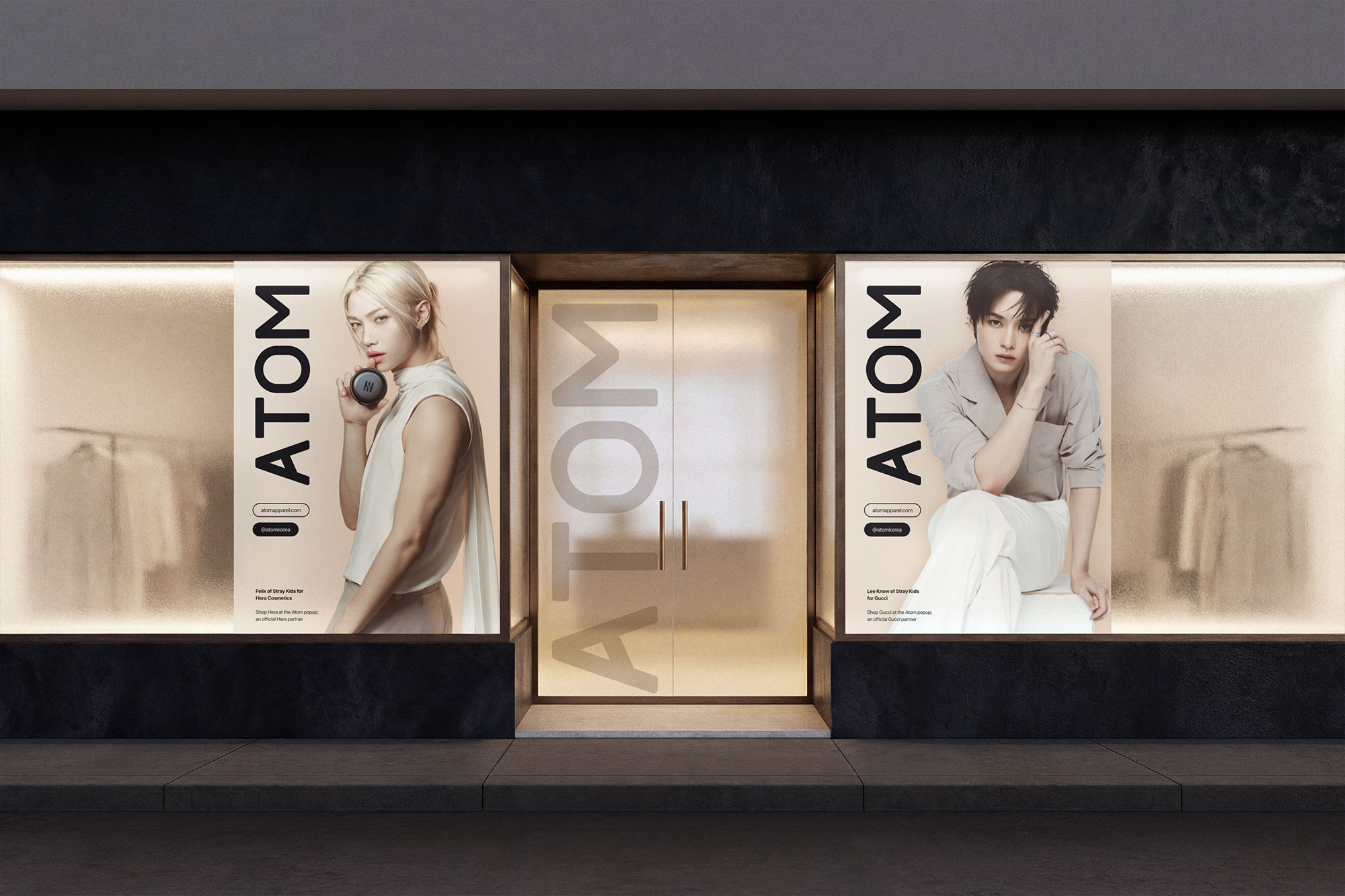
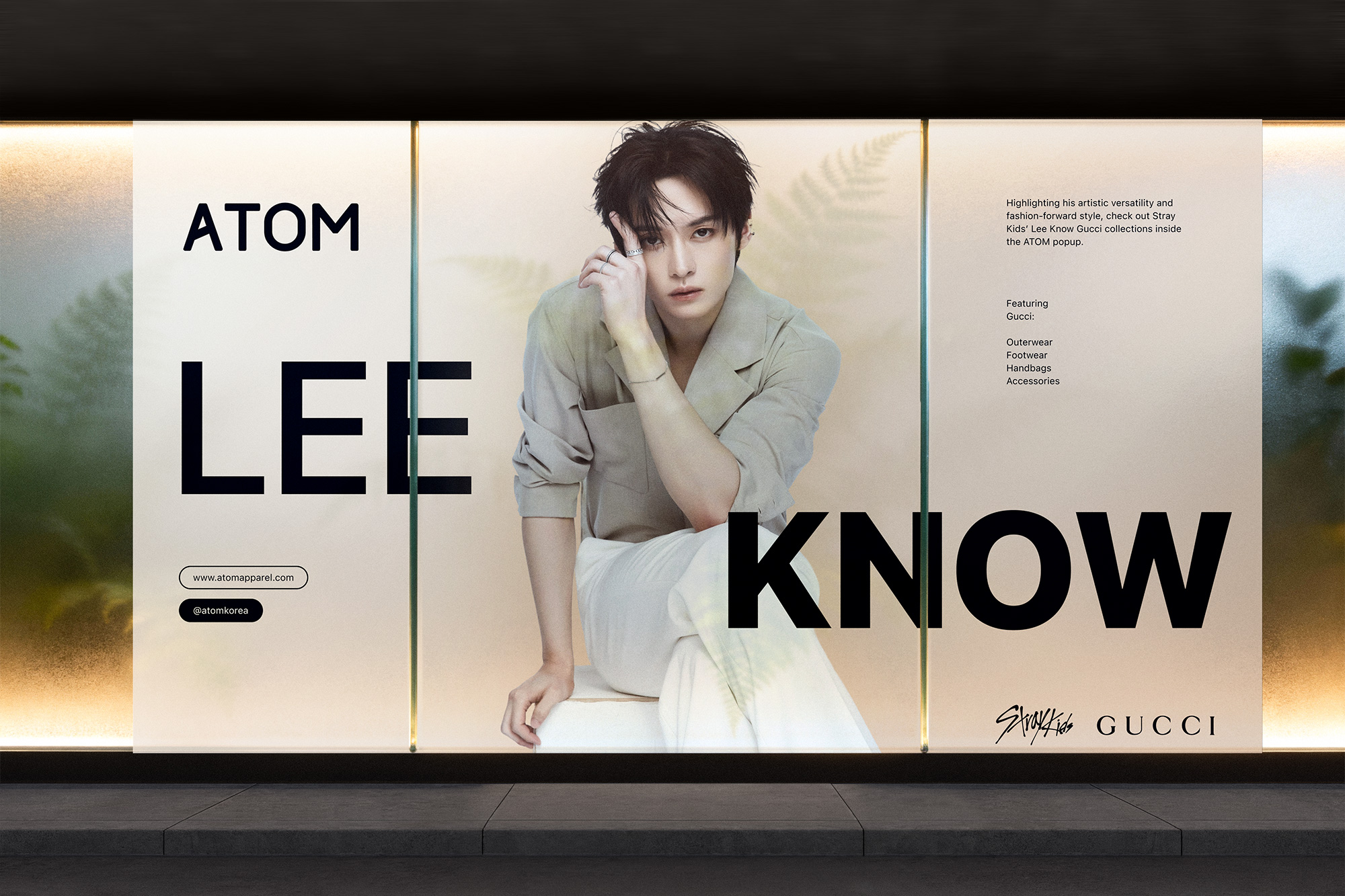
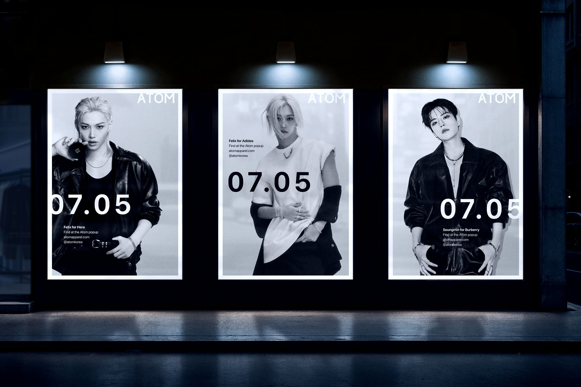
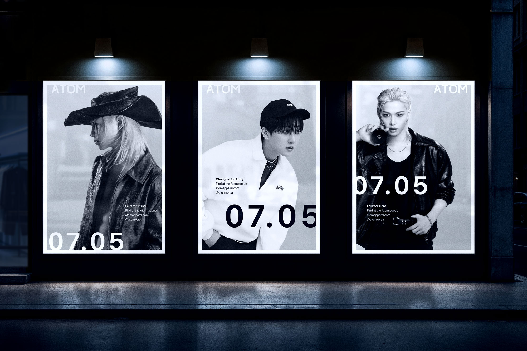
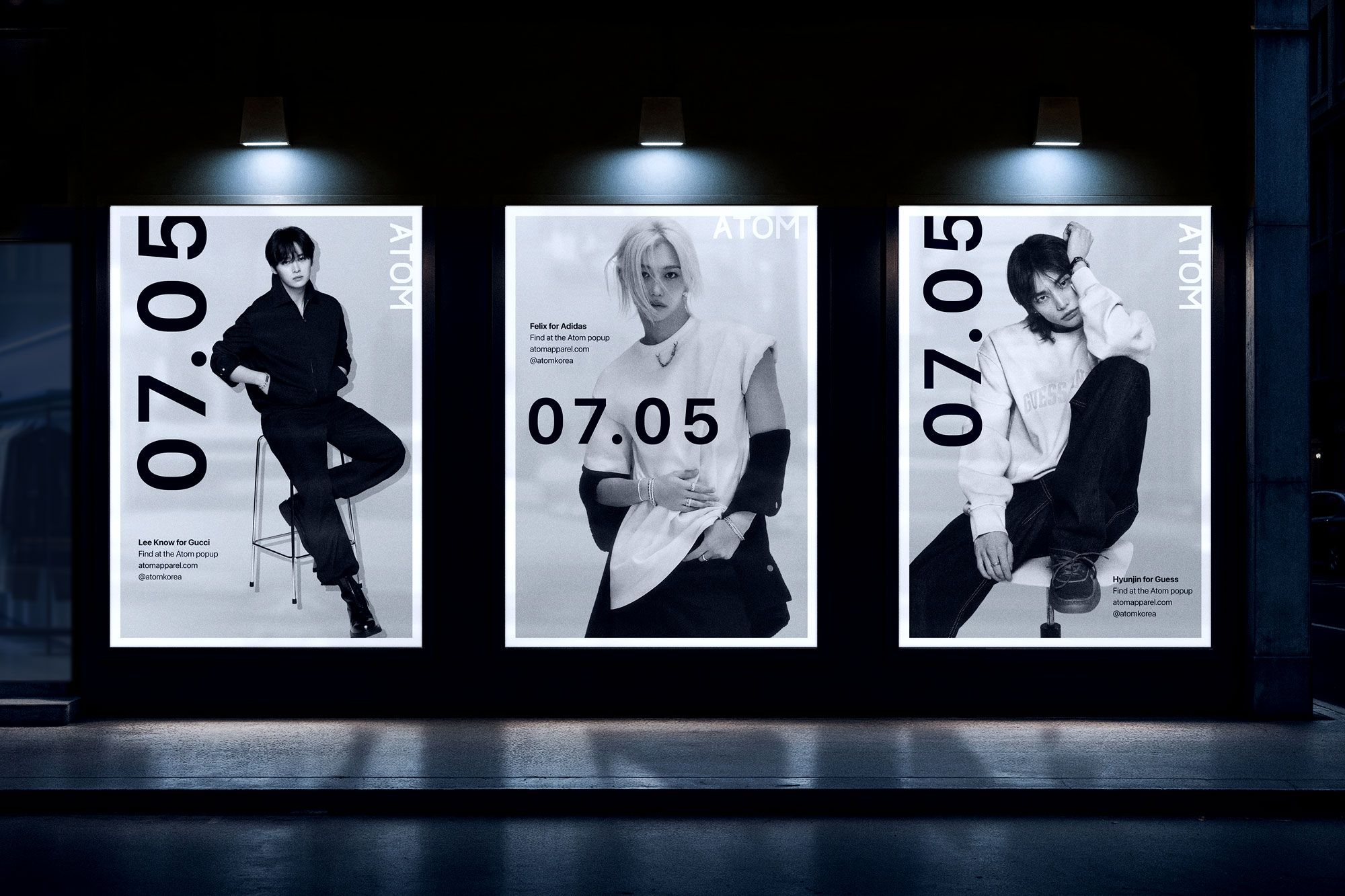
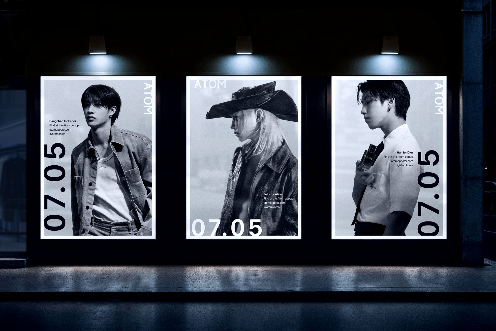
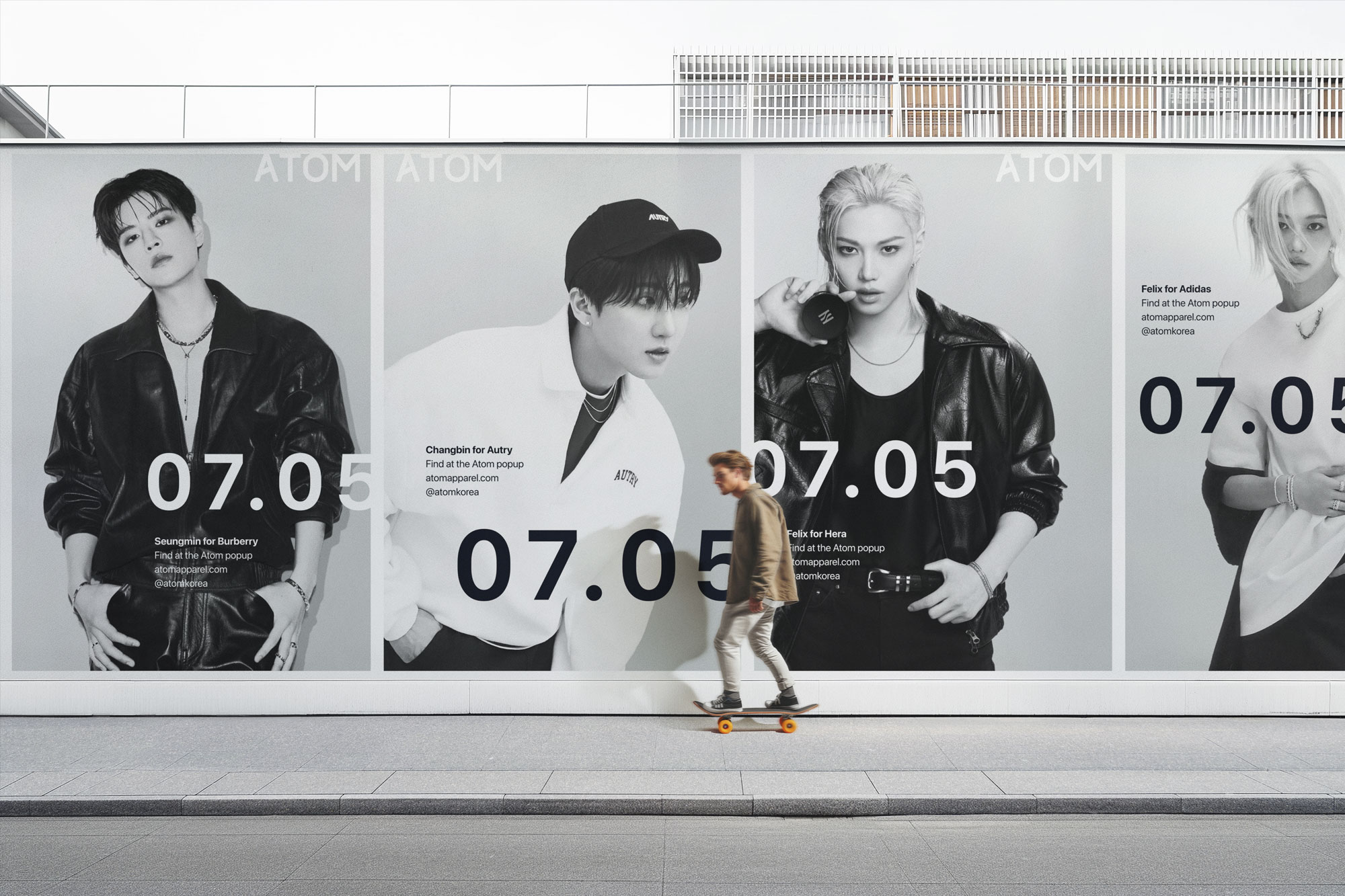
Popup store billboards and posters
For this iteration, I designed an extensive collection of popup store signage concepts and various sized billboard advertisement designs. The designs are purposefully minimal and bring all focus to the photography, which often features celebrity and K-pop idol brand ambassadors. The style is taken from American and European couture fashion ads, which often feature campaign photos combined with just the brand logo for an ultra clean, direct, and high-end feel. In ATOM’s case, there needed to be a little more information because they’re not advertising a brand, but a fashion destination.