
Amazon Prime design system strategy and execution: leading the architecture, governance, and accessibility modernization of Prime’s desktop and mobile shopping experience across a fast-moving, multi-team redesign effort.
Design system strategy, execution // Design governance
My role
Sr system designer
Core skills used
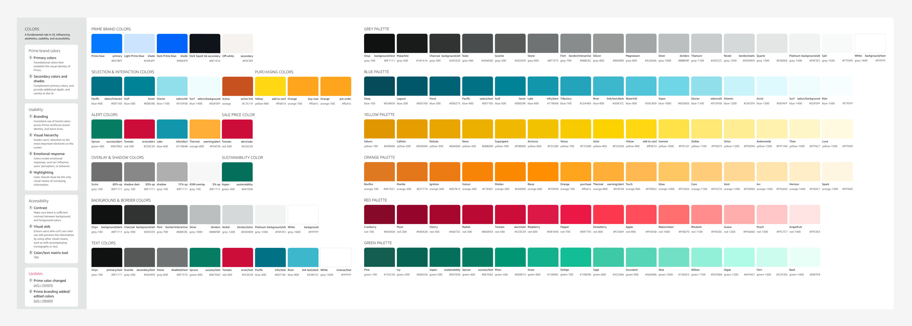
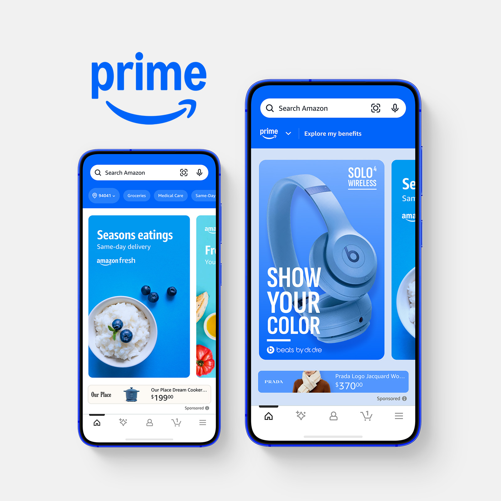
I was brought into Amazon to help lead the creation of the Prime design system, a dedicated system for the Prime shopping experience across desktop and mobile. The system was commissioned to solve an urgent gap: Prime’s existing components that lived within the Rio design system weren’t accessible, and the Rio team didn’t have the capacity to update them quickly enough to support Prime’s needs. Simultaneously, The Prime shopping experience received a brand refresh with new, bolder colors and matching lifestyle photography that needed to be implemented asap.
Because Prime is one of Amazon’s most visible and highest-priority product experiences, the work required a system that could elevate Prime sign-up, upsell, and promotional experiences, while operating within strict constraints from accessibility, legal, brand, and adjacent design systems.
I joined as a senior system designer and functioned as the lead in the creation of the Prime design system. My responsibilities included defining system architecture, shaping component structures and features, guiding variable and token planning for light, dark, and high-contrast modes, establishing template and layout approaches, and co-creating annotation and spec formats. I also played a hands-on role in reviewing and improving incoming designs, identifying accessibility issues, and helping shape stronger visual and interaction solutions.
This work intersected multiple teams and review layers. I collaborated closely with Prime CX teams, adjacent design system teams including Rio (general shopping) and AUI (Amazon core), engineering partners, and senior stakeholders through recurring review cycles. The structure was highly cross-functional and high-visibility, with frequent leadership involvement, and unusually fast iteration expectations.
As Prime’s 11 CX teams continually submitted refreshed flows, I reviewed the work for accessibility compliance, as well as interaction logic and system fit. My background in UI, visual, and interaction design allowed me to identify accessibility issues, propose stronger design directions where needed, and work effectively with designers through iteration cycles until the work was ready for review. This created a fast, but controlled, process where the system team acted as both quality gate and design partner.
Because Prime is a highly visible product, stakeholder involvement was unusually direct. I participated in separate weekly review cycles with L6 – L8 leadership, where decisions and iterations had to be finalized rapidly. In this environment, an important responsibility was ensuring adherence to the many constraints throughout these siloed feedback cycles, and negotiating compromises for adamant feedback that potentially broke these rules, raised accessibility concerns, bordered on dark UX patterns, or were simply not ideal for the user experience.
Prime needed a dedicated system because the prior dependency could not support accessible UI at the level required. The design work was distributed across many CX teams, each concurrently owning and redesigning different parts of the Prime experience, so new components, flows, and interaction patterns were constantly entering the pipeline.
In a fast-paced environment with many inputs, systems can quickly become bloated, inconsistent, or overly tailored to one-off needs. The system needed to stay lean and streamlined even while absorbing constant change, which created additional challenges.
One of the most complex challenges in the project was reconciling business, legal, accessibility, localization, and system constraints. The following two examples describe how I handled impossible and conflicting feedback, and the purposeful tactics I used to influence without authority.
Driving a balanced compromise
Prime promo components are small upsells placed strategically throughout consumer-facing shopping experiences. For the promo redesigns on mobile, the request was to include the Prime logo, a heading, a subheading, a CTA, and a link to a terms of use page. This wasn't an issue on desktop, but mobile was tricky due to lack of horizontal space.
The specific requirements of this promo were that it must include:
The following constraints conflicted with the requirements:
The problem was clear
We couldn't fit all of the elements in the allotted space, and we couldn't modify any text or UI elements to make them smaller.
As different partners offered ideas to balance business goals and content, one proposed direction was to place the Prime logo and button inline and remove the terms link to save vertical space. It was immediately clear that this solution was not viable because it created risks with localization and smaller viewports, violated the full-width mobile button rule, and created a dark UX pattern by removing access to the terms of the promotion. Rather than treating this as a rigid "no", I came back with in situ mockups showing how the pattern would behave with longer strings, and on more constrained viewports. The visual aids created immediate clarity of the tradeoffs and risks, and directed the conversation to system behavior, rather than personal opinion.
From there, we aligned on a compromise
I also brought in situ mockups of a compromise that proposed a more compact content structure, while keeping the crucial pieces, including:
The result was a compact, high-visibility promo that preserved the intent of the experience while balancing business efficiency, accessibility, localization, and legal requirements.
What I learned
The important part wasn’t simply finding a layout compromise. It was translating constraints into clear rationale and using concrete examples to help stakeholders evaluate tradeoffs.
Since then, when I expect a decision to be complex or controversial, I bring mockups and proposed alternatives into the first review. It helps me influence the direction without relying on authority, and usually gets the team to alignment faster.
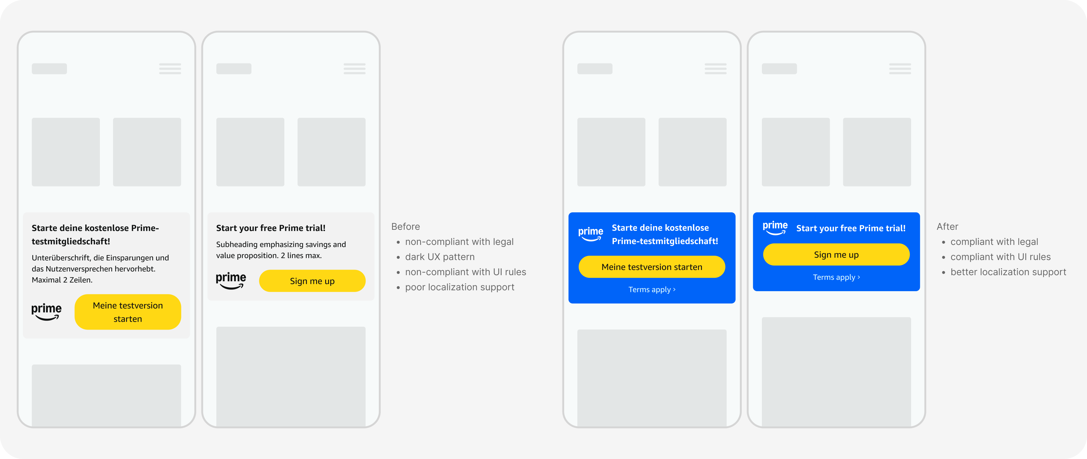
In situ mockups presented to show tradeoffs and risks
Negotiables vs non-negotiables
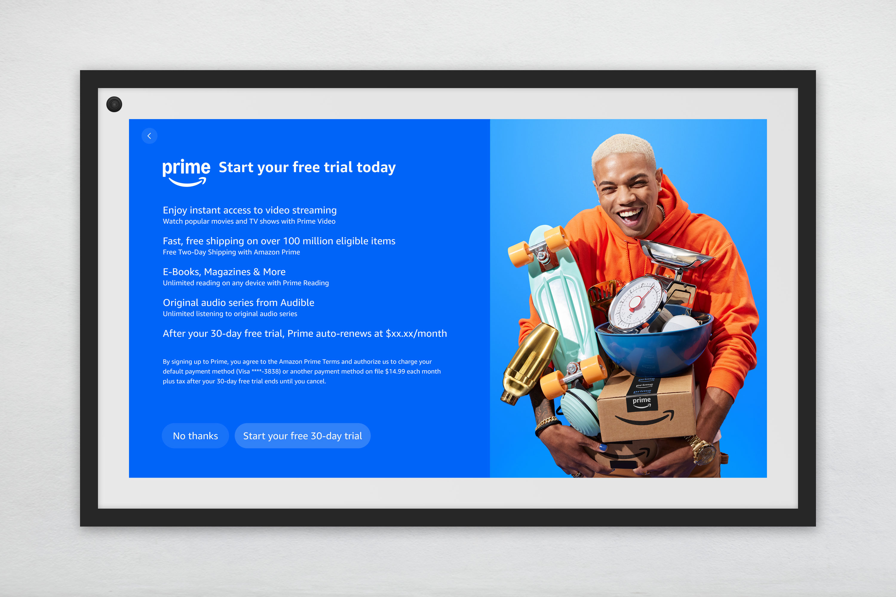
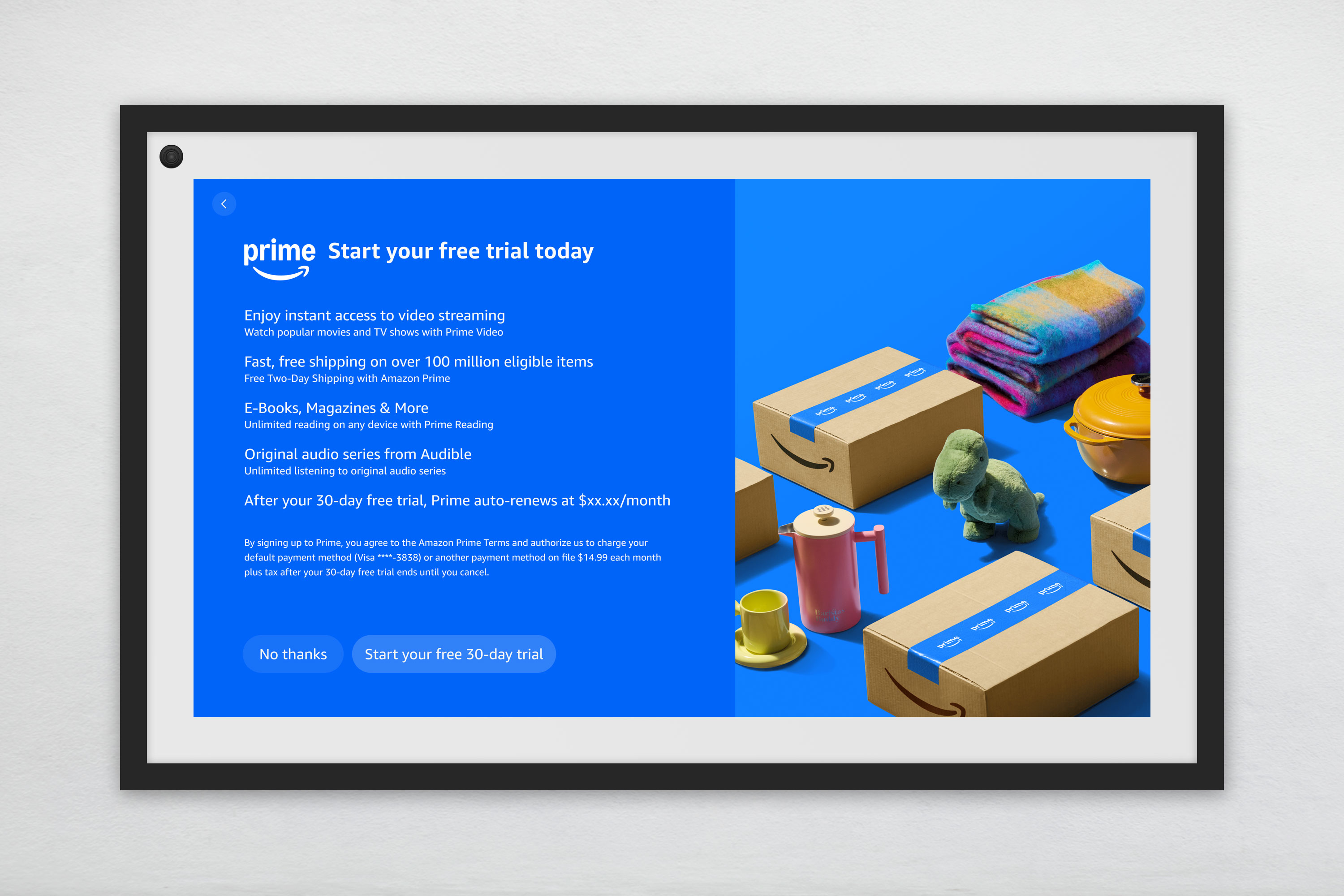
Because I was formerly in the Devices and Design Group, and therefore familiar with their design systems and requirements, I was tasked with redesigning the Prime promo screens that appear in certain device onboarding experiences. The intent of the promo was to get users to sign up for a 30-day Prime trial by clicking a button.
These redesigns required balancing multiple device-specific requirements with strict legal and accessibility constraints. Each promo had to work within the unique resolution and viewport rules of each device, while adhering to brand guidelines, multiple design system requirements, and updated legal guidance.
The most important constraint was that new, more verbose terms copy had to appear exactly as written, remain within specific proximity and position to the sign-up button, be 100% opaque, and meet WCAG contrast and text size standards. The button group also had to preserve equal clarity between the primary sign-up path and the decline option. These non-negotiable requirements limited how visually streamlined the layouts could become.
During review, there was feedback to remove the terms language in order to create a cleaner design, or to move it off the screen, below the button group. Those simply weren't options, and I handled that by first clarifying that the legal content was a fixed, non-negotiable requirement, then redirected the discussion toward areas where iteration was possible, such as imagery, color themes, and promotional copy. This eventually brought the conversation back to a constructive nature, and helped the team focus on meaningful refinements, rather than revisiting constraints that could not change.
What I learned
This was a strong example of protecting non-negotiables, while still finding room to improve the experience through elements that could flex. It was also a learning experience for how to direct the feedback into more useful areas when the session stalls on a specific detail.
A fair amount of time in this meeting was spent focused on something that wasn't negotiable at all, which created some level of frustration for everyone involved. Going forward, I come to these types of reviews with a list of negotiables and non-negotiables up front to keep the conversation focused on the most important aspects, and to make the most of the time we have in the meeting to solve the issue together.
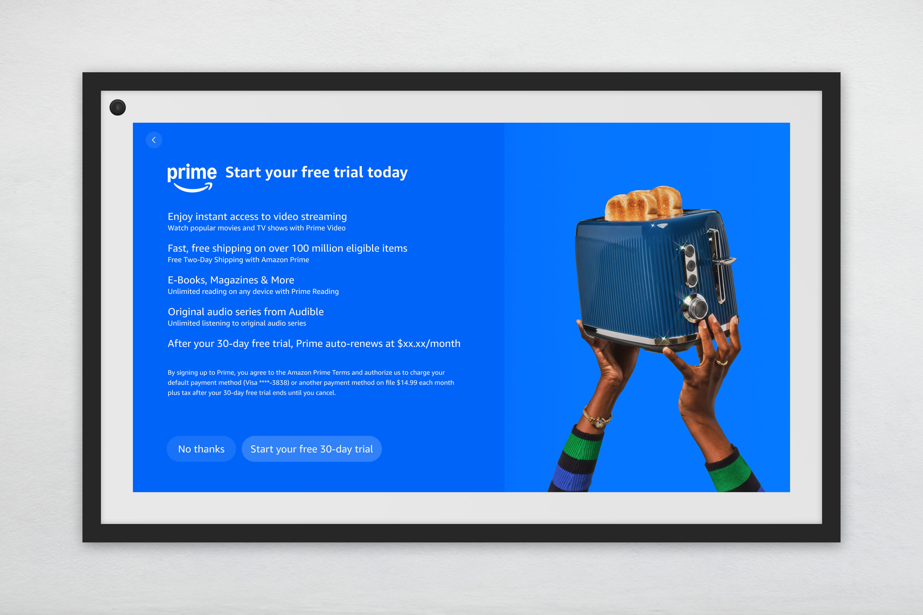
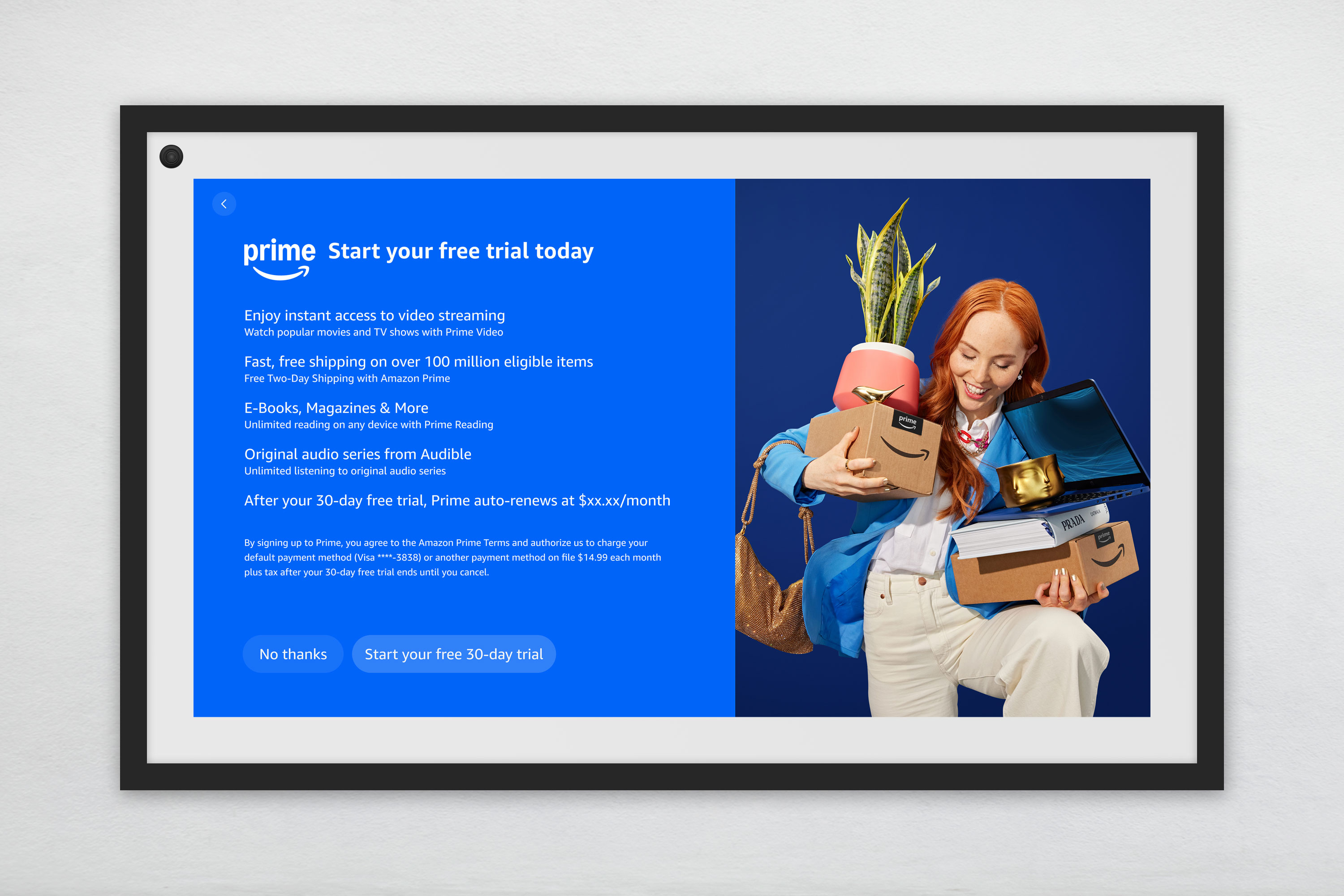
Final Echo Show Prime promo design with unaltered terms copy
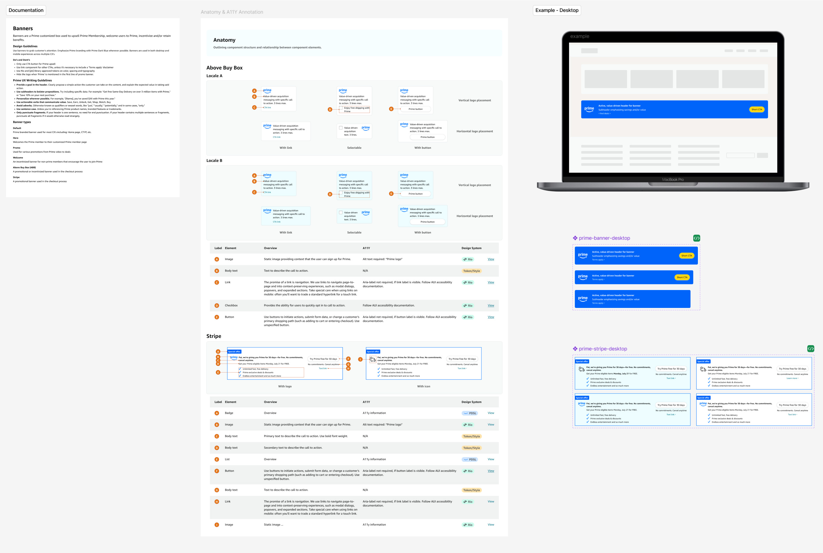
Because design informs engineering at Amazon, I put a lot of emphasis on how system decisions translated into implementation. That meant aligning and defining layer and property nomenclature, creating token hierarchies that were clear and scalable, and bringing engineering into the process early so component structure could support both design and code.
Once components and flows were finalized, I helped turn them into implementation-ready outputs through detailed specs, annotations, responsive behavior, and accessibility requirements. This helped reduce ambiguity during handoff, improved consistency between design and production, and ensured the intent of the system carried through into the final experience.
An important, but often overlooked, part of design systems work is the experience of the designers using the library. Designer adoption is crucial, and I aim to create systems that designers want to use because they bring real value to their processes, as opposed to them simply being required to use them.
I believe the design system should absorb any complexity, as opposed to putting this responsibility on the designer. I do strive for a streamlined system, but system purity is secondary to usability. This mindset helped the Prime design system function not just as a repository of assets, but as a usable tool for design teams working under high pressure.
I also believe that support efforts don’t end as soon as the initial release of the library is complete. Ongoing support is part of the job for me, which includes processes such as 1:1 support, regular office hours, routine training sessions, and the evolution of documentation and specs. Gathering user feedback, from both design and eng, gives better visibility into real pain points, allowing me to evolve the system in meaningful ways.
This section summarizes the Prime design system through its foundations, component, templates, and specs. These layers show how the system connected design craft to scalable, real-world implementation.
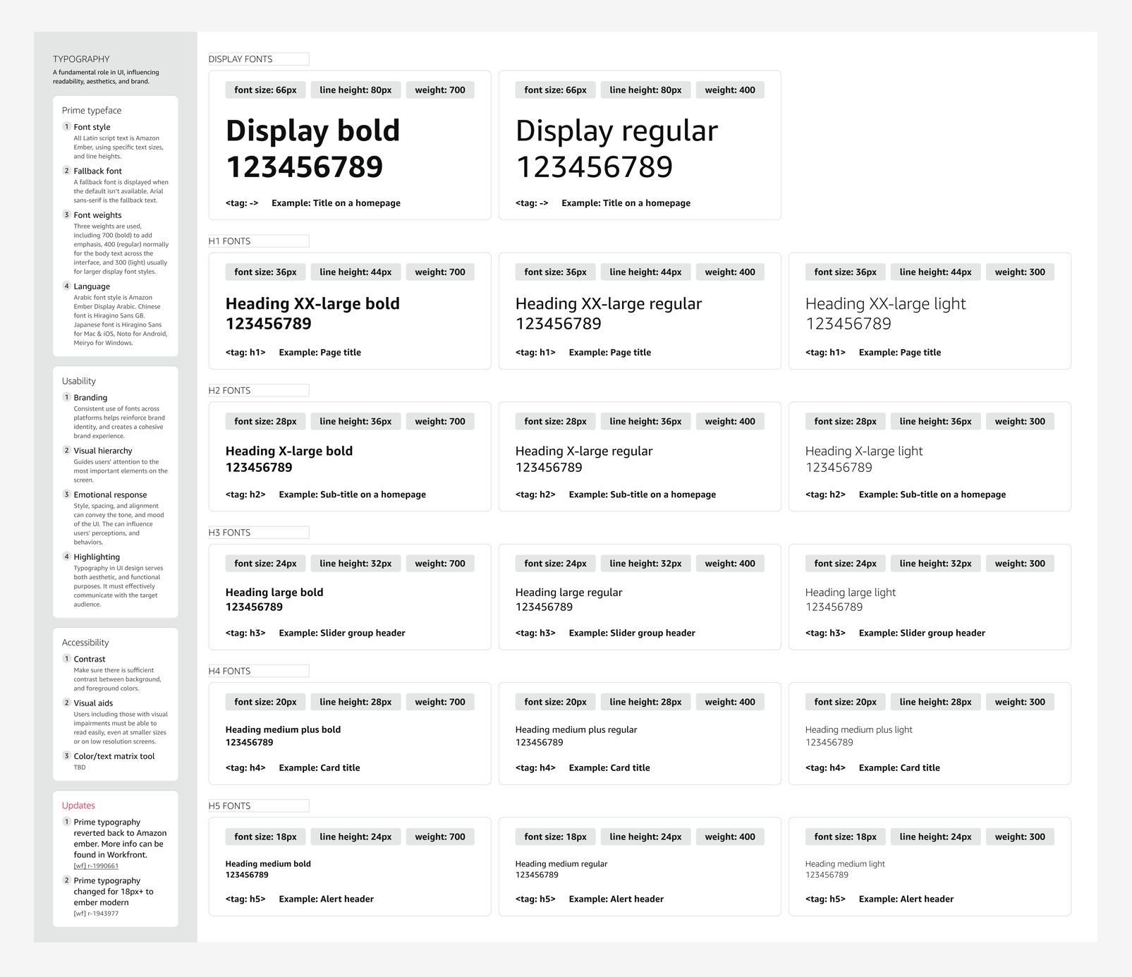
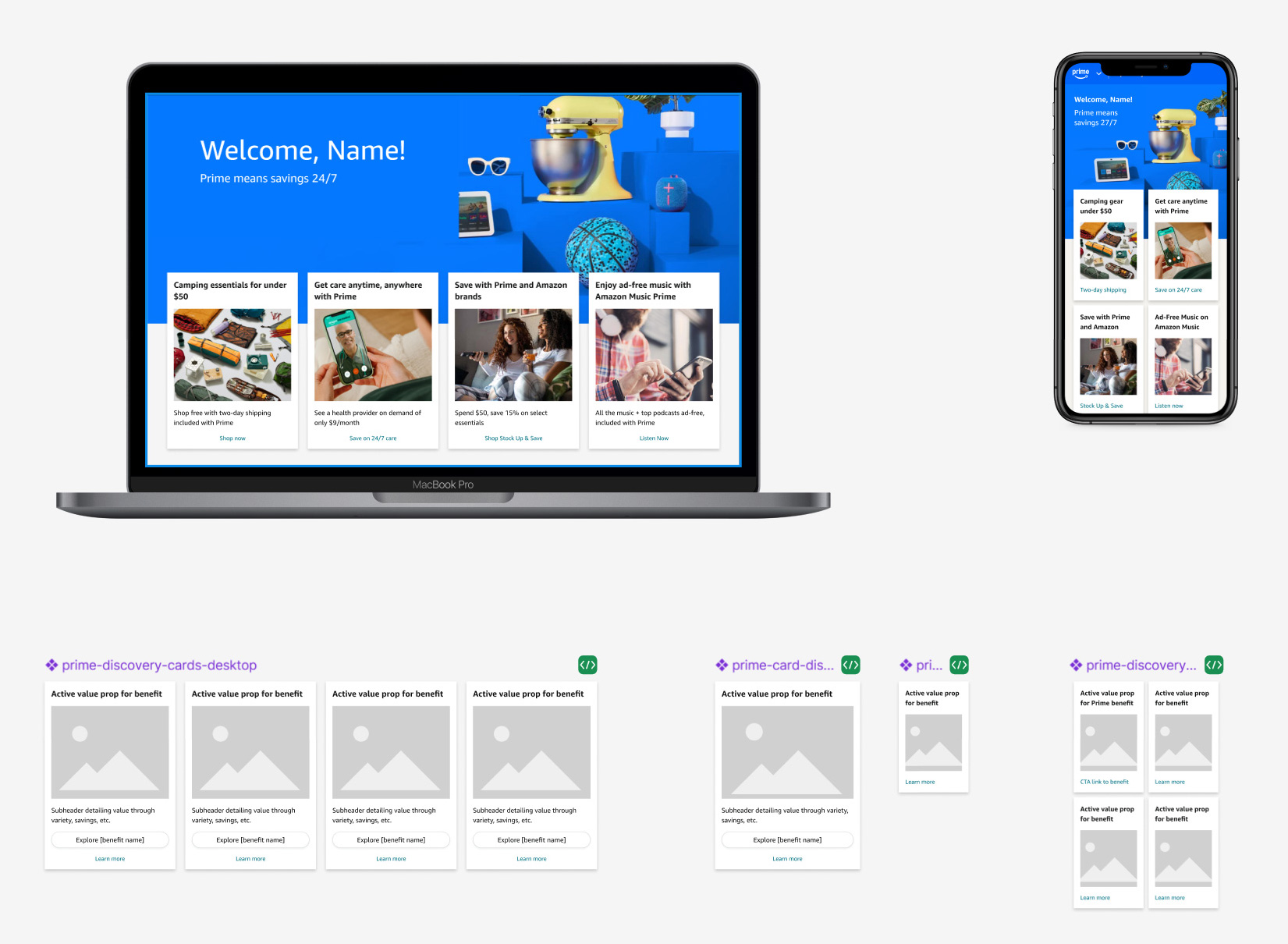
The Prime design system foundations established the visual and structural rules needed to support a fast-moving, accessibility-first redesign across desktop and mobile. This layer included core primitives such as color, typography, grid, elevation, and variables, creating a shared baseline that helped Prime teams work more consistently while staying aligned with broader Amazon system constraints and compliance requirements.
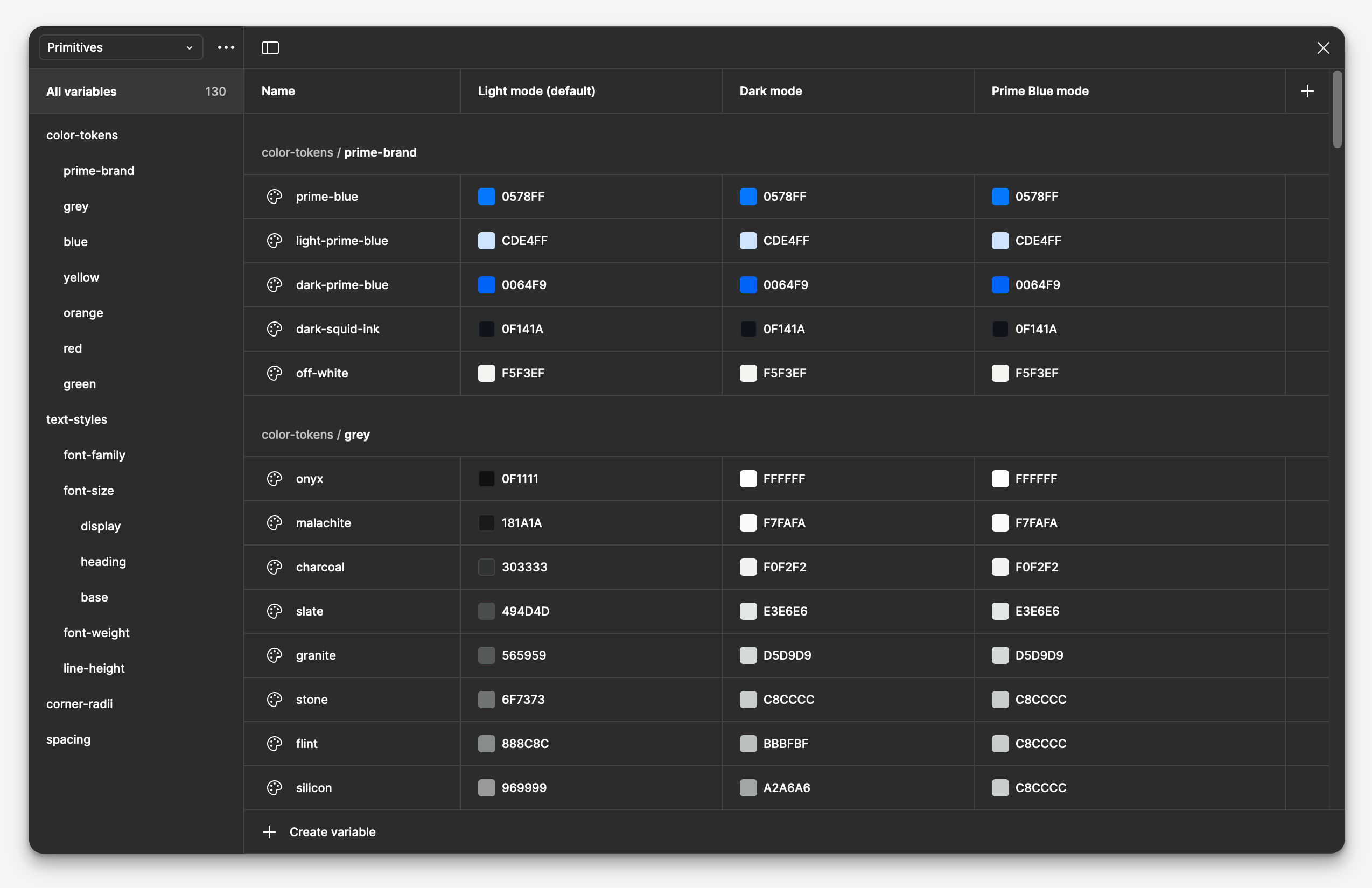
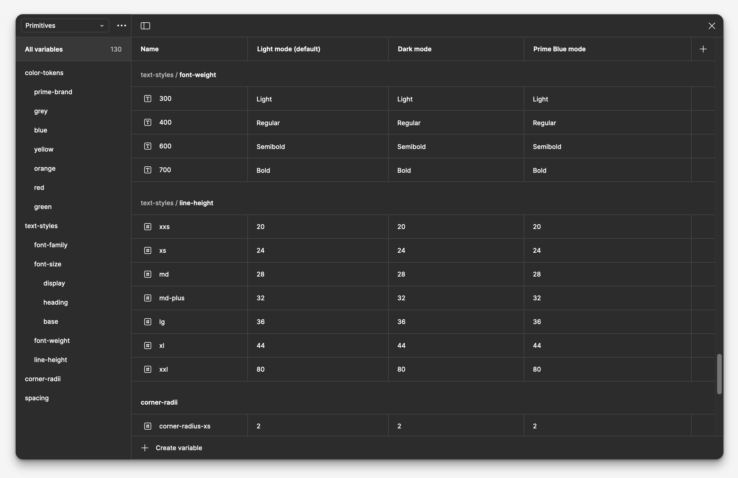
Variables were based on existing tokens, which already had a straightforward and easy to implement hierarchy that utilized t-shirt sizing. Modes included light and dark, as well as a special “Prime blue” that would activate a super-saturated Prime blue version of applicable components. This mode was intended for promos and other marketing-related elements to draw immediate attention. Internally, we called this “prime-izing”.
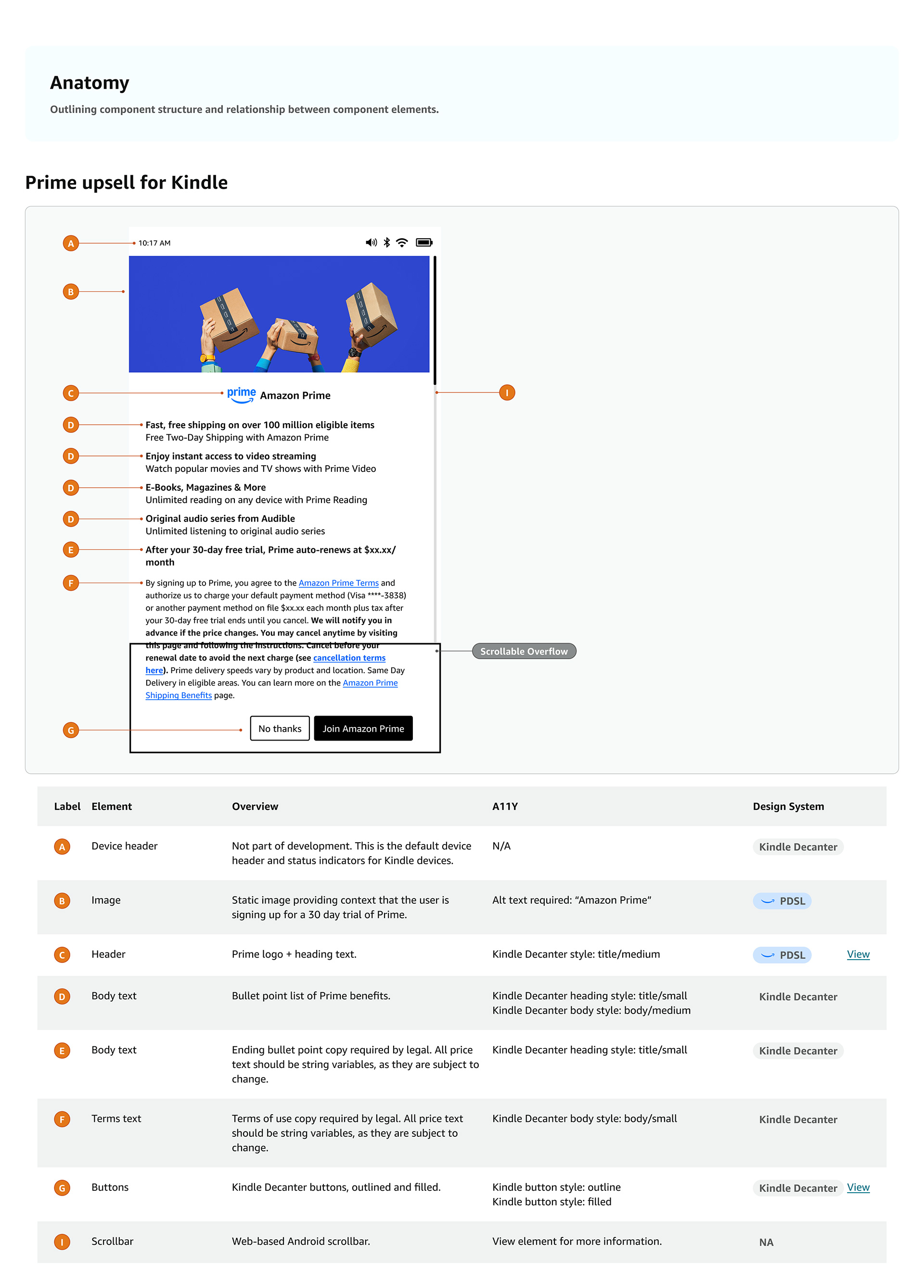
Component pages were formatted with a distinct and consistent architecture that included these elements:
I focused on building components that were clear, scalable, and easy to use across products. Their structure supported stronger accessibility, more consistent interactions, and smoother designer and engineering workflows. I also organized components with implementation in mind, using consistent naming and layer logic to make behavior easier to understand and instances easier to maintain. Careful property setup helped preserve content across variants, reducing rework and making the system more efficient to use.
This section highlights a selection of components and applied examples from the system, showing how shared patterns were designed to balance consistency, flexibility, and real product needs across the ecosystem.
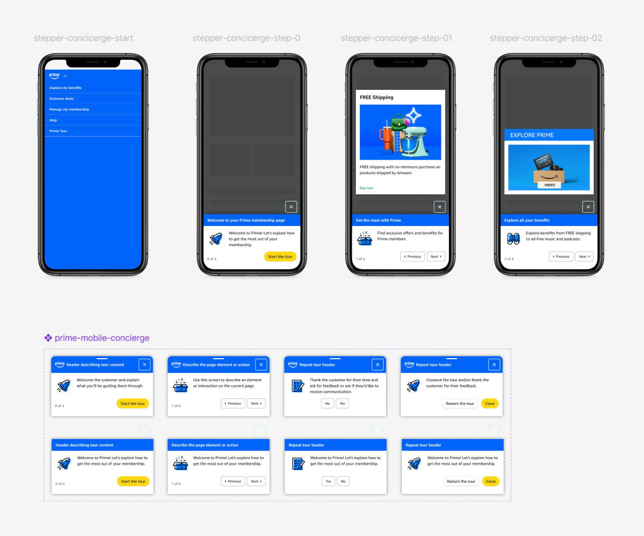
Stepper
The stepper component is used in a promotional campaign type where Prime members are rewarded with product discounts or gift cards for voluntarily revesting product promo pages a specific number of times.
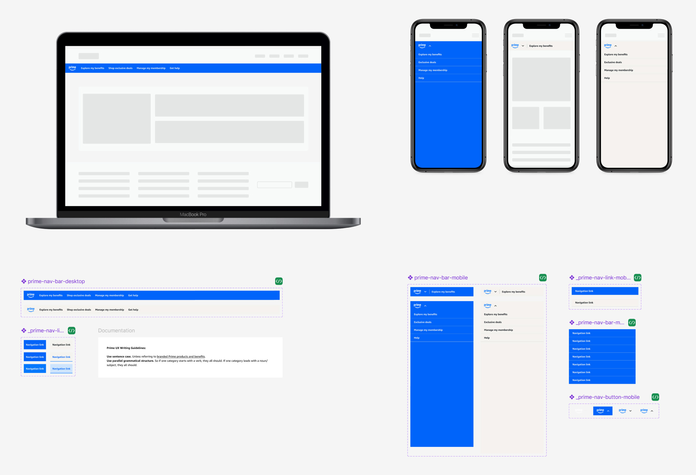
Prime navigation components
Desktop and mobile navigation menus displayed on all Prime membership pages. Nav menus come in standard Prime gray and Prime blue themes, which are used depending on the context of the page. Product and promo pages use Prime blue, while informational and membership management pages use the less distracting Prime gray.
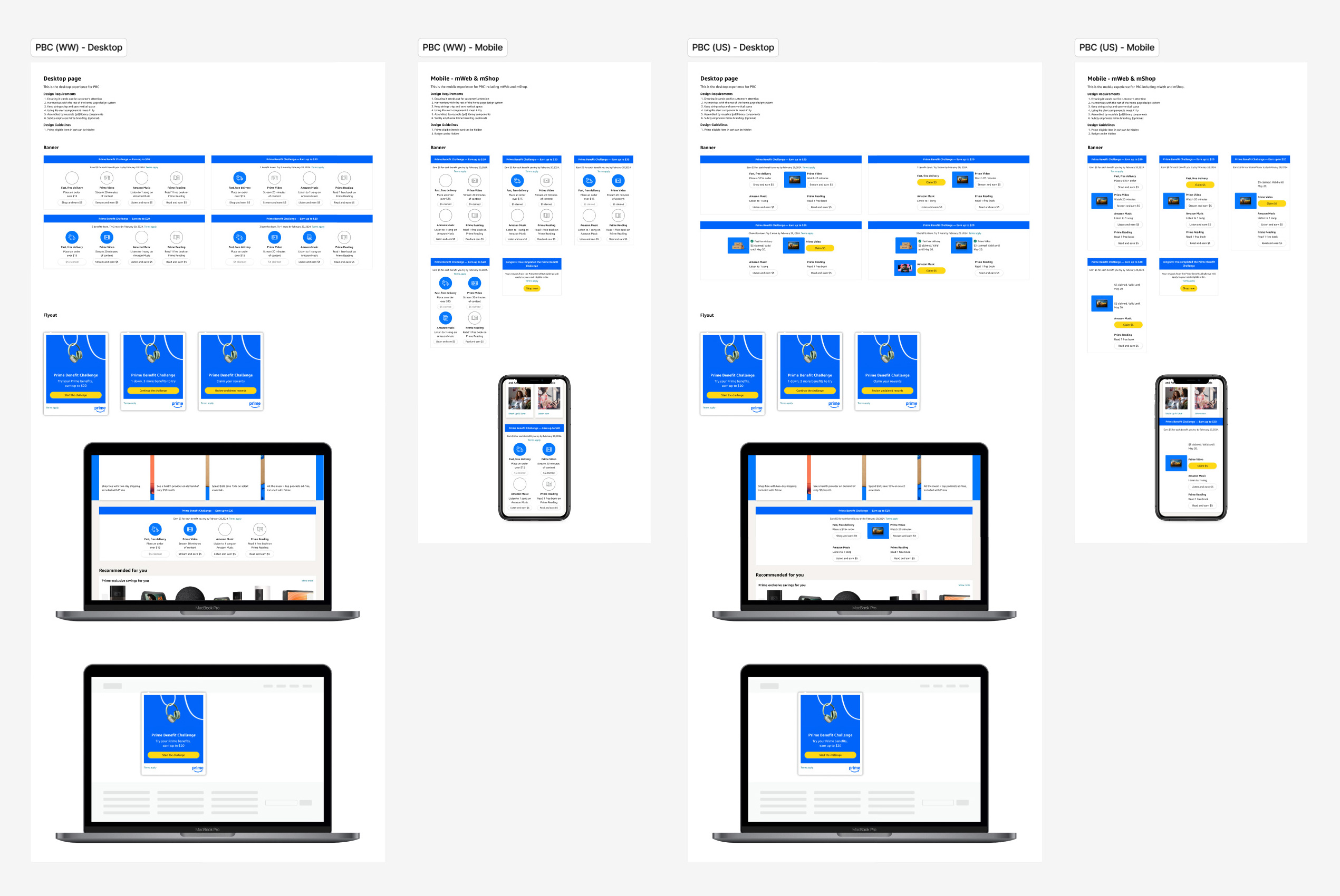
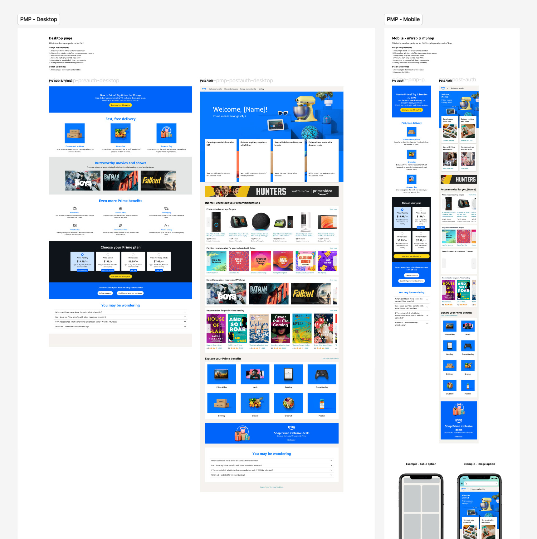
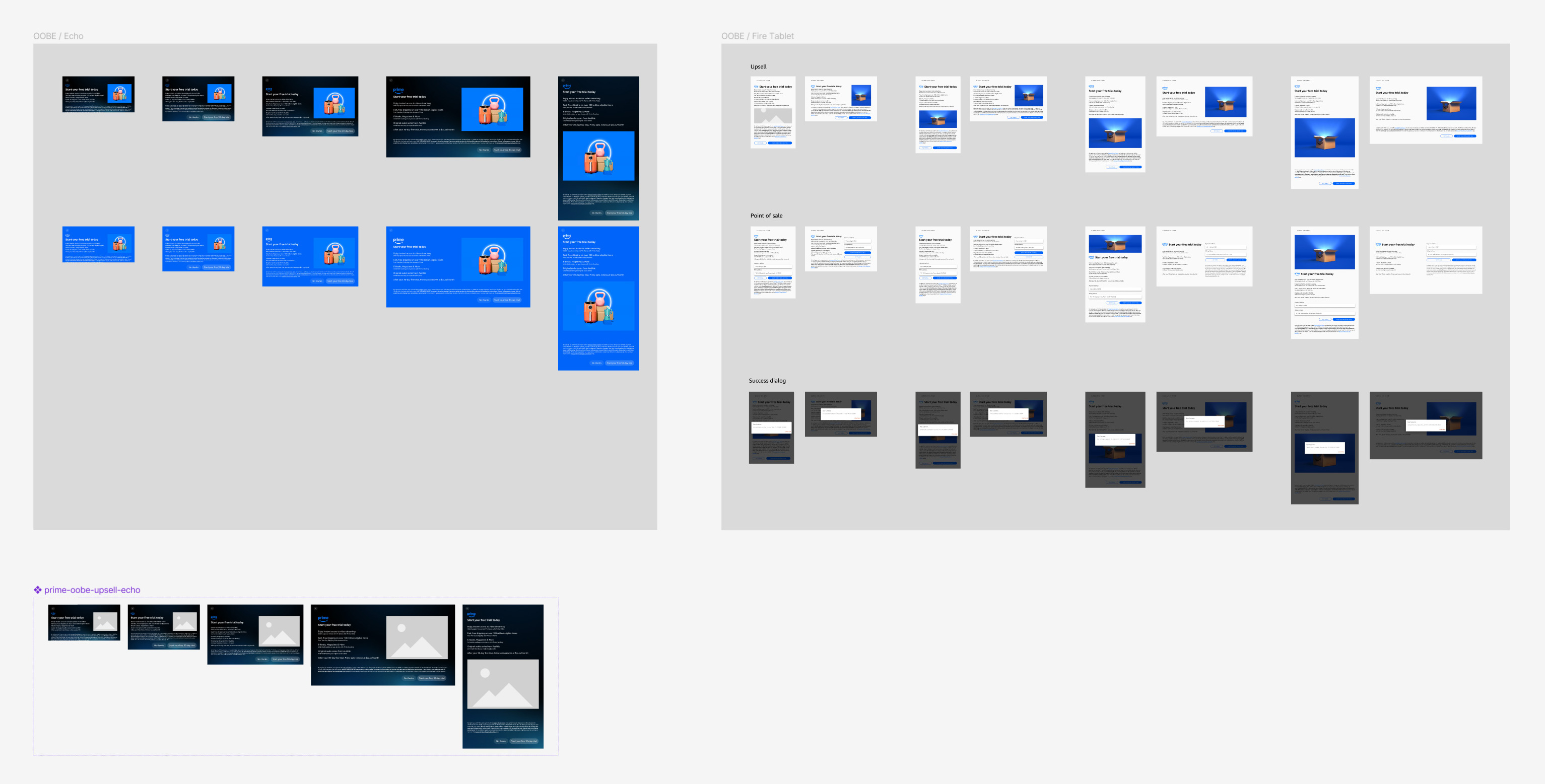
Templates and mockups extended the system beyond isolated components by showing how patterns behaved in a semi-realistic Prime context. Templates and full-page examples across onboarding, membership, homepage, marketing, and device upsell experiences helped teams and stakeholders understand placement, composition, and responsive behavior.
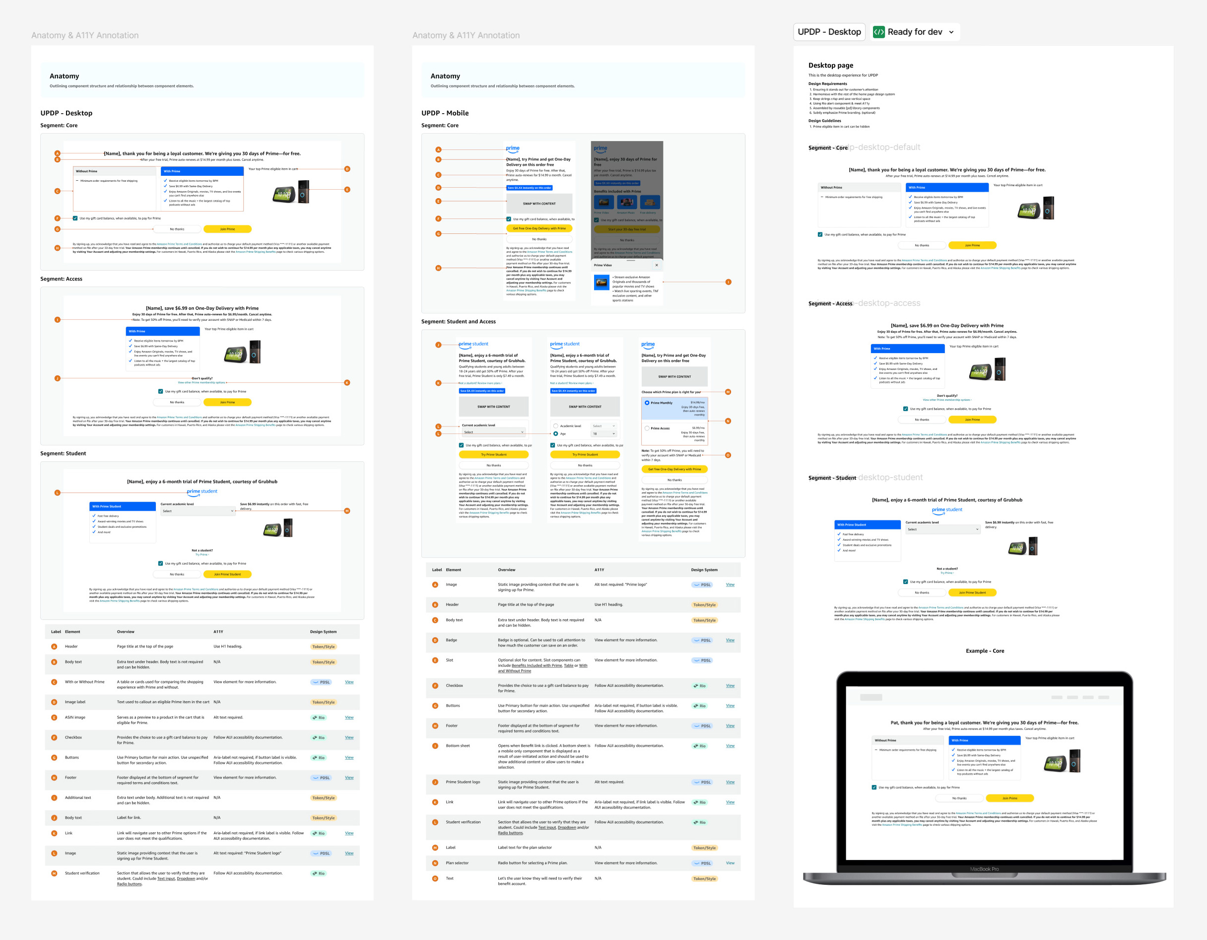
Detailed, annotated specs translated the system into implementation-ready guidance. The work included annotated documentation that clarified behavior, usage rules, accessibility requirements, and the broader constraints coming from legal, brand, Rio, AUI, and engineering.
I was also tasked with redesigning Prime upsell screens that appear in the onboarding flows of Echo Show, Fire Tablets, and Kindle devices. Balancing system consistency with the distinct branding, visual styles, and UI constraints of each device experience was the main focus. I worked across varying design systems, surface behaviors, and content rules to ensure each promo felt native to the product, while still meeting broader Prime design standards. A core requirement of this work was preserving the exact legal copy provided, which required careful hierarchy, spacing, and responsive content decisions so the messaging remained prominent, readable, and compliant without compromising the overall user experience.
This project delivered a comprehensive design system and set of assets that support quality, speed, and consistency across the Prime shopping experience on both desktop and mobile.
A lean, advanced design system architecture built for designer usability, engineering parity, and scalability
A streamlined Prime Design System built to support designer usability, engineering parity, and long-term scalability. The architecture emphasized efficient component methods, reduced redundancy, and flexible structures that could support a wide range of Prime experiences without unnecessary bloat.
Detailed engineering and accessibility specs, including component usage rules and cross-functional constraints from Rio, AUI, legal, brand, and marketing
Detailed engineering and accessibility specifications for components, including usage guidance, interaction behavior, and implementation notes. Documentation also captured the broader constraints each solution needed to satisfy, including requirements from Rio, AUI, legal, brand, and marketing.
Desktop and mobile templates and patterns showing component placement, usage, and in-context application across Prime surfaces
A set of templates and patterns for both desktop and mobile that showed how components should be placed, combined, and used in context. These assets helped teams apply the system more consistently across Prime surfaces and included in-situ mockups to demonstrate behavior within realistic product and device experiences.
Figma components with prototyping built in where applicable, including states for use in designer workflows and mockups
Figma components were built with prototyping support where applicable, allowing designers to use states and interactions directly in product mockups. This made the system more practical in day-to-day workflow and improved how design intent was communicated before handoff.
Accessibility-compliant redesigns for Prime promos, banners, device onboarding upsells, membership pages, navigation, and sign-up experiences with improved legal clarity
A suite of elevated Prime user experience patterns and surfaces, including in-shopping promos, banners, device onboarding upsells, Prime membership pages, and navigation elements. These redesigns improved accessibility, strengthened visual and interaction quality, and created clearer sign-up flows with stronger legal clarity and disclosure.
The project resulted in a comprehensive but streamlined Prime Design System that improved consistency across Prime surfaces and supported a more accessible foundation for the experience. It also enabled updated Prime upsell screens with a more modern visual expression and stronger legal adherence.
More importantly, the system created a structure for managing rapid redesign work across many teams without sacrificing quality. It gave Prime a more purpose-built and compliant system foundation, improved the consistency of UX across modules, and helped speed design work by creating clearer patterns, documentation, and reusable structures.
The impact included stronger accessibility alignment, tighter consistency across Prime experiences, improved governance across parallel redesign efforts, and a more scalable architectural model for component and layout creation. It also strengthened collaboration between product design, system design, and engineering by formalizing specs, annotations, and documentation patterns that made the system easier to use and implement. These themes are all visible in your current page, but this version frames them more explicitly as leadership and operating-model contributions.
This project reinforced that design systems leadership is as much about decision-making and governance as it is about craft. In a highly constrained environment, the challenge was not simply to make things look better. It was to improve visual and interaction quality in ways that remained compliant, implementable, and scalable.
It also sharpened my approach to component architecture. Fast-moving multi-team efforts create a constant risk of bloat and duplication, so system quality depends on having strong methods, clear rules, and the confidence to redirect work when needed. The Prime Design System succeeded because it paired design craft with architectural discipline and cross-functional leadership.