Within Amazon’s Devices & Design Group, our team of 9 system designers and technologists created, maintained, and owned the design systems for all of Amazon’s devices, including OOBE (Android), experience (APL), and legacy libraries. My focus was working with our CX teams to build and maintain feature-rich, streamlined systems and components that synched precisely with code. My scope was mainly within the Alexa core, Fire TV, and Echo family design systems.
Design systems build // System management
My role Sr system designer (L4)
Skills used
Systems thinking
System building
Complex components
UI design
Interaction design
Cross-function
System management
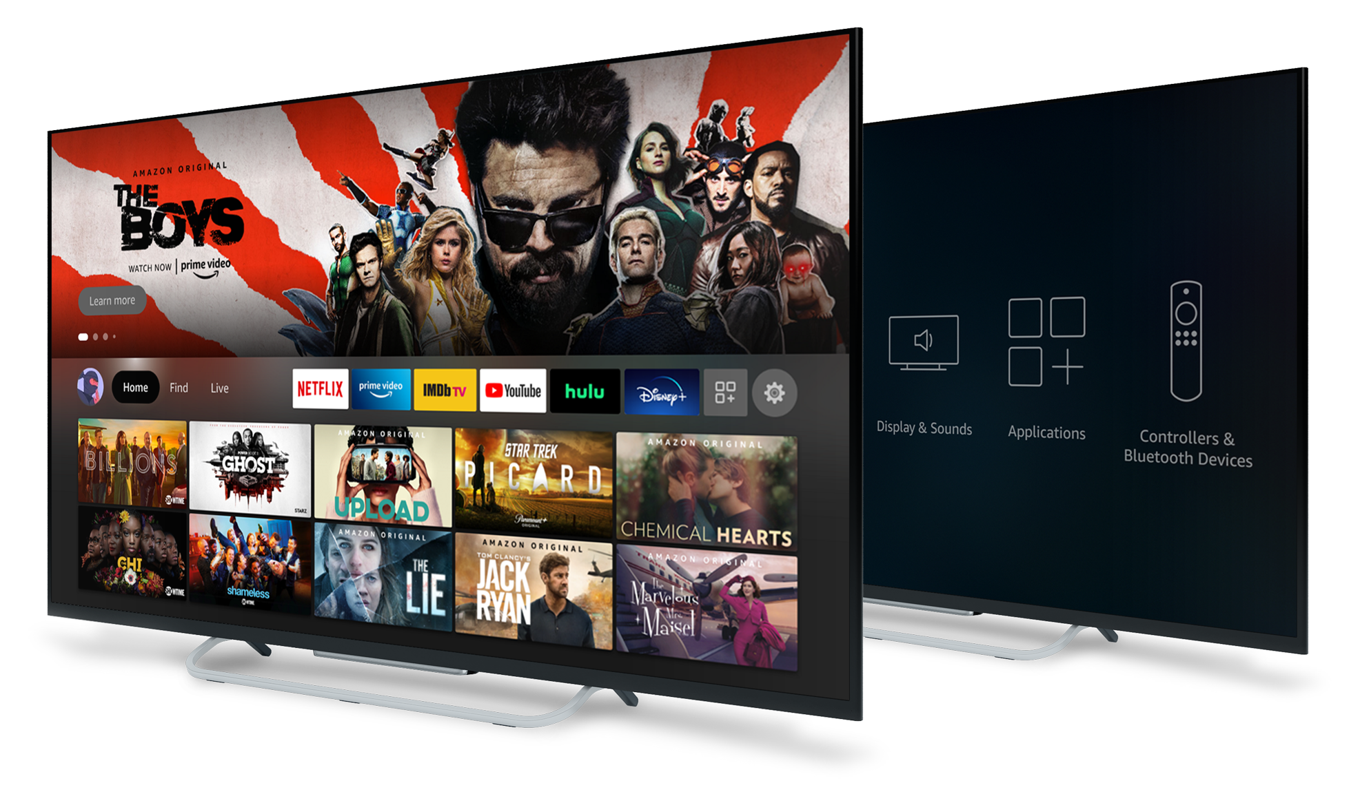
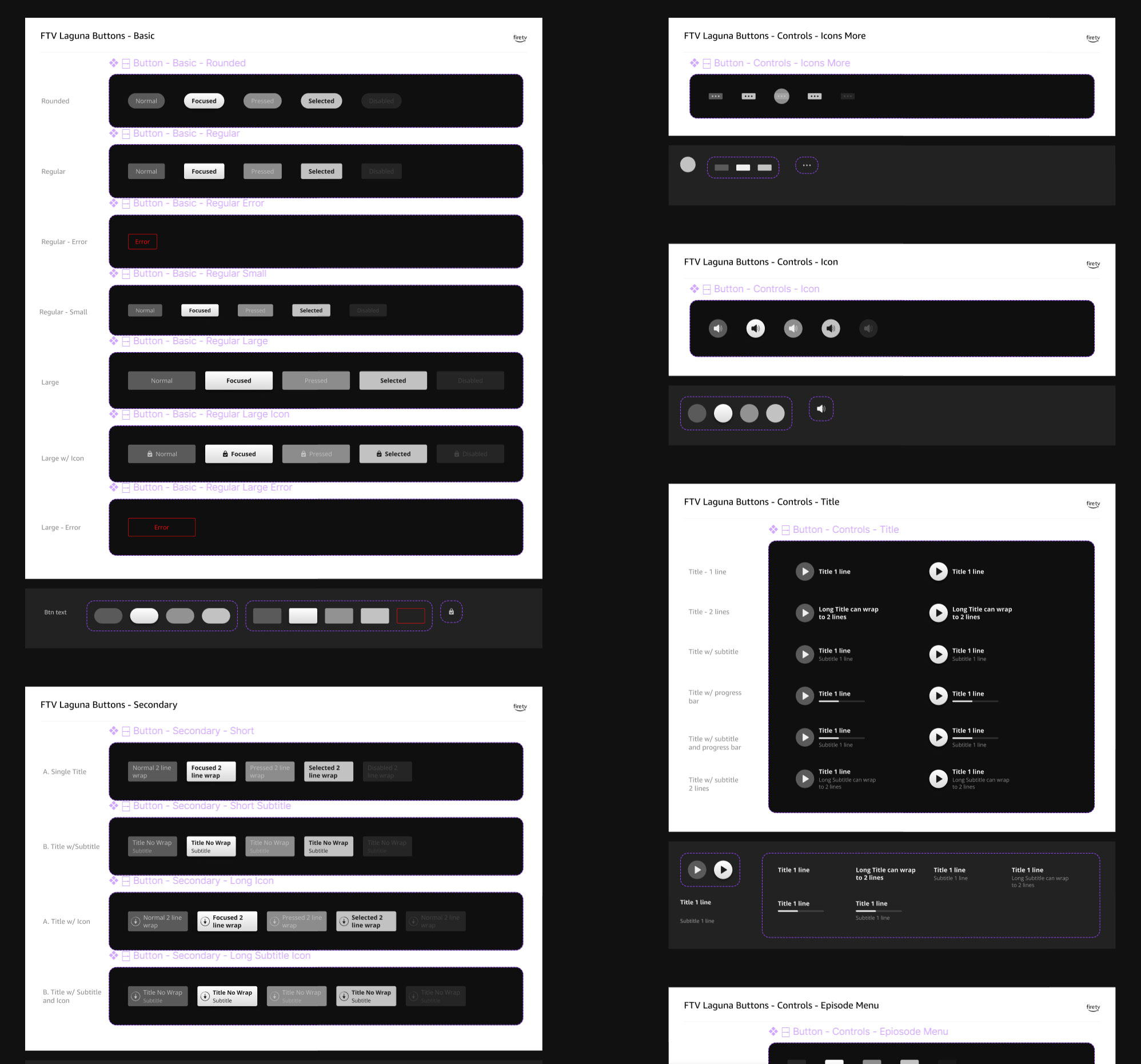
Fire TV design system
The Fire TV design system is one that I fully built and owned. As part of a transition to unify all device design systems in Figma, I rebuilt the system from scratch from its original home in InVision, including foundations, components, patterns, and templates. Like all Amazon systems, Fire TV utilizes advanced Figma features, such as variables, modes, component properties, and nested instances.
Components and templates
Amazon devices are built on Android, with native OOBE setup overlaid with an APL (Amazon programming language) layer that runs the app interface. This project included the creation of both Android OOBE and APL-based component libraries and templates. The following shows samples of components for both APL components and Android templates.
Button and Control components
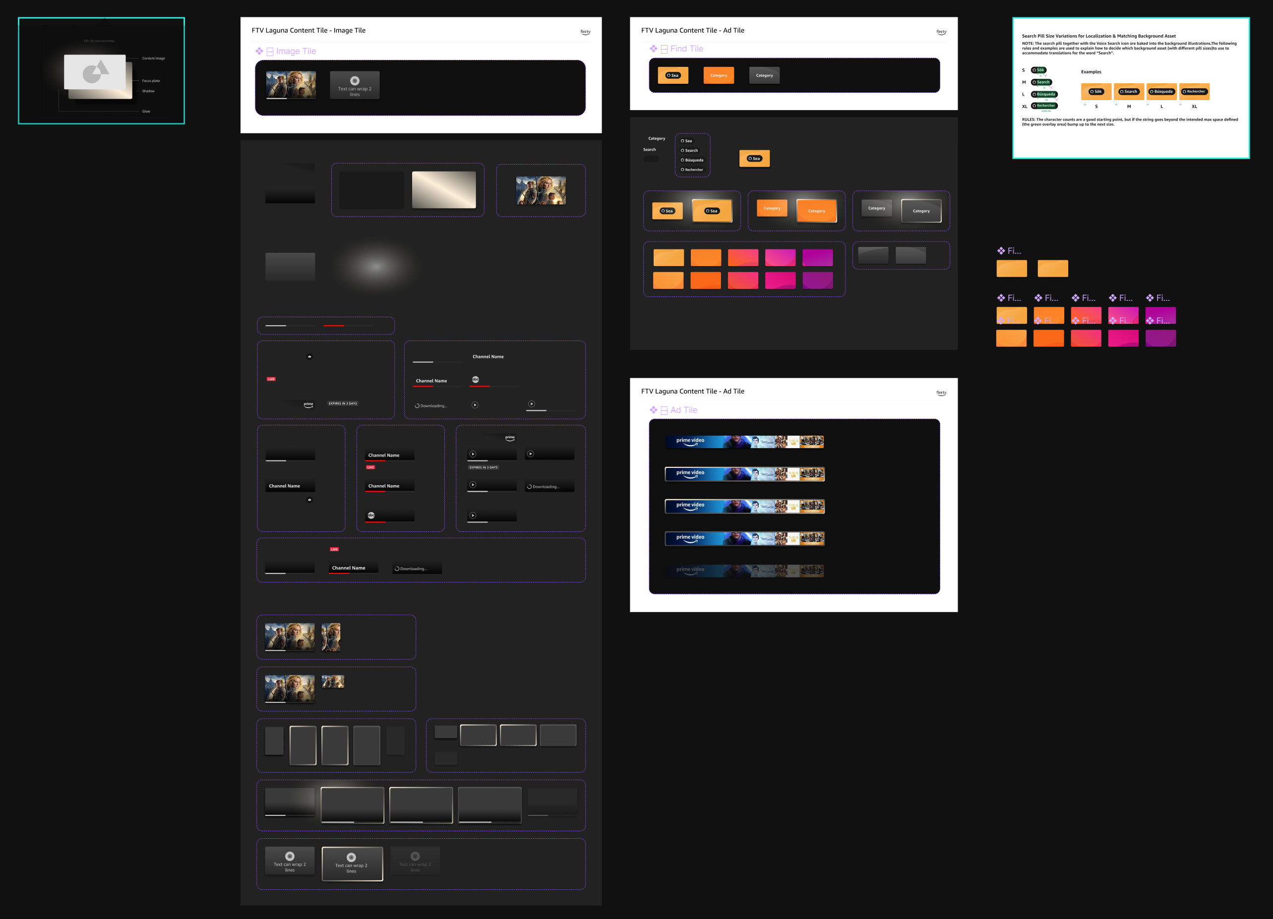
Because the Fire TV UI is built with a programming language (APL), as opposed to being web-based, components with colored backgrounds require an absolute-positioned graphic asset for variants with a background color, as can be seen in the following button and control components. To users, this method is optically identical to a typical frame with a background fill, border-radii, and other applied styles.
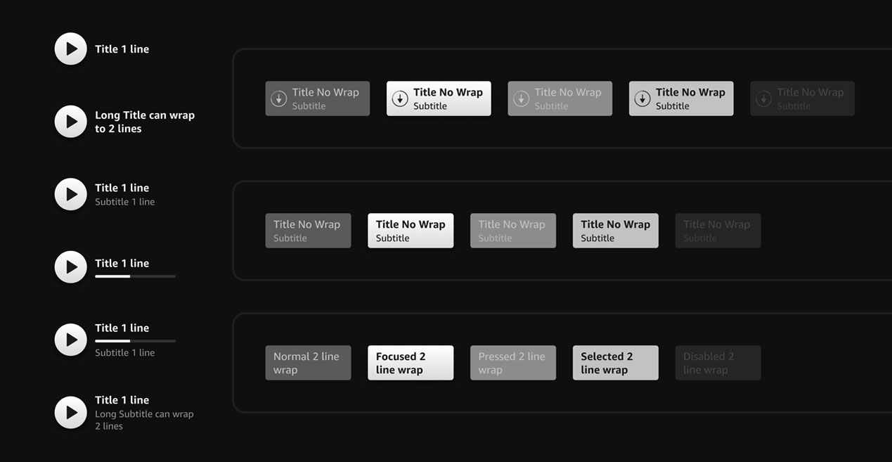
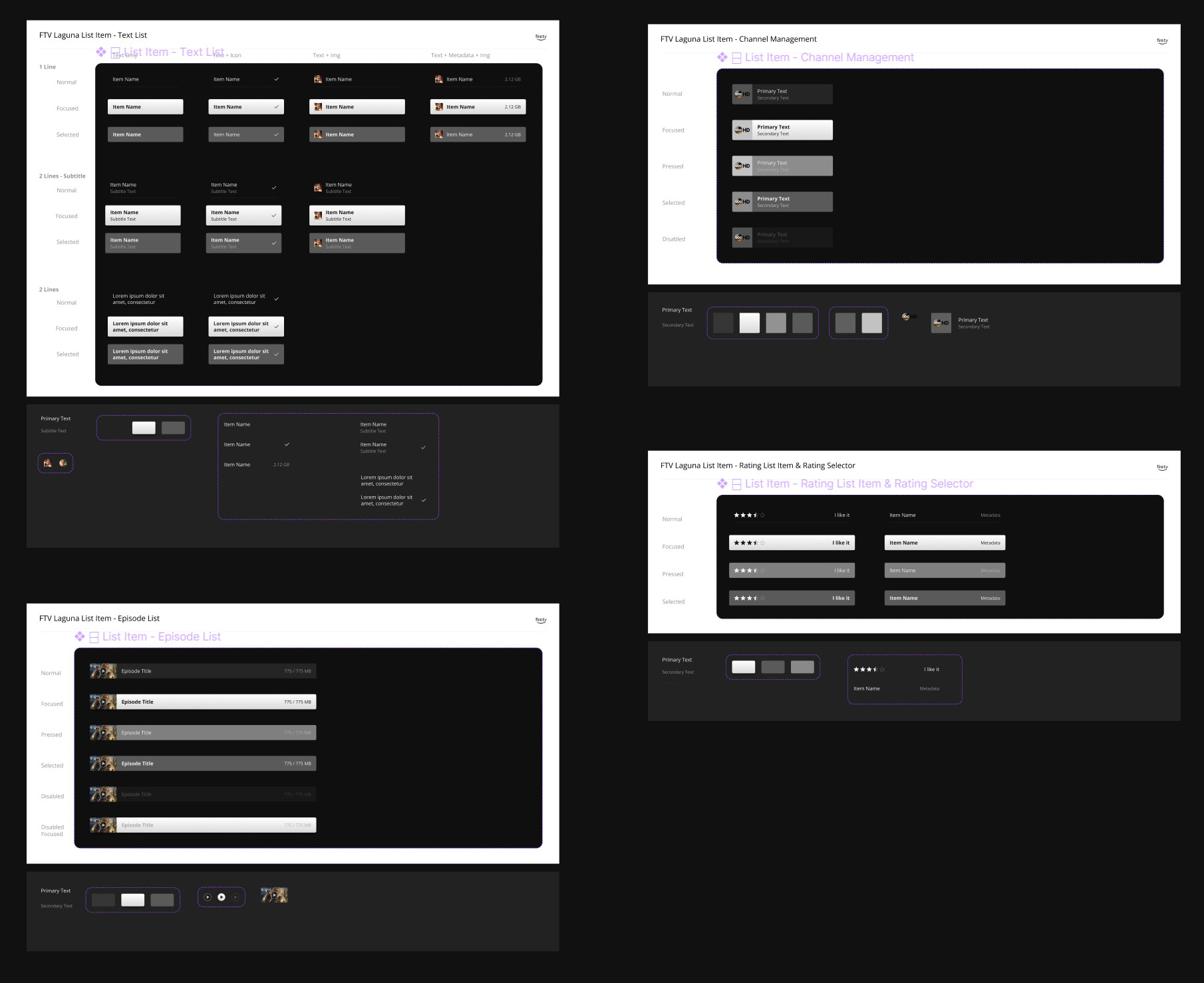
List Item components
Keypad (touch) components
A guiding principle that was strongly emphasized in our team was user-centered design; the idea that we put in the work behind the scenes to ensure the easiest user experience for our designers and engineers. That means component builds were often highly complex and sprawling within the system, but small and streamlined in use, which brought simplicity and intuitiveness to the user.
The Keypad component is a good example of this principle. Below the final component, which includes just 5 variants, the complex nested structure can be seen. This level of detail was necessary to provide fully interactive components and prototypes.
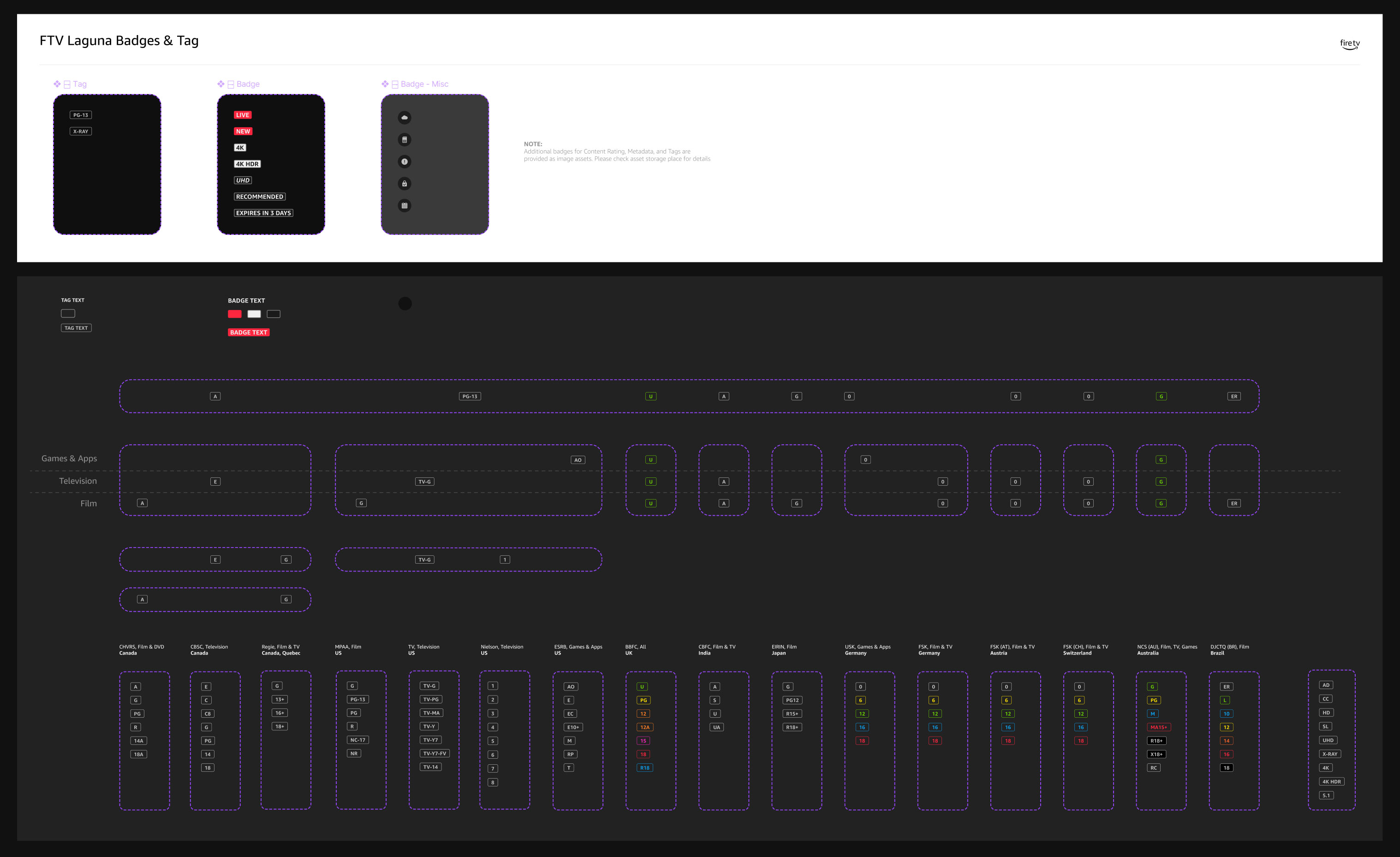
Badge and Tag components
As with all TV apps, badges and tags are needed to display applicable ratings and program information to users. Ratings and tag types vary across networks and countries, and a lot of research went into identifying these details for countries where Fire TV exists. However, many rating types that exist in the US aren’t used elsewhere. For example, at the time of writing, Canada didn’t have an applicable “Games and Apps” rating system. To future-proof this component, the grid system in shown below was designed such that any missing rating types can simply be added in the appropriate empty spaces within the sub-components without the need to expand or re-format the grid.
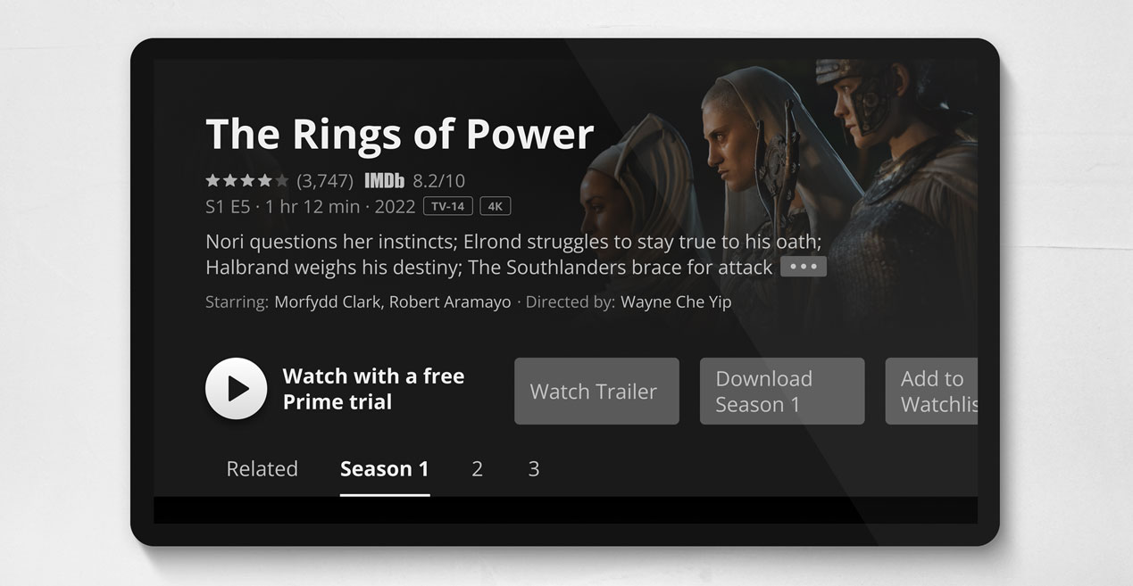
Tile components
The Tile components are, perhaps, the most used complex components in the system. The Image Tile includes a number of nested components that can be toggled on / off, and combined in a multitude of ways. In keeping with our team’s methods, the final component includes just 2 variants with dozens of configuration parameters in the component panel.
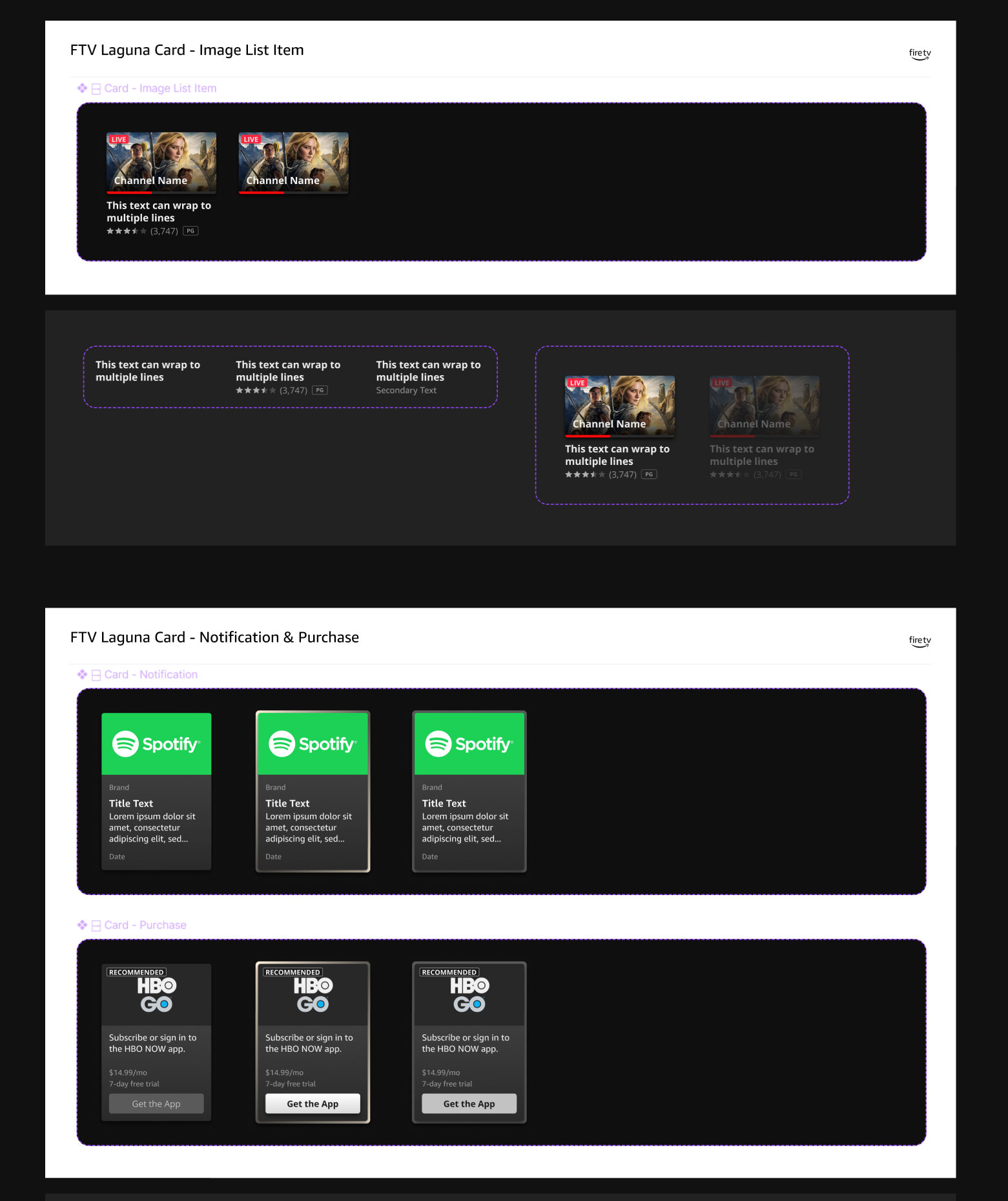
Card components
The Image List Card component is comprised of nested Tile components with 2 variants:
With metadata including title, user rating, and tags.
Tile only, no metadata
Fire TV also has cards typically used for upsells or configuration entry points for integrated streaming services.
Templates (sampling)
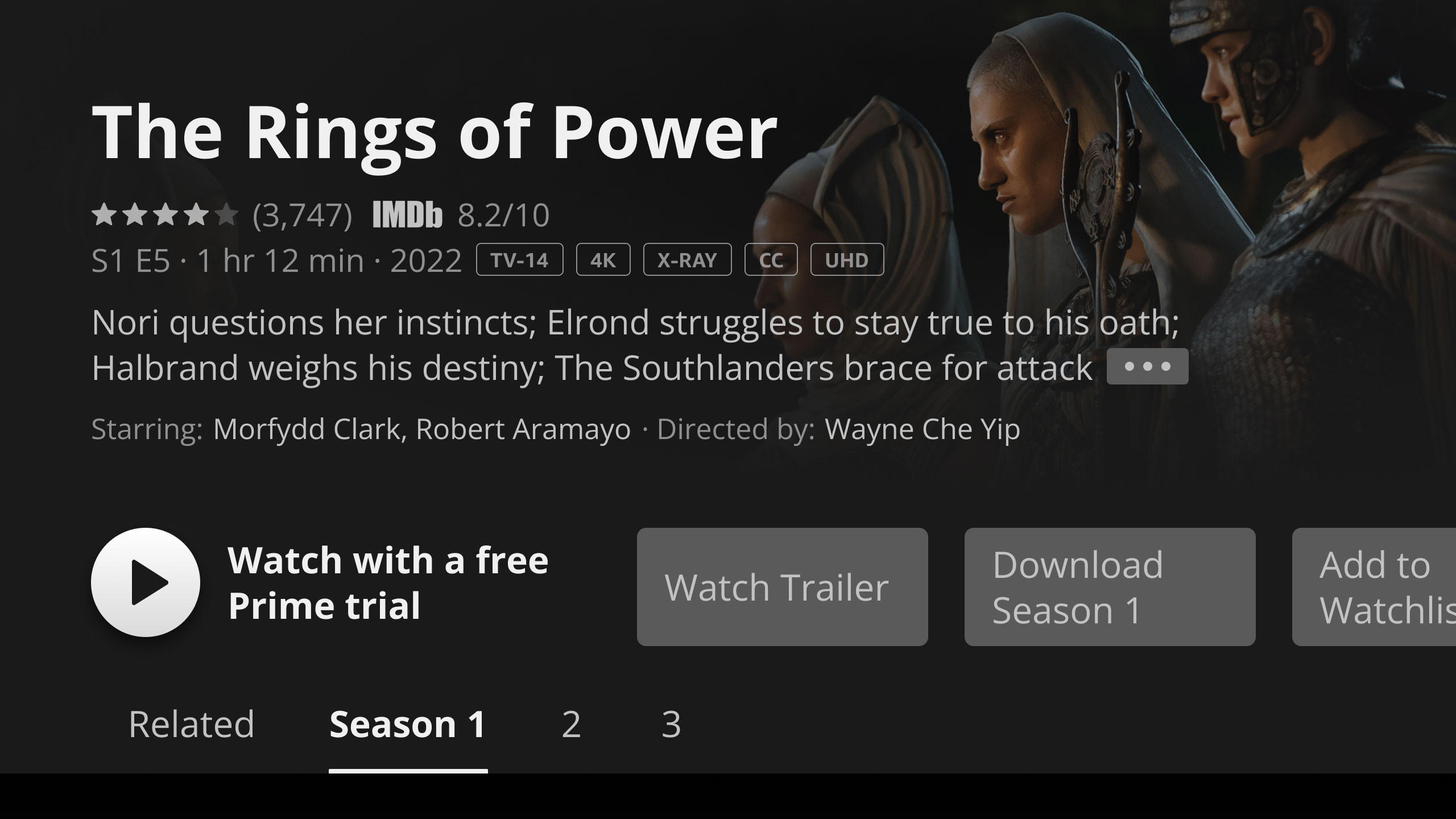
Program details screen
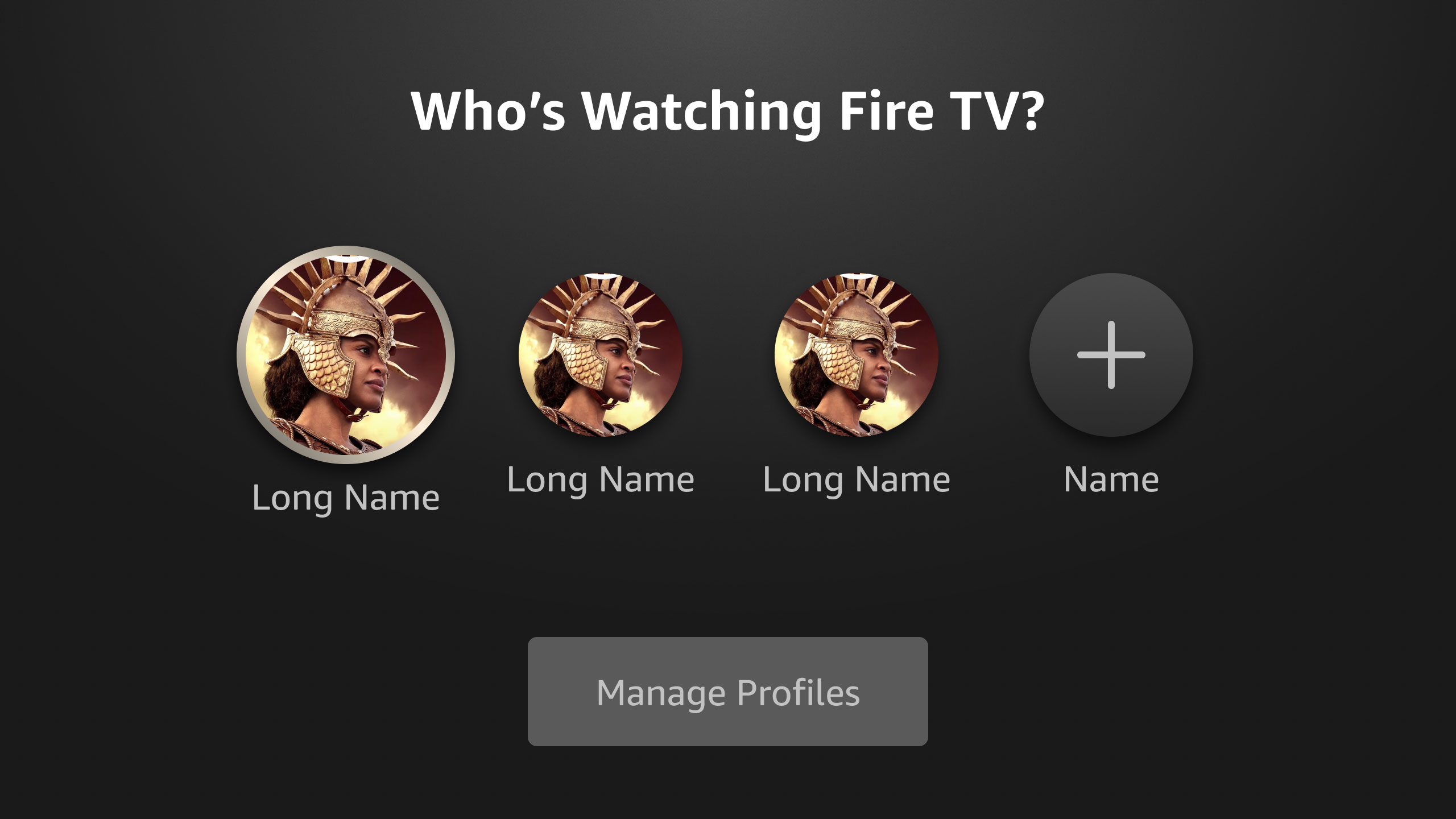
Profile selector screen
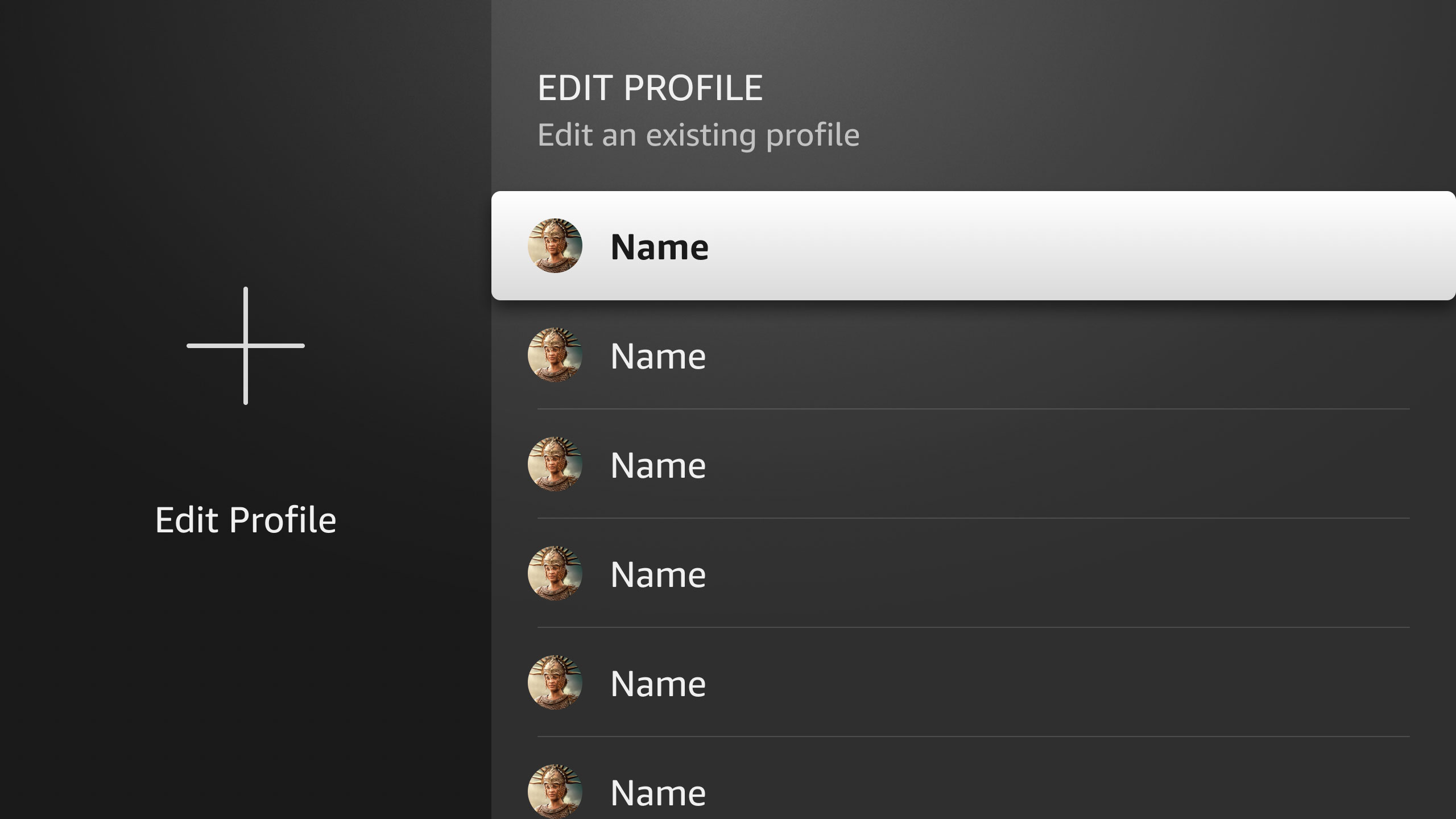
Edit profile screen
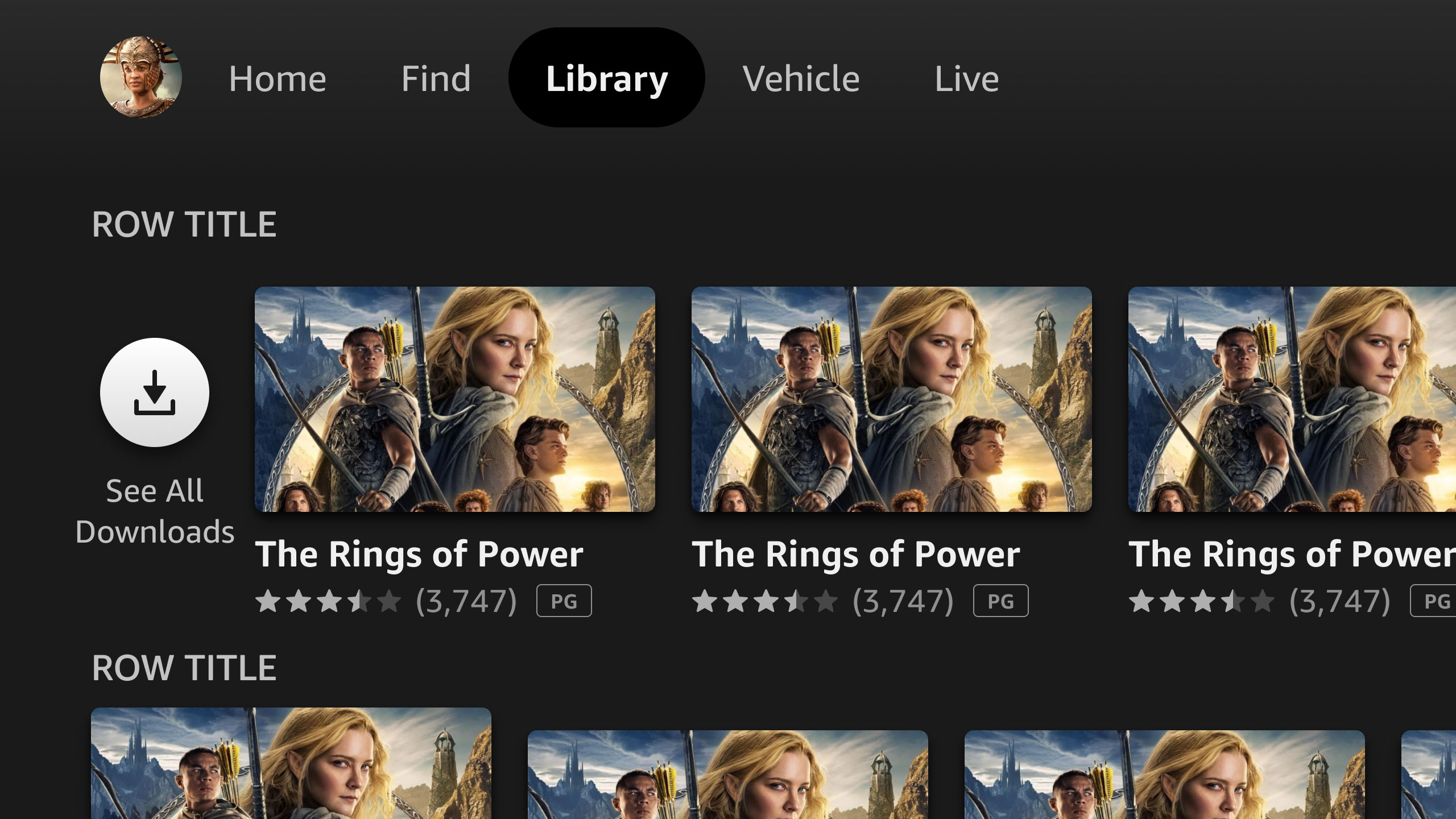
User library screen
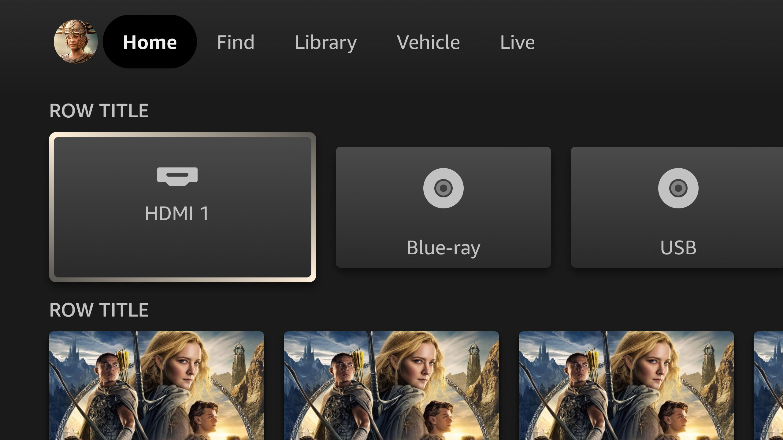
Video input screen
Fire TV Mobile design system
This design system is supplementary to the main Fire TV system, and includes components for mobile and other touch-enabled devices, such as auto and airline streaming screens. Because of the variable nature of these devices, the mobile components were built to a minimum resolution of 1280x720dp and scale up to any size, while maintaining a fixed 16:9 aspect ratio.
Fire TV Mobile component sampling // Program details template
⇆
Adoption success
The creation of the Fire TV design systems were part of a department-wide migration to Figma. Previously, CX teams managed their own design systems on various platforms, which created chaos and disharmony for designers and engineers. As such, Amazon made the decision to migrate (or recreate from scratch) all device design systems in Figma to form a more harmonious ecosystem that brought consistency to design, and parity to code. Thus, the “Bridge Team” was formed, consisting of 9 system designers, including myself, who migrated or recreated, owned, managed, and supported all device design systems, documentation, and template libraries – approximately 24 device-specific design systems, plus the core Alexa design system that was a shared responsibility.
Support and training
Once the primary systems were ready for launch with consistent interfaces, and detailed specs and documentation, we launched a comprehensive department-wide adoption and support campaign consisting of a video training library, office hours, intake forms, regular video and newsletter updates, and routine live training sessions. We followed up the campaign with a survey that showed a 78% positive rating of the new design systems themselves, as well as the support efforts from our team.
Positive feedback
0%
Team culture
To further promote and facilitate adoption, we worked to position our team as:
Highly dependable, approachable, and extra helpful. We worked to form good working relationships with our designers and developers by happily assisting, even when requests were outside of our typical scope.
Always supportive with quick turnaround times, attention to detail, and inclusive collaboration. Although it was sometimes difficult, we worked to ensure the shortest turnaround times possible.
Experts in user-centered solutions that reduce cognitive load and make the jobs of our users easier. We extended our support beyond just managing the systems, to consulting and formulating solutions for CX and engineering teams.
The result was a measurable successful adoption across the CX and engineering teams, and a smooth and easy support process. An additional perk of our support efforts was the formation of improved collaboration among the CX teams, themselves, and the breaking down of silos that previously created separation and hindered collaboration.
