Within Amazon’s Devices & Design Group, our team of 9 system designers and technologists created, maintained, and owned the design systems for all of Amazon’s devices, including OOBE (Android), experience (APL), and legacy libraries. My focus was working with our CX teams to build and maintain feature-rich, streamlined systems and components that synched precisely with code. My scope was mainly within the Alexa core, Fire TV, and Echo family design systems.
Design systems build // System management
My role Sr system designer (L4)
Skills used
Systems thinking
System building
Complex components
UI design
Interaction design
Cross-function
System management
Alexa design system
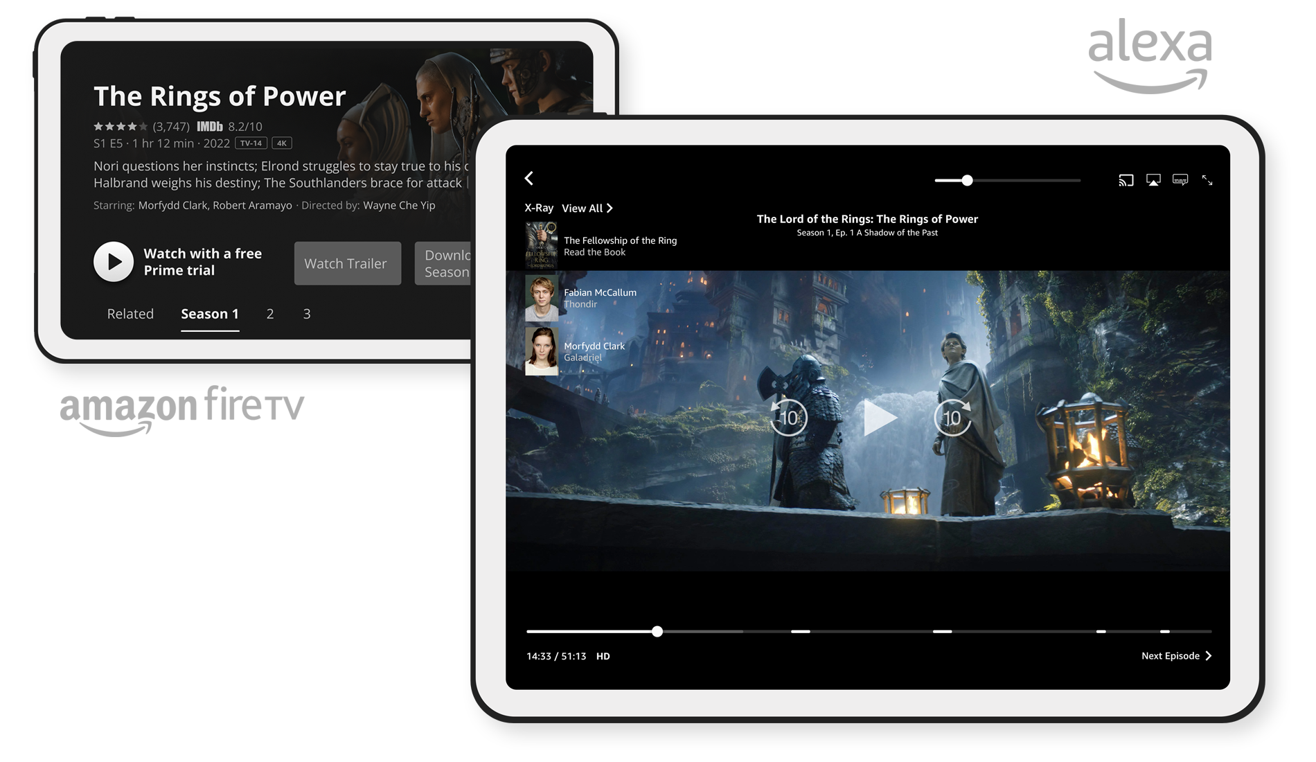
The Alexa design system (ADS) is Amazon’s core system. Prime Video and later versions of Echo Show devices are perhaps the most recognizable ADS component interfaces. The following are in-depth demos of two ADS components that I built: the Alexa Card and video Ad Markers.
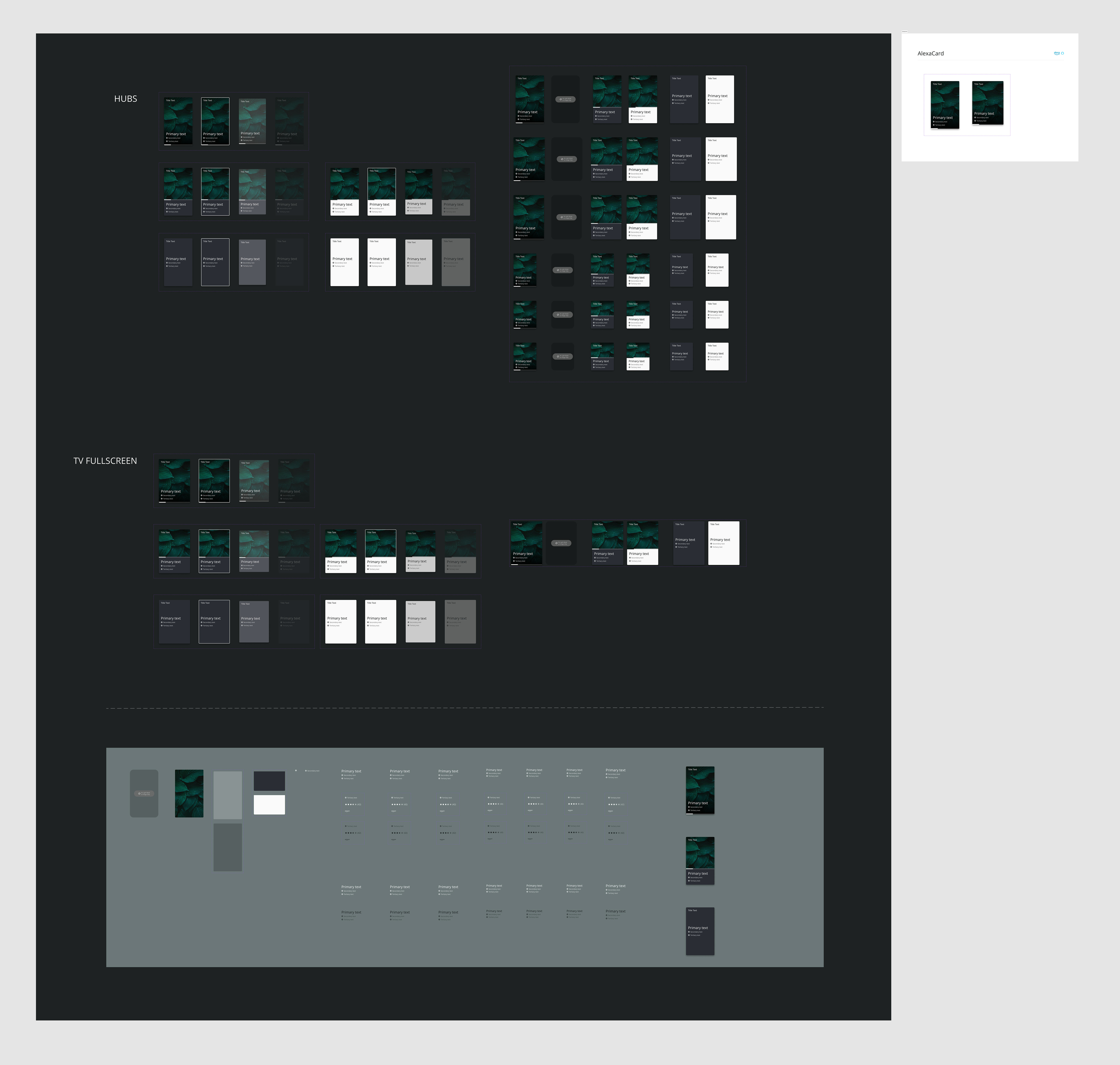
Component build demo: Alexa Card component
A guiding principle that was strongly emphasized in our team was user-centered design; the idea that we put in the work behind the scenes to ensure the easiest user experience for our designers and engineers. That means component builds were often highly complex and sprawling within the system, but small and streamlined in use, which brought simplicity and intuitiveness to the user.
As with all component builds for Amazon, the goal with the Card was to create a single component that included variants for all applicable devices, advanced properties that allowed full configuration from the component panel, color modes, and the smallest footprint for the end user. With over 100,000 permutations, this component was thoroughly planned out in advance to ensure the leanest structure while maximizing usability.
User features
3 fluid Card styles, each with unique layouts and features.
4 interactive states per Card (normal, focused, pressed, disabled).
Content mapping to allow users to update text, imagery, and settings universally across all variants.
User can toggle and customize all elements, such as the header, metadata, progress bar, scrim, content rows, etc.
2 themes, dark and light (note: this project was completed before variables and modes were introduced).
Component features
Considerations for nested components to ensure universal changes via the component panel are possible (Figma only allows this for 2 nested components deep).
Maximum use of component properties, particularly boolean layer and text properties.
Goal to enable all configuration via the component panel.
Inclusive of multiple device types and viewports (6 device total, plus applicable TVs).
Alexa Card component device mockup (Echo Show 15)
Alexa Card component walkthrough
Alexa Card atomic structure // Component preview
⇆
Alexa Card atomic structure // Nested instances
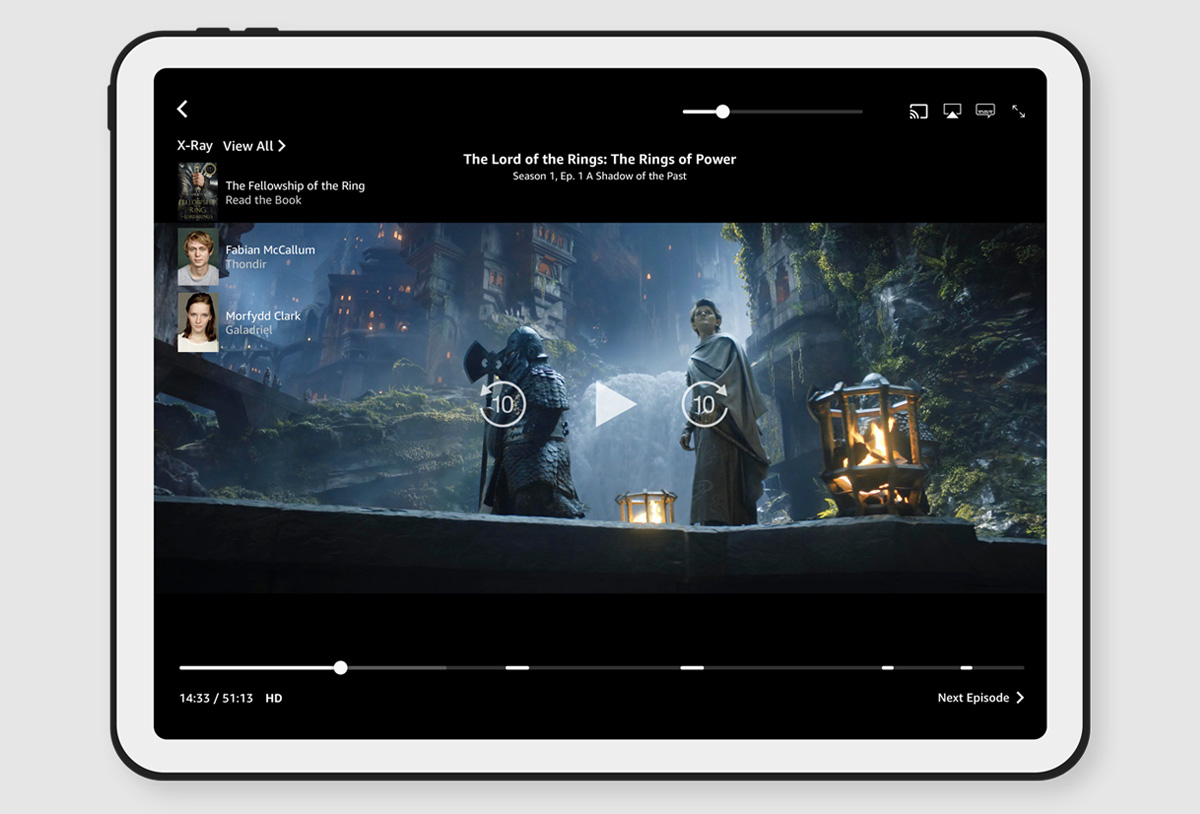
Component build demo: Alexa Slider + Ad Marker components
As Amazon was just introducing ads to Prime Video, the core Alexa Design System Slider component needed to be updated to reflect this new feature. For this component, I worked with an interaction designer to understand the requirements and functionality of the component, as well as formulate the best way to integrate the component into the design system.
I chose to demo this particular component because it includes some nifty Figma hacks for allowing the user to control the widths and positioning of the ad markers, progress fill, and buffer fill, which is a feature Figma technically doesn’t allow. Below are demos of how that functionality was achieved.
User features
User can toggle on / off up to 5 ad markers.
User can control width of the progress fill, buffer fill, and ad marker instances.
User can control the position of ad markers in the slider.
2 themes, dark and light (note: this project was completed before variables and modes were introduced).
Component features
Auto-layout hacks to allow user to control the width and position of nested instances.
Use of boolean layer properties to display ad markers.
Inclusive of multiple device types and viewports.
Alexa Slider + Ad Marker atomic structure // Prime Video device mockup (tablet)
⇆
Alexa Slider + Ad Marker components walkthrough
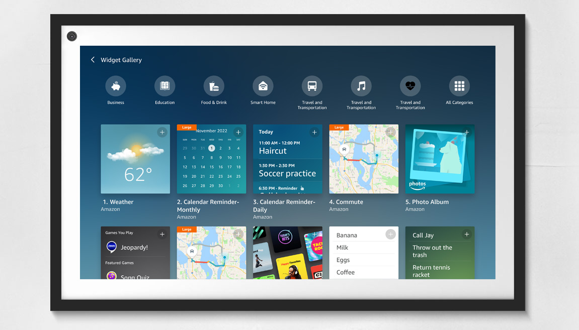
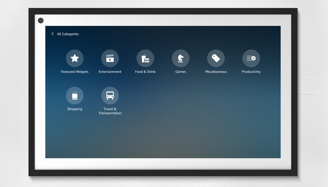
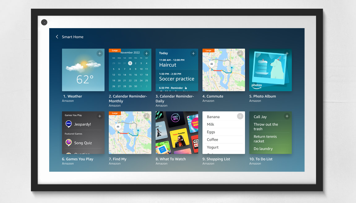
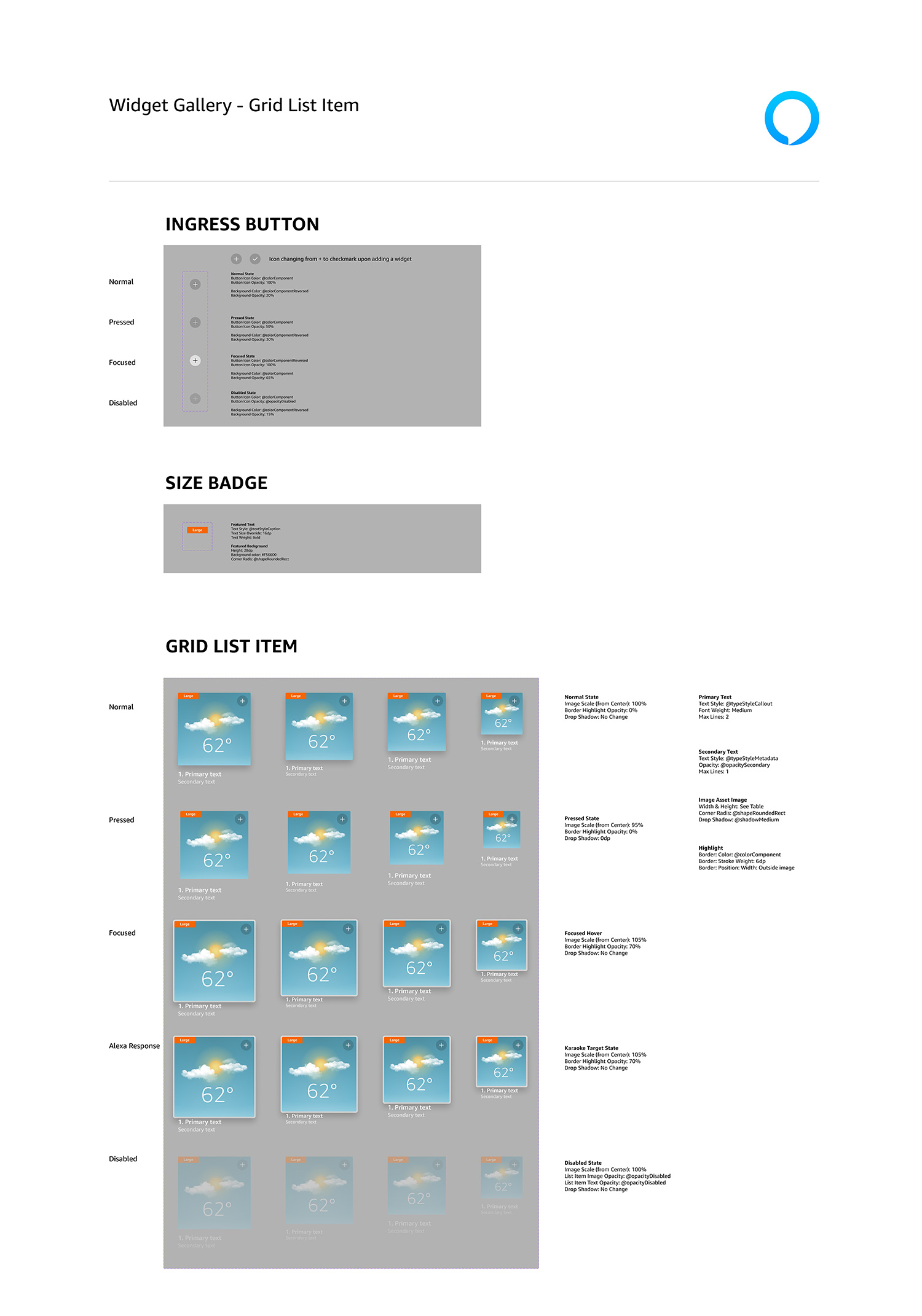
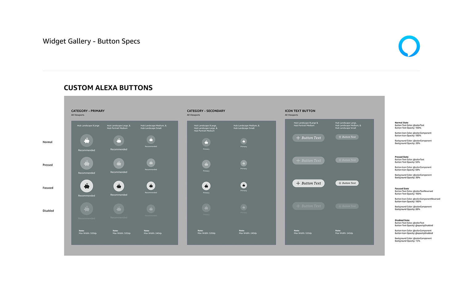
Widget Gallery templates
The Widget Gallery is a common interface that’s included in all Echo Show devices. This feature allows users to customize a collection of widgets to show various content, such as weather, to-do lists, calendar, photos, and more. The following shows select screens from the Widget Gallery mocked up on an Echo Show 15 device, as well as the custom components built to create these layouts.
Adoption success
The creation of the Fire TV design systems were part of a department-wide migration to Figma. Previously, CX teams managed their own design systems on various platforms, which created chaos and disharmony for designers and engineers. As such, Amazon made the decision to migrate (or recreate from scratch) all device design systems in Figma to form a more harmonious ecosystem that brought consistency to design, and parity to code. Thus, the “Bridge Team” was formed, consisting of 9 system designers, including myself, who migrated or recreated, owned, managed, and supported all device design systems, documentation, and template libraries – approximately 24 device-specific design systems, plus the core Alexa design system that was a shared responsibility.
Support and training
Once the primary systems were ready for launch with consistent interfaces, and detailed specs and documentation, we launched a comprehensive department-wide adoption and support campaign consisting of a video training library, office hours, intake forms, regular video and newsletter updates, and routine live training sessions. We followed up the campaign with a survey that showed a 78% positive rating of the new design systems themselves, as well as the support efforts from our team.
Positive feedback
0%
Team culture
To further promote and facilitate adoption, we worked to position our team as:
Highly dependable, approachable, and extra helpful. We worked to form good working relationships with our designers and developers by happily assisting, even when requests were outside of our typical scope.
Always supportive with quick turnaround times, attention to detail, and inclusive collaboration. Although it was sometimes difficult, we worked to ensure the shortest turnaround times possible.
Experts in user-centered solutions that reduce cognitive load and make the jobs of our users easier. We extended our support beyond just managing the systems, to consulting and formulating solutions for CX and engineering teams.
The result was a measurable successful adoption across the CX and engineering teams, and a smooth and easy support process. An additional perk of our support efforts was the formation of improved collaboration among the CX teams, themselves, and the breaking down of silos that previously created separation and hindered collaboration.