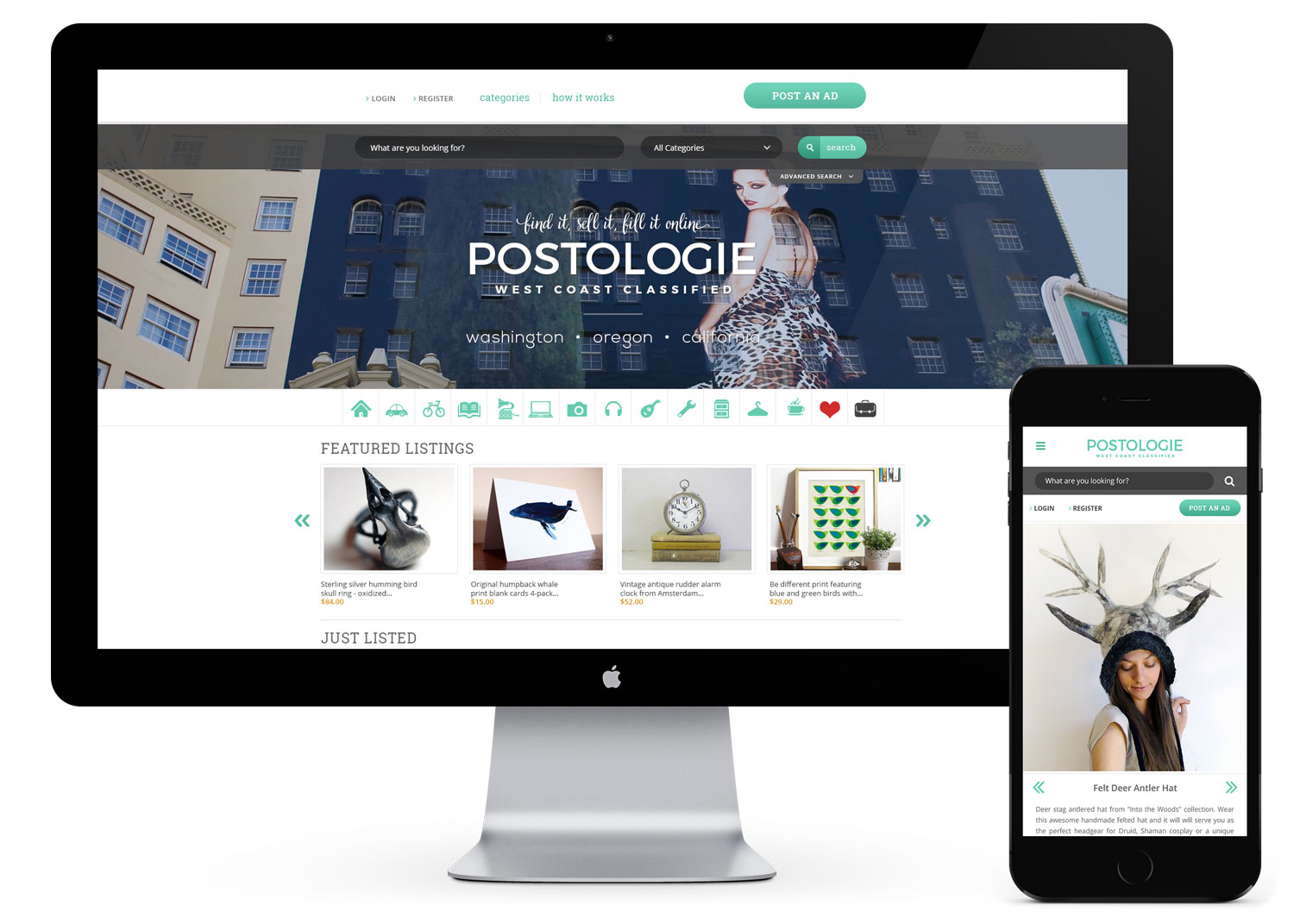
Postologie is a classified ad and community website for the West Coast. Postologie seeks to create a safe and honest classified platform through close member and listing moderation.
Brand // eCommerce Website // Collateral
My role Design lead
Skills used
Creative dir.
Brand design
Interaction design
UI / web design
Visual design
Info arch.
Copywriting
Services and deliverables
Brand // identity
Brand exploration
Color palette
Typography
Logo design
Brand / style guide
UI design // website
Discovery
Moodboards
User flows, purchasing journeys
UI / polished designs
Visual // collateral
Business Cards
Photography selection
Photo editing and correction
Promo // marketing
Custom email templates (Mailchimp)
Custom Woocommerce emails
Brand design
For the brand, Postologie wanted a casual, friendly, and distinctly West Coast feel that didn’t favor any one particular region. Blue, greens, and beige colors were chosen for the palette, with a primary turquoise/cyan hue. The logo is an insignia style used in three forms: minimal, simple, and extended, with each utilizing various taglines and descriptors, as illustrated below.
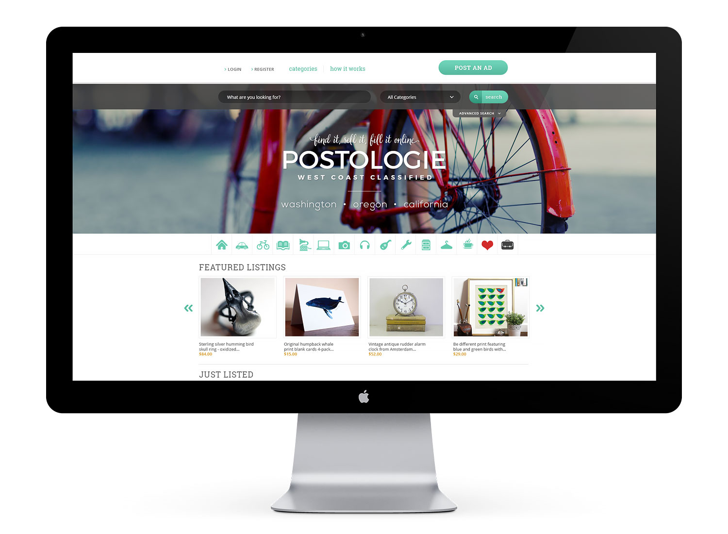
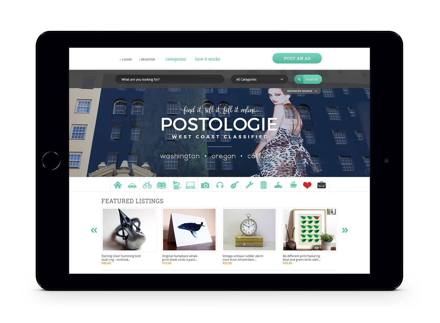
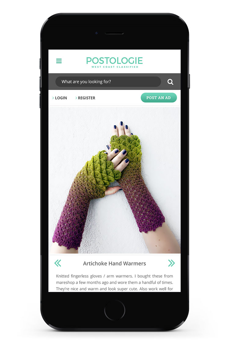
UI // web design
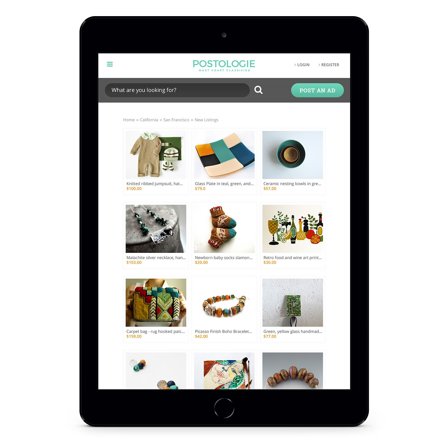
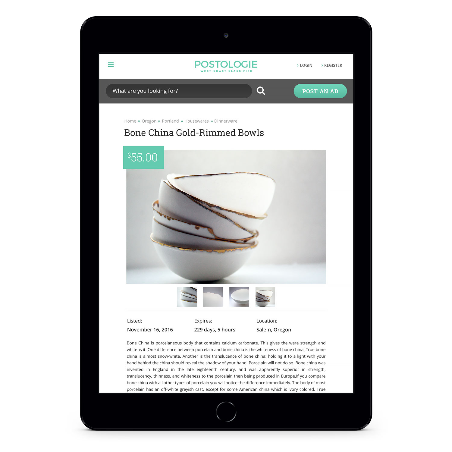
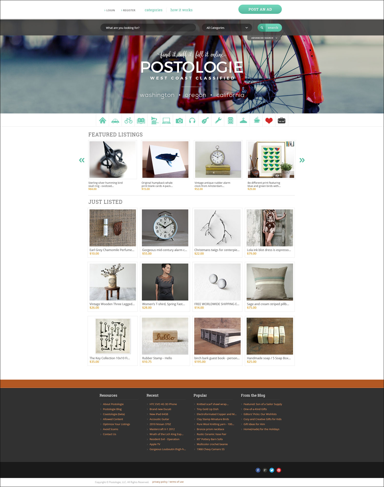
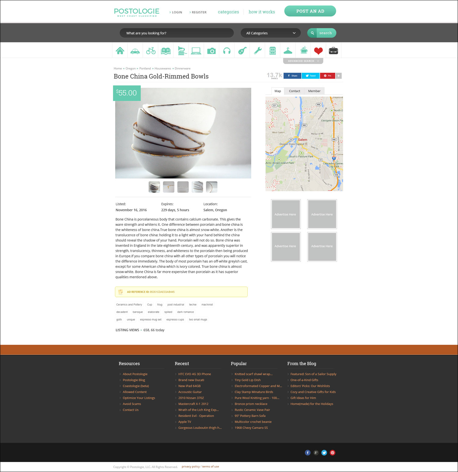
The primary site is divided into three parent regions – California, Oregon, and Washington – which are further divided into localized sub-regions. Each region and sub-region feature comprehensive classified listings and community features, complete with ratings, payment options, user profiles, listing maps, and more.
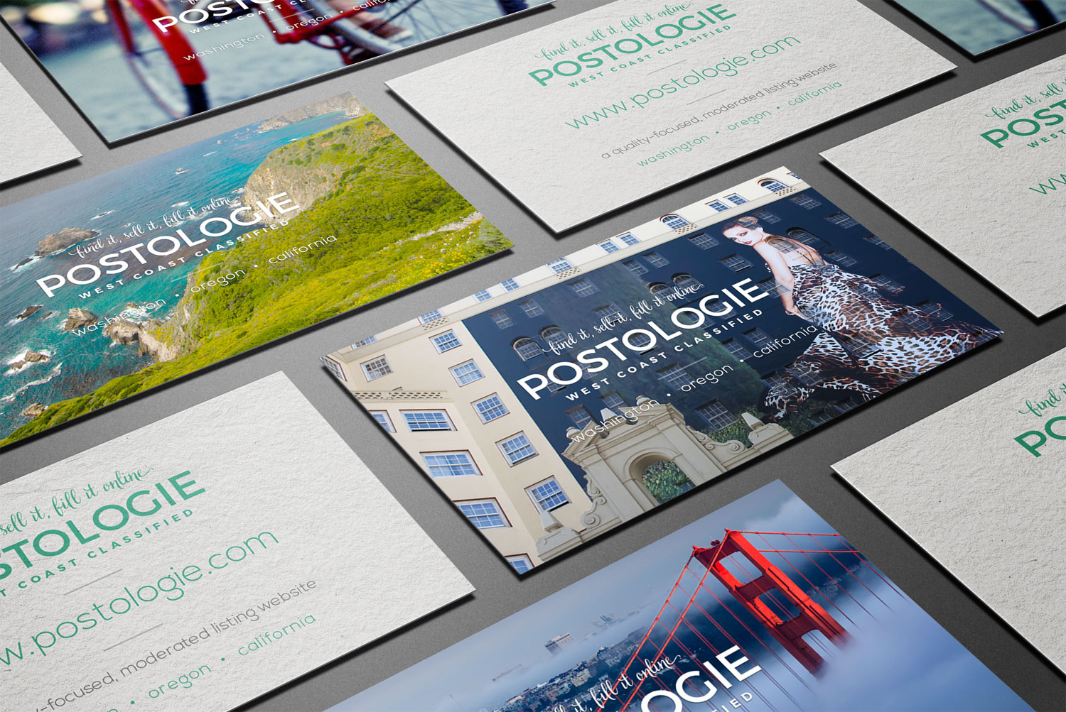
One of the main website features Postologie requested was location-based header imagery on the homepage. So viewers in Washington, for example, will see only Washington related imagery, and so forth. This would create a more local feel, which is important when building a community-based resource.
Visual design // collateral
Double-sided business cards were designed for pre-launch. The cards feature the same imagery displayed within the website’s header to create a sense of uniformity.