

Mozilla / Firefox
San Francisco, California
Acorn (Firefox) design system: Acorn is a highly technical design system for the Firefox browser. This project was a retooling and expansion of the current design system to accommodate a major redesign of the Firefox browser. The goal was imbue improved design usability and code parity via scalable component architecture, accessibility, token-driven foundations, and stronger design-to-eng alignment.
My role
Senior system designer
Product type
- Design system refresh
- Design ecosystem
Principles
- Systems thinking
- Inclusive design
- Accessibility
- Brand cohesion
- Ecosystem cohesion
Leadership
- System strategy
- Design governance
- Cross-functional collab.
- Adoption strategy
- Support, training
Design + craft
- Component craft
- Visual design
- Interaction design
- Documentation
- AI prototyping
- AI content
Overview
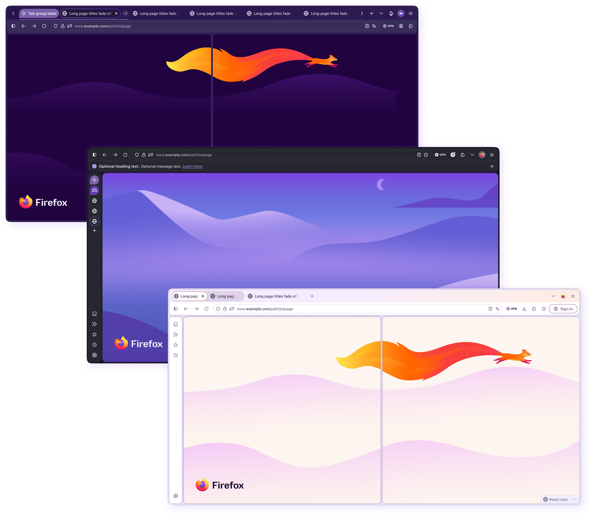
Aptly named Nova, meaning “new” in Latin, this project encompassed a major UI refresh and moderate retooling of the Firefox desktop browser, where I served as a senior system designer on the Acorn (Firefox browser) design system team. Nova was initiated to modernize the UI and improve usability across all product surfaces with a new focus on visual appeal and delightful experiences. This new prioritization of visual craft came to fruition as a result of a large-scale user testing campaign primarily targeting gen-z. The overwhelming response was that participants felt that, although Firefox was a highly functional browser, it had no “vibe” and looked “old”, leading them to believe that the product must be outdated.
My role
As a senior system designer on the Acorn (Firefox browser) team, my primary focus for this project revolved around ensuring the redesign and library expansion strengthened the system, rather than fragmenting it.
I served as a system, visual, interaction, and UI authority for the redesign, ensuring that newly introduced patterns aligned with brand, Firefox design standards, and engineering constraints, and were visually consistent across all surfaces. My work revolved heavily around design system governance, system architecture, component craft, engineering parity, and the enabling of teams to successfully adopt the updated, more robust system.
My day-to-day included:
- Reviewing UI patterns proposed by product teams, and collaborating on revisions.
- Reviewing and deciding if new patterns belong in Acorn, or in team-specific libraries.
- Ensuring accessibility compliance and system consistency.
- Evolving the Acorn design system architecture.
- Retrofitting and building new, more advanced components in Figma.
- Implementing expanded modes, including themes for Light, Dark, HCM, Private window, and Smart window (AI).
- Working with engineering to understand and implement constraints, and maintain close parity with code.
- Championing adoption through training and guidance for designers across all teams.
Challenges and considerations
Refreshing the Firefox browser interface required coordination across multiple product teams contributing new UI patterns. Without strong design system governance, the entire project would quickly accumulate design debt.
Because multiple teams contributed to the redesign, the success of the project depended on ensuring that new, more complex UI patterns could scale through the system without introducing inconsistencies or accessibility issues. The system needed to evolve and expand to support the new UI, while maintaining consistency, accessibility, and scalability.
System build strategy
To ensure the redesign scaled successfully, I focused on three main areas:
01.
Governance
Maintaining design system integrity across teams.
02.
Architecture + craft
Evolving and expanding the design system to support the new UI.
03.
Adoption
Helping product teams get the most out of the design system.
Augmenting design systems with AI
Firefox encourages thoughtful experimentation with AI, giving me opportunities to explore how it can support design system work beyond simple content generation. I focused on reducing repetitive work, identifying system debt, strengthening design-to-engineering parity, accelerating accessibility testing and prototyping, and making system knowledge easier to create and share.
Where a workflow proved useful, I also looked for ways to move it beyond one-off prompting and turn it into a reusable, maintainable process.
Finding design debt and system drift
Large Figma ecosystems accumulate hidden dependencies over time, including outdated styles, incorrect library references, detached assets, and components nested deep inside product flows.
Using Claude Code, custom skills, and the Figma MCP, I developed workflows that inspect files and identify where incorrect assets, styles, variables, and component references are being used. Instead of simply reporting that dependencies exist, these processes help locate the specific instances creating the problem.
Encoding audit logic into reusable skills also makes the process repeatable, so the same checks can be run as the system evolves rather than rebuilt as a new prompt each time.
Some AI solutions I explored using Claude Code and Claude Design for Acorn include:
- Design debt and entropy identifier
Figma will tell you how many assets and styles are being pulled from any added file, but it doesn't tell you where they are. Finding deeply embedded items is incredibly time consuming, so I created an agent that locates and logs all assets and styles within the system and product flows that are incorrect or pulled from incorrect libraries, allowing the design system and product teams to eliminate design debt and greatly reduce entropy going forward. - Variable / token consistency and structures
An agent for scanning variables collections for redundancies, missing or incorrect styles, and token related errors. Eventually, we're wanting to use AI as a tool to perform automatic cross-updates in both code and figma. - System and component audits
An agent that audits and records any design-to-eng disparity, redundant components, missing components or parts, and areas that could be streamlined or optimized better. - Multi-directional updates
We're aiming to create a process where our coded prototypes are the actual codebase, and updates to either code or Figma will automatically update the other library for ultimate design and code parity.More advanced experiments explore how automatically updated markdown files can guide AI skills and agents. These agents can scan design and code sources, generate UI rules, answer system-related questions, and help maintain code parity, visual consistency, and brand cohesion.
Exploring tighter connections between design and code
One of my longer-term areas of experimentation is reducing the separation between the design system in Figma and its implementation in code.
Using Claude Code, Figma MCP, Cursor, and structured markdown files, I explored workflows where AI agents could read system rules, inspect both design and code sources, answer system-related questions, identify disparities, and potentially propagate approved changes between environments.
The longer-term goal is a more connected system where Figma and code remain synchronized with less manual maintenance, strengthening design-to-engineering parity while reducing opportunities for system drift.
Accelerating accessibility and contrast audits
Accessibility testing can become especially time consuming in Acorn because components often need to work across many opaque background colors, states, and theme combinations.
I used Claude Code to generate WCAG-focused accessibility reports that could evaluate large sets of color and contrast combinations much faster than checking them individually with manual tools. This was especially useful when validating text, icons, controls, and component backgrounds across multiple surfaces.
The reports helped me identify failures, edge cases, and patterns more quickly, giving me more time to focus on the harder design decisions where accessibility, visual quality, and usability needed to be balanced.
Prototyping complex system behavior
Some component concepts are difficult to communicate through static Figma screens alone, particularly when they involve responsive behavior, motion, nested interactions, or complex browser functionality.
I used Claude Code, Cursor, Figma Make, and Figma Agents to rapidly create functional prototypes based on Acorn patterns. One area of experimentation involved prototyping portions of the Browser component as working coded interfaces with accompanying specifications.
These prototypes helped make complex system behavior easier to evaluate with designers, engineers, and leadership before committing to implementation.
Streamlining component documentation
Maintaining detailed component documentation can be time consuming, particularly when specifications need to incorporate accessibility guidance, interaction behavior, and established platform conventions.
I developed a reusable Claude Code documentation skill to help structure and generate component documentation consistently. The workflow incorporates defined documentation rules and reference material, while tools such as ChatGPT and custom GPTs help with research and synthesis from public sources including Apple’s Human Interface Guidelines and Google Material Design.
Every output is reviewed and verified before publishing, but the workflow reduced the time required to produce a component entry by an estimated 70%.
Making system education more visual and engaging
Maintaining detailed component documentation can be time consuming, particularly when specifications need to incorporate accessibility guidance, interaction behavior, and established platform conventions.
AI also gave me new ways to communicate design system concepts beyond traditional documentation.
I experimented with Figma Weave, Nano Banana, and other generative visual tools to create custom imagery, motion, video, presentation graphics, and higher-fidelity demonstrations for training and adoption materials.
This is especially useful for explaining how components behave rather than simply showing how they look. It also allows me to explore visual direction and motion earlier, helping designers and engineers better understand how an experience should look, move, and feel.
Accessibility and design
Because Firefox serves a broad global audience, accessibility was a critical requirement for all UI patterns. During design reviews, I ensured new patterns adhered to:
- Firefox-specific requirements set by internal A11Y team.
- WCAG accessibility standards.
- Correct color and typography tokens.
- Use of 4px / 8px grid.
- Responsive and assistive technology layout requirements.
- Engineering implementation constraints.
- Quality assurance of Dark and High contrast modes.
Patterns that introduced accessibility issues or system inconsistencies were returned for revision before entering the system.
Cross-team collaboration and governance
Balancing speed and craft was challenging due to rigid timelines and somewhat splintered communication between CX teams. To facilitate ongoing UI and UX alignment, I partnered closely with product designers across multiple teams to review proposed patterns and ensure they adhered to Firefox’s design standards and engineering constraints. Workflows were evaluated for accessibility compliance, interaction behaviors, typography and color consistency, and adherence to the grid system.
When patterns introduced inconsistencies or accessibility risks, I worked directly with our product designers to refine them before they entered the system. This governance process helped ensure the product and system maintained a consistent, accessible user experience across all surfaces.
Design system overview
This section highlights the component craft, scalable architecture, and modes that helped the Acorn design system support responsive, accessible, and consistent experiences across the newly revamped Firefox browser UI.
System architecture improvements
To support the redesigned browser UI, I restructured portions of the system, including:
- Addressing existing structural issues, such as nonintuitive or inconsistent nomenclature, unordered component hierarchy, and outdated spec overviews.
- Discovering and removing / updating references to archived libraries throughout the system.
- Reducing redundancy across component variants by consolidating duplicate components, and streamlining component builds.
- Increasing use of component properties, especially nested components, to allow advanced configurations.
- Meticulously ensuring variables, text styles, and effects are pulled from the correct library, and that every pixel works flawlessly with the modes included in our variables collections.
- Integrating comprehensive modes including: Light, Dark, HCM, Private Window, and Smart Window (AI) surfaces.
This detailed work enabled teams to build complex UI patterns while keeping the system maintainable.
System foundations
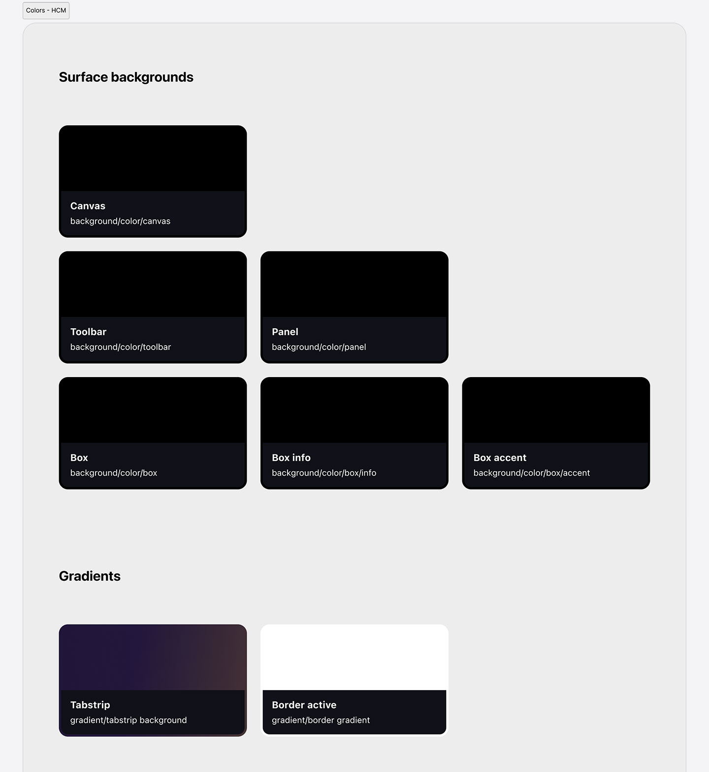
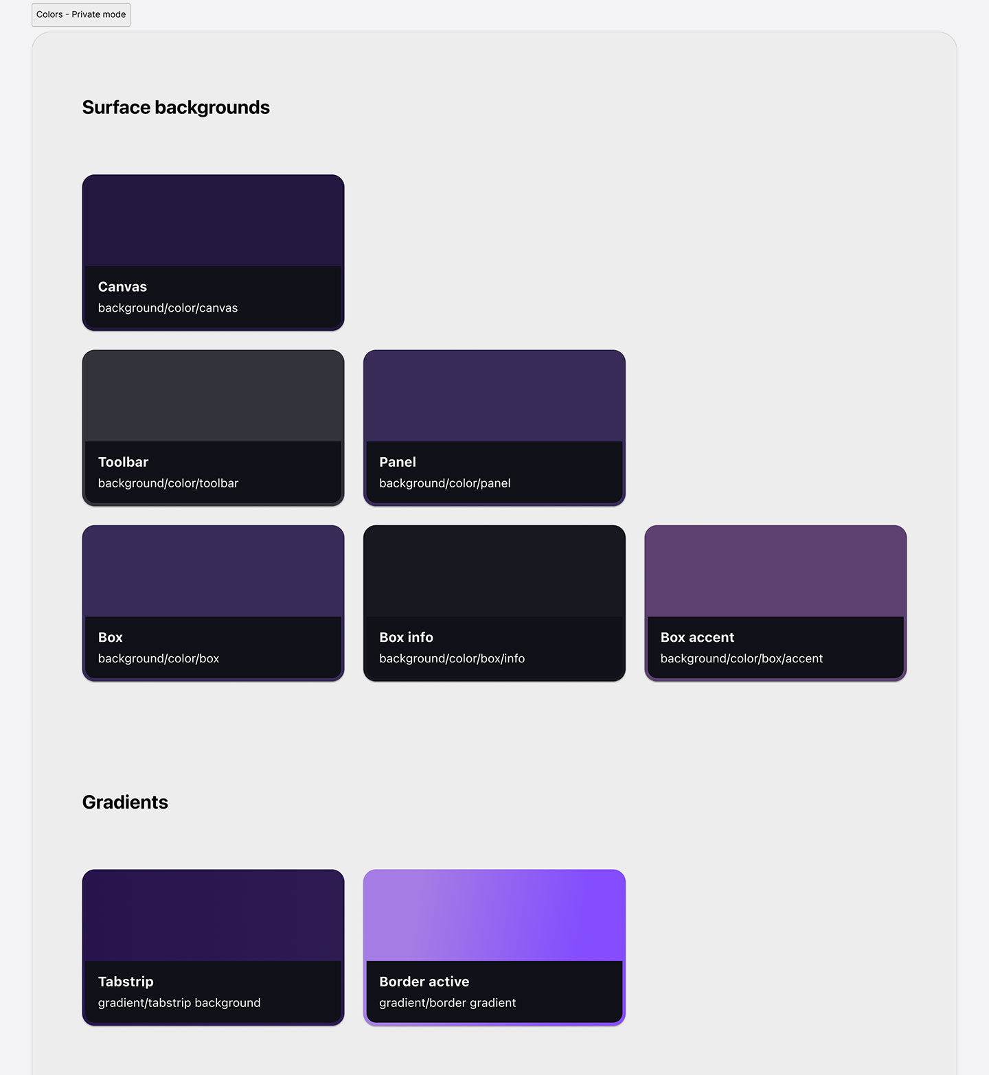
Tokens and variables
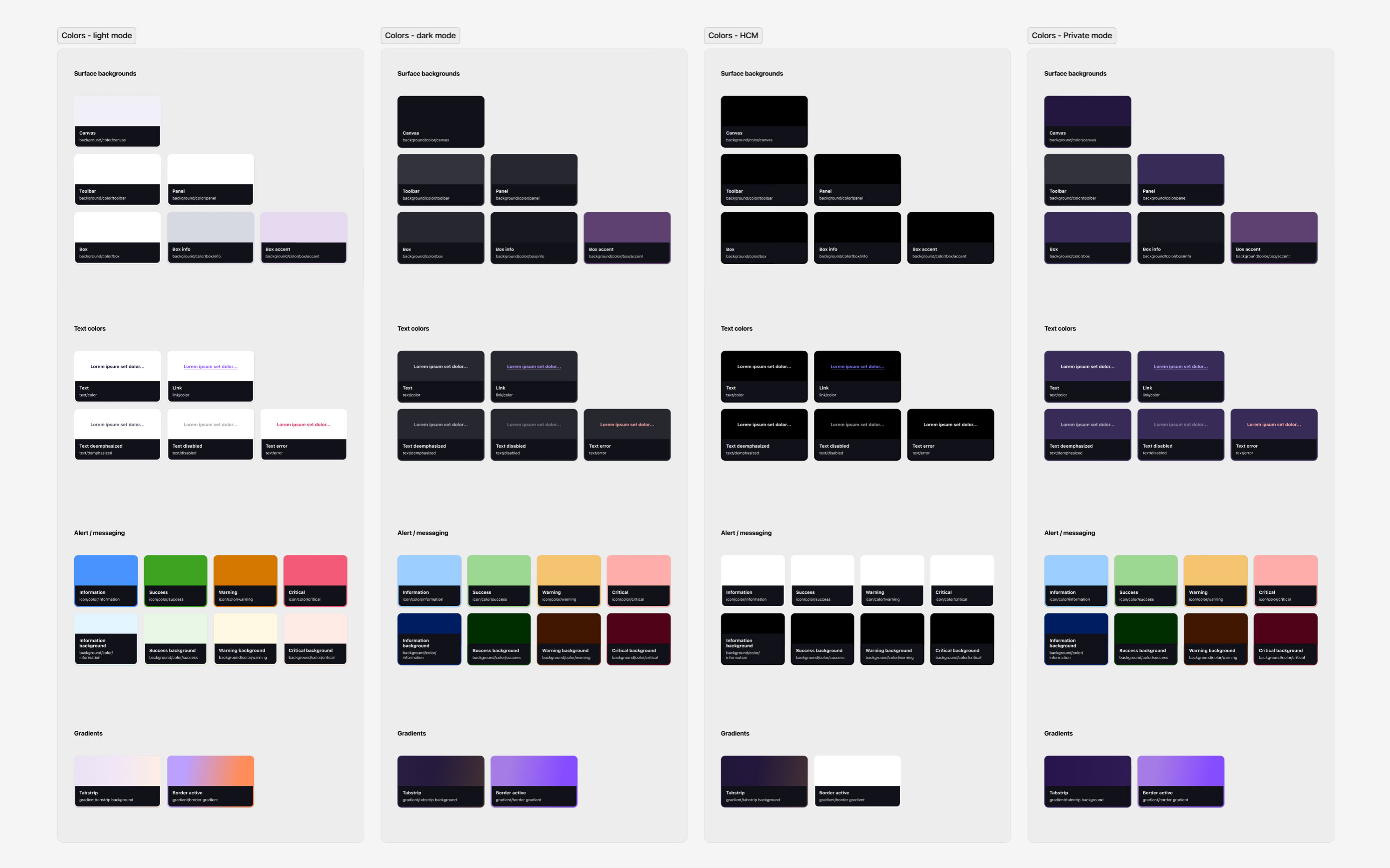
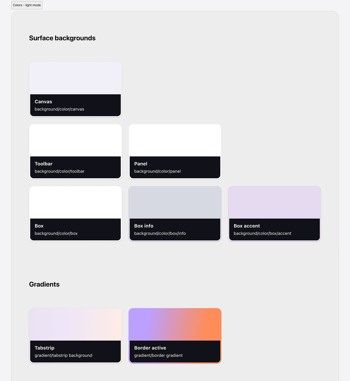
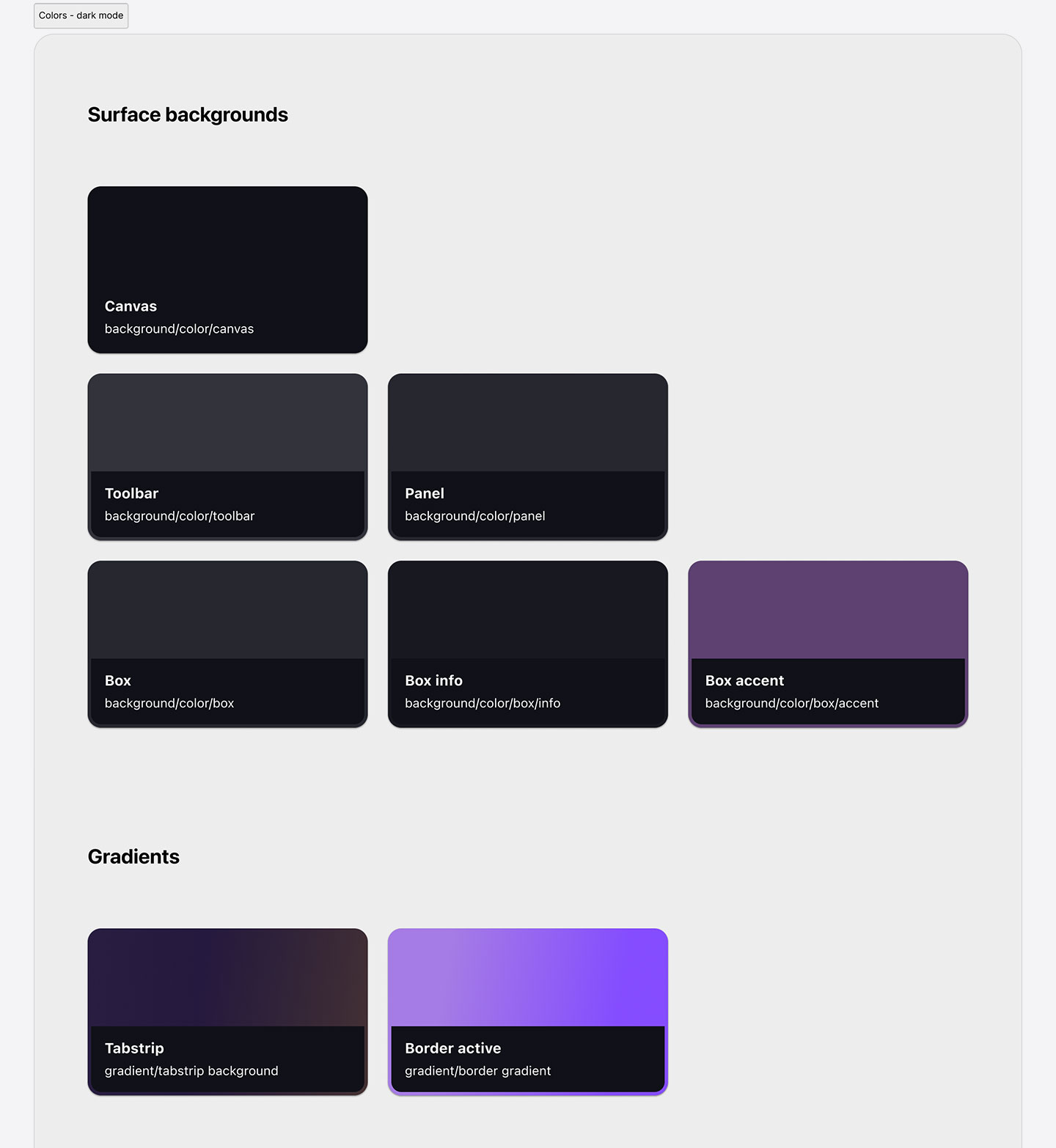
As a more technical design system, Acorn’s variables are fully synced with engineering design tokens for optimal design-to-code parity. Tokens are managed via a .json file that’s imported and exported to and from Figma and the codebase.
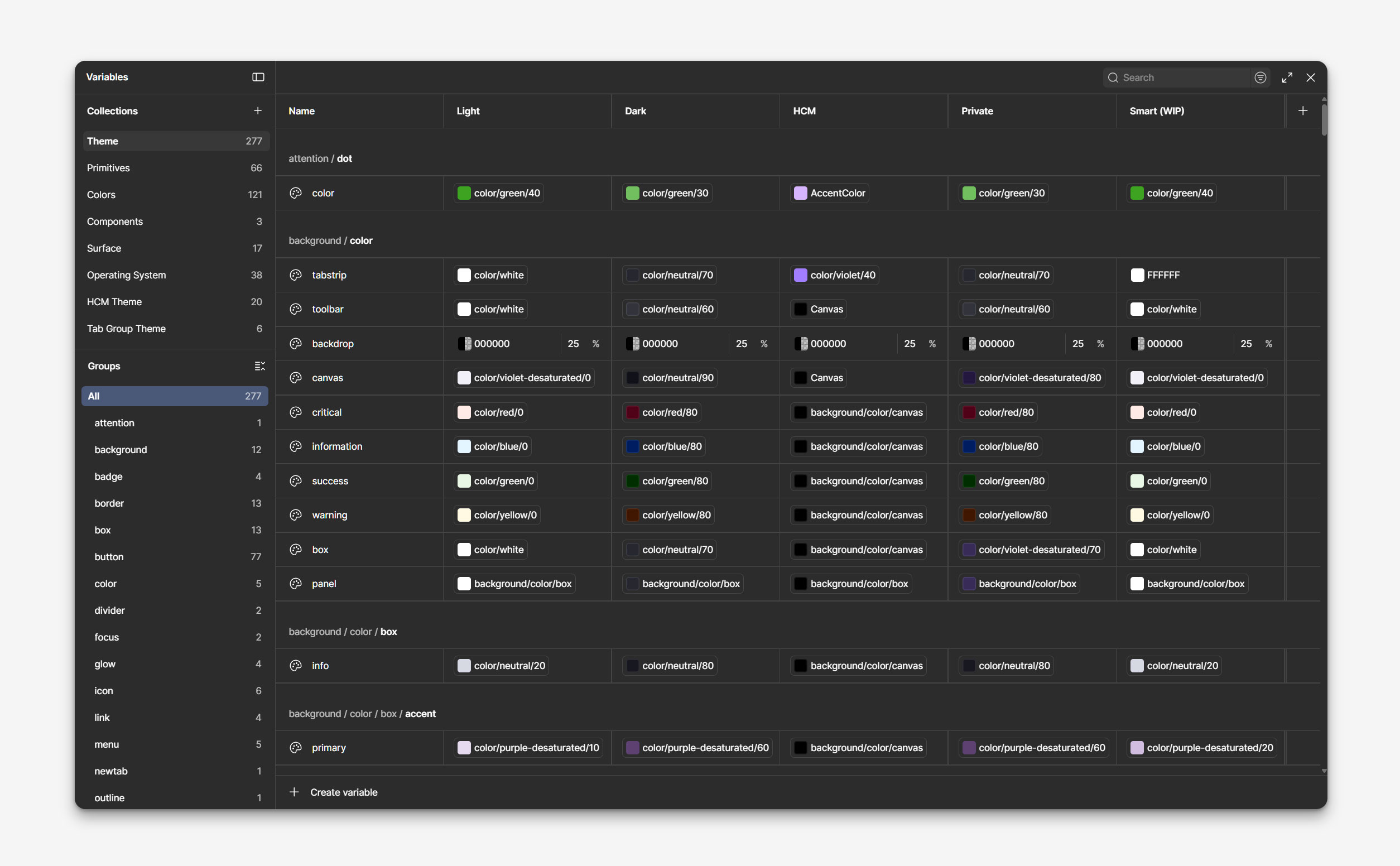
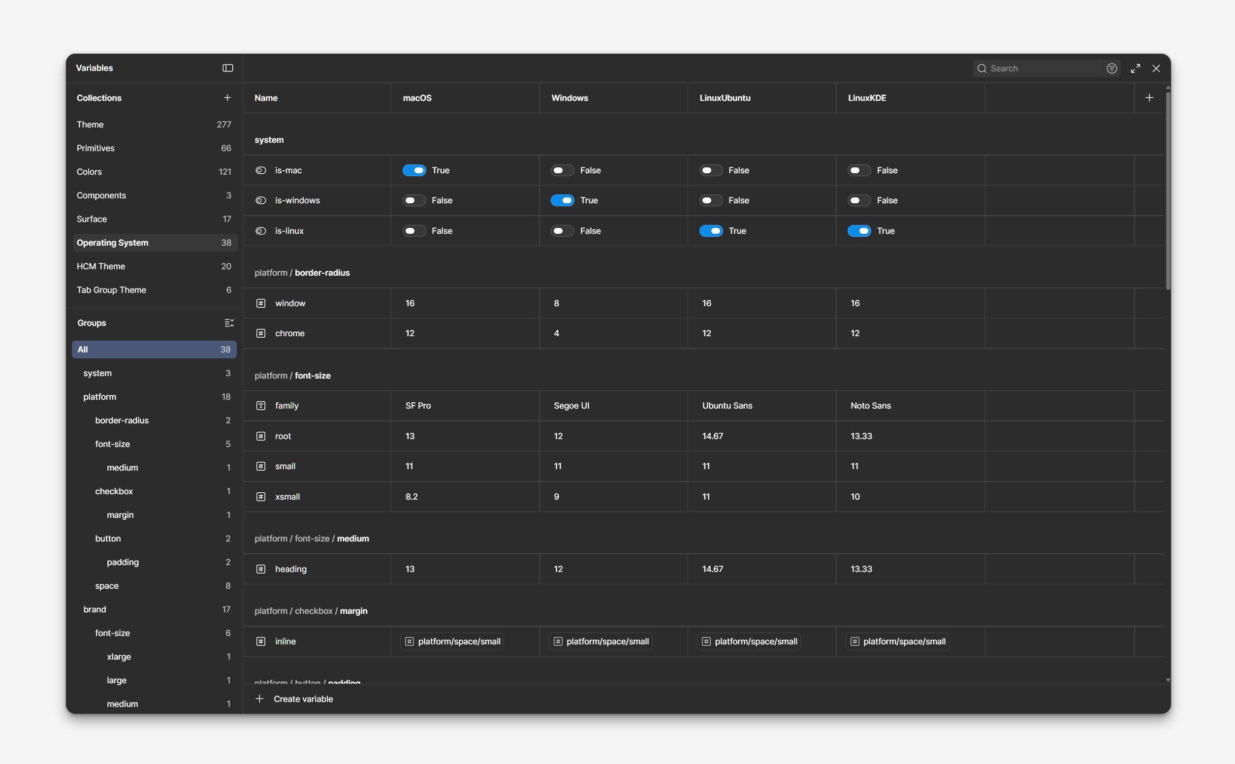
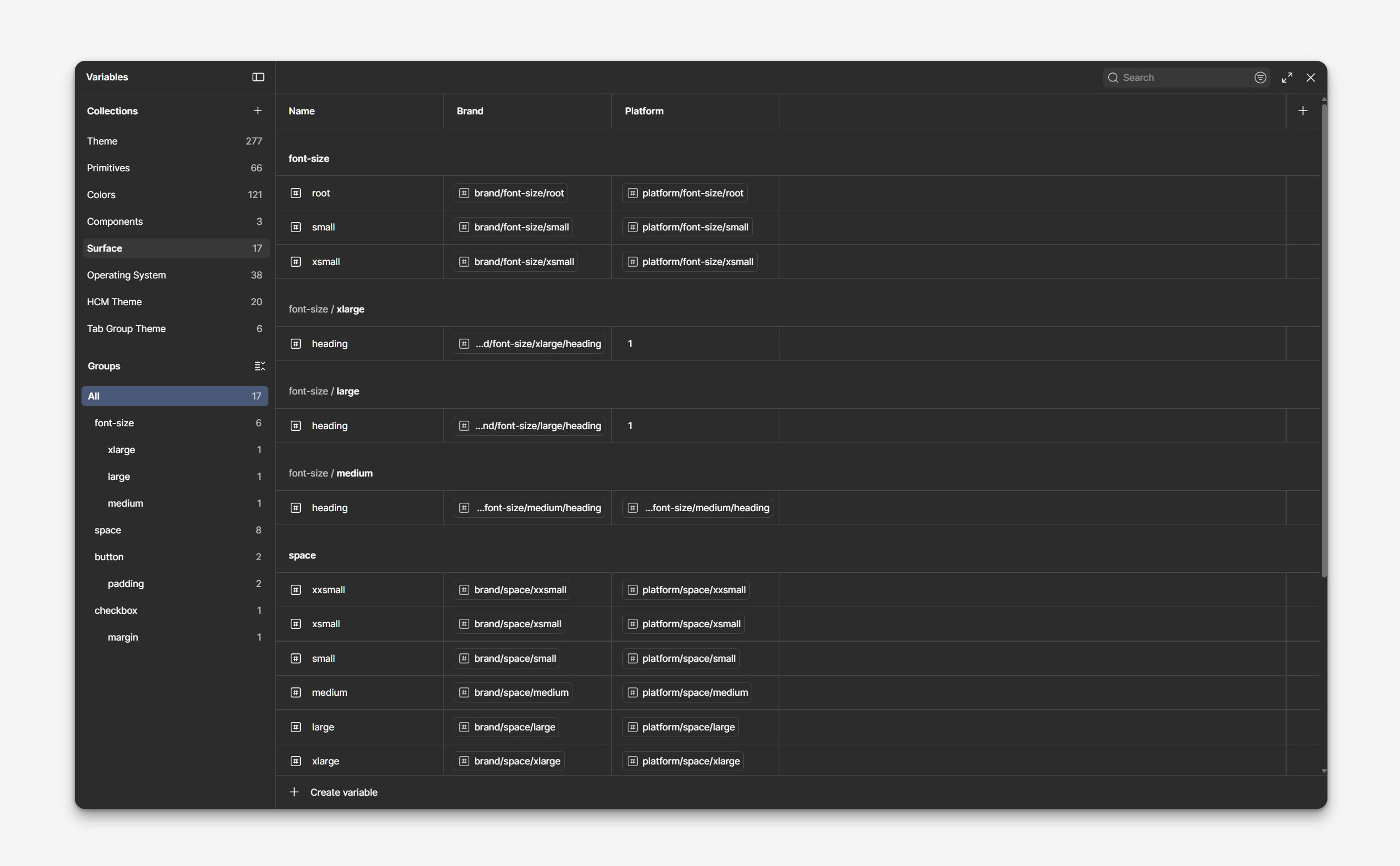
Modes
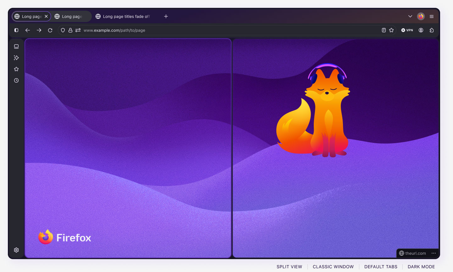
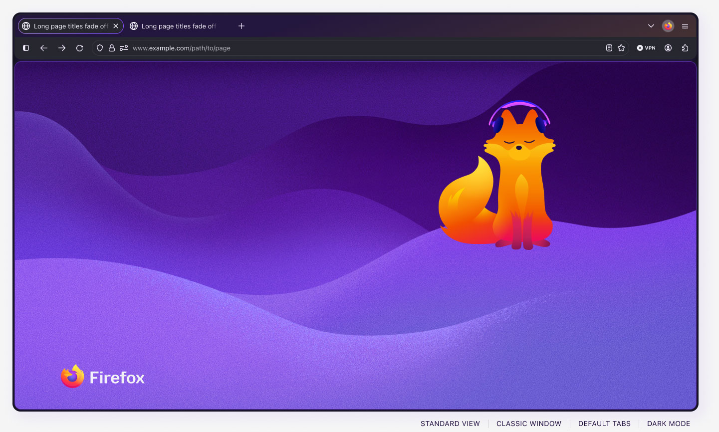
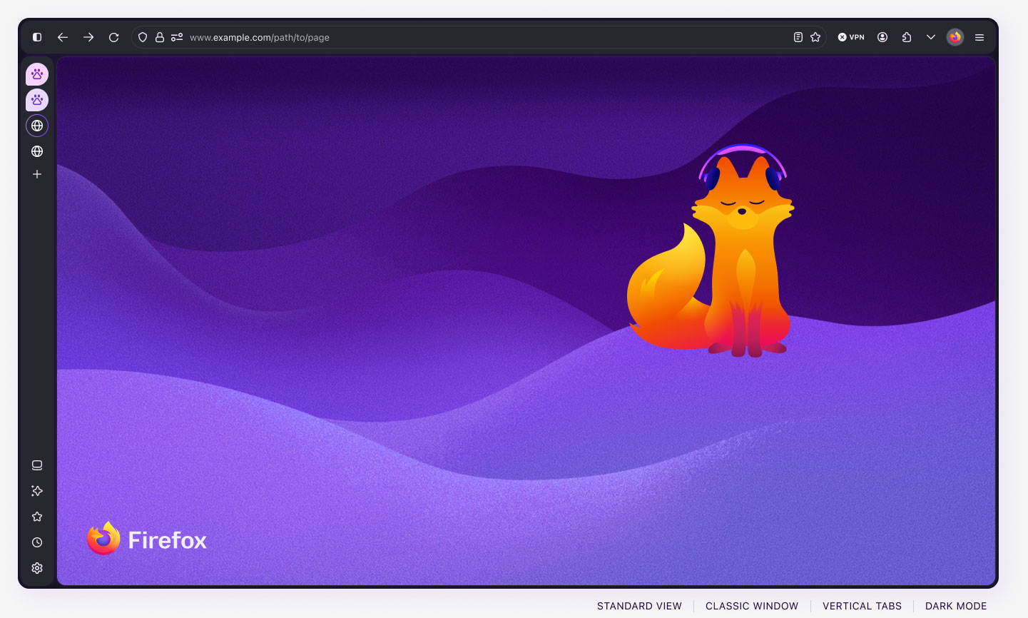
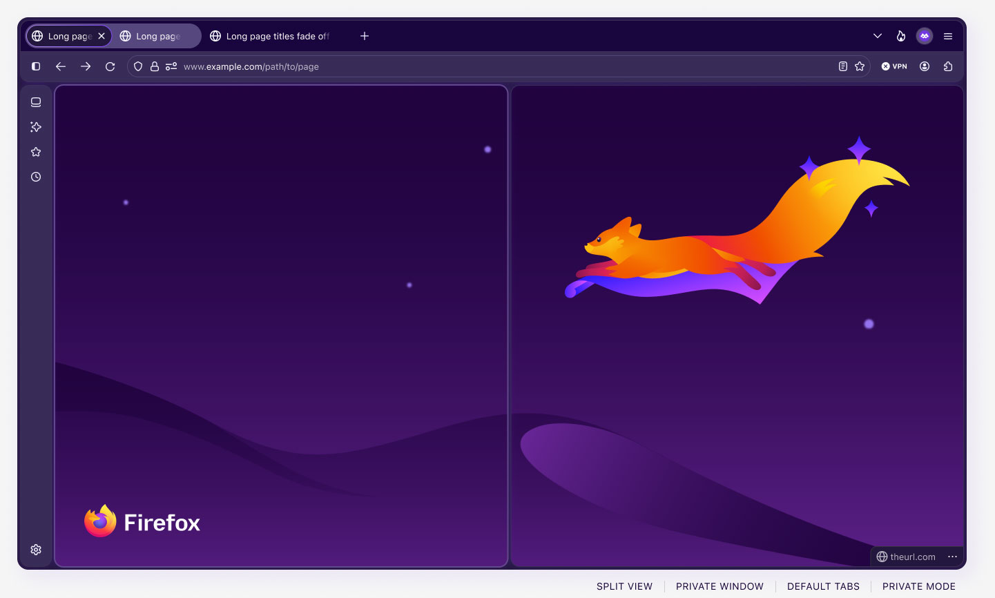
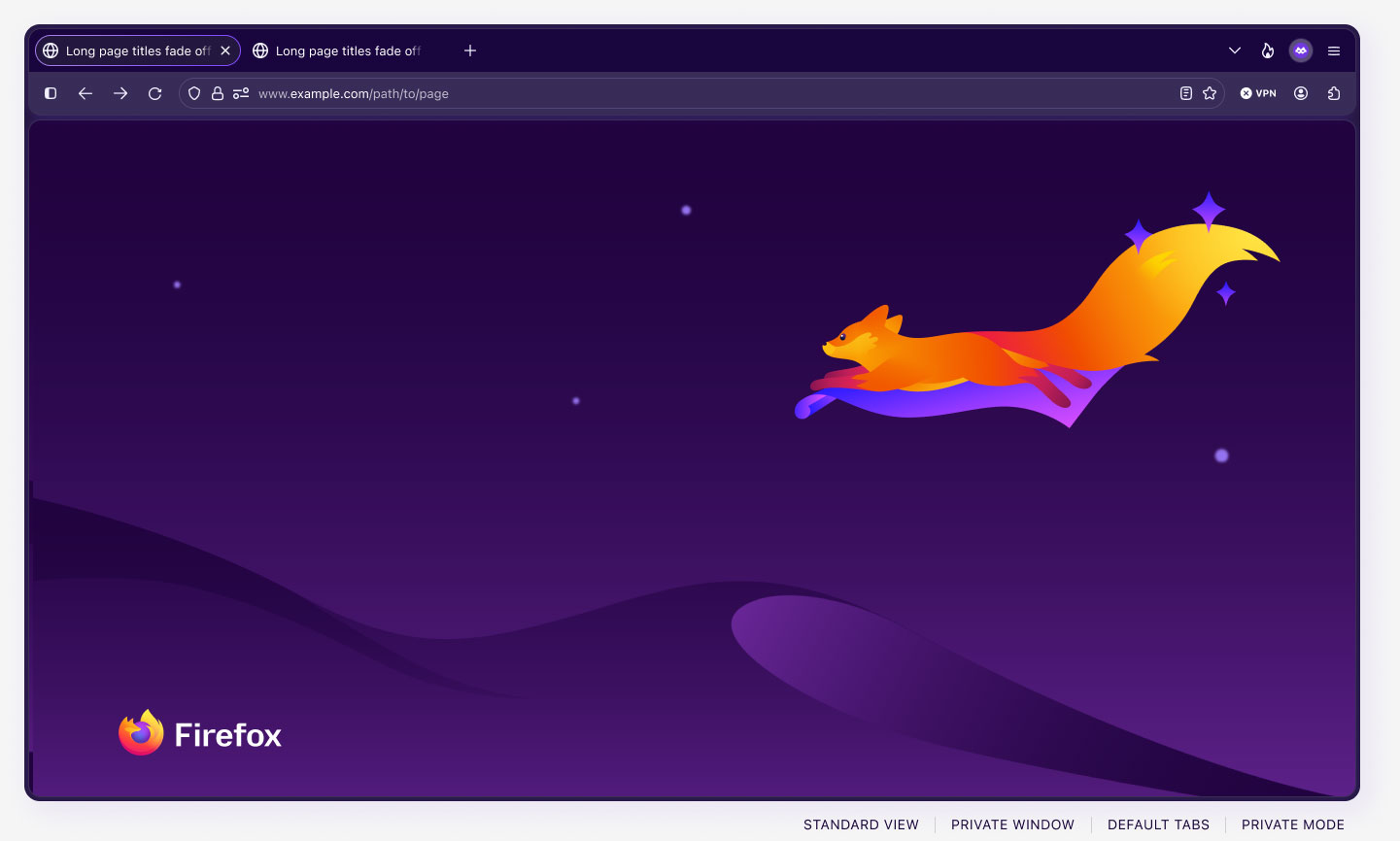
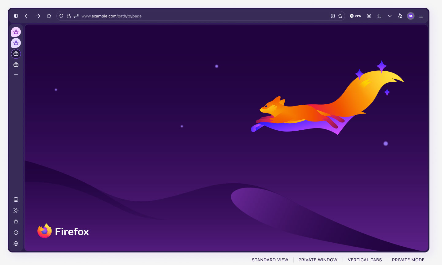
The Acorn design system also accommodates several color and surface modes that can be combined to create highly custom layouts, as illustrated below. Modes are included for:
- Color and accessibility: Light, Dark, HCM (high contrast mode).
- Firefox window type: Classic, Private, Smart (AI-powered Firefox)
- Surface: Chrome (Firefox browser), inContent (website content)
- OS: macOS, Windows 11, LinuxUbuntu, LinuxKDE
Each of these modes modifies the design and layout to be accurate across the chosen surfaces. For instance, window border-radii and default font families vary across operating systems, and our OS modes update these styles accordingly.
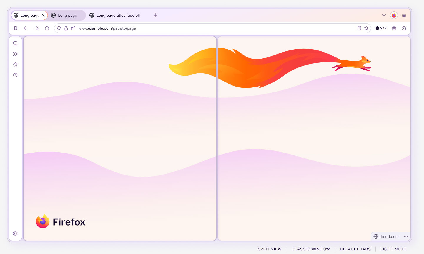
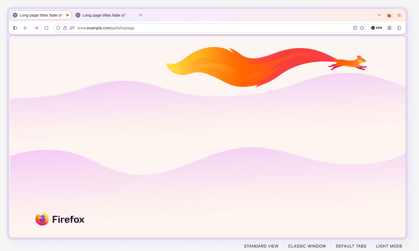
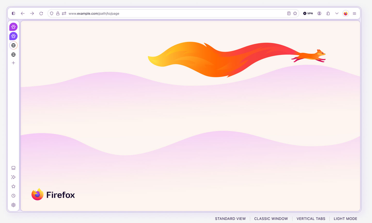
The following shows examples of Light, Dark, and Private modes with various tab and content layout features.
Component craft
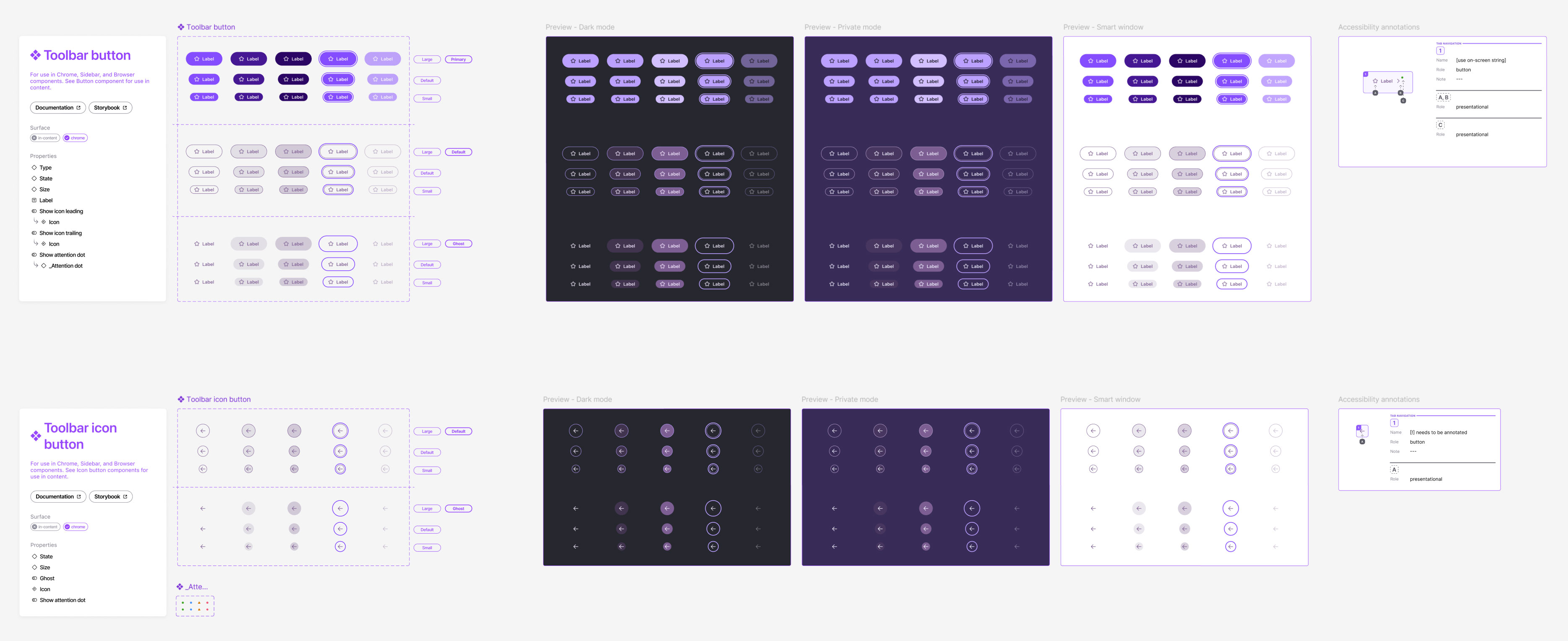
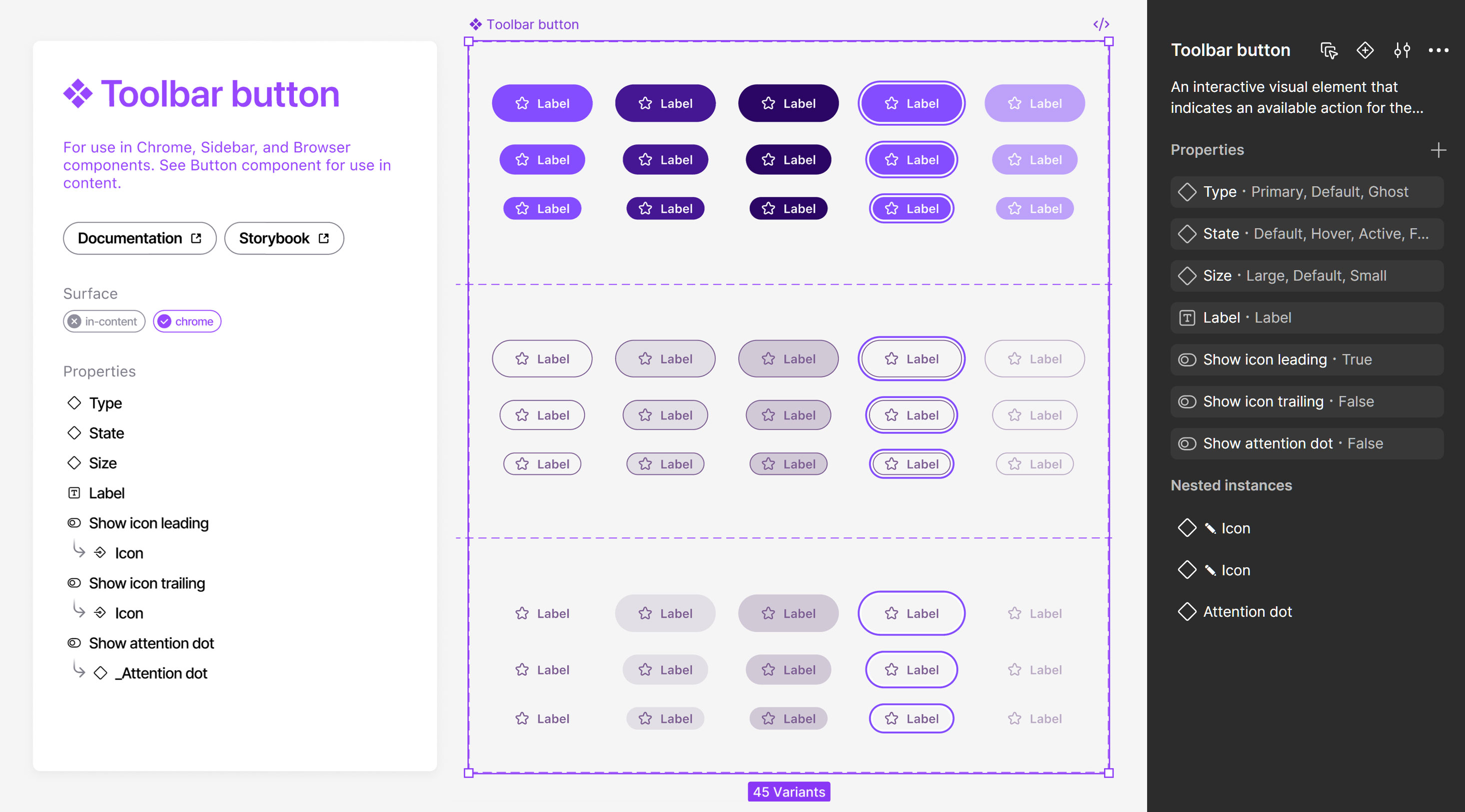
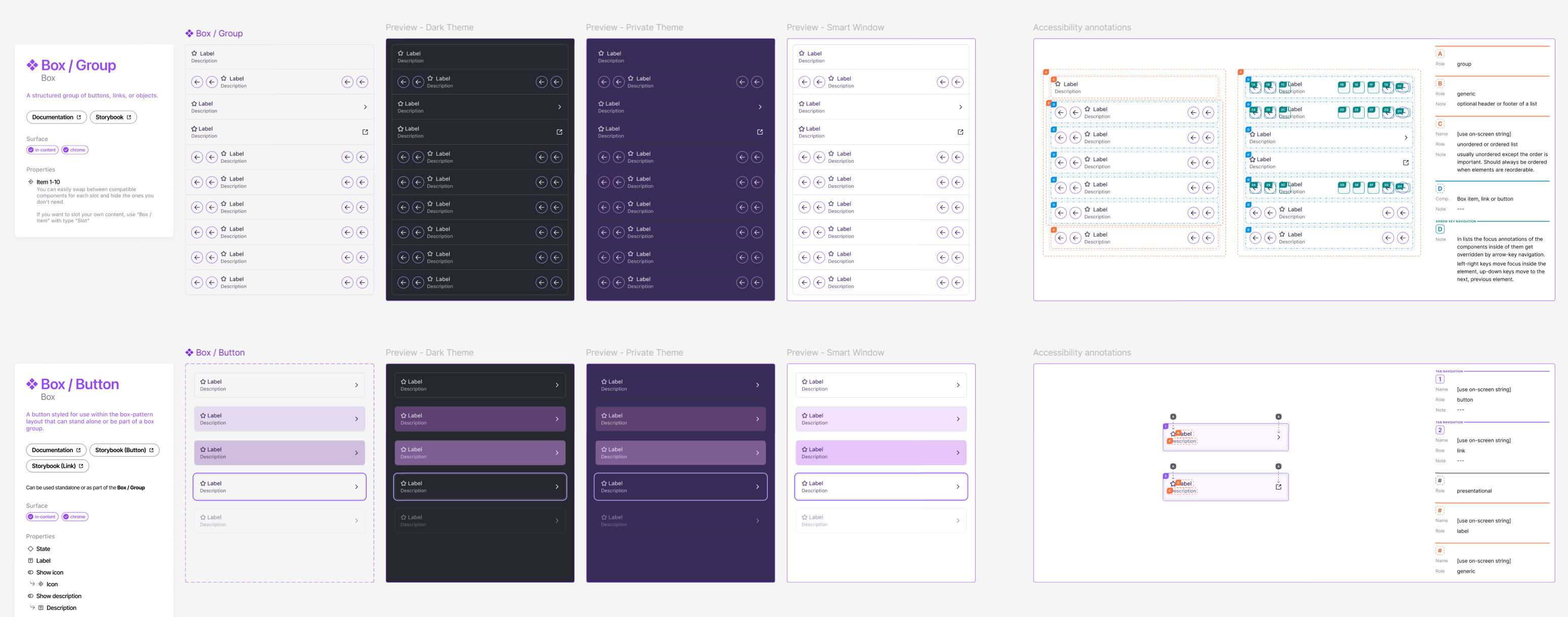
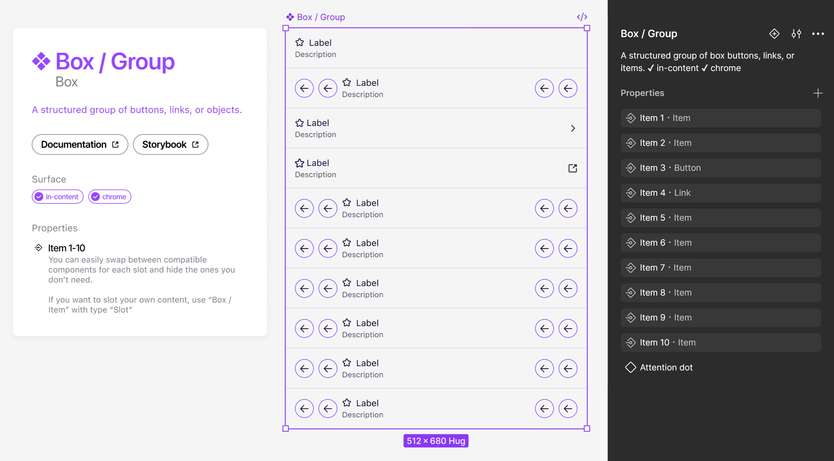
To prevent bloat and redundancy, and to improve scalability, components were crafted to be highly configurable and flexible, with comprehensive features and usability. This approach streamlined the system, while eliminating design debt, and made components more robust and flexible.
Components include a detail card that shows the name and description, links to the codebase and documentation, dependencies, usage surface(s), properties, and nested components. Accessibility annotations are also included, where needed. And samples of applicable modes are displayed alongside the components for quick reference.
Button component
Box component
Chrome top component
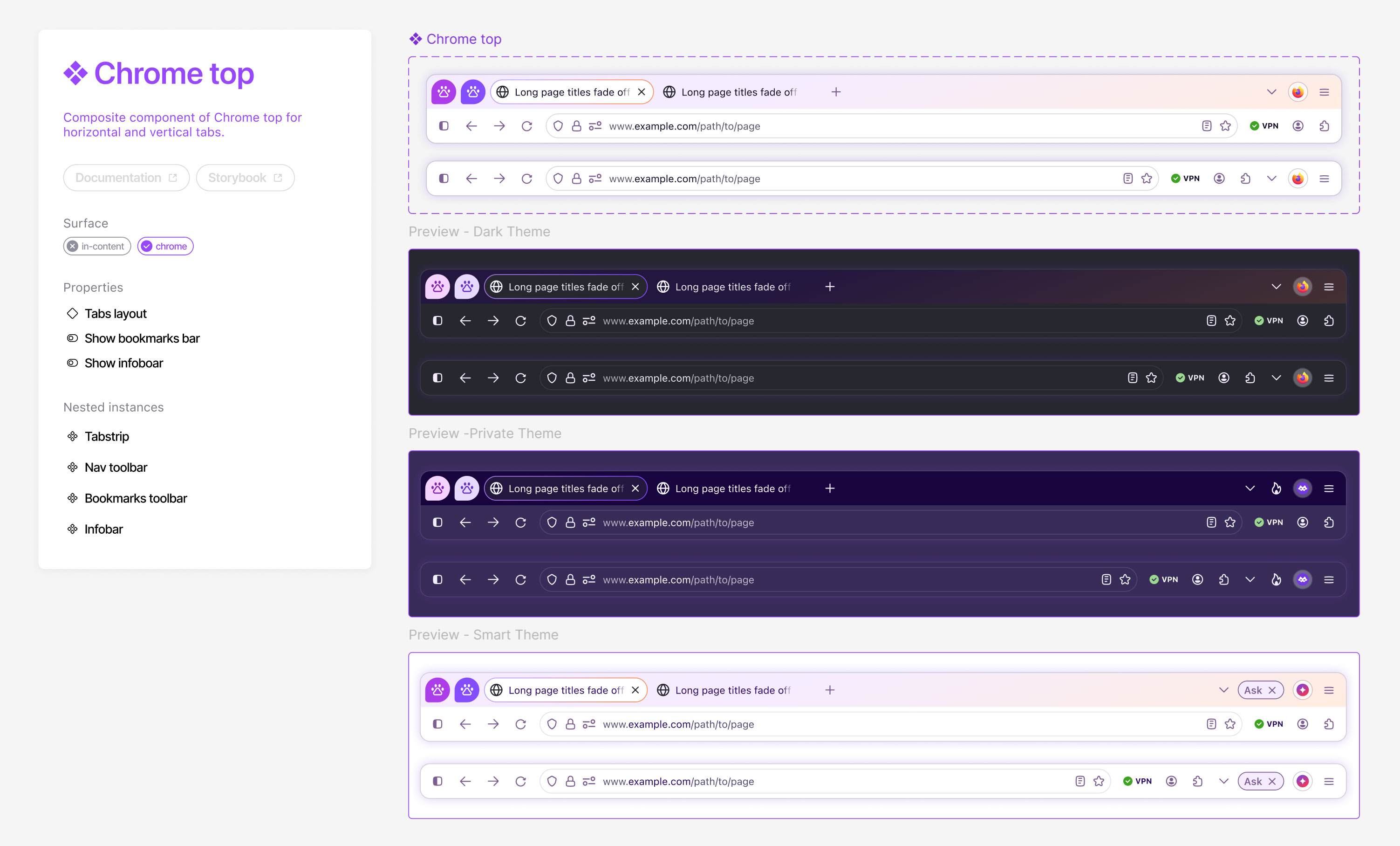
The Chrome top component is the primary (or default) Firefox browser interface, although there are also many other surfaces, such as vertical tabs, sidebars, settings, and more.
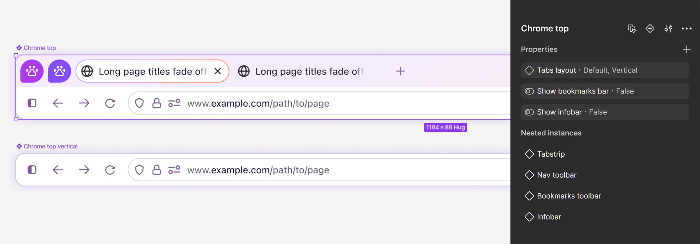
The Chrome top component is comprised of several nested components, including the tabstrip, toolbar, URLbar, bookmarks bar, and info bar. Slots are used in these nested components to allow designers to customize placement and options.
This component also uses boolean variables to show and hide elements across the modes. In the previews below, you’ll notice that the buttons shown in the classic, private, and smart windows differ. This is done automatically for the user as they switch between the window modes, ensuring the correct content is always shown for the different window types.
Note: in UI design, “chrome” refers to any visible part of a program that is not the primary content itself (e.g., toolbars, menus, tabs, and window borders). Firefox’s use of the word “chrome” is not related to Google’s Chrome browser, and long predates its existence.
Browser component
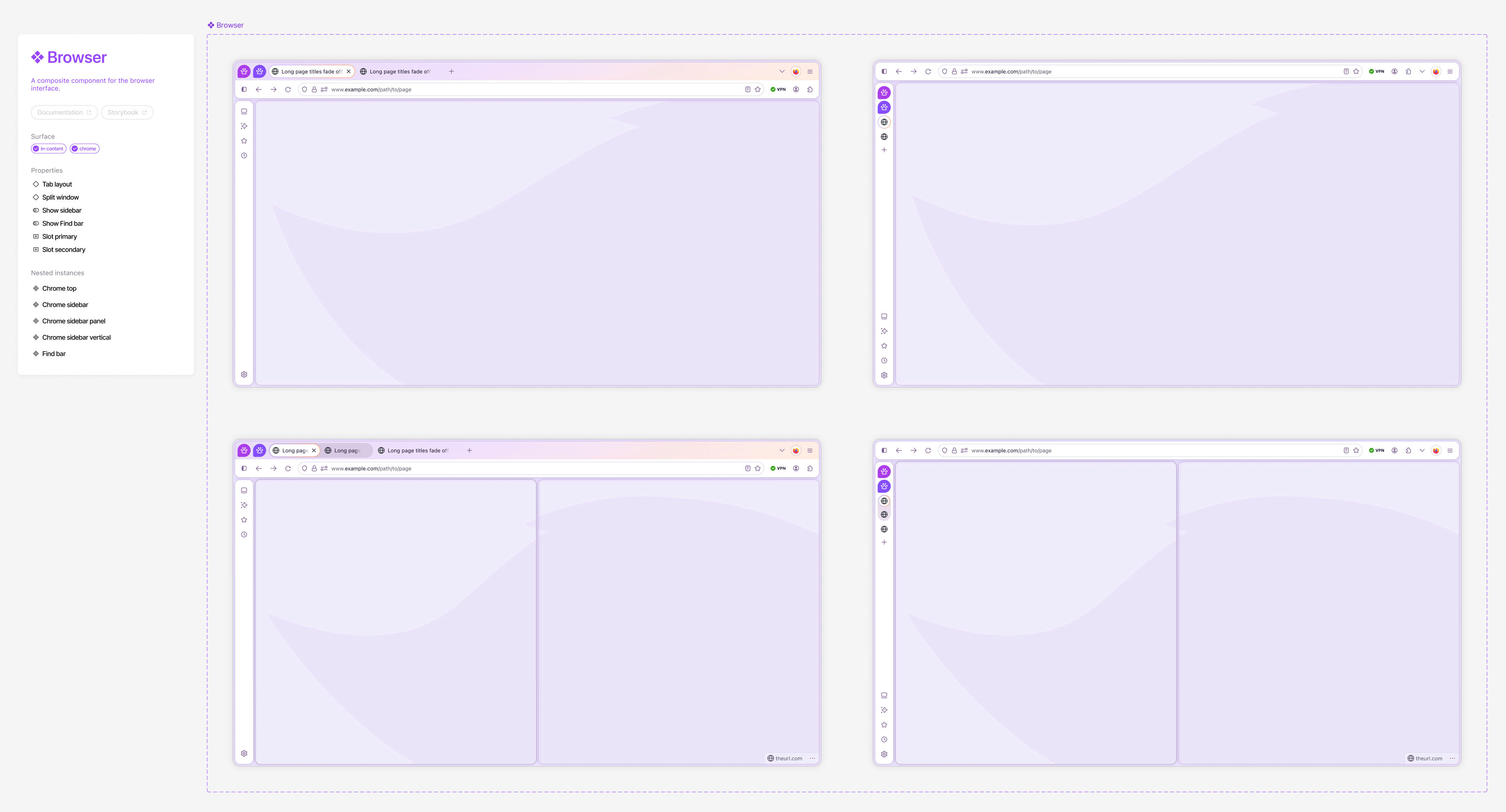
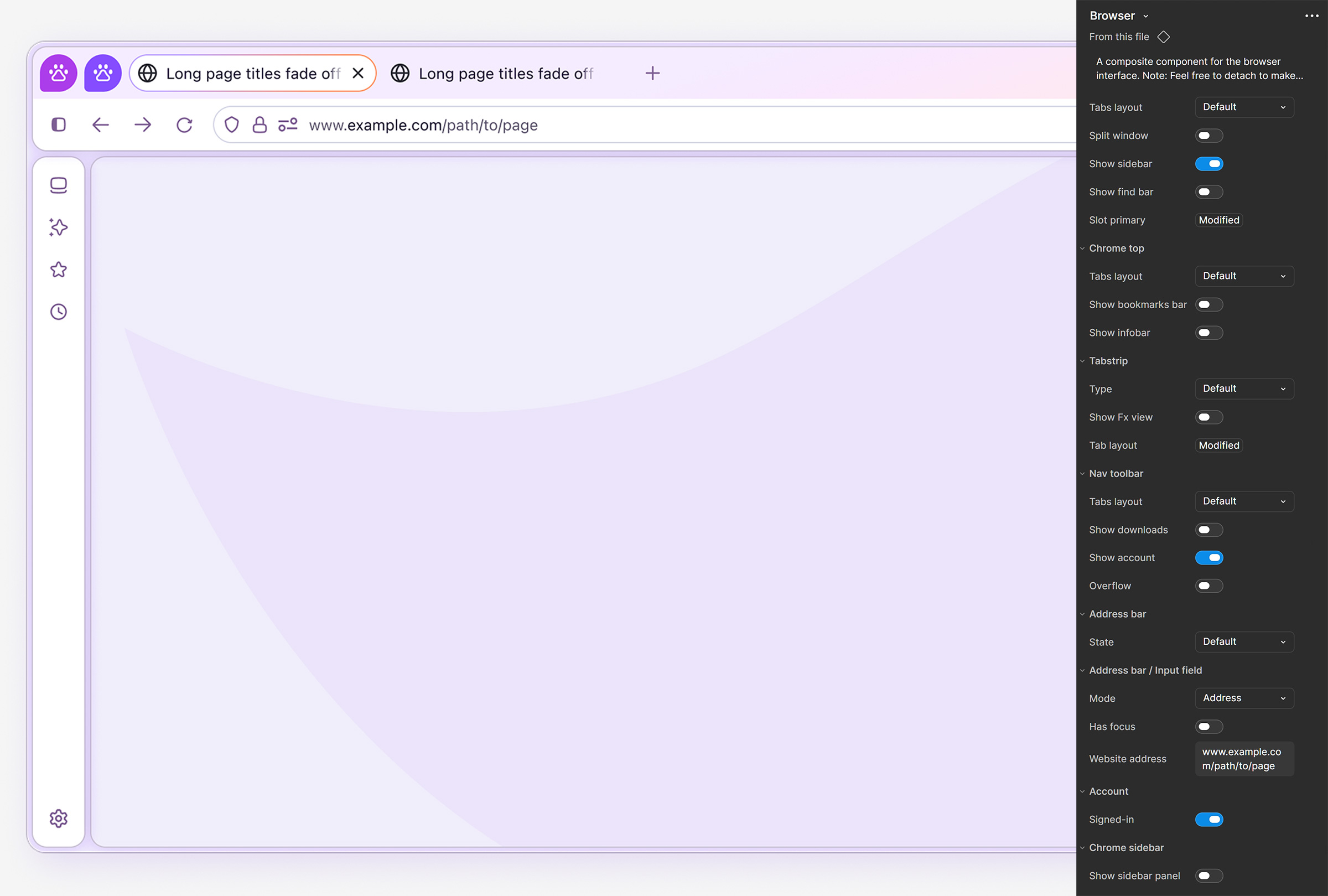
The Browser component is the most used component by design teams, as it serves as a fully functional composite of the Firefox browser UI, with robust options and features. This complex component uses advanced Figma features, such as boolean variables, modes, comprehensive component properties, and slots to allow designers to easily add their custom content.
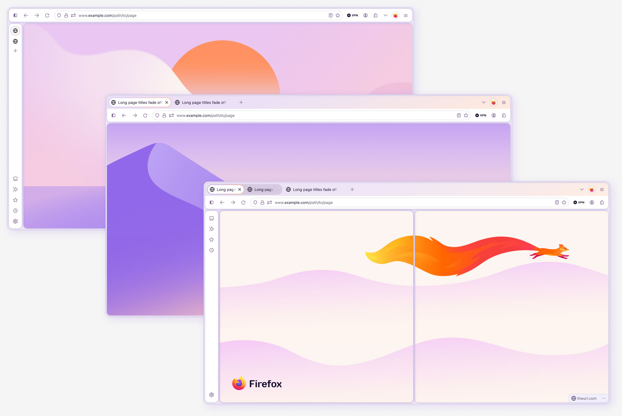
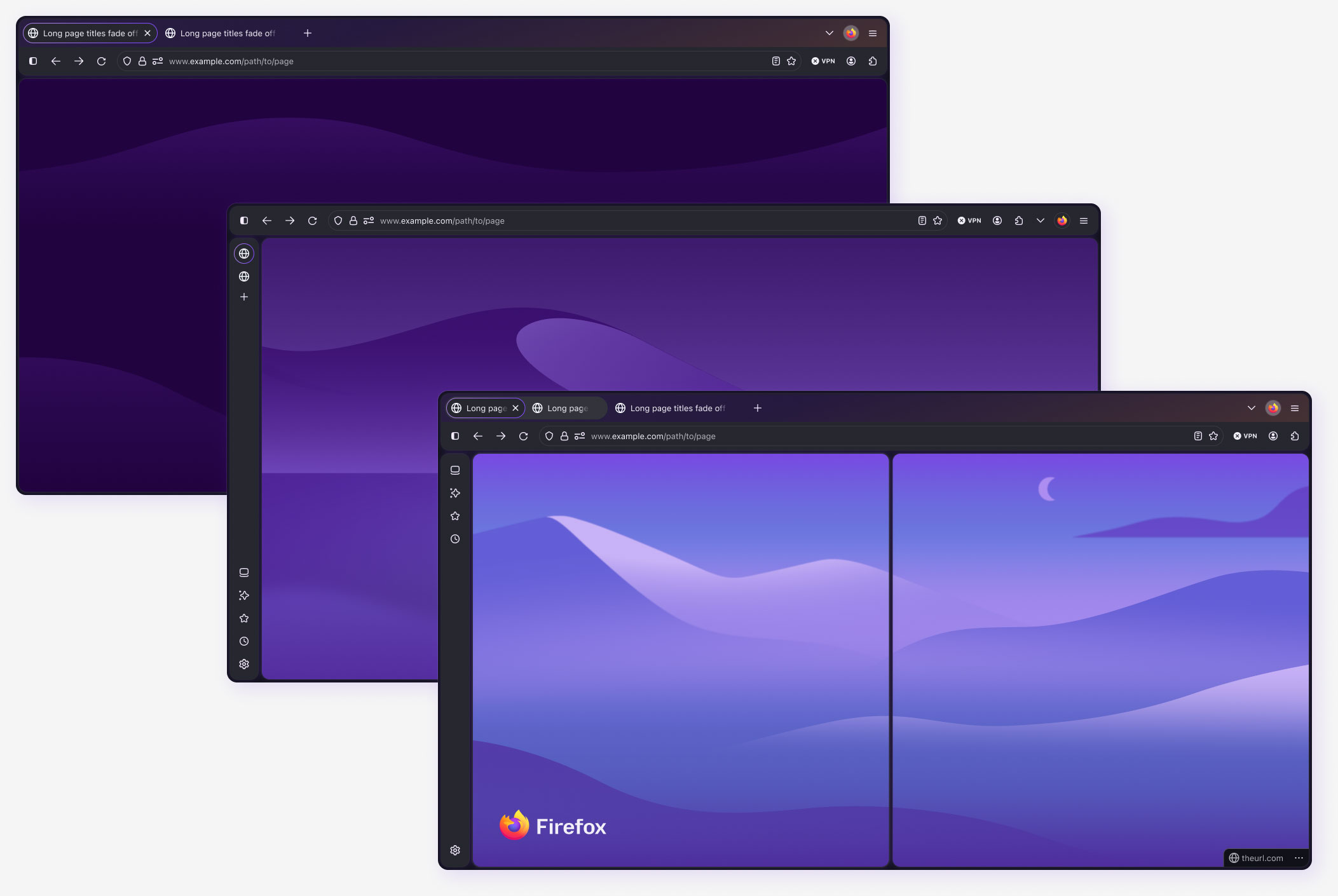
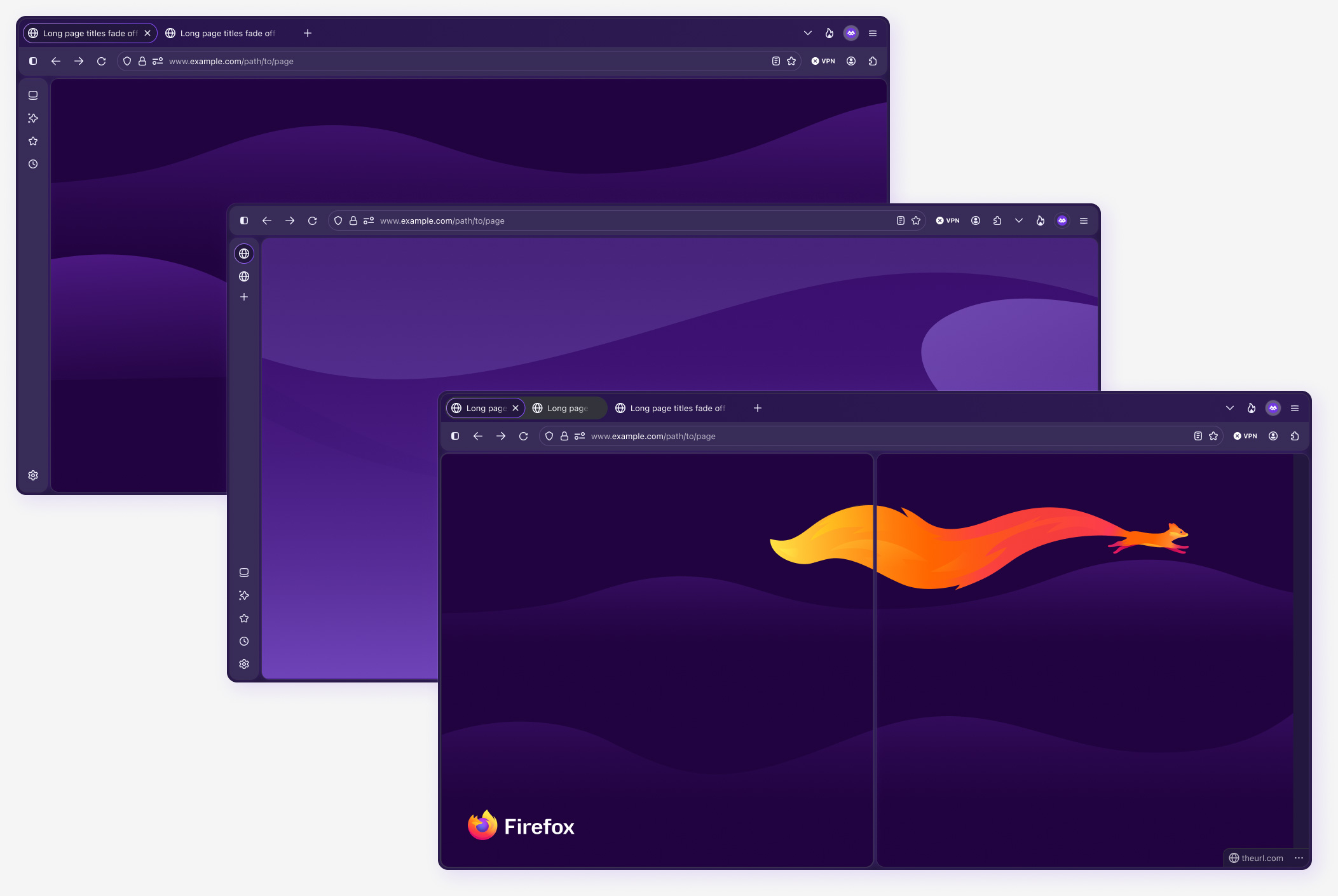
Top-level Browser component customizations include the default Firefox UI, vertical tabs layout, sidebar options, split window, custom tab groups, search and suggest panel, compact mode, toggle-able toolbars, auto responsiveness, slots for custom content, and all applicable modes. Any of these options can be combined to create fully customized UI designs, and every nested element includes its own set of advanced properties accessible from the component properties panel.
As with all components, I thoughtfully structured and built the Browser component to absorb the complexity of the nested hierarchy, as opposed to placing that work on the designers. All features of the browser are built into this component via nested instances, component properties, and modes, with just 4 top-level variants. This level of completeness helps ensure the UI is used correctly in UX flows, as it eliminates the need for designers to manually find, position, and use the individual components correctly. In addition to saving design time, this method significantly reduces, and often eliminates, design debt and entropy, extending the “life” of the current system iteration.
Because this component, and many others, was a new addition to the Acorn design system, support and recurring workshops were needed to ensure designers were getting the most out of the component. To facilitate adoption, components were structured using a set of build rules that defined uniform, system-wide methods for layer naming and case styles, documentation hierarchy, component card content, parent and child component differentiators, property naming and usage, instance swaps setup, and variable application.
Color themes
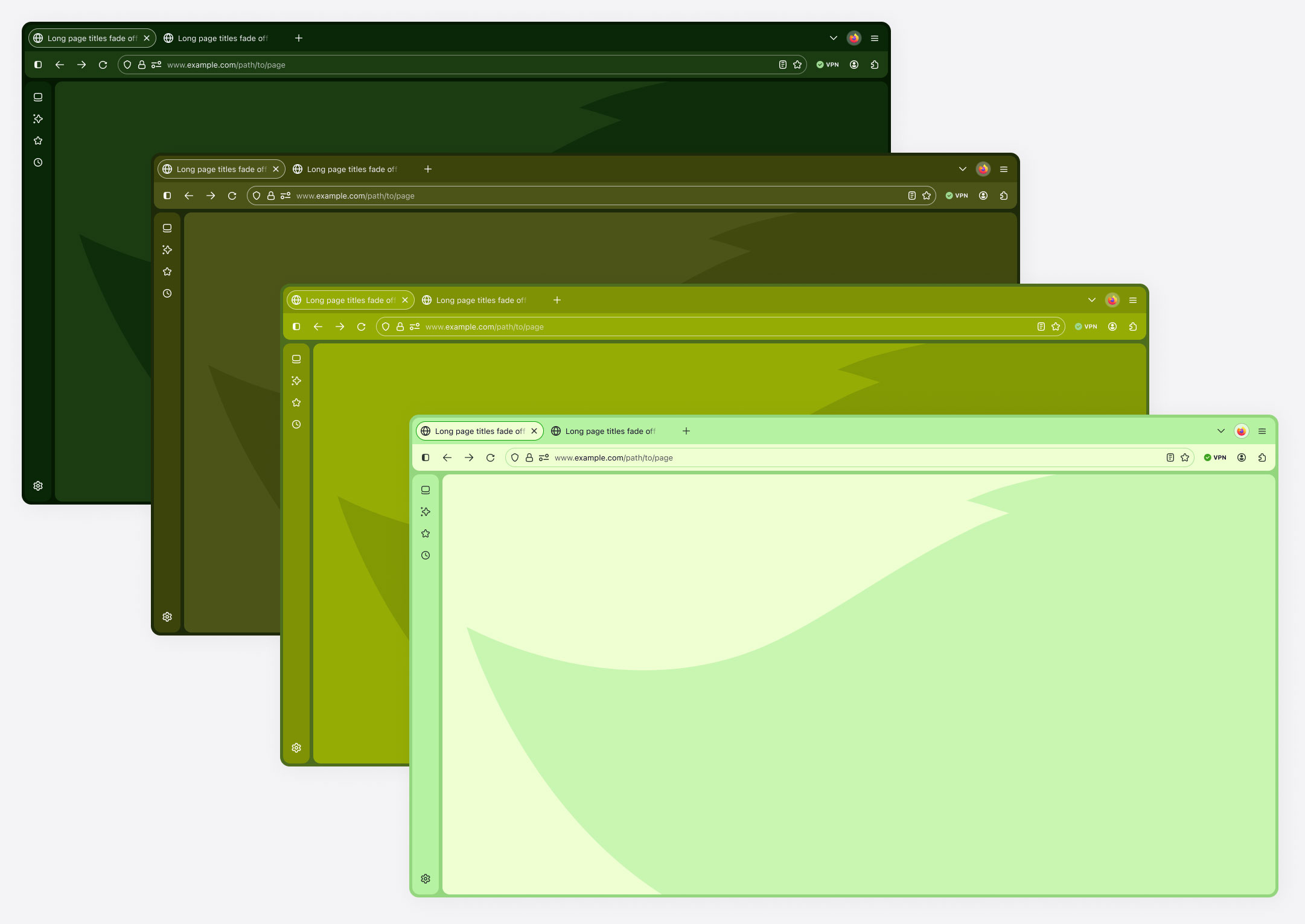
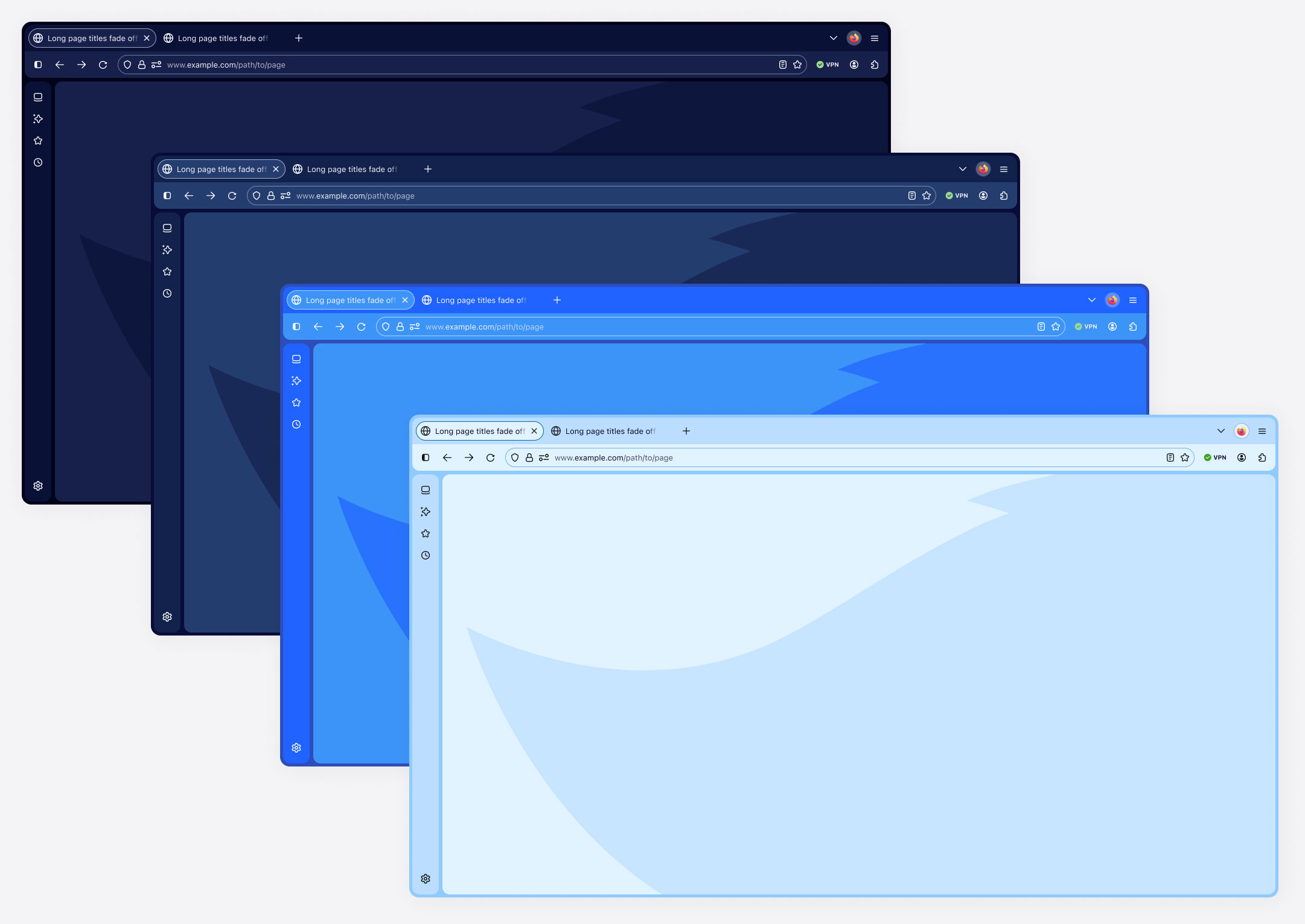
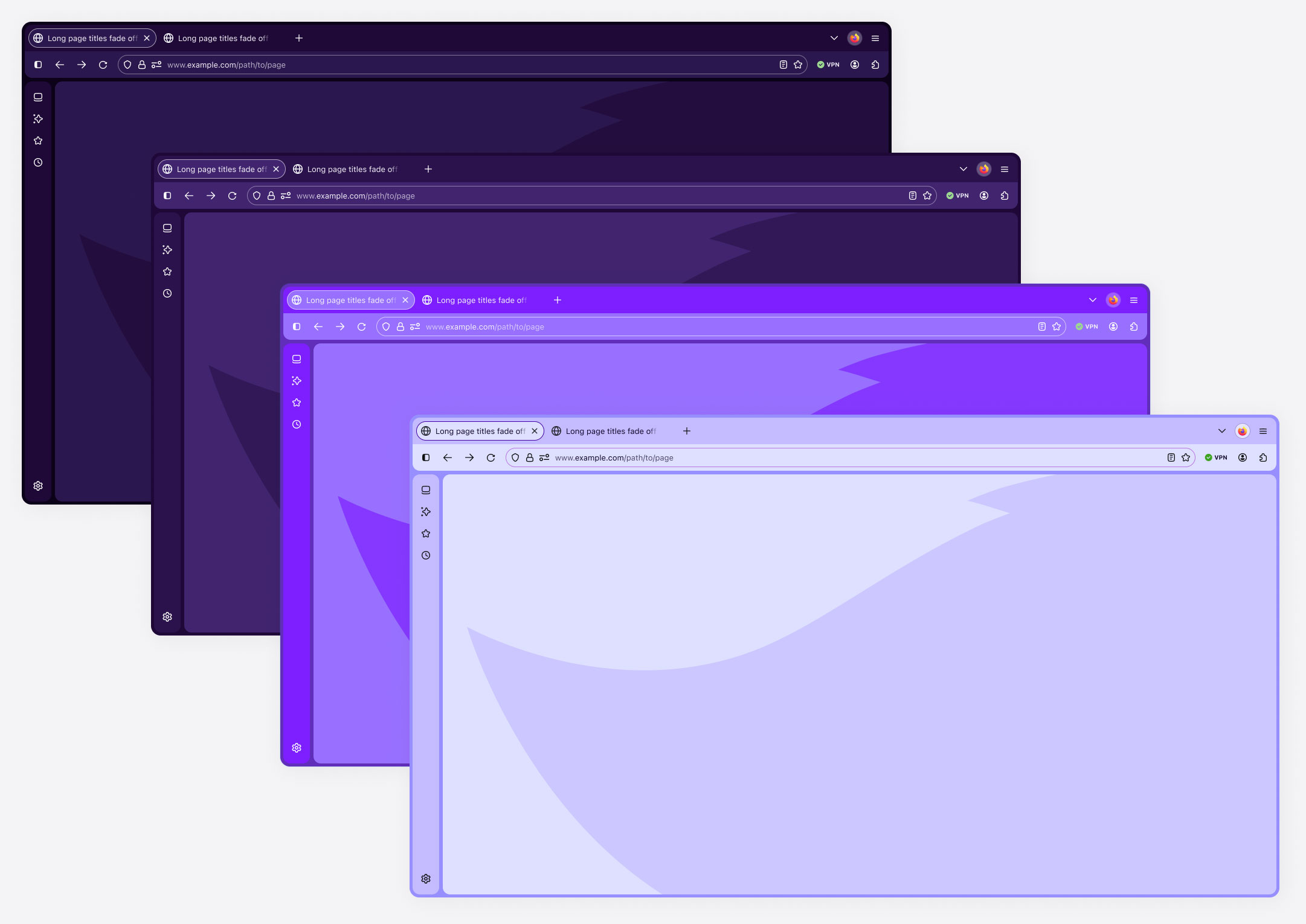
Firefox allows user to fully customize their browser experience with both configurable tool placement and nearly unlimited color options. The following shows some examples of custom color themes. Although users can assign custom colors to individual elements, these examples are cohesively themed for optimal aesthetic value.
Color theme spectrum examples
Adoption and ongoing support
Beyond system architecture, I played a key role in enabling adoption across the organization. I provided hands-on guidance, training, and ongoing support for designers working across Firefox teams, helping them successfully adopt the new component patterns and system workflows.
To mitigate design debt, I worked closely with our product design teams to integrate our new components, led routine office hours and support calls, and initiated a weekly short-content training session that reinforced the importance of using components, using them correctly, and getting the most out of them.
In my experience, providing excellent support has always been the most effective way to foster adoption and ensure designer’s and developers actually want to work with the system, as opposed to them simply being required to do so.
Design system impact
Through this work, the Firefox redesign shipped with a stronger system foundation capable of supporting the browser’s evolving UI while maintaining consistency, accessibility, and engineering alignment, and improved how teams build UI across the browser.
System outcomes
- Reduced component redundancy through flexible architecture.
- Integrated Figma variables and modes for scalable design.
- Improved accessibility compliance across new UI patterns.
Team outcomes
- Increased adoption of system components across teams.
- Improved cross-team UI consistency.
- Reduced design review friction through clearer standards.
Product outcomes
- A cohesive and modernized Firefox browser interface.
- Consistent interaction patterns across the product.
- Stronger alignment between design and engineering.
Reflection
Large product redesigns present an opportunity not only to improve UI, but to strengthen the systems that support it.
Through design system governance, architecture improvements, and team enablement, the Firefox redesign shipped with a stronger foundation for building consistent and accessible browser experiences.
The updated Acorn design system enables designers to build complex UI patterns using more robust, highly scalable components that are better aligned with engineering.