Mozilla / Firefox
San Francisco, California
Firefox Sync design system: a multi-brand, automation-driven design system that brought parity, scalability, and design-to-engineering alignment across multiple Mozilla and Firefox service products.
Design system build // Design governance
My role
Lead system designer
Core skills used
- System building
- Component craft
- Cross-function
- UI design
- Interaction design
- Visual design
Project overview
The Sync design system was created to bring visual and experience cohesion across three distinct, but interconnected, Firefox services:
- Accounts: account access, security setup, recovery actions.
- Subplat (subscription platform): subscription, billing, and plan management for free and paid offerings.
- Settings: account management, profile settings.
At its core, the system was intended to reduce fragmentation across Firefox services by creating a scalable, token-driven component architecture that aligned design and engineering, supported multiple brands and theming, and made shared UI easier to maintain.
This project also included a visual refresh and slight retooling of each product to create a seamless experience that’s visually aligned with Firefox.
My role
Within the Accounts team, I served as design lead, owning system architecture, library craft and execution, design automation strategy, and design-to-engineering parity.
My responsibilities included translating existing Storybook codebases into Figma, auditing coded components for UX and UI issues, identifying accessibility and parity gaps, directing updates, and partnering with engineering to implement. I also defined where Firefox styles should be inherited, where custom patterns were needed, and how the system should scale across multiple brands and products.
Another major part of my role was building advanced system automation through variables, modes, component string mapping, and responsive logic (demo further down the page).
Finally, I was tasked with leading a visual and interaction redesign to better align the products with Firefox’s design language, and to address areas, particularly in Subplat, where the experience had the potential to confuse users.
Challenges and considerations
The system was created to solve several connected problems at once.
- The 3 products function together as a single unit, but the experience was not a seamless one to the user, which the system needed to solve.
- The system needed to work across both desktop and mobile, requiring responsive patterns and consistent behavior across surfaces.
- Because distinct product experiences lived within a shared platform, the system needed to balance consistency with flexibility for product-specific needs.
- Accounts can be created or accessed from multiple product entry points, so the system needed to have easy multi-branding abilities.
- The breadth of products and use cases increased the need for stronger governance to allow components and patterns to improve platform cohesion.
Accounts, Subplat, and Settings had drifted from each other, and from Firefox, in visual style, component behavior, and UX patterns.
Without a design system, designers were eyeballing colors, styles, and layout behaviors, with zero consideration for a rational grid system. This created inconsistent and incorrectly formatted flows, made quality dependent on individual judgment, and slowed down design work.
Engineering also lacked a reliable source of truth for specs. Because designs were often underspecified or nonexistent, engineers had to infer details like grid framework, text styles, color codes, breakpoints, and viewport behavior. That led to ambiguity, rework, and excessive revision cycles.
The system had to support multiple brands and teams, responsive workflows, and evolving product needs, while remaining streamlined and scalable, and visually aligned with Firefox.
Legal compliance and considerations
Any information architecture or copy changes had to pass legal review to ensure the correct terms links, privacy policies, and product-specific disclaimers were present throughout the experience. Checkout flows also needed to meet legal requirements around subscription clarity and disclosure. This meant the design work had to balance usability and visual cohesion with a high level of compliance rigor.
System strategy and execution
I approached the work in two parallel tracks: first, creating parity with the existing codebases, and second, evolving that baseline into a more cohesive, automated, and scalable system. Next, I focused on addressing the areas where it made sense to align with Firefox design language.
Translating Storybook into a usable design system foundation
Because engineering had already completed a comprehensive Storybook codebase, the first step was to bring the coded components into Figma as faithfully as possible. This created immediate design-code parity and gave the team a practical starting point, rather than building the system from theory.
Auditing and correcting component quality
Once the initial library was created in Figma, I reviewed components for gaps in interaction quality, accessibility, consistency, and usability. This included identifying places where coded implementation, existing designs, and Firefox ecosystem expectations were out of sync. Building the initial “as-is” components gave me an in-depth view of every visual and interaction element, allowing me to discover and record the issues I found, in preparation for the redesign.
I then worked with the engineering teams to address the most immediate issues concerning responsive behavior, accessibility, spatial formatting, confusing or unclear patterns, content, and areas that were clearly improvised. This made the system a genuine bridge between design and engineering, rather than a parallel library that drifted from code over time.
Establishing Firefox parity without losing product flexibility
A key strategic part of the work was determining where the system and design flows should inherit directly from Firefox design language, and where product-specific patterns still needed to exist. I worked through areas that overlapped with Firefox styles, replacing custom or inconsistent treatments with Firefox-aligned patterns where it reduced divergence, while preserving enough flexibility for account and subscription experiences to function within their own product needs. This helped correct the earlier disconnect between the products’ UX and Firefox design language, while maintaining a practical system for the product teams.
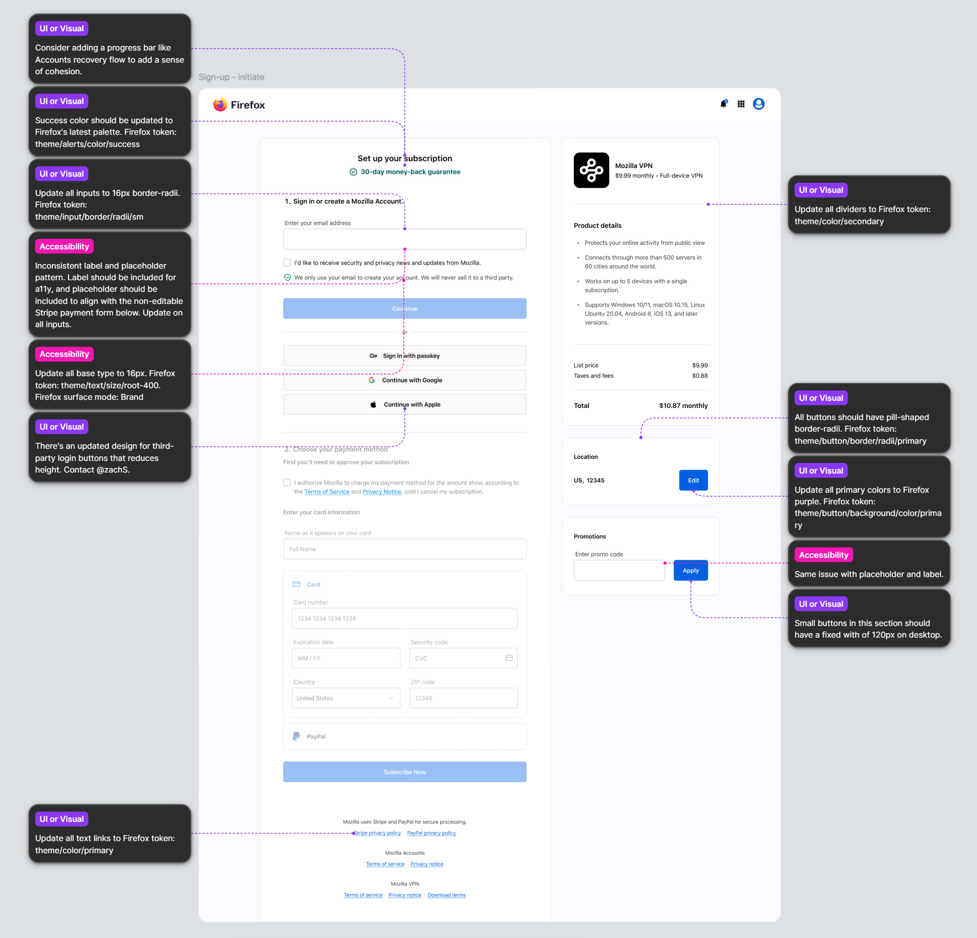
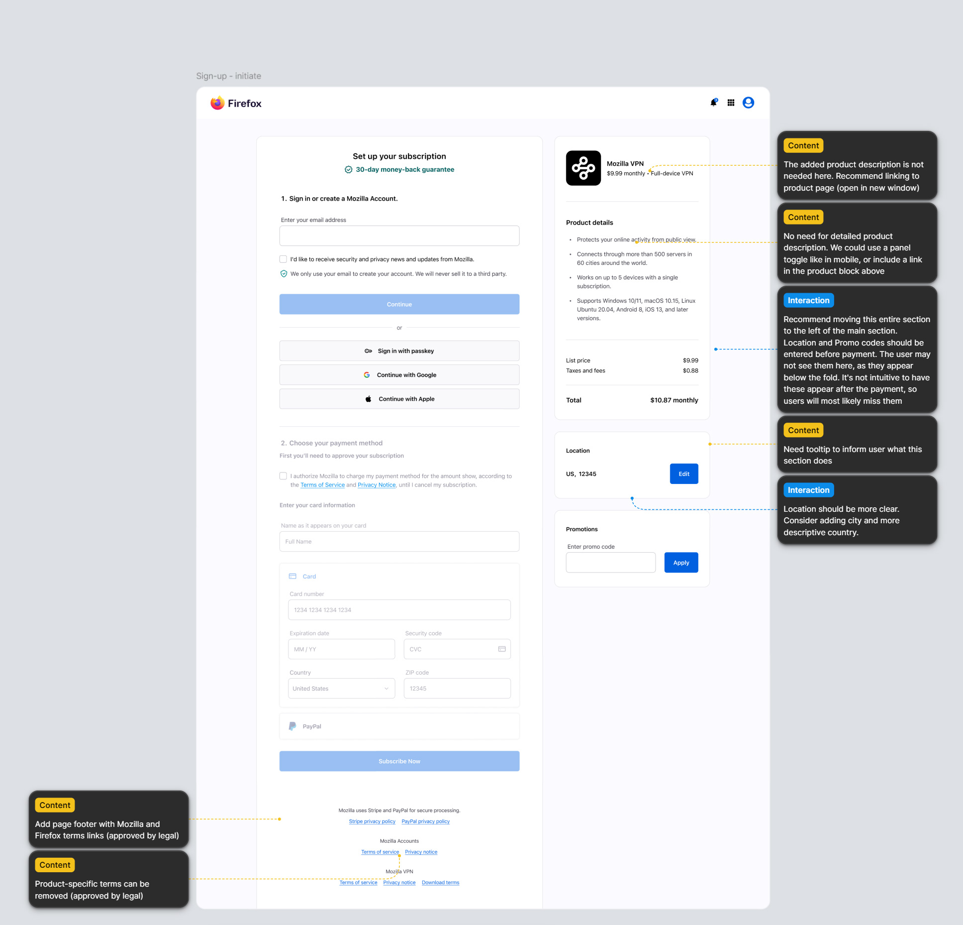
The following shows Subplat’s initial payment screen with annotations from the audit. The last image shows the result of updating just the most immediate concerns, before the larger visual refresh.
Redesigning high-value user flows
The scope of the redesign phase of this project included visual and interaction updates, and elevation of core user flows across:
- Account sign-in and sign-up
- Account and password recovery
- Subscription purchase and management
- Transactional Subplat emails
I started by bringing visual cohesion to Accounts, Subplat, and Settings to create a seamless environment for users. This work focused on establishing consistent styles, grids, and universal components across the products. From there, I shifted focus to integrating Firefox styling, crafting a strong visual experience with improved accessibility, and integrating delightful elements to elevate these typically functional-only products.
Bringing delight into functional product experiences
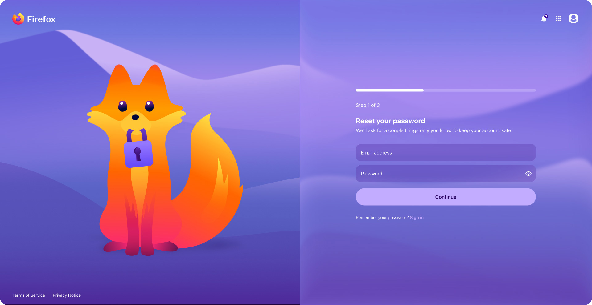
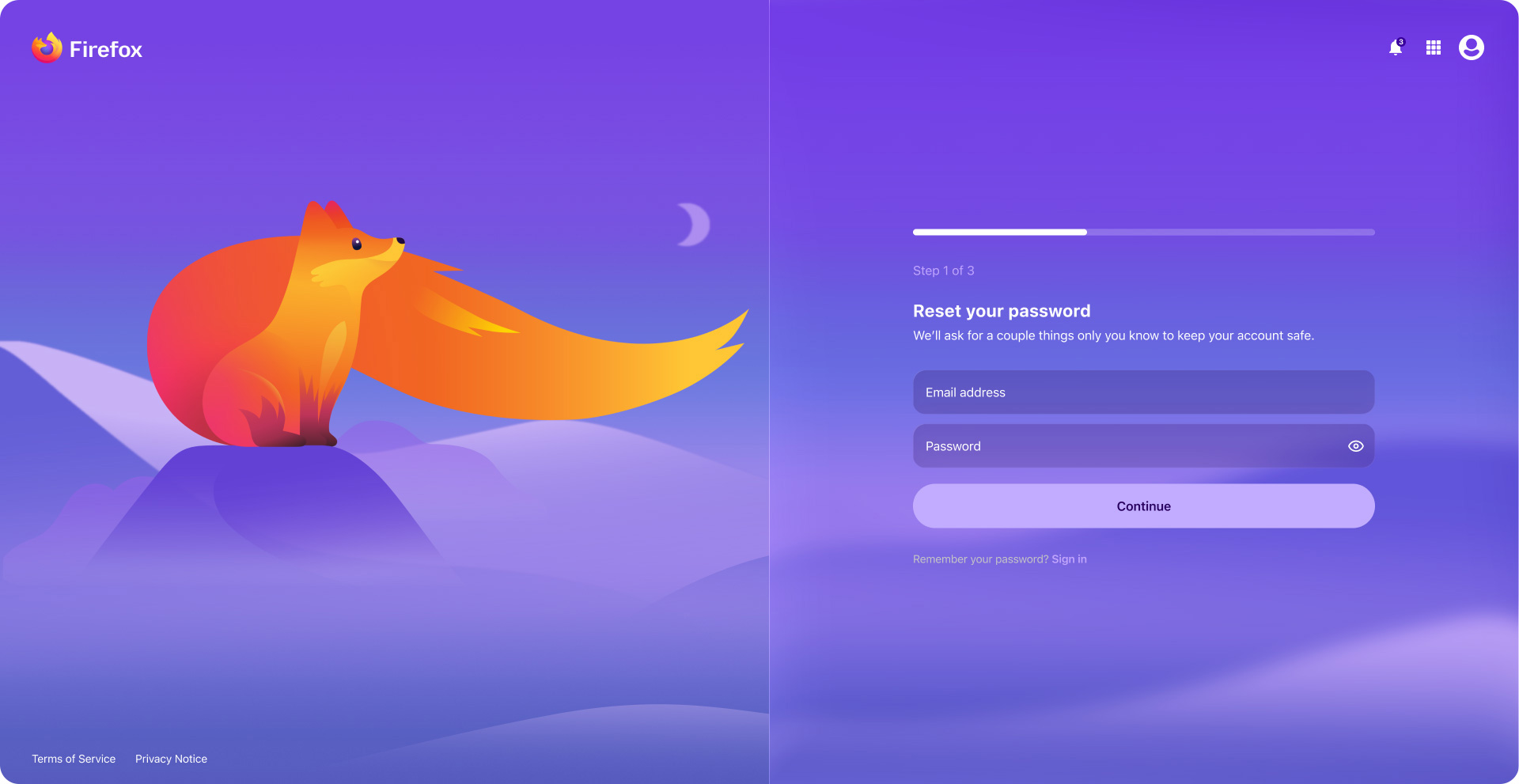
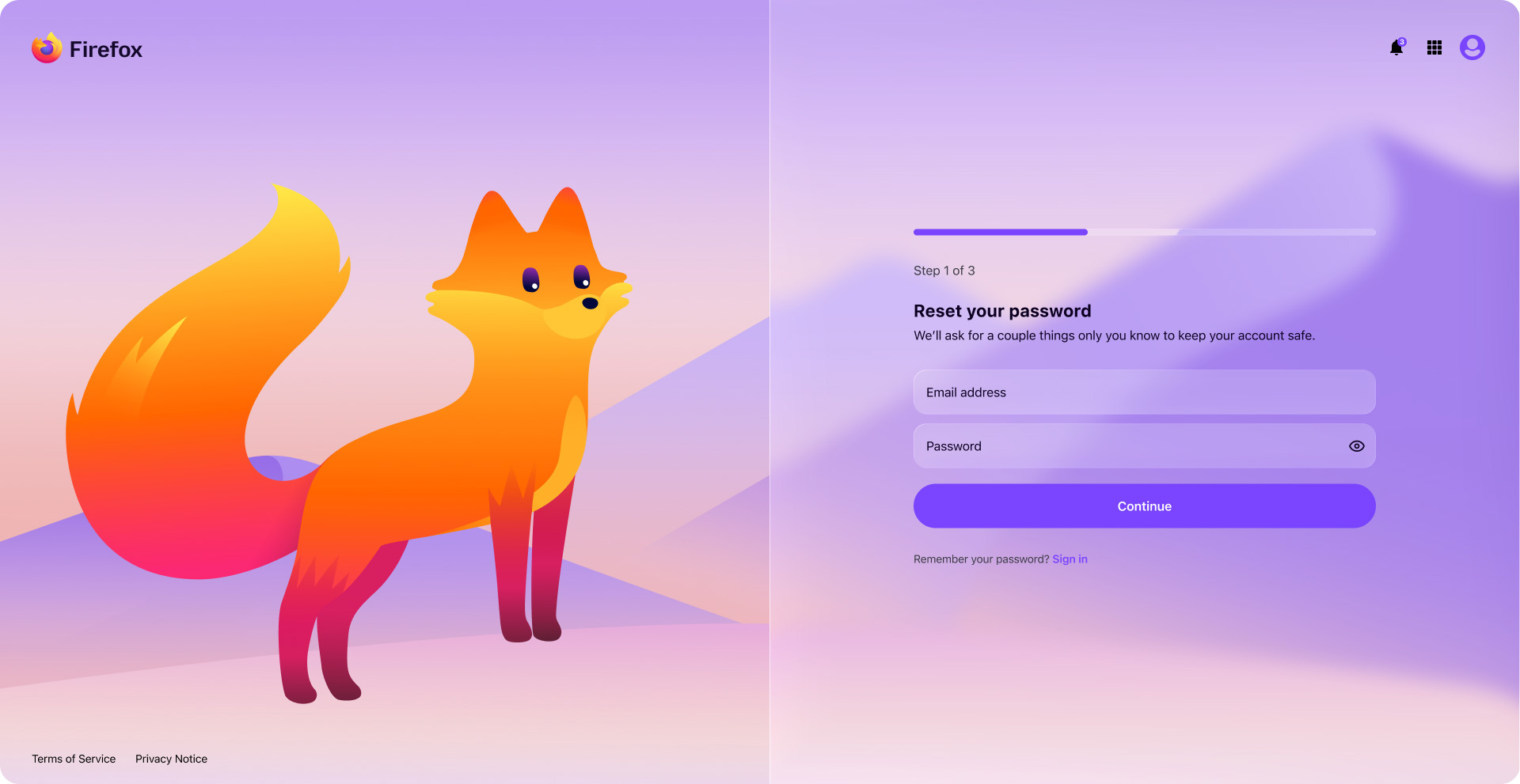
New visual concepts were crafted in collaboration with Accounts’ UX manager and Subplat’s product manager. We were all keen on adding delightful elements, such as instances of Firefox’s new mascot (aka Kit), confetti, animated transitions, and motion graphics. Applied thoughtfully, this level of care for the user creates warmth, and a stronger sense of responsiveness, helping sign-up and subscription flows feel more engaging.
A major goal with all design work around Firefox was to bring a more youthful and modern visual appeal, playing up the fun, whimsical personality, without being disingenuous or clichéd. This was part of a broader push to appeal to younger audiences and reestablish Firefox as the tech leader that it once was. To support this, I introduced popular glass-morphism visual treatments, coupled with strategic use of Kit. This also reflected Firefox’s recent integration of Apple Liquid Glass and Google Material 3 Expressive, helping account and subscription flows feel polished, cohesive, and culturally relevant.
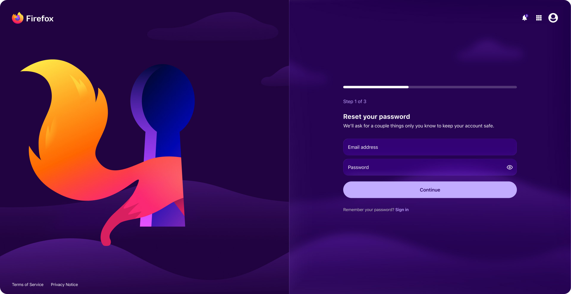
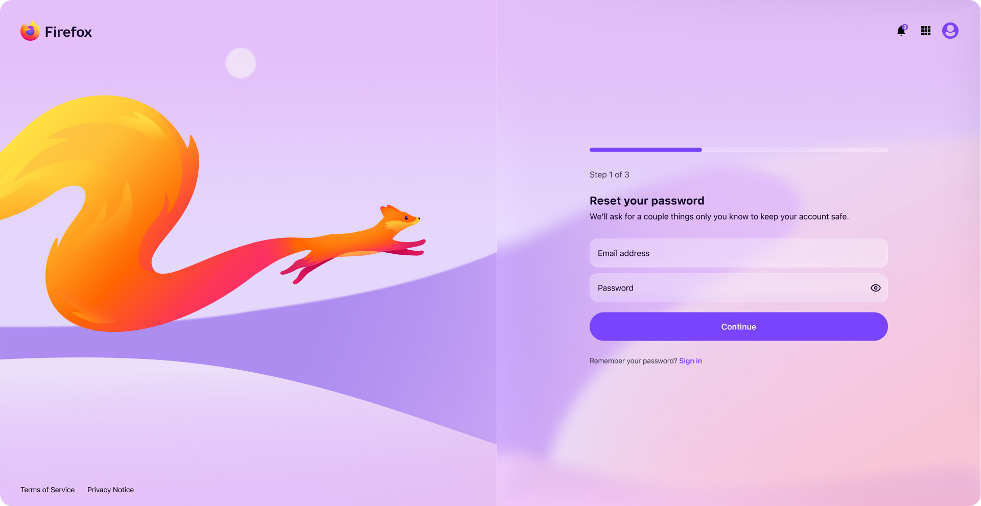
The following mockups show the updated design direction, using Accounts password reset screen and Subplat flows as examples. This style is strongly aligned with Firefox, and reflects the interaction direction and slight retooling I touched on earlier.
Leadership presentation
Below is the Figma slidedeck my manager and I presented in a leadership showcase alongside a live demo. Many of the slides were omitted for brevity, but I thought I’d include them all here for completeness.
Design system overview
This section highlights the component craft, scalable architecture, and advanced mode automation that helped the Sync design system support responsive, accessible, and consistent experiences across a growing product ecosystem.
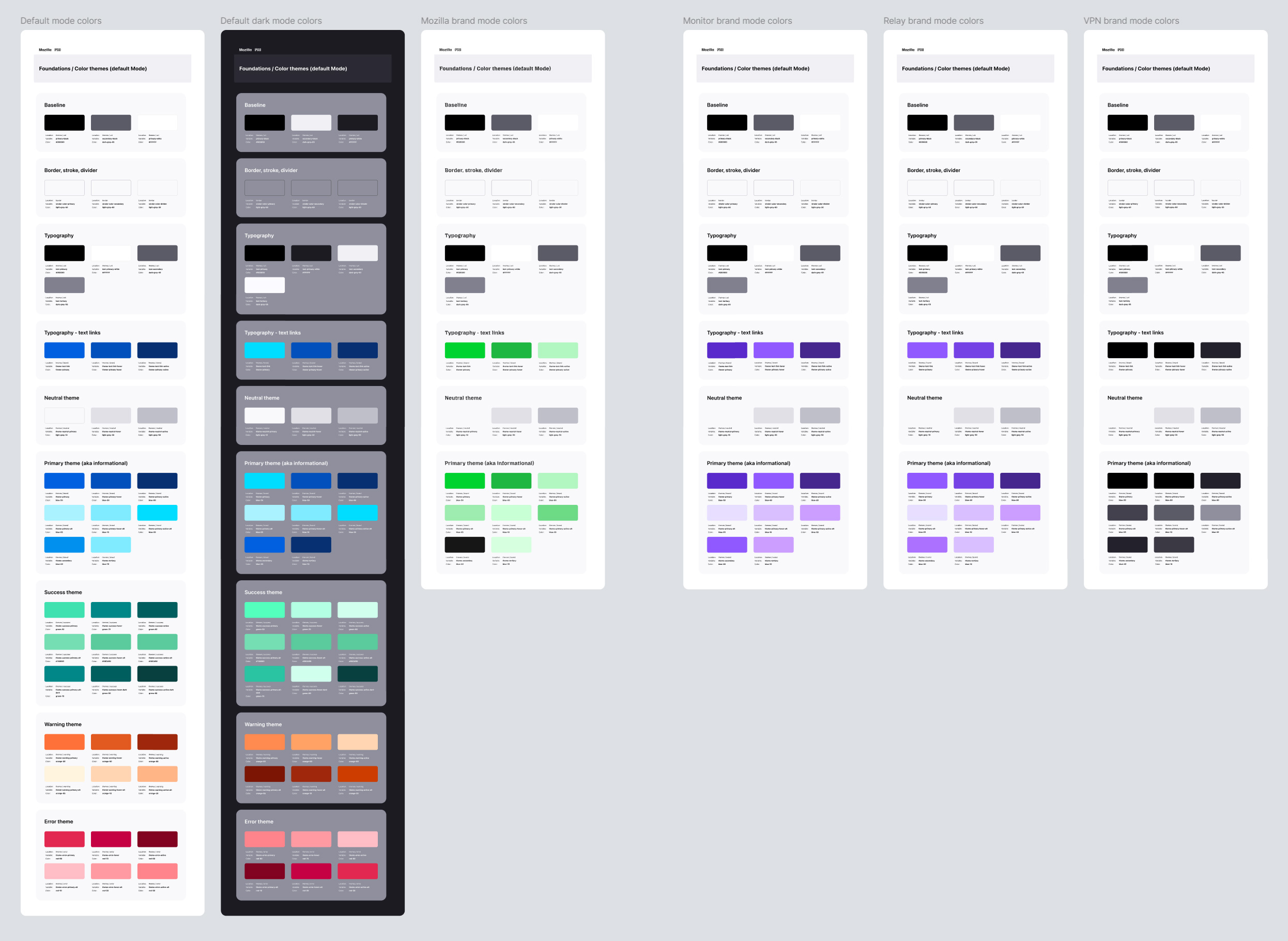
Foundations
This layer included core design primitives such as color, typography, spacing, and other shared values, along with the mode architecture that powered brand theming across the targeted products, and Light and Dark mode environments. Keeping variables and modes embedded in the system improved discoverability, and made the relationship between foundational tokens and applied components clearer.
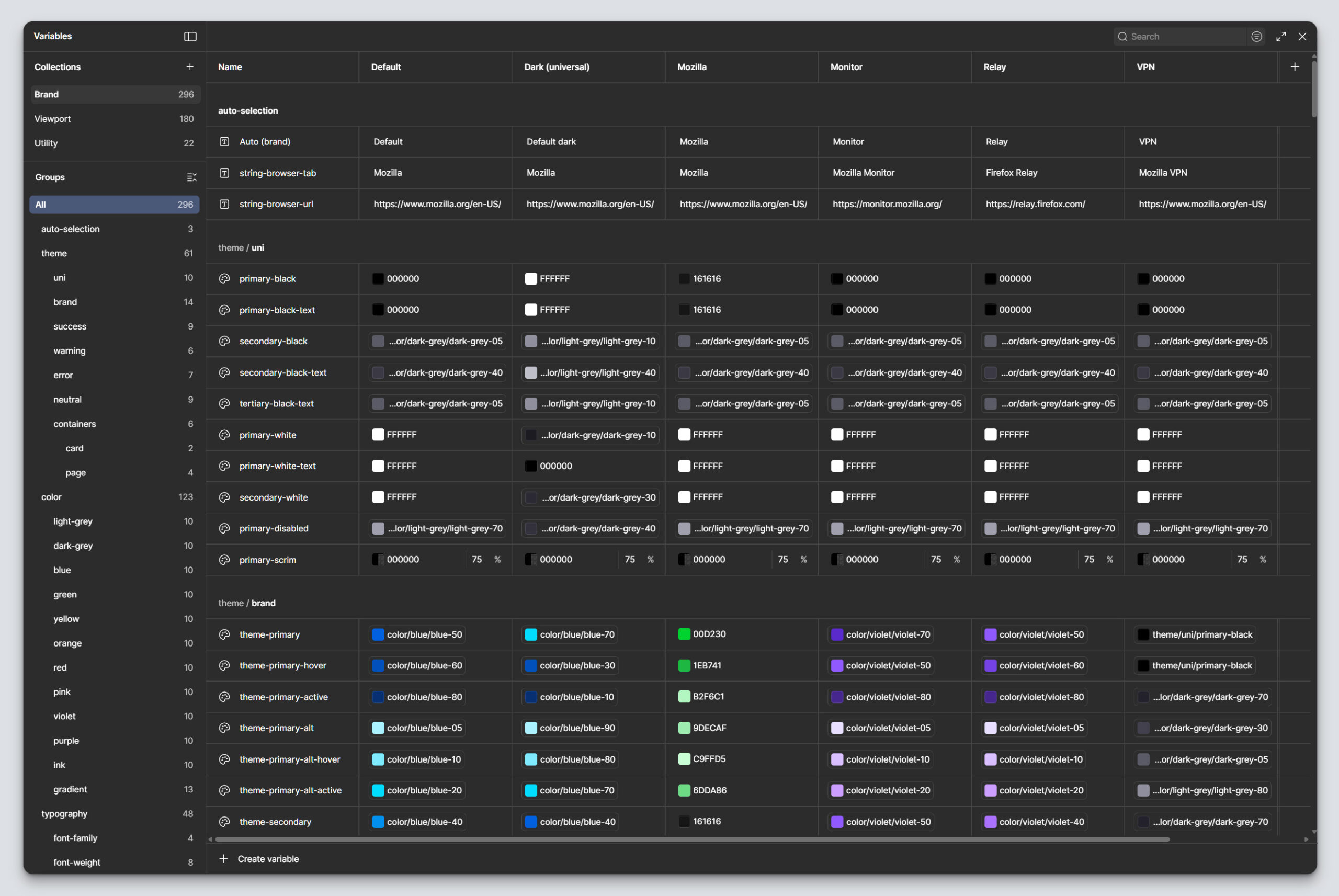
Tokens, variables, and modes
Variables and modes were housed directly within the system rather than split into a separate supporting file, which made the foundations easier for designers to access and apply in day-to-day work.
I structured the token and variable architecture to support Light and Dark modes, as well as multi-brand modes, as shared system behaviors. The goal was to unify these alternate modes across the ecosystem while aligning them to the patterns already established in Firefox.
By building those modes into the system foundation, teams could apply them consistently through shared variables rather than recreating mode-specific UI decisions product-by-product. This strengthened parity with Firefox, reduced visual drift across experiences, and made brand themed design easier to scale throughout the system.
Token architecture
Named with intent, not guesswork. Every token moves through three tiers before it reaches a component, and every name was reviewed with engineering against the existing codebase, not invented in isolation.
01 · Primitive
violet-60
A base value of color, size, radii, motion duration, spacing value, etc.
02 · Semantic
color-brand-primary
Aliases the primitive for each brand. Carries the intent of the value, not just the value itself.
03 · Component
button-primary-background
Bound directly to the property. This is what a designer or engineer touches.
Alias chain
violet-60 ⇒ color-brand-primary ⇒ button-primary-background
This allows for more granular control over token application, without an overly complicated token architecture. The entire system can be updated by changing the primitive, just a single brand can be updated by changing the semantic token, and individual components can be updated by changing the component level token.
Lorem ipsum dolor sit amet, consectetur adipiscing elit. Ut elit tellus, luctus nec ullamcorper mattis, pulvinar dapibus leo.
Components
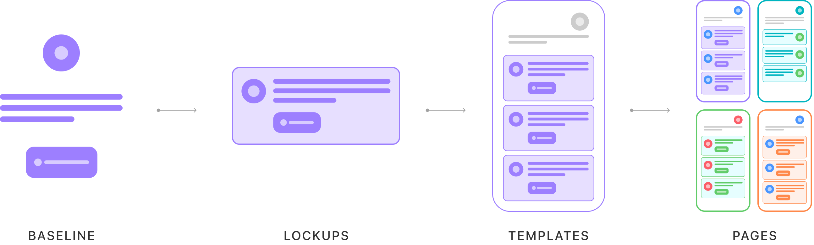
The component layer was built around reusable baseline elements, lockups, and configurable UI patterns. Components were designed to be configurable enough to support a wide range of use cases, without creating unnecessary duplication or brittle one-off variants. Rather than treating atomic design as a fixed hierarchy, I used it as a flexible framework for organizing reusable building blocks, while still supporting the complexity of real product needs.
It’s definitely possible to make a system too granular, which adds complexity, instead of removing it. This is common with traditional atomic systems that over atom-ize components, which leads to fragmentation and scalability challenges. To avoid this, the Sync design system features a tailored atomic structure that prioritized component efficiency and usability.
Components start at the “molecule” level, eliminating tedious atom-level components altogether, and sharing assets and resources where applicable. This goes a long way in preventing design entropy and runaway complexity.
Component craft through a human-centered systems lens
Component quality was a central part of my contribution to Sync. I built the system with a strong emphasis on structured, logical, high-functioning components that could scale across products while remaining intuitive for the teams using them.
For product users, the benefit was clearer hierarchy, more consistent interactions, stronger accessibility, and less friction across sign-up, sign-in, and subscription journeys. For designers, it created components that were flexible, efficient, and easier to apply correctly. For engineers, it made design intent more legible by clarifying behavior, layout expectations, and usage rules in ways that translated more cleanly into code.
I build components with implementation structure in mind. Because I have a background in web development, I think carefully about how component layouts will be understood by engineers and try to organize them in ways that feel logical from a code and stylesheet perspective, such as using recognizable layer names to provide clearer structural context and behavior cues.
I keep layer structures and naming consistent across components to reduce cognitive load and make bulk-editing possible. That consistency also supports more reliable instance behavior. I pay particular attention to how instance properties are configured so that content, especially text configuration, remains intact when a designer switches between variants. For example, in a component such as an article card with configurable fields like headline, excerpt, source, and image, those values remain preserved when the designer switches between desktop and mobile variants. This significantly reduces the time designers spend configuring or updating instances in their workflows.
Configurable component logic
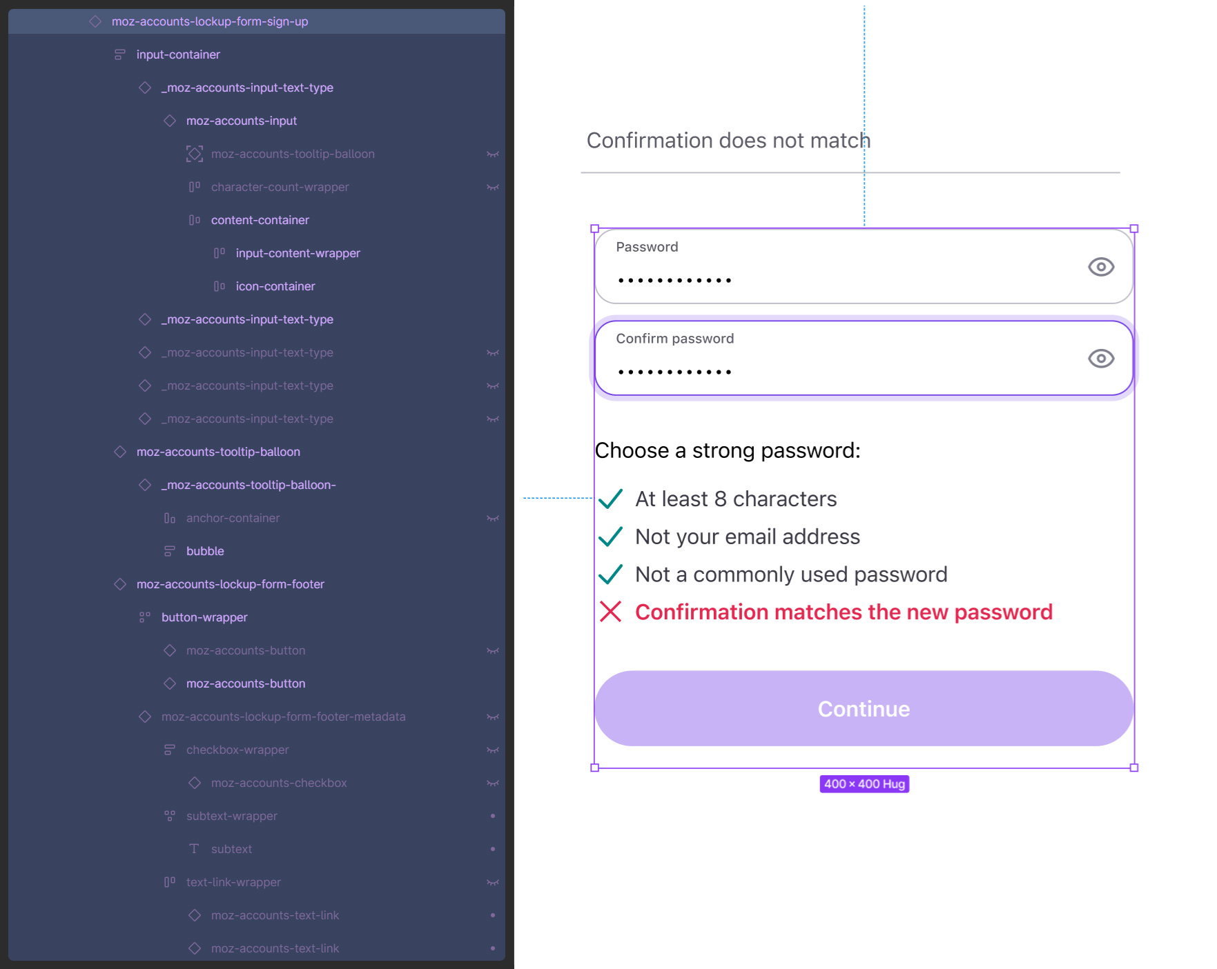
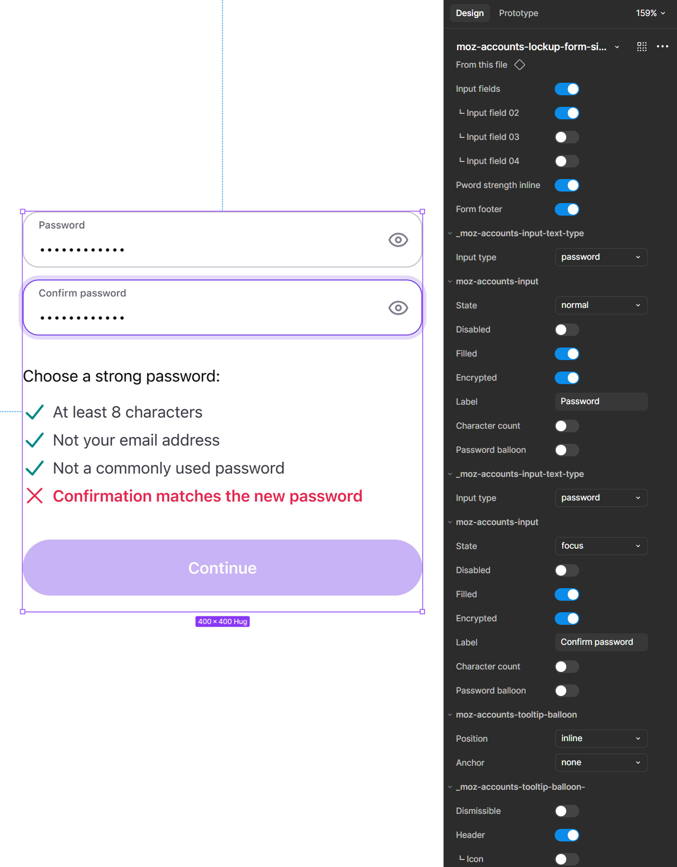
I used advanced component properties to create flexible, highly configurable components that could support a wide range of use cases within a shared structural model. Content and configuration were intentionally mapped across variants so components could scale through property logic rather than duplicated builds. This made it possible to manage differences in layout, state, and context while maintaining consistency in core behavior and visual hierarchy. The result was a more resilient component architecture that reduced redundancy, improved usability for downstream designers, and better reflected the compositional logic needed for real product implementation.
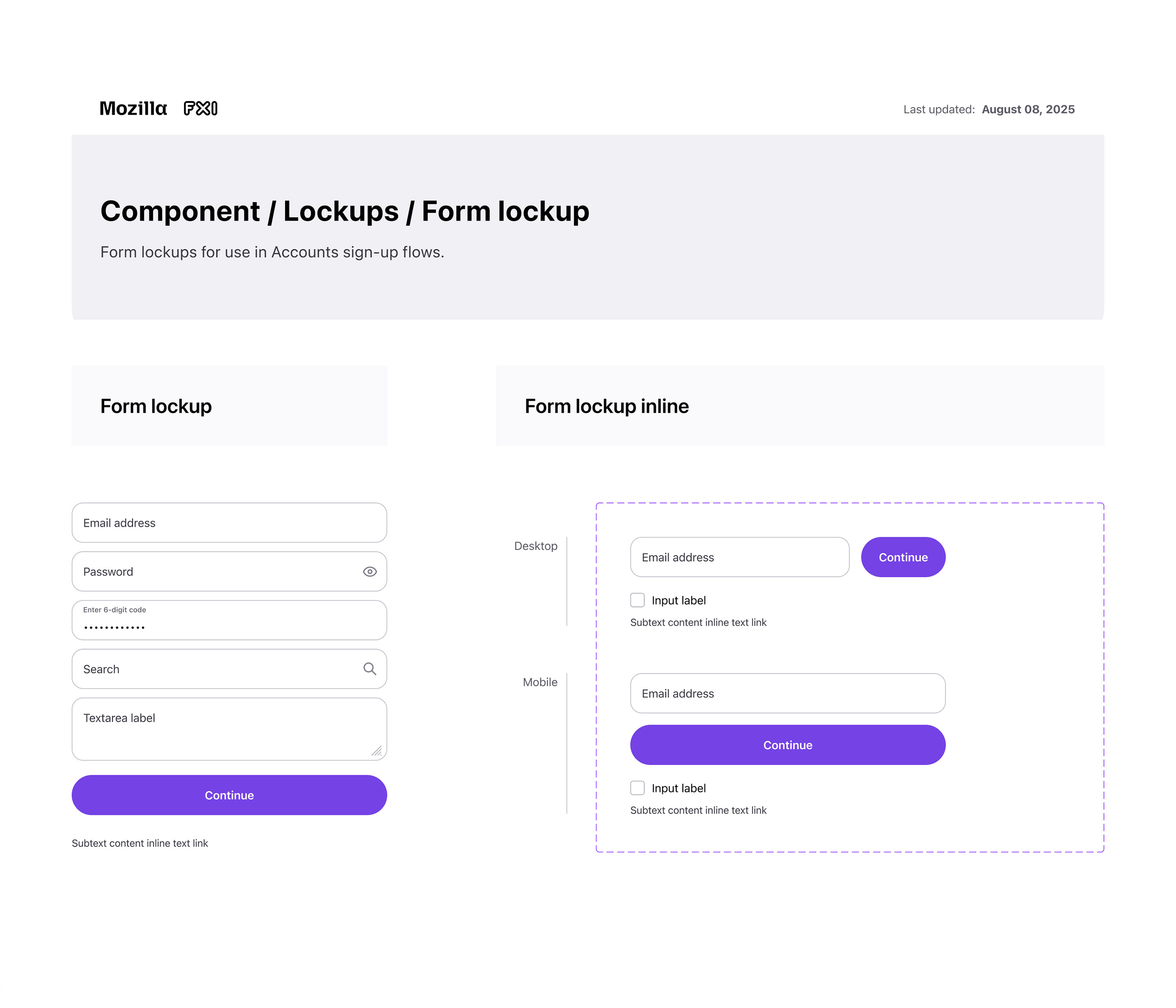
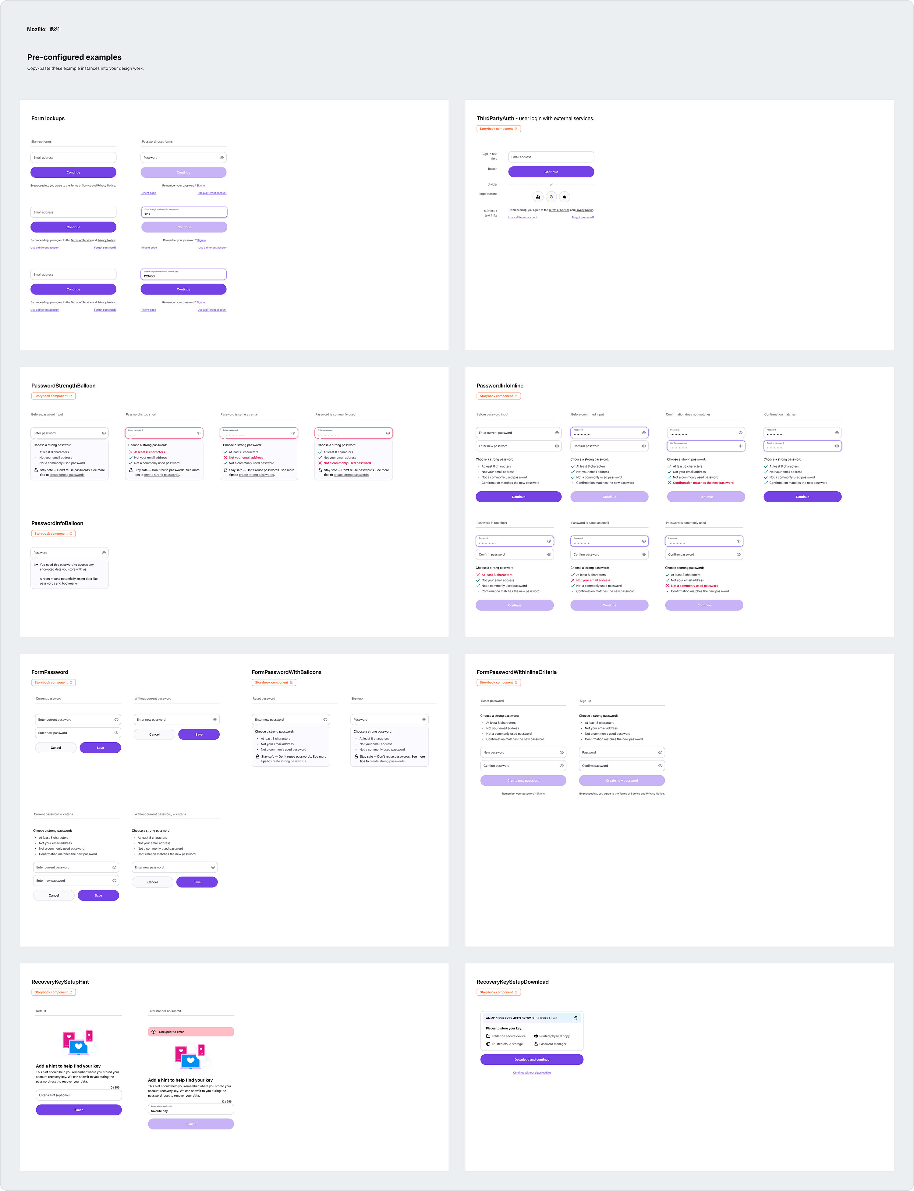
The following shows a simple input component, followed by a complex form lockup with inputs and other nested components.
Components and examples
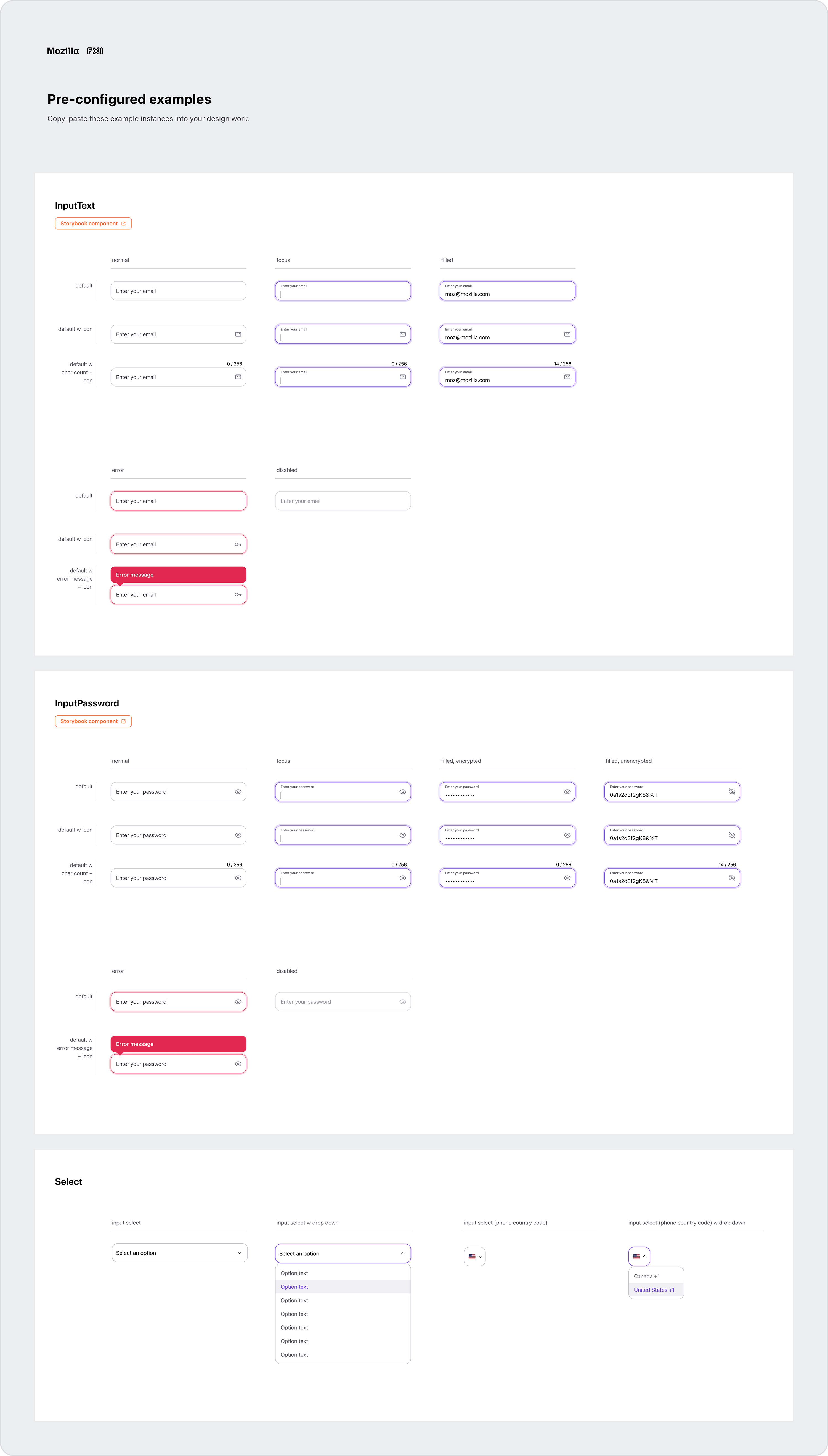
Sync components use properties extensively to allow designers to create highly configurable layouts. Because these parameters might not be obvious, components in Sync usually included collections of pre-configured instances with real, but configurable, content. To further reduce repetitive tasks, designers could simply copy and paste these instances into their flows.
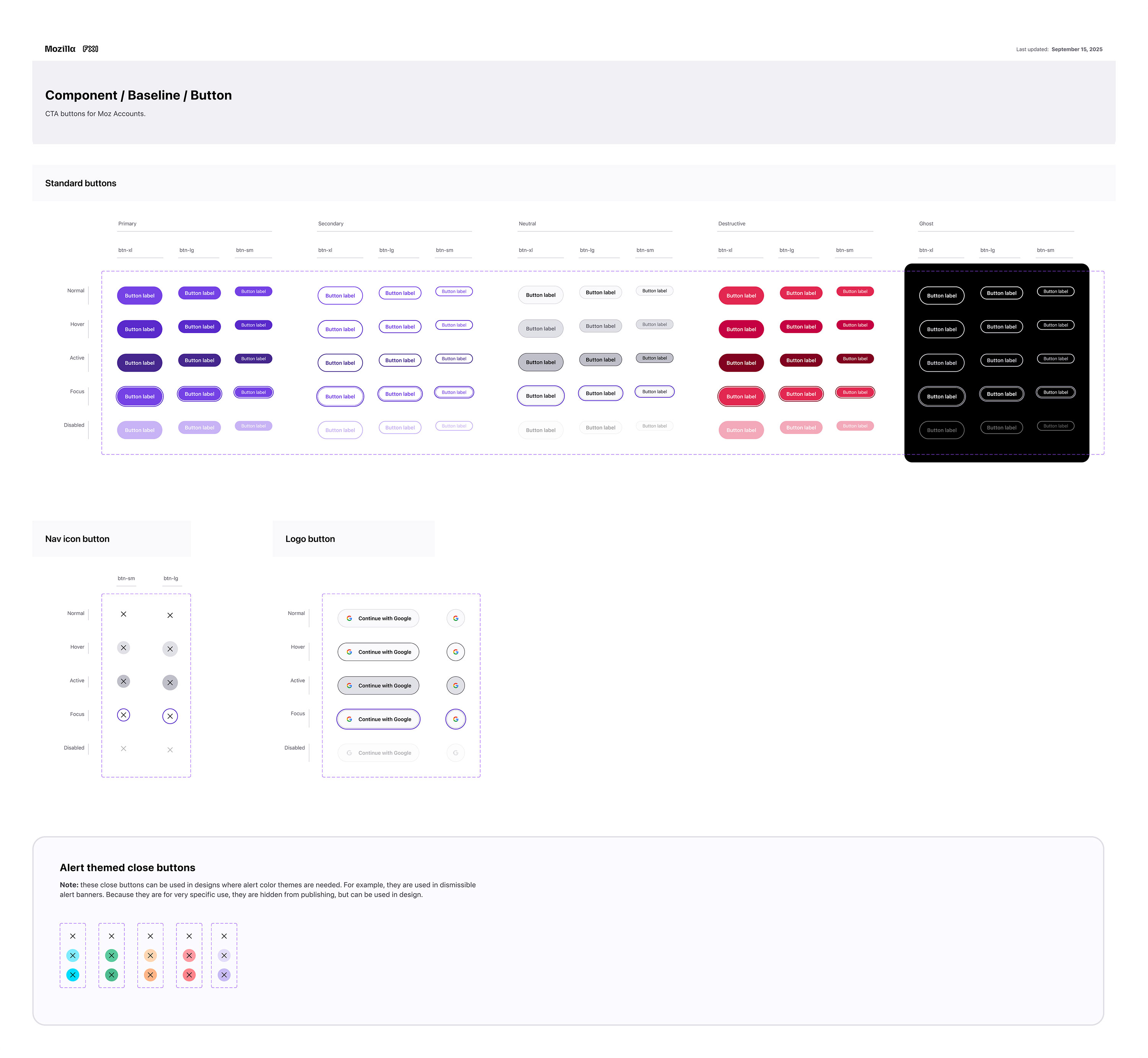
Button components
Sync includes a number of buttons, such as primary, secondary, and destructive, which are all available in multiple sizes. These buttons mirror Firefox colors and styles, but are a bit larger to maximize accessibility.
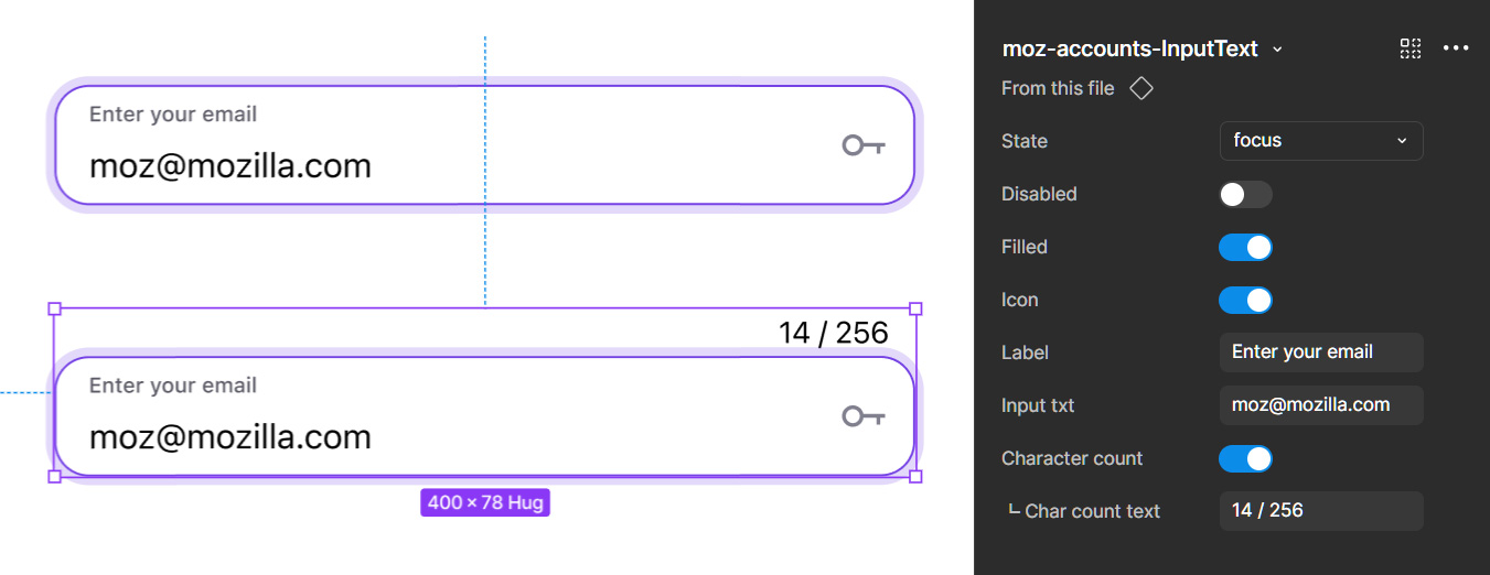
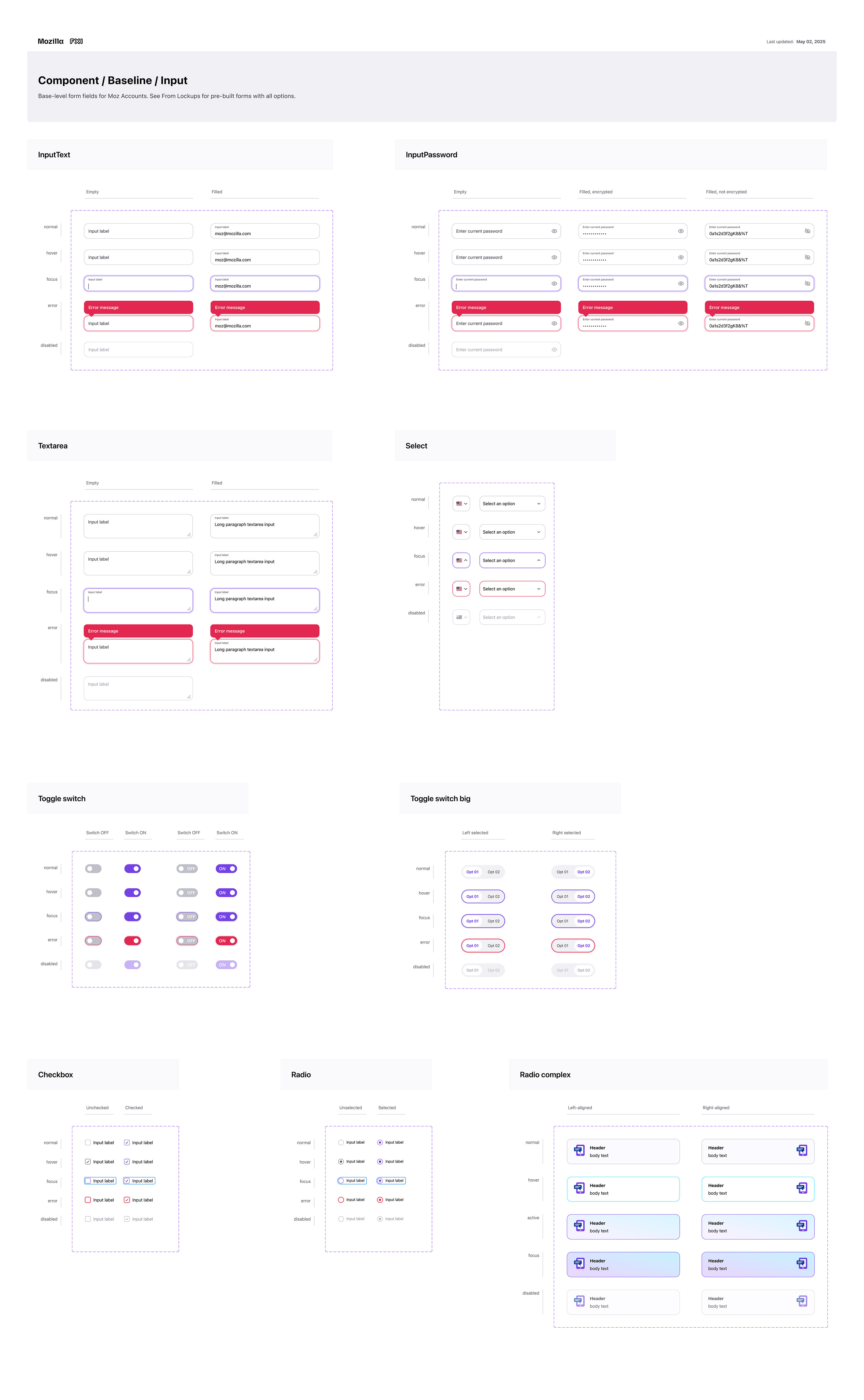
Input components
Input components include comprehensive properties to allow full configuration. They’re also designed to map content between variants and other input components when nested in a lockup component.
Form lockup components
Form lockups were especially important in automating design work, as they are a prominent feature in Accounts and Subplat, in particular.
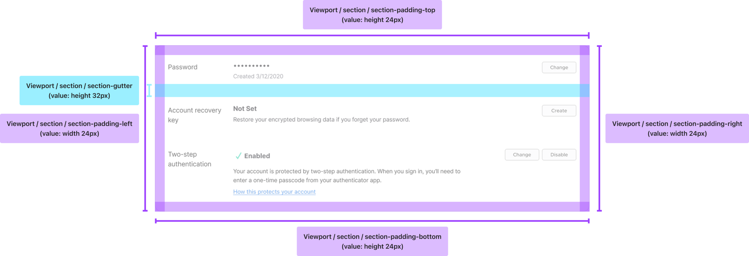
Building tech specs into the components
Another defining part of the system was that technical specs were built into the components. Rather than expecting designers to manually manage padding, margin, spacing, gutters, and other layout values, I structured components to work inside variable-driven auto-layout containers. Designer’s could simply be drag components into a frame, and they’d into place correctly.
This allowed designers to focus on flow construction and UX, rather than reconstructing spacing and positioning logic. It also improved consistency, reduced formatting errors, and created stronger parity with implementation.
Advanced automation with variables and modes
Multi-brand automation
One of the defining characteristics of Sync was the advanced use of variables and modes to automate work that would otherwise be manual and error-prone.
Because users can enter account and subscription flows from Mozilla, Firefox, Monitor, Relay, or VPN entry points, the system needed to support multiple brand contexts cleanly. I built brand automation into the library using modes, allowing designers to switch between product brands from a simple dropdown and automatically update visual styling across the flow.
I took that further by using component name mapping and property relationships to automatically swap branded variants inside the design when a mode changed. That meant a brand switch did not just update token values like color and typography. It also updated assets and component variants such as headers, logos, and branded promo graphics automatically. In practice, this eliminated a large amount of manual design work and helped ensure the correct branded imagery was always paired with the selected product context.
Responsive design automation
I also built a responsive workflow that significantly reduced design time through automation. Using modes, property mapping, and boolean variable logic, designers could create a flow just once in either desktop or mobile, and then switch the mode to reformat the layout for the other viewport.
The system handled structural changes such as stacking content, changing layout behavior, and toggling responsive elements on or off. For example, when a designer switched from desktop to mobile, the navigation treatment could automatically change from desktop navigation to the mobile variant. This turned responsiveness from a repetitive manual task into a system capability.
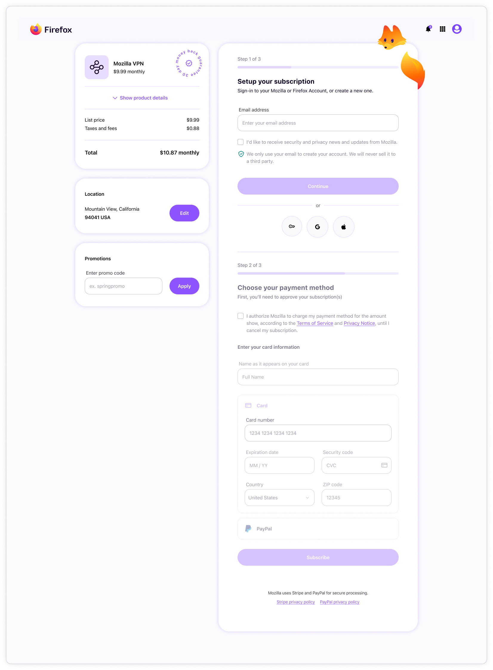
Comprehensive templates
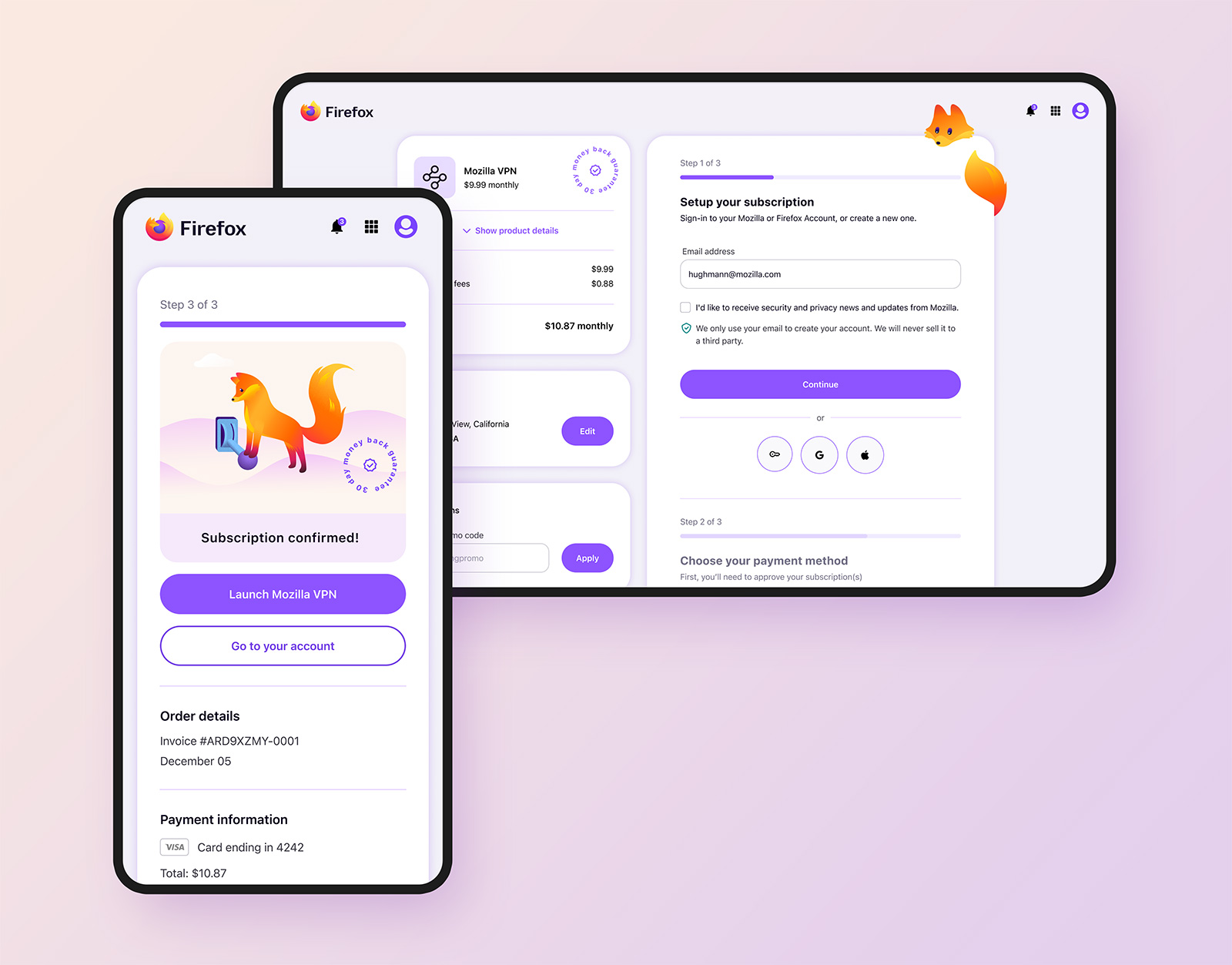
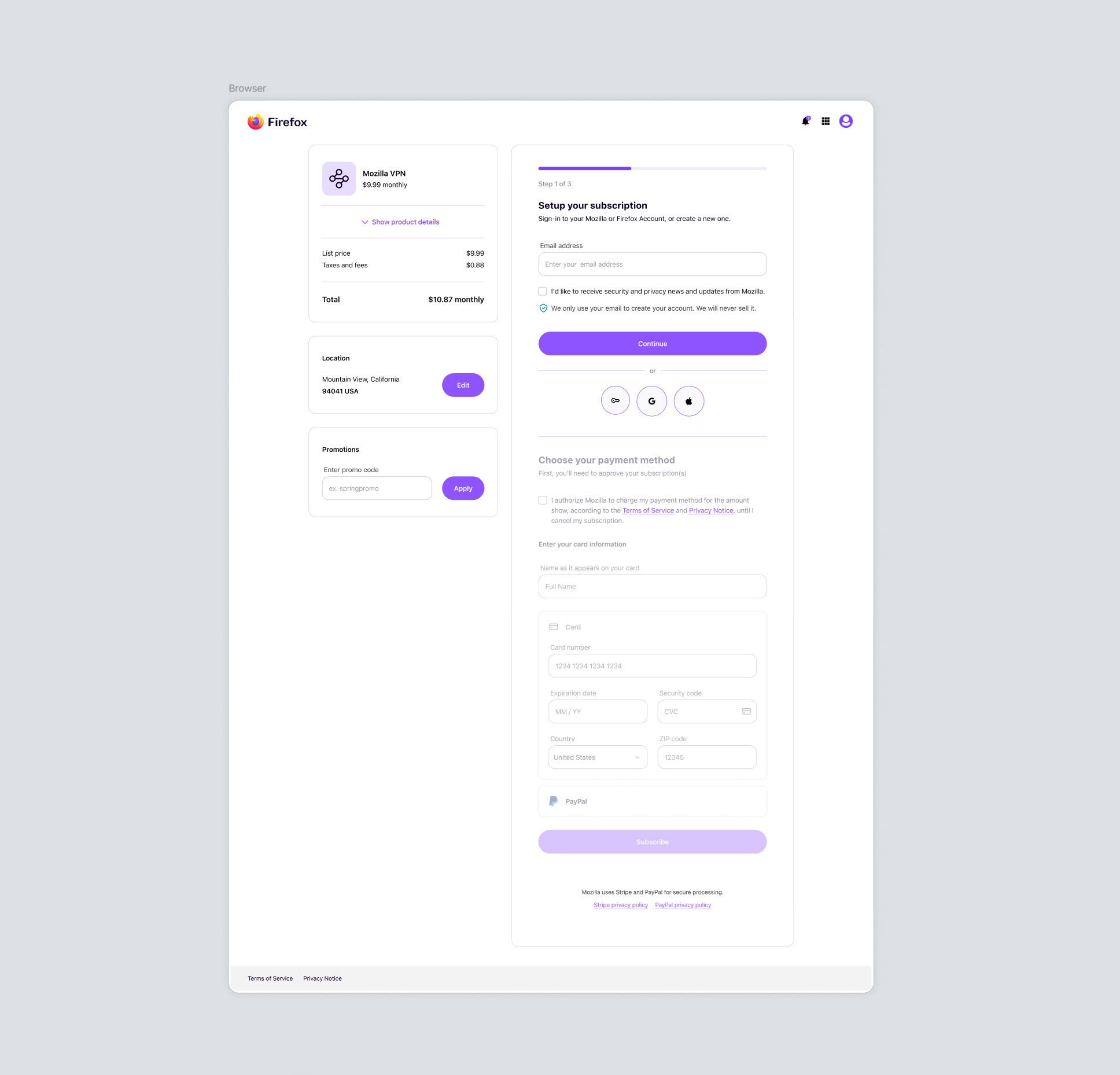
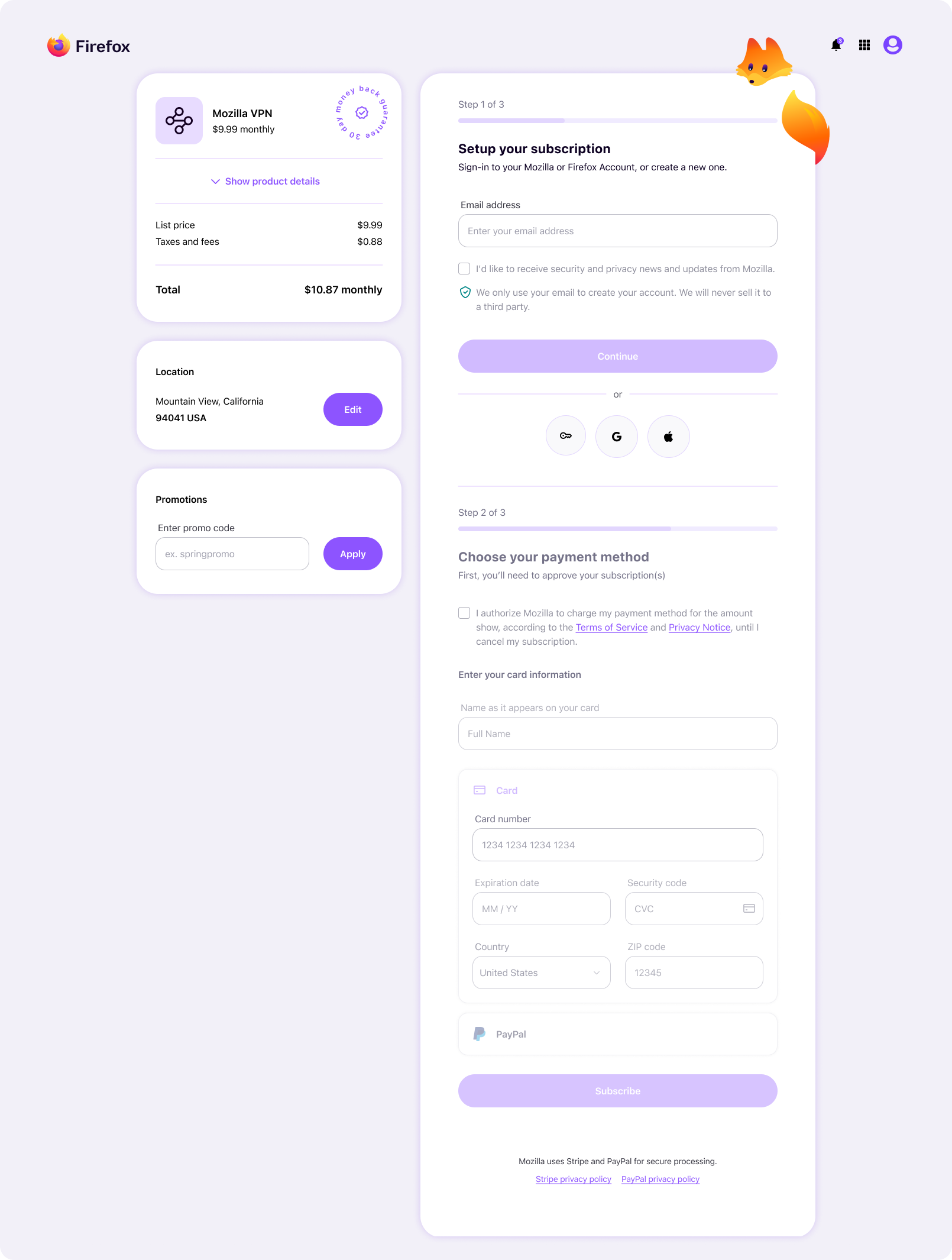
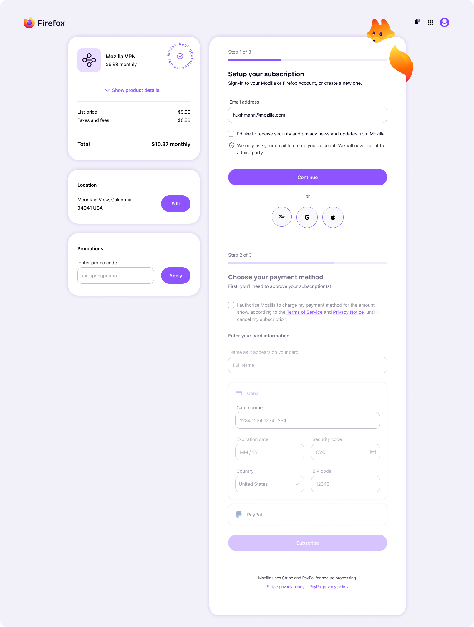
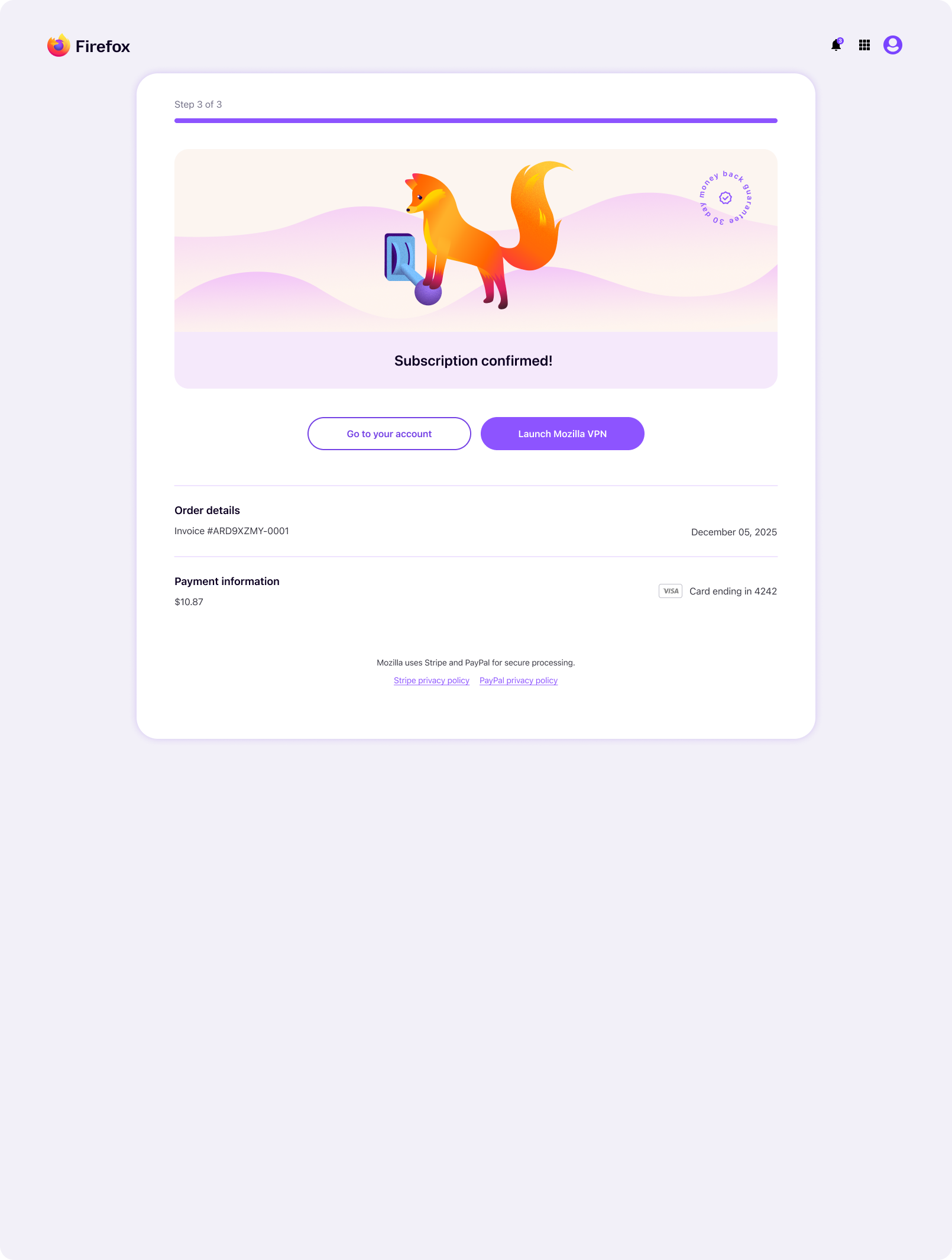
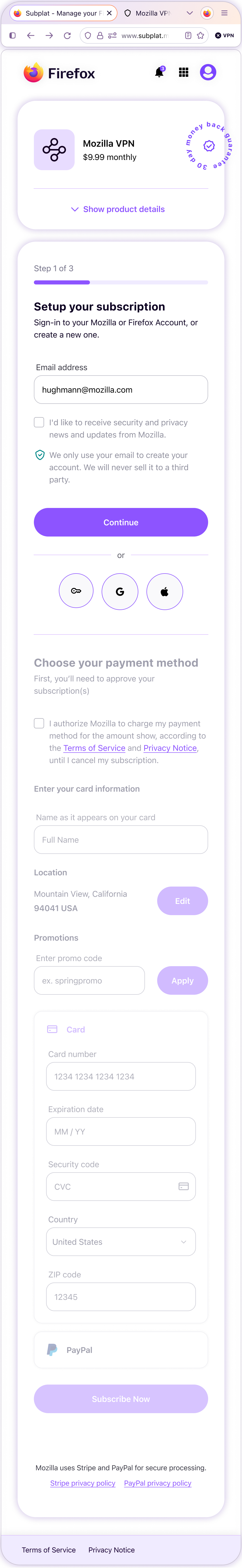
The following shows examples of desktop templates for the Subplat subscription purchase flow from initial step to payment success. For brevity, most error and diversion screens, as well as mobile layouts, have been omitted.
Subplat step 01: account email capture
Users must provide their account or fresh email address the “continue” button becomes active. After clicking, a modal appears to guide the user through signing-in or an abbreviated signing-up that must be completed later. The user is then redirected back to this page, where step 02 is ready to start.
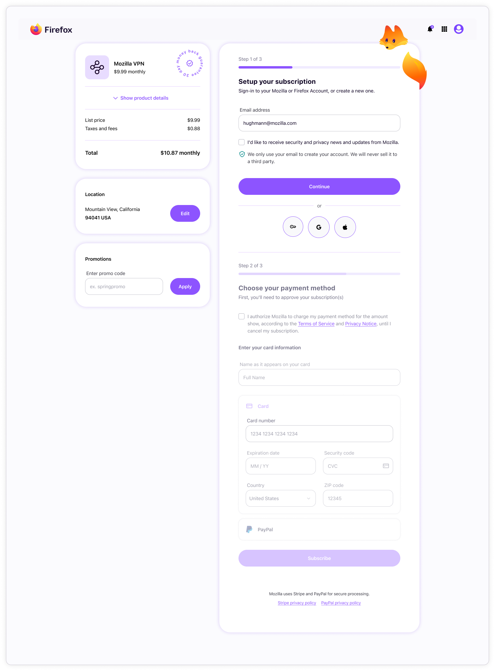
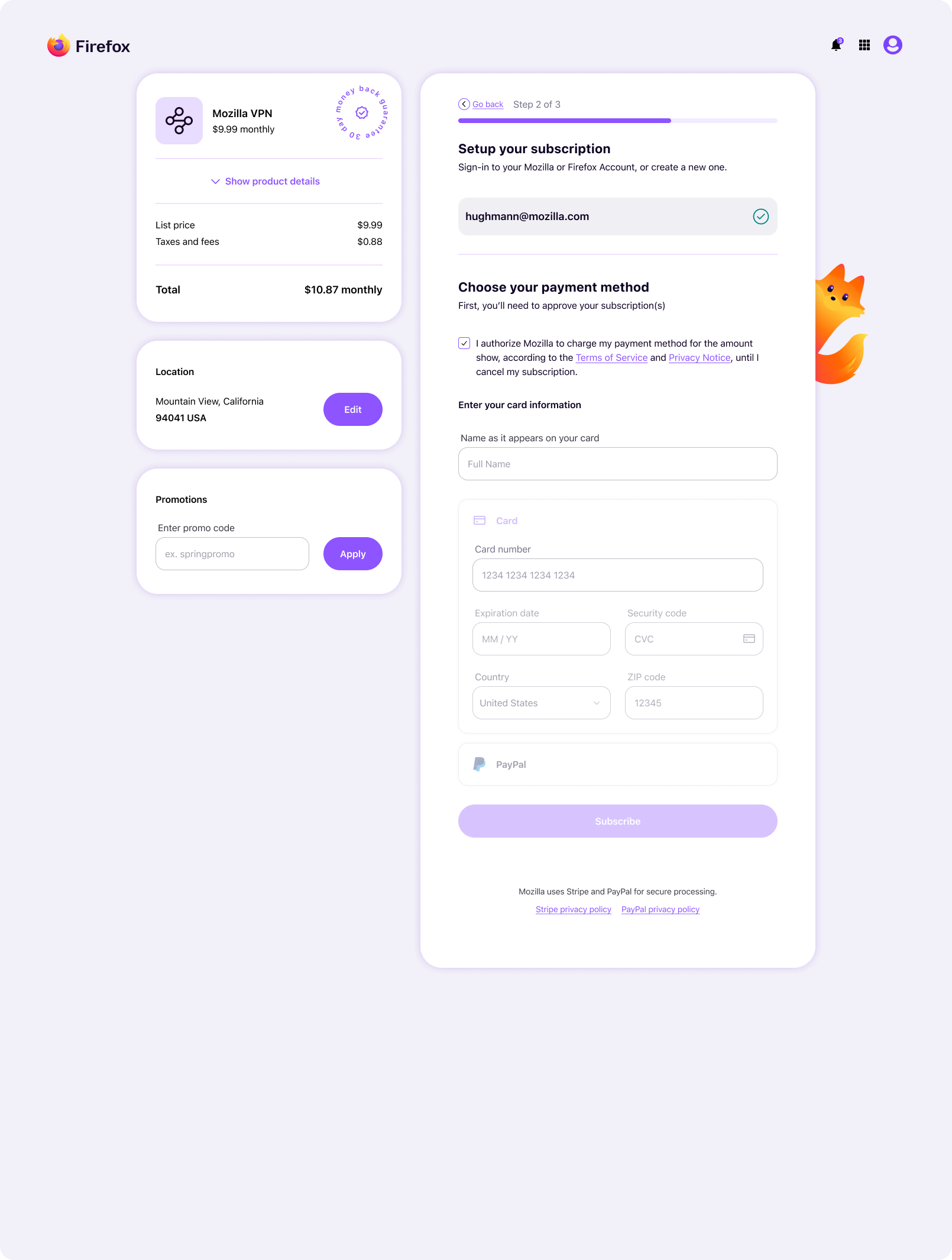
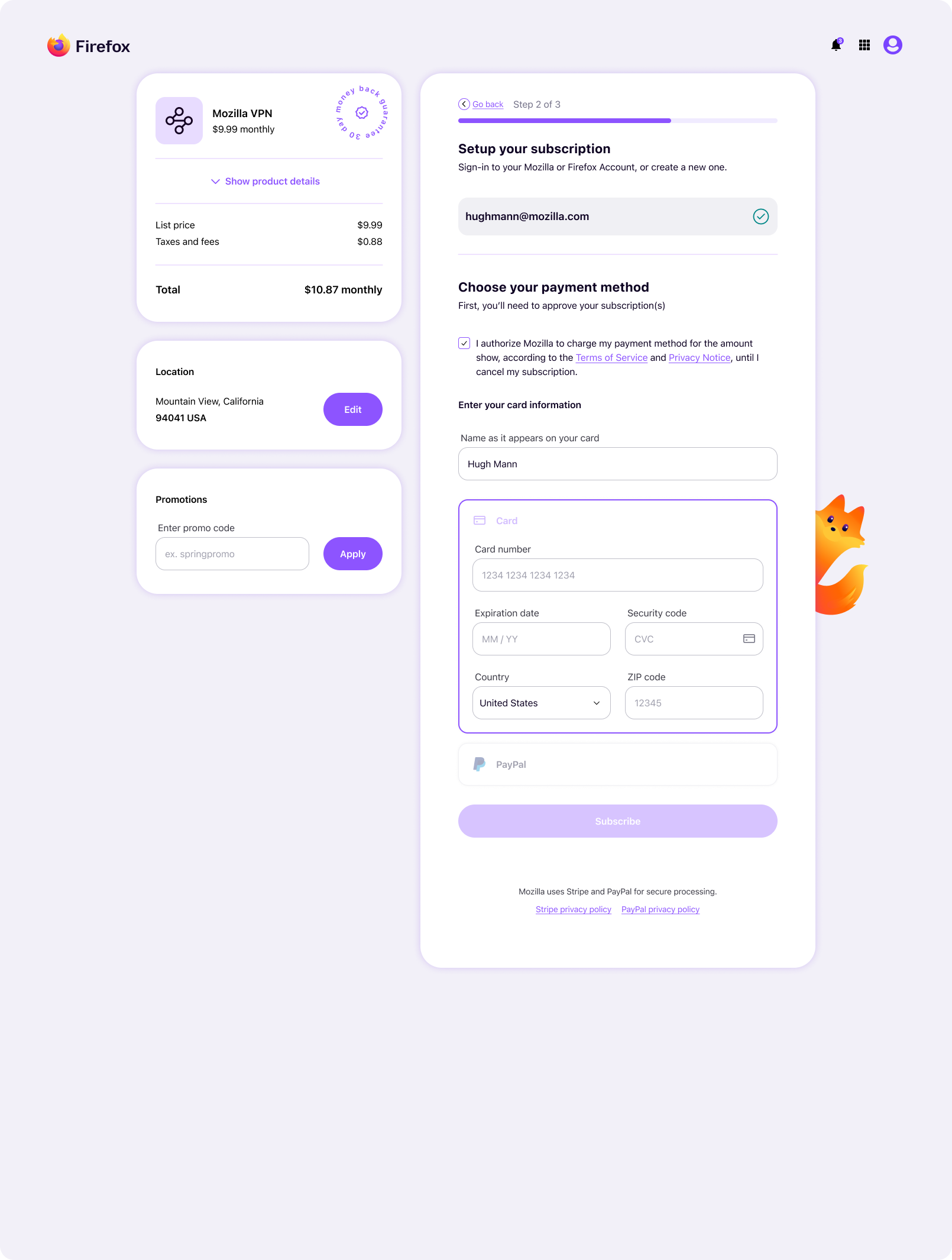
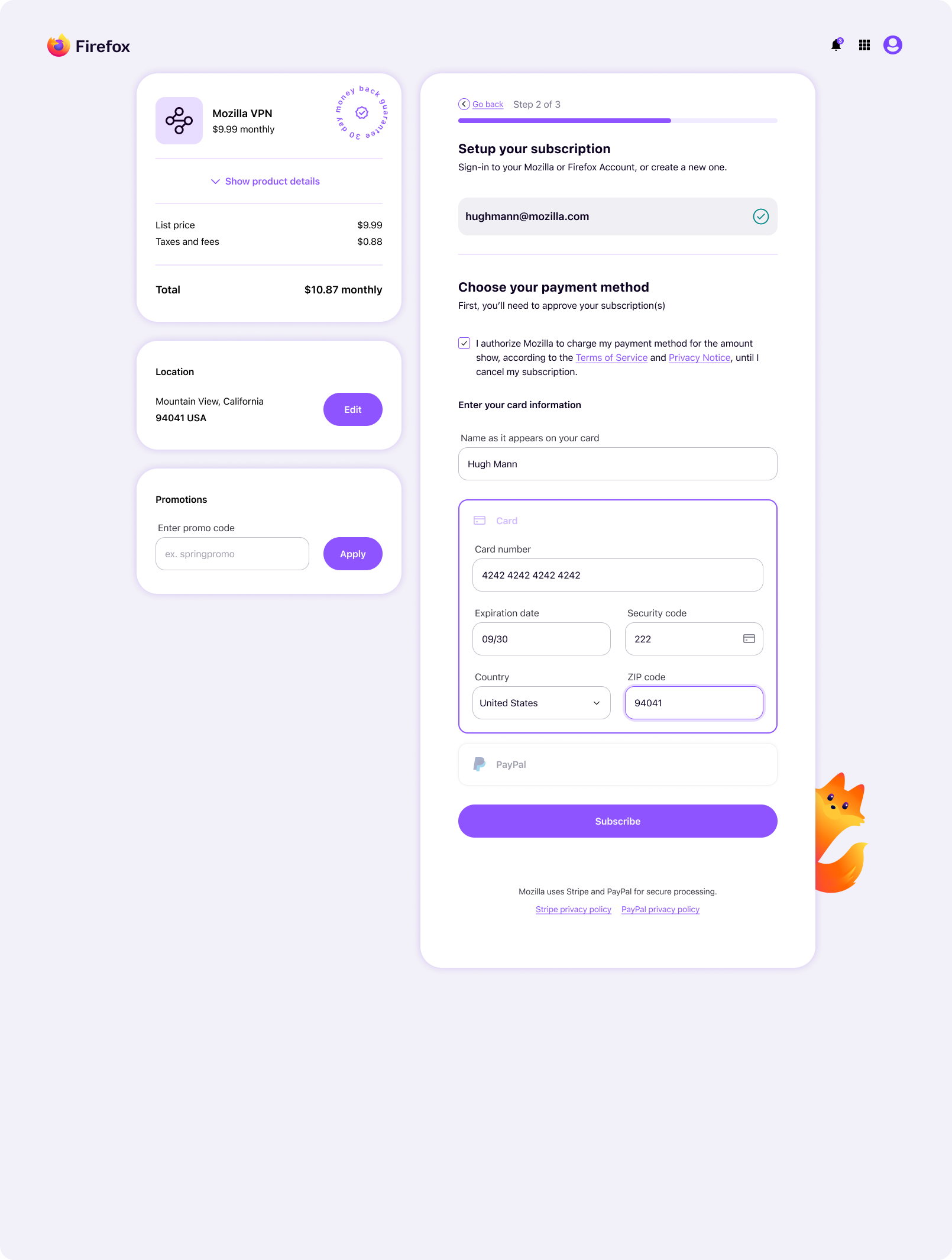
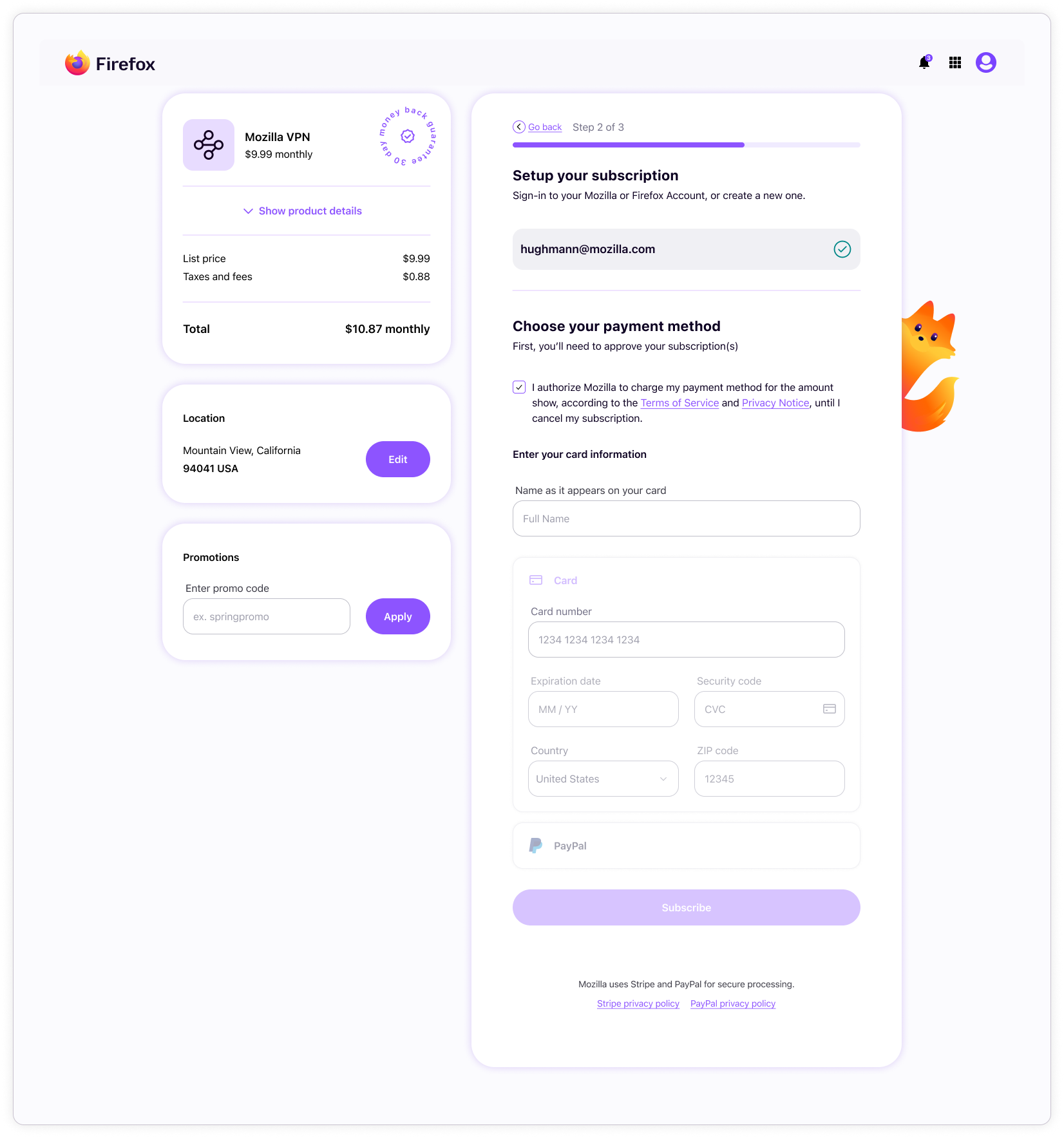
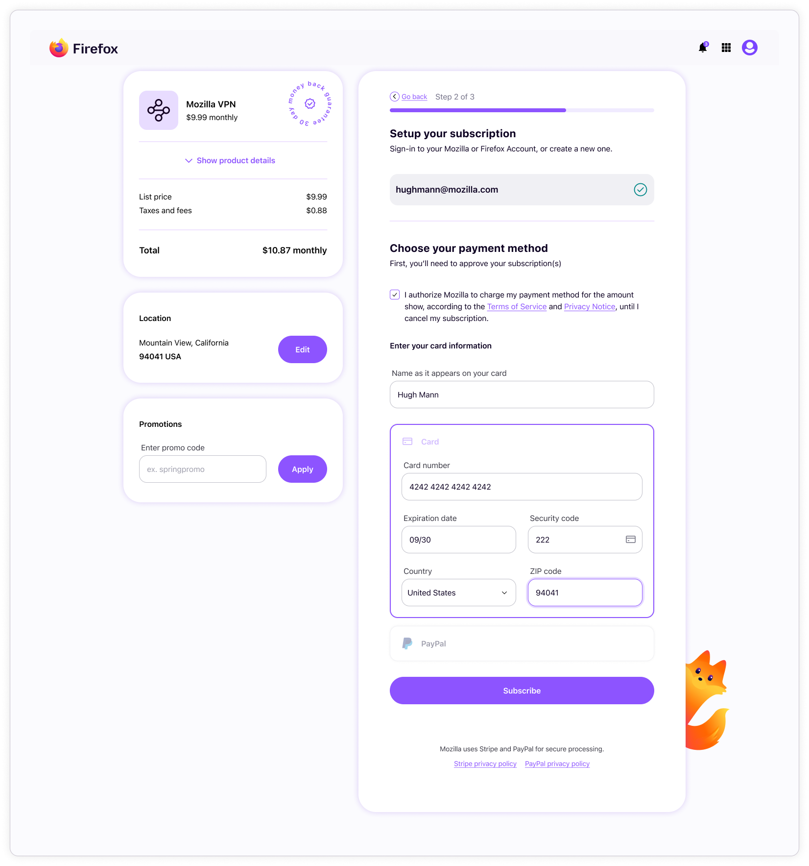
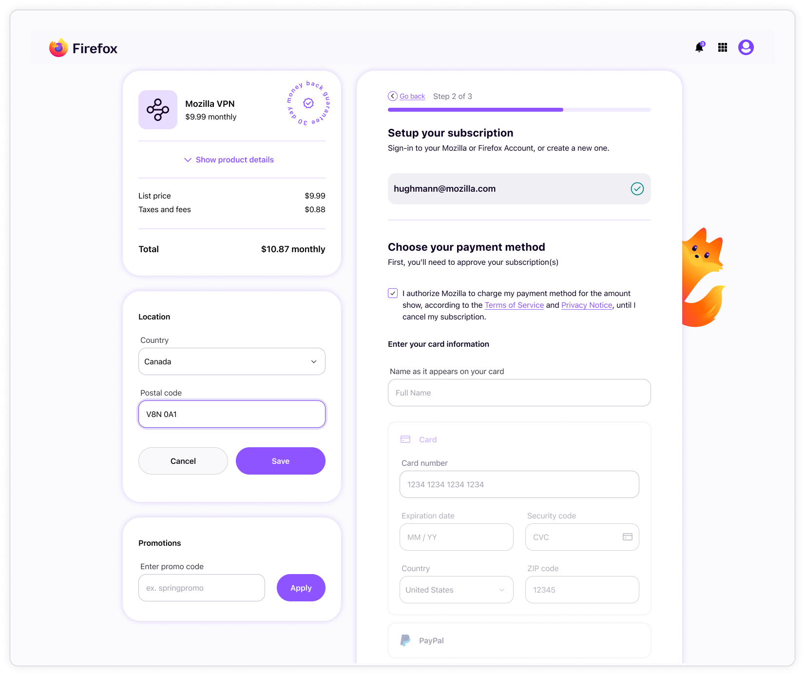
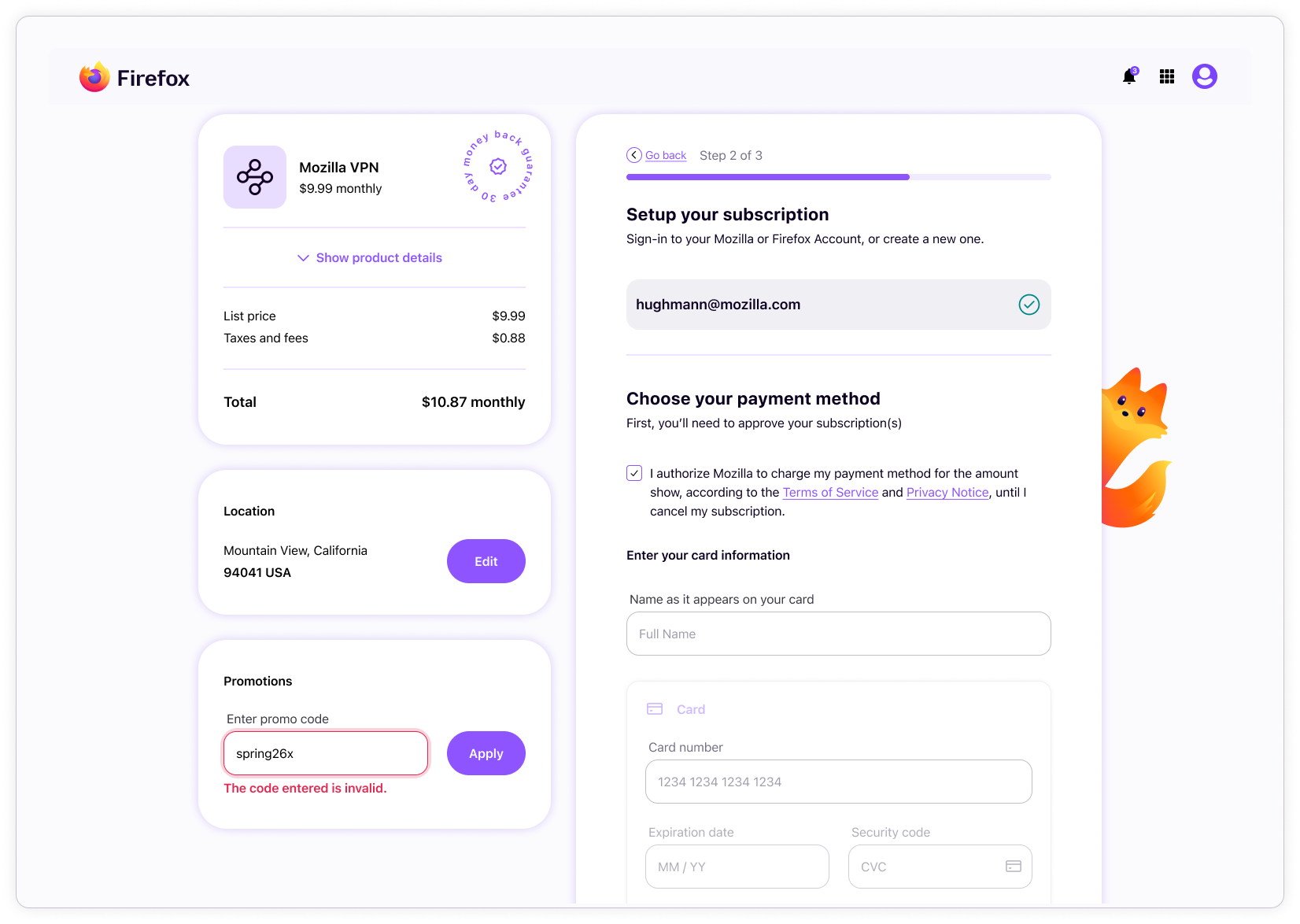
Subplat step 02: payment capture
Once signed-in, users must agree to terms before choosing to pay for their subscription with a card or PayPal. Subplat uses Stripe for card payments, which offers very little customization ability. We couldn’t get the Stripe forms to match our forms, so Subplat had to have their own custom input components that work slightly differently.
Once payment information is collected, the “subscribe” button becomes active. Clicking this button starts the payment verification process and returns either success or one of many error types.
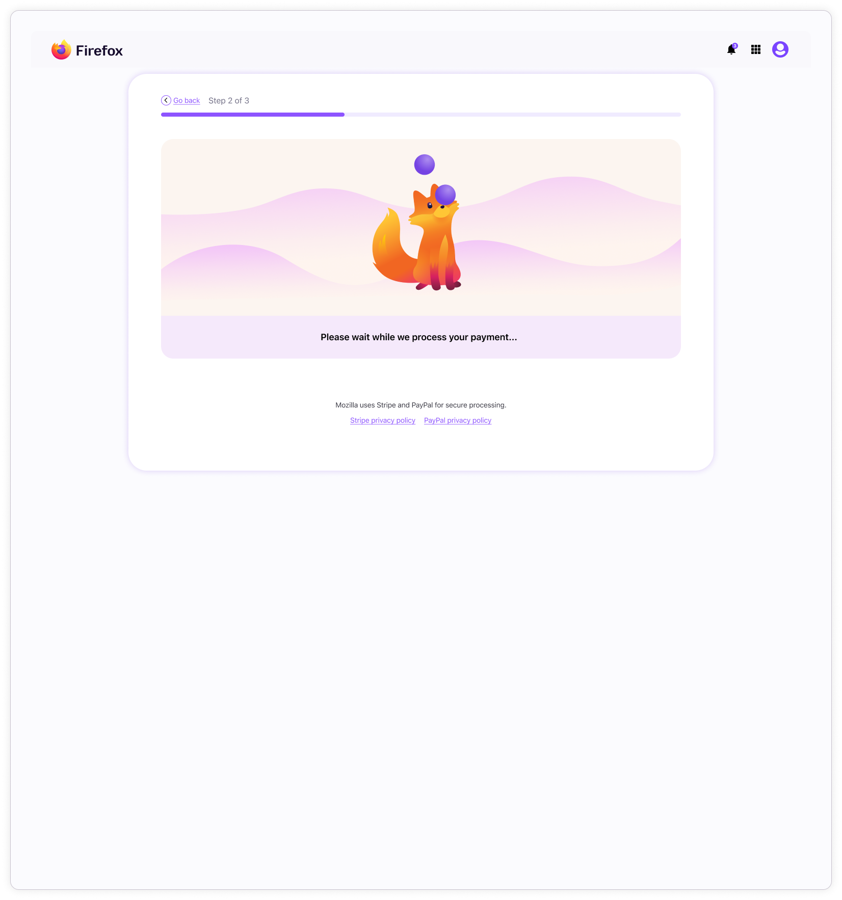
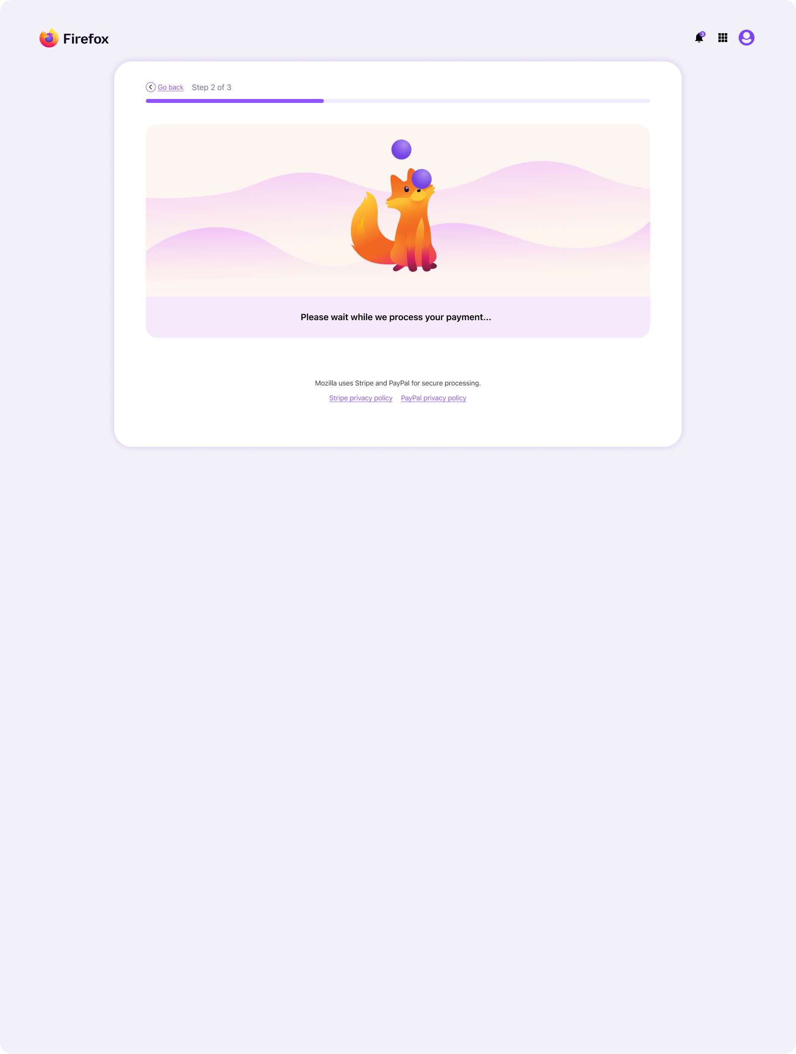
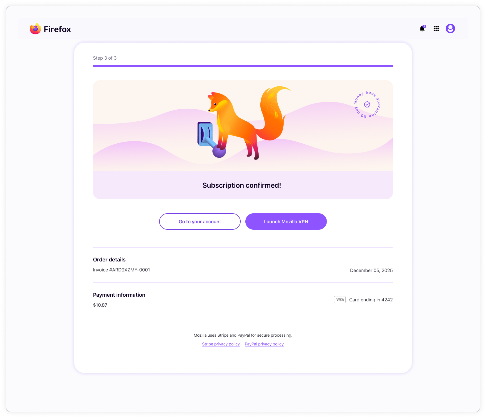
Subplat step 03: interstitial payment verification and purchase completion
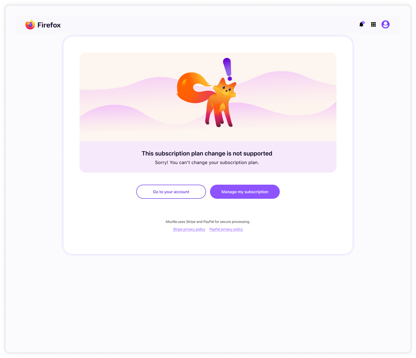
Payment verification can trigger either a success or error page. Errors can be generated from a number things, such as unsupported location configurations, failed payments, or timeouts.
If payment is successful, clicking “continue” takes the user to the start page of the product purchased.
If the user chose PayPal instead of card, the interstitial is omitted, and the user goes straight to the success or error page.
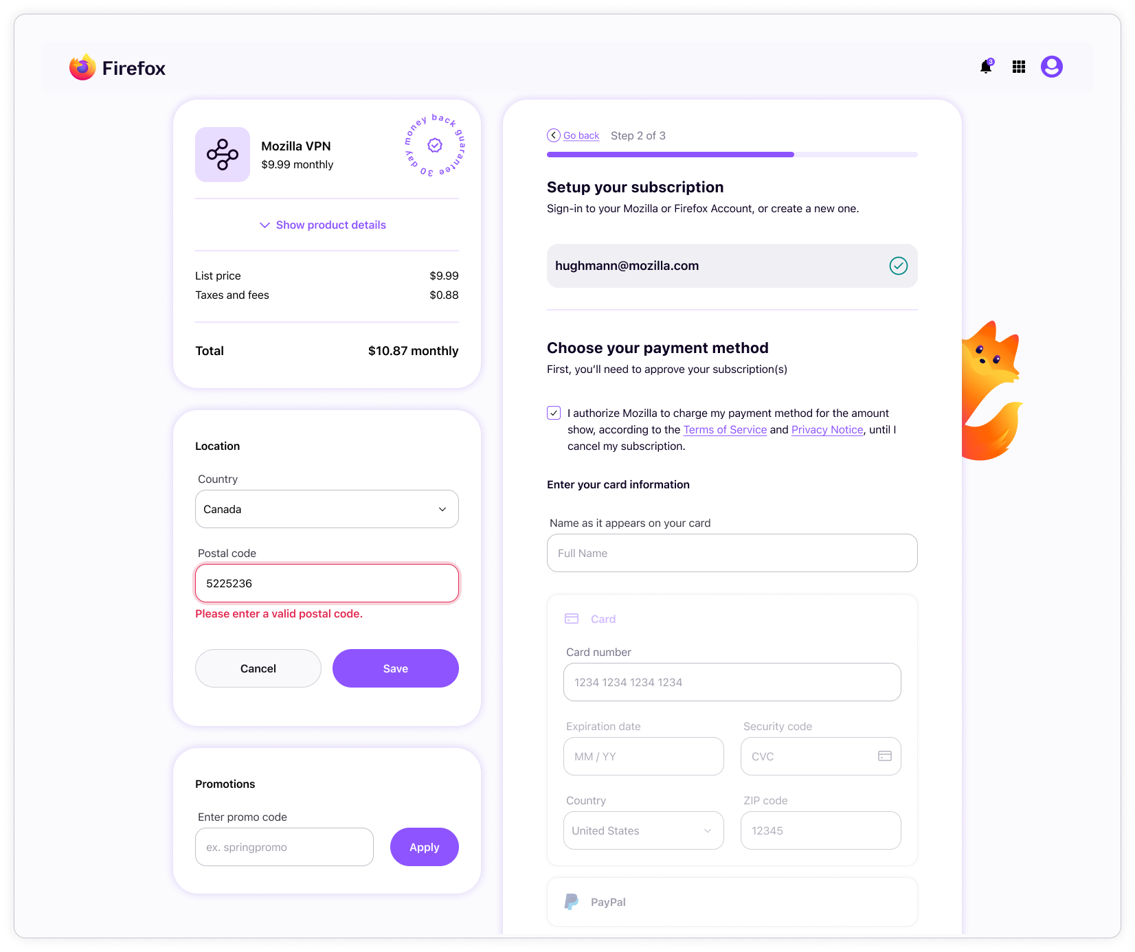
Subplat location switcher
For billing and tax purposes, the location switcher allows users to enter a location that differs from their billing address. This section has several error states covering scenarios such as invalid postal code entries and unavailable countries.
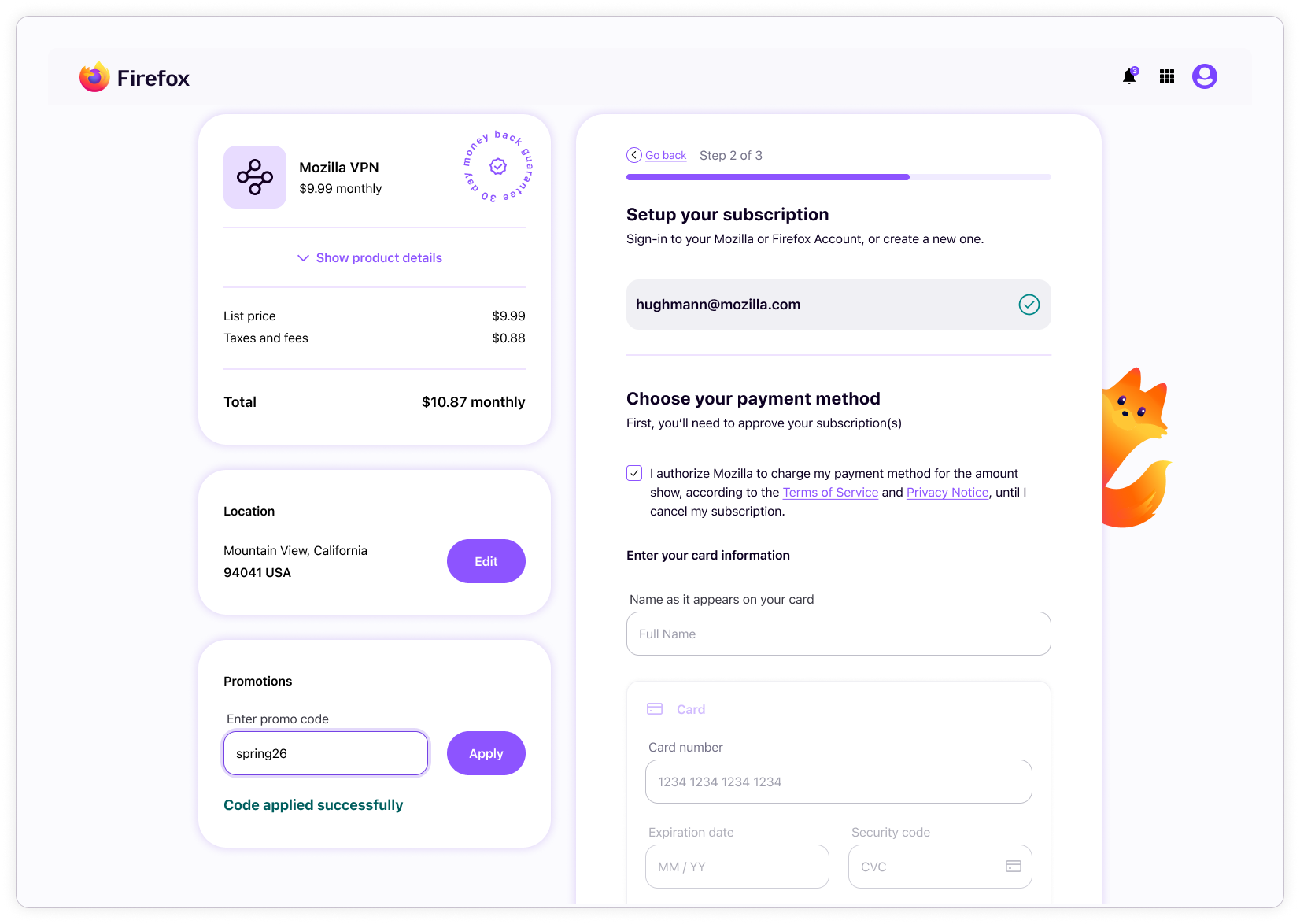
Subplat promo code
Subplat also supports promo codes, which have a single error state for invalid promo codes.
Results
The Sync design system created a stronger shared foundation across Accounts, Subplat, and Settings by bringing greater consistency to experiences that had previously drifted from one another, and from Firefox design language. It established a more scalable structure for shared UI, improved alignment between design and engineering, and made it easier to support multiple branded contexts within a connected product ecosystem.
The project also expanded beyond system standardization alone. The visual and interaction redesign helped address areas of friction, especially in Subplat, where parts of the experience risked confusing users. This refinement improved clarity in key moments while introducing more engaging brand expression through motion and character-driven elements (Kit).
Design systems impact
The system improved the quality and scalability of shared UI across the products by combining stronger component craft with flexible architecture. Variables, modes, advanced component properties, and configurable layout structures made the system easier to apply across products, without relying on duplicated files or one-off solutions.
Impact was visible across several areas:
- Reduced fragmentation across Accounts, Subplat, and Settings
- Stronger alignment to Firefox design language
- More consistent component behavior and visual structure across products
- Scalable multi-brand theming through mode automation
- Better design-to-engineering alignment through code-aware system structure
The work helped shift the system from a collection of reusable assets into a mature design infrastructure that could support multiple products, brands, and flows with greater consistency.
Reflection
This project reinforced that a design system’s value comes not only from the quality of its components, but from the logic and structure that allow teams to use it effectively. The most important contribution was creating a system that could support variation without losing cohesion across brands and implementation contexts.
The mode logic and advanced component configuration were especially meaningful because they moved the work beyond static UI standardization and toward a more adaptable system framework. It also reinforced how important it is for design systems to bridge craft and infrastructure.